10,000 search results
(0.036 seconds)
- Searching - Unknown license

- Hyrule - Personal use only

- Anderson Torchy The Battery Boy - Unknown license

- Alright! Imagine you're flipping through an old-school comic book or gazing at a vintage poster at a quirky market. The bold, eye-catching letters that scream for your attention? That vibe is pretty ...
- Ice Creamery by FontMesa,
$29.00Ice Creamery is a new variation of our Saloon Girl font family complete with italics and fill fonts which may be used to layer different colors into the open parts of each glyph. We don’t recommend using the fill fonts for Ice Creamery as stand alone solid fonts, Ice Creamery Chocolate was designed as a the stand alone solid font for this font family. Fill fonts go back to the 1850's where they would design matched sets of printing blocks and the layering of colors took place on the printing press, they would print a page in black then on a second printing they would print a solid letter in red or blue over the letters with open spaces to fill them in. Most of the time the second printing didn't line up exactly to the open faced font and it created a misprinted look. With the fill fonts in Ice Creamery and other FontMesa fonts you have the option to perfectly align the fill fonts with the open faced fonts or shift it a little to create a misprinted look which looks pretty cool in some projects such as t-shirt designs. I have some ice cream making history in my family, my Grandfather Fred Hagemann was the manager of the ice cream plant for thirty years at Cock Robin Ice Cream and Burgers in Naperville IL. In the images above I've included an old 1960's photo of the Cock Robin Naperville location, the ice cream plant was behind the restaurant as seen by the chimney stack which was part of the plant. If you were to travel 2000 feet directly behind the Cock Robin sign in the photo, that's where I started the FontMesa type foundry at my home in Naperville. My favorite ice cream flavor was their green pistachio ice cream with black cherries, they called it Spumoni even though it wasn't a true Spumoni recipe. Their butter pecan ice cream was also incredibly good, the pecans were super fresh, their Tin Roof Sundae ice cream was chocolate fudge, caramel and peanuts swirled into vanilla ice cream. One unique thing about Cock Robin and Prince Castle was they used a square ice cream scoop for their sundaes. - Song And Dance JNL by Jeff Levine,
$29.00 The hand lettering of a piece of 1930s sheet music's title has once more yielded an interesting take on the popular "thick and thin" lettering of the Art Deco period.
 - Back ttf - Unknown license

- Novusa by Taznix Creative,
$18.00 Novusa is a bold and dramatic display font. This original look will appeal to a wide range of crafty ideas, from letterheads and titles, to stationery. Novusa Perfect for for many creative products such as logos, tattoo design, t-shirt prints, street wear, headlines, tattoo lettering, calligraphy, clothing brands, music, sports, labels and much more. What's Included : Web Fonts Standard glyphs Ligature Works on PC & Mac Simple installations Accessible in the Adobe Illustrator, Adobe Photoshop, Adobe InDesign, even work on Microsoft Word. PUA Encoded Characters - Fully accessible without additional design software. Fonts include multilingual support for; ä ö ü Ä Ö Ü ß ¿ ¡
 - Manhattan Midnight by Scholtz Fonts,
$19.95 Manhattan Midnight owes its style to Art Deco fonts of the early 20th century. It has the opulence of New York City in the 20s and 30s, the glitter of city lights, the glamour of movie stars, the razzmatazz of Manhattan in the bad old days. You can use Manhattan Midnight for all advertising with an art deco flavor, for music media needing a bluesy, retro look, for movie posters reminiscent of the era, and so many more applications. The font has all the features usually included in a fully professional font. Language support includes all European character sets.
 - Grunge Standard by Scholtz Fonts,
$9.50 Grunge Standard is to grunge fonts what Jazz standards are to the world of Jazz – timeless, easy to use, great for every occasion. The font is easily recognized, clear and legible, just like the tune that everyone knows. Use Grunge Standard for contemporary display work, for fashion items, for event posters, movie posters, music posters, videos, DVD covers, in fact, anywhere that grunge fonts could possibly appear. Grunge Standard contains over 250 characters - (upper and lower case characters, punctuation, numerals, symbols and accented characters are present). It has all the accented characters used in the major European languages.
 - Junglemania by TypeArt Foundry,
$45.00 High contrast bleeding letter grunge.
 - Faith Collapsing - Personal use only

- HoMicIDE EFfeCt - Unknown license

- Voodoo Needles - Personal use only

- Ellianarelle's Path - Unknown license

- Devil's Snare - Unknown license

- OPN Malatashito - Unknown license

- Shards - Unknown license

- Bands & Artists - Unknown license

- Freeze! - Unknown license

- extravaganza- - Unknown license

- For The One Hundreth Time - Unknown license

- Badinerie by JBFoundry,
$16.00 Badinerie is a cursive font family with decorative variations. You can choose simplicity, swash, love or flowers.
 - Nestine by Craft Supply Co,
$20.00 Introducing Nestine – Elegant Sans Serif High Contrast Elegance Nestine – Elegant Sans Serif is more than just a font; it’s a visual masterpiece with high contrast that effortlessly exudes an air of elegance and luxury. The Epitome of Elegance Moreover, Nestine epitomizes elegance. Its striking contrast between thick and thin lines creates a visual appeal that is both refined and sophisticated, making it the perfect choice for luxury designs that demand attention. A Minimalist Marvel Nestine’s high contrast design is a minimalist marvel. It relies on the purity of its design to convey sophistication and elegance, proving that simplicity can be the essence of opulence. Ideal for Luxury Design Additionally, Nestine is tailor-made for luxury design projects. From high-end branding to upscale packaging, it adds a touch of opulence and refinement that leaves a lasting impression of sophistication. In Conclusion In summary, Nestine – Elegant Sans Serif is the epitome of high-contrast elegance. It’s the font that effortlessly combines the art of sophistication and luxury. With Nestine, your designs achieve a minimalist yet opulent quality that captivates the viewer, leaving an indelible mark of refined taste and aesthetic beauty.
 - Holitter Circle - 100% free

- Osaka-Sans Serif - Unknown license

- Holitter Hollow - 100% free

- The Good Stuff by Epiclinez,
$18.00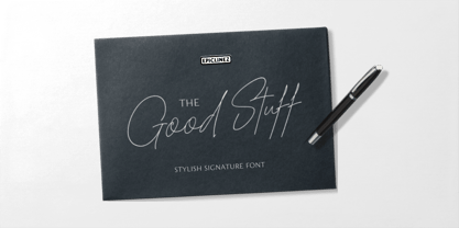 The Good Stuff is a handwritten signature script with a natural flow. This stylish font is a good choice for high-end, sophisticated Branding design.
 - Eiffel Shine by Haksen,
$13.00 A cute serif quirky font style Specifics: Cute style with average high of uppercase Ligatures of the lowercase Numerical, Punctuation, Multi language included Happy Designing!
 - Distinction by Great Lakes Lettering,
$12.00 Distinction Is a brand new font from Great Lakes Lettering. A high contrast brush script with a ton of usefulness. Make you mark with Distinction.
 - DT Stoner Toon by Dragon Tongue Foundry,
$10.00 Inspired by early cool cartoon fonts, early rock and hippie posters, I created this casually organic 'DT Stoner Toon' font. Please use with contextual ligatures turned on when possible. These letters like to adapt to their neighbours. 60's 60s artdeco artnouveau cartoon cartoonesque Cartoon Font cartoonish cartoony casual contextual cool cool font cool typeface dots fun fun font gigposter hippie hippy joined party poster poster font poster typeface rock poster spots spotted Stoned Stoner stones theater poster toon wet with dots written
 - Breadcrumbs by Hanoded,
$15.00 Every morning, after the kids have gone to school, I vacuum the floor and remove about half a kilo of breadcrumbs… No, not really have a kilo, but any given bird could probably survive on the leftovers. When it was time to name this font, Breadcrumbs was all I could think of! Breadcrumbs and children seem to go together well, as they are featured in Hansel & Gretel and Hop-o'-My-Thumb. Breadcrumbs font is a happy, sloppy fairytale font, which you can use for your book covers, your party posters and maybe crumbly bread packaging. But that is entirely up to you.
 - Dear Penpal Script by Giaimefontz,
$6.00 This is a fully connected script font, not calligraphic, but entirely designed to follow handwritten cursive ligatures rules as teached in schools. In order to correctly visualize it, you have to enable OpenType features (Contextual Alternates, Discretionary Ligatures, Standard Ligatues and Kerning). Trying to write All Capitals will generate Block Letters writings, since cursive style doesn't allow more than the first uppercase per word, however this font is not meant to be a Block Letters font. Using specific type combinations will generate special glyphs. All of these features are intended to reproduce a classic schoolboy or schoolgirl notebook.
 - Kickbox by Ahmad Jamaludin,
$19.00 Introducing KICKBOX Fonts - Unleash the Power of Nostalgia and Captivate Pop Culture, Lifestyle, and Music and Film Branding Looking to infuse your brand with a burst of retro charm and a dash of pop culture? Say hello to our KICKBOX Fonts! Designed with 3 styles: Narrow, Regular, Wide to make your brand stand out in the realms of pop culture, lifestyle, music, and film branding. These fonts are an absolute game-changer. KICKBOX transports you to the golden era of the past, evoking a sense of nostalgia that resonates with pop culture enthusiasts. Seamlessly blending boldness and authenticity, they captivate the hearts of your audience, adding a unique and irresistible touch to your brand identity. KICKBOX has 3 widths on each type: Narrow - Regular - Wide so can be perfect for any retro project like logotype, branding, title, packaging, and many more Features: Kickbox Main File Has 3 Variable: Narrow - Regular - Wide Instructions (Access special characters, even in Cricut Design) Unique Letterforms Works on PC & Mac Simple Installations Accessible in Adobe Illustrator, Adobe Photoshop, Microsoft Word even work on Canva! PUA Encoded Characters Fully accessible without additional design software. Embrace the captivating allure of our KICKBOX today and unleash a world of endless possibilities! Enjoy Designing! Dharmas Studio
 - Ratieka by Yukita Creative,
$12.00 Ratieka is a stylish, modern font that is perfect for use in fashion-related design projects. Its elegant letterforms make it ideal for branding and logo design, while its high level of legibility makes it perfect for use in websites, advertising, and other types of communication. Features. Supports all languages in the world (37) Versatile Single Font. One font for all needs. OTF File Ratieka is perfect for modern fashion brands or any projects that require a high-end feel.
 - Dabu by Gunjan,
$42.00 Dabu is a hand paint inspired high contrast decorative display typeface. With unique five ornamental layers which makes Dabu very presentable and eye catchy. Dabu has identical styles that very well goes with logo design, headline, creative sign boards, poster design, social media, fashion brand, beauty product branding, large print and screen. How to use Dabu ? - Select Dabu-Regular. - Copy the same one more time. - Select and choose any one Dabu Depth, Dabu Heart, Dabu Flower, Dabu Diamond, Dabu Square. - Select both and Aline. - Bingo!! :) No animals harmed in the making of this typeface Dabu is supportive to Adobe illustrator, Adobe Photoshop, Adobe In-design and All Adobe.
 - Kwun Tong JNL by Jeff Levine,
$29.00 Loosely based on a hand lettered title found on vintage sheet music for the song "Hong Kong", the design for Kwun Tong JNL emulates the letters and numbers formed from pieces of bamboo stalk. Kwun Tong JNL is named for a locality in Hong Kong although (according to Wikipedia) "the Hong Kong Government is unitary and does not define cities and towns as subsidiary administrative units."
 - Torrid Tango JNL by Jeff Levine,
$29.00 1920s-era sheet music for "Tangos Pour Manon" from Brussels, Belgium had the title hand lettered in an unusual style. The alphabet was square, had serifs and the thick-and-thin stroke weights that were more popular in the upcoming Art Deco years of the 1930s and 1940s. This became the working model for Torrid Tango JNL, which is available in both regular and oblique versions.
 - Weekend Date JNL by Jeff Levine,
$29.00 Sheet music from 1910 with another one of those ridiculous thirteen word titles (“I Love My Steady but I’m Crazy for My “Once-in-a-While’”) had the lengthy verbiage hand lettered in a bold serif typeface with slightly spurred serifs. This has been recreated in a digital typeface with a much shorter name: Weekend Date JNL, which is available in both regular and oblique versions.
 - Dine And Dance JNL by Jeff Levine,
$29.00 Sheet music featuring a song from the 1933 film "Torch Singer" starring Claudette Colbert was the basis for Dine and Dance JNL. A multi-line Art Deco design, it epitomizes both the typographic style and the night life of the time, when supper clubs featuring big bands were at their peak. Torch Singers were female vocalists who typically sang melancholy love songs of lost love and heartbreak.


