1,966 search results
(0.019 seconds)
- Faces - Unknown license
- Crackling - Unknown license
- Aquaduct - Personal use only
- BLU Esoteric - Unknown license
- Timesquare by Campotype,
$25.00 - Atomic - Unknown license
- Slumgullion - Unknown license
- Big - Unknown license
- Flowerchild - Unknown license
- Oedipa - Unknown license
- Snowy - Unknown license
- West Side - Unknown license
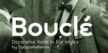
- Boucle by TipografiaRamis,
$29.00 - Harting - Unknown license
- Generations - Unknown license
- Rechtman - Unknown license
- Lilith - Unknown license
- Shohl - Unknown license
- Dobkin - Unknown license
- Rothman - Unknown license
- Neue Haas Grotesk Text by Linotype,
$33.99 - Complete - Unknown license
- Micahels - Unknown license
- Dolphin - Unknown license
- Jains by Typotheticals,
$4.00 - Stretch - Unknown license
- Meichic by Typotheticals,
$6.00 - Akbar - Unknown license
- ballot - Unknown license
- Hungover Outline - Personal use only
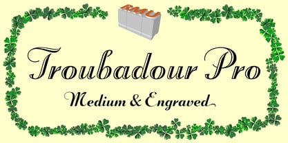
- Troubadour Pro by RMU,
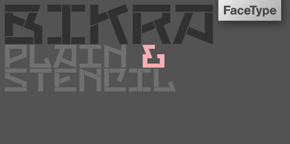
$35.00 - Bikra by FaceType,
$18.00 - Etched Fractals by Typotheticals,
$6.00 - Cyne by Typotheticals,
$8.00 - Folio by Linotype,
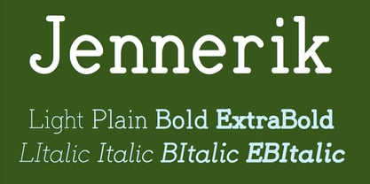
$29.99 - Jennerik by Ingrimayne Type,
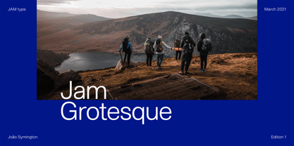
$9.95 - Jam Grotesque by JAM Type Design,
$25.00 - Cardboard by deFUNKT,
$35.00 - Benjamin by Wilton Foundry,
$29.00 - Kids - Unknown license


