985 search results
(0.042 seconds)
- Zenoa by Brenners Template,
$19.00 Zenoa Display Serif Font Family - They are sharp and sensitive, but connected-oriented. That's why they're designed by incorporating hook glyphs into an elegant serif style. Somewhat high contrast between vertical and horizontal, they reveal the strong individuality of each glyph, so you can create creative layouts. The meticulous design stands out so that readability and individuality can be expressed in harmony. And, these are the special excellences of this font family: Stylish Alternates and Ligatures where calligraphic subtlety is artistically connected. These OpenType features are decorative pleasures of using this font family more functionally. Please check first if the app you are using supports these features. They are easy to use in Adobe apps such as Photoshop and Illustrator. Alternates : A, B, C, D, E, F, G, H, J, K, L, M, N, P, Q, R, S, T, U, V, W, X, Y. Standard Ligatures : ff, fi, fl Discretionary ligatures : Am, Ba, Ca, Ch, De, En, Fr, Ge, Ha, In, Lo, Mi, No, Pa, Ro, Sa, Th, Va, Wo, Yo, an, bi, ck, de, ee, gn, ha,ie, lo, mo, no, oo, pr, ro, ss, st, te, um, ve, we, yo. Supported Languages: Western Europe, Central/Eastern Europe, Baltic, Turkish, Romanian
 - Grapple BRK Pro by CheapProFonts,
$10.00 Another very squarish and futuristic font from Brian Kent. This time I've kept the very thin style of the diacritics, but I have redesigned the A and H (and a couple of other letters and glyphs ;) - mostly to give them a little more "meat". And then added the usual plethora of accented letters for our unique language support, of course. Result! ALL fonts from CheapProFonts have very extensive language support: They contain some unusual diacritic letters (some of which are contained in the Latin Extended-B Unicode block) supporting: Cornish, Filipino (Tagalog), Guarani, Luxembourgian, Malagasy, Romanian, Ulithian and Welsh. They also contain all glyphs in the Latin Extended-A Unicode block (which among others cover the Central European and Baltic areas) supporting: Afrikaans, Belarusian (Lacinka), Bosnian, Catalan, Chichewa, Croatian, Czech, Dutch, Esperanto, Greenlandic, Hungarian, Kashubian, Kurdish (Kurmanji), Latvian, Lithuanian, Maltese, Maori, Polish, Saami (Inari), Saami (North), Serbian (latin), Slovak(ian), Slovene, Sorbian (Lower), Sorbian (Upper), Turkish and Turkmen. And they of course contain all the usual "western" glyphs supporting: Albanian, Basque, Breton, Chamorro, Danish, Estonian, Faroese, Finnish, French, Frisian, Galican, German, Icelandic, Indonesian, Irish (Gaelic), Italian, Northern Sotho, Norwegian, Occitan, Portuguese, Rhaeto-Romance, Sami (Lule), Sami (South), Scots (Gaelic), Spanish, Swedish, Tswana, Walloon and Yapese.
 - Art Gothic HiH by HiH,
$10.00 Art Gothic was attributed to the Central Type Foundry of St. Louis, Missouri, USA by Henry Lewis Bullen, writing in INLAND PRINTER in 1907, with a reproduction shown in Kelly’s American Wood Type. The typeface appears on the cover of an issue of “The Superior Printer” pictured in Typology by Heller and Fili dated in the 1870s. Art Gothic was designed in 1884 by Gustav Schroeder and proved to be one of the more popular and enduring of the American-designed Victorian display faces of the period, appearing frequently in ads in various publications. The Hamilton Mfg. Co showed a very similar wood type, No. 232, with a modified and rather heavy-handed upper case in 1892. As late as 1897, it may be found in the advertising section of The Ivy of Trinity College of Hartford, Connecticut and was included in the Norwood Press 1902 Specimen Book. Our font includes a complement of five upper case and four lower case alternatives as follows: 123=C, 125=E, 135=H, 137=S, 172=c, 175=e, 215=m and 247=s. Great for period pieces. ART GOTHIC HIH is clean, readable, and surprisingly modern-looking; unlike so many overly complex Victorian display fonts, it can be used in text sizes.
 - Freigeist by René Bieder,
$29.00 The story of Freigeist is a journey into the past, back to the early grotesk fonts and long before Helvetica and Co were standard fonts in operating systems. For what we take for granted today is the result of innovation and pioneering spirit of type foundries such as Caslon or Stephenson Blake in the 19th century, whose expressive designs are mostly forgotten today. The Freigeist family captures this untamed spirit — hence the name (German for “free spirit”) — and puts it into a contemporary context, resulting in a multi-faceted family with a wide range of applications, font styles and features for modern typesetting. Design Details Unlike other modern grotesk typefaces like Helvetica or Univers, Freigeist is characterized by a warm and dynamic appearance. It draws inspiration from various historical models such as Caslon’s Doric or the Grotesque variants of Stephenson Blake. Particularly noticeable are the narrow terminals, the serpentine S or the dynamic g in combination with ascenders that reach to the cap-height only. Italics Many italic grotesk fonts are strongly oriented towards their upright counterparts. Unfortunately, this often means that they cannot do justice to their actual task, which is to highlight words or sections of a text. The italic cuts of Freigeist try to remedy this situation by using the greatest possible formal distance while reinforcing the untamed spirit. What adds to this, is a reminiscent of handwritten forms, which can be found in a, n, y or g, as well as the German sharp s or the ampersand. Alternate Characters Alternative letterforms are ideal for customizing the overall appearance of a text, for usage in logos or they can even work as custom fonts for companies. Freigeist comes with ten stylistic alternatives that are easy to insert via the Opentype window, such as the single-storey a, a tail-less version of the a for compact text, when uses in condensed widths or a dialed down version of the r. Languages Freigeist has a built-in support for Latin and Cyrillic based languages and covers more than 210 languages. Opentype Features and Symbols The family comes with many opentype features to support modern typesetting. This includes ligatures, different number sets or alternative shapes for texts set in all caps. Styles Freigeist is available in five widths (XCon, Con, Normal, Wide, XWide) and six weights (Thin, Light, Regular, Medium, Bold, Black). Including the accompanying italics, the family comes in 60 cuts that are suitable for any application. Testfonts If you like to test the fonts before buying the full version, please follow the link below: https://www.renebieder.com/test-fonts Update 1 A lot has changed in this first update. It is more than just a 1.01 or 1.02. It is actually the 2.0! I’ve gone through all! single glyphs of the 18 master files, making the family more sharp and even a bit more modern. I’ve added some new opentype features and redesigned the italics, because I wasn’t happy enough with the result. I’ve added new kerning pairs, new metrics, and even new glyphs. Please check my website for more details on the new design and overview about the opentype features and alternate shapes. If you purchased the Freigeist family already, thanks a lot!! It is the most advanced family that I published so far. I hope that you’re happy with this new version. Thanks!
 - Malnor Sans by Sikifonts,
$24.00 Malnor Sans is a normal sans serif family of 18 fonts. With modern style or neo-grotesque, Malnor sans has balanced proportions in every letter, and it's clean, minimal and cool. There are several alternative letters that can be used in both upright and oblique styles. Single story 'a' can give a more geometric impression, even though it is not purely geometric. There is also an alternative double story 'a' with a tail, a double story 'g' and an alternative 'l' that can be applied together via the 'salt' or 'stylistic sets' features for a slightly warmer feel. Malnor Sans currently has around 900 glyphs, including diacritical marks, that support a broad Latin-based language.
 - Stettinum Nicodemus Pro Sansum by Wardziukiewicz,
$20.00 Stettinum Nicodemus Pro is a project to revitalize lettering from tenement houses in Szczecin. The project includes the digitization of letter remains from ul. Kaszubska in Szczecin to form functional fonts. The main idea of the project was to preserve the disappearing remnants of Szczecin's typographic past, which, despite the span of glyphs limited by time, can be an inspiration for many future extensions of the already established family. Stettinum Nicodemus Pro Sansum is a family of typefaces consisting of 7 variations. The block structure with a regular structure and a relatively high minuscule allows for many different applications. Versions 700, 800 and 900 are intended for titles, headings and emphasis, typefaces 300 to 600 are text typefaces.
 - Alamia by Ani Dimitrova,
$29.00 The Alamia type family is a sans serif in 20 weights, ranging from Hair Line to Black with matching italics. Each style contains more than 900 glyphs. Alamia comes with an extended coverage of the Latin and Cyrillic Script. All weights of this family are equipped for complex, professional typography with OpenType Features including: Small Caps, Ligatures, Discretionary Ligatures, Superscript, Subscript, Tabular Figures, Old-Style Figures, Circled Figures, Arrows, Matching currency symbols and fraction.The construction of the characters combines clean grotesque style with modern, that gives the font an organic, warm and friendly touch. The Alamia font family is a perfect choice for body text, branding design, web design, editorial design and more.
 - Jagerlay by Picador,
$29.00 Jagerlay was brought to life to cope with diverse and complex data gathered in presentations, corporate identity and other office documents. Its geometric shape and characteristic endings are reminiscent of classic typography from Sci-Fi Movies from the 80's. The simple design makes Jagerlay outstandingly easy to use for every user. Jagerlay pairs with other typefaces in the blink of an eye – it goes well with display, serif or script fonts. The whole family consists of 9 weights and matching italics. Every style has almost 900 glyphs. Jagerlay has many opentype features such as tabular figures, fractions, superscript and subscript, small caps and arrows. Low contrast makes it easy to read. The rest makes it easy to use.
 - Diploma Script by Latinotype,
$45.00 Diploma Script was born from merging classic calligraphy and contemporary tools. The Copperplate style, which served as baseline for the development of the font, mixes harmoniously with brush pen drawing techniques that give Diploma Script a modern touch. The typeface provides elegance and legibility, while preserving characteristic shapes and strokes from the Copperplate style. Diploma Script covers a wide range of uses ranging from titles, logotypes, invitation cards, certificates and labels to small-sized texts. The family comes with initial, medial and terminal alternates that allow user to emphasize specific words. Figures, fractions and symbols are also included. Diploma Script includes a set containing more than 900 characters that support over 200 different languages.
 - Mersin by Hurufatfont,
$29.00 Mersin is a modern sans serif font family. The asymmetrical structure of the beginning and ending shapes of letters such as "Cc, Ss" is its most distinguishing feature. Mersin has a total of 20 fonts, includings 10 weights and their appropriate italics. With its 2-axis (Weight & Italic) Variable Version, Mersin offers the advantage of using a very rich weight between 100-900. It includes detailed ligatures such as "Th, Tl, Ti, Tä, Tä, Tü, Tö, iï, fä, fä, fö fü" for very wide and different accents. “Mersin Book” and “Mersin Book Italic” are specially designed for body texts and small fonts usages. Ideal for corporate identity, posters, brochures, guidance signages and all other kinds of graphic design works.
 - Okoye by XO Type Co,
$40.00 Okoye occupies a liminal space between the bonkers curviness of 19th-century grotesques and the sandblasted neutrality of 20th-century models. Both extremes are nice, but there’s something to be said for some neutrality with character left in place, yes? Okoye comes in 9 weights, Thin to Black. If you’re using it for interfaces, each weight lines up from 100-900 in the CSS specification you already know, with Regular sitting at 400 and Bold at 700. You’ll see what you expect to see without extra font-weight specification. There’s extensive Latin language support, a set of small caps which mirrors full-size caps (good for control labels), and arrows. Okoye will be your quirkhorse: hardworking, with personality.
 - Aloe by ROHH,
$29.00 Aloe is a characterful and friendly display font family inspired by headlines from 1930’s newspapers and calligraphy. The family consists of 9 weights, ranging from Thin to Heavy, with matching ornament fonts. It features a variable font with weight axis. Each weight has over 900 glyphs including advanced typographic features, such as vast number of stylistic alternates, swashes, titling and terminal forms, case sensitive forms, ligatures, symbols, ornaments as well as lining and old style figures, fractions, subscripts and superscripts. This original mixture of display typeface with calligraphy gives a versatile family great for all sorts of uses - from advertising, packaging, branding, wedding invitations, menu cards and other editorial uses to screen and web projects.
 - Ongunkan Sweden Futhark by Runic World Tamgacı,
$40.00 Prior to 500 AD the 24-rune Elder Futhark was used in Sweden. From 500 AD until 800 AD there were many Futharks which were transitions from the 24-rune Futhark to one of the 16-rune Futharks. By the end of this period the 24-rune Futhark was completely out of use , and only 16-runes Futharks were in use. By 900 AD two different types of Shorttwigs-Futharks had been born. One was popularized in Norway and the other was used in the west (the British islands). By 1000 AD the adjustment of the runes to the Latin alphabet had begun, and several versions are found up until the Dalrunes, about 1700-1800 AD.
 - Glimp Variable by OneSevenPointFive,
$60.00 Variable version of 'Glimp' font family Glimp Variable supports 3 axis flexibility across width, weight and italic in a single font. It also comes with the static styles available as options in the font style selection menu. It features rich set of opentype features such as stylistic sets, contextual alternates, case sensitive forms, superscripts, subscripts, fractions, and more. Glimp Variable is made to be your go-to choice for a wide range of projects, whether you're working on branding, web design, print materials, or presentations. It elevates your designs or brand effortlessly, embracing your creative vision. Variable Axis Ranges: Width - wdth - 75 to 100 Weight - wght - 100 to 900 Italic - ital - 0 to 1
 - Cleodify by Namara Creative Studio,
$15.00 Inspired by bold & retro typefaces in the ’90s, Cleodify comes with a retro-ish style. The bold design combined with classical proportions gives a choice for creative work. Cleodify Sans is available in two style : Regular and Rounded. Features : Full Set of standard characters and punctuations. Alternates, ligatures and multilingual support characters. PUA Encoded | no special software needed to access extra characters.
 - Ye-As-Ta by Grummedia,
$20.00Ye-As-Ta is a unique interpretation of traditional brush drawn oriental calligraphy. A caps only font, the characters type English style left to right but appear laid on their side. When the text box is rotated 90 degrees clockwise the text reads top right to bottom left, oriental style. A fun typeface, though reading can require a little practice! - Cursive Signa Script Variable by Pedro Teixeira,
$670.00 Cursive Signa Script Variable, quite possibly the first true cursive and signature variable font. It has 90 styles that range between weight, slant and alternates. It can be use in a lot of projects, like logos, end of a statement, pairing with a beautiful sans serif like Aleante, in a title, invites and so on. Designed by Pedro Alexandre Teixeira
 - Shard by Device,
$39.00 Shard was originally commissioned for Nickelodeon’s 3D reboot of the Teenage Mutant Ninja Turtles franchise. It complemented the show’s new angular logo, which Rian Hughes also designed. There are alternative versions of many letters available in the upper and lower case keys, and a selection of around 90 ligatures that automatically substitute themselves in running text to give a tight, interlocked fit.
 - Stepback by We Make Font,
$16.00 Our new font family is modern and exclusive, designed for the most varied uses. With sober and sporty lines, it offers a rounded finish with a lot of sophistication. It ranges from ExtraLight to Black, offering 8 weight options, with regular and italic variations. With 499 glyphs, it can be used in over 90 languages, with a crisp layout and strong contours.
 - Caneline by Gatype,
$14.00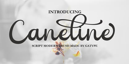 Caneline is an elegant classic script font, this font is equipped with various opentype features such as Stylistic Set & Ligature as well as multi-language support. Equipped with 90+ stylistic sets, this font has a large selection of glyphs / characters. This font is perfect for your design needs such as wedding invitations, logo designs, branding, social media designs, books, magazines, etc.
 - Bringhum by Letterhend,
$14.00 Introducing Bringhum, a bold and nostalgic typeface that captures the essence of the 90s era. Immerse yourself in its retro charm. This font is exceptionally well-suited for a range of applications, particularly for logos and various formal formats such as invitations, labels, magazines, books, greeting stationery, novels, and diverse advertising materials. Features :Uppercase & lowercase, Numbers and punctuation, Alternates & Ligatures , Multilingual, & PUA encoded
 - Eliptik by Yock Mercado,
$9.00 Eliptik is a typeface with disruptive shapes, inspired by the aesthetics of technology from the 80s and 90s, when they had a very particular style of seeing the future. It is an ideal typeface for large size display texts and wordmarks, designed in upper and lower case, it also has many stylistic variables (OpenType features) that give it more memorable and unique personality.
 - Acid Squares by Milan Vuckovic,
$29.00Acid Squares is a casual ornamental (fun) font. It was inspired by squares, the 70’s, the 90′s, street art and Berlin. Due to its limited readability it is recommended to use it in words that are common and uncomplicated or in logo design. As a decorative element it can be used well if the kerning is adjusted by the user. - Sauerkrauto Pro by Martin Lexelius Core,
$33.00 In the late 90’s, there were many German cars coming into Malmö (where I lived at the time). I was blown away by the font on the license plates. So strange, so strong, peculiar – but still macho. I built the uppercase from my own photos. After this I completed the font with my own lowercase, small caps and punctuation.
 - Epic Miracle by Prestige Artsy Studio,
$29.99 Epic Miracle is beautiful rounded bold retro serif with a 90s touch. A great serif that works beautifully in modern designs. You can definitely create amazing logos, headings, apparel designs and more. Epic Miracle is an essential font for branding as well if you want to go BOLD. I can't wait to see what you can create with Epic Miracle!
 - Une Nuit Parisienne by Megami Studios,
$10.00 This font is based on a lot of the downtempo culture in Paris. Smoky bars, jazz clubs, that sort of thing. How a font can be influenced by intangibles is a question that I can't quite answer, but I can say that when I created it, it strongly reminded me of a couple of times spent in Paris back in the mid-90s.
 - Riff by estudioCrop,
$24.90Having spent all of my teenage years in the 90s, it's no surprise that this very particular decade resonates so deeply in me. As a graphic designer, I still think the strongest visual languages of the last 50 years or so come from that time. Bold aggressive attitude is what most people remember from those designs. What they seem to forget—or, rather, to have completely ignored—is that some incredibly elegant and subtle styles emerged from those years. It still amazes me how they reflected so well the period in which they were conceived, taking style construction to the next level. Riff is a natural development of some of my thoughts about the 90s. Mixed with a very contemporary feel, it embodies several idiosyncrasies I absorbed over years of exposure to favorite design pieces, fonts, music, films and other cultural products that share the same spirit. - Upton by Halbfett,
$30.00Upton is a modern and condensed sans serif. The initial inspiration for its design came from lettering Wim Crouwel created for a poster design. It also takes some cues from neutral grotesks like Helvetica and Akzidenz. Because of its narrow letterforms, Upton is best applied to headlines and poster-sized typography. Upton’s italics were designed with high-quality compensation for all circles and strokes. Upton ships in two different formats. Depending on your preference, you can install the typeface as two Variable Fonts or use the family’s 14 static OpenType font files instead. Those weights run from Extralight to Extrabold. While the static-format fonts offer a good intermediary-step selection, users who install the Variable Font have vastly greater control over their text’s stroke width. The weight axes in Upton’s Variable Fonts allow users to differentiate between almost 1,000 possible font weights. That enables you to fine-tune your text’s exact appearance on-screen or in print. In its fonts, Upton has several ligatures. That includes optional “discretionary ligatures,” which bring a unique tone to display usage. For instance, the fonts include optional ligatures for the letter combinations “E-T”, “F-l”, “L-E-T-T-E”, “L-E-T-T”, “L-E-T”, “L-E-L-O”, “L-U”, “i-j”. and “m-m”. There are also many alternate glyphs. Stylistic Set 1 substitutes in new forms for “G”, “R”, “a”, “f”, “g”, “i”, “r”, “t”, and “y”. Six more Stylistic Sets have alternates for the “æ”, “g”, “k”, “o”, “K”, “O”, and “Q”. Additional OpenType features activate other useful features, such as fractions, numbers in circles, or symbols. - Vintage Galore by Letterhend,
$12.00 Vintage Galore is a handmade blackletter font font with casual & classic feels. This font will bring you back to 90s feel.This font perfectly made to be applied especially in logo, and the other various formal forms such as invitations, labels, logos, magazines, make up, stationery, novels, labels or any type of advertising purpose. Features : Uppercase & lowercase, Numbers and punctuation, Alternates & Ligatures, Multilingual & PUA encoded
 - Montain by Anaya Studio,
$14.00 Montain is a classic script font with rounded edges and a modern and unique look. This font is also equipped with 90+ stylistic sets, Contextual Alternative, ligatures and also multi-language support which further adds to the creativity in using this font. This font is perfect for your creative projects such as Logotype, printed quotes, invitations, cards, product packaging, headers, Letterhead, Apparel , Web design, Magazine, Book, etc.
 - Heroline by Graptail,
$15.00 Introducing Heroline, a retro-inspired font that evokes the 1950s to 90s nostalgia. This font is perfect for creating vintage-themed designs and giving it a touch of nostalgia and personality. Heroline features a soft, solid design with curved corners and a unique letter shape. This font also includes a variety of alternative characters and ligatures, allowing you to create many different looks with the same font.
 - Peanotes by Mvmet,
$15.00 Peanotes is a fun cartoon display font inspired by 80s and 90s cartoon movies. Peanotes font comes in 2 versions, regular and filler version. You can use it for anything ranging from t-shirts, book designs, and greeting cards to stickers and posters, or anything that needs a casual touch. Fall in love with its incredibly versatile style, and use it to create lovely designs!
 - TG Praktikal by Tegami Type,
$30.00 TG Praktikal is new modern geometrics sans with 8 styles & 1 variable font. Inspired by geometrics and gothic typefaces like Bell Centinel, Whitney and Metric, with an additional touch of monospace characters. That makes that TG Praktikal has a unique character set and fit perfectly for body text. Coupled with 3 flavors that can provide different impressions, including approximately 90 multilingual with various OpenType features.
 - Piked by Lemonthe,
$13.00 Piked is an elegant handwritten font, featuring 90 ligatures and swashes for a truly unique and personalized look. This font showcases a beautiful script style that captures the beauty and charm of hand-drawn calligraphy, ideal for adding a personal touch to any design project. It is perfect for many different projects such as logos & branding, invitation, stationery, signature, product designs, labels, photography, and much more!
 - Siwa Arabic by Protype,
$45.00 Siwa is a Multilingue typeface that created for the screens and the daily uses, with a simple timeless geometric design to merge the modern requirements with the traditional rules of calligraphy, comes with 9 weights, and support an OpenType feature for more than 90 languages, includes all the languages that based on Latin and Arabic letters, also support the Indian, Latin, Persian and Urdu numbers.
 - Zooja by Aerotype,
$48.00 Zooja™ and Zooja Light have alternates for every capital and lowercase letter, consecutive characters are controlled with the OpenType Ligature feature. Zooja Elements & Borders has 90+ fun decorative doodads, borders and corners that play well with the fonts. Zooja Catchwords has 60+ hand drawn word glyphs and Zooja Banners & Patterns has 17 repeatable patterns and 50+ banner and frame elements to help pull it all together.
 - Wasted Youth by Wing's Art Studio,
$12.00 Wasted Youth: A 90s Grunge Inspired Brush Font by Wingsart Studio Wasted Youth is a versatile brush font with shades of grunge, punk and horror. The font comes in three styles including a clean-edged original, plus two additional versions drawn with inky brush and marker pen. It takes inspiration from 90s grunge bands, with a hand-made punk aesthetic that’s equally at home in music videos, album covers, horror movies and skate culture. It aims to combine the best of these popular looks into one versatile font. Along with its unique uppercase and lowercase characters, Wasted Youth also comes with a host of custom ligatures, underlines and alternatives, along with numerals, punctuation and language support. It’s a truly flexible font that can be shaped into titles and headlines that look authentically hand-made. Try it on t-shirts, posters, stickers, movie titles, YouTube videos and more! Check out my visuals to see it in action.
 - Teenage Dreams by Indieground Design,
$10.00 This handwritten font is ideal for bringing back 90s nostalgic atmospheres. With its indie nature, this grungy font will add a touch of spontaneity and style to any creative project. This font recreates the atmospheres of our teenage years in the 90s, when we listened to Smashing Pumpkins, wore Chucks, and went to indie gigs. We love thinking about that time of wonder, discovery and imagination, and Teenage Dreams is perfect for bringing them back into our creative projects. Achieve a realistic handwritten effect by mixing the 4 different versions in titles and covers, instantly creating typographic artwork with an alternative, intimate attitude. On top of that, we also added a 5th bonus version of this dreamy font, with scribbles and drawings you can add to your compositions. This way, you will get a grungy scrapbook effect while adding intensity and style to any project. It is awesome when used on dark, noisy backgrounds, or used on top of images and photographs!
 - Rumi by ROHH,
$28.00 Rumi is a script font with organic and natural feel, designed to look as true handwriting. It has a calligraphic touch and shaky, unpredictable execution, being very clear and readable at the same time. In order to achieve realistic look, Rumi features 4 variations of lowercase characters, figures and punctuation. The font mixes randomly all four versions after activating OpenType “calt” feature. Many ligatures help to create even more unrepeatable settings. Rumi has an extended character set of more than 900 glyphs containing alternate styles, standard and discretionary ligatures, symbols, ordinals and case-sensitive forms. It suppors Central, Eastern as well as Western European languages. Rumi is great for all kinds of projects that need strong, personal feeling and natural, organic look.
 - Angeletta by Monotype,
$50.99 Despite being drawn digitally, Angeletta is a typeface in the hand-lettering tradition. It draws on designer Rob Leuschke's three decades of experience with pen and ink, including his time creating scripts for Hallmark Cards. Spontaneous and energetic, Angeletta is satisfyingly inky – with strokes almost spilling into one another. Its quirky personality and titling version makes it a good choice for packaging and social expression, while its distinctive character could work well in branding, perhaps paired with a more sedate sans serif. The Angeletta typeface is a calligraphic script designed by Robert E. Leuschke exclusively for Monotype. It is available in OpenType OTF and TTF fonts formats. Angeletta has 900 glyphs with OpenType typographic features like contextual and stylistic alternatives, swashes, ligatures and fractions.