10,000 search results
(0.057 seconds)
- Roklin by Sign Studio,
$20.00 Roklin is an elegant serif family for use as both formal text and headers. Has quite a lot of character alternatives and also enhanced ligatures. It's perfect for casual typography as well as official documents, really. All characters are PUA Encoded, you can use this font easily in many common editor software easily.
 - Lazy Monday by Stringlabs Creative Studio,
$29.00 Lazy Monday is a flowing and beautiful handwritten font. It is PUA encoded which means you can access all of the glyphs and swashes with ease! It features a varying baseline, smooth lines, gorgeous glyphs and stunning alternates. Fall in love with its incredibly versatile style and use it to create spectacular designs!
 - Cleanliness Power by Letterara,
$12.00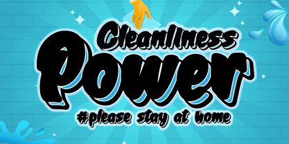 Cleanliness Power is bold script script that looks elegant and classy. It will add a charming touch to anything project This font is PUA encoded which means you can access all of the cute glyphs and swashes with ease! It also features a wealth of special features including alternate glyphs and ligatures.
 - Just Simple by Stefani Letter,
$14.00 Just Simple is a playful monoline handwritten. It was inspired by a marker pen, and is perfect for logos, t-shirts, branding, prints, and much more! This font is PUA encoded which means you can access all of the cute glyphs with ease! It also features a wealth of special features including ligatures.
 - Sothardjo by Isolatype,
$15.00 Introducing! new typeface by wildan type and Isolatype Sothardjo is a delicate, elegant and flowing handwritten font. It has beautiful and well balanced characters and as a result, it matches a wide pool of designs. Sothardjo is PUA encoded which means you can access all of the glyphs and swashes with ease!
 - Estienne by Solotype,
$19.95Many fonts have carried this name. Ours goes back to just before 1900 in France. This general style had considerable popularity among job printers all over Europe. We have even seen it used for name imprints on medical school diplomas, which seems a bit grotesk. Surely you can do something better with it. - Motopica by Anomali Creative,
$19.99 Motopica was born when I watched a show, namely "the pickers". At that time I realized that there were still many communities or people who really loved Western culture (Cowboy), Vintage Style in the 40s - 60s era and Classic Motorbike style (Caferacer). So I intend to combine these three concepts into a single font, and Motopica was born, which brings the spirit of the three styles, namely Western Cowboy, Vintage, Beer and motorbike. Motopica can be used as a Vintage Poster, Vintage Signage, Vintage badge What's Included Motopica Reguler Motopica Italic Motopica College Motopica Bold How to install your new font This font can be used with all software that can read standard fonts. Check out my instagram for update: https://www.instagram.com/anomalikreatif/ Thanks so much for checking out my shop! All the best, Krisna
 - English Engravers Roman by Smith Hands,
$38.00 English Engravers Roman is inspired by the beauty and eccentric detailing of British stone carved lettering. After observing many beautiful inscriptions around London and southern England, Robbie Smith decided to create a font family in homage to this rich heritage. English Engravers Roman features a set of beautifully balanced uppercase Roman, and a characterful lowercase alphabet with some endearing quirks. Included in the each font are two forms of lowercase 'q', one very similar to an uppercase 'Q' with a tail, and a traditional 'q'. Each font in the family features a comprehensive character set with many ligatures, added to enhance letter spacing. The fonts all feature an additional set of old style numerals. Many extra characters and ligatures can be accessed via the 'insert glyph' functions in graphic design software.
 - Just Be by Roland Hüse Design,
$12.00 JUST BE is a playful brush script. Perfect for titles, headings and logotypes for blogs, ads, quote prints, home decor, book title, invitation, birthday, custom product, lifestyle imagery (like quotes and stuff). Character set contains Eastern and Western European Latin accented letters. For additional customisations (for logotypes for example) please email me at contact@rolandhuse.com You MAY NOT sell this font or claim them as your own. You MAY NOT edit or rename this font. You MAY NOT redistribute this font. Thank you I hope you like this font & good luck with your project! Roland Instagram: @rolandhusedesign Background images of "Just Be" main poster by Annie Spratt from unsplash https://unsplash.com/@anniespratt "Your best moments in life are ahead" by Helena Hertz https://unsplash.com/@imperiumnordique paper bag mock up by Graphic Burger https://graphicburger.com"
 - Zin Slab by CarnokyType,
$46.00 Zin Slab is a contemporary slab-serif typeface designed for various situations of typographic usage. Characteristic feature is a large x-height and balans between neutral construction of letters (strictly vertical axis) and dynamic open forms (opened terminals). Another typical feature is a visually narrower connection between stems and strokes. The complete font family consist of three width proportions (Normal, Condensed and Extended). Every sub-family has 5 weights, ranging from Light to Black with matching Italics. Each font includes small capitals, old-style and tabular figures, standard and discretionary ligatures, alternate glyphs and a many of typographic options applied by the Opentype features. Zin Slab can be effectively used for both text and display typesetting. It can be used especialy in magazine layouts and editorial design, as well in advertising typography, orientation systems, corporate identities and many other situations. Zin Slab is a member of the Zin super family, which also includes Zin Sans, Zin Serif and Zin Display fonts. You can try Demo styles in Medium weight fully for free.
 - Ambassador Script by Canada Type,
$69.95 When Aldo Novarese designed his “tipo inglese” Juliet typeface, he had a simple objective in mind: Reduce the inclination angle of the traditional 18th and 19th centuries English script in order to make the punchcutter’s job easier and the resulting metal type more durable. But when Juliet was released by Nebiolo in 1955, it was a big surprise to both typesetters and calligraphers all over Europe. Novarese’s idea of working the standard copperplate script within the limited technology of the time proved to be a marvel in optical metal sizing (Juliet was available in sizes ranging from 12 to 60 pt), but also opened the door to new calligraphic possibilities. Easier readability and a very friendly color were obvious side effects of the reduced angle. So soon after its release, calligraphers worldwide began emulating the angle reduction and experimenting with the application of the same concept to other calligraphic genres. Today, more than 50 years later, many professional calligraphers point to Novarese’s Juliet as an opening to fresh ideas and new directions in 20th century elegant calligraphy. Ambassador Script, this digital version of Aldo Novarese’s surprising masterpiece, is the result of more than a thousand hours of work. Going above and beyond its duty as a revival, it was expanded by a great number of alternates, swashes, beginning and ending forms, as well as accompanying flourishes and snap-on strokes for even more ending forms. Ambassador Script also supports almost every known Latin-based language, which makes its name all the more fitting. Ambassador Script is available in all popular font formats. The True Type and Postscript Type 1 versions come in 12 fonts, available in different piecemeal configurations or a full volume. The OpenType version collects more than 2300 characters in a single feature-rich font that can sing mightily in OpenType-supporting applications. Ambassador Script is ideal for weddings, invitations, greeting cards, book and magazine covers, or anywhere a touch of calligraphic elegance is desired.
 - Kesora Faux by Twinletter,
$15.00 KESORA is a Japanese-style font that we carefully crafted to give your composition the proper look. This font is really versatile, so you may use it for a wide range of projects. Your project will always appear special to your audience if it has the proper composition, beautiful appearance, and unique shape. Logotypes, food banners, branding, brochure, posters, movie titles, book titles, quotes, and more may all benefit from this font. Of course, using this font in your various design projects will make them excellent and outstanding; many viewers are drawn to the striking and unusual graphic display. Start utilizing this typeface in your projects to make them stand out.
 - Retrolight by Almarkha Type,
$29.00 Introducing Neon Font called Retrolight A unique Fonts with Retro Style can make your logotype become more interesting. inspired by real world neon light signs, it features minimal letter forms with smooth rounded corners and, true to real neon tubes, strictly uses lines with open start and end points. This font is perfect for adding your own glowing light effects or can be used to actually design real world neon signs. Retrolight fonts is perfect for your project and allows you to create designs, headlines, posters, logos, badges, t-shirts and many more that are beautiful. It is also best used for posts, logos, posters, certificates, labels and more.
 - Canden by Struggle Studio,
$17.00 Canden – Display Handwritten Font serif look with simple, clean, visual elegance with subtle curves and beautiful bindings, An incredibly versatile font that works both large and small. This font is suitable for a wide variety of projects such as: headlines, logos, labels, branding projects, magazines, home appliance designs, product packaging, mugs, quotes, posters and many more. It can also be more expressive and playful, thanks to the many alternatives and binders that blend harmoniously in this font and make it more attractive and versatile. Try to change alternatives, fasteners and you will get a lot of options for your project that will make it Vintage & Unique.
 - Space Time by Lauren Ashpole,
$15.00 What can I say? I like fonts with stars. Space Time is a hand drawn font with a lot of variety. I started designing the regular version with the characters slightly touching but it wasn't quite what I had in my head. I’d imagined tightly spaced letters with overlapping shadows and the only way to get that effect was to create a second version with stackable layers. That means this download includes regular, base, outline, shadow, and stars files. Plus, the base and outline can be used for stacking or work fine as standalone fonts. This font is all caps but the lowercase letters feature alternative styles.
 - Avaneonz by Almarkha Type,
$29.00 Introducing Neon Font called Avaneonz A unique Fonts with Retro Style can make your logotype become more interesting. inspired by real world neon light signs, it features minimal letter forms with smooth rounded corners and, true to real neon tubes, strictly uses lines with open start and end points. This font is perfect for adding your own glowing light effects or can be used to actually design real world neon signs. Avaneonz fonts is perfect for your project and allows you to create designs, headlines, posters, logos, badges, t-shirts and many more that are beautiful. It is also best used for posts, logos, posters, certificates, labels and more.
 - Neonblitz by Almarkha Type,
$33.00 Introducing Neon Font called Neonblitz A unique Fonts with Retro Style can make your logotype become more interesting. inspired by real world neon light signs, it features minimal letter forms with smooth rounded corners and, true to real neon tubes, strictly uses lines with open start and end points. This font is perfect for adding your own glowing light effects or can be used to actually design real world neon signs. Neonblitz fonts is perfect for your project and allows you to create designs, headlines, posters, logos, badges, t-shirts and many more that are beautiful. It is also best used for posts, logos, posters, certificates, labels and more.
 - Xegir by Twinletter,
$15.00 The Xegir Retro Condensed Display font is a strong solid display font with tall, dense shapes with a geometric appearance. comes with two styles slab and sans perfect for titles, typography, magazines, brochures, packaging, and many more for your design needs, making your designs more modern and professional What’s Included : - File font - All glyphs Iso Latin 1 - Alternate, Ligature - Simple installations - We highly recommend using a program that supports OpenType features and Glyphs panels like many Adobe apps and Corel Draw so that you can see and access all Glyph variations. - PUA Encoded Characters – Fully accessible without additional design software. - Fonts include Multilingual support
 - Badora by Twinletter,
$15.00 BADORA, a display font with a Japanese flair, is now available. We created this typeface using natural handwriting that has been modified in visual form so that it may be used in a variety of applications. This font will enhance any of your projects, particularly those with a casual and fun theme. Logotypes, food banners, branding, brochure, posters, movie titles, book titles, quotes, and more may all benefit from this font. Of course, using this font in your various design projects will make them excellent and outstanding; many viewers are drawn to the striking and unusual graphic display. Start utilizing this typeface in your projects to make them stand out.
 - Stacker by Almarkha Type,
$29.00 Introducing Neon Sci-fi Futuristic Font called Stacker A unique Fonts with Futuristic Style can make your logotype become more interesting. inspired by real world neon light signs, it features minimal letter forms with smooth rounded corners and, true to real neon tubes, strictly uses lines with open start and end points. This font is perfect for adding your own glowing light effects or can be used to actually design real world neon signs. Stacker fonts is perfect for your project and allows you to create designs, headlines, posters, logos, badges, and many more that are beautiful. It is also best used for posts, logos, posters, labels and more.
 - Itemone by oneType,
$10.00 Itemone is a pixel-based typeface consisting of 5 styles. It is suitable for posters, flyers, t-shirts, magazines and more, giving your designs a cool contemporary look. The main parts of each character in the monoline font, including counters, can be drawn using a single line. This has been the main principle in the design of this geometric typeface, giving each font a very distinct look. All of the five fonts have been designed on the same pixel grid with an x-height of five units. Each font in this typeface consists of 250 characters, including uppercase and lowercase characters and two sets of numerals.
 - Ametis by Larin Type Co,
$20.00 Ametis is a modern elegant serif display font. In this font you will find many ligatures and alternates that give great potential for creating logos, branding, arranging wedding invitations, business cards, packaging and much more. This font will help to realize all your ideas and will not leave indifferent even the most sophisticated. Try it, change alternates and ligatures and you will see how many options you can get by creating in a classic style or a more elegant style. Lowercase completely duplicate uppercase, they have the same alternates and ligatures, but differ in size from uppercase. This font is easy to use has OpenType features.
 - Monten by Gatype,
$14.00 Monten is a script font whose letters are designed a bit bold, almost similar to the Sans Serif font. A great choice if you want to add a retro look to your designs. Perfect for titles, logos, or anything your creative brain can think of. This customizable font will look great on a variety of design ideas such as Christmas themes, valentines, posters, invitations, weddings, branding projects, social media posts, magazines, book covers and more! This will add a fun and friendly touch to any of your projects! This font is PUA encoded which means you can access all the glyphs and sweeps easily.
 - Antique by Storm Type Foundry,
$26.00The concept of the Baroque Roman type face is something which is remote from us. Ungrateful theorists gave Baroque type faces the ill-sounding attribute "Transitional", as if the Baroque Roman type face wilfully diverted from the tradition and at the same time did not manage to mature. This "transition" was originally meant as an intermediate stage between the Aldine/Garamond Roman face of the Renaissance, and its modern counterpart, as represented by Bodoni or Didot. Otherwise there was also a "transition" from a slanted axis of the shadow to a perpendicular one. What a petty detail led to the pejorative designation of Baroque type faces! If a bookseller were to tell his customers that they are about to choose a book which is set in some sort of transitional type face, he would probably go bust. After all, a reader, for his money, would not put up with some typographical experimentation. He wants to read a book without losing his eyesight while doing so. Nevertheless, it was Baroque typography which gave the world the most legible type faces. In those days the craft of punch-cutting was gradually separating itself from that of book-printing, but also from publishing and bookselling. Previously all these activities could be performed by a single person. The punch-cutter, who at that time was already fully occupied with the production of letters, achieved better results than he would have achieved if his creative talents were to be diffused in a printing office or a bookseller's shop. Thus it was possible that for example the printer John Baskerville did not cut a single letter in his entire lifetime, for he used the services of the accomplished punch-cutter John Handy. It became the custom that one type founder supplied type to multiple printing offices, so that the same type faces appeared in various parts of the world. The type face was losing its national character. In the Renaissance period it is still quite easy to distinguish for example a French Roman type face from a Venetian one; in the Baroque period this could be achieved only with great difficulties. Imagination and variety of shapes, which so far have been reserved only to the fine arts, now come into play. Thanks to technological progress, book printers are now able to reproduce hairstrokes and imitate calligraphic type faces. Scripts and elaborate ornaments are no longer the privilege of copper-engravers. Also the appearance of the basic, body design is slowly undergoing a change. The Renaissance canonical stiffness is now replaced with colour and contrast. The page of the book is suddenly darker, its lay-out more varied and its lines more compact. For Baroque type designers made a simple, yet ingenious discovery - they enlarged the x-height and reduced the ascenders to the cap-height. The type face thus became seemingly larger, and hence more legible, but at the same time more economical in composition; the type area was increasing to the detriment of the margins. Paper was expensive, and the aim of all the publishers was, therefore, to sell as many ideas in as small a book block as possible. A narrowed, bold majuscule, designed for use on the title page, appeared for the first time in the Late Baroque period. Also the title page was laid out with the highest possible economy. It comprised as a rule the brief contents of the book and the address of the bookseller, i.e. roughly that which is now placed on the flaps and in the imprint lines. Bold upper-case letters in the first line dramatically give way to the more subtle italics, the third line is highlighted with vermilion; a few words set in lower-case letters are scattered in-between, and then vermilion appears again. Somewhere in the middle there is an ornament, a monogram or an engraving as a kind of climax of the drama, while at the foot of the title-page all this din is quietened by a line with the name of the printer and the year expressed in Roman numerals, set in 8-point body size. Every Baroque title-page could well pass muster as a striking poster. The pride of every book printer was the publication of a type specimen book - a typographical manual. Among these manuals the one published by Fournier stands out - also as regards the selection of the texts for the specimen type matter. It reveals the scope of knowledge and education of the master typographers of that period. The same Fournier established a system of typographical measurement which, revised by Didot, is still used today. Baskerville introduced the smoothing of paper by a hot steel roller, in order that he could print astonishingly sharp letters, etc. ... In other words - Baroque typography deserves anything else but the attribute "transitional". In the first half of the 18th century, besides persons whose names are prominent and well-known up to the present, as was Caslon, there were many type founders who did not manage to publish their manuals or forgot to become famous in some other way. They often imitated the type faces of their more experienced contemporaries, but many of them arrived at a quite strange, even weird originality, which ran completely outside the mainstream of typographical art. The prints from which we have drawn inspiration for these six digital designs come from Paris, Vienna and Prague, from the period around 1750. The transcription of letters in their intact form is our firm principle. Does it mean, therefore, that the task of the digital restorer is to copy meticulously the outline of the letter with all inadequacies of the particular imprint? No. The type face should not to evoke the rustic atmosphere of letterpress after printing, but to analyze the appearance of the punches before they are imprinted. It is also necessary to take account of the size of the type face and to avoid excessive enlargement or reduction. Let us keep in mind that every size requires its own design. The longer we work on the computer where a change in size is child's play, the more we are convinced that the appearance of a letter is tied to its proportions, and therefore, to a fixed size. We are also aware of the fact that the computer is a straightjacket of the type face and that the dictate of mathematical vectors effectively kills any hint of naturalness. That is why we strive to preserve in these six alphabets the numerous anomalies to which later no type designer ever returned due to their obvious eccentricity. Please accept this PostScript study as an attempt (possibly futile, possibly inspirational) to brush up the warm magic of Baroque prints. Hopefully it will give pleasure in today's modern type designer's nihilism. - Dream Reacher by Asenbayu,
$14.00 Reacher is a creative stylish ligature serif font. Each letter is beautifully crafted which has an elegant look that attracts a tall, minimalist and slender shape. Reacher font is a typeface that combines the elegance of a serif with a unique and decorative binding, creating a more harmonious and visually appealing look. This font has alternate and ligature features, perfect for using it in creative and artistic designs, such as logos, branding, headlines, titles, invitations, posters and more. Reacher font features: kerning, standard glyphs, stylistic alternates, stylistic ligatures, symbol, punctuation and multilanguages supported. Note: To use the alternate and ligature features, please look in the Glyph Panel / Character Map in your software to be able to access all the glyphs in this font. The ligature style in this font is simply "Standard Ligature", meaning it appears automatically. To set your desired letter binding, you can block letters or add them from the glyph panel. Thank you!
 - Chocolate Banana by madjack.font,
$15.00 Chocolate Banana Script is a modern calligraphy design including Regular. This typeface is casual and beautiful with grids. Can be used for various purposes. such as logos, product packaging, wedding invitations, branding, headlines, signage, labels, signatures, book covers, posters, quotes, and much more. Chocolate Banana Script includes OpenType language styling changes, binding and international support for most Western languages. To enable alternative OpenType features, you need a program that supports OpenType features such as Adobe Illustrator CS, Adobe Indesign & CorelDraw X6-X7, Microsoft Word 2010 or later versions. How to access all alternate characters using Adobe Illustrator: https://www.youtube.com/watch?v=XzwjMkbB-wQ Chocolate Banana Script is encoded with Unicode PUA, which allows full access to all additional characters without having to have special design software. Mac users can use Letter Book, and Windows users can use Character Maps to view and copy any additional characters to attach to your favorite text editor/application. How to access all alternate characters using Windows Character Map with Photoshop: https://www.youtube.com/watch?v=Go9vacoYmBw If you need help or have any questions, let me know. I'm happy to help :) Thank you & Happy Designing!
 - Caldwell Script by madjack.font,
$15.00 Caldwell Script is a modern calligraphy design. This typeface is casual and beautiful with swash. It can be used for various purposes such as logos, product packaging, wedding invitations, branding, headlines, signage, labels, signatures, book covers, posters, quotes, and more. Caldwell Script includes changes in the OpenType language style, binders and international support for most Western languages. To enable alternative OpenType alternatives, you need a program that supports OpenType features such as Adobe Illustrator CS, Adobe Indesign & CorelDraw X6-X7, Microsoft Word 2010 or newer versions. How to access all alternative characters using Adobe Illustrator: https://www.youtube.com/watch?v=XzwjMkbB-wQ Caldwell Script is coded with Unicode PUA, which allows full access to all additional characters without having special design software. Mac users can use Letter Book, and Windows users can use Character Maps to view and copy any of the additional characters to attach to your favorite text editor/application. How to access all alternative characters, using Windows Character Map with Photoshop: https://www.youtube.com/watch?v=Go9vacoYmBw If you need help or have questions, let me know. I am happy to help. Thank you & Happy Designing!
 - Yosyita Script by Romie Creative,
$13.00 Yoshita Script is a modern calligraphy design, including Regular. This typeface is normal and beautiful with swashes. It can be used for various purposes, such as logos, product packaging, wedding invitations, branding, headlines, signage, labels, signatures, book covers, posters, quotes, and more. Yoshita Script includes OpenType features, binders, and international support for most Western languages. To activate the OpenType Stylistic alternative, you request a program that supports OpenType features such as Adobe Illustrator CS, Adobe Indesign & CorelDraw X6-X7, Microsoft Word 2010 or newer versions. How to access all alternative characters using Adobe Illustrator: https://www.youtube.com/watch?v=XzwjMkbB-wQ Yoshita Script is coded with Unicode PUA, which allows access to all additional characters without having to install special software. Mac users can use Letter Books, and Windows users can use Character Maps to view and use one of the additional characters to enter their favorite text editor / application. How to access all your alternative characters, use Windows Character Map with Photoshop: https://www.youtube.com/watch?v=Go9vacoYmBw If you need help or have questions, let me know. I am happy to help :) Thank you & Happy Designing!
 - Hug Shack by Yumna Type,
$12.00 A beautiful and easy-to-style font duo to elevate your design. Hug Shack expresses a feeling of joy and cute overall. Through the script font, Hug Shack brings your design to delve deep into the world of cuteness, while the display font creates modern look. You can mix and match this harmonious font duo to make gorgeous result in your design. This font become more special with awesome clipart as bonus. Features: Stylistic Sets Ligatures Multilingual Supports Numerals and Punctuation It can be used for branding, logos, social media quotes, stickers, posters, vintage designs, wall art, merchandise, social media, and many more. Get more inspiration by seeing the preview. Thank you for purchasing our premium fonts! Happy Designing!
 - Modern Prestige by Letterhend,
$19.00 Modern Prestige is a unique serif which is combined with copperplate script letterform with all the swashes! This typeface has many alternates with swashes that can make your lettering / logotype become more interesting. The clean and neat of a serif combined with the swirl swashes makes this font one of a kind! This font perfectly made to be applied especially in logo, and the other various formal forms such as invitations, labels, logos, magazines, books, greeting / wedding cards, packaging, fashion, make up, stationery, novels, labels or any type of advertising purpose. Features : uppercase & lowercase numbers and punctuation multilingual ligatures alternates swashes PUA encoded We highly recommend using a program that supports OpenType features and Glyphs panels like many of Adobe apps and Corel Draw, so you can see and access all Glyph variations.
 - Delayed Love by Abbastype,
$10.00 Delayed Love is a unique blend of a classic and modern script style. It works well for logos, wedding invitations, posts, t-shirts, letterhead, signage, labels, posters, badges and more. It includes OpenType features with alternative styles, binders and multi-language support. To activate the OpenType Stylistic alternative, you need a program that supports OpenType features such as Adobe Illustrator CS, Adobe Indesign & CorelDraw X6-X7, Microsoft Word 2010 or newer versions. How to access all alternative characters, using Windows Character Map with Photoshop: https://www.youtube.com/watch?v=Go9vacoYmBw How to access all alternative characters using Adobe Illustrator: http://youtu.be/iptSFA7feQ0 There are additional ways to access alternatives / swash, using Character Maps (Windows), Nexus Fonts (Windows), Font Book (Mac) or software programs such as PopChar (for Windows and Mac).
 - Karatone by Letterhend,
$19.00 Introducing, Karatone, An Elegant Serif. This typeface has many alternates with swashes that can make your lettering / logotype become more interesting. The clean and neat of a serif combined with the swirl swashes makes this font one of a kind! This font perfectly made to be applied especially in logo, and the other various formal forms such as invitations, labels, logos, magazines, books, greeting / wedding cards, packaging, fashion, make up, stationery, novels, labels or any type of advertising purpose. Features : uppercase & lowercase numbers and punctuation multilingual ligatures alternates swashes PUA encoded We highly recommend using a program that supports OpenType features and Glyphs panels like many of Adobe apps and Corel Draw, so you can see and access all Glyph variations. Email us to letterhend@gmail.com if you need something! Happy Designing!
 - Better Pallet by Ditatype,
$29.00 Better Pallet is a charming script font that beautifully captures the essence of continuous handwriting with brush details. The brush details infuse the font with a handcrafted charm. The continuous handwriting style of this font ensures that each letter flows gracefully into the next. For the best legibility you can use this font in the bigger text sizes. This font fits in headlines, logos, posters, flyers, invitations, branding materials, and many more. Thanks for purchasing our fonts.
 - Wakcaho by Twinletter,
$17.00 Wakcaho is a traditional serif typeface that is ideal for classic or retro modernist projects. With an exquisite and outstanding personality, this font will provide a memorable traditional touch to your designs. Wakcaho’s particular characteristics, like ligatures and alternatives, provide you the freedom to create unique text display variations. These typographic components can be simply combined to create distinctive and eye-catching compositions. Furthermore, Wakcaho is bilingual, allowing you to display your messages in a variety of languages all across the world. This allows you to reach an international audience while maintaining consistency in your designs regardless of language barriers. By using Wakcaho as the main font for your project, you will achieve an attractive style with a traditional vibe. Use Wakcaho right away to give your ideas a remarkable appeal and a unique visual experience. What’s Included : - File font - All glyphs Iso Latin 1 - Alternate, Ligature - Simple installations - We highly recommend using a program that supports OpenType features and Glyphs panels like many Adobe apps and Corel Draw so that you can see and access all Glyph variations. - PUA Encoded Characters – Fully accessible without additional design software. - Fonts include Multilingual support
 - Bodoni Classic Ad by Wiescher Design,
$55.00 I became interested in designing Bodoni Classic because of a lazy graphic designer at Jacques Damase publishing house. He had to change a single letter on a bookcover about J. B. BODONI. The French call him Jean Baptiste instead of Giambattista! And that unknown graphic designer just took any old “J” from some newly cut Bodoni. All the new Bodoni cuts have square serifs, whereas the originals had rounded serifs and slightly concave feet. The single letter “J” with the squared off serif was for me like a road sign to start redesigning the entire Bodoni family. That’s exactly what I started in 1993 and a dozen years later I am finished. Okay, I am still adding new Bodoni Classics, but those are my personal additions. Yours very retro, Gert Wiescher
 - Bodoni Classic Initials by Wiescher Design,
$55.00 I became interested in designing Bodoni Classic because of a lazy graphic designer at Jacques Damase publishing house. He had to change a single letter on a bookcover about J. B. BODONI. The French call him Jean Baptiste instead of Giambattista! And that unknown graphic designer just took any old “J” from some newly cut Bodoni. All the new Bodoni cuts have square serifs, whereas the originals had rounded serifs and slightly concave feet. The single letter “J” with the squared off serif was for me like a road sign to start redesigning the entire Bodoni family. That’s exactly what I started in 1993 and a dozen years later I am finished. Okay, I am still adding new Bodoni Classics, but those are my personal additions. Yours very retro, Gert Wiescher
 - Bodoni Classic Chancery by Wiescher Design,
$55.00 I became interested in designing Bodoni Classic because of a lazy graphic designer at Jacques Damase publishing house. He had to change a single letter on a bookcover about J. B. BODONI. The French call him Jean Baptiste instead of Giambattista! And that unknown graphic designer just took any old “J” from some newly cut Bodoni. All the new Bodoni cuts have square serifs, whereas the originals had rounded serifs and slightly concave feet. The single letter “J” with the squared off serif was for me like a road sign to start redesigning the entire Bodoni family. That’s exactly what I started in 1993 and a dozen years later I am finished. Okay, I am still adding new Bodoni Classics, but those are my personal additions. Yours very retro, Gert Wiescher
 - ITC Cyberkugel by ITC,
$29.99ITC Cyberkugel is the work of British designer Timothy Donaldson, who occasionally likes to write with an extra-fine ballpoint pen. I like the spindly scrawny forms that it gives me when I follow all the usual 'italic' writing conventions", he says. And there lie the origins of ITC Cyberkugel, although the creative process was moved from pen and paper to software and a Wacom tablet. "I like the fact that people will be buying it to give them a 'human', 'organic', 'non-digital' look, and yet no ink has soiled paper. Although the movements of the hand are still the essence, the whole thing was created in cyberspace." The name comes from combining cyberspace and Kugelschreiber, the German word for ballpoint pen. ITC Cyberkugel is a fresh interpretation of traditional calligraphy." - Bodoni Classic Text by Wiescher Design,
$55.00 I became interested in designing Bodoni Classic because of a lazy graphic designer at Jacques Damase publishing house. He had to change a single letter on a bookcover about J. B. BODONI. The French call him Jean Baptiste instead of Giambattista! And that unknown graphic designer just took any old “J” from some newly cut Bodoni. All the new Bodoni cuts have square serifs, whereas the originals had rounded serifs and slightly concave feet. The single letter “J” with the squared off serif was for me like a road sign to start redesigning the entire Bodoni family. That’s exactly what I started in 1993 and a dozen years later I am finished. Okay, I am still adding new Bodoni Classics, but those are my personal additions. Yours very retro, Gert Wiescher
 - Bodoni Classic Hand by Wiescher Design,
$55.00 I became interested in designing Bodoni Classic because of a lazy graphic designer at Jacques Damase publishing house. He had to change a single letter on a bookcover about J. B. BODONI. The French call him Jean Baptiste instead of Giambattista! And that unknown graphic designer just took any old “J” from some newly cut Bodoni. All the new Bodoni cuts have square serifs, whereas the originals had rounded serifs and slightly concave feet. The single letter “J” with the squared off serif was for me like a road sign to start redesigning the entire Bodoni family. That’s exactly what I started in 1993 and a dozen years later I am finished. Okay, I am still adding new Bodoni Classics, but those are my personal additions. Yours very retro, Gert Wiescher