10,000 search results
(0.102 seconds)
- Headline Gothic by BA Graphics,
$45.00A nice readable Headline and Sub head face, great for movie credits. - Ghost Scepter by Forberas Club,
$16.00 This font inspired by scary movie. You can this font for your journal logotype or something about scary or horror and maybe hardcore style. Let's try and have fun with this font.
 - Sachsenwald by Monotype,
$50.99 Toshi Omagari’s revived Sachsenwald design can be the perfect choice for distinctive headlines and brand identities for music, movies, video games and more. The revised design includes a regular and light weight – maintaining its distinctive design traits and adding more versatility.
 - Reform School JNL by Jeff Levine,
$29.00 The extra bold sans serif stencil lettering on movie posters and lobby cards for “Reform School Girl” (a 1957 film by American International Pictures) was the basis of Reform School JNL, which is available in both regular and oblique versions.
 - SCR-N by URW Type Foundry,
$39.99 SCR fonts are screen optimized (also called 'pixel fonts'). Unlike standard fonts (and like the few well-hinted fonts like Verdana or Arial), they give a crisp look on screen at very small sizes, thus increasing legibility. The perfect applications for those fonts are web pages and software user interfaces (computer, cellular phones, console games and any other system that uses a screen interface). Unlike most pixel fonts, SCR fonts contain kerning information. Kerning is the adjustment of space between certain pairs of characters (like 'AV') to make text look more fluid, thus increasing legibility and appeal. To benefit from this feature, auto-kerning must be activated in the application. In Photoshop, kerning must be set to 'Metrics'. Although SCR fonts are optimized for screen, they can be used for print (in Illustrator or Indesign for example) for a decorative 'computer text' effect. In this case, there is no constraint: they can be used as any other font. For screen use (in Photoshop, Fireworks, Flash... ), they have to keep aligned with the screen pixel grid not to look blurred or distorted. To achieve this, here are the guidelines to follow: RESOLUTION If the application permits it (Photoshop, Fireworks), document resolution must be set to 72 pixels per inch. SIZE The font size must be set to 10 (or multiples of 10) points. POSITIONING & ALIGNMENT The reference points of text fields and text blocks (upper left corner for left aligned text, upper right for right aligned text) must be positioned at integer values of pixels. In Photoshop, text can be precisely moved with [Edit Free Transform]. In Flash, movie clips containing text fields must also be positioned at integer values on the stage. Text must be aligned to the left or right only. Center alignment can be simulated with left alignment by adding spaces at the begin of each line. To dispense with the positioning and alignment constraints, text anti-aliasing can be turned off if the application permits it (Photoshop, Flash MX 2004). OTHER SETTINGS Leading (line spacing), tracking (letter spacing), manual kerning and baseline shift must be set either to integer values of points or to multiples of 100 units (depending on the application). Vertical and horizontal scaling must be set to 100%. Faux bold or Faux italic must not be used. The document must neither be resized on export, nor allow resizing (Flash Movies).
 - SCR-I by URW Type Foundry,
$39.99 SCR fonts are screen optimized (also called 'pixel fonts'). Unlike standard fonts (and like the few well-hinted fonts like Verdana or Arial), they give a crisp look on screen at very small sizes, thus increasing legibility. The perfect applications for those fonts are web pages and software user interfaces (computer, cellular phones, console games and any other system that uses a screen interface). Unlike most pixel fonts, SCR fonts contain kerning information. Kerning is the adjustment of space between certain pairs of characters (like 'AV') to make text look more fluid, thus increasing legibility and appeal. To benefit from this feature, auto-kerning must be activated in the application. In Photoshop, kerning must be set to 'Metrics'. Although SCR fonts are optimized for screen, they can be used for print (in Illustrator or Indesign for example) for a decorative 'computer text' effect. In this case, there is no constraint: they can be used as any other font. For screen use (in Photoshop, Fireworks, Flash... ), they have to keep aligned with the screen pixel grid not to look blurred or distorted. To achieve this, here are the guidelines to follow: RESOLUTION If the application permits it (Photoshop, Fireworks), document resolution must be set to 72 pixels per inch. SIZE The font size must be set to 10 (or multiples of 10) points. POSITIONING & ALIGNMENT The reference points of text fields and text blocks (upper left corner for left aligned text, upper right for right aligned text) must be positioned at integer values of pixels. In Photoshop, text can be precisely moved with [Edit Free Transform]. In Flash, movie clips containing text fields must also be positioned at integer values on the stage. Text must be aligned to the left or right only. Center alignment can be simulated with left alignment by adding spaces at the begin of each line. To dispense with the positioning and alignment constraints, text anti-aliasing can be turned off if the application permits it (Photoshop, Flash MX 2004). OTHER SETTINGS Leading (line spacing), tracking (letter spacing), manual kerning and baseline shift must be set either to integer values of points or to multiples of 100 units (depending on the application). Vertical and horizontal scaling must be set to 100%. Faux bold or Faux italic must not be used. The document must neither be resized on export, nor allow resizing (Flash Movies).
 - Akisa by Twinletter,
$15.00 Akisa is a faux Japanese display typeface with amusing character characters that you may use for a variety of design projects. You will create a project that is striking and memorable in the minds of the entire audience if you use this typeface. Logotypes, food banners, branding, brochure, posters, movie titles, book titles, quotes, and more may all benefit from this font. Of course, using this font in your various design projects will make them excellent and outstanding; many viewers are drawn to the striking and unusual graphic display. Start utilizing this typeface in your projects to make them stand out.
 - Bukama by Twinletter,
$15.00 BUKAMA font is a faux Japanese font with a distinctive and unusual shape. If you use this font in a special project, it will look straight away and fit into the composition of the visual display that has an Asian design theme. Logotypes, food banners, branding, brochure, posters, movie titles, book titles, quotes, and more may all benefit from this font. Of course, using this font in your various design projects will make them excellent and outstanding; many viewers are drawn to the striking and unusual graphic display. Start utilizing this typeface in your projects to make them stand out.
 - Movieland JNL by Jeff Levine,
$29.00Movieland JNL is a re-working of Jeff Levine's Art Deco-styled Wingate JNL, with more traditional letter shapes; making it perfect for creating (or recreating) the compact look of movie poster production credits. - Bit Part JNL by Jeff Levine,
$29.00 Bit Part JNL is an extra condensed monoline sans serif typeface that's well suited for movie credits, disclaimers and other forms of tight-fit word copy. Inspired by just the numbers "65" on the cover of a 1965 high school yearbook, this retro font will fit a lot of copy into a small area. The typeface is available in regular and oblique versions.
 - Show Biz JNL by Jeff Levine,
$29.00 The lettering style of Show Biz JNL is a classic sanserif with Art Deco influences. Slight variations in some letter shapes set it off from similar releases. The basic inspiration for this font was a set of ceramic letters and numbers used for home movie titling, but a few touches were added to give the font its own style and flavor.
 - Walking Broadway by IKIIKOWRK,
$17.00 Introducing Walking Broadway - Bold Type, created by ikiiko. Walking Broadway is a serif bold type, that inspired by typography from a vintage movie & newspaper at that era. This typeface is designed to give a formal yet old style look. Walking Broadway has a distinctive bold to light contrast shape. A style commonly used in movie, magazines, and signage in that era. This typeface is perfect for an formal layout, old movie poster, newspaper, magazine cover, and also good for vintage product, food & beverages, quotes, or simply as a stylish text overlay to any background image. What's included? Uppercase & Lowercase Number & Punctuation Alternates & Swashes Multilingual Support Works on PC & Mac Enjoy our font and if you have any questions, you can contact us by email : ikiikowrk@gmail.com
 - BD Unicorse by Typedifferent,
$25.00 BD Unicorse is a retro futuristic mixed case display font with the main characters set on the small keys and alternatives on the capital characters. It features 12 ligatures and is great for the use as headlines in magazines, logotypes on posters, games, movies or music packaging.
 - Roney JNL by Jeff Levine,
$29.00If it's at all possible to "Deco-ize" an Art Deco font even more, it's been done with Roney JNL. Named for one of the classic hotels built during the heyday of Miami Beach, this font is a stylized version of Jeff Levine's Metalet Modern; a design derived from an actual 1940s home movie titling set. - Qbig by Roman Cernohous Typotime,
$10.00 Qbig was originally designed as a typeface for an amateur sci-fi movie in 2006. The basic style can be complemented with two types of shadows (Block and Superblock) which leads to 3D effect. The "Shadow" styles can also be used individually for example to create various graphic structures. This typeface is determined for use in larger sizes.
 - Mastji by Wildan Type,
$15.00 Proudly present- Mastji, created by Wildan Type, A serif modern and bold typeface, Mastji has decorative alternate & beauty ligature. This typeface is perfect for an elegant & luxury logo, book or movie title design, fashion brand, magazine, clothes, lettering, quotes, and so much more. Add to your most creative ideas and watch how they bring them to life!
 - Bloody Terror by Yoga Letter,
$15.00 “Bloody Terror” is a decorative font featuring letters like blood dripping. This font is perfect for Halloween moments, Halloween greetings, Halloween invitations, movie titles, comics, and more.
 - Ticketbook by Suomi,
$20.00 Univers and Helvetica Compressed are most often used for movie posters, but they lack variants. Therefore I made a compressed family with seven weights for more versatility.
 - RTCO Fransworth by Roams Type Co,
$12.00 RTCO Fransworth Inspired by Vintage Horror Novel & Movies Poster Typograhphy This font is suitable for graphic designs such as logotypes, merchandise, printed stickers, and other branding needs.
 - QEWUR by Twinletter,
$15.00 Introducing QEWUR, our newest font, an authentic font with a Japanese style theme, with an attractive and decent font shape to make your project elegant, special, gorgeous, and charming, and easy to remember for the audience. Logotypes, food banners, branding, brochure, posters, movie titles, book titles, quotes, and more may all benefit from this font. Of course, using this font in your various design projects will make them excellent and outstanding; many viewers are drawn to the striking and unusual graphic display. Start utilizing this typeface in your projects to make them stand out.
 - Manicuore by PintassilgoPrints,
$29.00 Manicuore is a hand-drawn typeface inspired by Italian movie posters by the prolific movie poster artist Symeoni (a.k.a. Sandro Simeoni). Being a talented and skilled painter, portraitist and illustrator, Symeoni enjoyed a long and fruitful career and was remarkably productive during the sixties and seventies. He counts over 3,000 works to his credit, which truly fed the imagination of several generations. This all-caps font brings different lettershapes on upper and lower case slots, which work as alternates, providing handy options to spice up your compositions. When using it in OpenType savvy applications just turn on contextual alternates feature to instantly cycle lettershapes – a one click way for adding spontaneity while also preventing neighbor double letters from using the same glyph. To put the icing on the cake, Manicuore brings a cool set of graphic elements that match the typeface look and feel. An inspiring toolbox for creative lettering designs. Now... Lights! Camera! Action!
 - Pacific Island JNL by Jeff Levine,
$29.00 Lettering on the sheet music cover for the title song from the 1957 Marlon Brando movie "Sayonara" was the model for Pacific Island JNL. The design has an Asiatic influence, but also reflects a bit of show card lettering as well. Available in both regular and oblique versions.
 - PiS Penny Serenade by PiS,
$38.00 PiS Penny Serenade is an elegant all caps high-contrast sans with some serif-y elements in the caps, inspired by the handwritten titles of the 1941 melodrama movie of the same name. Be sure to use the art deco style alternate glyph set for more 1920s vintageness!
 - Fathoms PB by Pink Broccoli,
$14.00 A totally off-the-wall sans serif font based on the titling from one of ABC's Movie of the Week series from 1969 called Daughter of the Mind. Turn on Contextual Alternates to automatically alternate between Capitals and Lowercase as you type to really make the font dance!
 - WILD2 Ghixm by Fontry West,
$15.00 Accidents happen. Things go where they don't belong, get changed - remade. Something new crawls out of the murky depths. Ghixm is a retrospective of the horror comics and movie posters of the 1960s and the 1970s. It's fluid forms harken to watery graves and tentacled unnameable horrors. These twisted shapes are reminiscent of titles that will make your skin crawl. It’s already warped and twisted, so don't hesitate to abuse it. This face can take it and still deliver its chaotic message.
 - Cinema Nouveau JNL by Jeff Levine,
$29.00 Shadowland was a magazine dedicated to the arts, and was published from 1919 through 1923. The lettering for its masthead was hand lettered in a then-contemporary Art Nouveau style. Although the photoplay (movies) was just an incremental part of the magazine’s overview of the arts, the digital version of the type design has been named Cinema Nouveau JNL, and is available in both regular and oblique versions.
 - Diosa Rubia NF by Nick's Fonts,
$10.00This svelte type family, whose name translates as "Blonde Goddess", is ideal for creating loquacious headlines in tight spaces, as well as dense informational blocks such as movie credits. Available in three weights. This font contains the complete Latin language character set (Unicode 1252) plus support for Central European (Unicode 1250) languages as well. - Machiarge by Dharma Type,
$19.99 Best selling baseball script, Distinctive brush stroke inspired by retro 20th century’s movie.
 - Dub Tone by Seb Dub,
$10.00 DubTone is simple sans serif font with a halftone texture from an old newspaper scan on an old flatbed scanner. This font was created for a movie poster in 2003 and then finally converted to a font in 2012. Each of the characters were individually designed with care to make sure that in small or large sizes it remained readable with a unique texture.
 - Goblin Monster by Yoga Letter,
$16.00 "Goblin Monster" is a font with a monster theme that is perfect for your Halloween celebration. This font is very easy to use and each letter is decorated with bats and spider webs which will add to the beauty of this font. The shape of the letters and the character of the letters is very unique and different. This font can also be used for book covers, movie or book titles, logos, posters, stickers and more.
 - Rossela by Letterena Studios,
$17.00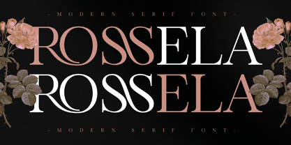 Rossela is an elegant, distinct and stylish serif font. This typeface is perfect for an elegant & luxury logo, book or movie title design, fashion brand, magazine, clothes, lettering, quotes, and so much more. It is also PUA encoded which means you can access all of the glyphs and swashes with ease.
 - Under Terror by Sarid Ezra,
$15.00 Under Terror is a rough handwritten font with creepy vibes that will suitable for your next halloween poster. You can use this font for any project especially horror movie poster. With unique lowercase and uppercase, you can combine both to get more handwritten looks. You can access the underline from ligatures, just type underline + number(1-6) in the middle of the text. For example: TeR_2roR. This font also support multilingual.
 - Binder by Grype,
$16.00 Our Binder Family is a revival and expansion of Binder-Style, a typeface designed by Joseph Binder and released by D. Stempel AG in 1959. It originally was a single weight. In later film type adaptations, a bold style, and an outline with drop shadow style were made available. However, this typeface never really had a true sense of family or larger language compatible character set. The original Binder-style typeface found revived popularity with its super condensed style when it appeared on the movie poster for "Silence of the Lambs". It was always a disappointment to me how this typestyle had never gained more traction in use. And so, many years later, we decided to revive the original typestyle, and expand it with a range of weights and obliques to pair with those weights. We've moved most of the unusual lowercase forms to a Stylistic Alternates feature, along with unicast alternates for the Capitals. The family includes a full standard character set with expansive international support of latin based languages, and 4 weights jumping from Thin to Bold, along with 4 accompanying obliques. This family is ready for you to eat it up with a nice glass of Chianti. Here's what's included with the Binder Family: 538 glyphs per style - including Capitals, Lowercase, Numerals, Punctuation and an extensive character set that covers multilingual support of latin based languages. 4 weights: Thin, Light, Regular, & Bold. Accompanying Obliques with each weight/width style. TTF formatted fonts have been hinted for optimal performance. Here's why the Binder Family is for you: You're in need of a stylish condensed font with a variety of weights and obliques for your designs You're a fan of the typographic works of Joseph Binder, but wish there was more to them You love the style of Agency and Bank Gothic, but want something uber-narrow You are desperate to recreate the movie poster from Silence of the Lambs You just like to collect quality fonts to add to your design arsenal
 - Skywalking by The Bigmind Designs,
$4.99 The Skywalking font is inspired by sci-fi movies and video games. It purposely avoided the us of curves and preferred the sharp edges to get a more robot aesthetic into it. Designed by Mark Silva, the font is suited for logos, company branding, game titles and shirt designs.
 - Tide Sans by Kyle Wayne Benson,
$6.00 Tide Sans’ fresh, carefree, look makes you almost forget that you’re staring at a monitor and not on the beach. When Tide Sans is not surfing, you’ll find it at community college parties, giving free henna tattoos, or tossing a Frisbee to the dachshund next door. The Tide Sans family includes beautiful italics and an equally affable condensed set. Tide Sans does the work for you by providing a ridiculously large stylistic alternates set, fine tuned small caps, and a whole beach of alternate (amper)sands to feel between your toes. Also check out its kid brother, Tide Sans Condensed.
 - Tadashi Faux by Twinletter,
$15.00 TADASHI is our newest display font, which was created with the goal of enhancing the appearance of your project in terms of theme harmony, distinctiveness, and differentiation, in order to produce an appealing and targeted look. This typeface is the solution to everything you’ve been searching for and needing. Logotypes, food banners, branding, brochure, posters, movie titles, book titles, quotes, and more may all benefit from this font. Of course, using this font in your various design projects will make them excellent and outstanding; many viewers are drawn to the striking and unusual graphic display. Start utilizing this typeface in your projects to make them stand out.
 - Snack Shop JNL by Jeff Levine,
$29.00Snack Shop JNL draws its basic influence from the capital letters of Jeff Levine's Two Reeler JNL, but is a bolder, outline design - looking more like sign lettering than a title font from a silent movie. - Cyber Track by Nirmana Visual,
$24.00 Cyber track - Techno Futuristic Display Typeface Inspired by Sci fi Movie, very suitable for the title, logo, typography, clothes, magazines, brochures, packaging and much more for your design needs,making your designs more modern and professional.
 - Demented Avenger by Phat Phonts,
$20.00A splattery grunge font with ink blobs suitable for horror movies or Halloween use - Boochie by Zang-O-Fonts,
$25.00Boochie is a fun font, created as a homage to 1960's movie posters.