10,000 search results
(0.038 seconds)
- Dalek Pinpoint by K-Type,
$20.00 - Kremlin Alexander - Unknown license
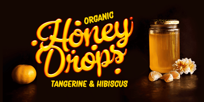
- Honey Drops by Fenotype,
$25.00 - Straits Light by AdultHumanMale,
$12.00 - Faith Collapsing - Personal use only
- Bosox - Unknown license
- Pamela - Personal use only
- MCF bad manners - 100% free
- Hoedown - Personal use only
- Estilographica - Personal use only
- Puppeteer - Personal use only
- CBGBFont - Unknown license
- Wild West Shadow - Unknown license
- Cheap Stealer - Personal use only
- Burris - Unknown license
- Fiddums Family - Unknown license
- Ghosttown BC - Personal use only
- Belwe Gotisch - Personal use only
- JFRingmaster - 100% free
- Monky Business - Unknown license
- Poseidon - Unknown license
- The·Fire - Personal use only
- Mellogothic - Personal use only
- Steelplate Textura - Personal use only
- Pillbox Opaque - Unknown license
- Screw DSG - Unknown license
- StageCoach - Unknown license
- Gothic Flames - Personal use only
- Göt - Unknown license
- Bill Hicks - Unknown license
- Medici Text - Personal use only
- MCF bad manners ww - 100% free
- CantzleyAD1600 - 100% free
- Morgan Sans by Feliciano,
$50.00 - Bordini (Unregistered) - Unknown license
- Eastside Motel - Unknown license
- Monstered - Unknown license
- Architec by Monotype,
$29.99 - Comixed RP by BluHead Studio,
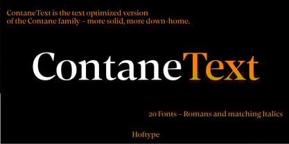
$20.00 - Contane Text by Hoftype,
$49.00


