10,000 search results
(0.067 seconds)
- Gold Year Personal Use - Personal use only
- Corpulent Caps Shadow BRK - Unknown license
- KR Irish Kat 2 - Unknown license
- KR Deco Caps One - Unknown license
- KR Irish Kat 1 - Unknown license
- KR Irish Kat 4 - Unknown license
- Kremlin Synod (Display Caps) - Unknown license
- Lady Ice - Small Caps - Unknown license
- KR Irish Kat 3 - Unknown license
- Alpha Flight Small Caps - Personal use only
- Pie charts for maps - Unknown license
- KR Deco by Kat - Unknown license
- BM spiral Cap Cyr - Unknown license
- KR Irish Kat 5 - Unknown license
- PR Uncial Alt Caps - Unknown license
- Tulipán Broken Caps Pro by Estudio Calderon,
$40.00 - Albeit Grotesk Stencil Caps by Cloud9 Type Dept,
$20.00 - Groovy 3D Caps JNL by Jeff Levine,
$29.00 - Albeit Grotesk Rounded Caps by Cloud9 Type Dept,
$40.00 - Mauro Poggi Ornamental Caps by Celebrity Fontz,
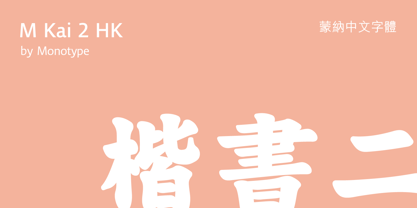
$19.99 - M Kai 2 HK by Monotype HK,
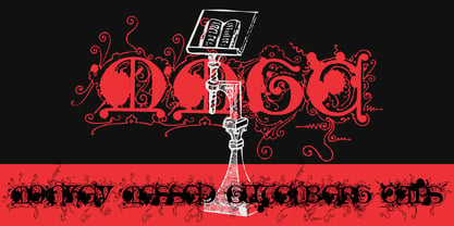
$523.99 - Monkey Messed Gutenberg Caps by Intellecta Design,
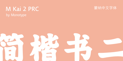
$22.90 - M Kai 2 PRC by Monotype HK,
$523.99 - Bank Sans Caps EF by Elsner+Flake,
$35.00 - Roma Initial Caps JNL by Jeff Levine,
$29.00 - Keyden Drop Caps JNL by Jeff Levine,
$29.00 - Mac Key Caps Pi by Linotype,
$29.00 - Deco Drop Caps JNL by Jeff Levine,
$29.00 - Dearest Open - Unknown license
- Dearest Friend - Unknown license
- Ardenwood Demo - Unknown license
- KaiserRotbartOneCaps - 100% free
- Rediviva - Unknown license
- Dearest Friend lite - Unknown license
- KaiserzeitGotisch - Personal use only
- Parigee Initials Simple - Unknown license
- Final Frontier Old Style - 100% free
- Old printing press_free-version - Personal use only
- SF Old Republic SC - Unknown license
- Old Dog, New Tricks - Unknown license


