10,000 search results
(0.036 seconds)
- Galson Serif by Typehill Studio,
$15.00 Galson Serif attracts a typeface that is smooth, clean, unique, elegant, modern, feminine, sensual, glamorous, simple and very easy to read. Classic style is very suitable to be applied in various formal forms such as invitations, labels, menus, logos, fashion, make up, stationery, letterpress, romantic novels, magazines, books, greeting/wedding cards, packaging, labels. Galson Serif has alternative, Ligature and multilingual support.
 - Panforte Serif by Zetafonts,
$39.00 Panforte Serif is the basic ingredient for any tasty visual feast: a prime-cut font family, deliciously readable online and offline, space-saving and organic, appealing to hipster consumers and seasoned gluttons. Hand drawn in easy big strokes, its a very condensed typeface that allows you to typeset easily long texts. Lovers of world cuisine will be delighted to discover that it supports over 190 languages using the latin alphabet.
 - Redeye Serif by Aboutype,
$24.99 - Questa Serif by The Questa Project,
$- Questa is a serif font family. This typeface has ten styles and was published by The Questa Project.
 - Pocket Serif by Letradora,
$18.00 Check out other members of the Pocket family: Pocket and Pocket Swash This hand drawn serif font is perfect for giving a fun touch to your projects. It combines a handmade look and rough texture with classic serif forms. It has support for most western and central European languages, and has alternates for most letterforms accessible through Opentype features, allowing for variations that make it look authentically hand-drawn.
 - Corpo Serif by Borutta Group,
$19.00 Corpo Serif is REFRESHED version of my old font Korpo Serif. Corpo Serif, designed by Mateusz Machalski, is a serif type family with a friendly feel. This type comprises 12 variants with 6 weights. The high contrast and high x height is perfect for headlines and display uses. Corpo Serif is a great complement for Corpo Sans.
 - Thawilak Serif by Jipatype,
$27.00 ขอแนะนำ Thawilak Serif แบบอักษรที่สวยงามและละเอียดอ่อนที่รวบรวมแก่นแท้ของความสง่างาม และความมั่นคง ด้วยคอนทราสต์สูงและรูปทรงที่กว้าง ฟอนต์นี้มีเสน่ห์เหนือกาลเวลาซึ่งจะสร้างความประทับใจให้กับผู้พบเห็นได้ไม่รู้ลืม Thawilak Serif คือตัวแทนแห่งความงามและความมั่นคง ไม่ว่าจะใช้ในสื่อสิ่งพิมพ์หรือสื่อดิจิทัล จะเพิ่มสัมผัสของความมีระดับและความน่าเชื่อถือให้กับโปรเจ็คต่างๆ ไม่ว่าจะเป็นบทความ การสร้างแบรนด์ หรือบรรจุภัณฑ์ที่หรูหรา Introducing "Thawilack Serif," a stunning and sophisticated typeface that captures the essence of elegance, and stability. With its high contrast and wide shape, this font exudes a timeless charm that is sure to make a lasting impression. Thawilack Serif is the embodiment of beauty and stability. Whether used in print or digital media, it adds a touch of class and credibility to any project, be it article layouts, branding materials, or luxury packaging.
 - Sky Serif by AVP,
$29.00Sky Serif is a clean-cut slab-serif design. The six weights provide extreme variations and great flexibility making it useful for reports and newsletters where a mix of weights can be used to good effect. - Swomun Serif by Tebaltipis Studio,
$15.00 Swomun a new fresh & modern serif with a strong style, a dancing baseline! So beautiful on invitation like greeting cards, branding materials, business cards, quotes, posters, and more! Swomun Display Typeface is the part of a strong and modern Bold display. This typeface both impressive at display sizes and easily readable in text size, while the sharp shapes of the triangular serif and the distinctive letter shapes show their strength in logo design and impressive editorial use. WHAT'S YOU GET ? Unique Letterforms Works on PC & Mac Simple Installations Accessible in the Adobe Illustrator, Adobe Photoshop, Microsoft Word Fully accessible without additional design software. I really hope you'll get pleasure using Pagers font and it will be perfect addition to your font collection! Contact me with an inbox message If you have any question. Thank you! Happy Creating.
 - Revla Serif by Eclectotype,
$40.00 Meet Revla Serif, an unashamedly spirited font, with a spring in its step and a lust for life. Loosely based on a few letterforms from a mid century poster, it takes the feel of Madison Avenue print ads and runs with it. OpenType acrobatics ensure letters don't repeat monotonously, using the contextual alternates feature. Also included for your viewing pleasure - automatic fractions, case sensitive forms and one solitary stylistic alternate, an alternative ampersand. And that's it! Put the fun back into your text with Revla Serif.
 - Greatness Serif by Shape Studio,
$14.00 Greatness font is a new modern serif calligraphy font with an irregular baseline. Trendy and feminine style.Greatness font looks lovely on wedding invitations, thank you cards, quotes, greeting cards, logos, business cards and more. Perfect for using in ink or watercolour. Including initial and terminal letters, alternates, ligatures and multiple language support.
 - Letterhack Serif by Comicraft,
$19.00 IT’S MAILBAG TIME! Dear Jolly JG Roshell and Rascally Richard Starkings, Comicraft Fonts are a thing of Beauty and a Joy Forever! You guys must be a Wild Bunch, and I roar with delight whenever a new comicbookfonts release appears in my emailbox. But I have to level with you daredevils...what about us Letterhacks? We need representation too! We haven’t spent years hammering away on our typewriters to be ignored! BRING BACK THE LETTER HACK! In fearless font form. You know it makes sense! Truly Yours, Forbush, Irving, senior. We give up! We can’t resist your appeals, threats and commands ANY LONGER!!! We may crack under the strain, but this month’s release IS two (count 'em) Letterhacks! That’s right, a pair of fantastic fonts that recreate the look and feel of your Marvelous Letters of the Sixties! It’s a Bullpen Bulletin! It’s an Iconoclastic Item!
 - Carole Serif by Schriftlabor,
$34.00 Carole is an interpretation by Matz Gasser of the old-style serif model. It explores the early serif typefaces and how handwriting still had a significant influence on the shapes. The result is a dynamic serif text font to use in small sizes and make reading comfortable. It was designed to work for text sizes, but you might find it in packaging or food brands because of its robust design features.
 - Zin Serif by CarnokyType,
$46.00 Zin Serif is a contemporary typeface designed for various situations of typographic usage. Characteristic feature is a large x-height and balance between neutral construction of letters (strictly vertical axis) and dynamic open forms (opened terminals). Another typical feature is a visually narrower connection between stems and strokes. The complete font family consist of three width proportions (Normal, Condensed and Extended). Every sub-family has 5 weights, ranging from Light to Black with matching Italics. Zin Serif can be effectively used for both text and display typesetting. It can be used especialy in magazine layouts and editorial design, as well in advertising typography, orientation systems, corporate identities and many other situations. Zin Serif is a member of the Zin super family, which also includes Zin Sans, Zin Slab and Zin Display fonts.
 - Eumundi Serif by Type Associates,
$24.95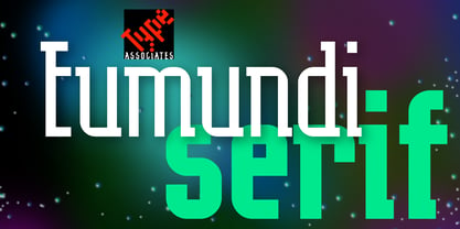
- Browser Serif by AVP,
$19.00 Browser Sans is a companion to Browser Sans, sharing similar forms and metrics. The four styles (Regular, Italic, Bold and Bold Italic) make it simple to use in desktop applications and easy to implement on websites.
 - Gather Serif by wearecolt,
$14.00 Gather Serif - The Modern Classic Let your creativity flow with Gather Serif. Beautifully crafted letterforms and ligatures to give your type a modern touch of elegance. Gather Serif is packed with extra ligatures and stylistic alternative glyphs. Ligatures: CH CO DO EH EA EO IJ KA KO LA LE LH OC OO QO QU RA RC RH RI RO RS RU TH TT Th ZO fl ffl fi ffi st Language Support for: Western European, Central European, South Eastern European, South American, Esperanto.
 - Frutiger Serif by Linotype,
$42.99 Frutiger® Serif is a re-envisioning of Meridien,a typeface first released by Deberny & Peignot during the 1950s. Working closely with Adrian Frutiger, Linotype's Type Director Akira Kobayashi expanded the original metal type version of Meridien into a new digital family of 20 variants. Renamed Frutiger Serif, this up-to-date Meridien has new weights, widths, and styles that correspond better with several other of Frutiger's designs. Just as Meridien has always been a fine choice for text settings, Frutiger Serif works brilliantly for large amounts of text & also at small point sizes. With its many weights and styles, this family is strong enough for most typographic projects. However, its added versatility is revealed when used in combination with other fonts. Frutiger Serif works well with the original Frutiger, Frutiger Next, and Univers - just to name a few. Paring these serif and sans serif families together is perfect for creating complex hierarchies and clear information design. Working with complicated typographic systems - involving elements such as headlines, captions, pull quotes, multilingual text, etc - is made easy by selecting Frutiger Serif and another of Frutiger's sans serif families. The designer needs simply to mix and match different weights and styles for the various textual elements to create smart and innovative layouts.
 - Sommet Serif by insigne,
$22.00 The Sommet superfamily has been updated with a new serifed member. Expanding on Sommet’s successful design principles, Sommet Serif is there when you need legibility for continuous text. Its interesting forms lend it to use as headlines as well. Sommet Serif is available with six weights and complementary italics and plenty of OpenType features. Sommet Serif features a tall x-height, and its letterforms are compact, perfect for when layout space is at a premium. Sommet Serif also includes oldstyle figures and small caps. Use Sommet Serif whenever you need a powerful and contemporary serif. In addition, be sure to check out the sans, rounded, and slab members of the superfamily.
 - Amor Serif by Storm Type Foundry,
$55.00Antique monumental incriptional majuscule, originally carved in stone, and sometimes called “Roman Capital”, is the origin of the upper-case part of our latin alphabet. Its narrowed form, derived from handwritten originals used between the first to third century A. D., served as the inspiration for the Mramor typeface, which I drew with ink on paper in 1988 under Jan Solpera’s leadership. After composing negative letters on a strip of film it was possible to use Mramor with the early phototypesetting devices. In 1994 with the help of Macintosh IIvi I added the lowercase letters and bolds, and issued this typeface as 14-font family. After some years of using Mramor for various purposes, I realized a need of modernization and humanizing its very fragile appearance, as well as removing numerous decorative and useless parts. Besides that, type design made a huge technical progress in past few years, so I was able to finish the remaining approximately 9600 glyphs contained in the present font system named Amor. It is already usual to combine sans and serif fonts within one family in order to distinguish (e. g. in a book) historical part from contemporary, a plain chapter from a special one, or, in quotations, to divide speaking persons. Sans-serif typefaces don't arise by simple removal of serifs; they have to be drawn completely separately, when occasionally many declined forms may be made, considered to the serifed original. Nevertheless, both parts of this type system appear consistent as for proportional, aesthetic and emotional atmosphere. Usage of type is often closely linked to its original inspiration, in this particular case with architecture and figurative sculpture. An inner “order” was also text setting in smaller sizes. A smooth scale of weights enriches the possibilities in designing of magazines, brochures, exposition catalogues and corporate identity. Economizing, but opened shape of characters is well legible and antique hint comes into play after longer reading. - KyivType Serif by Dmitry Rastvortsev,
$- KyivType Sans is a part of the KyivType superfamily, consisting of three subfamilies: Sans, Serif and Titling. Also available KyivType Variable superfamily. Initiated by Projector, Dmytro Bulanov Creative Büro, and Banda Agency for Kyiv city (Ukraine) identification and promotion. Freeware. Fonts are free for commercial and non-commercial use. More at Behance.
 - Certa Serif by Glen Jan,
$25.00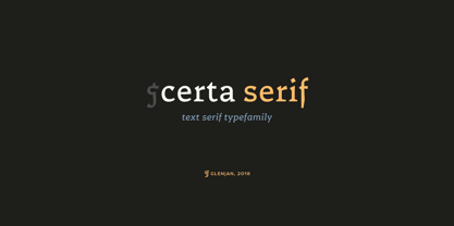
- Open Serif by Matteson Typographics,
$19.95 OPEN SERIF - answering the question “what font pairs well with Open Sans?”. Designed by Steve Matteson for extraordinary legibility and comfortable reading on screen and in print. Open Interpretation: Not quite Veronese – not quite Egyptian. A dash of panache in an otherwise sturdy serif typeface. Open Serif is an elegant text and display typeface family. Open Interiors: Visually open and legible at text sizes just like its cousin Open Sans. Open Serif reads smoothly but has an energetic texture. The chancery style italic contrasts nicely to the roman in a full bodied nod to Italian Renaissance forms. Open Type: Open Serif is full of OpenType features including Small Capitals for the Roman, Italic Swash Capitals and Old Style Figures for both. Open Translation: Supporting all the languages available in Open Sans, Open Serif completes the translation capabilities of international companies. Extended text is more pleasant to read in a serif typeface so go global with a unified typeface family! Open Face: Open Serif Titling is an elegant companion to round out the family. These ‘open-face' capital letters are ideal for initial letters, mastheads, titles and decoration.
 - Farrerons Serif by Tipo Pèpel,
$39.00 Specially designed for text size, Farrerons is a full-working Open-type Font. Looking superbly readible but providing a distinctive formal character for immediate impact due to its sudden strokes, mixing delightfully the ancient Roman Trajan inspired uppercase characters with lowercase characters inspired in XV´s humanistic types. A contemporary design that evokes the past but also embraces the future. The font features a full set of small caps, aligning, proportional, oldstyle and proportional oldstyle figures, plus stylistic sets for initial and finishing decorative characters. The font also contains an extended character set supporting Central Europe and Cyrillic languages.
 - Range Serif by Eclectotype,
$36.00 Range Serif is a sharp, contemporary, wedge serif typeface with just a hint of fraktur influence. There are five weights from light to black, each with corresponding italics. This is a typeface designed for demanding typographic work; it’s legible at small sizes, but unique at display sizes. There is an abundance of OpenType features in each font, including: Ligatures - all fonts contain standard f-ligatures. Contextual Alternates - Range Serif has been carefully designed to not ‘need’ ligatures. If you choose to deactivate them, the contextual alternates feature will make sure an alternative f is used before certain letters to avoid clashing. Fractions - When activated, numbers separated by a slash will automagically turn into fractions. Numerals - There are many different figure sets. These are Proportional Lining, Tabular Lining, Proportional Oldstyle, Tabular Oldstyle, Superiors and Scientific Inferiors. A slashed zero feature is also included. Small Caps - All styles include small caps, for both small caps and capitals to small caps functions. Ornaments - For convenience, the arrows are grouped in the ornaments feature. Case Sensitive Forms - There are different punctuation and bracket glyphs for all caps usage. Stylistic Alternates / SS01 - The italic fonts contain alternates for the letters A, K, R, U and X. Range Serif is a versatile and fully-featured typeface, ideal for corporate identities, contemporary art catalogs, even t-shirt slogans. The language coverage is impressive (Latin Extended A is fully covered) so Range Serif should prove a useful text and display workhorse for speakers of many different tongues. The typeface includes an array of currency symbols, including the new symbols for Indian Rupee and Turkish Lira. Also check out the accompanying sans serif version, Range Sans.
 - Steletto Serif by Jonahfonts,
$42.00 Condensed serif font. Great for tight-fitting headlines and other condensed titling situations such as headlines, ads, invitations, captions, packaging, bulletins, posters, and greeting cards.
 - Menaka Serif by Gunjan,
$49.00 Menaka is a high contrast type family. The main feature of the typeface is round shaped stroke ends, which distinct it with other serif fonts. Menaka solves problem in many design areas such as books, fashion brands and beauty products. Thought behind Menaka is to give classic yet modern form to a font. Menaka also serves well in short texts, article introductions, brands identity and packaging. Have fun with Menaka!
 - Ligaturess Serif by Caron twice,
$19.00 Ligaturess Serif is a modification of Textworthy Serif. This modification contains 79 uppercase ligatures. 59 lowercase ligatures. And 493 ligatures with diacritics marks. Ligatures are groups of letters joined together and usually compensate for the free space between individual letters. Ligaturess Serif, in addition to the basic ligatures - fi, fl... - also includes superstandard ones - CA, OO, ST, SS, VA... -. Text set in Ligaturess Serif has a unique and interesting look. The font works well in headings. And when using capital letters. A book cover, a chapter title, an inscription on a poster or even an interesting logo are the places for which the Ligaturess Serif font was designed.
 - JollyGood Serif by Letradora,
$16.00 JollyGood Serif is another member of the JollyGood family. This is a hand drawn serif/typewriter font that can work both for comics or as a display face . It is a complete complete family with 4 weights in regular and italic (8 fonts in total). It has an amazing character set, with support for most latin languages, as well as extra characters and ligatures.
 - Equality Serif by Mans Greback,
$69.00 Equality Serif is a font that radiates classiness and luxury. This beautiful serif font features delicate and intricate details that add finesse and sophistication to any design. Designed with an aristocratic feel, this font is perfect for high-end projects that require a touch of elegance and refinement. With its clean lines and precise angles, Equality Serif is the epitome of top class design. This uppercase font is perfect for headlines, logos, and branding projects that demand attention and make a statement. The font also features a set of ligatures that add a touch of fluidity and grace to your designs. Whether you're working on a wedding invitation or a high-end fashion project, Equality Serif is the perfect font for adding a touch of class and elegance to your work. Equality Serif is available in two styles: Regular and Italic. The font is built with advanced OpenType functionality and has a guaranteed top-notch quality, containing stylistic and contextual alternates, ligatures and more features; all to give you full control and customizability. It has extensive lingual support, covering all Latin-based languages, from Northern Europe to South Africa, from America to South-East Asia. It contains all characters and symbols you'll ever need, including all punctuation and numbers.
 - Anselm Serif by Storm Type Foundry,
$63.00 One of the good practices of today’s type foundries is that they release their type families as systems including both serif and sans serif type. Usually, the sources of inspiration need to be well tried with time and practice, since production of a type family is such a laborious and complex process. From the beginning, it needs to be clear that the result will be suited for universal use. Such systems, complete with the broad, multi-lingual variations permitted by the OpenType format, have become the elementary, default instrument of visual communication. Non-Latin scripts are useful for a wide scope of academic publications, for packaging and corporate systems alike. And what about outdoor advertisement designated for markets in developing countries? Cyrillics and Greek have become an integral part of our OpenType font systems. Maybe you noticed that the sans serif cuts have richer variety of the light – black scale. This is due to the fact that sans serif families tend to be less susceptible to deformities in form, and thus they are able to retain their original character throughout the full range of weights. On the other hand, the nature of serifed, contrasted cuts does not permit such extremes without sacrificing their characteristic features. Both weights were drawn by hand, only the Medium cut has been interpolated. Anselm Ten is a unique family of four cuts, slightly strengthened and adjusted for the setting in sizes around 10 pt and smaller, as its name indicates. The ancestry of Anselm goes back to Jannon , a slightly modified Old Style Roman. I drew Serapion back in 1997, so its spirit is youthful, a bit frisky, and it is charmed by romantic, playful details. Anselm succeeds it after ten years of evolution, it is a sober, reliable laborer, immune to all eccentricities. The most significant difference between Sebastian/Serapion and Anselm is the raised x-height of lowercase, which makes it ideal for applications in extensive texts. Our goal was to create an all-round type family, equally suitable for poetry, magazines, books, posters, and information systems.
 - Simple Serif by Gerald Gallo,
$20.00 The Simple Serif fonts are designed as hand-lettered serif fonts. They are casual and informal and are ideal for use in conveying these qualities.
 - Alex Serif by T-26,
$29.00 - Schola Serif by StudioJASO,
$56.00 Schola Serif is a neo classic serif font that reinterpret the classic Latin style structure and expression in a modern and intriguing way. Schola Serif looks sharply defined, giving clear-cut impression. It features sharp serif and details and presents its own distinctive character when used in title or sub headline or written with over 16pt. Font with 5 different weights, over 60+ languages, 9 OpenType features. It really does work in everything ranging from editorial design, graphic, and even integrated branding design.
 - Ninfa Serif by dooType,
$22.00 Using the genetic inheritance of semi-serif typeface Ninfa, designed in 2008, Ninfa Serif has 10 styles and designed to fulfill all needs in the design of text - books and magazines.
 - Balgon Serif by Typehill Studio,
$15.00 Balgon Serif attracts such a subtle, clean, feminine, sensual, glamorous, simple and very readable typeface. The classic style is perfect to apply in various formal forms such as invitations, labels, menus, Logos, fashion, make up, stationery, letterpress, romantic novels, magazines, books, greeting / wedding cards, packaging, labels Balgon Serif also features a strong neoclassical serif typeface with high contrast, cool, stylish and unique look with alternative fonts, Ligatures, and multilingual support Thank you for your visit.
 - Penumbra Serif by Adobe,
$29.00Penumbra is a capitals only design. Based on inscriptional capitals, the style progresses from a sans serif to a serifed design. The Penumbra font family is useful for posters, book jackets and labels. - Vernacular Serif by jpFonts,
$19.95 The Vernacular trilogy was designed by Swiss designer Hans-Jürg Hunziker, who had worked for Adrian Frutiger in Paris for many years. Based on the concept of a transitional Linear Antiqua, he has developed a colorful bouquet of typefaces that contain the entire spectrum of typefaces for book design and corporate identity. Thanks to his "Swiss school" and his outstanding skills, he has succeeded in giving the typefaces a particularly noble and sympathetic expression. In addition to the Sans family, there is a Serif family and a Clarendon family, each of which, including the separately drawn italics, is equipped with 12 font weights that are finely tuned to one another. Each of the 3 font styles develops its own character, but thanks to a concept that brings the different font styles closer together, they also work well together and complement each other perfectly. Sans and Clarendon have a vertical axis and similar endings in contrast to the Serif, which has a traditional diagonal axis and horizontal endings. The straight stems and the proportions are used as an element to stress the closeness of the typeface-trilogy. They thus share a comon feature. All fonts contain tabular and proportional figures as well as old style figures. Small caps and small cap figures are also available in all fonts. In addition, some fonts have alternative characters available via style set, such as «g», which can be used to further vary the typeface. Vernacular offers all the options for well-kept typesetting for print and web - for small and large orders.
 - Manometer Serif by Fontador,
$18.99 Manometer Serif is a pneumatic ultra-black serif typeface with variable pressure. Fat but stylish.
 - Haboro Serif by insigne,
$- The polls are in. Now here by customer request--Haboro Serif, the newest edition of the Haboro Hyperfamily. The Haboro fonts are an outstanding upstart success from the first part of 2016. Following the release of the popular Haboro, Haboro Sans and Haboro Slab have both been welcomed additions to the family, too. Now, Haboro Serif continues to build on the base of these related designs. Serif maintains the unique, script-like terminals of the original. These terminals, along with the optimized stroke weight of this face, make it useful for text settings. Prefer standard serifs? These are also available as OpenType alternates within the font, giving you a wider variety of options without compromising its effectiveness in the same text settings.. Haboro Serif works with many other members of the Haboro family as well. Try the original Haboro for your headlines, and pair your Serif text with Haboro Sans for a balanced design that appeals to the reader. Add Serif to your box today, and try this all-around “Renaissance man” of a typeface for a touch of practical elegance on your next job.