6,617 search results
(0.046 seconds)
- Art Event JNL by Jeff Levine,
$29.00 A 1930s WPA (Works Progress Administration) poster advertising an exhibit of New Jersey area posters had its main lettering rendered in a very condensed hand lettered interpretation of the ever-popular Futura Black Art Deco style. This has now been re-drawn and digitized as Art Event JNL, in both regular and oblique versions.
 - Arsis by Linotype,
$40.99Arsis is a condesed modern headline face that was originally produced and cast in hot metal by the Dutch type foundry Lettergieterij Amsterdam. The Arsis font family was designed by Gerry Powell in 1937. Arsis is a Serif (Antiqua) Modern Style font. Arsis font family attributes include roman serif, Didone, elegant, formal, modern style, feminine. - Display Patrol by Hanoded,
$15.00 I have always liked handmade display fonts - maybe that’s why I have so many of them! Display Patrol is a rather fat, in your face font. It is completely handmade and comes in two distinct styles: regular and dots. Use it for your posters, books and product packaging. I am sure it will stand out!
 - Travel Plans JNL by Jeff Levine,
$29.00 A 1930s travel poster from American Airlines had the airline’s name in a classic thick-and-thin Art Deco design of hand lettering. With the addition of angular spurs, some of the characters become semi-serif in nature. This type style is now available as Travel Plans JNL, in both regular and oblique versions.
 - Drakoheart Revofit Sans by G3 Typefaces,
$- Drakoheart Revofit is an initiative to make sans fonts. It’s one of my personal favorites, in fact. In its first release, this font had a cool appearance but was improved with better kerning and a cool look in this new release. Perfect to write some digital texts as in web articles, blogs and branding.
 - Bona Nova by Borutta Group,
$- ☞ Bona Nova is a collective revival project of Bona typeface designed in 1971 by the author of polish banknotes Andrzej Heidrich. Besides giving the project a digital font form the aim was to expand the base character set: preparation of small caps, designing the alternative glyphs and multiple opentype features. Working together with the author we designed two new text versions: regular and bold – to give the family a form of a classic script triad. ☞ It is accompanied by three title versions and three contour styles under the name of Bona Sforza. All styles contains over 1200 glyphs. ☞ Bona Nova is an unprecedented typographic adventure for our team. We hope that our work will allow the cultural heritage of Bona and the work of Andrzeja Heidricha to gain new followers and fans. This project connected three generations of graphic designers who graduated the same school – the Academy of Fine Arts in Warsaw. ☞ Bona Nova isn’t only a typeface. We have also prepared a book about the project (including an interview with Andrzej Heidrich, my text about the digitalisation and a font specimen). The Bona Nova release party was a big exhibition (over 1000 guests). I’ve invited 26 graphic designers to prepare their own initials of Bona Nova – they were presented as posters on exhibition too. LINKS Bona Nova WEB Bona Nova FP Bona-Nova-(FREE-FONT) Bona Nova Book BONA NOVA IN THE MEDIA Typeroom Typography Guru Slanted Designalley Stgu Typografie Info Wikipedia Bona Nova is a non-profit project, all founds that we raise we reinvest to develop the Bona Nova project (new styles, Cyrillic & Greek, extend character set).
 - TT Tricks by TypeType,
$35.00 TT Tricks useful links: Specimen | Graphic presentation | Customization options TT Tricks is a modern serif font family whose design refers us to the style of transitional serifs. The distinctive features of TT Tricks are the relatively low contrast of strokes, the slightly squarish shapes of round characters and the emphasized businesslike nature. The original idea of TT Tricks is based on the graduation project of student Sofia Yasenkova, who chose to create a daily planner font as her final project. This led to many stylistic decisions, for example, the large and asymmetrical serifs, low contrast strokes, and the presence of interesting details. In the process of working on TT Tricks, we have significantly revised the initial idea and expanded the areas of possible font application, while maintaining the original spirit of the project. Despite the large number of display details, the typeface looks great in a small point size, and also when it is used in large text arrays. TT Tricks features an original stylistic set which, when turned on, adds features of typical pointed-pen serifs to some of the lowercase characters. In addition, TT Tricks has small capitals for Latin and Cyrillic alphabets, as well as several interesting ligatures. The TT Tricks font family consists of two font subfamilies, these are the main version and the version with the original stencil cutting. Each subfamily consists of 12 fonts: Light, Regular, DemiBold, Bold, ExtraBold, Black + True Italics. Following a good tradition, TT Tricks supports a large number of OpenType features: ordn, case, c2sc, smcp, frac, sinf, sups, numr, dnom, onum, tnum, pnum, dlig, liga, calt, salt (ss01).
 - Cotton Club by Vincenzo Crisafulli,
$30.00 Cotton Club remembers the fonts of the thirties of the last century and the Bodoni, but it does not present graces: it is a sans serif. It has 360 glyphs and is composed of two regular and italic styles. Cotton Club is characterized by a high contrast between thick and thin strokes. The emphasized signs give the font an essential, sharp and elegant look. The Italic style of the Cotton Club refers to handwriting and this is noticeable in the ligatures obtained with kerning. The name of the font, “Cotton Club,” refers to the famous Jazz Club in New York, in Harlem, active in the twenties and thirties, during and after Prohibition. At that time the Bodoni, in its many derivations, was widely used not only in lead composition, but also in neon signs, plaques, posters, as well as in many other applications. Redesigning a new font that brings back to those years wants to be, therefore, a tribute and a reinterpretation of the graphics of that period as well as, it is understood, to the glorious Bodoni. Supported Languages Bulgaro, Bosnian, Catalan, Czech, Danish, German, English, Spanish, Estonian, Finnish, French, Irish, Croatian, Hungarian, Icelandic, Italian, Lithuanian, Latvian, Maltese, Dutch, Norwegian, Polish, Portuguese, Romanian, Slovak, Slovenian, Albanian, Serbian, Swedish, Turkish. Vincenzo Crisafulli font designer Vincenzo Crisafulli graduated from the Faculty of Architecture in Palermo and works as a graphic designer. He has been designing fonts since 1996 and has published with T26 (Type-Foundry, digital foundry in Chicago-California USA): Crisafulli, Chocolat, LST, Luminaria, and Stitching; with MyFonts: Rétrospectif, Bella Copy, Jasmin and Noahs Ark.
 - FF Good Headline by FontFont,
$72.99 FF Good is a straight-sided sans serif in the American Gothic tradition, designed by Warsaw-based Łukasz Dziedzic. Despite having something of an “old-fashioned” heritage, FF Good feels new. Many customers agree: the sturdy, legible forms of FF Good have been put to good use in the Polish-language magazine ‘Komputer Swiat,’ the German and Russian edition of the celebrity tabloid OK!, and the new corporate design for the Associated Press. Although initially released as a family of modest size, the typeface was fully overhauled in 2010, increasing it from nine styles to 30 styles, with an additional 30-style sibling for larger sizes, FF Good Headline. In 2014, the type system underwent additional expansion to become FontFont’s largest family ever with an incredible 196 total styles. This includes seven weights ranging from Light to Ultra, and an astonishing seven widths from Compressed to Extended for both FF Good and FF Good Headline, all with companion italics and small caps in both roman and italic. With its subtle weight and width graduation, it is the perfect companion for interface, editorial, and web designers. This allows the typographer to pick the style best suited to their layout. As a contemporary competitor to classic American Gothic style typefaces—like Franklin Gothic, News Gothic, or Trade Gothic—it was necessary that an expanded FF Good also offers customers both Text and Display versions. The base FF Good fonts are mastered for text use, while FF Good Headline aims for maximum compactness. Its low cap height together with trimmed ascenders and descenders give punch to headlines and larger-sized copy in publications such as newspapers, magazines, and blogs.
 - joeHand 3 - Personal use only

- bearerFond - Personal use only

- curlyJoe - Unknown license

- joeHand 2 - Unknown license

- Big Bag NF by Nick's Fonts,
$10.00This industrial-strength titling face takes its design cues from Hans Eduard Meier's Syntax Antigua. This version is bolder and beefier, so your headlines will grab and hold attention in a refined and genteel manner. Both versions include complete Latin 1252, Central European 1250 and Turkish 1524 character sets, with localization for Moldovan, Romanian and Turkish. - Stove Plate JNL by Jeff Levine,
$29.00 An old printer's advertising cut for Red Star Oil Stoves yielded a typeface that was both vintage and somewhat techno at the same time. Originally drawn as a slanted logo, the individual letters had an array of chamfered, angled and flat sides combined with a bold outline. This font is available in both vertical and oblique versions.
 - Fernburner NF by Nick's Fonts,
$10.00This stunning display face is based on Hans Bohn’s 1929 opus for Gebr. Klingspor, originally named Orplid. One of the treasures discovered in the legendary green vinyl binder that launched Nick’s love of type, it’s a real crowd pleaser. Both versions of this font include the complete Latin 1252, Central European 1250 and Turkish 1254 character sets. - LTC Spire by Lanston Type Co.,
$24.95 LTC Spire with alternate caps was designed by Lanston’s type director Sol Hess in 1937. Spire Roman was designed without lowercase. But it includes alternate rounded caps which transform this extra condensed “fat face” into more of an art deco titling face. Spire Roman has been used within department store logos, luxury hotel signage, perfumes, etc, etc.
 - Peanut Crunch by Hanoded,
$15.00 I really like peanuts! My family and I often eat an Indonesian snack called Rempeyek, which is a deep fried, battered peanut cracker and I was probably craving one when I made this font. Peanut Crunch is a hand painted display font. It comes with some alternates and a bunch of ligatures for you to play around with.
 - Rotisserie Menu JNL by Jeff Levine,
$29.00 A 1928 menu for the restaurant “Rotisserie Du Cardinal” had the word “Cardinal” hand lettered in quite an unusual Art Nouveau type design consisting of thick and thin lines using angles to form the letter shapes. This eccentric (yet charming) style of lettering is now available as Rotisserie Menu JNL in both regular and oblique versions.
 - YT Deal Latin by Yangtype,
$9.00The concept of this letter is calmness. I created a variety of sans-serif fonts, and when I listed the fonts I had created, I was surprised that their shapes were not very different from each other. Among them, this font calmly caught my eye. The power of quiet progress is felt in this unremarkable form. - Rock Face by Studio K,
$45.00 Rock Face was inspired by a crude but effective home made sign I came across advertising a garage sale. The lettering was created using sticky black insulation tape which, like a child's drawing, had a certain naive charm. The type design presented here is obviously more considered, but I like to think it has the same raw dynamism.
 - Rozza by Serebryakov,
$49.00 Rozza is a single weight stencil cursive fat face font for extremal display use. Looking at this font the story of beauty and the beast comes to mind. That is how I would describe it. On the one hand prickly and dangerous, and on the other - pulsating beauty and passion. Try to combine Rozza together with Displace — great pair!
 - Obdulia by Andinistas,
$39.9520g Rosadelia + 200g Alcira + 2 tablespoons Heleodora + 1 cup ninja stock + 100g Lucrecia + 2 tablespoons lirrot. REDUCE to a medium heat and melt the grunge. Add the photo and color and sauté for 5 minutes or until softened. Add the design, stock and andinistas and simmer until slightly thickened. Serve immediately with Dingbats and handwriting South America. - Swordtail by Type Innovations,
$39.00 A friend bought me a Chinese calligraphic brush set in a beautifully decorated box. I started to letter the alphabet on parchment, in my own hand, using quick strokes and found the resulting script had an interesting energy to it. After further refinement in my font application software 'Swordtail' was born. A great free-hand script.
 - Caesar Pro by RMU,
$35.00 In 1913, Leipzig-based foundry C. F. Ruehl released a hot-metal font called Caesar-Schrift which was cut by the engraver and medalist Georg Schiller (1858-1937). This humanist sans combines successfully traditional classic forms with the flowing lines of the Art Nouveau period. Now revived as Caesar Pro, this font was carefully extended and made multilingual.
 - Century Old Style by URW Type Foundry,
$35.99 The Century Old Style font family was modeled on Century Expanded which had been cut in 1900. Similar weights and proportions were maintained but the letter shapes were made more elegant by the introduction of a number of old style characteristics. The Century Old Style font family is a useful text design that offers good legibility and economy.
 - Klop by Invasi Studio,
$19.00 Klop is a display typeface with a bloated and fat appearance. Combining this with round corners and a natural shape, Klop has a quirky and endearing appearance. You can use alternative glyphs to create a different appearance for your design. The Klop font is ideal for branding projects or packaging that need a modern and playful feel.
 - Monotype Century Old Style by Monotype,
$29.99The Century Old Style family was modeled on Century Expanded, which had been cut in 1900. Similar weights and proportions were maintained, but the letter shapes were made more elegant by the introduction of a number of old style characteristics. The Century Old Style family is a useful text design that offers good legibility and economy. - Primrose Gardens by Rachel White Art,
$12.00 Primrose Gardens is a lovely, loopy all caps font. Mix and match loopy capitals with plain jane lowercase letters for a whimsical vibe. The loopy alternates are coded as uppercase letters for ease of use. Hit shift on b, e, k, m, r, w, and y for a loopy alternate. Includes characters for Western European languages.
 - Karolla by ParaType,
$30.00 Designed at ParaType in 1994 by Tatiana Lyskova. Based on Carola Grotesk of H.Berthold and Bauer type foundries (early 20th century) and Boutique of Haas type foundry (Munchenstein, Switzerland). Bold style based on Herkules of H.Berthold foundry (early 20th century) was added for ParaType by Manvel Shmavonyan in 2002. For use in advertising and display typography.
 - NorB Chalk by NorFonts,
$28.00 NorB Chalk is a handwritten text font with an angled fat chalk style. You can use this font with any word processing program for text and display use, print and web projects, apps and ePub, comic books, graphic identities, branding, editorial, advertising, scrapbooking, cards and invitations and any casual lettering purpose… or even just for fun!
 - Electra by Linotype,
$40.99 Venecian Old Face fonts had a strong influence on typeface design in the 1930s and 1940s in England. Such influence is evident in the font Electra, designed by William A. Dwiggins for Linotype in 1935. Electra combines its classic roots with the Zeitgeist of the 1930s, also displaying characteristics of the Bauhaus and Art Deco styles.
 - Joking Lemon by Bogstav,
$17.00 Joking Lemon is a playful sans serif font, which does really well with catch words or headlines that needs a casual and fun look. Both ascenders and descenders are pretty long, giving the text a kind of stretched look - but still very legible! Use Joking Lemon for toys, recipes, packaging, candy, birthday cards ... actually anything, even cat food commercials!
 - Attitudes by ITC,
$29.99Hugh Whyte, best known for his geometric computer graphic images, created these designs to encompass a variety of today's modern attitudes. These illustrations can be used imaginatively in book jackets, brochures, logos, posters, or wherever bold, creative imagery is needed. 'Attitudes' includes many striking and fanciful images from cats, masks and robots to a skull and crossbones! - Combustible by Hanoded,
$15.00 Combustible is a hot, handwritten script font. I don’t really know why I named it Combustible - maybe because I scribbled this one down with near frozen hands. Combustible was made with a medium sized Japanese brush pen. It is a messy script, yet highly legible. Comes with double letter ligatures and a matchbox full of diacritics.
 - Old Trail JNL by Jeff Levine,
$29.00 An image of an antique metal marking stencil [circa late 1890s or early 1900s] reading “Folck’s Roller Mills #196 New Surprise manufactured by Wolfe Brothers, Cumberland, MD” had the words “New Surprise” rendered in a Western/Victorian typeface. Those letters served as the model for Old Trail JNL, which is available in both regular and oblique versions.
 - Maybrook JNL by Jeff Levine,
$29.00 One of the type examples found within the pages of “Lettering” by Harry B. Wright (1950) is a bold hand lettered serif typeface with a unique twist – the slab serifs had rounded corners, looking very much like show card lettering of the early 1900s. This design is now available digitally as Maybrook JNL, in both regular and oblique versions.
 - Dance and Sing JNL by Jeff Levine,
$29.00 A 1932 fan magazine from Spain entitled “Films Selectos” (“Select Films”) had those words hand lettered in a decorative Art Deco type style that was a cross between the “Futura Black” style of stencil influenced display lettering and “Fiesta” lettering. This hybrid design is now available digitally as Dance and Sing JNL in both regular and oblique versions.
 - Journey Unicorn by Allouse Studio,
$16.00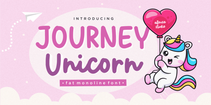 Proudly Present, Journey Unicorn A Fat Monoline Font Journey Unicorn is perfect for any titles, logo, product packaging, branding project, megazine, social media, wedding, or just used to express words above the background. Journey Unicorn also come with Multi-Lingual Support. Enjoy the font, feel free to comment or feedback, send me PM or email. Thank You!
 - Lunisolar by Hanoded,
$15.00 Lunisolar, according to the dictionary, means “of or caused by both the sun and the moon”. I liked the name, therefore I used it! Lunisolar is quite an interesting font: it is fat(tish) and rough, very neat and legible. It could be used for product packaging, book covers and starships. Comes with an abundance of diacritics.


