10,000 search results
(0.05 seconds)
- Dyane by Wiescher Design,
$39.50 Dyane is based on monolinear scripts from the Bauhaus time. But it is very special for ist counterstrokes in the lowercase letters a, h, m and n that gives the script a very distinct rhythm. Your rhythmic type-designer Gert Wiescher
 - Khatulistiwa by Arendxstudio,
$16.00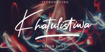 Khatulistiwa is a handwritten font that is very charismatic and with a strong character, that will be very suitable for the various needs of your design projects. Features : • Character Set A-Z • Numerals & Punctuations (OpenType Standard) • Accents (Multilingual characters) • Ligature • Swash
 - Dark Graffiti by Yoga Letter,
$20.00 "Dark Graffiti" is a very elegant and unique graffiti font. This font is equipped with uppercase, lowercase, numerals, punctuation, and multilingual support. It is very suitable for painting street walls, designing t-shirts, jackets, logos, stickers, tattoos, bag designs, and others.
 - Subway Novella by KC Fonts,
$34.00 Inspired by old books and misprinted type, Subway Novella is perfect for adding that washed and worn look to your designs without going over the top making it look fake or over done. A little distress goes a long way!
 - Ghost Skeleton by Yoga Letter,
$15.00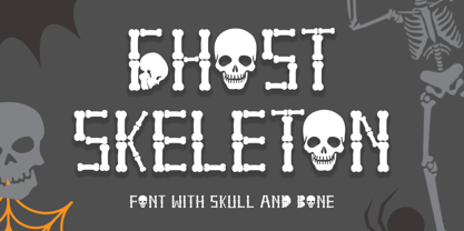 "Ghost Skeleton" is a font made from bones and skull shapes. This font is very simple, easy to use and consists of uppercase, lowercase, numerals, punctuations, and multilingual support. Very suitable for Halloween, comics, movie titles, invitations, social media and more.
 - Tanto by Lomax Design,
$17.00 Tanto is a boxy, futuristic sans-serif that is not directly inspired by any particular typestyle, but is more of an exploration of shapes. It has a very modern feel and although very geometric, still has a character that's not robotic.
 - Melon Kundang by Zamjump,
$13.00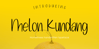 Melon Kundang its homeliness font, very simple and very easy to remember with distinctive hand strokes! This font would be perfect for party invitations, quotes, t-shirts, birthday cards, product packaging and more. • lowercase and uppercase • Includes numbers and punctuation
 - Java Temple by Sipanji21,
$13.00 Java Temple is a Display Font that is inspired by the uniqueness of Javanese culture, thus presenting a very dynamic font form that is very suitable for various design purposes, especially with traditional cultural themes with unique and authentic characteristics.
 - Egyptian Oldstyle by Solotype,
$19.95Here's a wide, very light version of the widely known font P. T. Barnum (or French Clarendon, if you prefer). We have used this to good effect as secondary lines on old fashioned stationery. Reads well in very small sizes. - Heathen by Canada Type,
$24.95A few emails sent to Canada Type have asked for more “bad scripts”. A few others asked for "more Mascara-like treatments". And some asked for more fonts of “distressed elegance”. Whatever you like to call this style of doubled-script font, sightings of designs using it have become common within the last few years. Such fonts have become the standard in expressing elegant confusion, old chaos in modern settings, recycled histories, and rebellious ideas. This style is quite often seen on chic clothing, music packaging, some sports paraphernalia, surfer and skateboarder gear, even book covers. That said, the Heathen font was made to include an advantageous feature that other distressed scripts do not normally have: More intertwined over-swashing in the majuscules. This over-swashing is quite useful in settings where the stroke and fill colors differ, or complement each other. It is also quite the point of emphasis where the idea is to show elegance gone ancient, old thoughts in a modern wrapper, rust never sleeping, or the very basic limits of the world’s nature. The original Heathen was made by redrawing Phil Martin’s Polonaise majuscules and superposing them over the majuscules of Scroll, another Canada Type font. The lowercase is a superposition of Scroll’s lowercase atop a pre-release version of Sterling Script, yet another Canada Type font. Heathen Two was made in a similar way, by combining two pre-release Canada Type scripts. - Daily Sans by Up Up Creative,
$15.00 Introducing Daily Sans, a complete sans serif font family with 10-weights, plus italics (20-fonts total). Daily Sans was designed to be an everyday-use geometric typeface with excellent legibility and a neutral tone. It's a perfect go-to for branding, web, and print design projects and can stand out on its own or play a supporting role in font pairings. It’s great for body/paragraph type as well as for larger display type. Because the goal was to create a font you can truly use for any project, purpose, or occasion, Daily Sans includes a wide range of weights starting from the very thin Hairline all the way through to the very bold Heavy. This means that you’re always able to find just the right weight for your needs, and it makes creating type hierarchies a breeze. Daily Sans comprises 20 fonts, each with approximately 450 glyphs - including 16 standard and discretionary ligatures, three ampersand variants, a full set of arrows, and more - and supports over 200 languages. The OpenType features can be very easily accessed by using OpenType-savvy programs such as Adobe Illustrator and Adobe InDesign. (To access these awesome features in Microsoft Word, you'll need to get comfortable with the advanced tab of Word's font menu.) PLEASE ENJOY! I can't wait to see what you make with Daily Sans. Feel free to use the #upupcreative and #dailysansfont tags to show me what you've been up to.
 - FS Lola by Fontsmith,
$80.00 L-O-L-A Like the subject of the Kinks’ song, FS Lola is a little bit of both – a font with a rare combination of masculine and feminine. The font was inspired by the song, which itself was inspired by the night the Kinks’ manager spent dancing drunkenly in a Soho club with a beautiful woman... Or so he’d thought, until her stubble started to show halfway through the evening. Masculine/feminin Phil Garnham’s experience in designing FS Lola was similar to the one related by Ray Davies. Setting out to create a sans serif font, he realised along the way that he was actually dealing with a semi-serif. He went with it, though, and produced a font with the best masculine and feminine qualities: hard edges and corners tempered by shapes of softness and generosity, the outcome of what Phil calls an “organic” design process. “Initially, my designs were very graphic and hard but not very distinctive. By printing and redrawing the letters in pencil I achieved a softer and friendlier alphabet with a strong personality.” Broad Lola, as you’d expect, is very broad-minded. Available in five weights with italics – and fluent in central European languages – FS Lola offers a confident combination of feminine softness and male steeliness to any kind of design. As the song says, “It’s a mixed-up, muddled-up, shook-up world... except for Lola.
 - 1510 Nancy by GLC,
$20.00 This set of decorated initial letters was inspired by those used in 1510 in Nancy (France, Lorraine) for printing of "Recueil ou croniques des hystoires des royaulmes d'Austrasie ou France orientale[...]" Author Symphorien Champion, unknown printer. There were three sorts of initials family, but only one complete and clear, except a very few characters. The printer used some letters to represent others, as V, turned over to make a A, D to make a Q, M for E, So, the reconstruction was a little less difficult. Thorn, Eth, L slash and O slash were also added. The original font's letters was only drawn in white on a black background only, but it was tempting to propose a negative version in black on white. A few letters have multiple appearance, but only the A was clear enough to be reproduced. It can be used as variously as web-site titles, posters and flyer design, publishing texts looking like ancient ones, or greeting cards, all various sorts of presentations, as a very decorative, elegant and luxurious additional font... This font supports strong enlargements revealing its fine details and remaining very smart. Its original medieval height is about one inch equivalent to about three to four lines of characters. This font may be used with all our blackletter fonts, but as well with "1543 Humane Jenson", "1557 Italic" and "1742 Civilite", without any fear about anachronism.
 - Kingthings Serifique - 100% free

- Kingthings Wrecktangle - 100% free

- Kremlin Empire - Unknown license

- Raventame by Viaction Type.Co,
$16.00 Raventame font with original handwriting brush style, looks very natural and beautiful. It is suitable for boutique brand, photography, magazine, quote, business card, logo, poster and many more. Script is equipped with multilingual support and PUA Encoded. This font is equipped with the Raventame Swash version which is very easy to combine with the Raventame font. Very many swash options with a variety of original hand strokes. I hope you enjoy and thank you.
 - Miss Demeanor by Typadelic,
$19.95 Miss Demeanor has a tendency to create her own rules due to her free-spirited nature. She conforms to every day typographic expectations but she wouldn’t like you to think so. She has unusual yet casual and eye catching shapes and makes the best of any situation. I hope you enjoy her pretty style! My inspiration for Miss Demeanor came from a specimen sheet of an american type style from the early 1930’s.
 - Meroe by Linotype,
$29.99 Meroe from Peter Becker: a warm script with a very dynamic touch Meroe is a warm, calligraphic script with a very dynamic touch. The many little details of the rugged stroke direction show to advantage in large font sizes. Nonetheless, Meroe is also very readable in small sizes. The font feels at home everywhere, where a personal note is required, as for example, in invitations and greetings cards , but of course also in packaging design.
 - Easter Day by Yoga Letter,
$16.00 Easter Day is a very cute and unique font. The font is embellished with a bunny shape which adds to the funniness of this font. This font is very easy to use because it is specially designed, so it will be very easy to bring out the embellishment of the letters. Easter Day is perfect for Easter celebrations, logos, branding, banners, book titles, movie titles, animation, children's world, promotions, business and more.
 - NT Gagarin by Novo Typo,
$26.00 Anna Gagarin is the loving matriarch of the Gagarin Family. Her life was full of love and passion. She had several affairs with Futurist and Contstructivist artist in the beginning of the 20th century. She was in love with the Russian poet Vladimir Majakovski (born on July 19th, 1893 and died in Moscow on the April 14th, 1930). She gave birth to his son Boris. She called him 'a cloud with trousers'. After this love story, Anna Gagarin met the designer and artist Gustav Klucis in Italy. His radical and political ideas were much too childish for her. After a period of love and passion Anna gave birth to his son. At that time they were in Italy, which explains his italic forms. After her return to Moscow in the beginning of the 1920's Anna was introduced by Alexander Rodchenko. They were heavenly in love but Ilja Stepanova was very jealous on her husband. Anna once said that 'Alexander fills mine construction with love...' That phrase can be an explanation for the term Constructuvism as an art movement. Alexander was the great love of Anna. She gave birth to their love-baby Dimitri Gagarin. That night Alexander designed his most famous poster. A decade before that Anna told it was 'a time for a change'. In a local bar in Sint Petersburg she met Gregory Rasputin. At that time Rasputin was a well known person and a respected member of the Sint Petersburg upper class.His diabolic character influenced Anna and after several months she gave birth to their son Kurt. He inherited the main characteristics of his father. The Gagarin Family wants to give love and wants be loved...
 - Souljah by 38-lineart,
$17.00 Let us introduce you our new font Souljah, a natural script font. This font has a very contrast stroke, very wide down stroke and very tiny up stroke. Every glyphs shaped very flowy and smooth as if it is written by a dancing hand. All glyphs are connected nicely, this font also included ligature to add more natural touch. "Natural and Soulful Calligraphy" is a perfect tagline to describe Souljah Included Opentype font with ligature, swash alternate and multilingual support. Souljah swash Uppercase for beginning swash and lowercase for ending swash, this file was made to the user who is not common to opentype stylistic feature.
 - Montarsi by insigne,
$32.00 Montarsi is a typeface designed by Jeremy Dooley, inspired by Arabic calligraphy and contemporary design trends. The letters are fluid and graceful, inspired by the curves and swirls of Arabic script. Montarsi is a bold, contemporary calligraphic face with broad strokes and high contrast. It has a variety of styles and weights to give you an extensive range of design options. This font family, which includes eight weights, is ideal for producing brief texts for editorial, fashion, branding, magazine, television, window displays, and other media applications. Small caps, old-style figures, and width variations are also included. It's ideal for writing brief sentences because of the increased x-height. Montarsi is a classic spirit reinvented in a modern language, influenced by the delicate curves of letters and the way ink glides across paper. We especially thank Lucas Azevedo and ikern.
 - Maister by Dora Typefoundry,
$19.00 Maister is a contemporary look serif typeface with sharp and dynamic strokes, strong contrasts that are subtle. Giving traditional serif design elements a modern feel, this is a graceful and confident set of timeless simple, easy-to-read typefaces that can easily become a staple in your font library perfect for branding, logos, invitations, magazines, product packaging, and more. Features: All Caps Font with different uppercase and lowercase Number & Symbol Supported Languages Alternates and Ligatures PUA Encoded We highly recommend using a program that supports OpenType features and Glyphs panels like Adobe apps and Corel Draw, so you can see and access all Glyph variations. This type of family has become the work of true love, making it as easy and fun as possible.I really hope you enjoy it! Thank you Enjoy the font and go get creative :)
 - Vinneta by Dima Pole,
$27.00 Vinneta is a direct italic font. Its contours and graceful, and precise. Vinneta has a huge number of alternative variations of the glyphs, 20 stylistic sets, it allows you to create a variety of compositions. In addition Vinneta has 17 OpenType features, including oldstyle numbers, swashes, contextual alternates, historical forms, standard ligatures, discretionary and contextual ligatures, localized forms, stylistic alternates, and more others. For convenience here are two faces, one with stylized capitals (they are different from swashes), in another - classic capitals. Vinneta has characters of all European and Slavic languages. "Vinneta" it is an ancient city of the Venedi (Wends), the legendary highly developed Slavic-Aryan people that lent its name to Venice city, lake Bodensee in southern Germany, the land of Wendland in Lower Saxony; and besides, Lithuanians and Estonians even today, this name referred to the Slavs (Veneja and Vene).
 - Dashie by Muksal Creatives,
$17.00 The "Dashie" font is a captivating modern display typeface with a strong feminine touch. Designed with a blend of retro and vintage elements, this font carries an elegant and alluring vibe. Dashie boasts smooth lines while still exuding gracefulness. Each letter possesses a unique form, with soft contours and slightly curved angles, delivering a sense of sophistication and timelessness. This font is exceptionally fitting for creating feminine branding logos due to its gentle yet powerful characteristics. When integrated into designs, Dashie has the ability to infuse a classic touch of retro or vintage, emanating an aura reminiscent of the past yet maintaining a fresh and modern feel. Dashie is the perfect choice for crafting a visually captivating and memorable identity for brands seeking to stand out with an elegant, feminine style, while incorporating retro or vintage nuances into their brand.
 - Bathysphere by Kickingbird,
$24.00 This steam era typeface, created by Gustav Schroeder in 1884, found popular use on soap box labels and tobacco tins during its initial release. Then, later, a successful and stout revival of Gustav's face, named Othello, was carried out by Morris Fuller Benton in 1934, and the typeface's appeal widened to include items such as broadside posters featuring Boris Karloff's Frankenstein. After metal gave way to film type, Gustav's creation experienced a brief fashion moment in the 1960's, but then disappeared entirely, never re-surfacing as a full digital typeface. With the release of Bathysphere, the typeface comes full circle, having been completely redrawn from scratch using Gustav's original specimens. The new extended language support establishes the typeface firmly in the modern era, while Bathysphere's refinement of subtle blunt corners restores a deep-sea grace to this iron giant.
 - Klear by Ahmad Jamaludin,
$15.00 Introducing Klear - A typeface that's turning design conventions on its head! Inspired by the graceful flow of art nouveau, Klear is a perfect blend of quirkiness and elegance. Whether you're working on a formal project or something more avant-garde, Klear has you covered. With two styles to choose from - Regular and Outline, Klear gives your creativity a fresh canvas to shine What's Included? Klear Main File Regular and Outline Family Instructions (Access special characters, even in Cricut Design) Unique Letterforms Works on PC & Mac Simple Installations Accessible in Adobe Illustrator, Adobe Photoshop, Microsoft Word even Canva! PUA Encoded Characters. Fully accessible without additional design software. Language Support: Danish, English, Estonian, Filipino, Finnish, French, Friulian, Galician, German, Gusii, Indonesian, Irish, Italian, Luxembourgish, Norwegian Bokmål, Norwegian Nynorsk, Nyankole, Oromo, Portuguese, Romansh, Rombo, Spanish, Swedish, Swiss-German, Uzbek (Latin) Thank you Dharmas Studio
 - Stonetype by Kustomtype,
$20.00 Stonetype is a typeface that was used by stonemasons in the 70s & 80s of the last century. When I was starting as a stonemason, these were the first characters I had to draw, by hand, back then on grave monuments and memorial plaques. The idea was born to digitize all the material, to be saved for eternity. By digitizing all and fine tuning, plus the addition of some main characters, Stonetype has now grown into a user-friendly typeface that can, now still, be used by stonemasons, to improve their creation process times. But Stonetype can also easily be used in modern and contemporary designs. Stonetype is the perfect fit for graphic design, editorial design, magazines, posters, logotypes, brands and corporate design. Stonetype is designed by Coert De Decker in 2019 and published by Kustomtype Font Foundry.
 - Nostalgic Remain by Ardian Nuvianto,
$23.00 The Nostalgic Remain is a chic modern and timeless serif font that evokes a sense of nostalgia and old-world charm. Its elegant and refined letterforms are perfect for creating designs that require a touch of sophistication and tradition. This font is ideal for vintage logos, book covers, editorial designs, and any project that needs a touch of old-school glamour. With its graceful curves and delicate serifs, Nostalgic Remain is a versatile font that can be used for both digital and print projects. Its timeless appeal makes it a great choice for designers who want to create a sense of heritage and history in their designs. Whether you’re designing for a fashion brand, a restaurant, or a publishing house, Nostalgic Remain is a font that will add a touch of class and elegance to your work.
 - Black Oldest by Letterara,
$24.00 Experience the timeless allure of Black Oldest, a font that effortlessly blends style and bold. With its neat and clean design, this serif font is a versatile choice for a wide variety of designs, taking them to new heights of sophistication. Explore the possibilities as you unlock the potential of its alternates and ligatures, allowing you to create the perfect typography design. Whether you're working on a luxury logo and branding, a classy editorial design, magazines, packaging, posters, movies, brands, fashion promotions, or art gallery branding, Black Oldest is the ideal companion for your upcoming projects. Embrace the possibilities and unleash your creativity with this PUA-encoded font, granting you access to all the captivating glyphs it offers. Elevate your designs with the timeless charm of Black Oldest and watch them come to life with elegance and grace.
 - Betriciya Signature by Gloow Studio,
$14.00 Introducing Betriciya Signature An elegant, graceful, yet simplistic cursive font. Inspire your audience, clients, or guests with this stylish, handwritten font that can be used for almost every platform such as websites, social media, pinterest, printed cards and many more! Aesthetically pleasing handwritten cursive font, just for beautiful you! Multilingual & Ligature Support Full sets of Punctuation and Numerals Compatible with: Adobe Suite Microsoft Office KeyNote Pages Software Requirements: The fonts that you’ll receive in the pack are widely supported by most software. In order to get the full functionality of the selection of standard ligatures (custom created letters) in the script font, any software that can read OpenType fonts will work. We hope you enjoy this font and that it makes your branding sparkle! Feel free to reach out to us if you’d like more information or if you have any concerns.
 - Rosella by Monotype,
$50.99 The Rosella™ family, by Sabina Chipară, is an elegant and playful suite of typefaces that are ideal for book covers, social announcements, packaging and posters. Inspired by late 19th century engravers typefaces that mimic the delicate and ornate hairlines of steel and copperplate engraving, the family’s foundation is built on the dramatic Solid design and then expands to Deco, Engraved, Flourish, Hatched and Inline styles. Rosella also takes to color like the beautiful Australian parrot it is named after. Words set in the typeface come alive when vibrant colors, or tinted backgrounds become part of their plumage. While modern as today, the design also has a quiet antique vibe that brings an understated refinement to a variety of hardcopy projects. Rosella is a typeface for those times you need a design that stands out from the crowd – but with grace and composure.
 - Wishes Script by Typesenses,
$32.00 Plenty of swashes, ligatures, beginning and ending shapes, Wishes is a wit option for invitations, cards, stationery, fashion and apparel, among a wide range of uses. The curves of the cursive style are neither too solemn or pompous, its grace and playfulness are more 1950s than 1750s. This family offers the designer an additional decorative toolkit full of frames, ribbons, hearts, flowers and ornaments, plus a collection of caps and small caps. Wishes Script Pro includes the complete set of Script characters plus Ornaments and Caps. The family offers optically optimized Display and Text styles for each of the weights: Light, Regular and Bold. Use professional software that widely support Open Type features. Otherwise, you may not have access to some glyphs. For further information about features and alternates, see the User Guide Use Wishes to express your greetings!
 - Erotica by Lián Types,
$49.00 “A picture is worth a thousand words” and here, that’s more than true. Take a look at Erotica’s Booklet; Erotica’s Poster Design and Erotica’s User’s Guide before reading below. THE STYLES The difference between Pro and Std styles is the quantity of glyphs. Therefore, Pro styles include all the decorative alternates and ligatures while Std styles are a reduced version of Pro ones. Big and Small styles were thought for better printing results. While Big is recommended to be printed in big sizes, Small may be printed in tiny sizes and will still show its hairlines well. INTRODUCTION I have always wondered if the circle could ever be considered as an imperfect shape. Thousands of years have passed and we still consider circles as synonyms of infinite beauty. Some believe that there is something intrinsically “divine” that could be found in them. Sensuality is many times related to perfectly shaped strong curves, exuberant forms and a big contrasts. Erotica is a font created with this in mind. THE PROCESS This story begins one fine day of March in 2012. I was looking for something new. Something which would express the deep love I feel regarding calligraphy in a new way. At that time, I was practicing a lot of roundhand, testing and feeling different kinds of nibs; hearing the sometimes sharp, sometimes soft, sound of them sliding on the paper. This kind of calligraphy has some really strict rules: An even pattern of repetition is required, so you have to be absolutely aware of the pressure of the flexible pen; and of the distance between characters. Also, learning copperplate can be really useful to understand about proportion in letters and how a minimum change of it can drastically affect the look of the word and text. Many times I would forget about type-design and I would let myself go(1): Nothing like making the pen dance when adding some accolades above and below the written word. Once something is mastered, you are able to break some rules. At least, that’s my philosophy. (2) After some research, I found that the world was in need of a really sexy yet formal copperplate. (3) I started Erotica with the idea of taking some rules of this style to the extreme. Some characters were drawn with a pencil first because what I had in mind was impossible to be made with a pen. (4) Finding a graceful way to combine really thick thicks with really thin hairlines with satisfactory results demanded months of tough work: The embryo of Erotica was a lot more bolder than now and had a shorter x-height. Changing proportions of Erotica was crucial for its final look. The taller it became the sexier it looked. Like women again? The result is a font filled with tons of alternates which can make the user think he/she is the actual designer of the word/phrase due to the huge amount of possibilities when choosing glyphs. To make Erotica work well in small sizes too, I designed Erotica Small which can be printed in tiny sizes without any problems. For a more elegant purpose, I designed Erotica Inline, with exactly the same features you can find in the other styles. After finishing these styles, I needed a partner for Erotica. Inspired again in some old calligraphic books I found that Bickham used to accompany his wonderful scripts with some ornated roman caps. Erotica Capitals follows the essentials of those capitals and can be used with or without its alternates to accompany Erotica. In 2013, Erotica received a Certificate of Excellence in Type Design in the 59th TDC Type Directors Club Typeface Design Competition. Meet Erotica, beauty and elegance guaranteed. Notes (1) It is supossed that I'm a typographer rather than a calligrapher, but the truth is that I'm in the middle. Being a graphic designer makes me a little stubborn sometimes. But, I found that the more you don't think of type rules, the more graceful and lively pieces of calligraphy can be done. (2) “Know the forms well before you attempt to make them” used to say E. A. Lupfer, a master of this kind of script a century ago. And I would add “And once you know them, it’s time to fly...” (3) Some script fonts by my compatriots Sabrina Lopez, Ramiro Espinoza and Alejandro Paul deserve a mention here because of their undeniable beauty. The fact that many great copperplate fonts come from Argentina makes me feel really proud. Take a look at: Parfumerie, Medusa, Burgues, Poem and Bellisima. (4) Some calligraphers, graphic and type designer experimented in this field in the mid-to-late 20th century and made a really playful style out of it: Letters show a lot of personality and sometimes they seem drawn rather than written. I want to express my sincere admiration to the fantastic Herb Lubalin, and his friends Tony DiSpigna, Tom Carnase, and of course my fellow countryman Ricardo Rousselot. All of them, amazing.
 - Spidershank - Unknown license

- Gothic Leavenworth by Wooden Type Fonts,
$20.00 Gothic Leavenworth, a display type, very bold, sans serif.
 - GirderSuper by Wooden Type Fonts,
$15.00 A heavy slab serif font very useful for display.
 - Title Gothic Light by BA Graphics,
$45.00A very thin light line gothic, great headline face. - Mayfield by Typadelic,
$19.00Mayfield could be anybody's handwriting. Very clean and legible.


