10,000 search results
(0.05 seconds)
- Alight Slab by Eclectotype,
$40.00 Alight Slab is, wait for it... A light slab! Designed to be set large, in headlines or subheads and (very) short paragraphs of running text. It has slightly super-eliptical forms and crisp details, giving it a contemporary look. Alight Slab features automatic fractions, a discretionary ct ligature, and a capital sharp s. Anultra Slab is an ultra bold accompanying typeface.
 - Miragem by Vanarchiv,
$55.00 This serif typeface was designed to be simple and neutral on text sizes, there descender proportions are short and the x-height is large. The lowercase italics contain different structure from roman characters, but the most differentiation detail is the fact the ascender and descender strokes don’t contain serifs. Italics characters are slightly more narrow and condensed than roman letterforms.
 - Doki Doki Tokimeki by Megami Studios,
$12.50 Designed with visual novels and romantic text in mind, Doki Doki Tokimeki (taken from the Japanese sound for a heartbeat and the word heartbeat itself) is a romantically-inclined sans serif. From playful, yet friendly letters to a range of dingbats and a series of alternate heart-shaped glyphs, it’s sure to make your heart go pitter-patter as well!
 - Baker Signet by ParaType,
$25.00 Bitsream version of Baker Signet typeface designed by well-known calligrapher Arthur Baker in 1965 for Visual Graphic Corporation (VGC). A design on classical lines with subtle but effective calligraphic touches and flare stroke terminals. For use in advertising and display typography as well as for headlines and small texts. Cyrillic version was developed by Eugene Sadko and released by ParaType in 2008.
 - Brown Pro by Shinntype,
$39.00 At text size, Brown is a classic grotesque, distinguished by its semi-condensed proportions—especially in the capitals, which harmonize well with the lining figures—and an exceptional clarity in certain high-resolution media, such as offset printing, achieved by micro-detailing. At display size, the detailing provides the otherwise austere forms of the neo-grotesque with a subtle wealth of visual interest.
 - Quaderno Slanted by Resistenza,
$39.00 Quaderno Slanted is a light and monolinear script, accompanied by the heavier weights. This connected script combining elements of the traditional Italian script Bella Scrittura. Quaderno is suited for middle length texts and headlines and evokes both vernacular and commercial lettering of the 20th century and a typeface for school book purposes. You can also overlap them and get a double stroke effect.
 - Svetlana by ParaType,
$30.00 Designed in 1976–81 by Michael Rovensky (1902–1996) as the body text companion of his Bazhanov Display typeface (1961), of Polygraphmash typefoundry. Based on the lettering by Moscow book designer Dmitry Bazhanov (1902–1945). With old-fashioned flavor, this design recreates the Soviet hand-lettering style of the 1940s. The digital version was developed at ParaType in 1996 by Lyubov Kuznetsova.
 - Benelux by Talbot Type,
$17.99 Benelux is inspired by European styles of the late twentieth century, their origins can be traced back to the Bauhaus. Broadly geometric and with an emphasis on legibility, it's well-balanced and is equally effective at both text and display sizes. Benelux is available in five weights and features an extended character set, including accented characters for Central European languages.
 - Huggy by Typogama,
$19.00 Huggy is a display typeface designed by Michael Parson and inspired by the work of Heinrich Heinz. Full of Art Nouveau flair, this two weight typeface is bold forceful but full of subtle features that give the design a unique personality. With a narrow width and tall aspect, it is perfect for setting text in tight spaces like posters or other titling situations.
 - Centrifuge by Midwest Type,
$12.00 Originally inspired by manufacturer badges on old laboratory equipment, Centrifuge sports soft geometric shapes, wedge serifs, and sharply-angled terminals. Quirky but versatile, Centrifuge can appear anywhere from formal and elegant to funky and chunky depending on how it’s set. Centrifuge is suitable for short-form text and headlines but really sings in an all-caps setting with generous tracking.
 - Shard by Device,
$39.00 Shard was originally commissioned for Nickelodeon’s 3D reboot of the Teenage Mutant Ninja Turtles franchise. It complemented the show’s new angular logo, which Rian Hughes also designed. There are alternative versions of many letters available in the upper and lower case keys, and a selection of around 90 ligatures that automatically substitute themselves in running text to give a tight, interlocked fit.
 - Frusta by District,
$20.00 Frusta is an earnest family of slab-serifs softened by tapered serifs and slightly squared curves that give it a warmth often absent in other slabs. Monoline and with a geometric foundation, this three-weight family includes true italics that can be their own headline face. The airy, yet sturdy construction makes this perfect for small text, infographics, and headlines of all sizes.
 - Baby Boho by Bosstypestudio,
$12.00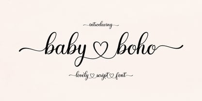 Introducing Baby Boho Baby Boho with a smooth handwriting style and very pretty and lovely. Baby Boho is perfect for branding projects, home appliance design, product packaging, use in business cards, invitation cards, etc. Just like a stylish text overlay to a wallpaper or anything that needs a touch of love. Thanks for checking! I really hope you enjoy it.
 - SK Akademkniga by Shriftovik,
$32.00 SK Akademkniga is a monumental classic sans serif with medium contrast. Its strict form emphasizes the uniqueness of each symbol. The typeface supports many languages, including Cyrillic and extended Latin. SK Akademkniga is great for poster design, titles and texts. It also has a versatile geometry, which makes it a great help in work, whether it is graphic design or web design.
 - SchoolBook by ParaType,
$30.00The typeface was designed at the Polygraphmash type design bureau in 1949-61 (project manager Elena Tsaregorodtseva). Based on Shkolnaya ('School') typeface, 1939 (project manager Evgeny Chernevsky), a version of Century Schoolbook of American Type Founders, 1915-1923 by Morris F.Benton. The low-contrast text typeface of the Ionic-Legibility group, it is designed expressly for schoolbooks and children books. - Vulgat by Typogama,
$29.00 Vulgat is a uncial inspired typeface that offers a vibrant personality while staying clear and legible in all applications, a contemporary style modeled by the past. Designed for use in editorial and branding situations, Vulgat can be used for titles but equally longer passages of text. This typeface features an extended Latin support for all European languages plus Cyrillic support.
 - Hey Magdison by Amelia Studio,
$12.00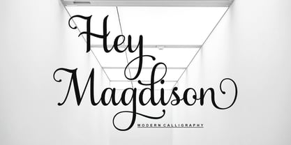 Introducing Hey Magdison Hey Magdison with a smooth handwriting style and very pretty and lovely. Hey Magdison is perfect for branding projects, home appliance design, product packaging, use in business cards, invitation cards, etc. Just like a stylish text overlay to a wallpaper or anything that needs a touch of love. Thanks for checking! I really hope you enjoy it.
 - Gerusa by Scannerlicker,
$33.00 Gerusa is a sans-serif technical typeface family by Loligovulgaris.com. It features a 970+ glyph set per cut, with monospaced uppercase and text-suitable lowercase characters, a very complete set of diacritics, math glyphs and a full range of OpenType features. This family is OCR and ISO inspired, with an engineering/architectural feel, robust and pragmatic, with the usual technical ugliness chopped away.
 - Kaisar by Hazztype,
$21.00 Kaisar is a geometric sans serif typeface that draws inspiration from Eurostile or similar typefaces, with less boxy feels. It comes with 9 weights and matching italics and contains 400+ glyphs that support broad latin language. Kaisar was designed to give a corporate, technological, futuristic look, great for many contexts from web to print, as a headline or as a body text.
 - Linem Up JNL by Jeff Levine,
$29.00Linem Up JNL is based on one of Alf R. Becker's alphabets for Signs of the Times magazine. With A-Z only and basic punctuation, it is best used in very limited text at larger point sizes. Thanks to Tod Swormstedt of ST Publications (and the curator of the American Sign Museum in Cincinnati, Ohio) for providing the reference material. - Fabrikat Normal by HVD Fonts,
$40.00 Fabrikat Normal is a geometric typeface which is based on 20th century German engineers’ typefaces. It is optimised for small sizes and long texts, but due to its constructed architecture it also works in headlines or display use. You can combine Fabrikat Normal with the more straight and space saving Fabrikat Kompakt or the reduced to the max Fabrikat Mono.
 - Oakes Grotesk by Studio Few,
$12.00 Oakes Grotesk is a more corporate take on the Oakes typeface. It explores a set of brand new metrics that allow it to be more legible in body text as well as headings. The letter 'g' has been tweaked to become double-story as well as the refinement of other characters. This is all whilst maintaining the subtle curves of the Oakes typeface.
 - Stymie by Linotype,
$40.99In 1931, Morris Fuller Benton created the Stymie typeface for the American Type Founders (ATF). Stymie is a reworking of a slab serif type that was popular in Europe at that time, Memphis. For the past one hundred fifty years, slab serif types (sometimes called Egyptian or Egyptienne-style faces) have been a popular choice for headline text in newspapers, magazines, and advertising. - FF Schulschrift by FontFont,
$131.99 Dutch type designer Just van Rossum created this script FontFont in 1991. The family has 20 weights and is ideally suited for advertising and packaging, book text, film and tv, editorial and publishing as well as logo, branding and creative industries. FF Schulschrift provides advanced typographical support with features such as alternate characters. It comes with tabular lining and proportional lining figures.
 - Lavatype AOE by Astigmatic,
$19.95Lavatype is an amorphous typestyle born from pools of bubbling magma. I highly reabable but playful typeface, it works well for headline and minimal text based needs. Just what is that sludge in those lava lamps anyways...? Add some spunk funk to your designs with Lavatype today! From a scary typestyle feel, to a distressed look, Lavatype is burning for you! - Hatchway by Rômulo Gobira,
$15.00 Hatchway is a monospaced display typeface with rounded corners, suitable for headlines and short passages of text. Hatchway has a tall x-height and unusually short ascenders and descenders. The family contains seven weights from Thin to Black and five widths from Ultra Condensed to Ultra Extended. This version (1.0) comes with Multiple Language Support, including Extended Cyrillic, and Opentype Features.
 - Borba by Edyta Demurat,
$20.00 Borba is light, fresh and friendly at first glace. It's simple, modern and elegant due to its monoline and minimalistic form. It is really readable which makes it perfect for long texts but it looks great in titles and short sentences as well. To sum up, borba is a universal typeface which may be used whenever you need a stylish and modern typography.
 - Varvara by TeGeType,
$19.00 Varvara is a new display typefaces family create as a tribute to the work of Barbara Stepanova (1894-1958). Varvara family has light, medium and bold weights in 6 differents versions (normal, rough, screen, inline, shadow and star), all with alternates letters. All versions are provided in latin, cyrillic and greek alphabets. It can be use for text as for titling applications.
 - Eliptik by Yock Mercado,
$9.00 Eliptik is a typeface with disruptive shapes, inspired by the aesthetics of technology from the 80s and 90s, when they had a very particular style of seeing the future. It is an ideal typeface for large size display texts and wordmarks, designed in upper and lower case, it also has many stylistic variables (OpenType features) that give it more memorable and unique personality.
 - Coupler by District,
$25.00 Coupler is a sturdy text face with low contrast, airy counters, and a strong baseline for smaller sizes and extended reading. Lightly bracketed serifs and pleasantly conspicuous italics temper Coupler’s formal demeanor—well suited for financial reports, news magazines, catalogs, academic journals, and any instructional setting. Four weights with italics and advanced typographical support provide design flexibility in any layout.
 - Skript by Wilton Foundry,
$49.00 Skript attempts to capture the essence of handwritten calligraphy. It emphasizes downstrokes and omits hair strokes with a contemporary stencil-like effect. Text is very readable since the foundation of each character remains intact. There many alternatives that make Skript versatile in a variety of applications. Compared to Carnegie Classic, Skript is more legible but less compact. Skript is available in Opentype.
 - Argumend by Ayca Atalay,
$29.00 Argumend | A Humanistic Slab Serif Typeface Argumend is a versatile slab serif typeface with a wide range of Opentype features. Create strong and eye catching headlines with its upper case ligatures or make use of its many weights and true italics to create mindful body copy; either way, Argumend is rich with typographic options to help create attention worthy text.
 - Cycles by Stone Type Foundry,
$49.00 Cycles was designed for use in books and other publications with lengthy texts and/or complex typography using different sizes of type. Different versions of Cycles have been designed which are optimized for setting at specific point sizes as was the practice in the days of metal type. Together with Stone Print, SFPL, and Arepo it makes up a superfamily of typefaces.
 - Numis by Tyler Jamieson Moulton,
$11.00 Numis was born out of a coin collecting hobby. A quick survey of coins from the late medieval to modern periods to today led to this unicase design. The rounded corners and smoothed edges are meant to evoke a the slightly worn letterfaces found on old coins; a process that tends to bolden the text before being rubbed away completely.
 - New Journal by ParaType,
$30.00The typeface was designed at the Polygraphmash type design bureau in 1951-53 by Lev Malanov, Elena Tsaregorodtseva et al. Based on Cyrillic version of Excelsior, 1931, of Mergenthaler Linotype, by Chauncey H. Griffith. Excelcior Cyrillic was developed in 1936 in Moscow by Professor Michael Shchelkunov, Nikolay Kudryashev et al. A low-contrast text face of the Ionic – "Legibility" group. - Dee Dee by TipografiaRamis,
$39.00 This is a second edition of Deedee type family, originally designed in 2011. Deedee is a geometric sans serif typeface family of ten styles with extended support for most Latin languages plus Cyrillic. Revisions in this edition included minor adjustments to glyph shapes and improved kerning tables. The typeface is ideal for use in display sizes and is quite legible in the text.
 - Iowan Old Style by ParaType,
$30.00 Iowan Old Style was designed for Bitstream in 1990 by noted sign painter John Downer. Iowan Old Style is a hardy contemporary text design modeled after earlier revivals of Jenson and Griffo typefaces but with a larger x-height, tighter letterfit, and reproportioned capitals. Cyrillic letters were designed by Natalia Vasilyeva in 2016. Iowan Old Style Cyrillic was released by Paratype in 2017.
 - FM Ephire by The Fontmaker,
$16.00 FM Ephire is a hand-drawn, multilingual, type family of five weights with complimenting italics. Stuffed with tons of features, Ephire really shines through its artistic and stylish, yet elegant feel of natural handwriting. It is your best choice whenever you design greeting cards, banners or posters, and it also handles pretty well for body text, even in small sizes. Enjoy Ephire!
 - Churchward Isabella by BluHead Studio,
$25.00 Churchward Isabella is a five weight typeface family originally designed during the 1980's by the late type designer Joseph Churchward, from New Zealand. A straightforward, geometric sans serif, it is a no-nonsense, highly legible workhorse design, readable on screen as well as in print, for text, headline and display. The family includes Light, Regular, Medium, Bold and Extra Bold.
 - Suomi Sans by Suomi,
$25.00 There are many sans serif typefaces with calligraphic tendencies, but Suomi Sans is different: the outside forms are fairly basic, fairly narrow sans serif style, but the counter forms have a strong calligraphic flair with accented upper left and lower right hand corners. With six weights in Roman and italic, Suomi Sans works well for both headline and text use.