10,000 search results
(0.072 seconds)
- Isle Body by Mans Greback,
$19.00 Isle Body is a high-quality serif typeface family, drawn by Måns Grebäck during 2018 and 2019. It is a sweet font with a casual and calm look, with generous spacing and an even weight, adapted for body texts and small sized type settings. It comes in four weights, each one as italic, totaling in eight styles: Light and Light Italic, Medium and Medium Italic, Bold and Bold Italic, Black and Black Italic. The font family can be used in a combination with a font of a different style, or together with its sister font Isle Headline, also a serif font, which has the same basic structure but more distinct weights and a sharper look. Each style contains ligatures and support for a wide range of languages.
 - Depicto by Michael Rafailyk,
$12.00 A pixelated typeface with asymmetrical serifs intended to depict emojis in coarse mosaic shapes and represented in two styles that perfectly complement each other – Mono (casual font) and Mosaic (color font). The main font feature is a large set of pictograms, which are activated using the Stylistic Set and typed right in a text with a keywords like :smile: :happy: :sad: :pear: :rose: :horse: :bike: :house: and so on. Read more about Depicto font family concept, features, pictograms, color font, emoji skin tone, how to use it, and the applications support: https://michaelrafailyk.com/depicto See the complete list of 600+ pictograms: https://michaelrafailyk.com/typeface/specimen/Depicto.pdf Scripts: Latin, Greek, Cyrillic, Hebrew Languages: 480+ The promo image “Serpant Mosaics” used a photo of Nick Verlice from Pexels
 - Dino Jumps by Twinletter,
$15.00 Dino Jumps is a fun typeface that is attractive, gorgeous, and funny. It is designed for those who are attractive, handsome, and creative. Use this typeface in all of your designs to express your extraordinary projects with presentations that can attract visitors due to the beauty of visual displays. This typeface can be used for a variety of themes and issues in your project. This font is perfect for games, sporting events, branding, banners, posters, movie titles, book titles, quotes, logotypes, and more. of course, your various design projects will be perfect and extraordinary if you use this font because this font is equipped with a complimentary font family, both for titles and subtitles and sentence text, start using our fonts for your amazing projects.
 - Regas by Kulokale,
$19.00 Regas is a contemporary and classic display serif font. Regas is well-suited for advertising, branding, logotypes, packaging, titles, headlines and editorial design. This font comes in two styles, Regular and Oblique Version. This font is encoded with Unicode PUA, which allows full access to all additional characters without having special design software. Mac users can use Font Book, and Windows users can use Character Map to view and copy one of the extra characters to paste into your favorite text editor / application. We highly recommend using a program that supports OpenType features and Glyphs panels such as Adobe Illustrator, Adobe Photoshop CC, Adobe InDesign, or CorelDraw, so you can see and access all Glyph variations. We hope you enjoy the font. Thanks and have fun!
 - Ageya by Kulokale,
$24.00 Ageya is a modern and elegant serif font. Ageya is well-suited for advertising, branding, logotypes, packaging, titles, headlines and editorial design. This font comes in two styles, Regular and Oblique Version. This font is encoded with Unicode PUA, which allows full access to all additional characters without having special design software. Mac users can use Font Book, and Windows users can use Character Map to view and copy one of the extra characters to paste into your favorite text editor / application. We highly recommend using a program that supports OpenType features and Glyphs panels such as Adobe Illustrator, Adobe Photoshop CC, Adobe InDesign, or CorelDraw, so you can see and access all Glyph variations. We hope you enjoy the font. Thanks for purchasing and have fun!
 - Appetite Pro by Serebryakov,
$39.00 Appetite Pro is a total upgrade of the world wide popular display font Appetite (2011). It is based on original lettering and belongs to the upright script like. Appetite Pro consists of 10 weights of the refreshed curves — 5 regular and 5 italic — from Light to Heavy. It’s a multilingual and international font, with a full Western Latin, Cyrillic (Russian, Belarusian, Ukrainian) and basic Greek support. The Appetite Pro font family is specially designed for food identity and packaging design projects. In addition to standard letter cases, Appetite Pro also includes dingbats set. Due to the 10 weights font palette, you can solve a wide variety of professional problems without spending money on extra fonts for titles, subtitles, and main text. Try and buy!
 - In The Sun by Ana's Fonts,
$15.00 In The Sun is a SVG font made from pencil handwriting and doodles. The SVG format allows for the texture of the pencil to be captured in a realistic way. In The Sun looks best at smaller sizes and will also look great in all caps texts. Use In The Sun in designs such as postcards and notes, posters, logotypes, social media posts, branding and packaging. In The Sun includes: In The Sun handwritten font In The Sun Extras font, with underlines, circles, arrows, and small floral illustrations in: SVG format and Vector format, with the texture preserved Software requirements for the SVG font: Photoshop CC2017+ // Illustrator CC2018+ No SVG support? No problem! I have also included a OTF vector version of the font
 - Holy Mordigan by BlackLotus,
$10.00 Holy Mordigan is a modern script font that is inspired by luxury. Holy Mordigan font makes every design created has an elegant aura. so it has its own value for everyone who sees it. Holy Mordigan also has a variety of alternate options that can be used. What's included in this font pack : -- LARGE GLYPH SETS : There are 409 total glyphs in this font pack. Holy Mordigan comes with a large range of glyphs including punctuation, numerals, international language support, ligatures & additional extra glyphs for stylistic sets. It includes 182 Glyphs of Stylistic Sets to make your text looks natural and beautiful. -- NO SPECIAL SOFTWARE REQUIRED -- INTERNATIONAL LANGUAGE SUPPORT : This font supports English, French, Italian, Spanish, Portuguese, German, Swedish, Norweigen, Danish, Dutch, Finnish, Indonesian, Malay.
 - Nexa Script by Fontfabric,
$40.00 Nexa Script is a clean version of the famous multifaceted font system Nexa Rust . All fonts from the family was successfully designed to match perfect to the other two members of this huge font system - Nexa and Nexa Slab . You can be sure that Nexa Script is equipped with the most advanced typographic Open Type features such as extended sets of ligatures, fractions, alternate characters, superscripts and subscripts, etc. The font family is most suitable for headlines of all sizes, as well as for text blocks that come in both maximum and minimum variations. Nexa Script font styles are applicable for any type of graphic design in web, print, motion graphics etc and perfect for t-shirts and other items like posters and logos.
 - Geska Rolling by Kulokale,
$19.00 Geska Rolling is a groovy retro display font. Geska Rolling is well-suited for advertising, branding, logotypes, packaging, titles, headlines and editorial design. This font comes in 2 styles, Regular and Oblique version. This font is encoded with Unicode PUA, which allows full access to all additional characters without having special design software. Mac users can use Font Book, and Windows users can use Character Map to view and copy one of the extra characters to paste into your favorite text editor / application. We highly recommend using a program that supports OpenType features and Glyphs panels such as Adobe Illustrator, Adobe Photoshop CC, Adobe InDesign, or CorelDraw, so you can see and access all Glyph variations. We hope you enjoy the font. Thank you.
 - Regysca by Kulokale,
$14.00 Regysca is a modern and elegant serif font. Regysca is well-suited for advertising, branding, logotypes, packaging, titles, headlines and editorial design. This font comes in two styles, Regular and Oblique Version. This font is encoded with Unicode PUA, which allows full access to all additional characters without having special design software. Mac users can use Font Book, and Windows users can use Character Map to view and copy one of the extra characters to paste into your favorite text editor / application. We highly recommend using a program that supports OpenType features and Glyphs panels such as Adobe Illustrator, Adobe Photoshop CC, Adobe InDesign, or CorelDraw, so you can see and access all Glyph variations. We hope you enjoy the font. Thanks and have fun!
 - Collager by Gilar Studio,
$16.00 Collager is a Modern Serif Family Font with 2 style Regular And Oblique.It's a very versatile font that works great in large and small sizes. Perfect for branding projects, Logo design, Clothing Branding, product packaging, magazine headers, or simply as a stylish text overlay to any background image. Collager variable allows fluid design across 18 weights,The font broadens its use by supplying weights all the way from Thin to Black We pushed the concept into a usability focused direction, to work as a bold tool and beautiful communicator.The natural curves, swells and sloping trunks, grow in character as the font gains weight. Whilst the thinner weights have lowered contrast and optical corrections to create a warm and gentle appearance. Check my other Font here : https://gilarstudio.com/
 - Garmalad by Si47ash Fonts,
$18.00 A distorted and fun Persian Arabic font which brings a lot of diverse emotions! Garmalad font is playing with standard and traditional way of Right to Left Arabic script. Based on Naskh, letters are designed in a deformed and disintegrated way to make it a typographic artistic typeface at the end. This font is a great choice for all graphic designers, typographers and visual artists. Shahab Siavash, the designer has done more than 30 fonts and got featured on Behance, Microsoft, McGill University research website, Hackernoon, Fontself, FontsInUse,... Astaneh text and headline font which is one of his latest designs, already got professional typographers, lay-out and book designers' attention as well as some of the most recognizable publications in Arabic/Persian communities.
 - KayKhosrow by Si47ash Fonts,
$19.00 Futuristic, modular, blocked, squarish and modernist KayKhosrow font has got 12 versatile styles! The very first non-cursive Arabic/Persian font which also supports Latin characters as well! You're gonna love how all those different styles are gonna work with each other! For your cover designs, posters, logotypes and any typographic projects, you can count on KayKhosrow fonts! There are 12 of them! Shahab Siavash, the designer has done more than 30 fonts and got featured on Behance, Microsoft, McGill University research website, Hackernoon, Fontself, FontsInUse,... Astaneh text and headline font which is one of his latest designs, already got professional typographers, lay-out and book designers' attention as well as some of the most recognizable publications in Arabic/Persian communities.
 - Arcus by CarnokyType,
$- Arcus OpenType is a geometrically constructed font. The grounding principle is the round curve. The homogeneous character of this font is guaranteed by using this principle not only in drawings of particular letters but in the shaping of diacritical signs, too. The scope of the typeface weight is from Extra Light to Extra Bold while the complete font family includes 6 weights and their respective, well turned italics. This font contains a wide range of alternative signs, small capitals, lining and oldstyle numerals, fractions, superiors, inferiors, ligatures and discretionary ligatures; all this is within the frame of OpenType functions. This font type is not made for the typography of extensive texts. Best it can be used for headline display typeface or in creating logotypes and corporate identities.
 - Ramose by Kulokale,
$19.00 Ramose is a experimental display serif font. Ramose is well-suited for advertising, branding, logotypes, packaging, titles, headlines and editorial design. This font comes in two styles, Regular and Oblique Version. This font is encoded with Unicode PUA, which allows full access to all additional characters without having special design software. Mac users can use Font Book, and Windows users can use Character Map to view and copy one of the extra characters to paste into your favorite text editor / application. We highly recommend using a program that supports OpenType features and Glyphs panels such as Adobe Illustrator, Adobe Photoshop CC, Adobe InDesign, or CorelDraw, so you can see and access all Glyph variations. We hope you enjoy the font. Thanks and have fun!
 - Billstone Signature by Din Studio,
$29.00 Billstone Signature is a modern signature font in relatively thick weight. Its main character relates to the name given which is similar to a signature in the interconnected letters. Besides, there is no prominent thick line differences on the letter. To improve legibility, use this font for bigger-sized texts. Features: Ligatures Stylistic Set Swashes Multilingual Supports PUA Encoded Numerals and Punctuations Billstone signature fits for any design projects, such as posters, banners, logos, book covers, invitations, quotes, headings, printed products, merchandise, social media, etc. Find out more ways to use this font by taking a look at the font preview. Feel free to contact us for further product information or trouble complaints. Thank you and happy designing. Thank you for downloading premium fonts from Din Studio
 - Kafkey by Kulokale,
$17.00 Kafkey is a display slab serif font. Kafkey is well-suited for advertising, branding, logotypes, packaging, titles, headlines and editorial design. This font comes in 2 styles, Regular and Oblique version. This font is encoded with Unicode PUA, which allows full access to all additional characters without having special design software. Mac users can use Font Book, and Windows users can use Character Map to view and copy one of the extra characters to paste into your favorite text editor / application. We highly recommend using a program that supports OpenType features and Glyphs panels such as Adobe Illustrator, Adobe Photoshop CC, Adobe InDesign, or CorelDraw, so you can see and access all Glyph variations. We hope you enjoy the font. Thanks and have fun!
 - Isle Headline by Mans Greback,
$19.00 Isle Headline is a high-quality serif typeface family, drawn by Måns Grebäck during 2018 and 2019. It is a sharp font with a clear and attentive look, adapted for headlines, titles and large type settings. It comes in four weights, each one as italic, totaling in eight styles: Light and Light Italic, Medium and Medium Italic, Bold and Bold Italic, Black and Black Italic. The font family can be used in a combination with a font of a different style, or together with its sister font Isle Body, also a serif font, which has the same basic structure but with a softer look and adapted for body text and smaller type. Each style contains ligatures and support for a wide range of languages.
 - Happy Land by Yumna Type,
$15.00 It can be a real challenge to deliver messages through designs due to the very ordinary display fonts lacking prominent characters. Let us present you the Happy Land, a prominent display font to add firm touches to any of your designs. The letters made all in capital can enhance certain effects on your designs. The font’s simple shapes with strong contrasts affect the legibility. As a result, it is suitable to apply for big text sizes. In addition, this font provides a clipart bonus for you. Enjoy the available features available here. Features: Stylistic Sets Multilingual Supports PUA Encoded Numerals and Punctuations Happy Land fits best for various design projects, such as brandings, posters, banners, headings, magazine covers, quotes, printed products, merchandise, social media, etc. Find out more ways to use this font by taking a look at the font preview. Thanks for purchasing our fonts. Hopefully, you have a great time using our font. Feel free to contact us anytime for further information or when you have trouble with the font. Thanks a lot and happy designing.
 - FS Olivia Paneuropean by Fontsmith,
$90.00Antwerp On a visit to Belgium and the Netherlands while still an MA student at Reading University, Eleni Beveratou made some important discoveries. First, there was the letter ‘g’ from the Didot family seen at Plantin Moretus Museum in Antwerp, which seemed “almost like a mistake”. Then there were strange details such as the serifs on the “l”, “h”, “k”, “b” and “d” in Egmont Cursive and other typefaces by Sjoerk Hendrik de Roos, found in volumes of poetry she picked up from a chaotic bookshop in Amsterdam. These were characters that stood out from the text but seemed to blend harmoniously with the rest of the letters. “And there it was, the spark. I decided to design a typeface that would capture the details of the process of writing.” A guiding hand Eleni shared her initial thoughts with Phil Garnham and Jason Smith. They liked what they saw in her tentative first sketches, and gave her the chance to develop her ideas further. Phil, in particular, provided valuable input as FS Olivia took shape. Eleni’s main influence – the handwritten – would give the font its character. “When creating a typeface,” says Eleni, “it’s fair to say that it reflects some of the designer’s personality. And that’s certainly the case with FS Olivia. “Although technology is part of my everyday life. I am a great admirer of traditional graphic design where you can touch and feel paper and ink.” Irregular “What I particularly like,” says Eleni, “is that a printed item can develop its own personality sometimes as a result of imperfections in the print. “FS Olivia has some of these characteristics as it’s inspired by handwriting, and yet it also includes some very modern features.” Feminine and fascinating, FS Olivia captures the expressive twists and turns of (the poet’s?) pen on paper, with low junctions, deep top serifs and semi-rounded edges. Round outstrokes contrast with the rough corners of the instroke, while strong diagonals and inclined serifs create a richly textured pattern. Polytonic It’s only fitting that there should be a version of this poetic font for one of the birthplaces of poetry and song. Eleni, who hails from Athens, developed an extensive range of glyphs that could be used for the Greek language, in both modern and ancient texts. For the latter, there is a version of Olivia for displaying polytonic Greek (a system that utilises a range of accents and “breathings”), which brings the 21st century technology of OpenType to the presentation of poetic texts from Ancient Greece. Just think what Homer could have done with that. - FS Olivia by Fontsmith,
$70.00 Antwerp On a visit to Belgium and the Netherlands while still an MA student at Reading University, Eleni Beveratou made some important discoveries. First, there was the letter ‘g’ from the Didot family seen at Plantin Moretus Museum in Antwerp, which seemed “almost like a mistake”. Then there were strange details such as the serifs on the “l”, “h”, “k”, “b” and “d” in Egmont Cursive and other typefaces by Sjoerk Hendrik de Roos, found in volumes of poetry she picked up from a chaotic bookshop in Amsterdam. These were characters that stood out from the text but seemed to blend harmoniously with the rest of the letters. “And there it was, the spark. I decided to design a typeface that would capture the details of the process of writing.” A guiding hand Eleni shared her initial thoughts with Phil Garnham and Jason Smith. They liked what they saw in her tentative first sketches, and gave her the chance to develop her ideas further. Phil, in particular, provided valuable input as FS Olivia took shape. Eleni’s main influence – the handwritten – would give the font its character. “When creating a typeface,” says Eleni, “it’s fair to say that it reflects some of the designer’s personality. And that’s certainly the case with FS Olivia. “Although technology is part of my everyday life. I am a great admirer of traditional graphic design where you can touch and feel paper and ink.” Irregular “What I particularly like,” says Eleni, “is that a printed item can develop its own personality sometimes as a result of imperfections in the print. “FS Olivia has some of these characteristics as it’s inspired by handwriting, and yet it also includes some very modern features.” Feminine and fascinating, FS Olivia captures the expressive twists and turns of (the poet’s?) pen on paper, with low junctions, deep top serifs and semi-rounded edges. Round outstrokes contrast with the rough corners of the instroke, while strong diagonals and inclined serifs create a richly textured pattern. Polytonic It’s only fitting that there should be a version of this poetic font for one of the birthplaces of poetry and song. Eleni, who hails from Athens, developed an extensive range of glyphs that could be used for the Greek language, in both modern and ancient texts. For the latter, there is a version of Olivia for displaying polytonic Greek (a system that utilises a range of accents and “breathings”), which brings the 21st century technology of OpenType to the presentation of poetic texts from Ancient Greece. Just think what Homer could have done with that.
 - Tavern by FontMesa,
$25.00 Tavern is a super font family based on our Algerian Mesa design, with Tavern we've greatly expanded the usability by creating light and bold weights plus all new for 2020 with the introduction of extra bold and black weights Tavern is now a five weight family. The addition of the bold weight made it possible to go further with the design by adding open faced shadowed, outline and fill versions. Please note, the fill fonts are aligned to go with the open faced versions, they may work with the outline versions, however you will have to apply them one letter at a time. The Tavern Fill fonts may also be used a stand alone font, however, the spacing is much wider than the regular solid black weights of Tavern. In the old days of printing, fill fonts rarely lined up perfect with the open or outline font, this created a misprinted look that's much in style today. To create that misprinted look using two different colors, try layering the outline fonts offset over the top of the solid black versions. Next we come to the small caps and X versions, for a font that's mostly seen used in all caps we felt a small caps would come in handy. The X in Tavern X stands for higher X-height, we've taken our standard lowercase and raised it for greater visibility in small text and for signage where you want the look of a lowercase but it needs to be readable from the street. In August of 2016 I started the project of expanding this font into more weights after seeing the font in use where someone tried creating a bold version by adding a stroke fill around the letters. The result didn't look very good, the stroke fill also caused the shadow line to merge with the serifs on some letters. This lead me to experiment to see if a new bold weight was possible for this font and I'm pleased to say that it was. After the bold weight was finished I decided to type the regular and bold weights together in a first word thin second word bold combination, however the weight difference between the two wasn't enough contrast. This lead me to wonder if a lighter weight was possible for this font, as you can see yes it was, so now for the first time in the history of this old 1908 type design you can type a first word thin second word bold combination. So why the name change from Algerian to Tavern? Since the original font was designed in England by the Stephenson Blake type foundry I decided to give this font a name that reminded you of the country it came from, however, there were other more technical reasons. During the creation of the bold weight the engraved shadow line was sticking out too far horizontally on the bottom right of the serifs dramatically throwing the whole font off balance. The original font encountered this problem on the uppercase E, L and Z, their solution was a diagonal cut corner which was now needed across any glyph in the new bold weight with a serif on the bottom right side. In order to make the light and regular weights blend well with the bold weight diagonal cut offs were needed and added as well. This changed the look of the font from the original and why I decided to change the name, additional concerns were, if you're designing a period piece where the font needs to be authentic then this font would be too new. Regular vs. Alt version? The alternate version came about after seeing the regular version used as a logo and secondary text on a major product label. I felt that some of the features of the regular version didn't look good as smaller secondary text, this gave me the idea to create an alternate version that would work well for secondary text in an advertising layout. But don't stop there, the alternate version can be used as a logo too and feel free to exchange letters between both regular and alternate versions. Where are the original alternates from Algerian? Original alternates from Algerian are built into the regular versions of Tavern plus new alternates have been created. We're excited to introduce, for the first time, all new swash capitals for this classic font, you're going to love the way they look in your ad layout, sign or logo. The best way to access alternate letters in Tavern is with the glyph map in Adobe Illustrator and Adobe InDesign products, from Adobe Illustrator you can copy and paste into Photoshop as a smart object and take advantage of all the text layer style features Photoshop has to offer. There may be third party character maps available for accessing alternate glyphs but we can't advise you in that area. I know what you're thinking, will there be a Tavern Condensed? It takes a lot of hours to produce a large font family such as this, a future condensed version will depend on how popular this standard version is. If you love Tavern we're happy to introduce the first weathered edge version of this font called Bay Tavern available in February 2020.
 - But by Nicole Fally,
$40.00 Bold, black and square. But was first drawn as a logotype for the magazine "BUT – Bilder und Texte" (pictures and texts) which was published by an experimentally-oriented non-commercial initiative. In consideration of the unusual dimensions of the magazine (6 x 14 cm / 2,4 x 5,5 inch), I decided to fill as much space as possible with the body of type. This formal idea refers to the meaning of the title by blurring the border between legible letters and abstract shapes. Because of its origin, But is ideal for short messages in headline point size. Despite its blocky shapes, But creates a friendly atmosphere. The details are as playful as the restrictions that are given by the concept allow them to be. Punctuation marks and other special characters contrast the boldness of the design since they are matching the thin parts of upper- and lowercase letters. This also avoids gaps when longer texts are set. But is available in open type format and has an extended character set (Latin extended A). Two sets of numerals, one matching the x-height and another one matching the cap-height, are provided.
 - Henrician by Greater Albion Typefounders,
$16.50 Henrician can claim two sources of inspiration. One of these was a set of beautiful capital letterforms seen on the cover of a 19th century album of engravings. The engravings contained therein depicted lovely examples of half-timbered Tudor architecture and there was a clear 'Tudor' intent behind the letterforms. The second source of inspiration is more conceptual-the title lettering of period films from the 30's to the 60's…think if the opening text when Errol Flynn plays Robin Hood, or think of Richard the Lionheart, or even that great comedy Classic 'Carry on Henry', and it's discussion of Sir Thomas de Cobbler….but we digress! Henrician is a set of eight display and text (but perhaps not Body Text) faces in a 'Tudor Revival' spirit. Like any good revival design they are somehow at home with a wide range period themed design work, covering the medieval until, perhaps, the 18th century, just so long as we're more concerned with fun and appearance than strict historical accuracy. The family will be at home in the realms of advertising, posters, cover design and web design. Try Henrician out today!
 - PT Root by ParaType,
$40.00 PT Root is a contemporary sans serif with strict, laconic forms. It’s a versatile typeface that provides a wide range of possibilities. Regular style works great in long texts (both on screen and in print), as well as in the interfaces. Medium and Demibold are good for signage, while the lightest and boldest styles look great in large sizes and are suitable for the brand identity. PT Root is a sans serif with 10 weights and a variable version. Its character set includes extended Latin and extended Cyrillic, three arrow variants, fractions, index numbers and letters. PT Root automatically lifts dashes and brackets with the case change. Its characters have stylistic variants, including the single-storey a, a strikethrough zero and some local alternates for Bulgarian and Serbian Cyrillic. PT Root can work in a project both independently and in pairs. Contemporary serif typefaces are the best text companions for it — try for example PT Serif, Yefimov Serif or Scientia. In case PT Root is the only text typeface in the project, then combine it with serious typefaces, such us technical (Din Condensed as an example) or pronouncedly contemporary typefaces, including postmodern ones, from Stapel or Spile to Helsa.
 - Mellow Sans by ParaType,
$30.00 Mellow Sans is a soft and friendly rounded sans serif. Its bold styles are great for packages of something tasty, while light and regular ones work well in rather long texts, from a children's book to a reading app, or a family restaurant menu. The typeface was created by Natalya Vasilyeva, an expert in designing text and calligraphic typefaces. Mellow Sans’s forms are based on humanist sans serifs. The nobility and liveliness of Renaissance calligraphy reads beneath its curves and makes the typeface even friendlier, while helping the eye to move along the line. The typeface supports extended Latin, extended Cyrillic (all major languages of the Russia’s peoples) and Greek. It also has old style figures, arrows and non-alphabetic signs. With Mellow Sans as a heading typeface (in that case bold styles fit the best), calm open sans serifs, f.e. Vast or Fact, are its optimal text companions on the screen. Calm serifs, f. e., Octava, Scientia or Aelita, will work as its companions on paper. And to create expressive typography, for example, in packaging, you can match Mellow Sans with quirky rounded serifs — Cooper or Epice.
 - Mislab Std by Typofonderie,
$59.00 A brighter slab n’ sans in 18 styles Referred to as Egyptian’s in the early years of the nineteenth century, today slab serifs are primarily used in display sizes but seldom used in body text. With Mislab, Xavier Dupré has designed a brighter and more legible slab serif than most. Mislab aptly combines the strength of a slab serif with the lightness of a sans serif. Bold and thick serifs make for strong impact in display uses while performing extremely well under the most stressful body text conditions. A slight cursive feel adds spice to the text while its delicate rounded rectangular structure is naturally adapted to screen displays. The capitals have fully assumed serifs while the lowercases have more discreet versions. Notable features include sanserif endings on the lowercase a, c, e & s, inducing fluidity and enhanced readability. This highly versatile typeface brings clarity to headlines. Mislab will provide foolproof stability to your layouts. Mislab, a new design by Xavier Dupré Type Directors Club 2014 Tokyo TDC 2014 Communication Arts Typography Awards 2014 Club des directeurs artistiques, 45e palmarès Slanted: Contemporary Typefaces #25
 - Veronika by Linotype,
$29.99Veronika is a semi-serif text face, available in three styles: Regular, Italic, and Bold. All three faces are available in OpenType format, with both lining and old-style figures. Grüger, a German artist and designer, first began the design of her typeface by writing out its letterforms with a wooden stylus. She wanted to create a new semi serif face that had uniform stroke widths, but still maintained some aspects of calligraphy. Veronika achieves this; the terminals that begin the first strokes of most letters are round and bulbous, as if the writing instrument added extra emphasis on that spot. This adds a dynamic, movement-like quality to texts designed with Veronika. Aside from some sans serif-ness, Veronika appears similar to old style typefaces from the renaissance: classical inscriptions inspired the proportions of the capital letters, and the lower case letters stem from Carolinian minuscule. These proportions allow Veronika to function very well in text and at small sizes. However, only when you design larger headlines, logos, or other elements with Veronika, will you notice all of its special qualities, like its weight distribution and stroke characteristics. - Digofa by Twinletter,
$10.00 Introducing the Digofa sanserif font. is an aesthetic font, which in its use has a natural beauty and has a modern style. This clean font when you use it will create an elegant and beautiful impression. We designed this san serif family font by paying attention to the combination of each letter to create a beautiful impression and appearance, making it easier to answer your needs, both formal and non-formal needs. This font is perfect for a wide variety of design projects, sporting events, branding, banners, posters, movie titles, food and beverage, technology, quotes, clothing, logotypes, and more. Of course, by using this font your various design projects will be perfect and amazing, because this font comes with a family of fonts, both for titles and subtitles and sentence text, start using our fonts for your amazing projects.
 - Gaffuk by Twinletter,
$12.00 Gaffuk is a handwritten font that smooths out each character This font is specially designed to have a beautiful and harmonious appearance in the use of your project. This font is equipped with three alternatives to beautify and enhance your needs in providing clear information to the audience but also having a beautiful visual appearance. not only that, but we also complete this font with ligatures and alternates. This handwritten font is perfect for children’s magazines, drink banners, games, posters, beverage, outdoor events, thumbnails, food banners, cheerful writing, film titles, quotes, titles, logos, and various kinds of projects you need, of course, your various design projects will be perfect and extraordinary if you use this font because this font is equipped with a complimentary font family, both for titles and subtitles and sentence text. start using our fonts for your amazing projects.
 - Soft Mouth by Alit Design,
$20.00 Introducing the stunning "Soft Mouth Victorian Typeface," a font that encapsulates the essence of Victorian elegance. This font style exudes an air of refinement and opulence, perfect for adding a touch of grandeur to your design projects. The "Soft Mouth Victorian Typeface" offers a versatile range of options with its four font families: Regular, Hole, Ornament, and Serif. The "Regular" font family serves as a reliable choice for everyday text, providing legibility and clarity. The "Hole" font family adds a unique twist, featuring intricate designs with hollowed-out letterforms, creating an intriguing visual effect. The "Ornament" font family boasts exquisite decorative elements, allowing you to embellish your designs with ornate flourishes. Lastly, the "Serif" font family offers a classic and refined aesthetic, perfect for evoking a sense of tradition and sophistication. This typeface includes a comprehensive set of ligatures and alternates, enabling seamless connections between letters and enhancing the overall flow and visual harmony of your text. With an impressive collection of 666 glyphs, you'll have an extensive range of characters and symbols at your disposal, allowing you to unleash your creativity and experiment with various typographic compositions. Whether you're working on elegant invitations, branding projects that require a touch of vintage sophistication, or creating elaborate typographic artworks, the "Soft Mouth Victorian Typeface" is a must-have resource. Its Victorian elegance, extensive features such as ligatures and alternates, a rich collection of 666 glyphs, and the added bonus of frames and floral embellishments, make it an invaluable asset for bringing a sense of timeless charm to your creative endeavors.
 - Architect by Australian Type Foundry,
$30.00Based on the text on architect's plans. The designer asked friends and relatives for the plans for their house extensions, and he studied plans in the public library, then blended the best features of all the characters he could find. Architect was designed originally in 1999. - Fourteen64 by Grummedia,
$24.00Inspired by 15th century Venetian italic book texts and based on examples from volumes on the history of type. Fourteen64 has a rugged charm and lots of character featuring 'Roman' capitals with italic lowercase. Includes alternate characters, extra ligatures and a small selection of medieval ornaments. - Fell Type Premium by MAC Rhino Fonts,
$59.00 A new take on the classic typeface used at Oxford University Press. Carefully crafted from original sources and updated for the modern times. Size specific weights and meant to act as a work horse for longer texts. A joint venture between Stefan Hattenbach and Johan Ström.
 - Rosestone by Supfonts,
$12.00 Rosestone is new signature script. This will give your text a unique and natural look. It is ideal for signatures, postcards, greetings, websites, blogs, and more. Includes: Uppercase and lowercase Numbers and punctuation Foreign language support Ligatures Check out my blog: https://www.instagram.com/zloillev pinterest.com/dmitriychirkov7 Enjoy
 - Tape Back by Adam Ladd,
$5.00 The Tape Back family comes in three weights. Each are monoline in weight and have a modern yet slightly quirky appearance. It is informal but has some stability with its linear forms. The slant backwards makes it unique, and it displays well even for body text.
 - Hauslan by Álvaro Thomáz Fonts,
$15.00 Hauslan is a simple, minimal and geometric type family inspired by the rationality presented by Bauhaus in 1920 which affected many areas such as architecture and graphic design. Following the concept of basic geometric shapes, Hauslan focuses on readability and versatility, either for small texts or headlines.
 - Bageline by Bosstypestudio,
$12.00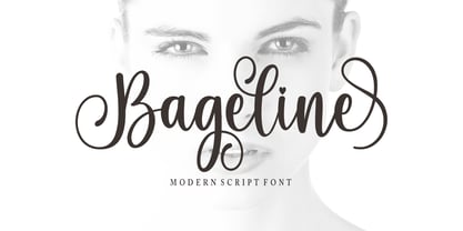 Bageline in a beautiful handwritten style. Equipped with 300 glyphs. Bageline is perfect for branding projects, home appliance design, product packaging, use in business cards, invitation cards, etc. Simply as a stylish text overlay onto a background image or anything that requires a touch of elegance.
 - Little Bosquee by Doehantz Studio,
$12.00 Little Bossque is a modern sans serif family. Its variety of weights provide a range of choices that will help you find the best typographic color for your project. Lighter weights are well-suited for body text while heavier ones are ideal for high impact headlines