10,000 search results
(0.057 seconds)
- Sam Suliman by K-Type,
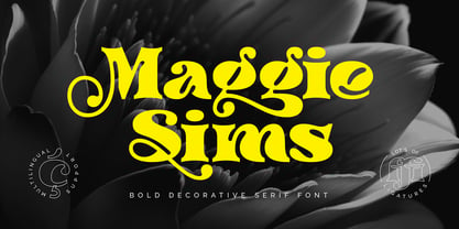
$20.00 - Maggie Sims by Gleb Guralnyk,
$15.00 - SST Japanese by Monotype,
$236.99 - SST Thai by Monotype,
$67.99 - STM Lovebug by Ziwoosoft,
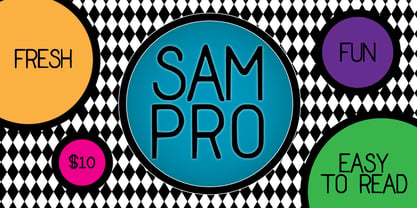
$33.00 - Sam Pro by Throndsen,
$10.00 - SST Vietnamese by Monotype,
$67.99 - SST Hebrew by Monotype,
$67.99 - Gotham Nights - Unknown license
- Gothic Gothic by Typeco,
$29.00 - a sogra Ruth - Personal use only
- A Lolita Scorned - Unknown license
- a Arena Graffiti - 100% free
- Get A Grip - Unknown license
- a bug's life - Personal use only
- A Charming Font - Personal use only
- Bric-a-Braque - Unknown license
- a Morris line - Unknown license
- Pabellona (A) Símplex - Personal use only
- In A Flash - Unknown license
- A La Nage - Unknown license
- A La Nage - Personal use only
- GOST type A - Unknown license
- A Lolita Scorned - Unknown license
- etch a sketch - Personal use only
- Mad a Fraf - Unknown license
- BEER02-A CROSS - Unknown license
- A Hundred Miles - Personal use only
- Oil Crisis A - Unknown license
- a picture alphabet - Unknown license
- Letter Set A - Unknown license
- Seized Future A - Unknown license
- Chunk-a-Chip - Unknown license
- A to Z - Unknown license
- A T & Love - Personal use only
- Blufunken (side A) - Unknown license
- A Little Pot - Personal use only
- Geek a byte - Unknown license
- Rock-A-Billy - Unknown license
- KR A Round - Unknown license


