10,000 search results
(0.026 seconds)
- Etewut Sans by Etewut,
$29.00 Etewut foundry proudly presents Etewut sans family. It includes 20 font styles and each of them supports extended Latin, basic Cyrillic and modern Greece languages. Styles variety is from formal and bold to italic and decorative. More of all there are many ligatures and alternative symbols in each font. And finally the typeface has minuscule letters and numbers!
 - San Giuseppe by Mans Greback,
$59.00 San Giuseppe is a serif font with finesse and unique charm. Inspired by the romantic, ornate style of the Victorian era and the bold, captivating geometry of Art Deco, San Giuseppe is the perfect blend of neo-classic and vintage aesthetics. This serif font family is designed to infuse your work with an air of grace and refinement that is sure to leave a lasting impression. Ideal for wine labels, luxury branding and high-end packaging, San Giuseppe is an all-capitals font, featuring a stunning array of alternate characters that allow you to create a truly bespoke typographical experience. With its fine, intricate serifs and delicate, artistic letterforms, this font is a testament to the beauty and craftsmanship of yesteryear, created for a modern setting. The San Giuseppe font family consists of six high-quality styles: In addition to the Regular font, it is provided in both Bold and Light, and each of the weights as Italic. The font is built with advanced OpenType functionality and has a guaranteed top-notch quality, containing stylistic and contextual alternates, ligatures and more features; all to give you full control and customizability. It has extensive lingual support, covering all Latin-based languages, from Northern Europe to South Africa, from America to South-East Asia. It contains all characters and symbols you'll ever need, including all punctuation and numbers.
 - Artis Sans by Wiescher Design,
$30.00 »Artis« is the name for my latest art-project-font. Obviously I just chopped off the last »t«. Then I looked it up on Wikipedia and what do you know, it is of latin descent. »Ars Gratia Artis« which means »art for arts sake« or in French »l’art pour l’art«, a perfect font name. If I would cut off the »s« as well it would mean disambiguation and that in turn is, what I just did here. Enough disambiguation! »Artis« is a modern classical beauty with extreme contrast between up- and downstrokes that make it unique with a touch of art deco and showing Renaissance roots. But – »Artis« is a twin-font that has an elegantly decorated twin sister »Artis-Swing«. Between the 2 fonts you have endless possibilities for combination. I love these twins! It is a great everyday workhorse with seven weights from ExtraLight to Bold and all the necessary weights in between. Great for short copy and elegant headlines! With 879 Glyphs it is a truly European font designed for all Central European and Latin using countries. »Artis« has a set of Cyrillic that is – besides Russia – also good for Serbia, Macedonia and Ukraine. It has oldstyle- and lining-, tabular- and tabular-oldstyle-figures and many ligatures. »Artis« comes in Sans and Swing and is an elegant, playful and friendly font. Enjoy!
 - Sky Sans by AVP,
$29.00Sky Sans is a companion to Sky Serif. The six weights provide extreme variations and great flexibility making it useful for reports and newsletters where a mix of weights can be used to create color. - Bric Sans by Nootype,
$35.00 Bric Sans is squared, it was inspired by colleges typefaces. Capitals aren't contrasted, giving a raw aspect to this typeface. The variety of styles makes this sporty typeface ideal for editorial projects, posters, packaging, branding, etc… The default setting of the numerals is tabular, proportional figures are available through OpenType Features. Bric Sans consists in a 12 styles family, including 6 weights in Condensed from UltraThin to ExtraBold. Each font includes OpenType Features such as Proportional Figure, Tabular Figures, Numerators, Superscript, Denominators, Scientific Inferiors, Subscript, Ordinals, automatic arrows and Fractions. The fonts have an extended characters set to support Central, Eastern and Western European languages.
 - Seol Sans by Monotype,
$187.99 The Seol Sans design offers a fresh palette for designers working with the Korean alphabet, particularly those looking to pair Latin and Korean alphabet (or Hangul) forms without creating typographic friction. The choices for Hangul fonts that work well with humanist Latin typefaces are limited. As Monotype’s first original Korean design, the Seol Sans typeface is a humanist take on the traditional rigid and hard designs of Hangul characters. The Seol Sans design more closely resembles the natural curve of hand-written characters. Seol Sans features Neue Frutiger for its Latin glyphs, and works harmoniously with Neue Frutiger World and Monotype’s CJK typefaces: Tazugane Gothic (Japanese) and M XiangHe Hei (Chinese). Seol Sans is a great choice for global brands using a Sans Serif design looking to maintain their visual identity, and communicate with a consistent tone of voice in the Korean market. Seol Sans has over 18,000 glyphs, and supports the Adobe-Korea1-2 and KS X 1001:2004 character sets.
 - Bommer Sans by dooType,
$30.00Bommer Sans is a warm and friendly type with a distinguishable look. It has been designed to add our twist to the flavour of English humanistic sans serif typefaces. Bommer Sans works like a charm for editorial, headlining, exhibition, signage and wayfinding projects. The big x-height and ascenders close to cap height favor tighter interlinear spacing. The ‘Q’ tail, resting on the baseline, is an invitation to play vertical, stacking lines of caps. Curved strokes on the ‘i’, ‘k’, ‘l’, ‘K’ and ‘R’ bring a friendly touch without compromising the sturdy structure, a marked characteristic of the design of the figure set. With seven weights in the upright and its matching italics, Bommer Sans has 14 styles and is part of the Bommer family. Check Bommer Slab for a great companion! - Xenois Sans by Linotype,
$29.99 “Drawing letters is my passion,” says Erik Faulhaber, the designer of the Xenois typeface family. Pronounced “zeeno-is,” the design distills character shapes into what Faulhaber believes are their purest forms. “I studied many typefaces, carefully examining their structure, before I began drawing Xenois. Then I actually wrote out a detailed design brief establishing the goals for my design.”
 - Soin Sans by Stawix,
$30.00 Soin Sans is a geometric sans-serif typeface inspired by the design of Futura. (All packages including OTF & TTF file format) Soin Sans Pro Version : http://www.myfonts.com/fonts/stawix/soin-sans-pro
 - Petrov Sans by Fontfabric,
$35.00 Petrov Sans Font Family is a font with a geometric approach that is out of this world. Featuring 9 uprights and 9 italics, Petrov Sans Font Family is a versatile typeface that will elevate any design project. Developed by the talented type designer Asen Petrov, finished by our own Stefan Yatanski and with the support of the CEO of Fontfabric – Svet Simov, Petrov Sans is the perfect blend of tradition and innovation.
 - Kathleen Sans by ActiveSphere,
$30.00 Kathleen Sans is a geometric sans-serif display font and works best in text and display applications, such as posters, headline, magazine, logos, titles, product branding, corporate branding and publishing. The Kathleen Sans font family has three weights: Light, Regular, and Bold, each available in italic, making a total of six styles. Each style has a full upper and lower-case, accents, punctuation and a selection of monetary symbols.
 - Lisboa Sans by Vanarchiv,
$35.00 This humanist sans-serif typeface was exhaustively designed, full-featured typeface family that reveals its character and distinctiveness in complex settings. It features a large complement of ligatures, lining and old-style figures, expert characters, dingbats (arrows, brackets, and symbols for both Regular weights). Lisboa Sans lacks the hook-head terminals, but its structure and proportions are the same. The simplicity of the sans weight created very strong readability at small sizes. After ten years from the first version publication, this new version (0.2) is available with Latin (Western, Central Europe) and Cyrillic alphabets. It was selected by Our Favorite Fonts of 2005 (Typographica).
 - House Sans by TypeUnion,
$30.00 House Sans is a 100 style super-family made up of 5 widths, 10 weights plus matching italics in two design approaches through stylistic alternates to the E, F, L and e characters. The weights range from compressed to expanded, from thin to heavy creating a plethora of styles to create with. House Sans has a unique visual structure to key glyphs such as the A, M & Y that give the font a stand out feel while the contrasting horizontal bars provide a nice balance. The compressed weights are great for fitting in tight spaces whilst the Heavy styles are perfect for standing out from the crowd. The font features extensive support for European and Cyrillic languages, stylistic and discretionary ligatures, plus superiors, inferiors and fractions.
 - Hiroshige Sans by Linotype,
$29.99Hiroshige was designed in 1986 by Cynthia Hollandsworth (now Batty) of AlphaOmega Typography, Inc. The typeface was originally commissioned for a book of woodblock prints by the great nineteenth-century Japanese artist Ando Hiroshige, whose work influenced many Impressionist artists. The typeface has a gentle calligraphic flair that creates an interesting page of text as well as elegant headlines. - Gringo Sans by Volcano Type,
$29.00Gringo is a type family that contains 27 different varieties. It is divided into three groups: Sans, Slab, and Tuscan = Europe - Texas. Due to its consistant structure, the single groups can be mixed as you wish. Furthermore every variety comes in Light, Medium, and Bold. There are three widths, from Narrow to Wide. Additionally, there is also a Dingbats font. The concept of Gringo is a fusion and a merging of type cultures to cross borders and create something new. Gringo won 3rd place in the "tdc2 2006 award" by the Type Directors Club New York. - Vayu Sans by Gunjan,
$49.00 Vayu(air) Sans is light typeface family. The complete family design comes with 9 weights and 9 matching italics. The fluent functionality of Vayu(air) is created keeping in mind contextual and stylistic alternatives. Which perfectly suits all areas of graphic design such as branding, identity design, especially digital use. It works great for web, corporate as well as editorial design. The standard numerals set encompasses figures and symbols, numerators and denominators, plus fractions. Approach of this typeface is to introduce light weight family. Thin master weight is 5 point size. Designed keeping in mind all kinds of scales and purposes of design aspects.
 - Harmonia Sans by Monotype,
$34.99 The Harmonia Sans™ typeface is a fine blend of contemporary geometric sans serif lettershapes and classic calligraphic proportions. Jim Wasco, who was aided by George Ryan in the production of the typeface family, began the design of Harmonia Sans with a single goal in mind. "I wanted to create a simple and legible typeface by pulling the best aspects of classic geometric sans designs, such as Futura and ITC Avant Garde Gothic," Wasco explained. The result is a design suitable for virtually all typographic applications, from text on low-resolution displays to high-resolution print and even architectural signage.
 - Corporative Sans by Latinotype,
$26.00 Corporative Sans typeface is developed by Latinotype Team. Corporative Sans is the new version of Corporative. This font has a marked personality and distinctive traits, what makes it suitable to be used at large text sizes. Since it is a condensed font, it can also be used in smaller sizes. Corporative comes with the Latinotype’s standard set of 350 characters, making it possible to use the font in 128 different languages. Corporative provides users with a wide range of characters, weights and widths for every project. By combining different variants, designers can achieve the best results. The family consists of 64 fonts: a basic family that includes 8 weights plus italics, an alternative family of 8 weights with matching italics and 2 condensed families, one regular and one alternative, both with italics. Latinotype has added new faces to its team. Latinotype Team now comprises: Rodrigo Fuenzalida, César Araya, Bruno Jara, Luciano Vergara and Daniel Hernández. Corporative was created by Latinotype Team and developed by Javier Quintana, Rodrigo Fuenzalida and César Araya, under the supervision of Luciano Vergara and Daniel Hernández.
 - Handy Sans by MADType,
$21.00 Handysans is a happy hand drawn sans face.
 - Island Sans by BA Graphics,
$45.00A beautiful face that really works well for any application a distinguished clean look. Headlines, subheads and text anything goes. Will also work as a bolder version of California Sans. - Alma Sans by Great Scott,
$22.00 Alma Sans is a low contrast sans-serif based on simple geographic shapes. It has friendly demeanor with rounded edges and curved ears & spurs. Alma Sans is available in 5 weights. Supports 28 languages: Afrikaans, Albanian, Catalan, Croatian, Czech, Danish, Dutch, English, Estonian, Finnish, French, German, Hungarian, Icelandic, Italian, Latvian, Lithuanian, Maltese, Norwegian, Polish, Portugese, Romanian, Slovak, Slovenian, Spanish, Swedish, Turkish, Zulu.
 - Querino Sans by Mans Greback,
$59.00 Querino Sans is an extra-bold sans-serif font, created by Måns Grebäck during 2018 and 2019. It comes as a regular, upright version and as italic. The font is multilingual and has an extensive range of glyphs; it supports all Latin-based European languages, contains numbers as well as all symbols and characters you'll ever need.
 - Kiva Sans by Kosinsky,
$30.00 Kiva sans - it is a modern grotesque with open forms and visible contrast. The font is built according to the experimental principle, which, to some extent, makes it stand out. Perfect for both small text and headings. The font supports Cyrillic and Latin. Developed in 2021.
 - Wanderly Sans by BeckMcCormick,
$16.00 Introducing Wanderly Sans - Wanderly Sans is a sleek, modern font. Its contemporary aesthetic makes it a perfect fit for effortlessly designing logos & branding, elegant paper products like wedding invitation suites, or for displaying content on your website. Wanderly Sans can also be used for other print design like magazines and flyers or printed marketing materials. This font can also be used for digital marketing materials and social media items! Wanderly Sans includes: - full upper + lowercase characters - numbers + punctuation - 10 alternate characters - A, E, K, M, N, P, R, f, j, t - PUA-encoding Extensive Language Support: Western European, Central European, South Eastern European, South American, Oceanian, Vietnamese, Esperanto Wanderly Sans can be used with graphic design programs such as Illustrator or Photoshop, word processing programs like Pages or Word, Design Space, Silhouette, Procreate, Canva Pro, Glowforge, GoodNotes, & more. This font is an installable for desktop & laptop machines, as well as iPads or iPhones. See below for links to help with installation.
 - Neutraliser Sans by HamburgerFonts,
$20.00 The Neutraliser family is a versatile collection of geometric-based fonts with 24 styles. The 6 Alternate styles are suitable for headlines and are complemented by the Sans and Serif styles suitable for small amounts text. The Caps styles allow for extra typographic variation within the family. Neutraliser is a direct result of the designer's initial exploration of typography and is uncompromising in its geometric nature. As the name suggests, the typeface celebrates the precision of the digital medium as a drawing tool in which the critical points that make up a letterform can be almost ‘plotted’ according to a grid-based logic.
 - Boring Sans by Zetafonts,
$39.00 Boring Sans, designed by Cosimo Lorenzo Pancini, is a typeface family designed along two variable axis: weight and weirdness. These two parameters allow designers to explore a full range of variations on sans serif design, starting from a neutral set of proportions and evolving to a strongly contrasted and dynamic treatment, ready to raise eyebrows on social media. The basic "A" subfamily, developed in in five weights plus italics, behaves like a traditional, solid workhorse sans serif, with finely tuned proportions for optimal readability and minimal emotional impact. The "B" subfamily, developed in the same ten weights, shows a more contemporary "brutal" approach, with slanted lines, deep inktraps and stronger contrast. All these features are brought to the extreme in the ten weights of the "C" subfamily, with each letter a bombastic show of exhuberant weirdness. Each of the style variant is developed in five weight with matching italics, with a glyph set covering extended latin languages and including many alternate forms and stylistc sets. For control freaks the family package includes two variable font versions that allow fine tuning and control of the design options.
 - Nokio Sans by TypeUnion,
$25.00 Nokio Sans is a clean, minimalist sans serif typeface designed by TypeUnion. The font incorporates clean lines and curves to produce a structured typeface with a subtle playfulness. Nokio Sans is made up of 5 weights + italics and also features an alternate font that uses more traditional character structures to offset the playful original. Nokio Sans is built for multiple uses, from digital applications such as Apps and Websites to logotypes and print applications.
 - Perspective Sans by Bülent Yüksel,
$29.00 The font primarily had a strong body. Family has a four layered experience. All and in harmony. This font has a strong personality, that makes it perfect for use in headline sizes. Also use for print, motion graphics, logo design, packaging design, t-shirts and more. By using layers, you can design different colors and sizes by repositioning lights and shadows. This will allow you to take your designs to the next level. Using this unique font, you'll have a lot of fun and produce beautiful materials. You can contact me at buyuksel@hotmail.com, pre-purchase and post-purchase with questions and for technical support. There is nothing as satisfying as to do a good quality and properly job. You can enjoy using it.
 - Storm Sans by Monotype,
$29.99 - Rig Sans by Jamie Clarke Type,
$25.00 Rig Sans is a streamlined geometric typeface, that speaks in a confident, affable tone. Its open, clean structure lends text a neutral, transparent quality. Distinct features enable Rig Sans to thrive, both in print and on screen: Minimalist Design Terminals clipped at 90º Generous x-height Wide apertures Distinct I,l,1 (uppercase i, lowercase L, Number 1) Rig Sans’ sturdy characters produce text settings with excellent clarity and readability. Their shape has been adapted from robust letterforms originally designed to withstand 3D distortions. This unique approach has resulted in an original sans serif rendition and an adaptive, durable type family. Rig Sans is comprised of eight weights and accompanying italics. Each weight contains 514 glyphs. OpenType features include: Alternate characters Three figure styles All caps punctuation Fractions Ordinals Superscript Subscript
 - Fregata Sans by Estudio Calderon,
$14.99 A modern and funny pack with 4 handmade script and sans fonts that started in the sketchbook and finished in the computer. Fregata has a unique and beatiful look to be used in many design projects as: cover books, labels, logos & branding, advertisements & product design. When you get this pack you will receive 4 font files, designed to work as perfect companions or simply as strong standalone typefaces. Fregata Script Inline: A unique style with a different look thanks to the line that connects the whole typographic system. Fregata Sans: Includes 3 handmade fonts variables (Fregata Sans 1, Fregata Sans 2, Fregata Sans 3) with small rounded serifs making it a modern and fun typography. Fregata is equipped with ligatures and all stylistic alternates, extended character set to support Central and Eastern European as well as Western European Languages. That's it! I really hope you enjoy it, and please don't hesitate to send us a message if you have any comments or questions. Enjoy Fregata!
 - Logo Sans by Emily Lime,
$16.00 Logo Sans is a clean, geometric sans-serif created with an obvious use in mind - logos (although quite suitable for longer texts as well). It is a clear, easy to read font that comes in a variety of weights & italics ...allowing for pleasing logo design combination and marketing pieces. Its wide characters and linear lines have a very modern, luxurious appeal. The family includes 5 weights...plus italics - for a total of 10 fonts.
 - Winner Sans by sportsfonts,
$19.00 Winner Sans™ and Winner™—Classic athletic aesthetics, finally as a versatile contemporary super family. Just when you thought there was nothing left to add to the classic sports design, we lifted it to a whole new level. Whatever you want to set in whatever space, with seven weights in seven widths both with or without serifs, you’ll definitely find the right proportions for it! Winner Sans supports not only most Latin-based languages but also Greek. Its extensive character set also contains currency signs, arrows, as well as a wide range of numerals from small figures to Roman numerals. Furthermore, its sophisticated OpenType layout features give you access to alternative letter shapes, fractions, tabular figures, and contextual alternates. With more than 24,000 glyphs in 49 fonts, Winner Sans leaves nothing to be desired. Grab Condensed Regular for free and give it a spin! (Stadium illustrations by Oskar Strauß)
 - Nova Sans by This is Not Typography,
$29.00 NovaSans is a modern geometric sans-serif font which captures the spirit of Bossa Nova, a noble Brazilian music style. Music and typography presents several things in commom, so the idea behind the font is show some of bossa nova’s characteristics, like melody, cadence, softness, metric, simplicity, waves, subtleties. Some gaps in representing the source of irregular alignment scores. NovaSans also was selected for Tipos Latinos Bienal, in the Display faces category. NovaSans was built with a modular system. Its whole set offers almost 280 glyphs with alternates, dingbats and ornaments. Conceived to be used as a display typeface, NovaSans is recommended for use at large sizes.
 - Civic Sans by CozyFonts,
$25.00 A Clean Sans Serif font family with a few stylish glyphs to give extra character e.g., L-R-Q-Z-W-g-t. Usage: Any applications is appropriate especially signs, directions, posters, graphics and use especially in Ads and billboards. There's 13 font variations in Civic Sans Font Family.
 - Framer Sans by 23-Jun,
$35.00 Framer Sans is sans-serif condensed type-family, created by June 23 Foundry. It is a geometric, lightly robust, simple and clean font, with a low contrast width. Framer Sans perfectly conforms to the ever-increasing demand for a diverse set of weights and additional support for non-Latin languages. The type system consists of 7 weights that for the clarity and users convenience is labelled with numbers from 100 to 700 (100 for “Thin”, 200 - “Ultra-Light”, and so on till 700 for “Bold”). It supports full Latin (European) character set, as well as Turkish, Vietnamese, Greek (basic) and Cyrillic languages. Framer Sans includes alternate characters, ligatures, symbols and 253 country codes that perfectly expand the design’s capabilities. Numerals contain six figure sets and Roman numbers. The variety of choices is expanded with additional stylistic sets for lowercases "a" and "g", as well as 3 stylistic sets for Latin uppercases with crossbars and letter “Q”.
 - Clasica Sans by Latinotype,
$26.00 Clasica Sans is a fresh and contemporary typeface, consisting of 7 standard fonts plus italics. It is perfect for publishing and print design. Clasica Sans comes in various weights, working well into paragraphs with small and large text sizes. Regardless of its use, size or alignment, the family keeps a solid look, thanks to its balanced contrast. In short, it is a font based on classical proportions, but with a fresh and contemporary look, ideal for the most versatile designs.
 - Golger Sans by Maulana Creative,
$16.00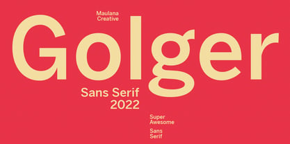 Golger Sans is a Classic Contemporary Sans serif. With bold weight stroke and fun character with a bit of ligatures. To give you an extra creative work. Golger Sans font support multilingual more than 100+ language. This font is good for logo design, Social media, Movie Titles, Books Titles, a short text even a long text letter and good for your secondary text font with script. Make a stunning work with Golger Sans font. Cheers, Maulana Creative
 - Genora Sans by Pixesia Studio,
$19.00 Introducing Genora Sans - Geometric Sans Serif Genora Sans is a clean and geometric sans serif font. Genora Sans comes in a modern style featuring 9 weights and 18 styles from Thin to Black, making it easy to adapt to your design. The typeface is ideal for corporate identities, branding, publishing, websites, titles, books, magazines, business cards, logos, product labels, packaging, or any kind of advertising purpose and use on UI/UX design. Hope you Like it. Thanks.
 - Comic Sans by Microsoft Corporation,
$49.00The Comic Sans® typeface, one of Microsoft's most popular designs, has received a makeover courtesy of Monotype Imaging. The company has introduced the four-font Comic Sans Pro family of typefaces. Featuring elements such as speech bubbles and cartoon dingbats, Comic Sans Pro extends the versatility of the original Comic Sans, designed by Vincent Connare for Microsoft in 1994. Hats off to Monotype Imaging for enlivening Comic Sans and getting it back to its roots as a comic book lettering face. Now everyone can write with more panache - and look even more like a pro using swashes, small caps and other typographic embellishments," said Connare. "Every day, millions of people rely on Comic Sans for countless applications ranging from scrapbooking to school projects," said Allan Haley, director of words and letters at Monotype Imaging. "Comic Sans is also a favorite in professional environments, used in medical information, instructions, ambulance signage, college exams, corporate mission statements and executive reprimands - even public letters from sports team owners to their fans. Breaking up with your spouse? Why not write a letter in Comic Sans Pro, embellished with a typographic whack!, pow! or bam! Comic Sans is everywhere, and now it's even better." The Comic Sans Pro family includes regular and bold fonts, in addition to two new italic and bold italic fonts drawn by Monotype Imaging's Terrance Weinzierl. "Our aim is to put the 'fun' back in 'functional.' We can't wait to see Comic Sans Pro used in everything from second wedding announcements to warning labels," said Weinzierl. "Long live Comic Sans!" Comic Sans Pro contains a versatile range of typographic features including swashes, small caps, ornaments, old style figures and stylistic alternates - all supported by the OpenType® font format. OpenType-savvy applications, such as Adobe® Creative Suite®, QuarkXPress® or Mellel™ software are required to access these features. Comic Sans Pro can also be used in new versions of Microsoft® Office including Microsoft Word 2010 and Microsoft Publisher 2010. In addition, Comic Sans Pro includes a set of ornaments and symbols, including speech bubbles, onomatopoeia and dingbats, pre-sized to work well as bullets."