10,000 search results
(0.046 seconds)
- Belong Sans by Brenners Template,
$19.00 The features of Belong Sans are that it has both readability and uniqueness. It touches to achieve uniqueness while conforming to the structure of the Sans Serif system. These harmonious intersections of the acclimations and deviations were applied to these fonts. As a result, these fonts can be used beautifully in any body and text area, not just the logo or title. In addition, circled glyphs will show originality in various emphasis and bullet areas. Convenience and creativity for professional designers will be shown up in various fields such as the editorial or APP design business.
 - Generisch Sans by Akufadhl,
$29.00 Generisch - a german equivalent of generic - sans serif typeface has gain its own place among designers and earn such popularity due to its "simple" design. Generisch is influenced by early grotesk typefaces from early 1900's when sans was starting to get popular and used as a body type. Some old ligatures such as ch ck and ng are present in generisch (not the ct and st tho), old style numeral for better typesetting experience and more.
 - Autorich Sans by Typia Nesia,
$20.00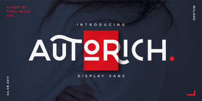 Autorich Sans is a display sans font, comes with 2 set of upper case (allcaps), 58 ligatures and some alternate. Great for brand identity, poster design, website / display, editorial, and more. **FEATURES :** * Basic A-Z * Numbers * Symbols * Stylistic Alternates * Standard Ligatures * Discretionary Ligatures * Oldstyle Figures * PUA Encode * Multilingual support Thank you for your purchase! and hope you're having fun with Autorich Sans ! Happy creating! Typia Nesia Studio
 - Revla Sans by Eclectotype,
$40.00 NEWSFLASH! Revla Sans is now available specially tailored for smaller settings. Take a look at Revla Sans Text ! Meet Revla Serif 's dorky younger brother, or should that be brothers? Revla Sans is a grotesque companion to Revla Serif, in four weights. The weights can be used pretty easily as grades, so that text set at different sizes has similar thickness. The contextual alternates engine from its serifed sibling is used to pseudo randomise the text and avoid the monotony of repeating glyphs. Other features include case sensitive forms, standard and discretionary ligatures, stylistic sets and automagic fractions.
 - Clear Sans by Positype,
$29.00 Clear Sans™ is a… wait for it… rational geometric sans serif. It is intended to fill a niche… to provide an alternative to the somewhat based-on-vernacular signage, somewhat geometric sans. I hear the word vernacular thrown around too much and too loosely. If a typeface is based in the vernacular, based on hand-painted or hand-crafted signage, then it should be based on the movements of the hand, retain that warmth and not on a pretty geometric model. For me, clean, geometric and precise doesn't have to be cold and expressionless. The original skeleton was hand-painted in 2008 to help determine and inform my decisions going forward. The typeface was completed shortly afterwards at the behest of an old friend for their identity. As usual, I expanded it, but considered retiring it since there were so many things similar out there. Years later, I had a chance to rediscover it and came to the conclusion that it could be improved, expanded in a logical and useful way, and introduced. I would be lying if I didn't admit that the rise of webfonts and embedded type in applications influenced many of the decisions I made about reworking Clear Sans™. Completely new Text and Screen fonts were developed that utitlize larger x-heights, space-saving widths, logical (and simplified) weight offerings… to name a few alterations. Even the pricing of each variant was considered to produce a more reasonable and simple solution for the developer, designer, professional and novice. Clear Sans™ is a departure from my previous sans serifs, but the influences of Aaux Next, Akagi Pro and Halogen are evident. Enjoy a light-hearted mini-site devoted to Clear Sans™
 - Latitude Sans by Stiggy & Sands,
$24.00 An Uber-Black Sans Serif with a Warm Personality Latitude Sans began as a digitization of a film typeface from LetterGraphics known simply as "Free". The original specimen included standard Capitals and Lowercase, Numerals and minimal Punctuation, a bare bones character set. We've fleshed out the Latitude Sans typeface to include a full standard character set, an extended international set, and more so it can be a strong heavyweight sans typestyle. See the last graphic for a comprehensive character map preview. Opentype features include: - Full set of Inferiors and Superiors for limitless fractions. - Tabular, Proportional and Oldstyle figure sets. - Ligatures for a collection of "f" paired sets: fi, fl, ft, ffi, ffl, etc. Approx. 652 Character Glyph Set: Latitude Sans comes with a glyphset that includes standard & punctuation, international language support, and additional features.
 - Kumo Sans by EchadType,
$10.00 Kumo Sans is a clear and comprehensible font stylized to mimic marker pen handwriting. The idea was to interpret swift and negligent hand movement in a distinct and easy to read familiar glyph silhouette. Family comes in three weights and italic slant option. Shadow version with outline and shadow effect is perfect for short catchy phrases, brand names and headlines use. Font contains Latin diacritics, Hebrew cursive writing, Bitcoin, Indian Rupee, New Israeli Shekel symbols, fractions etc.
 - Flavor sans by 4RM Font,
$18.00 Suitable for use in casual themed design applications, this font is made with a unique shape and condensed width, as well as a strong authenticity value.
 - Charlotte Sans by ITC,
$29.99Although designer Michael Gills was influenced by 18th century French type designer Pierre-Simon Fournier, Charlotte is best described as a modern roman typeface. Its clean cut style, accentuated by a strong vertical stress and unbracketed serifs, exudes an authoritative tone, guaranteeing its effectiveness for almost all text setting applications, but especially where a formal unmannered appearance is desired. - Moveo Sans by Green Type,
$46.00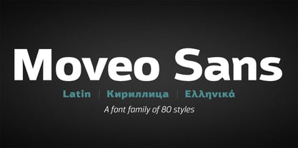
- Munich Sans by Eldertype Studio,
$13.00 Munich Sans is minimalist and modern sans serif font. This font fits in any project. You can use it for a title, logo, quotes, or as a pairing in any script font. It is inspired by minimalist and geometric forms. This font creates modern minimal style. This font also supports multi-language!
 - Monolith Sans by ABC Types,
$45.00 - Grey Sans by J Foundry,
$15.00 A grotesque with an angular design.
 - Metro Sans by Studio Few,
$12.00 The result of a study into the Paris Metro system; Metro Sans is a Grotesk typeface with personality. It bridges the gap between the stern terminals of a Swiss Neo-Grotesk, and the smooth curves of a modern day Geo-Grotesk. The two combine to give a versatile typeface that works well in both body and display weights.
 - Marat Sans by Ludwig Type,
$45.00 Marat Sans is a clean and lively sans serif typeface designed by Ludwig Übele. It is characterized by excellent legibility and suits a wide range of typography. The entire family contains 27 styles & weights and includes many OpenType features: various numerals, alternate glyphs, fractions, superiors and inferiors, language features, arrows, case sensitive forms and many more. Marat Sans is the perfect companion for Marat, a soft and elegant serif typeface.
 - Moneta Sans by Monotype,
$28.00 Moneta™ Sans is an elegant transitional sans-serif with high contrast. Its morphology is based on the study of traditional broad-edge pen script. It comes in 2 styles and 4 different weights (Light, Regular, Bold and Black) and has variable features. Designed by Santi Rey and launched on May 2020.
 - Option Sans by T-26,
$29.00 - Simpo Sans by Zenmurai,
$25.00 Simpo Sans is a family of ten sans serif fonts. It's my second font design project. It's safe to say Simpo Sans has quite different features compare to my last work CHAOS . Right from the start, my ambition was to take the rounded corner elements into characters & glyph and use them to make something smooth.
 - Myers Sans by T-26,
$19.00 - Brix Sans by HVD Fonts,
$40.00 It took Hannes von Döhren and Livius Dietzel two years to develop and complete the Brix Sans family – the companion of the well-known Brix Slab . The approach was to design an independent type family following the rules of the “Sans-Serif” genre, harmonizing with its older sister Brix Slab from the “Slab-Serif” genre. The result is a family of 6 weights with matching italics, which works perfectly for corporate design & editorial design. Combined with Brix Slab, high and complex typographical challenges can be solved. The Brix Sans OpenType fonts feature small caps, five variations of numerals, arrows and an extended character set to support Central and Eastern European as well as Western European languages.
 - Militia Sans by Canada Type,
$24.95Militia Sans is the sans-serif version of Militia. A heavy sans serif with very distinct stenciling, Militia Sans is ideal for strong designs that settle for nothing less than total obedience. A few alternates are sprinkled throughout the character set. Militia Sans comes in all popular font formats, and offers a full range of Latin support, including Western, Eastern and Central European languages, as well as Baltic, Celtic/Welsh, Cyrillic, Esperanto, Greek, Maltese, Turkish, and Vietnamese. The Open Type font is entitled Militia Sans Pro, and contains class-based kerning. - Potato Sans by 4RM Font,
$9.00 Made with a cute shape, making this font suitable for use in graphic designs related to unique things. This font is available in 2 styles namely bold and black.
 - Arpona Sans by Floodfonts,
$49.00 Arpona Sans is a contemporary sans serif family inspired by the work of Edward Johnston and Eric Gill for London Underground. As well as its serif companion Arpona it is a symbiosis of different design concepts. Arpona Sans combines the esthetics of a geometric Sans with the usefulness of the humanist concept and the calm of the modernist proportions. Arpona Sans is a good choice for editorial design, branding, app design and web design – a workhorse well readable even in running text on screen. The family has nine weights, ranging from Thin to Black plus corresponding italics. Each style includes 590 glyphs supporting all western-, eastern- and central-european languages including four sets of figures and various currency symbols. If you want to go into details visit the microsite: https://www.floodfonts.com/arponasans
 - Moyenage Sans by Storm Type Foundry,
$55.00Moyenage is a modern replica of blackletter. Whereas the calligraphic typeface family can be used in shorter texts and posters, the sans-serif variation is rather experimental project which may find its use on music cover design, occasional lettering and invitations. - KyivType Sans by Dmitry Rastvortsev,
$- KyivType Sans is a part of the KyivType superfamily, consisting of three subfamilies: Sans, Serif and Titling. Also available KyivType Variable superfamily. Initiated by Projector, Dmytro Bulanov Creative Büro, and Banda Agency for Kyiv city (Ukraine) identification and promotion. Freeware. Fonts are free for commercial and non-commercial use. More at Behance.
 - Vekta Sans by Positype,
$22.00 The Vekta Type System is part of a larger, interconnected grouping of 3 families: Neo, Sans and Serif. The goal was to develop a family designed along a common skeleton and matrix that would allow for interchangeable usage along a cohesive visual system. It's About The Personality. Interchange type families to be as expressive as you want to be. Let the piece you are designing constrain your usage and not the typeface.
 - Mato Sans by Picador,
$29.00 Legible and dynamic shape, tons of OpenType options, different scripts – that’s Mato Sans. Difficult small size, long text in Vietnamese, huge heading in Russian or table full of figures to create? It’s not a problem with this family. There are over 2000 glyphs in every weight with such features: superscript and subscript characters, tabular lining and old style figures, small caps, fractions, arrows or even case sensitive parenthesis. Mato Sans was designed for use in Latin as well as in Cyrillic script. Every font contains an extended set of Cyrillic characters including special, local glyphs for Bulgarian, Macedonian and Serbian.
 - Etewut Sans by Etewut,
$29.00 Etewut foundry proudly presents Etewut sans family. It includes 20 font styles and each of them supports extended Latin, basic Cyrillic and modern Greece languages. Styles variety is from formal and bold to italic and decorative. More of all there are many ligatures and alternative symbols in each font. And finally the typeface has minuscule letters and numbers!
 - San Giuseppe by Mans Greback,
$59.00 San Giuseppe is a serif font with finesse and unique charm. Inspired by the romantic, ornate style of the Victorian era and the bold, captivating geometry of Art Deco, San Giuseppe is the perfect blend of neo-classic and vintage aesthetics. This serif font family is designed to infuse your work with an air of grace and refinement that is sure to leave a lasting impression. Ideal for wine labels, luxury branding and high-end packaging, San Giuseppe is an all-capitals font, featuring a stunning array of alternate characters that allow you to create a truly bespoke typographical experience. With its fine, intricate serifs and delicate, artistic letterforms, this font is a testament to the beauty and craftsmanship of yesteryear, created for a modern setting. The San Giuseppe font family consists of six high-quality styles: In addition to the Regular font, it is provided in both Bold and Light, and each of the weights as Italic. The font is built with advanced OpenType functionality and has a guaranteed top-notch quality, containing stylistic and contextual alternates, ligatures and more features; all to give you full control and customizability. It has extensive lingual support, covering all Latin-based languages, from Northern Europe to South Africa, from America to South-East Asia. It contains all characters and symbols you'll ever need, including all punctuation and numbers.
 - Artis Sans by Wiescher Design,
$30.00 »Artis« is the name for my latest art-project-font. Obviously I just chopped off the last »t«. Then I looked it up on Wikipedia and what do you know, it is of latin descent. »Ars Gratia Artis« which means »art for arts sake« or in French »l’art pour l’art«, a perfect font name. If I would cut off the »s« as well it would mean disambiguation and that in turn is, what I just did here. Enough disambiguation! »Artis« is a modern classical beauty with extreme contrast between up- and downstrokes that make it unique with a touch of art deco and showing Renaissance roots. But – »Artis« is a twin-font that has an elegantly decorated twin sister »Artis-Swing«. Between the 2 fonts you have endless possibilities for combination. I love these twins! It is a great everyday workhorse with seven weights from ExtraLight to Bold and all the necessary weights in between. Great for short copy and elegant headlines! With 879 Glyphs it is a truly European font designed for all Central European and Latin using countries. »Artis« has a set of Cyrillic that is – besides Russia – also good for Serbia, Macedonia and Ukraine. It has oldstyle- and lining-, tabular- and tabular-oldstyle-figures and many ligatures. »Artis« comes in Sans and Swing and is an elegant, playful and friendly font. Enjoy!
 - Sky Sans by AVP,
$29.00Sky Sans is a companion to Sky Serif. The six weights provide extreme variations and great flexibility making it useful for reports and newsletters where a mix of weights can be used to create color. - Bric Sans by Nootype,
$35.00 Bric Sans is squared, it was inspired by colleges typefaces. Capitals aren't contrasted, giving a raw aspect to this typeface. The variety of styles makes this sporty typeface ideal for editorial projects, posters, packaging, branding, etc… The default setting of the numerals is tabular, proportional figures are available through OpenType Features. Bric Sans consists in a 12 styles family, including 6 weights in Condensed from UltraThin to ExtraBold. Each font includes OpenType Features such as Proportional Figure, Tabular Figures, Numerators, Superscript, Denominators, Scientific Inferiors, Subscript, Ordinals, automatic arrows and Fractions. The fonts have an extended characters set to support Central, Eastern and Western European languages.
 - Seol Sans by Monotype,
$187.99 The Seol Sans design offers a fresh palette for designers working with the Korean alphabet, particularly those looking to pair Latin and Korean alphabet (or Hangul) forms without creating typographic friction. The choices for Hangul fonts that work well with humanist Latin typefaces are limited. As Monotype’s first original Korean design, the Seol Sans typeface is a humanist take on the traditional rigid and hard designs of Hangul characters. The Seol Sans design more closely resembles the natural curve of hand-written characters. Seol Sans features Neue Frutiger for its Latin glyphs, and works harmoniously with Neue Frutiger World and Monotype’s CJK typefaces: Tazugane Gothic (Japanese) and M XiangHe Hei (Chinese). Seol Sans is a great choice for global brands using a Sans Serif design looking to maintain their visual identity, and communicate with a consistent tone of voice in the Korean market. Seol Sans has over 18,000 glyphs, and supports the Adobe-Korea1-2 and KS X 1001:2004 character sets.
 - Bommer Sans by dooType,
$30.00Bommer Sans is a warm and friendly type with a distinguishable look. It has been designed to add our twist to the flavour of English humanistic sans serif typefaces. Bommer Sans works like a charm for editorial, headlining, exhibition, signage and wayfinding projects. The big x-height and ascenders close to cap height favor tighter interlinear spacing. The ‘Q’ tail, resting on the baseline, is an invitation to play vertical, stacking lines of caps. Curved strokes on the ‘i’, ‘k’, ‘l’, ‘K’ and ‘R’ bring a friendly touch without compromising the sturdy structure, a marked characteristic of the design of the figure set. With seven weights in the upright and its matching italics, Bommer Sans has 14 styles and is part of the Bommer family. Check Bommer Slab for a great companion! - Xenois Sans by Linotype,
$29.99 “Drawing letters is my passion,” says Erik Faulhaber, the designer of the Xenois typeface family. Pronounced “zeeno-is,” the design distills character shapes into what Faulhaber believes are their purest forms. “I studied many typefaces, carefully examining their structure, before I began drawing Xenois. Then I actually wrote out a detailed design brief establishing the goals for my design.”
 - Soin Sans by Stawix,
$30.00 Soin Sans is a geometric sans-serif typeface inspired by the design of Futura. (All packages including OTF & TTF file format) Soin Sans Pro Version : http://www.myfonts.com/fonts/stawix/soin-sans-pro
 - Petrov Sans by Fontfabric,
$35.00 Petrov Sans Font Family is a font with a geometric approach that is out of this world. Featuring 9 uprights and 9 italics, Petrov Sans Font Family is a versatile typeface that will elevate any design project. Developed by the talented type designer Asen Petrov, finished by our own Stefan Yatanski and with the support of the CEO of Fontfabric – Svet Simov, Petrov Sans is the perfect blend of tradition and innovation.
 - Kathleen Sans by ActiveSphere,
$30.00 Kathleen Sans is a geometric sans-serif display font and works best in text and display applications, such as posters, headline, magazine, logos, titles, product branding, corporate branding and publishing. The Kathleen Sans font family has three weights: Light, Regular, and Bold, each available in italic, making a total of six styles. Each style has a full upper and lower-case, accents, punctuation and a selection of monetary symbols.
 - Lisboa Sans by Vanarchiv,
$35.00 This humanist sans-serif typeface was exhaustively designed, full-featured typeface family that reveals its character and distinctiveness in complex settings. It features a large complement of ligatures, lining and old-style figures, expert characters, dingbats (arrows, brackets, and symbols for both Regular weights). Lisboa Sans lacks the hook-head terminals, but its structure and proportions are the same. The simplicity of the sans weight created very strong readability at small sizes. After ten years from the first version publication, this new version (0.2) is available with Latin (Western, Central Europe) and Cyrillic alphabets. It was selected by Our Favorite Fonts of 2005 (Typographica).
 - House Sans by TypeUnion,
$30.00 House Sans is a 100 style super-family made up of 5 widths, 10 weights plus matching italics in two design approaches through stylistic alternates to the E, F, L and e characters. The weights range from compressed to expanded, from thin to heavy creating a plethora of styles to create with. House Sans has a unique visual structure to key glyphs such as the A, M & Y that give the font a stand out feel while the contrasting horizontal bars provide a nice balance. The compressed weights are great for fitting in tight spaces whilst the Heavy styles are perfect for standing out from the crowd. The font features extensive support for European and Cyrillic languages, stylistic and discretionary ligatures, plus superiors, inferiors and fractions.