10,000 search results
(0.069 seconds)
- Xperiment Sans by Tour De Force,
$30.00 Xperiment Sans is modern sans serif font family with eccentric design. Available in 7 weights, Xperiment Sans is unique and distinctive font family with solid visual character. Specific by it's geometry and atypical combination of stem positions and letter shapes, Xperiment Sans is basically very simple by design. It's ideal for modern and unconventional projects where you're not looking for conservative approach. Modern IT companies, electro types of music, sci fi movies, contemporary package design or if you are simply looking to be different, Xperiment Sans will work perfect in the most of situations. Contains standard ligatures in extended Latin character map.
 - Glance Sans by Identity Letters,
$29.00 Geometric, stylish, and not quite a stencil face: Glance Sans is the urban alter ego of Glance Slab—a strong-willed sans-serif with no frills but a few unique character traits. Glance Sans follows the design principle of nonjoining parts that made Glance Slab successful. Some strokes may not connect to their stems, creating visible gaps and thus, a dynamic impression of balance and movement. However, Glance Sans has a calmer appearance due to the lack of detached serifs. If Glance Slab’s home territory are large, crowded stadiums and massive sports events, Glance Sans prefers streetball courts, well-used skate parks, and underground clubs. It also adapts to urban work environments from finance to high-tech. Whenever a more toned-down look is called for while retaining the elegance of an athlete, Glance Sans is ready to roll. In the city environment, versatility is key. That’s why Glance Sans sports 7 weights as well as a complete set of italics. These are not just sloped romans but individually drawn letterforms, subtly referencing classic italic construction for more effective emphasis. Among the 600+ glyphs of Glance Sans, you’ll find goodies such as six sets of figures, circled numbers, circled arrows, and all kinds of currency symbols in two stylistic versions. Glance Sans is a great tool for industrial and high-tech branding, for wayfinding systems in contemporary or modernist architecture, for corporate identities in arts, crafts, medicine, culture, and education, and for all kinds of sports-themed design. Both members of the Glance superfamily are easily and effectively combinable; both are able to stand on their own feet. With its powerful italics, you might opt for Glance Sans as your text typeface and use Glance Slab for headlines. Or you set large, clean, display-sized lines in Glance Sans and spice them up with a bit of sportive Glance Slab. It’s up to you to decide how to bring out the best in both of them.
 - Lucifer Sans by Daniel Brokstad,
$29.00 Lucifer Sans is a modern sans serif font rooted in Scandinavian geometry and minimalism, mixed with a healthy dose of black metal and irreverent attitude. Harsh vertical cuts and angles throughout the font creates a very strict and hard look, that can either be amplified or loosened up through its stylistic sets. Lucifer Sans family contains 162 font, 9 different weights and width, plus italics. In addition there are 3 different stylistic sets. This creates substantially diverse set of characters for contrasting against another and makes it a versatile font for different formats. Style 01 takes on an almost hand drawn style, while Style 02 enhances the geometric aspects of the font further. Style 03 uses only the rounded letter 01 without the hand drawn variations.
 - Picador Sans by Picador,
$29.00 Picador Sans is a modern sans serif typeface. Intriguingly condensed. Distinctively eye-catching. Interestingly well-developed. This family covers latin script – every weight has more than 1200 glyphs. The whole family consist of 10 weights and italics, small caps, superscript and subscript letters, oldstyle, tabular figures, ligatures and fractions. Picador Sans is a perfect match for the elegance of serif Praho Pro.
 - Sidra Sans by Blythe Green,
$10.00 Sidra Sans is an upper-case font with an authentic, handwritten feel. It's perfect for: logos, playful branding, greeting cards, shirts, quotes, textiles, posters, magazines, social media, planners, prints, and more. FEATURES: Consistent stroke widths for linear designs Multilingual characters for the global designer
 - ADIL Sans by Adaylife,
$25.00
- Krea Sans by Krea SK,
$32.99 The inspiration for designing this font was our company logo, that we created first. The design is influenced by a typeface called Din. The main characteristic and features are clean, minimalistic, geometric. Young playful companies and clients could definitely use this font for their branding.
 - Novecento Sans by Synthview,
$- This is of Novecento Sans, a font family inspired by European typographic trends between the second half of 19th century and first half of the 20th. It looks rational and geometric. However, it is optically corrected and balanced. NEWS: you can add a layered effect with Novecento Carved as top layer. This font face is designed to be used mostly for headlines, visual identities or short sentences, both in big and small sizes. Lighter faces provide a more contemporary and design look and feel, while the bolder ones definitely look retro. Novecento Sans family comes in 32 styles, speaks 76 latin based languages, has 590 glyphs and 16 stylistic opentype features for advanced typography.
 - Deco Sans by Alan Ronn,
$30.00This font was created while looking at the various shapes my handwriting consistently took, especially in the ways that letters would have breaks in them. Over the course of a few months I continually tweaked the letter forms and shapes, and lo and behold, I developed Deco Sans. This family currently only includes a thin weight, as I'm only one person, and very busy with college. I'm continuing work on a regular, bold, and possibly a future italic weight, but these may not be released for many months to come. As this is a very thin font, it should be used at sizes no smaller than around 16 or 18pt as it tends to get lost in whitespace, and looks best at large sizes. As such, this weight should be considered more of a display font than a text font, however, I predict a regular weight to be very readable and much more useable for the everyday. - Comenia Sans by Suitcase Type Foundry,
$75.00Comenia Sans was designed in the framework of a unique typographic project for all types of schools. It is a complementary face for Comenia Serif, released by our friends at Storm Type Foundry. Comenia Sans has a lot in common with its serif sister: the height of both upper and lower case, the length of ascenders and descenders, and the general weight. This makes the two perfect partners which work well even when set side by side in a single line of text. Comenia Sans does, however, lack all serifs, ornamental elements and stroke stress variation. All these elements freshen up the feel of long texts, but for shorter texts use, they are not necessary. Despite that, Comenia Sans retains the soft, friendly character of its big sister, as well as a few tiny details which lend it its unique character without compromising legibility or utility. Open counters give all letters an airy feel and permit enough variation in construction. This is why the face works well even in multiple-page texts. All its letters are easily distinguished from each other, so the reader's eyes are not strained. Diacritics and punctuation harmonize with both upper and lower case. As usually, all diacritical marks fully respect conventional shapes of accents and they are perfectly suitable for Czech, Slovak, Polish and other Central European languages, where a lot of diacritics abounds. Similarly to the renaissance italics which refers to the cursive forms, Comenia Sans introduces novel shapes of some characters drawing from the hand-written heritage. This is most apparent in the single-bellied a, the simplified g, and the stem of f which crosses the baseline and ends with a distinct terminal. In the text, emphasized words are thus distinguished not only by the slant of letters, but also by the shapes of the letters themselves. All twelve styles contain set of small caps, suitable for the names, in the indexes or the headlines in longer texts. Legibility in small sizes under 10 points was at the center of designers' attention, too. This is why the counters of a, e and g are large enough to prevent ink spread in small sizes, both on-screen and in print. After all, the font was specifically optimized for screen use: its sober, simple forms are perfectly fit to be displayed on the computer screen and in other low-resolution devices. When used in the context of architecture, the smoothness of all contours stands out, permitting to enlarge the letters almost without limit. A standard at the Suitcase Type Foundry, each style of Comenia Sans boasts a number of ligatures, an automatic replacement of small caps and caps punctuation, a collection of mathematical symbols, and several types of numerals which make it easy to set academic and other texts in an organised, well-arranged way. For the same purpose, fractions may come in handy, too. Apart from the standard emphasis styles, the family also contains six condensed cuts (each set has the same number of characters), designated for situations where space is limited or the need for striking, poster-like effect arises. Comenia Sans is the ideal choice for the setting of magazines, picture books, and navigation systems alike. Its excellent legibility and soft, fine details will be appreciated both in micro-typography and in poster sizes. Although it was designed as a member of a compact system, it will work equally well on its own or in combination with other high-quality typefaces. - Pepper Sans by VIDI Visual Design Studio,
$17.99 The core design of Pepper family, designed by VIDI Visual Design Studio, is the fingertip handwriting style inspired by children’s writings on windows. This distinctive low-contrast typeface combines characteristics from neo-grotesque and organic models. Warmer than most Helvetica inspired typefaces, Pepper has organic shapes, playful strokes, rounded endings, and a generous x-height which makes Pepper easy to read. This family could be used well for food packagings, content aimed for children, book covers, branding, high-impact titles and small body texts, advertising, editorial design and more. What makes Pepper Sans Vol.1 competent and more spicy then some other fonts is that it contains a set of more than 900 characters for each of 5 weights that support many Latin-based languages, Greek and Cyrillic. As the weight decreases, the typeface gains impact with becoming elegant, giving titles in (Hair, Thin or Light) a breath of fresh air. We derived a typeface family consisting of Hair, Thin, Light, Regular, Semi Bold in this Vol.1 edition. Typeface features: • 5 weights: Hair, Thin, Light, Regular, Semi Bold • Latin, Greek & Cyrillic multilingual support • More than 900 characters for each of 5 weights Font Specs: • Created: August 2020 • Files type: .ttf
 - Quickstep Sans by Holland Fonts,
$30.00A 'quick' font, originally made for the 25th anniversary of SSP Printing Co. in Amsterdam. First used for an intro spread in Wired Magazine (#3.05, May 1995): "The problem with computers is that they don't have enough Africa in them. What's pissing me off is that they use so little of my body" (Brian Eno). - Ragik Sans by Hurufatfont,
$29.00 Ragik; It is a low-contrast sans serif font family with two accents. The letters are designed with a clear and simple elegance, devoid of ornaments. The open terminals of the letters “S, C, G, s, a, c, e” are elegant and legible with their large open areas. It consists of 16 styles, from thin to heavy, with true italics. Ideal for modern typographic posters, packaging and branding designs. It comes with rich OpenType features. Alternating glyphs, elegant and functional ligatures. All number sets (tnum, onum, lnum, numr, denom, sinf, sups etc.) have a rich symbol library with ornaments and arrows.
 - Sans Anger by Olivetype,
$18.00 Sans Anger is a stunning and authentic brush font with a natural feel. Get inspired by its whimsical style and turn any design project into a true stand-out. So what’s included: Sans Anger (OTF, TTF, and WOFF) Basic Latin A-Z, a-z, numbers, symbols, and punctuations Sans Anger is supporting Multi Languages: from Afrikaans Albanian Catalan Danish to Dutch English Spanish Swedish Zulu. Accented Characters : ÀÁÂÃÄÅÆÇÈÉÊËÌÍÎÏÑÒÓÔÕÖØŒŠÙÚÛÜŸÝŽàáâãäåæçèéêëìíîïñòóôõöøœšùúûüýÿžß Thank you
 - Lagu Sans by Alessio Laiso Type,
$20.00 Lagu Sans is a contemporary typeface that blends a geometric inspiration with a charming contrast between thick and thin strokes. Alessio Laiso has designed Lagu Sans in 18 styles: 9 weights ranging from Thin to Black, with matching, beautiful italics. The companion Lagu Serif makes the Lagu family a real workhorse for any use, including web, digital, print, branding and signage. Lagu Sans has a large x-height and open counterforms, making it easily readable. It comes with powerful OpenType features, including ligatures, alternative glyphs, small caps, fractions, tabular figures, old-style figures, and more. The Lagu family supports 219 languages, covering 100% of the Latin Plus character set.
 - Gexo Sans by Java Pep,
$19.00 Proudly present newest elegant sans serif font, Gexo Sans font is the family font that has 5 weights and 5 italics. Gexo Sans designed for elegant and outstanding purposes for your project. This font is perfect for logotype, advertising poster, title, headline, publishing, text font, and etc. Gexo Sans is supporting multilingual more than 30 languages.
 - Manometer Sans by Fontador,
$18.99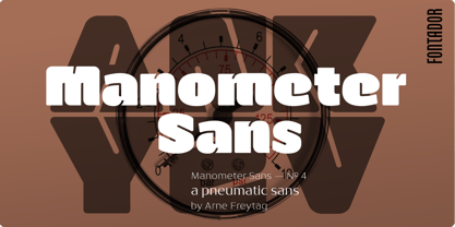 Manometer Sans is a pneumatic sans
 - Maiden Sans by Deltatype,
$29.00 Maiden Sans is a humanist sans-serif based typeface which contains nine weights, from thin to black. Designed to use as body text to headline. The design of Maiden Sans typeface can easily be recognized at the terminal with reverse pen-head style and a bit sweet link!
 - Claude Sans by ITC,
$40.99Claude Sans is the work of British designer Alan Meeks. The conservative roman weight is complemented by a more extravagant italic. The proportions are based on those of the original Garamond typeface of Claude Garamond, from whom this type gets its name. Claude Sans can be used alone or combined with Claude Sans italic and bold weights. - Kelpt Sans by Typesketchbook,
$55.00 Kelpt Sans is an altered modified from the form of the original Kelpt typeface. Designed to be more Corporate, the font family has flat terminals that harmonizes with sharp corners. With all of these features, “Kelpt Sans” is a prominent, eye-catching and unique typeface. It comes with 9 weights with 2 Hight options in order to suit for a multifunctional usage, especially for cooperative work, such as website, magazine, editorial, publishing, as well as packaging.
 - Henderson Sans by Sudtipos,
$39.00 The first thought that crosses a type designer’s mind upon seeing a slab serif is: I wonder what it would look if it was serifless. And so, after building Henderson Slab , I followed my instincts and gave it a sans serif companion. Henderson Sans comes in seven weights plus italics, each of which casting an eye on the crafty lettering origins of what is now the ubiquitous mode of corporate communication. This sans serif is a glyph-for-glyph match for Henderson Slab , inheriting pretty much all of its features and quirks, like the wealth of alternates and swashed variants — simple, endearing or otherwise. Henderson Sans is a family of seven weights plus italics, all full of open features and extended Latin language support. (Basic version do not include alternates, swashes, etc).
 - Premium Sans by ZeeshanFoundry,
$40.00 Premium Sans is a professional typeface which is aspired to solve the major typographic challenges in editorial, print, Graphic design, Commercial designs and other form of templates and documents such as pdf or ms word. It has four weights light, regular, semi bold, bold. Each with an italic profile, so in total it has 8 typefaces. We created this typeface to have attention of reader in Graphic commercial designs and as well as on editorial designs. The X-height plays a great role in readability of a typeface, so we tried to give it a reasonably high x-height with accordance to ascenders and descenders. We've engineered it in such a way that it can easily be paired with script, slab serif and serif typefaces. Premium sans is made on minimum required character set which will be handy while typing currency symbols like cents, dollars or euro and also be very useful when typing the characters consisting of diacritic. We've designed it in such a way that either you write a long content for editorial purposes or you create a typographic or graphic/commercial design it will look nice and fine which is the uniqueness of this font.
 - Vaccine Sans by ParaType,
$30.00 Vaccine Sans is a humanist sans-serif font family with soft terminals, but stem junctions on the contrary use hard constructions. Such combination of basic design features makes the font distinct and strong in setting and delicate and soft in appearance. This design peculiarity, together with very low contrast, produces a range of qualities needed for small sizes, low quality print and bad reading conditions. Vaccine Sans has a modern stylish design and takes its rightful place among popular faces. The family consists of 10 members — five weights with the corresponding italics. It can be used in a wide range of applications — magazines, advertising, corporate identity, urban navigation, packaging, children books, etc. Designed by Manvel Shmavonyan with the participation of Alexandra Korolkova and Gayaneh Bagdasaryan.
 - Virtus Sans by Andrew Footit,
$20.00 This clean sans-serif typeface brings your designs and layouts together in one great looking typeface, uncomplicated and legible large or small. VIRTUS SANS has 4 weights each with italics.
 - Ocean Sans by Monotype,
$29.99Released in 1993, Ocean Sans is a sans serif design created for Monotype by the talented Malaysian designer, Ong Chong Wah. The Ocean Sans font family has a distinct contrast between thick and thin strokes which sets it apart from the rather austere Grotesques with their more monotone appearance. Ocean Sans italic is an unusual design for a sans face, a strong cursive influence gives it a flowing rhythm not generally associated with sans serif italics. Ideal for text and display setting, the freshness of the Ocean Sans font family will give the user further scope in the design of catalogues, brochures, advertisements and flyers. - Range Sans by Eclectotype,
$36.00 This is Range Sans, the sans-serif counterpart to Range Serif . It can be categorized as a grotesque, with the idiosyncratic angular details from the serif family making themselves known in the arches and bowls of the lower case. The range of weights is larger than Range Serif, with two more weights at the lighter end of the spectrum. The weights from light to black correspond to their seriffed sisters, so can be interchanged with them freely while maintaining a similar text color and vertical metrics. This is useful for adding emphasis; Range Sans is deliberately lacking an italic, but the italics from Range Serif work better than you might expect in running text, particularly for the light and regular weights. Range Sans has a contemporary, somewhat geometric look that lends itself to uses such as corporate identities, minimalist graphic design, and logos. The middle weights do work well in running text, however, with the angled details being less noticeable at small sizes. Designed for demanding typography, supporting most Latin-based languages, Range Sans is equipped with true small caps for all weights, an array of numeral styles (proportional- and tabular- lining and oldstyle figures, small cap figures, numerators, denominators, superscripts and subscripts/scientific inferiors), automatic fractions, a set of useful arrows, case-sensitive forms, and a range of currency symbols including recent additions: Turkish Lira, Indian Rupee and Russian Ruble.
 - Rooney Sans by Jan Fromm,
$45.00 RooneySans is a humanist sans-serif typeface, and the latest addition to the Rooney family. It shares the same attributes as its seriffed companion – softly rounded terminals and a moderate contrast, thoughtfully applied to classical sans-serif proportions. Although RooneySans was developed as a stand-alone typeface family, it combines well with Rooney since both typefaces share the same stem weights and an equal gray value. RooneySans is suitable for any task in branding and packaging design and gives long texts a warm and inviting feel. All six weights from Light to Black come with matching real italics.
 - Carot Sans by Storm Type Foundry,
$39.00 Carot Sans is designed on the basis of three elements - square, circle and triangle. Simple and fresh typeface for visual identities, book covers, magazines and advertisement. The whole Carot system of 64 members offers a modern alternative for all types of design work.
 - Aprex Sans by S6 Foundry,
$20.00 Aprex Sans perfectly balances the minimalist quality associated with contemporary sans with flair within the width of the counters and comfortable, breathable apertures. — Throughout weights and sizes, the typeface has great legibility and good contrast between positive and negative space, making it stunningly versatile. — With a seamless combination of contemporary details and classic styles, Aprex Sans draws inspiration from the mid-century humanist and grotesque typefaces, and its solid and straightforward structure is characterized by angular connections between curves and stems. Aprex Sans is geometric in nature with humanist qualities rooted in the Swiss tradition.
 - Anicon Sans by NREY,
$19.00 Anicon Sans font family consist of 18 weight: from Thin to Black, each weight paired by italic. Also including Latin & Cyrillic language support with more than 35 languages. Anicon is a superfamily, semi condensed sans serif and slab serif with humanistic forms in the characters. This font was crafted with the intention to present clean, legible, multipurpose characters that are easy to read wether it's on screen or print. Fit for all purposes; text, display, headline, print, corporate identity, logo, branding, product, infographic, photography and other applications and medium.
 - San Louis by Inumocca,
$25.00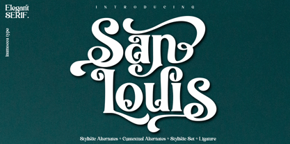 San Louis is an Elegant Serif typeface , Modern , Classy and Glamour Worlds. Awesome Stylictic Set, Beautiful Ligature and unique contecttual alternates, stylistic alternates. Really playful typeface to covering your Project, like Lettering, Website Interface, Magazine, Branding, Poster, wedding invitations, Quotes Lettering, Logos, and more your project design. - Unique glyphs - Multilingual Characters - UPPERCASE - Lowercase - Numeric - Symbol - Punctuation Character - Ligature - Contextual Alternates - Stylistic Alternates - SS01, SS02, SS03, SS04
 - Susan Sans by ParaType,
$30.00 An original text and display type family was designed for ParaType in 2008 by Manvel Shmavonyan to be used together with Susan and Susan Classic, earlier released type families by the same author. This is a low-contrast sans serif font with open letterforms. Its shape is distinguished by rounded upper parts of lower case. Susan, Susan Classic and Susan Sans forms a super family coordinated on weight, style and proportions. Susan Sans is well suited for short and middle range text composing as well as for use in advertising and display typography.
 - Ludwig Sans by Hyber Type,
$40.00 Ludwig Sans is a modern Sans Serif Font Family inspired by american Gothics. It also contains many Alternates that are inspired by Ludwig Sütterlin’s Latin Script from 1911. All those Alternates can be combined seamlessly within the neutral Sans Serif Typeface, so you get both: a bread-and-butter type and a display font.
 - Placebo Sans by Présence Typo,
$36.00 - Museo Sans by exljbris,
$- Museo Sans is based on the well-known Museo . It is a sturdy, low contrast, geometric, highly legible sans serif typeface very well suited for any display and text use. This OpenType font family offers also support for CE languages and even Esperanto. Besides ligatures, automatic fractions, proportional/tabular lining and old-style figures, numerators, denominators, superiors, and inferiors, Museo Sans also has a ‘case’ feature for case sensitive forms.
 - Contra Sans by Wiescher Design,
$16.50 Contra Sans is the base of my Contra family of fonts. It has just sufficient contrast to make for easy reading and an interesting appearance.
 - Character Sans by Brave Lion Fonts,
$14.00 Character Sans is a detail full sans serif typeface in 5 styles. It features all european languages, ligatures, arrows and minuscule numbers. It's characteristic style features are straightened ends and sharp curves. The lighter weights have great white spaces and their width is orientated on the heavier weights. Character Sans was made to have style and not to be uniform.
 - Ascender Sans by Ascender,
$92.99 Ascender Sans was designed by Steve Matteson as an inventive, exhilarating sans serif design that is metrically compatible with Arial. Ascender Sans offers enhanced on-screen readability characteristics and the pan-European WGL character set and solves the needs of developers looking for width-compatible fonts to address document portability across different platforms. The Ascender Sans Narrow offers enriched on-screen readability characteristics and the pan-European WGL character set and resolve the needs of developers looking for width-compatible fonts to address document portability across platforms. Ascender Sans Narrow contains regular, italic, bold and bold italic fonts.
 - Questa Sans by The Questa Project,
$25.00 Questa Sans is a sans serif font family. This typeface has ten styles and was published by The Questa Project.
 - Quiche Sans by Adam Ladd,
$25.00 Quiche Sans is a high-contrast, sans serif with monoline stroke endings, angled stems, and geometric proportions. A sibling to the Quiche family, with the ball terminal endings removed. The design is influenced by the serif didone genre, characterized by its elegance and extreme thick/thins, but it removes the serifs for a unique and modern expression and tapers out the stroke endings for a sophisticated monoline appearance.