10,000 search results
(0.03 seconds)
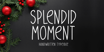
- Splendid Moment by Seemly Fonts,
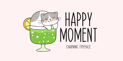
$12.00 - Happy Moment by Seemly Fonts,
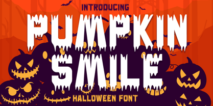
$12.00 - Pumpkin Smile by Sakha Design,
$12.00 - Punta Negra by Volcano Type,
$19.00 - Dualis by Volcano Type,
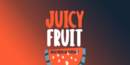
$19.00 - Juicy Fruit by Seemly Fonts,
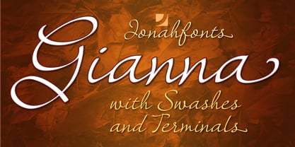
$14.00 - Gianna by Jonahfonts,
$35.00 - Tulip by Bogusky 2,
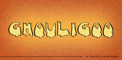
$24.50 - Ghouligoo by Magpie Paper Works,
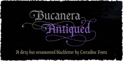
$18.00 - Bucanera Antiqued by Corradine Fonts,
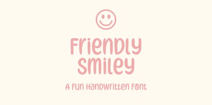
$24.95 - Friendly Smiley by Ali Hamidi,
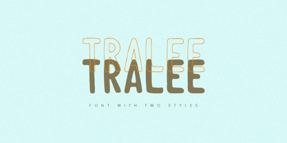
$10.00 - Tralee by Tanincreate,
$12.00 - The Underwood1913 font by Gilles Le Corre is a striking typeface that vividly captures the essence and nostalgic charm of early 20th-century typewriting. Inspired by the Underwood No. 5 typewriter, w...
- Solaris by Ultramarin,
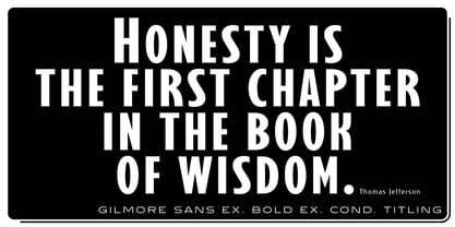
$40.00 - Gilmore Sans by Red Rooster Collection,
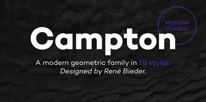
$45.00 - Campton by René Bieder,
$30.00 - Lapoya by Cuchi, qué tipo,
$9.95 - Germs - Unknown license
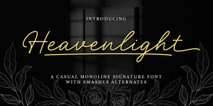
- Heavenlight by Fargun Studio,
$15.00 - Happy Maggie by SIAS,
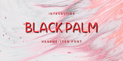
$29.90 - Black Palm by Just Lett,
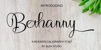
$17.50 - Bethanny Script by Slex Studio,
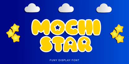
$11.00 - Mochi Star by Alfareaniy,
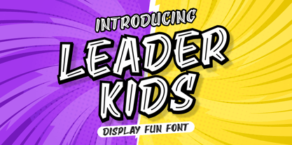
$100.00 - Leader Kids by Awan Senja,
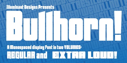
$14.00 - Bullhorn by Illuminaut Designs,
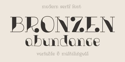
$10.00 - Bronzen Abundance by Kaer,
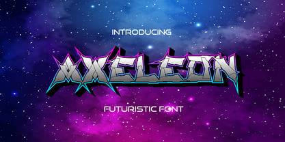
$14.00 - Axeleon Abstract by Sipanji21,
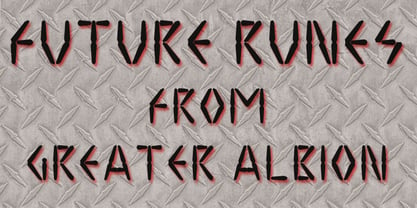
$16.00 - Future Runes by Greater Albion Typefounders,
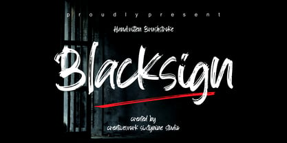
$4.50 - Blacksign by Creativework Studio,
$18.00 - Intense Eve by PizzaDude.dk,
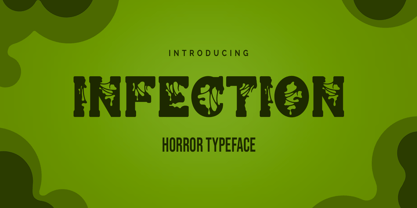
$20.00 - Infection by Ronin Design,
$15.00 - Earthwerk by PizzaDude.dk,
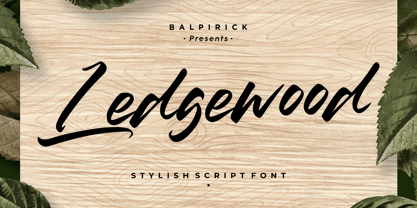
$20.00 - Ledgewood by Balpirick,
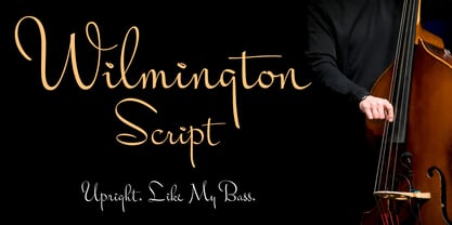
$15.00 - Wilmington BF by Bomparte's Fonts,
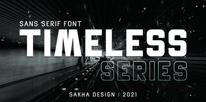
$39.00 - Timeless Series by Sakha Design,
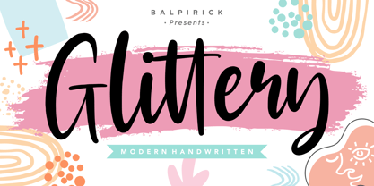
$12.00 - Glittery by Balpirick,
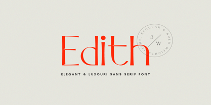
$15.00 - Edith Calamar by Calamar,
$16.00 - We Are Happy by Seemly Fonts,
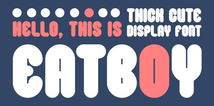
$14.00 - Eatboy by Figuree Studio,
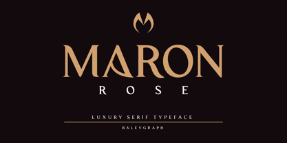
$15.00 - Maron Rose by Balevgraph Studio,
$12.00
