10,000 search results
(0.029 seconds)
- Kurph by PizzaDude.dk,
$20.00Kurph has got ligatures for both double letters and numbers, along with alternate versions of all lowercase letters. You will need to use OpenType supporting applications to use the ligatures. - Risans Basic by Richard Ham Lettertype Ontwikkeling,
$24.99Font with more than 400 glyphs. This font can be used for the most comman languages and can als used for the basic calculus. Some glyphs for the fractions (and special rootfunction) there are used special characters (which be can used with the key code f0000 till f00014 (and Alt + X)) - Gastone by Olexstudio,
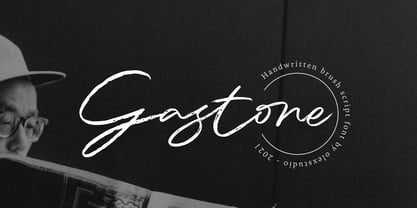
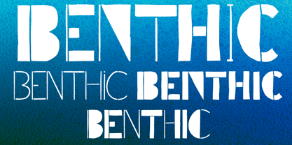
$16.00GASTONE - Handwritten Brush Script Font will look gorgeous on all your designs, invitation, poster design, book design, branding materials, logo's, t-shirt and all project design other. GASTONE - Handwritten Font contains standard characters, Lowercase, alternates, Uppercase, numbers, punctuation, ligatures and international glyphs. - Benthic by A New Machine,
$19.00 - Elipses by Lián Types,
$30.00It all began with an ellipse. Like an artist who goes from a pictorical logic to a more abstract one, in Elipses geometry is stripped of any distractive or ornamental detail. The font is naked and it shows that it does not need complex shapes or decisions in order to be very attractive. The font is a compendium of ellipses and stems, with a didone 'pensiero'. It also gets some inspiration from the art-deco letters and architecture, due to obvious reasons. Geometry at its best. Elipses will be useful for magazines, books, ads, or any piece of design that needs elegant letters. Note about the styles The styles named "Alt" (from Alternative) have their swashes with less loops. Use them if you are more into naked geometry. Apart from many alternates and ligatures, I've included some different sized glyphs in all the styles so you can also play on the rhythm! Have fun! - Godzie Olstd by Olexstudio,
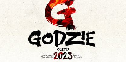
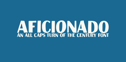
$19.00GODZIE Olstd Handwritten Brush Font will look gorgeous on all your designs, poster design, book design, branding materials, logo's, and all project design other. WHAT'S INCLUDED GODZIE Olstd Handwritten Brush Font contains standard characters, All Chacacter is Uppercase, numbers, punctuation, Alternates, ligatures and international glyphs. Happy designed.! thanks, regard olexstudio - Aficionado by Hanoded,
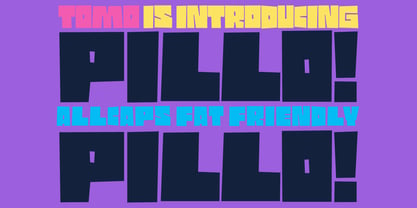
$10.00 - TOMO Pillo by TOMO Fonts,
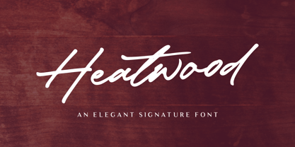
$15.00 - Heatwood by Balpirick,
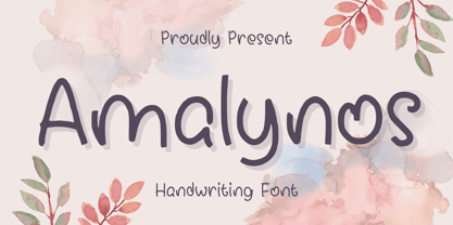
$15.00 - Amalynos by Aisyah,
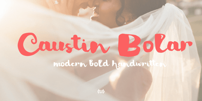
$12.00 - Caustin Bolar by madeDeduk,
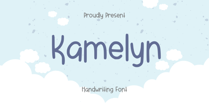
$16.00 - Kamelyn by Aisyah,
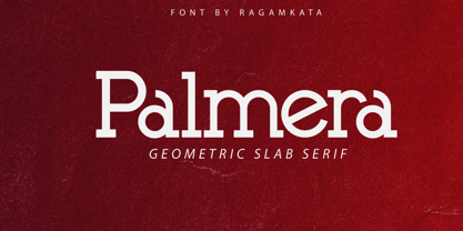
$12.00 - Palmera Outline by RagamKata,
$14.00Palmera is a geometric slab serif font. Simple and sharp-looking, this typeface will truly inspire you to create spectacular designs that will impress everyone. Palmera font is perfect for your up coming projects. Such as logo branding, editorial design, fashion, adventure apparel, stationery design, sport design, blog design, modern advertising design, card invitation, badge, art quote, home decor, book/cover title, special events and any more. - Cardinal Script by FadeLine Studio,
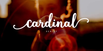
$12.00This is a beautiful handmade script font made with neat and clean. This font that will make your designs even more fun! With a style like this, this font will be suitable in use for logo's, branding projects, homeware designs, product packaging, mugs, quotes, posters, shopping bags, logo's, t-shirts, book covers, name card, invitation cards, greeting cards, and all your other lovely projects. - Japan Stamp by Pavel Boog,
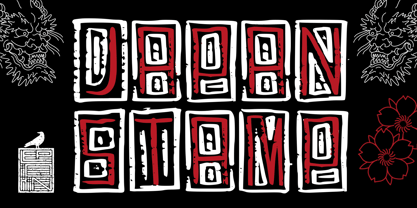
$26.00Japanese stamp - when creating this font, the author wanted to create a font unlike any other, taking inspiration from Japanese culture and history. It is one of a kind and unique font. It will immerse you in the historical era and add mystery to any of your projects. Anyone who wants to stand out among all this font will suit as out of place. - Natured by MuSan,
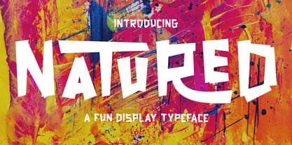
$16.00Natured is a fun, playful, bold display typeface. This font will bring joy and happiness to all of us. Natured is best suited for display, heading, text, print, branding, signage, and more. It comes with a lot of ligature that will give your design a more unique touch in any purpose. Natured contains: • Character set A-Z • Numerals • Punctuation • Multilingual • More than 40 Ligatures - Agharti by That That Creative,
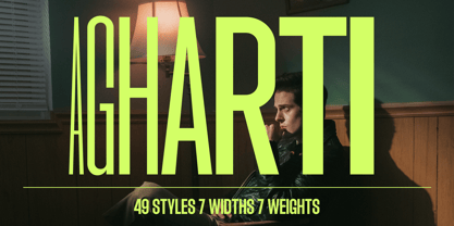
$15.00Agharti is a bold condensed display font perfect for headlines with a punch. The lowercase glyphs reach as high as the capitals so even if you are not typing in all caps you will have a solid impactful block of text. These extra tall lowercase letters will be sure to catch attention from any viewer and add some playful delight to any design project. - XXII Totenkult by Doubletwo Studios,
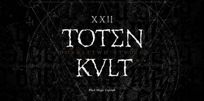
$21.99The “XXII Totenkult” is inspired by the classical letterforms of old roman/renaissance typefaces and an ode to the decay. This is an allCapitals-font and the lowercase glyphs contain a variation of the uppercase. With activated “calt”-feature every second lowercase will be replaced by an alternate, this will give the font a more natural look. Detailed information here: XXII Totenkult on Behance. - CA Mechano by Cape Arcona Type Foundry,
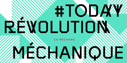
$19.00CA Mechano is quite what the name suggests – A mechanical typeface. Pretty straight forward and all-caps as long as you don’t activate the stylistic set "disorder". You will see what happens then: a lot of fun for the typographic eye. A more consumable distraction is offered by the other stylistic set. You will discover peacefully rounded letters in the neighborhood of strictly mechanically constructed glyphs. - Mr Happy by Hipopotam Studio,
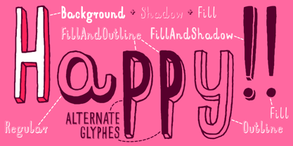
$22.00Hand drawn narrow typeface designed for one of our books. You can layer different styles over the background style to achieve lots of colorful effects. Use just one style to get a single color letter or set the shadow and fill over the background style to get a full, three color mode. Mr Happy has upper and lowercase characters with up to three alternate glyphs. Build in OpenType Contextual Alternates feature will automatically set alternate glyphs depending on frequency of appearance of the same character (even in web font but only in HTML5 browsers). The script doesn’t throw random glyphs. For example in the word “HIPPOPOTAMUS” you will automatically get three different “P” glyphs and two “O” glyphs. It really works great but of course you can always fine tune it by hand. - Colette by S&C Type,
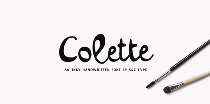
$14.00Colette is an inky handwritten script font designed to be easy to read and easy to use. Colette includes alternates and OpenType ligatures such as double letters or alternates glyphs that you can use to improve your designs and make them look natural and friendly. We also designed a Filled version (you can mix Colette and Colette Filled to give you more design options) and an Inside version (To do so, you can simply superimpose the layers with a compatible software like Photoshop, the weight above and the inside below, then choose a color for each). You could perfectly combine Colette with other S&C Type’s fonts, such as Naïve or The Hand for example. Just click on our foundry name to check them out! We hope you will enjoy our work. Merci beaucoup! - Cowhand by Monotype,
$9.99Cowhand is a display typeface designed by Toshi Omagari to keep words at one specific width. Words of one letter will have one very wide character, words of two letters will have characters of half that width and so forth. At the maximum of 20-letter words, characters become very tightly compressed. The design of the Cowhand typeface is inspired by western style block printing with reverse stress that is characterised by chunky slab serifs. This Lite version of the typeface was designed as part of a font marathon over the course of 3.5 days in Monotype’s NY office. Please Note: these "Lite" fonts are offered with a limited character set. Monotype is proud to support Room to Read’s work in literacy and girls’ education through our font marathon initiative. - Glary Tropic by Product Type,
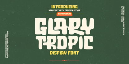
$17.00Say hello to Glary Tropic, the top choice for stunning, tropical-inspired designs. With boldness and strength imbued in every accent, this font brings a bold touch that immediately steals the show. Glary Tropic's bold style brings strong and eye-catching design elements. Filled with a fun tropical feel, each letter creates a fresh, vibrant atmosphere, perfect for projects that require exceptional visual appeal. This font is designed to provide maximum clarity and impact. With a strong tropical theme, Glary Tropic will be the perfect choice for posters, announcements, branding designs, or other creative projects that require a fresh and dynamic touch. Enhance your creativity and create unforgettable designs with Glary Tropic. With strength and uniqueness in every accent, this font will be an undeniable choice to take your design projects to the next level. - Dharma Gothic by Dharma Type,
$19.99Dharma Gothic is an antiqued sans serif designed inspired by 1800s-style wood type. All glyphs had been designed carefully to be retro-looking of the old time and to fill all with nostalgia. There is new rounded verision - Dharma Gothic Rounded Family This condensed font family with 42 styles will be the best solution for posters, titles and anywhere you need impact. To complete your work perfectly, Gothic Extras family is ready for free. They include borders, ornaments and frames designed using vintage catalog of Hamilton in 1800s as a model. Incidentally, g, r and y have alternative glyphs that are available with the OpenType salt feature and tabular figures are available with tnum feature. Be sure to check out the slab serif style of this Dharma series named Dharma Slab and Distress version Dharma Gothic P. When you need more modern gothic, please try our Kaneda Gothic and Fairweather. - Dharma Gothic Rounded by Dharma Type,
$19.99Dharma Gothic Rounded is an antiqued sans serif designed inspired by 1800s-style wood type. All glyphs had been designed carefully to be retro-looking of the old time and to fill all with nostalgia. There is Dharma Gothic Family that is not rounded. This condensed font family with 42 styles will be the best solution for posters, titles and anywhere you need impact. To complete your work perfectly, Gothic Extras Family is ready for free. They include borders, ornaments and frames designed using vintage catalog of Hamilton in 1800s as a model. g, r and y have alternative glyphs that are available with the OpenType salt feature and tabular figures are available with tnum feature. Be sure to check out the slab serif style of this Dharma series named Dharma Slab and Distress version Dharma Gothic P. When you need more modern gothic, please try our Kaneda Gothic and Fairweather. - Bloemgracht by Hanoded,
$15.00In the old Amsterdam neighborhood of 'De Jordaan', you will find a canal called Bloemgracht (Flower Canal). For many years, a coffee store called Schildmeijer could be found here. Their paper coffee bags and advertisements sported a hand made font which I have tried to recreate and the result is Bloemgracht typeface. It is an all caps art deco font, quite angular, but very legible and distinct. Bloemgracht comes with extensive language support. - Spirodelic by Mysterylab,
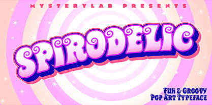
$16.00Spirodelic is a funky pop-art font with a sassy vintage vibe. This all-capitals design incorporates coiled spirals into the letters, and will add a lot of swirly psychedelic fun to your designs. It's great for retro seventies looks of course, but really also works well on anything modern that needs a loose and lighthearted touch, like kids books, toy packaging, flavored drinks, clothing lines, surf gear, logos... you name it. - Raittens by Gassstype,
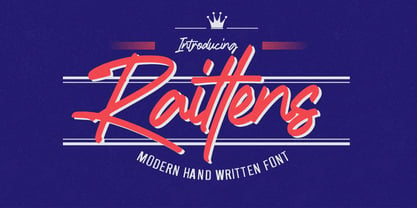
$22.00Introducing Raittens is Modern Handwritten Font is a Authentic Style and classy style, Raittens a natural handwritten feel. This handmade font will make your design has a beautiful natural touch for each details. It is perfect for any design project as Invitation,logo, book cover, craft or any design purposes,photography overlays, signs, window art, scrapbooking, tags and so much more! This font is PUA encoded which means you can access all of ligatures. - Pretty Salmon by Ali Hamidi,
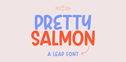
$10.00 - April Blossom by Angele Kamp,
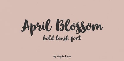
$22.00 - Syafiqa by ARToni,
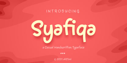
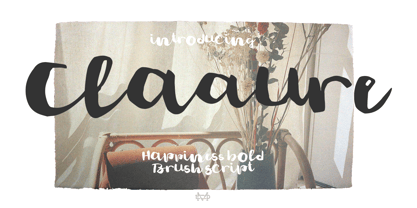
$12.00 - Claaure by madeDeduk,
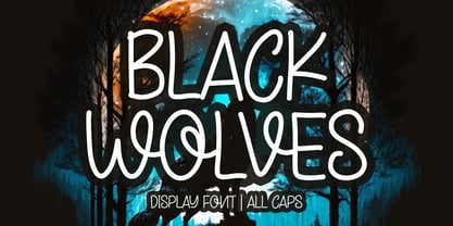
$16.00 - Black Wolves by Letterafandi Studio,
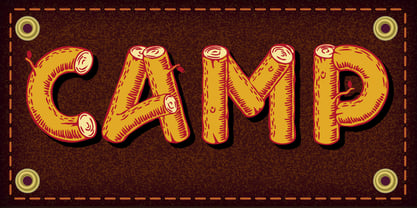
$14.00 - Camp by Pelavin Fonts,
$25.00Camp is a rough-hewn, woodsy font that gives new meaning to logging on to your computer. With engraving-like, hand-rendered details, it harkens back to frontier days and simpler times. Whether gliding across a placid lake or trekking through untarnished nature, Camp will let you see the forest among the trees. A family of 5 fonts gives you the option of printing a single color outline w/drop shadow or up to four different colors using the shadow, fill, ends and outline variants. - Chandello by Cooldesignlab,
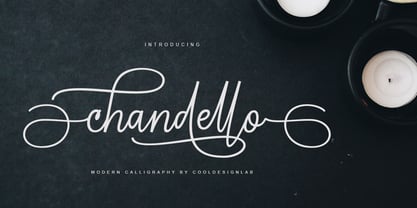
$10.00Chandello is a handwritten signature script with a natural & stylish flow, perfectly suited to signature, stationery, logo, typography quotes, magazine or book cover, website header, clothing, branding, packaging design and more. A handwritten script font containing upper and lowercase characters, numerals and a large range of punctuation. Chandello is a must-have signature script that has a diverse set of alternates that will surely be used many times over in various projects in the future. This collection fills a void and separates itself from other scripts available. - Gowes by Twinletter,
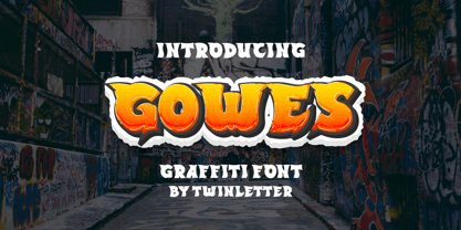
$15.00We designed Gowes, a graffiti-themed display font, for your bold, forceful, and speedy projects. This font was created as a supporting element for your limitless creativity. If you use this typeface, your project will have a unique and distinctive design. Your visual presentation will pique the interest of your audience. If you utilize this typeface, all of your creations will be of good quality. This graffiti font is great for product logos, poster titles, headlines, packaging, film titles, logotypes, gorgeous writing, and trendy graffiti designs, among other things. Of course, if you utilize this font in your numerous creative projects, they will be perfect and outstanding. Use this typeface right away for your one-of-a-kind and remarkable projects. - Joanna Nova by Monotype,
$50.99The Joanna® Nova design, by Monotype Studio designer Ben Jones, is an extensive update to Eric Gill’s original Joanna typefaces and brings this much admired – but underused – slab serif typeface into the 21st century. Joanna Nova features 18 fonts – more than twice as many as the original Joanna – with a wide range of weights including thin and ultra black, which were not available in the original design. Every glyph has been redrawn using a variety of reference sources, including Gill’s original sketches and the copper patterns used in Joanna’s initial production. When Jones set out to design Joanna Nova, he saw that the ‘real Joanna’ was not immediately evident. “Some of Gill’s original drawings have a sloped ‘M’; there is also a ‘K’ and ‘R’ with a curled leg and a letter ‘d’ without the flat bottom,” he explained. “Is this Joanna? Or is it the version used to print Gill’s Essay on Typography? Or is it the digital version with which most people are surely more familiar than any other version? Ultimately, I think, none of these and all of these were ‘Joanna’ because, as with any typeface, it is more the idea or concept behind the typeface that makes it what it is. My approach was to create a version of Joanna that appears in your mind when you think of Joanna.” Jones noted that one of the most distinguishing aspects of Joanna is the italics; and that, for reasons unknown, many of the characters in the current versions are much more condensed than those in the hand-set fonts of metal type., The newer designs being almost unusable at small sizes. The italics in Joanna Nova have been reworked to be more legible and closer to their original widths. Joanna Nova expands the original Joanna in several ways that open up new typographic possibilities, These additions include several new weights, support for Greek and Cyrillic scripts, small caps for all scripts in both upright and italic styles, several numeral options and a host of context-sensitive ligatures. The Joanna Nova typeface family is part of the new Eric Gill Series, drawing on Monotype's heritage to remaster and expand and revitalize Eric Gill’s body of work, with more weights, more characters and more languages to meet a wide range of design requirements. The series also brings to life new elements inspired by some of Gill’s unreleased work, discovered in Monotype’s archive of original typeface drawings and materials of the last century. - Dragon Fang by astroluxtype,
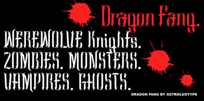
$20.00Dragon Fang is a headline display font set. The style suggests Medieval font forms but in a contemporary sense. The font contains uppercase and lowercase letterforms which include a few alternate characters. Look for the swash “B” and “D” to give your design project a special look. Influenced by everything from Rick Griffin and Linotext to tribal tattoo art this font will bring a contemporary edge to your design project. Fantasy book cover art, album covers, even that horror movie will find many uses for astroluxtype’s Dragon Fang. - March Evoked by SilverStag,
$12.00March Evoked is a brand new display font pack that includes regular and outlined version. march Evoked is inspired by an early spring in Spain, with flowers in full bloom all over the capital city - Madrid. With contrast lines & curves it will give your design that chic & modern appeal you are looking for. It is perfect for logos, branding, posters, social media & all other creative projects. I invite you to check out the preview images, and I hope you will be immersed in my vision for this creative typeface that, I am sure, will work for all kinds of interesting projects you might be working on this year. If you end up publishing your designs on Instagram, tag me - https://instagram.com/silverstagco and I will make sure to showcase your design and work to my audience as well! March Evoked - Creaive Display Font Includes: Numerals & punctuation Full language support Would you like to get 5 completely free fonts worth over $75? No tricks, no hidden words, terms or anything. Just subscribe to my newsletter, make sure to check your email to approve the subscription, add me to your contacts so that the emails don't end up in spam folder and you will get 5 fonts for free. The fonts are packed with alternates, ligatures and some even come with extra goodies. https://view.flodesk.com/pages/63594052b967a943dd6cc528 Happy creating everyone! - Sylvie by Anastasia Kuznetsova,
$14.00SYLVIE is a very stylish font with letters that seem to dance and harmoniously intertwine with each other, creating a unique and elegant typographic design. This font is in my collection, inspired by France. French architecture, vintage fonts, modern forms, fashion and their unique lifestyle have all had an impact on this font. Thanks to the contrasting lines and curves, it will give your design the chic and modernity that you are looking for. It is perfect for logos, branding, posters, social media and all other creative projects. It will also highlight your brand. SYLVIE will definitely add attractiveness to your design! I invite you to familiarize yourself with the preliminary images and hope that you will be imbued with my vision of this creative font, which, I am sure, will be suitable for all the interesting projects you are working on. Font Features: A-Z; a-z character set; 1 language (English); numbers and punctuation marks, symbols. Fonts can be opened and used in any software that can read standard fonts, even in MS Word. No special software is required to get started. It is recommended to use it in Adobe Illustrator or Adobe Photoshop. Made with love and magic ♡ Thank you for reading it, and do not hesitate to send me a message if you have any questions! ~ Anastasia
