10,000 search results
(0.064 seconds)
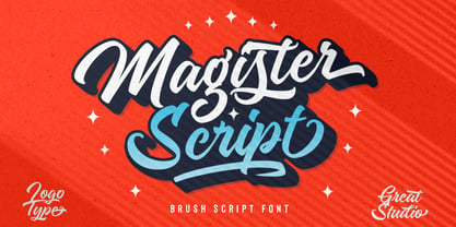
- Magister Script by Great Studio,
$23.00Magister Script is a brush script with original, clean and neat handwriting style, with a touch of personality on each curve. This master script is available in two styles. Magister Script One and Magister Script Two, accompanied by Extrudes to simplify your design. All versions Magister Script have luxurious and elegant Alternative letter characters, both for the final connection letters and Ascander and Descander letters. This typeface works very well for Logo Design, clothing, handwritten quotes, product packaging, headers, posters, merchandise, social media & greeting cards and all your artwork. Features · Basic Latin A-Z and a-z · Numbers · Symbols · Stylistic Set · Ligature · PUA Encode · Multilanguage Support Latin pro If there are problems, questions, or anything about my font, please send an email to greatstudi92@gmail.com. Thank you for viewing our new product, enjoy! - Already Broken by Allouse Studio,
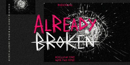
$16.00Already Broken a Rebellious Font With Twos Styles. Scratch : Bring an rebel and anarchy impression. Dull : Bring an rebel impression but more subtle. Already Broken is perfect for any tittles, logo, product packaging, branding project, megazine, social media, wedding, or just used to express words above the background. Already Broken also come with Multi-Lingual Support. Enjoy the font, feel free to comment or feedback, send me PM or email. Thank You! - Poptis by Abbasy Studio,
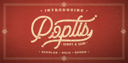
$10.00The combination of two different font styles 'script and sans' . Poptis font available in Regular, Bold, and Rough version as a choice to mix and match your design. This script font comes with multiple alternates that will make your words look like a custom lettering. With additional Serif font you will be able to create the beautiful combination. Both of these font is great for Logos, Lettering, Clothing Design, Poster, Label, Quotes, etc. - Pronter by Larin Type Co,
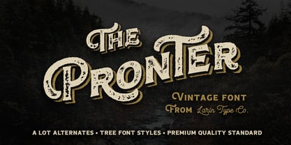
$16.00Pronter It is a stunning vintage font that comes in three styles: Regular, Rough and Stamp style and also includes two font styles: shadow and rough shadow. This font contains many alternates, so make them up to the extent that your design's creativity is enough. Pronter font versatile it can be used both in modern projects and in vintage ones, as a main or additional one. This font is easy to use, has OpenType features. - Spoodbrush by Dhan Studio,
$20.00Spoodbrush is a new lowercase brushed textured font family designed to perfectly combine the different styles with one another and allow you to create beautiful designs with a personal touch. It also contains some ligatures and swashes and additionally a Spoodbrush Sans style. Perfect for branding, logos, product packaging, posters, invitations, greeting cards, news, blogs, and everything requesting personal charm. Fonts Included : Spoodbrush One Spoodbrush Two Spoodbrush Bold Spoodbrush Slant Spoodbrush Sans Spoodbrush Extra - Road Crew by Larin Type Co,
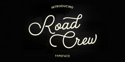
$16.00Road Crew is a handwritten, monoline font that includes two styles, regular and bold, with which you can combine and create unique designs in an instant. Also included in this font are alternatives and touches that you can use to make your design more diverse and attractive. You can also use them to create a logo or use them for small businesses, t-shirts, book covers, stationery, marketing, blogs, magazines, and more. - Caravan by Linotype,
$29.99Caravan was designed in 1938 by William Addison Dwiggins and consists of a variety of ornaments. He based the forms of the ornaments on the same lines and curves found in his font Electra. He wanted printers and designers to have the chance to combine the two fonts for a more attractive or outstanding overall picture. Caravan is particularly popular for advertisements in newspapers. Caravan can be easily mixed with other fonts designed by Dwiggins. - Concerto by profonts,
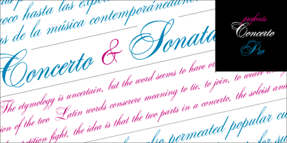
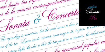
$41.99profonts Concerto and profonts Sonata are closely related to each other. In fact, the only difference between the two related fonts is in the upper case characters. Concerto's upper cases are more complex, swashier than those in Sonata. One is a perfect complement to the other, and that is why they are offered together at special rate. Both fonts contain about 370 glyphs covering the complete Latin set for Western and Eastern Europe. - Voire by Creativemedialab,
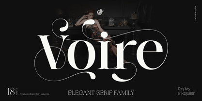
$22.00Introducing Voire is an Elegant stylish and playful modern serif family. Voire comes with two versions display and Regular, and it has 9 weights from thin to Black with tons of alternates and ligatures This modern pretty serif family is perfect for all sorts of elegant designs like wedding invitations, but can also work great for logo, branding, website font and headers, or product labels. It's easy to read and the alternates are visually interesting - 1880 Kurrentshrift by GLC,
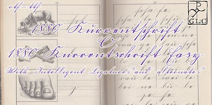
$38.00This font was inspired by the old form of the so called "Kurrentschrift" German handwriting, based on late medieval cursive. It is also known as "Alte Deutsche schrift" ("Old German script"). It was taught in German schools until 1941, when Adolf Hitler decided to forbid it. As it is a little hard to read, we are proposing here two versions: the "pure" Kurrentschrift, and an adapted "Easy" one, with simplified difficult characters. - Sonata by profonts,
$41.99profonts Sonata and profonts Concerto are closely related to each other. In fact, the only difference between the two related fonts is in the upper case characters. profonts Concerto's upper cases are more complex, swashier than those in profonts Sonata. One is a perfect complement to the other, and that is why they are offered together at special rate. Both fonts contain about 370 glyphs covering the complete Latin set for Western and Eastern Europe. - Galora by Gravia Design,
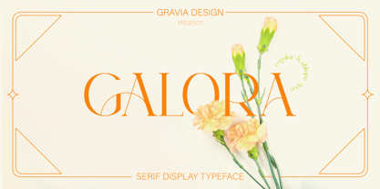
$15.55Galora is a sleek and contemporary high-contrast serif font. The typeface comes in two different styles. Regular has round and curvy lines to bring a soft aesthetic to your designs. The oblique style features sharp angles and diagonal lines for a more dynamic look. Galora is perfect for designing logos, headlines, posters, packaging, and invitations, adding a modern and captivating charm. Features Uppercase & Lowercase Number & Symbol Ligatures Multi-language 2 Styles - Bruce 532 Blackletter by Intellecta Design,
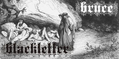
$23.90A classic font design remastered by the type foundry Intellecta Design, from the extra-rare Bruce's New York typefoundry from 1882. Distressed and antique, use this font in display purposes for a stylized type design. Great display face for headers and antique-like projects. Contains a limited amount of letter designs. Using the "0" and "2" keys you get two different fleurons to start words. Use "1" or "3" keys to close words with fleurons. - Isometrica by Greater Albion Typefounders,
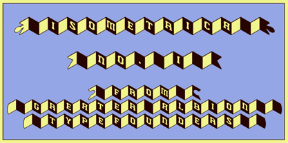
$15.00Isometrica is the latest in Greater Albion's line of 'Banner' typefaces. Like all of the banner faces they lend themselves to the design of mastheads and logos. Isometrica is also a meeting of architectural drawing and typeface design, given bold two coloured concertina banners with letters appearing page by page. A range of decorative end pieces are also included. Bring your designs to life with lettering that stands up off the page! - Benevolent by Attractype,
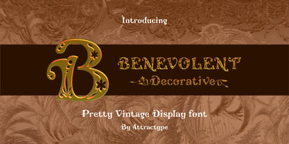
$15.00Introducing "Benevolent" - A pretty vintage font. With a subtle touch and unique design, Benevolent is an incredibly versatile font, perfect for any type of project from invitations and posters to magazines and corporate identity. Benevolent has two styles, solid regular and decorative which are packaged separately. Each of them comes with a swash and alternative feature. Of course, Benevolent can also be applied to various arts, crafts and jewelry. Happy crafting with Benevolent. - Bedazzle by Pelavin Fonts,
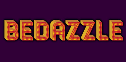
$15.00With a delicious twinkling in its eye, Bedazzle evokes a theatrical vibe. Filled with a pattern of glowing lights, it offers a festive journey for the eye as well as a tactile ambiance. Two fonts, an ornamented bright plus a solid version provide ample resources to create a variety of inlined, outlined, shadowed and multi-colored displays. Add in Illustrator’s 3D feature to take things beyond the mere surface of the page. - Houstoner Script by Martype co,
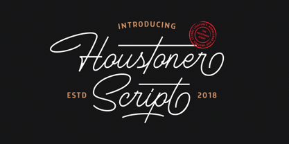
$19.00Houstoner Script is a signature script font designed with carefully handcrafted. Also suitable for branding, T-shirt, Wedding Invitation, Classic Design, Logotype, and any project. With two style make you easier to design everything. Comes with many ampersand set to make your design prettier than yesterday, this font also can make you happy when you design something even that you don't like, and of course this font make your design classy, elegant, luxury! - Morthern by Graptail,
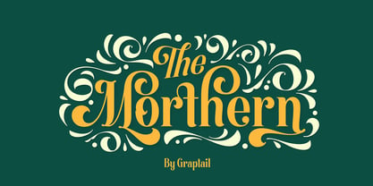
$19.00Morthern is inspired by the work of charming lettering artists with a combination of Old Style Display Bold. Each letter is modified so that the distance, width and weight can give the beauty of the alternates given. A passionate curve gives a touch of beauty to this font. With both weights you have two different shapes in terms of uppercase letters that aim to distinguish between title of the letter and the paragraph. - Circe Rounded by ParaType,
$40.00Circe Rounded is an extension for a popular Circe typeface, with rounded terminals. Bold and ExtraBold faces have two variants with different radius of the roundings. Circe Rounded is even more friendly than the original Circe. The typeface is designed by Alexandra Korolkova and Alexander Lubovenko and released by ParaType in 2015. It is known that the Circe typeface is distinguished by mild and humanist nature being formally a geometric sans-serif. However, as an experiment we decided to make it even softer: Circe now has a version with rounded terminals — Circe Rounded. Rounding is generally regarded as a mechanical operation, but in this case a lot of manual adjustment was needed because of the humanist nature and peculiarities of type design. Moreover, the two bold styles now have two options: a basic one is slightly rounded and an alternate one is fully rounded. In Circe Rounded we decided to dismiss characters with swashes that are rather inappropriate in such a rounded font, but the stylistic sets and alternate characters are remaining. Rounded terminals make an open and friendly typeface even more childish. For example, in quite large point sizes (because the x-height is still not big) it can be used as a body type in infant books. Circe Rounded, similar to Circe, has alternative forms of lowercase characters, which are called “infant” and are used in publications for children’s reading. However, a humanist basis is preserved alongside with its softness and it does not allow it to be as “plasticine” as many other rounded fonts. Two of the most obvious areas of possible application of Circe Rounded are everything for children and everything edible, especially all that is sweet and puff. However, we believe that there are other options. - LifeAfterCollege by Ingrimayne Type,
$13.95The LifeAfterCollege family began as a set of four fonts based on two styles of Ranger, which are slab-serif, geometric fonts with no curves. Two of the four are outlines with hollow insides, and two have-filled insides. The two fonts that are outlined have been taken apart and made into three typeface that can be layered. This allows one color for the inside, another for the middle ring, and a third for the outside outline. - Eggad by Ingrimayne Type,
$9.00Eggad features letters on eggs. It can be a fun font to use at Easter or for any egg-related message. Some of the eggs - those on the upper-case keys - have their large end on the bottom and others - those on the lower-case keys - have their large end on the top. The font uses the contextual alternatives feature of OpenType to alternate the big-bottom and big-top eggs. If you only want eggs with big tops or with big bottoms, turn this feature off. Eggad comes in two styles, a regular style in which the eggs are outlined and a bold style in which the eggs are solid. Both are monospaced. The two styles can be layered to color the eggs. Alternatively, background color can be added (dot accent and ring characters) or the outline color can be changed (sterling and yen characters) using layers in the regular style. If you are typing numbers and you want the start to be big-bottom number, switch on OpenType style set 1. - Nutmeg by W Type Foundry,
$25.00Nutmeg is a geometric typeface with a slight flavored touch. Although its structure is stick to the traditional forms, its details transform this typeface in a boldly project that separates it from other geometric fonts. Nutmeg’s texture can be perceived as a clean typeface that is comfortable to the human eye, furthermore, if you use it in big sizes Nutmeg’s details can be seen as a display font. Under these two ways of perceiving this typefamily, we took the decision of split this type project in two families: a cleaner and more rational Nutmeg versus a Headline version that has more flavored details at the end of the characters. Designed with powerful OpenType features in mind, each weight includes alternate characters, ligatures, fractions, special numbers, arrows, extended language support and many more… Perfectly suited for graphic design and any display/text use. The 36 fonts are the first part of a larger Nutmeg family. We’re proud to introduce: Nutmeg. Learn about upcoming releases, work in progress and get to know us better! On Instagram W Foundry On facebook W Foundry wtypefoundry.com - Yasmine Mutlaq by Arabetics,
$29.00The Yasmine Mutlaq type family follows the guidelines of the Mutamathil Mutlaq type style. It has one glyph per basic Arabic Unicode character or letter. Each glyph is completely symmetrical around its vertical axis to facilitate bi-directional ordering. This family does not include any required ligatures and does not use glyph substitutions or forming but it does use marks positioning. Text strings composed using types of this family are non-cursive with stand-alone isolated glyphs. Yasmine Mutlaq employs four x-height values, two above and two below the x-axis. Its design uses curves with equally distributed weight. This family includes both Arabic and Arabic-Indic numerals, all required diacritic marks, in addition to all standard English keyboard punctuations and major currency symbols. It is available in regular styles. Also included is an additional font, Yasmine Mutlaq bidi that encodes same glyphs as symbols to facilitate user input from left to right using a Latin keyboard. The fonts in this family support the following scripts: Arabic, Persian, Urdu, Pashtu, Kurdish, Baluchi, Kashmiri, Kazakh, Sindhi, Uyghur, Turkic, and all extended Arabic scripts. - Explorer by Fenotype,
$30.00Explorer - a classy typeface collection. Explorer collection includes following: • 8 Fonts - a clean and textured version of each • Catchwords • Swooshes • Pictures Explorer’s core is a strong script type with straight edges. All the fonts are designed to work nice together. Here’s a short introduction to the styles: •Explorer Script is equipped with Contextual Alternates that make the connections between letters smooth. In addition it has Swash, Stylistic and Titling Alternates for standard characters for more customised look. Explorer Script has three weights. •Explorer Sans is a wide all caps sans-serif that doesn’t shy away from taking it’s own space. Explorer Sans has two weights. •Explorer Condensed is a sturdy all caps condensed sans-serif with rounded edges. Explorer Condensed has two weights. •Explorer Serif is a bulky all caps serif. •Explorer Swoosh is a collection of strokes and swooshes designed to go with the Script. Try adding a connecting one in the end of a word written with Script or place a loose swoosh above or below a word. •Explorer Catchword is a collection of catchwords designed to go with Explorer fonts. - Delphi by Positype,
$22.00Delphi grew from a logotype Lily Feinberg produced using Greek-column-inspired letterforms. As that concept expanded to include more and more letters, the typeface had its beginnings. Intertwined, kinetic, and deliberate, Delphi carves itself onto the page and screen, encouraging variation and experimentation. The letterforms’ unique construction and predispostion for experimentation inspired two varying sets: Delphi Dio, comprised of two-line strokes, and Delphi Tria, built of both 2- and 3-line strokes. With a design as elaborate, yet tightly tuned as this, the desire to add more and more was irresistible—you'll see a number of stylistic, swash, and titling alternates (and even more hidden away in further stylistic sets). Because Dio and Tria could only hold so much, alternate cuts were produced to better organize your options: the Delphi Alt fonts feature certain letter styles and stylistic alternate sets distinct from those in Delphi. Delphi’s sophisticated, striking letterforms make it an ideal display face for use at large sizes, and with so many unique details and alternate letterforms, it’s simply fun to use. - P22 Ringwell by IHOF,
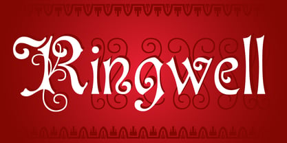
$24.95 - Wanker - Unknown license
- MFC Semicirculus Monogram by Monogram Fonts Co.,
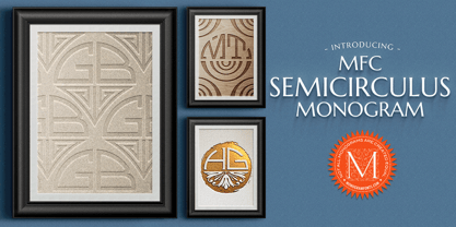
$19.95The inspiration source for Semicirculus Monogram is a stylish sans serif letterset from a vintage embroidery publication which combines to create a semi-circular form monogram. Originally intended to adorn handkerchiefs, it has so many other possibilities. Ornaments from numerous antique specimen books were combined with the letter set to accent and complete its form. This is one of many monogram designs for the early 1900s which fall into a two letter format that is either adorned or interwoven with ornamentation. Download and view the MFC Semicirculus Monogram Guidebook if you would like to learn a little more. - Laser Vision by Hanoded,
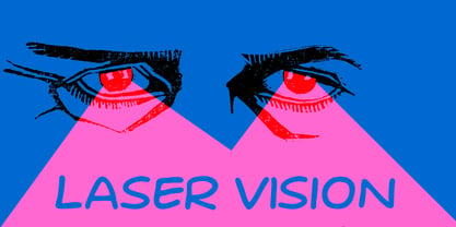
$15.00I seem to be in my comic book font fase. It's not that I have tons of comics lying around (I actually have none), but when I was a kid, I used to read them all the time. Laser Eyes is a handmade comic book font. It is a little rounded, a little fat and very useful. You don't really have to put it to work in an actual comic book; it will feel at home just about anywhere. Laser Vision comes with two sets of alternate glyphs that cycle as you type, plus extensive language support, including Cyrillic and Vietnamese. - Gamby by Nathatype,
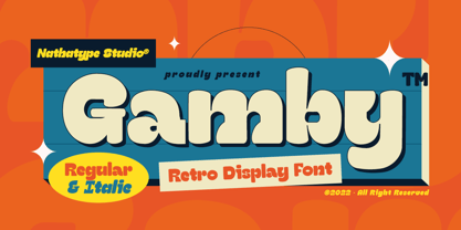
$29.00Gamby is an attractive, vintage, playful display font for your customers. Its main character is the round, thick letters in thin outlines. Gamby provides two versions, regular and italic to use for bigger-sized texts to be legible. Features: Ligatures Multilingual Supports PUA Encoded Numerals and Punctuations Gamby fits for any design projects, such as posters, logos, book covers, headings, printed products, merchandise, social media, etc. Find out more ways to use this font by taking a look at the font preview. Feel free to contact us for further product information or trouble complaints. Thank you and happy designing. - Beyond Eternity by Fromletterel,
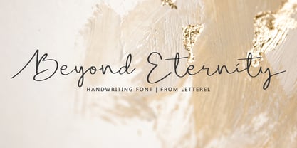
$14.00Welcoming to a new script font from letterel "Beyond Eternity" Beyond Eternity is a delicate script font with opentype featured such as ligature, swash and alternates. There are two styles for uppercase, a casual one and alternates one with beginning swash. For lowercase there are both beginning and ending swash to complete your design needs. All characters are coming with PUA encoded, so they are accessible. If you are not common with opentype featured you can use Beyond Eternity Alternates to access Uppercase Alternates and Beyond Eternity Swash to access lowercase swashes with ease. Happy Design - Galavant by Atlantic Fonts,
$32.00Galavant will take you anywhere you want to go! Enjoy three font looks in one; a fun, chunky lower-case, a bold, animated upper-case, and in all-caps with discretionary ligatures turned on, Galavant is tightly interlocking. To explore the interlocking possibilities, turn some ligatures off and others on until you settle on the best combo. There are over 260 two, three, and four-letter ligatures available. Discover interlocking ligatures featuring lower-case "i" along the road as well. In sentence-case, turn discretionary ligatures off, except to add more handmade variation in double-letter pairs and to access a fine "ft". However you roam, Galavant aims to entertain. - Dusty Circus by Baseline Fonts,
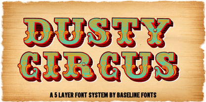
$24.00Dusty Circus™ is a five layer stacking display face designed to be infinitely morphed. The metrics are set identically in the individual and family set, to provide for typographic ease (although we seem to prefer an offset appearance). Great for a vintage western feel or a modern aesthetic. In addition, note that it is very easy to omit a layer and add multiple copies of other layers to produce a 3D bevel on the fly, or inline styles with flair and substance. LTD is a short set for non-commercial use only and combines two of the layers with many features/glyphs removed. - Virna by FSD,
$60.00In September, 2003 I was contacted by MTV for the restyling of mtv.it I started from the beginning to work on a radical simplification of its visual elements, to achieve a better usability. It didn't take me so much to realize the basic design I attempted would have called for a notable reduction of the rich imagery distinguishing MTV's visual identity. As a visual aid to help me in this process I designed Virna, a headline "op-art" inspired face with the ability to create both vertical and horizontal ligatures between single words among two text lines, with the same ease of linking letters in handwriting or a linked script typeface. - Gridlite PE Variable by Rosetta,
$290.00The two great technical constraints a type designer can tackle are low resolution, which limits detail and dictates proportions between negative and positive shapes, and uniform width, which restricts each letter to a fixed horizontal space. Wrestle with both at once, and each letter becomes a black-and-white chessboard that challenges every design decision. Sometimes battling these constraints gets in the way of a good idea, but other times, tinkering with fewer options can make the job irresistibly easy and lead straight to a grid addiction. Gridlite, an experiment with a modular negative space, is the side effect of such an addiction. It’s simplified, monospaced, and variable: foreground and background alike are ready to be animated, typed, scaled up, scaled down, rounded, or otherwise deformed. Gridlite is primarily a variable font with axes that control the size of the elements, their shape, and the background (one for the rectangular field and one for the compact envelope around the letters). The fonts cover Cyrillic, Greek, and Latin scripts. Small caps are included, for no apparent reason ... and there is a monospaced elephant, too. - Contenu by Hackberry Font Foundry,
$24.95Because Contenu is designed for text use, it is spaced for body copy in the 9-12 point range. That is far too much spacing for heads, subheads, and the like. So I made the display version of Contenu Book to use for headers. In the process of tightening the spacing at the very large sizes, I also made some minor modifications to the glyph shapes to make this version a little more elegant. Contenu Opentype has two Opentype families for print design. Contenu Book has five fonts: Regular, Italic, Bold, Bold Italic, and Display. Contenu has Medium, Medium Italic, Black, and Black Italic. The name is French for content and this is what the family is designed for: text, body copy, and book layout. If it has a style, it is a modern take on oldstyle serif font using Jenson as a mask. There are no plans for display versions of the bolder weights or the italics. If you want them, use Contenu Medium, Book Bold, Contenu Black, or any of the four italics and tighten the tracking. - Mr. Jenkins by Lindstrom Design,
$13.00Mr. Jenkins is designed to fill the void between the crazy, wacky and reckless comic style fonts, and the standard boring but very readable sans-serif typefaces. It makes for a distinctive bold headline, but is also quite legible at small sizes. It’s just off kilter enough to not take itself too seriously. A deceptively care-free font, each character was carefully drawn. The spacing and kerning of each letter and letter combination were painstakingly considered. Particular attention was paid to maintaining consistent optical weights and a spontaneous appearance. Mr. Jenkins is inspired heavily by humanist sans-serif faces such as Myriad and Lucida Sans, with its open apertures, and low contrast but almost calligraphic line weights. The lowercase a is single story in the italic face, but two story in the regular face. It contains uncommon features amongst many “quirky” fonts, including a full set of latin accented characters, lining and proportional figures, math symbols, standard fractions, foreign currency marks, contextual alternates, and even a few ligatures. - Mamirolle by The Ampersand Forest,
$20.00Sometimes a sans serif just needs a sister. Meet Mamirolle! A geometric wedge-serif companion to Mimolette! (OR is Mimolette the sans serif companion to Mamirolle.... hmmmmm....) Mamirolle, like her sister, is great for text and display alike—she's super-readable AND super-legible, and her different weights lend themselves to creating clear contrast in your textual hierarchy! And she's got some nifty features, too! Mamirolle has a two-story a and g in the upright versions, but if you want a one-story a and g, just turn on Stylistic Set 01! Her italic is a true italic, not just an oblique. Want more playful cursive alternatives in the italic? Activate Stylistic Set 02, and you've got them in the A, E, K, Q, R, and k. She's got true small caps in all styles! She's got true fractions in all styles, as well as oldstyle (small cap) and lining numerals, in both tabular and proportional widths. Best of all, perhaps, Mamirolle was made with love, as always, by yer pals in the Ampersand Forest. - Contenu Book by Hackberry Font Foundry,
$24.95Because Contenu is designed for text use, it is spaced for body copy in the 9-12 point range. That is far too much spacing for heads, subheads, and the like. So I made the display version of Contenu Book to use for headers. In the process of tightening the spacing at the very large sizes, I also made some minor modifications to the glyph shapes to make this version a little more elegant. Contenu Opentype has two Opentype families for print design. Contenu Book has five fonts: Regular, Italic, Bold, Bold Italic, and Display. Contenu has Medium, Medium Italic, Black, and Black Italic. The name is French for content and this is what the family is designed for: text, body copy, and book layout. If it has a style, it is a modern take on oldstyle serif font using Jenson as a mask. There are no plans for display versions of the bolder weights or the italics. If you want them, use Contenu Medium, Book Bold, Contenu Black, or any of the four italics and tighten the tracking. - Cherry by Fenotype,
$19.00Cherry is a bold and smooth display family with connecting script “Brush” and supporting thin marker caps “Sans”. In addition there is “Extras” which is a set of strokes and ornaments designed to go with the fonts. Cherry Print is the same set with rugged outlines and eroded print texture. Cherry Brush has clear and smooth letter shapes with lot’s of character. It’s great for Logo, Poster, Headlines, Packaging or any Display use. Cherry Brush is equipped with plenty of contextual alternates and ligatures that keep the connections smooth. This feature is set in Standard Ligatures and it’s on by default. Cherry Brush is designed so that you can also use it to writ ALL CAPS. For more flashy initials try Swash feature. Cherry Brush is PUA encoded so you can access extra characters in most graphic design softwares. Cherry Sans is an all caps thin marker font with two size of letters (uppercase & lowercase). Cherry Sans is clean and legible. It’s designed to work with Cherry Brush but works just fine on its own too.
