10,000 search results
(0.025 seconds)
- Typographer Rotunda Alt - Personal use only
- brunoBook - Personal use only
- Ganz Grobe Gotisch - Personal use only
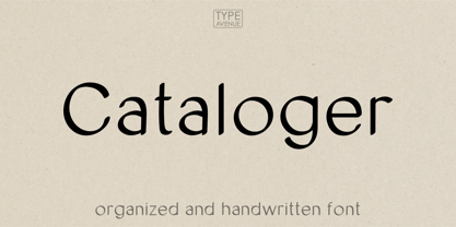
- Cataloger by The Arborie,
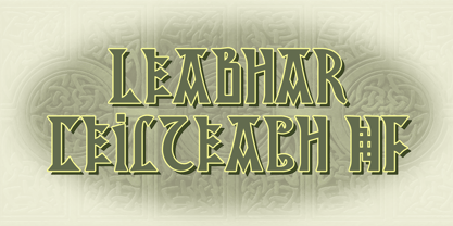
$11.00 - Leabhar Ceilteach NF by Nick's Fonts,
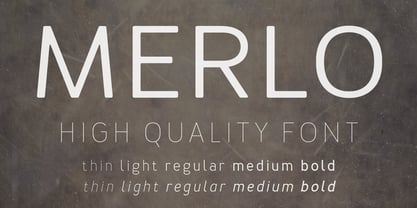
$10.00 - Merlo by Typoforge Studio,
$25.00 - Turban Hey NF by Nick's Fonts,
$10.00 - TypographerFraktur - Unknown license
- Ornate Blackboards by Intellecta Design,
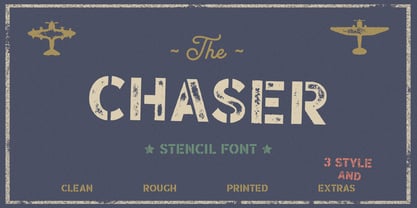
$16.90 - Chaser by Larin Type Co,
$12.00 - Bing by Pelavin Fonts,
$20.00 - Big Trees by A New Machine,
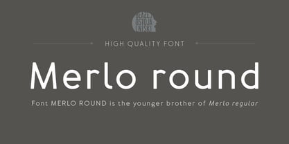
$19.00 - Merlo Round by Typoforge Studio,
$25.00 - Slave - Unknown license
- Sign Maker JNL by Jeff Levine,
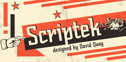
$29.00 - Scriptek by ITC,
$29.99 - ZentenarZier - Unknown license
- Yanone Kaffeesatz - Unknown license
- stamPete - Unknown license
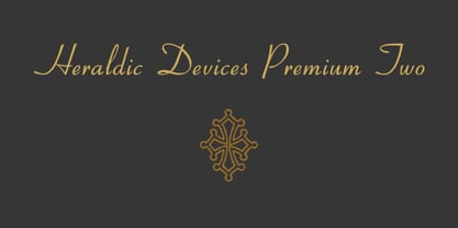
- Heraldic Devices Premium by Intellecta Design,
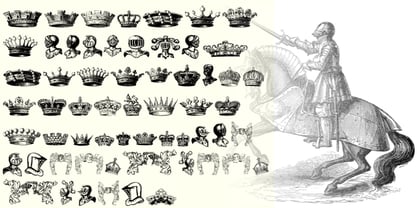
$16.90 - Stahlhelme Und Kronen by Intellecta Design,
$22.90 - Bobbin by Typoforge Studio,
$19.00 - Neufile Grotesk by Halbfett,
$30.00 - dearJoe 2 - Unknown license
- Steelplate Textura - Personal use only
- Paulus Franck Initialen - Personal use only
- Rephran by Mirror Types,
$20.00 - Linotype Bix by Linotype,
$29.99 - Bobbin Cyrllic by Typoforge Studio,
$25.00 - Minehead by Hanoded,
$15.00 - joeHand 3 - Personal use only
- San Remo - Personal use only
- bearerFond - Personal use only
- curlyJoe - Unknown license
- flutSaus - Unknown license
- joeHand 2 - Unknown license
- Toskanische Egyptienne Initialen - Personal use only
- Koch-Antiqua Zier - Personal use only
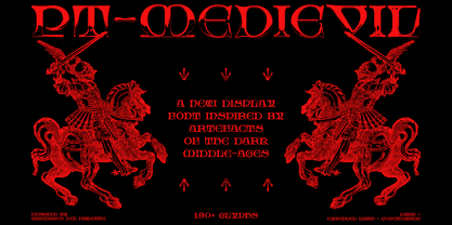
- PT Medievil by Paupe Type,
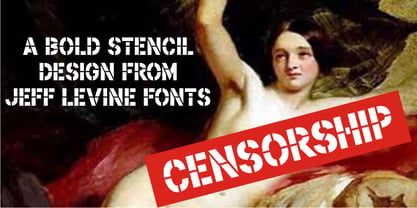
$10.00 - Censorship JNL by Jeff Levine,
$29.00


