10,000 search results
(0.04 seconds)
- County Clerk JNL by Jeff Levine,
$29.00 County Clerk JNL was modeled after the vintage Hamilton wood type design Gothic Special, and is available in both regular and oblique versions. An early grotesk font, this condensed sans serif lends itself well to short headlines and brief body copy.
 - Xahosch by Ingrimayne Type,
$9.95 Xahosch uses a calligraphic pen to form a set of letters in which circular elements are based on a bottom-heavy egg shape. A pen-drawn san-serif face, it is available in three weights, each with an italic style.
 - Mylon by Nasir Udin,
$19.00 Mylon is an elegant display sans-serif family with high contrast. It has 14 styles with 7 weights plus matching italics. Mylon works well with headlines or short paragraphs. It has extended latin character set that supports 200+ latin-based languages.
 - Happy vibe by Brown Cupple Typeface,
$15.00 Happy vibe is a cool retro groovy decorative font. The additional elements of blood dripping and bones-like letters make an ambiance of horror Invitations, postcards, posters, and headings for a Halloween event; this font can be used in every setting.
 - Ligurino by Typodermic,
$11.95 Introducing Ligurino, the sleek and sophisticated sans-serif typeface that is the epitome of clean design. With its gentle yet elegant appearance, Ligurino is sure to elevate any project it graces. Ligurino’s clean style is its greatest asset, boasting a simple and minimalist aesthetic that maximizes readability. Whether you’re designing a logo or crafting a body of text, Ligurino’s legibility will ensure your message is communicated loud and clear. What’s more, Ligurino comes with an OpenType “stylistic alternatives” function, which allows you to access an austere “Q” for added versatility. Plus, with three widths, six weights, italics, and an all-caps outline style, you have complete creative control over your project. Ligurino’s contemporary design is the perfect blend of form and function. Its modern yet timeless appearance is sure to make a lasting impression on your audience. So why settle for anything less? Choose Ligurino and let your design stand out with its refined and polished look. Most Latin-based European, Vietnamese, Greek, and most Cyrillic-based writing systems are supported, including the following languages. Afaan Oromo, Afar, Afrikaans, Albanian, Alsatian, Aromanian, Aymara, Azerbaijani, Bashkir, Bashkir (Latin), Basque, Belarusian, Belarusian (Latin), Bemba, Bikol, Bosnian, Breton, Bulgarian, Buryat, Cape Verdean, Creole, Catalan, Cebuano, Chamorro, Chavacano, Chichewa, Crimean Tatar (Latin), Croatian, Czech, Danish, Dawan, Dholuo, Dungan, Dutch, English, Estonian, Faroese, Fijian, Filipino, Finnish, French, Frisian, Friulian, Gagauz (Latin), Galician, Ganda, Genoese, German, Gikuyu, Greenlandic, Guadeloupean Creole, Haitian Creole, Hawaiian, Hiligaynon, Hungarian, Icelandic, Igbo, Ilocano, Indonesian, Irish, Italian, Jamaican, Kaingang, Khalkha, Kalmyk, Kanuri, Kaqchikel, Karakalpak (Latin), Kashubian, Kazakh, Kikongo, Kinyarwanda, Kirundi, Komi-Permyak, Kurdish, Kurdish (Latin), Kyrgyz, Latvian, Lithuanian, Lombard, Low Saxon, Luxembourgish, Maasai, Macedonian, Makhuwa, Malay, Maltese, Maori, Moldovan, Montenegrin, Nahuatl, Ndebele, Neapolitan, Norwegian, Novial, Occitan, Ossetian, Ossetian (Latin), Papiamento, Piedmontese, Polish, Portuguese, Quechua, Rarotongan, Romanian, Romansh, Russian, Rusyn, Sami, Sango, Saramaccan, Sardinian, Scottish Gaelic, Serbian, Serbian (Latin), Shona, Sicilian, Silesian, Slovak, Slovenian, Somali, Sorbian, Sotho, Spanish, Swahili, Swazi, Swedish, Tagalog, Tahitian, Tajik, Tatar, Tetum, Tongan, Tshiluba, Tsonga, Tswana, Tumbuka, Turkish, Turkmen (Latin), Tuvaluan, Ukrainian, Uzbek, Uzbek (Latin), Venda, Venetian, Vepsian, Vietnamese, Võro, Walloon, Waray-Waray, Wayuu, Welsh, Wolof, Xavante, Xhosa, Yapese, Zapotec, Zarma, Zazaki, Zulu and Zuni.
 - Coco Gothic Pro by Zetafonts,
$39.00 Inspired by a biography of Coco Chanel and trying to capture the quintessential mood of classical fashion elegance, Cosimo Lorenzo Pancini designed Coco Gothic looking for the effect that the first geometric sans typefaces (like Futura, Kabel or the italian eponyms like Semplicità) had when printed on paper. The crisp modernist shapes acquired in printing charme and warmth through a slight rounding of the corners that is translated digitally in the design of Coco Gothic. This signature touch is enhanced by the inclusion of light humanist touches to the proportions of the letters, resulting in the unique mix that makes Coco Gothic one of our best sellers, with a look that is both contemporary and vintage. After six years from the original project (that has spawned in the meanwhile successful families like Cocogoose and Coco Sharp), we went back to the design to completely redraw and expand the original family, creating with a Pro version that has better on-screen readability, a wider weight range, variable type versions and more language coverage (with Coco Gothic Arabic adding a new script to the latin, greek and Cyrillic of the original). Coco Gothic Pro comes in three subfamilies, each with seven weights with matching italics and featuring an extended character set with open type support for small caps, ligatures, alternates, European languages, Greek and Cyrillic alphabets. The original, body-text optimised Coco Gothic and Coco Gothic Alternate subfamilies have been kept for compatibility with the previous version, while a new Coco Gothic Display subfamily has been developed with a complete redesign aimed at display usage, featuring tighter spacing and optimised letterforms. A distinguishing feature of Coco Gothic Pro is the inclusion of ten alternate historical sets that allow you to use the typeface as a true “typographic time machine”, selecting period letterforms that range from art deco and nouveau, to modernism and to eighties’ minimalism. Equipped with such an array of historical variants, Coco Gothic Pro becomes an encyclopedia of styles from the last century, ready to transform itself and adapt to the mood of your text.
 - Sgraffio by Eurotypo,
$48.00 Sgraffio is a classic script font with an elegant contemporary style. Inspired by the CopperPlate script, it is an updated viewpoint. The special characteristics of this typeface is that its strokes are agile and dynamic, with slight and smooth variations in thickness, giving to the final art a sophisticated atmosphere. It is attractive and readable. It can be used in decorative titles, as well as in large readable text. Contain a useful set of OpenType features that can help you in many typographic fine adjustments, you can choose from different alternates, swashes, discretionary and standard ligatures. This fonts is completed with Old Style figures and Central European languages. It is ideal for fashion magazines, advertising, business web, logotypes, lettering - logotypes, e-commerce brands, books, greeting / wedding cards, packaging, labels or any type of effective visual communication purpose.
 - Intimate Summer by Get Studio,
$15.00 Introducing Intimate Summer Font Duo, featuring a strong and bold sans font alongside a casual handwriting-inspired script font. This duo is a perfect combination that brings harmony and versatility to your creative projects. The bold sans font exudes strength and confidence with its clean lines and thick letterforms. It commands attention and adds a modern and retro touch to any design. Complementing the bold sans is the casual script font, which mimics the relaxed style of handwritten text. This script font brings a unique and free-spirited atmosphere to your typographic compositions. Together, this font duo offers an ideal balance between strength and casualness, making it a versatile choice for a variety of design applications. Whether you're designing logos, branding materials, invitations, or editorial layouts, this font duo is a captivating combination that adds an irreplaceable casual touch to your projects.
 - Avenir Next Cyrillic by Linotype,
$49.00 The original Avenir typeface was designed by Adrian Frutiger in 1988, after years of having an interest in sans serif typefaces. The word Avenir means “future” in French and hints that the typeface owes some of its interpretation to Futura. But unlike Futura, Avenir is not purely geometric; it has vertical strokes that are thicker than the horizontals, an “o” that is not a perfect circle, and shortened ascenders. These nuances aid in legibility and give Avenir a harmonious and sensible appearance for both texts and headlines. In 2012, Akira Kobayashi worked alongside Avenir’s esteemed creator Adrian Frutiger to bring Avenir Next to life, as a new take on the classic Avenir. The goal of the project was to take a beautifully designed sans and update it so that its technical standards surpass the status quo, leaving us with a truly superior sans family. Since then, Monotype expanded the typeface to accommodate more languages. Akira’s deep familiarity with existing iterations of the Frutiger designs, along with his understanding of the design philosophy of the man himself, made him uniquely suited to lead the creation of different language fonts. Avenir Next World family, the most recent release from Monotype, is an expansive family of fonts that offers support for more than 150 languages and scripts that include Latin, Cyrillic, Greek, Hebrew, Arabic, Georgian, Armenian and Thai. Avenir Next World contains 10 weights, from UltraLight to Heavy. The respective 10 Italic styles do not support Arabic, Georgian and Thai, since Italic styles are unfamiliar in these scripts/languages. Separate Non-Latin products to support just the Arabic, Cyrillic, Georgian, Hebrew and Thai script are also available for those who do not need the full language support.
 - Avenir Next World by Linotype,
$149.00 The original Avenir typeface was designed by Adrian Frutiger in 1988, after years of having an interest in sans serif typefaces. The word Avenir means “future” in French and hints that the typeface owes some of its interpretation to Futura. But unlike Futura, Avenir is not purely geometric; it has vertical strokes that are thicker than the horizontals, an “o” that is not a perfect circle, and shortened ascenders. These nuances aid in legibility and give Avenir a harmonious and sensible appearance for both texts and headlines. In 2012, Akira Kobayashi worked alongside Avenir’s esteemed creator Adrian Frutiger to bring Avenir Next to life, as a new take on the classic Avenir. The goal of the project was to take a beautifully designed sans and update it so that its technical standards surpass the status quo, leaving us with a truly superior sans family. Since then, Monotype expanded the typeface to accommodate more languages. Akira’s deep familiarity with existing iterations of the Frutiger designs, along with his understanding of the design philosophy of the man himself, made him uniquely suited to lead the creation of different language fonts. Avenir Next World family, the most recent release from Monotype, is an expansive family of fonts that offers support for more than 150 languages and scripts that include Latin, Cyrillic, Greek, Hebrew, Arabic, Georgian, Armenian and Thai. Avenir Next World contains 10 weights, from UltraLight to Heavy. The respective 10 Italic styles do not support Arabic, Georgian and Thai, since Italic styles are unfamiliar in these scripts/languages. Separate Non-Latin products to support just the Arabic, Cyrillic, Georgian, Hebrew and Thai script are also available for those who do not need the full language support.
 - Avenir Next Hebrew by Linotype,
$79.00 The original Avenir typeface was designed by Adrian Frutiger in 1988, after years of having an interest in sans serif typefaces. The word Avenir means “future” in French and hints that the typeface owes some of its interpretation to Futura. But unlike Futura, Avenir is not purely geometric; it has vertical strokes that are thicker than the horizontals, an “o” that is not a perfect circle, and shortened ascenders. These nuances aid in legibility and give Avenir a harmonious and sensible appearance for both texts and headlines. In 2012, Akira Kobayashi worked alongside Avenir’s esteemed creator Adrian Frutiger to bring Avenir Next to life, as a new take on the classic Avenir. The goal of the project was to take a beautifully designed sans and update it so that its technical standards surpass the status quo, leaving us with a truly superior sans family. Since then, Monotype expanded the typeface to accommodate more languages. Akira’s deep familiarity with existing iterations of the Frutiger designs, along with his understanding of the design philosophy of the man himself, made him uniquely suited to lead the creation of different language fonts. Avenir Next World family, the most recent release from Monotype, is an expansive family of fonts that offers support for more than 150 languages and scripts that include Latin, Cyrillic, Greek, Hebrew, Arabic, Georgian, Armenian and Thai. Avenir Next World contains 10 weights, from UltraLight to Heavy. The respective 10 Italic styles do not support Arabic, Georgian and Thai, since Italic styles are unfamiliar in these scripts/languages. Separate Non-Latin products to support just the Arabic, Cyrillic, Georgian, Hebrew and Thai script are also available for those who do not need the full language support.
 - David Hadash Script by Monotype,
$50.99Monotype Imaging is pleased to present David Hadash (New" David), the full family of typefaces by Ismar David, in its intended authentic form. The Estate of Ismar David has sought to revive this jewel of Twentieth-Century design by granting an exclusive license to Monotype Imaging to implement it in industry-standard format. Never before has the typeface in its full set of sub-styles been made available to the design community. David Hadash consists of three style families, Formal, Script, and Sans. Each of these appears in three weigths: regular, medium, and bold. Originally devised as a companion to the upright Formal style, the Script style has a beauty and grace all its own that allows it to be used for full-page settings also. While it is forward-leaning and dynamic, it does not match any of the existing cursive styles of Hebrew script. Ismar David created an eminently readable hybrid style which is like no other by inclining the forms of the upright while blending in some features of Rashi style softened with gentle curves. One can say that the Script style is the first truly italic, not just oblique, typeface for Hebrew script. Although the proportions of the Sans style are very similar to those of the Formal style, its visual impression is stunningly different. If the Formal style is believably written with a broad-point pen, the Sans is chiseled in stone. Rounded angles turn angular and stark. The end result is an informal style that evokes both ancient and contemporary impressions. David Hadash (Modern) supports the writing conventions of Modern Hebrew (including fully vocalized text) in addition to Yiddish and Ladino. David Hadash Biblical is a version of the Formal style that supports all the complexities of Biblical Hebrew, including vocalization and cantillation marks. " - David Hadash Biblical by Monotype,
$50.99Monotype Imaging is pleased to present David Hadash (New" David), the full family of typefaces by Ismar David, in its intended authentic form. The Estate of Ismar David has sought to revive this jewel of Twentieth-Century design by granting an exclusive license to Monotype Imaging to implement it in industry-standard format. Never before has the typeface in its full set of sub-styles been made available to the design community. David Hadash consists of three style families, Formal, Script, and Sans. Each of these appears in three weigths: regular, medium, and bold. Originally devised as a companion to the upright Formal style, the Script style has a beauty and grace all its own that allows it to be used for full-page settings also. While it is forward-leaning and dynamic, it does not match any of the existing cursive styles of Hebrew script. Ismar David created an eminently readable hybrid style which is like no other by inclining the forms of the upright while blending in some features of Rashi style softened with gentle curves. One can say that the Script style is the first truly italic, not just oblique, typeface for Hebrew script. Although the proportions of the Sans style are very similar to those of the Formal style, its visual impression is stunningly different. If the Formal style is believably written with a broad-point pen, the Sans is chiseled in stone. Rounded angles turn angular and stark. The end result is an informal style that evokes both ancient and contemporary impressions. David Hadash (Modern) supports the writing conventions of Modern Hebrew (including fully vocalized text) in addition to Yiddish and Ladino. David Hadash Biblical is a version of the Formal style that supports all the complexities of Biblical Hebrew, including vocalization and cantillation marks. " - David Hadash Formal by Monotype,
$50.99Monotype Imaging is pleased to present David Hadash (New" David), the full family of typefaces by Ismar David, in its intended authentic form. The Estate of Ismar David has sought to revive this jewel of Twentieth-Century design by granting an exclusive license to Monotype Imaging to implement it in industry-standard format. Never before has the typeface in its full set of sub-styles been made available to the design community. David Hadash consists of three style families, Formal, Script, and Sans. Each of these appears in three weigths: regular, medium, and bold. Originally devised as a companion to the upright Formal style, the Script style has a beauty and grace all its own that allows it to be used for full-page settings also. While it is forward-leaning and dynamic, it does not match any of the existing cursive styles of Hebrew script. Ismar David created an eminently readable hybrid style which is like no other by inclining the forms of the upright while blending in some features of Rashi style softened with gentle curves. One can say that the Script style is the first truly italic, not just oblique, typeface for Hebrew script. Although the proportions of the Sans style are very similar to those of the Formal style, its visual impression is stunningly different. If the Formal style is believably written with a broad-point pen, the Sans is chiseled in stone. Rounded angles turn angular and stark. The end result is an informal style that evokes both ancient and contemporary impressions. David Hadash (Modern) supports the writing conventions of Modern Hebrew (including fully vocalized text) in addition to Yiddish and Ladino. David Hadash Biblical is a version of the Formal style that supports all the complexities of Biblical Hebrew, including vocalization and cantillation marks. " - Fabrizio by ARTypes,
$60.00 The new Fabrizio™ types, designed by Ari Rafaeli, have made their first appearance in Saggi di Letteratura Italiana: Da Dante per Pirandello a Orazio Costa, by Lucilla Bonavita, printed at Pisa in March 2016 by Fabrizio Serra Editore for whom the type was specially designed. The types are now offered for general sale. Each style (roman, small capitals, italic, semi-bold, bold) contains Cyrillic and ‘polytonic’ Greek letters and letters for many European languages (Czech, Hungarian, Icelandic, Lettish, Polish, Romanian, Serbian, Ukrainian, Welsh etc.), non-kerning fs, long ſ, ligatures and fractions. Alternative forms are supplied in ‘B’ versions of each style. A set of swash letters and sets of superiors, inferiors, fractions and phonetic letters are also offered. Two ‘Special’ fonts (roman and italic) containing special accents, letters for transliteration, Vietnamese letters, mathematics signs and symbols, arrows, commercial signs, pictograms, figures in circles, scansion marks, braces & benzene rings and the Rafaeli-Meruba Hebrew letters, as well as Latin, Cyrillic and Greek letters, are included in the Fabrizio family.
 - Vesta by Linotype,
$29.99 In the late 1990s Gerard Unger won the assignment to design the signage system for the Holy Year celebrations to be held in Rome in 2000. The system he developed in cooperation with the design agency n|p|k used a classically inspired serif typeface, but the earlier proposals included a sans-serif, which became Vesta (2001). Vesta is a versatile family that can be used as a display face alongside Unger's serif faces Gulliver, Capitolium or Coranto; it can also be used on its own, even in longer texts. Vesta is narrower and therefore more economical than some commonly used sans serifs such as Arial and Helvetica; there is also a noticeable contrast between thick and thin parts, which makes it more lively. Vesta is to be extended with narrow versions, small capitals and old style numerals, along with some special versions for headlines.
 - Shookup by Typodermic,
$11.95 If you’re looking for a typeface that will add a little extra pizzazz to your message, look no further than Shookup! This curly, springy font is the perfect way to inject some fun and casual humor into your designs. With its lively, bouncing letters, Shookup is guaranteed to catch the eye and put a smile on your readers’ faces. But don’t be fooled by its playful appearance—this typeface is also highly functional and versatile, making it a great choice for a wide range of design projects. One of the most unique features of Shookup is its automatic jumbling of letters and numerals in OpenType-aware programs. This gives the typeface an even bouncier, more dynamic look that’s sure to make your message stand out from the crowd. Whether you’re designing a magazine spread, a social media post, or an eye-catching poster, Shookup is the perfect typeface to help you convey a sense of joy and fun. So why not give it a try and see how it can take your designs to the next level? Most Latin-based European writing systems are supported, including the following languages. Afaan Oromo, Afar, Afrikaans, Albanian, Alsatian, Aromanian, Aymara, Bashkir (Latin), Basque, Belarusian (Latin), Bemba, Bikol, Bosnian, Breton, Cape Verdean, Creole, Catalan, Cebuano, Chamorro, Chavacano, Chichewa, Crimean Tatar (Latin), Croatian, Czech, Danish, Dawan, Dholuo, Dutch, English, Estonian, Faroese, Fijian, Filipino, Finnish, French, Frisian, Friulian, Gagauz (Latin), Galician, Ganda, Genoese, German, Greenlandic, Guadeloupean Creole, Haitian Creole, Hawaiian, Hiligaynon, Hungarian, Icelandic, Ilocano, Indonesian, Irish, Italian, Jamaican, Kaqchikel, Karakalpak (Latin), Kashubian, Kikongo, Kinyarwanda, Kirundi, Kurdish (Latin), Latvian, Lithuanian, Lombard, Low Saxon, Luxembourgish, Maasai, Makhuwa, Malay, Maltese, Māori, Moldovan, Montenegrin, Ndebele, Neapolitan, Norwegian, Novial, Occitan, Ossetian (Latin), Papiamento, Piedmontese, Polish, Portuguese, Quechua, Rarotongan, Romanian, Romansh, Sami, Sango, Saramaccan, Sardinian, Scottish Gaelic, Serbian (Latin), Shona, Sicilian, Silesian, Slovak, Slovenian, Somali, Sorbian, Sotho, Spanish, Swahili, Swazi, Swedish, Tagalog, Tahitian, Tetum, Tongan, Tshiluba, Tsonga, Tswana, Tumbuka, Turkish, Turkmen (Latin), Tuvaluan, Uzbek (Latin), Venetian, Vepsian, Võro, Walloon, Waray-Waray, Wayuu, Welsh, Wolof, Xhosa, Yapese, Zapotec Zulu and Zuni.
 - Sui Generis by Typodermic,
$11.95 Looking for a typeface that’s as unique as your personality? Look no further than Sui Generis, the rounded square sans-serif that’s unlike any other. With its technical letterforms and boxy curves, Sui Generis has an industrial character that’s all its own. It’s the kind of typeface that demands attention, without ever feeling pushy or obnoxious. In fact, its understated charm is part of what makes it so special. But don’t let its quirky personality fool you—Sui Generis is as practical as it is unique. With four weights, two widths, italics, and an outline style, it’s incredibly versatile and perfect for any project that requires a touch of character. So if you’re tired of bland, run-of-the-mill typefaces that all look the same, give Sui Generis a try. Its square letterforms and distinctive voice will make your design stand out from the crowd, and leave a lasting impression on anyone who sees it. Most Latin-based European writing systems are supported, including the following languages. Afaan Oromo, Afar, Afrikaans, Albanian, Alsatian, Aromanian, Aymara, Bashkir (Latin), Basque, Belarusian (Latin), Bemba, Bikol, Bosnian, Breton, Cape Verdean, Creole, Catalan, Cebuano, Chamorro, Chavacano, Chichewa, Crimean Tatar (Latin), Croatian, Czech, Danish, Dawan, Dholuo, Dutch, English, Estonian, Faroese, Fijian, Filipino, Finnish, French, Frisian, Friulian, Gagauz (Latin), Galician, Ganda, Genoese, German, Greenlandic, Guadeloupean Creole, Haitian Creole, Hawaiian, Hiligaynon, Hungarian, Icelandic, Ilocano, Indonesian, Irish, Italian, Jamaican, Kaqchikel, Karakalpak (Latin), Kashubian, Kikongo, Kinyarwanda, Kirundi, Kurdish (Latin), Latvian, Lithuanian, Lombard, Low Saxon, Luxembourgish, Maasai, Makhuwa, Malay, Maltese, Māori, Moldovan, Montenegrin, Ndebele, Neapolitan, Norwegian, Novial, Occitan, Ossetian (Latin), Papiamento, Piedmontese, Polish, Portuguese, Quechua, Rarotongan, Romanian, Romansh, Sami, Sango, Saramaccan, Sardinian, Scottish Gaelic, Serbian (Latin), Shona, Sicilian, Silesian, Slovak, Slovenian, Somali, Sorbian, Sotho, Spanish, Swahili, Swazi, Swedish, Tagalog, Tahitian, Tetum, Tongan, Tshiluba, Tsonga, Tswana, Tumbuka, Turkish, Turkmen (Latin), Tuvaluan, Uzbek (Latin), Venetian, Vepsian, Võro, Walloon, Waray-Waray, Wayuu, Welsh, Wolof, Xhosa, Yapese, Zapotec Zulu and Zuni.
 - Net Hunt by Putracetol,
$28.00 NetHunt - Spider Display Sans Font Introducing NetHunt, a spider display sans font that is perfect for any design that requires a horror or scary look. The font is inspired by an old embossed nameplate with cobwebs in it, and the designer made it into a display font. NetHunt features both uppercase and lowercase versions, with the lowercase version not having the cobweb design. The font also includes a sans ligature feature that makes the cobwebs of each word even cooler. If you are looking for a font that will give your designs a spooky and eerie vibe, NetHunt is the perfect choice. Use it for logos, titles, logotypes, covers, headlines, apparel, comics, cover books, cards, posters, or anything else that requires a horror or scary look. NetHunt comes with a variety of features that make it a versatile font. The font includes uppercase and lowercase letters, opentype alternates and ligatures, and multilingual support for a wide range of languages. The font also includes number, punctuation, and symbol glyphs. The font can be used on both Windows and Mac operating systems and is compatible with most design software, including Adobe Photoshop, Illustrator, InDesign, and more. If you want to add a spooky and horror touch to your designs, NetHunt is the font for you. It is perfect for Halloween designs, horror movie posters, or any design project that requires a unique and scary font. Use it for your next project and see the difference it makes! In summary, NetHunt is a spider display sans font that is perfect for horror and scary designs. It is inspired by an old embossed nameplate with cobwebs and features both uppercase and lowercase versions. The font includes opentype alternates and ligatures, multilingual support, and number, punctuation, and symbol glyphs. Use NetHunt for your next design project and add a spooky and eerie vibe to your designs. Tags: spider, display, sans, horror, scary, Halloween, movie poster, logo, title, logotype, cover, headline, apparel, comic, books, cards, posters, opentype, ligatures, multilingual, glyphs.
 - FS Split Serif by Fontsmith,
$80.00 Quirky and irregular FS Split is no ordinary typeface. Its irregular proportions make it unique, with round letters appearing wide, and straight letters narrow. Other quirks include its eclectic crossbars – the uppercase ‘A’ has an unusually low bar, while the bar on ‘G’ is particularly long. The uppercase has many interesting features in fact, including large counters, closed terminals on certain letters like ‘J’, and a cap-height that lines up with ascenders. The lowercase also holds surprises – the dots on ‘i’ and ‘j’ are unusually large, and some characters, such as ‘g’, feature double-storey counters. An extreme but stylish italic The italic versions of FS Split Sans and Serif are particularly striking. While similar in style to their upright, Roman versions, they take on a larger-than-usual 18-degree angle, making the forward-slant more dramatic. Although the main purpose of any italic is to help words and phrases stand out, this unique execution helps to make the italic variants of FS Split stylish fonts in their own right – they would work brilliantly on magazine covers, in titles and headlines, pull quotes, and even used commercially in logos and corporate branding. Serif and sans: a split personality FS Split Sans and Serif have their differences but also their similarities, contrasting and complementing each other perfectly. This ‘love hate’ relationship inspired the name of the typeface family, and means the two variants provide a versatile, typographic palette for use in graphics and branding. While its proportions are similar to the sans, the serif has a bigger contrast between its weights of bold, regular and light, bracketed serifs, and different styles of terminals, some being straight and others ball-shaped. FS Split Sans has more subtlety and simplicity, with a smaller weight contrast, less flamboyant terminals, and more consistent counter sizes. The two variants are distinct yet alike, so can be used successfully either in isolation or together.
 - Neo Afrique Pro by Tondi Republk,
$17.00 Neo Afrique sans a neo-futuristic typeface with a modern decorative twist. This typeface design came out of further development and refinement on an original typeface that i created some time ago, Durango Sans. True in nature to it's predecessor, Neo Afrique was also born out of this desire to fuse two different aesthetics, the geometric Neo-Futuristic aesthetic, fused with flourishing decorative forms from Art Nouveau and the later Lubalinesque aesthetics. This typeface will form part of a larger body of work that is meant to be an exploration of Afrikan neo-futurism, using the immense power of visual-linguistic narratives to catalyse new cultural movement and perception.
 - Golden Brown by Flawlessandco,
$9.00 Introducing "Golden Brown" - An Elegant Sans Serif Font. Step into a world of refined beauty with "Golden Brown," an elegant sans serif font that not only exudes sophistication but also offers a range of alternate characters and ligatures to elevate your design possibilities. There's some connected letters and some alternates that suitable for any graphic designs such as branding materials, t-shirt, print, business cards, logo, poster, t-shirt, photography, quotes .etc This font support for some multilingual. Also contains uppercase A-Z and lowercase a-z, alternate character, numbers 0-9, and some punctuation. If you need help, just write me! Thanks so much for checking out my shop!
 - Millbrae JNL by Jeff Levine,
$29.00 In the city of Millbrae (just South of San Francisco in San Mateo County, California) stands an office building which formerly housed the Millbrae Theater. California has the distinction of preserving artifacts of its past, unlike many other portions of the US, and the perpendicular "Millbrae" sign with its neon tubes and Art Deco lettering is still attached to the renovated structure. Gene Gable (a friend of type designer Jeff Levine) took a photo of the sign and sent it along as simply an image of great lettering of the past to enjoy, but it triggered the inspiration to create the namesake font Millbrae JNL.
 - Suzanstein by Arterfak Project,
$29.00 When horror and retro are combined in a more elegant composite, we present Suzanstein! Because darkness is not always about ghosts, death, and sadness. Suzanstein takes you to explore other possibilities. This font is perfect for horror themes surely, but can also be used on themes of darkness, passion, youth, idealism, social issues, even motivation. Suzanstein is an all-caps font with small caps and comes with an OpenType feature to add variety to your designs. You can apply Suzanstein for T-shirts, logos, posters, flyers, stickers, quotes, book covers, short editorial, and many more! Featured : Uppercase Smallcaps Numbers Punctuation Symbols Multilingual accents Stylistic alternates Ligatures That's all, folks!
 - Rodge by Designova,
$15.00 Rodge is a unique display typeface perfect for headlines, big text, branding, logotypes & graphic design purposes such as posters, flyers and advertisements. This all-caps font can be an excellent choice for creating outstanding logos, promotional content, and marketing presentations that can bring uniqueness and freshness at its level best. The typeface comes with OpenType Stylistic Alternatives feature giving you the option to add some unique characters. Please see the examples shown above to get an idea of the capability of this typeface. Rodge comes with extended language support including Western European, Central European, and South-Eastern European character sets (total of 238 glyphs).
 - Kessel 205 by Talbot Type,
$19.50 Kessel 205 is inspired by the classic, geometric sans-serifs such as Futura, but has shallower ascenders and descenders for a more compact look, and features an art deco influence with sharp points at the apex of many characters, lowered crossbars and an oblique crossbar on the lower case e. It's a versatile, modern sans, highly legible as a text font and with a distinctive, elegant look as a display font at larger sizes. It includes old style non-aligning (lower case) numbers, both proportional and tabular as well as accented characters for Central European languages. The Kessel 205 family comprises of six weights and is closely related to Kessel 105.
 - Delecta by Robert Corseanschi,
$9.99 Delecta is a sans serif family of seven weights + matching italics. Influenced by the geometric-style sans serif faces. The font has a slightly geometric touch with a simple and clean personality which makes it suitable for advertising and packaging, festive occasions, editorial and publishing, logo, branding and creative industries, poster and billboards as well as web and screen design. It has some OpenType features like all new and modern fonts such as “stylistic alternates” which includes an elegant set of chars changing the feel of the font. The font also has an extended character set to support Central and Eastern European as well as Western European languages.
 - Tengwar Transliteral by Zephyris,
$- You can read more about how to use this font and how it works here. This font lets you write in accurate Tengwar (elvish) quickly and easily. While writing his Middle Earth books, JRR Tolkein invented an entire alphabet for the elves called Tengwar. His attention to detail was incredible, Tengwar is a fully functioning writing system. This is the famous Elvish writing seen all through Lord of The Rings and the Hobbit. Tengwar is an alphabet, not a language, and can be used to write many languages. Tolkein gave detailed notes on how to write English in the Tengwar alphabet. This font uses advanced font features (contextual alternates, ligatures and kerning) to automatically convert any English text, as you type, into an accurate representation in the elvish Tengwar alphabet.
 - Neo Tech by Monotype,
$29.00 Neo Sans began as an intriguing assignment from a branding agency. The agency’s client wanted an “ultra modern” type family that was "futuristic without being gimmicky or ephemeral.” When a bureaucratic decision cancelled the project, Monotype staff designer Sebastian Lester decided to finish the design on his own. “I was left with a sketchbook full of ideas,” he said, “and thought it would be a shame not to see what came of them.” Lester decided that the principal ingredient of an "ultra modern" typeface was simplicity of character structure: a carefully drawn, monoline form, open letter shapes and smooth, strong curves. By further amplifying these qualities, he crossed the line from modern to futuristic. Two highly functional and versatile typefaces emerged. These are Neo Sans and Neo Tech, designs Lester describes as "legible without being neutral, nuanced without being fussy, and expressive without being distracting." Both the Neo Sans and the more minimalist Neo Tech families are available in six weights, ranging from Light to Ultra, with companion italics. Neo Tech offers a suite of alternate characters.
 - Aaah Speed - Unknown license

- Velko by Keristyper Studio,
$14.00 Volka is a modern sans serif font with clean and minimal lines with high contrast looks. This font is good for logo design, Social media, Movie Titles, Books Titles, short text even long text letters, and good for your secondary text font with script, sans or serif. **Featured:** * Standard Uppercase & Lowercase * Numeral & Punctuation * Multilingual : ä ö ü Ä Ö Ü ß ¿ ¡ * Alternate & Ligature * PUA encoded We recommend programs that support the OpenType feature and the Glyphs panel such as Adobe applications or Corel Draw. so you can use all the variations of the glyphs. Hope you enjoy our fonts!
 - Mantul Pro by Struggle Studio,
$12.00 Mantul Pro is inspired by the sans-serif style and a little modern touch, making this font luxurious & neat. Mantul itself has a meaning (Mantap Betul = Really Good), because it requires very good accuracy in doing so making this font the best. After a long journey of doing this font work, finally finished.made very carefully has 19 font styles that are luxurious & extraordinary.This font is done for a very long time, and therefore the font can be considered as a very extraordinary and best font. Can be used for designs, logos, labels, badges, clothing designs, letterhead and titles, stationery, etc.
 - Diversa by DSType,
$40.00 Diversa is a typeface that takes a very different path from the most fonts, both in terms of appearance and usability. Diversa is a single typeface with 9 fonts within, containing 2760 glyphs*, divide in 9 stylistic sets, but the main difference is that all the glyphs are kerned with each other, which means you can swap glyphs between stylistic sets and keep them properly kerned - unbracketed serifs, bracketed serifs, engraved, stencil, sans, slab, baroque, stencil sans, stencil slab and a stylistic set that mixes them all in a rotative feature. Diversa: Because uniformity sucks! *requires applications which have Open Type access/features.
 - Tokyo Style by Sensatype Studio,
$15.00 Tokyo Style is a Modern sans serif display font that special created for Modern needs with unique style. A New Display font that we created special for Unique branding needs, with weird style that ready to add value of your brand. It's so nice to leverage designer or product owner that need solutions to make their design look more unique and urban. Tokyo Style Unique Sans Serif font ready with: All Uppercase characters Numbers and Punctuations Preview as a inspirations that you can do with Tokyo Style font Available for PC and Mac Wish you enjoy our font. :)
 - Olike Variable by Typicaltype,
$36.00 Looking for a contemporary and modern grotesque sans serif font? Look no further than Olike! This versatile font comes with 18 styles, so you can create amazing designs that look both modern and stylish. With its sans serif style, Olike is perfect for any type of project or design. You will find your way to use this family certainly. Theatre posters or party flyers, vintage t-shirt or modern web service, movie titles or magazine header and even infographic – Olike will suit you everywhere. You may use the completed styles or may use a Variable Font. To make it as you want to.
 - Olike by Typicaltype,
$20.00 Looking for a contemporary and modern grotesque sans serif font? Look no further than Olike! This versatile font comes with 18 styles, so you can create amazing designs that look both modern and stylish. With its sans serif style, Olike is perfect for any type of project or design. You will find your way to use this family certainly. Theatre posters or party flyers, vintage t-shirt or modern web service, movie titles or magazine header and even infographic – Olike will suit you everywhere. You may use the completed styles or may use a Variable Font. To make it as you want to.
 - Gimmick Style by Sensatype Studio,
$15.00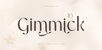 A Luxury Beauty Sans Serif font that we created special for elegant branding needs, with unique shape will be ready to add value of your brand. It so nice to leverage designer or product owner that need solutions to make their design look more stylish and modern. And specially for Gimmick font, We prepared any characters to help you create unlimited variations for your creative needs. Gimmick Luxury Beauty Sans Serif Font ready with: Unique Beauty Characters Preview as a inspirations that you can do with Gimmick font Ready with Lowercase and Uppercase characters Wish you enjoy our font. :)
 - Lychee Farmland by Putracetol,
$25.00 Lychee Farmland - Playful Sans Serif Font. This font is a playful quirky font with a lot of character ligatures, as many as 90 ligatures. With a soft and warm appearance, it is suitable for all ages from children, teenagers and the elderly. This font is perfect for logos, greeting cards, quotes, svg, clothes, posters, logos and more. This font can be installed on MAC OS and Windows OS, it can also be installed in the procreate and cricut applications. Come with lot of ligatures character, its help you to make great lettering, quote, logos and. This font is also support multi language.
 - Magnificent SS by Sensatype Studio,
$15.00 Magnificent is A Modern Feminine Vintage Font Magnificent font is a feminine retro modern vintage font with a fancy, playful, unique, and versatile vintage sans serif that you can combine to get a beautiful typography. It is a Sans Serif font with moderate contrast that perfect for branding projects, logo, wedding designs, social media posts, advertisements, product packaging, product designs, label, photography, watermark, invitation, stationery, and any projects, it makes with a high level of legibility. What's Included: Character set A-Z Uppercase & Lowercase Numerals & Punctuation Accented Characters (West Europe) Works on PC & Mac Wish you enjoy our font. :)
 - Daymore by Rillatype,
$15.00 Introducing, Daymore Font duo! Daymore is a duo font that complements each other. By using Daymore, you can simply use one font family without thinking about other fonts to complete the design you need. In the process of making this font, I was careful in choosing what font concept would be able to complement a bold sans serif font so that it could be balanced so that it would produce a blend of firm and strong sans serif fonts, as well as handwritten fonts that flowed naturally. The Daymore font duo is perfect for use as wedding invitations, branding, logos, etc.
