10,000 search results (0.135 seconds)
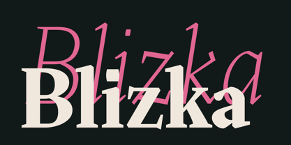
  1. Blizka by YXType, $22.00
    Blizka is a legible sans-serif with much characteristics! Inspired by calligraphic strokes, it features straight cuts in unexpected details. Great care is taken to make sure all letters flow harmoniously with each other for a superb reading experience for small texts. Blizka is subtle and functional in small sizes but perverse and full of personality when large! • Support over 200 languages with full coverage of western & central European Latin. • Beautiful Italics • SmallCaps • Proportional, tabular, oldstyle figures, fractions, you name it.
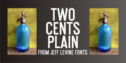
  2. Two Cents Plain JNL by Jeff Levine, $29.00
    Two Cents Plain JNL is a simple sans design for titling, sign work, display ads and so forth. The name is derived from the way folks in the Northeast used to ask for a glass of seltzer water at restaurants and soda fountains decades ago: "Give me a two cents plain." It was always cheaper to order plain seltzer than to have flavored syrup added, and this was especially true in the years during the Great Depression when every penny made a difference.
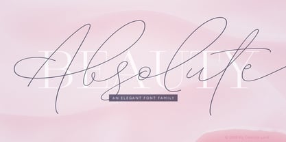
  3. Absolute Beauty by My Creative Land, $34.99
    Absolute Beauty is a happy family of a smooth casual monoline signature script and a high contrast elegant didone serif. The signature script comes in three weights to cover as much design needs as possible - from websites to brand design, from magazines to billboards. It compliments from OpenType features such as ligatures, swashes, stylistic and contextual alternates, and is fully unicode mapped. Absolute Beauty serif is an ideal partner for the script: it features the same elegance and comes in two weights.
  4. Tudor Perpendicular by Greater Albion Typefounders, $12.00
    Tudor Perpendicular is Greater Albion's seasonal Black letter release (not that we rule out the possibility of non-seasonal ones...) for 2012. As the name suggests, it is a design which emphasises, and yes, exaggerates for effect, the perpendicular up and down nature of Black Letter typefaces. There's no particular historical basis for this one - straight out of our own minds, just as a lot of Black letter 'revivals' have been over the years. Come and visit 'Ye Olde' world today...
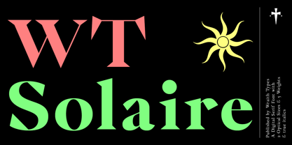
  5. WT Solaire by Wraith Types, $50.00
    Inspired by the classical “Fell Types”, especially the charmingly quirky weights designed by Peter De Walpergen. WT Solaire is a liberal interpretation of those cuts, meant for the digital age. Its design reflects an elegant tension between tradition and modernity. Its elegance and sharpness make it a perfect fit for any project that requires impact and subtlety at the same time. It is especially meant for editorial design, be it magazines or books, but it also works well with images.
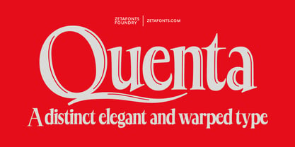
  6. Quenta by Zetafonts, $39.00
    Canovaro was inspired by the hand-lettered masthead of Queenslander, a weekly magazine published during the first half of XIX century. The condensed serif letterforms of the magazine title, with the warm, human touch gave the shapes of Quenta a lively personality and a literary charme. To let you experiment with his vintage decorative layers, it comes in 4 styles including discretionary ligatures to allow you to use script elements to enrich its expressive range for editorial and logo design.
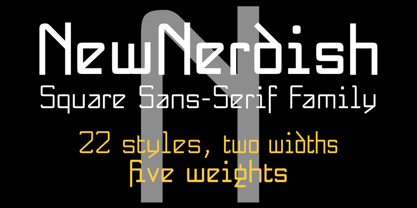
  7. NewNerdish by Ingrimayne Type, $9.95
    A sans-serif face in which the circular elements have become almost square, NewNerdish resembles a number of typefaces which have become associated with a modernistic, computer look. There is little or no variation in the weight of horizontals, diagonals, and verticals. It comes in two widths each with five weights and each weight has an oblique version, which has the same letter shapes as the upright version. The ShadowedInside style is designed to be used in a layer with the Shadowed style.
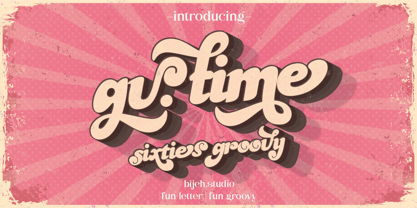
  8. Gv Time by Bejeletter, $18.00
    Inspired from 60's and 70's script lettering, bringing a smile and a dose of nostalgia to the daily lives. Where you get to relive the far out culture of the 60’s and 70’s! The era of groovy was all about music, festivals, where icons were created, epic stories were told, and culture was changed forever. The Gv. time came with opentype features such stylistic alternates and others, its help you to make great lettering, also support multilanguage.
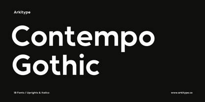
  9. Contempo Gothic by Arkitype, $20.00
    Contempo Gothic is a modern sans serif with a geometric approach. It comes in 18 weights, 9 uprights and its matching italics. Designed with opentype features including stylistic sets and tabular figures. Contempo Gothic includes extensive language support, fractions, arrows, ligatures and more. Perfectly suited for graphic design and any display use at any size. It could easily work for websites, blogs, signage, corporate identities, publishing and editorial design to name a few. Contempo Gothic is super versatile for everyday design use.
  10. Sopi by Tipo, $40.00
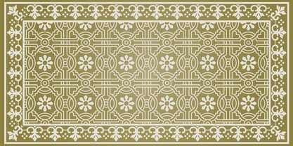
    Sopi is a typography of ornaments, borders and combined frames. It was inspired by the design of limestone tile floors, located in different places in Buenos Aires. All characters have the same measure, which enables the possibility of any desired combination. In the case of edges or combined frames, the typography was programmed in a way that is possible to generate textures with 2 or more colors, attempting to rescue the colorful designs that were original thought in the limetone tile floor.
  11. Worker 3D by Ndiscover, $35.00
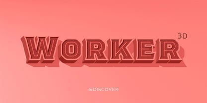
    Worker 3D is the tridimensional version of Worker. The tridimensionality enhances the vintage feel of the original design. It has 8 different layers so there are plenty of possibilities, you can use all 8 layers at the same time or have a more sober look by just using some outline and shadow or some lines texture. You can create astounding lettering in a matter of seconds. Make great logos, eye-catching typographic posters, re-create vintage packaging, and much more.
  12. Brighten by Eurotypo, $22.00
    Brighten is the new family font composed of Brighten Regular and Regular Italic, Brighten Round and Round Italic. With the total number of 606 glyphs, Brighten is the perfect blend of elegant and casual. Brighten is equipped with plenty of OpenType features. Uppercase letters can alternate between at least two or three different forms and lowercase letters have leastways four choices more to avoid repetition. These effects include start and end forms of lowercase letters, which are automatically substituted in at beginnings or ends of words. To activate the optional glyphs,  you may click on Swash, Contextual, Standard Ligatures, Stylistic or Discretionary Ligatures buttons in any OpenType savvy program or manually choose the characters from Glyph Palette. Also, there’s some ornaments designed to support the font (access the ornaments through the Glyph Palette). The Brighten family font might be the choice to use on creating headlines, logos & posters for branding and packaging purposes.
  13. Ethnocentric - Unknown license
  14. Good Times - Unknown license
  15. Street Cred - Unknown license
  16. Vademecum - Unknown license
  17. Baltar - Unknown license
  18. Astron Boy - Unknown license
  19. Mexcellent 3D - Unknown license
  20. Libel Suit - 100% free
  21. Zorque - Unknown license
  22. Wild Sewerage - Unknown license
  23. Walshes - Unknown license
  24. Saved By Zero - Unknown license
  25. Zeroes Three - Unknown license
  26. Metal Lord - Unknown license
  27. Graffiti Treat - Unknown license
  28. Misirlou Day - Unknown license
  29. Interplanetary Crap - Unknown license
  30. ParaAminobenzoic - Unknown license
  31. Motorcade - Unknown license
  32. Let's Eat - Unknown license
  33. Univox - Unknown license
  34. Still Time - Unknown license
  35. Almonte - 100% free
  36. Hello Larry - Unknown license
  37. Highway to Heck - Unknown license
  38. Should've Known - Unknown license
  39. VDub - Unknown license
  40. Lewinsky - Unknown license
Looking for more fonts? Check out our New, Sans, Script, Handwriting fonts or Categories
abstract fontscontact usprivacy policyweb font generator
Processing