10,000 search results
(0.064 seconds)
- Sticky Fingers by Comicraft,
$19.00 LOOK OUT! It's kinda creepy, we know, but we're convinced that this font does whatever a spider can -- in fact, we believe it can actually spin a web of pretty much any size, and even catch thieves as if they were bugs of some sort -- let's say flies. In fact we'd almost go so far as to say that, in the chill of night (perhaps at the scene of a crime) this font may just arrive like a streak of light in the nick of time. We're releasing this font now not for wealth or fame, we ignore those things, action is our reward. Here at Comicraft we think of life as a great big bang up, and whenever there's a hang up, you won't find us climbing -- or crawling -- the walls... well, not without STICKY FINGERS anyway. Find yourself a pair of webshooters and this font is the perfect complement to any Halloween costume.
 - Jack History by Ditatype,
$29.00 Jack History is a unique, amazing font inspired by creative, experimental handwritings of which letters are always connected to each other to create surprising, dynamic flows, and adopt unconventional proportions and variations. Some of the letters may actually seem bigger or smaller than the others in free moving and curvy lines to express bravery and freedom nuances of the font. Differences in proportions and letter style changes of the font have become the design’s integral parts. Despite the absence of strict rules, creativity and courage to combine the connected letters in a unique way is all that matters because this script font offers extraordinary attractiveness and uniqueness in all designs. Furthermore, the connected letter flows in various proportions reflect some explorations and innovations in the handwritings. You may then apply this font for big text sizes for a legibility reason and enjoy the available features here. Features: Alternates Ligatures Multilingual Supports PUA Encoded Numerals and Punctuations Jack History fits best for any design projects requiring artistic, elegant displays such as wedding invitations, greeting cards, merchandise designs, and more. For such artistic and elegant displays, this script font is also applicable for logo designs, posters, and packaging. Find out more ways to use this font by taking a look at the font preview. Thanks for purchasing our fonts. Hopefully, you have a great time using our font. Feel free to contact us anytime for further information or when you have trouble with the font. Thanks a lot and happy designing.
 - Zapfino Extra X by Linotype,
$29.99Today's digital font technology allowed the world-renowned typeface designer/calligrapher Hermann Zapf to finally realize a vision he first had more than fifty years ago: creating a typeface that could capture the freedom and liveliness of beautiful handwriting. The basic Zapfino™ font family, released in 1998, consists of four alphabets with many additional stylistic alternates that can be freely mixed together to emulate the variations in handwritten text. In 2003, Herman Zapf completely reworked the Zapfino design, creating Zapfino™ Extra. This large expansion of the Zapfino family was designed in close collaboration with Akira Kobayashi. Zapfino™ Extra includes a cornucopia of new characters. It features exuberant hyper-flourishes, elegant small caps, dozens of ornaments, more alternates and ligatures, index characters, and a very useful bold version, named Zapfino™ Forte. A version of the 1998 Zapfino typeface ships as one of the pre-installed fonts included with Mac OSX. The Mac OSX version's letters are four times larger than the Linotype standard. In order to minimize compatibility problems for Macintosh users, Linotype has created OSX versions of its Zapfino Extra Pro typefaces, which have been enlarged to correlate visually with the Mac OS Zapfino system font. These special Linotype fonts can be distinguished by the letter X" in their name. Zapfino Extra is an OpenType format font, which is available in two versions. Which version you purchase should depend on which software applications you use the most and what features they support! The Contextual version of Zapfino Extra Pro contains a treasure-trove of extra contextual features. When created in 2004, this was the most advanced OpenType font released to date. By purchasing this version, users of OpenType-supporting applications, such as Adobe InDesign, may access all of the features available in the entire Zapfino family through just two fonts, Zapfino Extra LT Pro (Contextual) and Zapfino Forte LT Pro! Unfortunately, most non-Adobe applications currently do not support the contextual features made possible by recent OpenType developments. Users of Quark XPress and Microsoft Office should instead purchase all of the non-contextual fonts of Zapfino Extra Pro family, in order to access all of the Zapfino Extra family's 1676 glyphs. The Zapfino Extra family's character set supports 48 western and central European languages. Use Zapfino Extra to produce unusual and graceful advertisements, packaging, and invitations. Zapfino Extra is so joyously abundant that it's tempting to over-indulge, so be sure to check out the tips for working well with the possibilities." - Ollie by Eclectotype,
$40.00 Meet Ollie, a casual signage script whose friendly, bouncy exterior belies a heart of sophisticated OpenType programming. This font is designed to make the most of OpenType savvy applications, and as such is recommended for professional design use. Or to put it another way: Make sure that contextual alternates and ligatures are always turned on! Ollie includes about 900 glyphs, many of which are automagical substitutions to keep the text flowing smoothly, and to pseudo-randomly pick different glyphs to avoid repetition. With contextual alternates turned on (as they should be by default), most lowercase letters will alternate between at least two different forms. The powerful OpenType programming makes the font itself ‘look back’ (up to eight characters) on previously used letters; typing “banana” will give you three different a’s and two different n’s (the last a is a special ‘end form’ character). The calt feature controls many other ‘special effects’ which all add together to give a smooth-flowing, hand-lettered look. These effects include start and end forms (and indeed, ‘loner’ forms) of many letters, which are automatically substituted in at beginnings or ends of words, or when the previous or next letter doesn't connect. Another special feature tests to see if there is room for the crossbar of t (or tt ligature) to extend further over the previous or next letter, or both, as is often the case. The last main effect of the calt feature is to substitute certain letters typed before any ‘e’ character, to make for a more natural connection (see the pe combination in ‘Eclectotype’ in the first poster). Ligatures should be on by default, for a much nicer looking tt combination, and a few others besides. The swash feature should be used sparingly (one glyph at a time, really) to apply a more extravagant look to g,j and y in the lower case, and quite a few of the upper case too. Oldstyle figures are included, as well as the lining defaults. Now to delve into the stylistic alternates... These are all included in the salt feature, or for uses of applications that support them, separated into stylistic sets thus: ss01 - (with swash feature on) L and G swashes get even swashier. ss02 - standard s changes to a connected script s form. ss03 - r takes on a script form. ss04 - z also gets a scriptier look. [the previous three sets also change any versions of s, r or z with diacritics] ss05 - a useful underline function. When enabled, typing two or more underscores will extend a cool underline under the previous letters. More underscores = longer underline. ss06 - the Polish script lslash changes to its more standard form. ss07 - E, S and B change to a more top-heavy alternate form. ss08 - An alternate form for A characters. ss09 - Alterative rounder forms of M and N. ss10 - An alternate ampersand. That about wraps up the features. Now all that’s left is for you to license the font and get experimenting!
 - Mati by Sudtipos,
$19.00 Father's Day, or June 17 of this year, is in the middle of Argentinian winter. And like people do on wintery Sunday mornings, I was bundled up in bed with too many covers, pillows and comforters. Feeling good and not thinking about anything in particular, Father's Day was nowhere in the vicinity of my mind. My eleven year old son, Matías, came into the room with a handmade present for me. Up to this point, my Father's Day gift history was nothing unusual. Books, socks, hand-painted wooden spoons, the kind of thing any father would expect from his pre-teen son. So you can understand when I say I was bracing myself to fake excitement at my son's present. But this Father's Day was special. I didn't have to fake excitement. I was in fact excited beyond my own belief. Matí's handmade present was a complete alphabet drawn on an A4 paper. Grungy, childish, and sweeter than a ton of honey. He'd spent days making it, three-dimensioning the letters, wiggle-shadowing them. Incredible. A common annoyance for graphic designers is explaining to people, even those close to them, what they do for a living. You have to somehow make it understandable that you are a visual communicator, not an artist. Part of the problem is the fact that "graphic designer" and "visual communicator" are just not in the dictionary of standard professions out there. If you're a plumber, you can wrap all the duties of your job with 3.5 words: I'm a plumber. If you're a graphic designer, no wrapper, 3.5 or 300 words, will ever cover it. I've spent many hours throughout the years explaining to my own family and friends what I do for a living, but most of them still come back and ask what it is exactly that I do for dough. When you're a type designer, that problem magnifies itself considerably. When someone asks you what you do for a living, you start looking for the nearest exit, but none of the ones you can find is any good. All the one-line descriptions are vague, and every single one of them queues a long, one-sided conversation that usually ends with someone getting too drunk listening, or too tired of talking. Now imagine being a type designer, with a curious eleven year old son. The kid is curious as to why daddy keeps writing huge letters on the computer screen. Let's go play some ball, dad. As soon as I finish working, son. He looks over my shoulder and sees a big twirly H on the screen. To him it looks like a game, like I'm not working. And I have to explain it to him again. This Father's Day, my son gave me the one present that tells me he finally understands what I do for a living. Perhaps he is even comfortable with it, or curious enough about that he wants to try it out himself. Either way, it was the happiest Father's Day I've ever had, and I'm prouder of my son than of everything else I've done in my life. This is Matí's font. I hope you find it useful.
 - Beliber by Ridtype,
$15.00 Beliber is a Serif Font Family, this font is specially designed to get the best feel and high quality to get the touch of a high end product This font supports Opentype Features, such as Alternate and Ligatures, as well as other forms of support symbols, numeric, mathematical symbols and others characters to be used. Thank you for your support of our product and using it in your project.
 - Quick Remarks by Sarid Ezra,
$17.00 Quick Remarks is a reverse and modern serif that comes with stylish and noticeable contrast. With unique uppercase and lowercase, this fonts will make your presentation, poster, or logo even more stunning and stand out! You can mix and match the uppercase and lowercase for unlimited form. This font also include many beautiful ligatures. This fonts support Multi Language. Features Uppercase with unique lowercase Ligatures Number & Symbol Multi language
 - Bambino by Mindburger Studio,
$29.00 Bambino Font Family is a typography project by Milos Mitrovic and affiliates. Bambino has an influence of 1920s Futura-like fonts and art deco look and feel. Combining its vintage character with clean geometric form and organic flow, Bambino is shaped to fit modern aesthetics. There are 12 fonts (six weights with italics) included in the family. Bambino weight range spreads from almost hairline lightness to extreme bold style.
 - Valerie Indirose by sizimon,
$20.00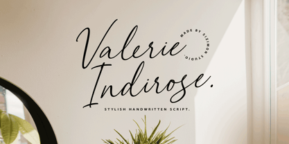 The font is called "Valerie Indirose", it is with fashionable themes. Script font contains 2 set alternates and some ligatures. The Valerie Indirose matches apply in some designs such as the logotype, quotes, wedding invitation, business card, packaging, branding, and more custom design. What's Include : Uppercase, lowercase, numeral, symbol and punctuation, alternates (ss01-ss02), ligature in script font PUA Encoded Multilingual support If you have any questions, please contact : info@sizimon.com
 - Mormont by Letterhend,
$17.00 Mormont is a reverse display font with classic looks. This type of font perfectly made to be applied especially in storybook children or child theme which is need a standout font, and the other various formal forms such as invitations, labels, logos, magazines, books, greeting / wedding cards, packaging, fashion, make up, stationery, novels, labels or any type of advertising purpose. Features : Uppercase & lowercase Numbers and punctuation Alternates & Ligatures Multilingual PUA encoded
 - Dalcora by Linotype,
$29.99Dalcora was designed by Erwin Koch in 1989 in a single weight. The most distinguishing characteristic of this font is its unusual proportions. Text fonts are usually designed with more delicate horizontal strokes as the verticals, but Dalcora is exactly the opposite. Its slight slant to the right and the round forms of the letters make the font dynamic and cheerful. Dalcora is intended exclusively for headlines in larger point sizes. - Lehmann Egyptian by ParaType,
$30.00 Lehmann Egyptian is a font of three styles, based on the pre-revolutionary hand set fonts by Berthold and Lehmann type foundries in St. Petersburg. Designed mainly for display typography, the font works well in small texts too. There's also a quite useful bonus — a stylistic set of historical forms. Lehmann Egyptian was designed by Albert Kapitonov in cooperation with Dmitry Kirsanov and released by ParaType in 2018.
 - Qasengi by Twinletter,
$17.00 Qasengi is a bridge to the cultural wonders of Japan and Southeast Asia in a captivating typographic form. With a strong Japanese theme, this font is the perfect companion for any project that calls for a distinctly Japanese and Southeast Asian touch. What’s Included : File font All glyphs Iso Latin 1 Alternate, Ligature Simple installations PUA Encoded Characters – Fully accessible without additional design software. Fonts include Multilingual support
 - Bogen by Linecreative,
$16.00 Bogen - Bold italic font with sharp angles for dynamic effects. Use ligature characters to give you unlimited designs, this font is great for your work such as posters, logos, branding, covers, banners, t-shirts and headers, or even large-scale artwork Bogen , offers you: Bogen -italic bold font including Upper & Lowercase characters(ALL CAPS has a different form characte), Ligatures Character Supports Multi linguage (Latin Western Europe), Numbers and Punctuation
 - Alright, picture this: Zekton Free, a font that looks like it moonlights as a futuristic secret agent. Designed by the font wizard Ray Larabie, this typeface isn't just another font in the crowd. Oh ...
- Prussian Brew - Unknown license

- Kandide Upper Wide - Unknown license

- Kandide Unicase Wide - Unknown license

- Guilloche B by Wiescher Design,
$24.00 »Guilloche B« is a set of graphics that join with each other to form very sophisticated, op-art-like borders. Try them on lots of different assignments, they form very surprising bands or patterns.
 - Hawkes by Kimmy Design,
$15.00 Hawkes is an extensive handmade typeface family that comes with a bundle of weights, widths and styles, all designed to work cohesively. Here is a breakdown of the Hawkes family. Hawkes Sans: The primary subfamily is a sans-serif typeface that includes nine fonts: three weights (light, medium and bold) and three widths (narrow, regular and wide). Within this set are an array of stylistic features; including small capitals, character style alternatives, discretionary ligatures and contextual alternatives. See details below for more information on OpenType Features. Hawkes Variable Width Sans: The secondary subfamily is the same base sans-serif fonts but combined in variating widths. Essentially, it takes all three widths of each weight and randomly mixes them together. This creates a funky and creative alternative to the more traditional sans-serif set. The variations are for the uppercase, lowercase, small capitals, ligatures and numbers. Hawkes Script: The last subfamily is the script typeface. It’s a quirky script with variations of its own, including ligatures, swashes and contextual alternatives (again, see below for further details.) The script font works great as a complimentary style to the sans-serif, or on it’s own. FEATURES Alright, let’s get into all the extra goodies this typeface has to offer. Small Capitals: Small caps are short capital letters designed to blend with lowercase text. These aren’t just capital letters just scaled down but designed to fit with the weight of both the lowercase and capitals. With Hawkes, small caps can either sit on the baseline (in line with the base of the capital and lowercase) or to be lifted to match the height of the capital letters by applying the discretionary ligature setting in the OpenType panel. These small capitals have a dot underlining them that sit along the baseline. The feature offers a unique display affect that is great for logos, titles and other headline needs. Discretionary Ligatures: A discretionary ligature is more decorative and unique combination than a standard ligature and can be applied at the users discretion (as the name indicates.) The specific styling for these ligatures varies for different fonts. With Hawkes, they are used as an all capital styling feature, or to lift the small capitals to align with the height of the capitals. In the former setting, both lowercase and uppercase letters are first changed to all capitals, then a specialized set of letter combinations are transitioned so small characters are positioned within a main capital letter. These combinations only happen with main characters that include an applicable stem, such as C F K L R T Y. Some of these combinations include two or three characters. When Small Caps is turned ‘on’, this feature will lift the small caps to the height of the capital letter. For more information, please check out the user guide! Stylistic Alternatives: Stylistic alternates are a secondary form of a character, often used to enhance the look or style of a font. For Hawkes, these alternatives provide a slightly more handmade feel. A - the capital and small capital A will lose its pointed apex and become rounded. Think of it more as an upside-down U than an up-side-down V ;-) Oo, G, Ss, Cc- these characters’ topmost terminal becomes a loop. The O is applied automatically, the G S and C need to be turn on individually. Titling Alternatives: This feature does sort of the opposite of what it intends. Instead of being used for titling purposes, this feature makes the text look better in paragraph text settings. Kk Rr h n m - curved terminals on the are straightened e - the counter stroke also gets straightened from a more looping motion y - the shape of y is changed from a rounded character to a sharper apex (think more like a ‘v’ than ‘u’) Contextual Alternatives: Contextual alternates are glyphs designed to work within context of other adjacent glyphs. With Hawkes Sans, there are three slightly different variations per character. The feature rotates the application of each variation. This helps with organic authenticity, so if you have two e’s next to each other, they won’t look identical (reflecting the natural variations in handwriting and lettering.) With Hawkes Variable width fonts, I have created a contextual pattern that randomizes the widths of each character. So, when the feature is turned ‘on’ in the OpenType panel, the widths would alternate in a pattern such as: Narrow, Wide, Regular, Narrow, Regular Wide, Narrow, etc. It happens automatically so the user doesn’t have to think or worry about getting a random seed. With Hawkes Script, contextual alternates allow strokes to connect properly from one character to the next while maintaining a believable, natural flow. Connecting strokes are present for two letters next to each other but are replaced by a shorter stroke when located at the end of a word or sentence. Some characters have in-strokes when located at the start of a word. When a character is preceded by a capital letter that doesn’t connect, it too needs an in-stroke or altered spacing. This feature is complicated and messy, but luckily you don’t really have to think about it! I’ve done all the coding so all you have to do is turn ‘on’ the feature in the OpenType panel and you are off to the races! I’m just letting you know what’s happening behind the scenes. Swashes: These are just for Hawkes Script and provide tail swashes to the start and ends of letters. There are three different options. You can pick the basic option by turning ‘on’ the swash feature in the OpenType panel, or you can pick using the Glyph panel. Stylistic Sets: This feature work in new versions of Illustrator CC and InDesign CC. You can pick specific styling sets instead of turning on an entire feature. For example, let’s say you want to have a loopy S, but not a loopy C or O, you can just turn on the S in the Style Set. It also helps create the little drop box that pops up when you hover over a character, showing you the alternates associated with that character. This makes it easy to pick and choose specific styles you want in a word or headline. ---------- And there it is folks! That’s all the basic info on Hawkes, I know it’s been a lot and I appreciate you hanging on. If you are like me and need more of a visual reference to accessing all these goodies, I’ve made a user guide to help navigate Hawkes and everything it has to offer. Altogether this extensive family boasts 14 total fonts in a wide array of styles, weights and widths, making it a great addition to any handmade type collection. Enjoy!
 - Pompeijana by Linotype,
$29.99Pompeijana is a part of the 1990 collection Type before Gutenberg 2’, which includes twelve contemporary typefaces each representative of a particular era. Pompeijana is Adrian Frutiger’s contribution to the project Type before Gutenberg’. He based the forms of this capital typeface on the writing of the Romans in Pompei. The decorative look of the alphabet is achieved by purely graphic means, placing the emphasis of the top and foot of the letters with heavy horizontals and diamond-shaped serifs. Frutiger completed his typeface with the weight Borders, a font consisting of numerous ornaments true to the style of the alphabet. The ornaments can be combined to form different borders and offer an optimal addition to the elegant Pompeijana. Pompeijana is best combined with modern sans serif typefaces. - Imperial Granum by Greater Albion Typefounders,
$18.00 Imperial Granum is designed primarily as a Roman Title and lettering face, combining formality and dignity with a delightful touch of 'Arts and Crafts' like hand drawn design. The regular form of Imperial Granum (which is inspired by a beautifully hand-lettered early 20th century food advertisement) offers two sizes of capitals, in order to provide true 'small-capitals' lettering. Similarly, the Ornamental form consists exclusively of capitals and is designed to be able to mix and match with the regular form. The miniscule form can, of course, be used in its own right, but is primarily intended to complement the regular and ornamental forms. All three faces are offered in regular and bold weights. Explore some Edwardian Arts and Crafts typographical fun today!
 - Aero Flux by Ferry Ardana Putra,
$19.00 Introducing "Aero Flux", the cyber mecha font that will take your designs to the next level. This font is designed with a perfect blend of modern and squared feel, giving it a unique and futuristic aesthetic that is perfect for a wide range of applications. The bold and sleek design of Aero Flux makes it an ideal choice for logos, headlines, and branding materials. It's all-caps design with punctuation, numerals, and foreign support allows for flexibility in creating unique and engaging visual designs. Aero Flux's squared feel makes it perfect for projects that require a strong and sturdy look, such as designing video game or movie titles, product packaging, or creating futuristic posters. This font's bold, industrial look is perfect for capturing the essence of the mecha genre, with its sharp angles and futuristic design. The squared feel of Aero Flux adds a sense of strength and solidity to your designs, making it the perfect choice for projects that require a bold, commanding look. Moreover, Aero Flux's industrial, mecha-modern design makes it the perfect font for creating digital interfaces and user interfaces (UIs), especially those that require a futuristic or high-tech feel. In summary, Aero Flux is a highly versatile font that is perfect for a wide range of applications, from logos and branding to digital interfaces and futuristic posters. With its modern, squared feel and unique design, Aero Flux is the perfect font to add a touch of futurism to your projects and captivate your audience. Aero Flux features: A full set of uppercase Numbers and punctuation Multilingual language support PUA Encoded Characters OpenType Features Cyber Mecha Style +246 Total Glyphs
 - APF Lagoon Regular by Pomegranate,
$30.00 In 2007-8, Carolyn Puzzovio developed this OpenType typeface: Lagoon which is based on an Armenian model from the Mechitarist monastery, Venice, 1810. This project was supported by a grant from the AHRC (Arts & Humanities Research Council, UK) and won a first prize in the Granshan 08 type design competition. Oſten, Armenian digital types are designed to match the forms of Latin type characters and ‘Latinized’, by uprighting the forms; truncating ascenders and descenders and raising the x-height – but in this case the Latin characters in the OpenType font have been designed to blend in with the traditional Armenian proportions which are based on cursive forms – also incorporating some of the quirky shapes from the original model. Faithfully following the original created difficulties of ‘clashing’ characters, particularly those with long descenders, so the font contains over 100 alternative characters in the Armenian part, which will normally substitute automatically where necessary. The sloping lower case characters and upright capitals are traditional in Armenian – capitals are used less in the Armenian language. Three new characters for the Armenian unicode range are included: the Armenian dram (currency) symbol; the eternity symbol; and the index number symbol. This font which will be one of the first OpenType fonts to incorporate these newly unicoded characters.
 - Campeno by Craft Supply Co,
$20.00 Geometric Precision Let’s step into the world of Campeno, a Geometric Sans Serif font that embodies precision and order. This font is the epitome of geometric perfection, making it an ideal choice for various editorial applications. Editorial Excellence Campeno’s geometric form is what sets it apart and makes it a top choice for editorial needs. Whether you’re working on magazines, long-form text, or other editorial projects, its geometric precision enhances readability and offers editorial excellence. Versatile Typography What makes Campeno even more exceptional is its versatility. It seamlessly adapts to diverse design contexts, ensuring that it can be used for a wide range of projects, from magazines to websites and beyond. Engaging Readability Beyond its geometric aesthetics, Campeno excels in providing engaging readability. It guides the reader through the content, focusing on the message while maintaining a visually appealing design. In Conclusion In summary, Campeno – Geometric Sans Serif is the font that brings precision and clarity to your editorial projects. Its geometric form ensures that your content is not only engaging but also visually appealing, catering to a broad readership while maintaining a high standard of clarity. Whether you’re working on magazines, websites, or other editorial endeavors, Campeno stands out as a font that combines aesthetics with functionality, offering editorial excellence for your projects.
 - Eezyl by Partu Haodis,
$25.00 A title font that looks better as larger the font size. First of all, it is designed for use in the upper-case format. Feature style: futurism, space, modernism, glyph variety (uniqueness (minimum automatic generation)). A kind of „s‟ in the lower-case format sets the tone and emphasizes the character, formed in the Prime Numbers Nebula — they determined its appearance, and influenced the style as a whole. Particular attention is paid to the kern: the kern table is formed manually, taking into account absolutely all the glyphs included in the font-family. Two types of stress (grave, acute) for all letter glyphs. The font contains basic Latin and several additional tables, as well as three types of quotation marks, a non-breaking space and a hyphen, a short, medium, and long dash. For a set of mathematical expressions there are centrifugal signs: equal, minus (not a hyphen or minus-hyphen), plus, multiplication (X-shaped and dot), plus-minus, division. The font was made for 3 years.
 - Rebekah by Ascender,
$29.99 Rebekah Pro is a revival of ATF’s Piranesi family, the regular being designed by Willard Sniffin, and the remaining weights designed by Morris Fuller Benton. Tom Rickner first revived Benton’s Italic for use in his wedding invitations for his marriage to Rebekah Zapf in 2006. He completed the character set in 2009. Rebekah Pro captures the elegance and distinction of the original. Tom carefully studied samples from 1930s American Type Founders catalogues and created a digital version with meticulous care. While considered an informal script because its letterforms do not connect, Rebekah Pro has graceful strokes and a truly elegant appearance. Tom created a variety of typographic enhancements not found in the original Piranesi italic font. These OpenType typographic features offer a distinguishing touch to everything from invitations and announcements to greeting cards and advertisements. Rebekah Pro contains the Latin 1 character set and the following OpenType typographic features: Swashes, Small Capitals, Ligatures, Alternates, Oldstyle Figures, Proportional Lining Figures, Tabular Lining Figures and Ornaments.
 - Roma by Canada Type,
$29.95 Tom Lincoln's award-winning type design work since the 1960s has been one way or another of expressing his fascination for the Roman majuscules inscribed at the base of the Trajan Column in Rome. This time he has really outdone himself by bringing us Roma, a definitive, contemporary, mature sans serif expression of those majuscules. With Roma, Lincoln is not satisfied with simply creating a proper "Trajan Sans". He goes on to make it a family of four weights, with built-in small caps and oldstyle figures, then he really goes to town with the options he makes available for shading and multi-color settings. Precise renderings of the Roma capitals are provided in different fonts that can function individually or be layered atop each other for two- or three-color treatments. The Roma family comes with extended language support that spans the majority of Latin-based languages. For more information on the design, complete character sets, technological features, and print tests, consult the accompanying PDF.
 - Smart Bars12 by Postage Saver Software,
$15.00 This is a special font for use creating US Postal Service "Intelligent Mail" barcodes. Those are the barcodes you see on most cards and envelopes. Commercial mailers get the best pricing by printing barcodes when they address the mail, saving the Postal Service a step. The barcodes are also used on reply mail and Share mail, and for "Informed Visibility" tracking. Software to create these barcodes, including the USPS Intelligent Mail Small Business (IMsB) tool, typically provide an output of 65 characters, each character being an A, D, T or F, corresponding to each of the styles of bar. SmartBars 12 replaces those characters with the corresponding bar. When doing a mail merge to print addresses, the user would set the barcode field on their merge template to be printed using SmartBars 12, at 12 point, regular, and the barcode will print with the correct bars and at the required size to meet USPS requirements.
 - Looking Flowers by Sudtipos,
$49.00 Lu Nolasco, also known as Lunol, is a fresh representative of a new generation of Souther American lettering artists. She was born in Lima, Peru. After learning from some of the region’s best teachers and exploring the pointed nib on her own, she became a prolific lettering workshop instructor herself. Miraflores is one of Lima’s main tourist attractions. An upscale district with a great window on the Pacific ocean, it is the place where Lu looks for inspiration. It particularly inspired this “Looking flowers” (Miranda las flores), Lunol’s first typeface, designed in collaboration with Ale Paul. It is a comprehensive informal script that comes with many alternates, swashes and ligatures, along with small cap and quite a few ornaments. The fonts cover an expansive range of Latin languages, and are intended for use in stationery, menus, packaging, and general design where the main objective is to relay a sense of fun, playfulness and sensibility.
 - Timeout by DearType,
$35.00 Timeout is a fresh, casual script paired with a bold, impactful sans and lots of goodies. It is modern, stylish and it comes in two variations for easy use: - Timeout - long ascenders, descenders and caps - for more impact. - Timeout B - short ascenders, descenders and caps - for easy stacking. The combo between the script and the headline-style sans works perfectly for various applications such as logos, posters, fashion photos, ads, postcards, branding, T-shirts, web images, product packaging and basically for anything you need to look sexy, interesting and informal. The script has some sweet ligatures, stylistic alternates and swashes that will make your designs stand out and capture attention, especially paired with some of the goodies.
 - Realtime Stencil Rounded by Juri Zaech,
$30.00 Realtime Stencil Rounded is part of the Realtime type family which draws inspiration from information displays. The result is a technical yet friendly design with details that serve function and visual impact alike. As a monospaced typeface it lends itself to tabular designs, sturdy columns and tidy layouts. Nevertheless Realtime Stencil Rounded comes with a feature for setting continuous text — a proportional design employable through OpenType — it further comes in five weights, from light to black, and with a character set that covers over 200 latin languages. Please see the Realtime Stencil Rounded Type Specimen PDF in the gallery. Realtime Stencil Rounded is the soft companion to the standard Realtime Stencil typeface which is available separately.
 - Balkind by Ekahermawan,
$20.00 Proudly present Balkind is a playfull and beauty serif family that consists of 7 weights from Thin to ExtraBold. All the alternates and ligatures characters of Balkind are specially designed to make your typography design result looks more unique and attractive. Balkind also comes with ornaments that will support your creativity in creating many design projects such as logo design, branding, poster, magazines, labels, merchandise, invitation, presentation, advertising and so much more! FEATURES: OpenType support Playful to use (with ligatures and alternates options) Multilingual support PUA Encoded If you need support or more information about this item, please kindly contact me: ekahermawanputu@gmail.com Thank you so much...I really hope you enjoy when using it!
 - Realtime Stencil by Juri Zaech,
$30.00 Realtime Stencil is part of the Realtime type family which draws inspiration from information displays. The result is a technical yet friendly design with details that serve function and visual impact alike. As a monospaced typeface it lends itself to tabular designs, sturdy columns and tidy layouts. Nevertheless Realtime Stencil comes with a feature for setting continuous text — a proportional design employable through OpenType — it further comes in five weights, from light to black, and with a character set that covers over 200 latin languages. Please see the Realtime Stencil Type Specimen PDF in the gallery. A soft version of Realtime Stencil is available separately: Realtime Stencil Rounded. Its soft edges apply warmth to the otherwise rather technical appearance.
 - P22 Glaser Houdini by P22 Type Foundry,
$24.95 Milton Glaser commented about this type family: “The typeface is called Houdini after the famous American magician. I wanted to produce a letterform that would gradually disappear as one line after another was removed.” The various versions of Houdini presented by P22 include those originally offered as phototypesetting fonts, plus a solid and an outline version—a variation of which was used for Sesame Place children’s park in 1980. These Houdini variations can all be layered on top of each other for a range of chromatic effects. Each of the Houdini fonts contains over 375 characters for full European language coverage. The family is taken to its logical conclusion with the bonus font “P22 Glaser Houdini Vanished.” This font shares the same spacing and kerning as all of the Houdini font but lacks all visible outlines. Over the years there have been many typefaces that borrowed heavily from the Glaser designs, but these are the only official fonts approved by Milton Glaser Studio and the Estate of Milton Glaser.
 - Astrum by Fontex,
$40.00 Astrum is a very decorative script font using elegant caligraphic handwritten letters that are all mutually interconnected, creating a unique look & feel of a personalized human handwritting. Its clean and prefined lines makes Astrum very appealing and modern, although being very classical in its core essence. The idea for the creation of this font had originally came up from the need to create a beautiful design for Weddings, wedding occasions, etc., but none of the existing fonts were satisfactory - so I decided to create a new and unique typeface to fill this need. Letters and other characters are recognizeable by prefined ornaments, incorporated in a very subtle way. Whitespace between capital letters, lower-case letters, numbers and other characters are done in a way to minimize the need for kerning. The font Astrum, besides being a celebration of class and exclusivity, is a very luxurious and elegant handwritten font perfectly suited for Wedding cards. The character set for this font contains all western, central-european latin and cyrillic characters.
 - Fenomen Sans by Signature Type Foundry,
$38.00 Geometrical drawing of Fenomen Sans typeface goes back to the roots of the Bauhaus aesthetics and the entire architectural and design avant-garde of the 20th century. It is still a symbol of functional rationality, clean aesthetics in relation to shape, and of progressive thinking. Its popularity is timeless and permanent. The set contains eight basic alphabets of a square pattern, eight semicondensed, eight condensed and eight extremely condensed alphabets, all in Latin and Cyrillic alphabets. Every font of the family has four types of numerals, small caps and variant letters. The typesetting can fluently use all fonts simultaneously. The typeface originated between the years 2011–2014 and was subjected to a series of tests for the fluent legibility of narrow fonts even in extreme conditions. Narrow fonts provide this set with the maximum use also for newspaper typesetting. The typeface has an elegant, delicate design in thin fonts and sufficient legibility in bold. Mutual contrast produces creative tension. Font name acronyms described: SCN = SemiCondensed CN = Condensed XCN = ExtraCondensed
 - Kalista by Great Studio,
$18.00 Kalista Font Duo is a luxury font. which comes with a combination of modern and elegant fonts, namely serif and signature style. You can combine them to create beautiful typography. This handcrafted style makes it perfect for use in all your design projects be it logos, labels, packaging designs, blog titles, posters, wedding designs, social media posts, Instagram designs, invitation cards, art quotes, home decor, book / title covers, etc. This is what includes: Kalista Script Regular / Bold • Thin and realistic signature font containing 40+ ligatures and alternates, lowercase, uppercase, all punctuation & numbers. Kalista Serif Light / Regular / Bold • Serif Fonts with upper and lowercase letters, all punctuation, numbers and Language support 8 BONUS Logo Templates that you can edit and customize in Adobe Photoshop and Adobe Illustrator. Language Support • Kalista supports the following languages; English, French, Italian, Spanish, Portuguese, German, Swedish, Norwegian, Danish, Dutch, Finnish, Indonesian, Malay, Hungarian, Polish, Croatian, Turkish, Romanian, Czech, Latvian, Lithuanian, Slovak, Slovenian. I hope you enjoy this font. If you have questions, don't hesitate to give me a message :)
 - Goodrich by Hendra Pratama,
$15.00 WARNING! Roughed version is quite heavy to open. Highly recommended to install the font without previewing it first. GOODRICH come in 2 different styles, with same character; Bold & Strong, and can evoke a different emotions. It comes in both clean and rough styles in only Uppercase Latin characters. When choosing a font, it’s important to consider the visual theme of your design. A clean bold fonts can lend a more stronger tone to your design, making it a great choice for Logo or Title. On the other hand, a textured fonts can lend a more natural printed-looks, making them perfect for designing 70s-80s themed parties. It can be used for various design purposes ; Posters, Logos, Packaging, Books or Movie Titles. In summary, these fonts are versatile and can add a unique look to any design project. If you want to add a touch of nostalgia and elegance to your designs, these fonts were timeless asset. With plenty of vintage and retro design resources available, it’s easy to find the perfect ideas for your next project.
 - Paralucent Slab by Device,
$39.00 Paralucent Slab is an addition to the ever-popular Paralucent family. Paralucent is versatile all-purpose modern sans and slab serif design. Available in seven weights, from Thin to Heavy, with corresponding italics, it avoids some of the more eccentric calligraphic quirks of Akzidenz or Helvetica or the cool precision of Univers for an elegant, functional, yet warm design. Several core ideas inform Paralucent’s design. Prime attention has given to the negative space between characters, giving a more even “colour”, especially in text. For example, the J, L and T have shorter arms than comparable sans typefaces, while the M and W are wider. The A has a lower bar, opening up the interior counter. An unusually high lower-case x-height again helps to give a more even colour and improve legibility. Care has been taken to rationalise repeated elements like the tails on lower-case letters, or the Q and the “ear” of the g. Typographic design solutions that are consistent across all these features add more stylistic cohesion. ‘Ink traps’ are exaggerated incisions used to open up a letter's narrower internal angles, which can become clogged with ink, especially in small point sizes. Now largely redundant due to the high quality of modern print, they are still sometimes used as a stylistic quirk or design feature. Now that digital fonts are often reversed or outlined, or enlarged to enormous sizes, these can also lead to unexpected or obtrusive results. Paralucent takes these inevitable digital manipulations into account, and adds optical corrections without resort to ink traps. The family has been picked up by many UK and US publishers, featuring heavily in magazines like Loaded, Heat and TV Quick, as well as high-end coffee-table photography books and gallery websites. The addition of the Slab family adds even more options for running text and headline.


