10,000 search results
(0.05 seconds)
- Linotype Aspect by Linotype,
$29.99The letters in the Linotype Aspect Family fonts seem to be experiments in the handcrafting of letters with just a few basic geometric forms. For instance, the bowls of the letters C, D, and G in Linotype Aspect Intro are all made up of narrow half circles. Features like this make Linotype Aspect Intro perfectly suited for headlines and short passages of text. Its quirkiness is sure to lend a smile to the faces of your readers. For shorter headlines with larger point sizes, try setting your text in Linotype Aspect Regular, the second member of the Linotype Aspect family. Linotype Aspect Regular uses the same basic letterforms as Linotype Aspect Intro, but reverses them out in white, and places them over bulbous black shapes. The Linotype Aspect family was developed by German designs Hans-Jürgen Ellenberger in 1999. - Piano Keybuild by Type Minds,
$5.00 Piano Keybuild is a small font designed for creating piano keyboard layouts. It was inspired by my Yamaha CLP-840, a wonderful digital piano. The face consists entirely of keyboard keys that can be combined to form realistic keyboards. These keys come in four styles: basic outlined keys, filler keys (for adding a second color inside the outlines), keys with note names, and pre-made sets of keys. Keys of a given kind will kern with one another, but only in the order that they would naturally occur on a keyboard. (This makes it easier to spot incorrect key sequences.) It also includes digits 0 through 9 inspired by numerals used in traditional music notation. The user guide (PDF under Gallery tab) demonstrates the locations of all the glyphs as well as how to use them together effectively.
 - Varisse by AVP,
$19.00 Varisse spans over two centuries of type design and draws its inspiration from well-loved classics that are as fresh today as they were when they were created. The range stretches from a quintessential 18th century transitional serif to an uncompromising 20th century sans. Think Baskerville, think Gill. The idea was to create a family that shared similar forms and the same vertical metrics, allowing them to be mixed to provide impact and readability as required. With a generous x-height and a host of options, the Varisse family is ideally suited to branding, packaging, magazines and editorial. It also provides a wealth of opportunity in website presentation. The fonts are divided into five subfamilies by degree of ‘serification’. Varisse Sans Varisse Soft Sans Varisse (normal) Varisse Soft Serif Varisse Serif Each subfamily contains six weights and accompanying italics.
 - Shandy BF by Bomparte's Fonts,
$40.00 Shandy is a cheerful, free-spirited font that dances jauntily along an undulating baseline. Like Gene Kelly merrily cavorting through that rain-soaked street, in the famous dance scene from Singin’ in the Rain. Curiously, it’s got the liveliness of a bouncy brush script, with some elements of a robust Copperplate-style script, that appear to have been defined by a funhouse carnival mirror. In order to promote variety, no two letters are identical within most occurrences of typical lowercase double-letter pairings (bb, dd, ee, ll, nn, oo, tt, etc.) To enhance your typography, Shandy features many automatic OpenType ligatures, beginning and terminal lowercase forms and Stylistic Alternates for letters E, M and N which are accessible in OpenType-capable applications. Suitable for Branding, Logos, Product Packaging, T-shirts, Magazine headlines, Fashion Glossies, and Food Advertising to name a few arenas.
 - Terrorista by Just in Type,
$20.00 Terrorista is a homage to everyone who fought against the Millitary Regime in Brazil from 1964 to 1985. The Terrorista Marighella features generous inktraps, fits perfect for small sizes. Terrorista Dilma has the same design as the Marighella, but without inktraps, made for display. The last typeface from the package is Terrorista Lamarca, stencil version, all three weights have the same metrics, making it easier to use them together. Have a look at the Terrorista Specimen.
 - Become Display by Brenners Template,
$19.00 BECOME Display Font Family It tries to display playful ideas in well-balanced styles. Hello, designers. We always seek new innovations, but run into the world of forms and frames, presently. This font family presupposes pleasant imagination and provocation, but controls the change of various styles so as not to lose a sense of balance. B, E, M and W glyphs started from the same skeleton, but the detailed correction work for interpolation transformation was all applied differently. It is designed to be well suited to any layout while providing a unique stimulus. It can be a great display for all ages, from kids to seniors, and covers publishing, web, app and graphic design areas. OpenType Features Stylistic Sets(ss01) : C,E,G,H,L,N,O,Q,U,Z(Uppercases), a,b,c,d,e,g,i,j,l,,n,o,p,q,u,z(lowercases) Stylistic Sets(ss02) : ↑↗→↘↓↙←↖↔↕ ligatures : fi,fl oldstyle figures tabular figures fractions
 - Aragon by Canada Type,
$24.95 Re-introducing the classic mid-1500s Garamond forms for the twenty-first century is never an easy task. But Hans van Maanen makes a fine attempt at just that by remodeling the traditional shapes through a modern lens with stunning results. Aragon is a workhorse family that performs very well in a variety of text sizes, from footnotes and legal copy to lengthy body sets. Its combination of wedge serifs with uniquely tapered stems offers a sturdy Dutch touch that improves legibility altogether, while at the same time the slight stress shift to the top half of the characters makes the immersive reading experience very open and comfortable. The Aragon family comes in a standard two-weight set with corresponding italics, a roman small caps font with its own italics, and very attractive initials for display uses. All fonts come in the usual popular formats, and include a glyph repertoire that covers Western, Central and Eastern European languages, as well as Turkish and Welsh/Celtic.
 - Capital by Fenotype,
$19.00 Capital is a multifunctional super family with modernist roots. It is comprised of two distinct subfamilies: Gothic and Serif. Both share the same structure and proportions and come in seven weights – thin, light, regular, bold, extra bold and black, along with corresponding italics. Both Capital families are equipped with a full set of Cyrillic characters, making them a versatile choice for multinational use. All Capital fonts come with the following Open Type features: Small Caps, Old Style Figures, Fractions, Numero-sign & Ligatures. Features specific for Gothic roman versions only are Circle Numerals, Titling alternate for the R character and Arrows. The Gothic italics have a Titling alternates feature where the true italic forms are omitted and replaced with simpler stroke endings. Both Capital gothic and Serif families are true workhorse fonts that can carry out almost any typographic task. Combine them both for the best results – multi-pack available for a no-brainer price.
 - Scala Pro by Martin Majoor,
$49.00 The award-winning Scala family (1990-1993) is a worldwide bestseller and has established itself as a ‘classic’ among digital fonts. It was one of the first serious digital text fonts to support small caps, ligatures and different set of numbers. In fact Scala and Scala Sans (1990-1993) are two different typefaces sharing a common form principle: the skeletons of both Scala and Scala Sans are identical. Scala’s dark colour and low contrast works to prevent the thin parts from breaking up. The generous length of Scala italic’s serifs gives it a strong rhythm. The bold weight has the same character widths as the normal weight, so changing a text from normal into bold does not affect the set width. Another part of Scala is very popular among its users: Scala Hands, containing more than one hundred decorative hands and pointers, is a free bonus. Scala Jewels is a set of four highly decorative typefaces, based on the bold capitals of Scala.
 - ZF Captiva by ZooFont,
$22.00 The name Captiva is derived from the word captivate, meaning 'enchanting' or 'capturing the heart'. Captiva is a geometric sans serif font with a harmonious blend of clean shapes and straight lines, diagonal lines, and curves. The simple yet sophisticated design shows a soft yet hard, hard yet beautiful appearance. It has a total of 9 thickness levels, and the edges and strokes are rounded to give the user a peaceful impression. The non-decorated form gives the user a comfortable reading of the text, and the high height value and wide inner space make it stand out from other fonts. In addition, it provides comfortable readability in various digital media as well as in general printing environments. Captiva has the following features: 9 thickness levels (from thin to heavy) extended latin 450+ glyphs fixed width numbers The Latin extension offers more than 130 languages with extensive multilingual Latin support for Western, Central, and Southeastern Europe.
 - Lahab by Arabetics,
$39.00 A connected typeface design with a calligraphic flavor. The Lahab (Arabic for flame) font family employs visual features from the Arabic Diwani Calligraphy. It has six members, normal, bold, and light, all of which come in two styles, regular and left-slanted italic styles. This font family design follows the guidelines of Mutamathil Taqlidi type style with one glyph for every basic Arabic Unicode character or letter, as defined in the latest Unicode Standards, and one additional final form glyph, for the freely-connecting letters in traditional Arabic cursive text. Lahab employs variable x-height values. It includes only the Lam-Alif ligatures. Soft-vowel diacritic marks, harakat, are selectively positioned. Most of them appear by default on the same level, following a letter, to ensure that they would not interfere visually with letters. Tatweel is a zero-width glyph. Keying the tatweel key before Alif-Lam-Lam-Ha will display the Allah ligature. Lahab includes both Arabic and Arabic-Indic numerals, in addition to standard punctuations.
 - Bangkok Restless by Roland Hüse Design,
$25.00 I have been walking around the streets of Bangkok with my good old film camera taking photos the way like back in the day. I think there is something magical and authentic in it. Guess what, the first day I went out with that camera I stumbled upon a place is called Fotoclub BKK they develop film rolls how cool is that! I shoot all the 36 photos at the Silom area, taking random photos most came out off centred subject, wrong settings, blurry just like the way I wanted! Soon after I was working on a handwritten script that is a perfect match to the overall topic of my stay in Bangkok so I named it after this exceptional adventure I have had here. The font contains all European diacritics and special characters, some double letter ligatures and stylistic alternates for better flow and more organic and natural look. I hope you guys like it and it will add some spiciness to your next creative project! Any feedback or questions, character request please don't hesitate to contact me either in email or on social.
 - Visine FF by Koral Creative,
$32.00 Visine FF is a typeface that aims to question the geographical borders that in so many ways can define people's lives. It was developed with the experience of advertising and commercial use in mind. The name Visine can be translated most simply as HEIGHTS. Visine FF was developed out of the necessity to make the most of the space on the visual format. With the tall arches and narrow bodies with exceptional, easy-to-read features, Visine FF aims to complement visual languages in many linguistic regions. Visine FF was developed in the Balkans, where Cyrillic, Latin and Glagolitic were the three historical writing systems used in the former Yugoslavia to denote cultural, ethnic, religious and political identities. Today, the languages of the Western Balkans are so similar that they can easily be called dialects, although they are written in different scripts. This is the result of their coexistence and parallel evolutions, which gave a rise to the common traits. This font family celebrates all the languages and scripts of the Western Balkans and is a labour of love. Love of design, love of language and the human need to communicate across borders, cultures and identities.
 - Dr Slab by Dharma Type,
$14.99 Extraordinary impact and visual conspicuousness. Dr Slab is a super 3D serif family for posters, logos and all display. The basic idea is not a brand new. Stacking type system have been used since before wood type age. As you imagined, colored wood type(woodcut), many other engravings and contemporary printer machine print many colors separately with different printing plates for each colors. Dr Slab uses the same system for 3d effect. Please use Photoshop or Illustrator, or your favorite graphic design apps that can handle layers. Layers are the printing plates of wood type. You should be able to change text color for each layers. Dr Slab "Base" style is the core of this font family. You can add effects by using the other styles(Rim, Shadow, Ext). Instruction 1. Type your text as you like. 2. Set font-name "Dr Slab" and font-style "Base" 3. Set color for "Base". 4. Duplicate the layer which includes "Base" text. 5. Set font-style and color for new layers. 6. Stacked layers in different font-style and color make the text in 3D. For further detail, https://www.dropbox.com/s/9p9083zv2855bcq/DrSlab.pdf Dr Slab "Base" style can be used solely. Rounded slabs add soft, cute and casual impressions to your design. Spec: OpenType Format (.otf) with over 500 glyphs! Basic Latin ✓ Western Europe ✓ Central Europe ✓ South Eastern Europe ✓ Mac Roman ✓ Windows 1252 ✓ Adobe Latin 1 ✓ Adobe Latin 2 ✓ Adobe Latin 3 ✓ Almost all Latins are covered.
 - ITC Greengate by ITC,
$29.99ITC Greengate is the result of a time-traveling, intercontinental collaboration--one between 21st century South African designer Richard Every, and early 20th century Scottish artist Jessie Marion King. Jessie Marion King (1875-1949) began her professional career as a book designer and illustrator, but over time her creativity found its outlet in many forms, including posters, jewelry, ceramics, wallpaper, fabrics, murals, interior design and costumes. After eventually settling in Kirkcudbright, Scotland, she founded Green Gate Close, a center for women artists. Although her style is reminiscent of the Art Nouveau artist, Aubrey Beardsley, King's aesthetic was an offshoot of the “Glasgow Style,” a Scottish hybrid of the Arts and Crafts movement and Art Nouveau. Often, her illustrations included hand lettering. It was just this kind of lettering that gave Richard Every his inspiration for ITC Greengate. When he saw some children's book illustrations that King created in 1898, he knew on the spot he had to complete the hand lettering as a typographic font. He began working on the typeface in 1996, but it took six years to be released as an ITC typeface. Every simplified and harmonized King's letterforms slightly and, most importantly, added a suite of lowercase characters. The result is a somewhat earthy Art Nouveau design, with a character quite distinct from typical digital revivals. Every's career has been as diverse as King's. He was born in Durban, South Africa and studied graphic design at ML Sultan Technikon in Durban. He's been an art director, freelance designer, the owner and manager of a nightclub and co-manager of a South African band. “Through it all,” he says, “typography has always been one of my passions.” - Zaftig Pro by Typeco,
$49.00Many current poster artists like to reference the graphic type styles that were popular in the ’60s and ’70s. Zaftig is a contemporary font that takes the geometric and blocky inspiration from that era but then steps off in a modern direction. At first glance, it may appear that the capitals of Zaftig all take up the same amount of space, but certain letters have been designed proportionally for a better flow. However, if the designer would prefer to stack the capital letters in even columns, like blocks, then one can use the Titling Alternates feature. In this feature the metrics of all the capital letters are the same, and certain letters have been designed narrower, allowing for seamless stacking. The space, bullet, asterisk have also been given the same monospaced metrics in this feature to make stacking easy. The Small Caps feature in Zaftig is designed so that the small cap glyphs are the same height as the lowercase. This allows the graphic designer not only the option of small caps, but also the ability to mix and match both kinds of letters to create a distinctive style. There are also alternate numerals in the Small Caps feature that match the height of the small caps. In Stylistic Alternates 1 you will find alternate designs for the Q, A, I, J, L, n, and u glyphs. Or you can find alternates in the Glyph Pallet of your favorite OpenType savvy application. Zaftig is more than it appears on the surface. This OpenType font contains over 1200 glyphs and language support. That makes it an international font which contains letters for most languages that use Latin, Central European, Cyrillic, and Greek scripts. - All Hooked Up - Unknown license

- Shady Lady NF by Nick's Fonts,
$10.00 The 1907 Barnhart Brothers & Spindler type specimen catalog called this unique typeface simply "Umbra". Since that name is already taken, it now has another. Due to the highly ornate nature of this face, the font has a limited character set (all accented characters, but no math operators or fractions). The Opentype version of this font supports Unicode 1250 (Central European) languages, as well as Unicode 1252 (Latin) languages.
 - Assegai by Scholtz Fonts,
$19.00 Named for the Zulu traditional spear, Assegai evokes the long, slim outline of the weapon, and the strength of the Zulu warrior. The font combines the irregular shapes of tribal African art with the simple, clean elegance of contemporary design. It is especially useful for headings, subheading, for shorter passages and also works as a body font since it has both upper and lower case and is striking and readable.
 - Berlin Sans by Font Bureau,
$40.00 Berlin Sans is based on a brilliant alphabet from the late ’20s, originally released by Bauer with the name Negro, the very first sans that Lucian Bernhard ever designed. Assisted by Matthew Butterick, David Berlow expanded this single font into a series of four weights, all complete with expert character sets, plus a dingbat font. Imaginative & little-known, it promises enticing opportunities to the adventurous typographer; FB 1994
 - Tied To A Stick by PizzaDude.dk,
$20.00 A serif font with shadow - done with a steady, but yet shaky hand. Make some catchy headlines with Tied To A Stick. Throw in some different colors for the stroke, the letters and the shadow and make it really look like something homemade! I would use this font for for my next handmade craft project - and I advice you to do the same! :) Comes with ligatures which substitutes double letters!
 - Kurkuma by Hanoded,
$15.00 Kurkuma (Turmeric in Dutch) is a spice I use in all of my curries. And I love curry! It's not more than fair to name a font after my favorite ingredient, so here you have it: Kurkuma. It is a unique and somewhat bizarre font with both an angelic and a diabolical side. I wouldn't set a whole text in it, but it does look great in headlines, posters and websites.
 - Mivron by Aah Yes,
$4.95Mivron is a stand-out type of sans-serif block text especially suited for headlines and display work. There's a wide range of accented characters making this font appropriate for a wide variety of languages. The zip contains OTF and TTF versions - only install one version of a font on the same machine, either the OTF or TTF, but not both as that could cause various conflicts and erratic behaviour. - Black Bamboo by Hanoded,
$15.00 Black Bamboo is a beautiful plant. My father in law, who recently passed away, loved it and had a prized specimen growing in his garden. This font was named in his honour. Black Bamboo font is a bold typeface, created using a good brush and quality paint. It is all caps, but upper and lower case differ and can be freely interchanged. Of course, Black Bamboo comes with all diacritics.
 - Real Fat by vanAllerlei,
$30.00 RealFat is a typeface that has been started with the intention to create a very squared bold font with a futuristic look and feel. The squared shapes also refer to the architecture of big city buildings with small windows. This font fits perfect on modern posters, flyers and other artwork or pixel based work. Most characters have the same width and height and are perfect 'building-blocks' for typographic compositions.
 - Three Day Pass JNL by Jeff Levine,
$29.00Three Day Pass JNL is another addition to the large collection of stencil fonts from Jeff Levine. This design was based on a 1980s clone of a popular lettering guide first sold in the 1950s. To the untrained eye, many of the stencil designs look the same - but there are subtle nuances in the shapes of the letters and numbers that makes each font unique and slightly different. - Beautiful Blossoms by Arendxstudio,
$15.00 Introducing a Beautiful Blossoms - Handwritten Script Font with sharp and beautiful letters that create fonts that are modern, trendy and elegant. Wayfaring came with opentype features such stylistic alternates, stylistic sets & amp; amp; ligatures good for logotype, poster, badge, book cover, tshirt design, packaging and any more. Features : • Character Set A-Z • Numerals & Punctuations (OpenType Standard) • Accents (Multilingual characters) • Ligature • Alternate There it is! I really hope you enjoy it
 - Recollect by Arendxstudio,
$15.00 Introducing a Recollect - Handwritten Script Font with sharp and beautiful letters that create fonts that are modern, trendy and elegant. Matsuyama came with opentype features such stylistic alternates, stylistic sets & amp; amp; ligatures good for logotype, poster, badge, book cover, tshirt design, packaging and any more. Features : • Character Set A-Z • Numerals & Punctuations (OpenType Standard) • Accents (Multilingual characters) • Ligature • Alternate There it is! I really hope you enjoy it
 - Ovation by Arendxstudio,
$15.00 Introducing a Matsuyama - Modern Script Font with sharp and beautiful letters that create fonts that are modern, trendy and elegant. Matsuyama came with opentype features such stylistic alternates, stylistic sets & amp; amp; ligatures good for logotype, poster, badge, book cover, tshirt design, packaging and any more. Features : • Character Set A-Z • Numerals & Punctuations (OpenType Standard) • Accents (Multilingual characters) • Ligature • Alternate There it is! I really hope you enjoy it
 - Workfares by Arendxstudio,
$15.00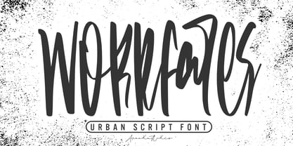 Introducing a Workfares - Urban Script Font with sharp and beautiful letters that create fonts that are modern, trendy and elegant. Workfares came with opentype features such stylistic alternates, stylistic sets & amp; amp; ligatures good for logotype, poster, badge, book cover, tshirt design, packaging and any more. Features : • Character Set A-Z • Numerals & Punctuations (OpenType Standard) • Accents (Multilingual characters) • Ligature • Alternate There it is! I really hope you enjoy it !
 - Hemera II by Konstantine Studio,
$18.00 To celebrate the milestone of our all time bestseller font called Hemera, After four years now we're ready to the next level of it. Please welcome Hemera II. A sophisticated vintage victorian era fonts, inspired from the old advertising and classic sign back in circa 1800 - 1900s. Perfectly fit for your vintage vibes and classic touch on any branding works. Logo, badges, label, headline, retro decoration, you name it.
 - Banteng by dotHK Studio,
$27.00 Banteng is a cool brushed handwritten font, organic and interesting looking. Masterfully designed to become a true favorite, this font has the potential to bring each of your creative ideas to the highest level. Include OpenType alternates and common ligatures. Ideal for logos, name tag, handwritten quotes, product packaging, merchandise, social media & greeting cards. Try the alternates and ligatures to give your designs looks good, fresh, casual, stylish, and modern.
 - P22 Speyside by IHOF,
$24.95 Speyside is a round, curved and controlled sans serif with an additional set of decorated uppercase letters, initials and small caps. It's appropriate for text, titling and display. The origin of the name is taken from a small location in Tobago. The font is inspired by the local handicraft, the batik in particular. Each pro font style includes small caps and decorative initials as well as several OpenType features.
 - Zera JNL by Jeff Levine,
$29.00Zera JNL is one of those fonts that defy any simple description. While trying out effects on Transactive JNL, Jeff Levine came up with a set of letters comprised of intersecting rings that could illustrate chain, cellular structure, bubbles or probably anything your imagination can come up with to adapt the font to a particular project. Please keep in mind this design works best in larger point sizes. - Matsuyama by Arendxstudio,
$15.00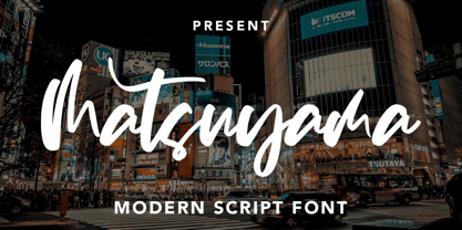 Introducing a Matsuyama - Modern Script Font with sharp and beautiful letters that create fonts that are modern, trendy and elegant. Matsuyama came with opentype features such stylistic alternates, stylistic sets & amp; amp; ligatures good for logotype, poster, badge, book cover, tshirt design, packaging and any more. Features : • Character Set A-Z • Numerals & Punctuations (OpenType Standard) • Accents (Multilingual characters) • Ligature • Alternate There it is! I really hope you enjoy it
 - Pusekatt by Hanoded,
$15.00 Pusekatt means Pussycat in Norwegian. It was finished on a rather gloomy monday, which reminded me of Norway and I just like cats. There you have it: the naming of fonts explained. It ain't rocket science for sure! There is nothing gloomy about Pusekatt font: it is a very lively, happy and useful poster face. It comes with extensive language support, one alternative (yes, one) and a lot of feline grace.
 - Selliboy Script by Arsa Visual,
$10.00 Proudly Present, Selliboy Stylish Handwritting Script Font from Arsa Visual. Selliboy It's a modern script font with a signature style look. It's very recommended for you who want to make some designs with natural handwriting with signature style. Selliboy will work for name card design, product packaging, branding project, social media post, wedding design, book cover title, poster or just used to express words above the background and more.
 - Nolagert by Oleg Gert,
$30.00 The Nolagert display san serif font also has a traditional and at the same time modern, playful and elegant look. Font Nolagert is an amazing creation that combines two cultural eras: I was inspired by the typography traditions of the Soviet Union of the 60s and refracted by modern requirements. It is a kind of bridge between the past and the present, combining classic elegance and modern playfulness.
 - Alpharain by Supfonts,
$18.00 Alpharain is a modern and at the same time absolutely incredible Serif with reverse contrast. A bright font will give the mood to your project Thanks so much for checking out my shop, and please get in touch if you have any questions! Alpharain Font Features: - Full Set of standard alphabet and punctuation - Handwritten ligatures - PUA Encoded - no special software needed to access extra characters - Multilingual Characters AÁĂÂÄÀĀĄÅÃÆBCĆČÇĊDÐĎĐEÉĚÊËĖÈĒĘẼFGĞĢĠḠHĦIIJÍÎÏİÌĪĮĨJKĶLĹĽĻŁMNŃŇŅÑ OÓÔÖÒŐŌØÕŒPÞQRŔŘŖSŚŠŞȘẞTŤŢȚUÚÛÜÙŰŪŲŮŨVWẂŴẄẀXYÝŶŸỲỸZŹŽŻ aáăâäàāąåãæbcćčçċdðďđeéěêëėèēęẽfgğģġḡhħiıíîïìijīįĩjȷkķlĺľļłmnńňņñoóôöòőōøõœpþ qrŕřŗsśšşșßtťţțuúûüùűūųůũvwẃŵẅẁxyýŷÿỳỹzźžż
 - PR Hydra by PR Fonts,
$15.00 A sequel to my own Herakles font, with multiple faces, and more to come, so the name refers to his second labor, slaying the Hydra. The straight lines and sharp angles make it suitable for evoking the feel of many ancient civilizations where writing was cut into stone. Whether your heroic deeds include slaying mythical monsters, or making the best spanakopita in the city, this font is for you.
