2,911 search results (0.019 seconds)
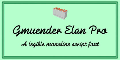
  1. Gmuender Elan Pro by RMU, $35.00
    A legible multi-purpose, multilingual monoline-script of great clarity.
  2. Pea Gretchie Print - Unknown license
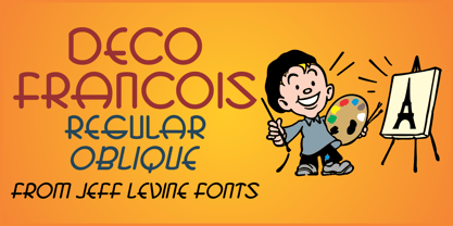
  3. Deco Francois JNL by Jeff Levine, $29.00
    The 1930s-era French alphabet collection entitled “La Lettre Dans le Decor & La Publicite Modernes” (which somewhat translates to “The Letter in Modern Decor and Advertising”) has page after page of attractive and unusual type interpretations. One particular Art Deco design puts an entirely different spin on the classic “rounded terminals and geometric design”. Unusual character shapes add a fresh new/old take to the “Streamline Movement”. The aptly-named Deco Francois JNL is available in both regular and oblique versions.
  4. IM FELL French Canon - Unknown license
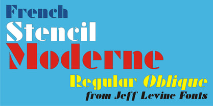
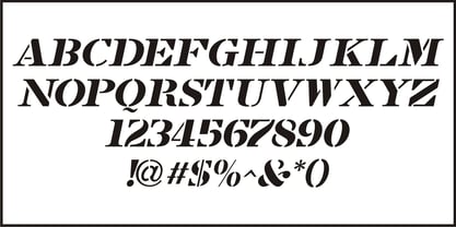
  5. French Stencil Moderne JNL by Jeff Levine, $29.00
    French Stencil Moderne JNL is modeled from an alphabet found in the 1930s publication "100 Alphabets Publicitaires" by M. Moullet, and is available in both regular and oblique versions. Strongly resembling the stencil motif of Futura Black, this French stencil alphabet has enough variations to give it a unique design flavor all its own.
  6. French Serif Moderne JNL by Jeff Levine, $29.00
    French Serif Moderne JNL gives a slab serif treatment to the lettering comprising Jeff Levine's French Art Initials JNL. The font - containing a full character set - was inspired by a page from an early 20th Century French alphabet book posted online at an image sharing site.
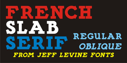
  7. French Slab Serif JNL by Jeff Levine, $29.00
    Another example of 1930s French Art Deco lettering from the 1934 publication L'Art du Tracé Rationnel de la Lettre (which roughly translates to “The Rational Path Art of the Letter”) resulted in the digital typeface French Slab Serif JNL. This bold and slightly eccentric slab serif design is available in both regular and oblique versions.
  8. French Art Initials JNL by Jeff Levine, $29.00
    The source for these hand-drawn initials was an early 20th Century French alphabet book whose pages were displayed online at an image sharing site. This style typifies the Art Nouveau period, and makes a wonderful paragraph starter or "drop cap" for your printed projects. Some users may still want to compose headlines with this font, but be aware there are no punctuation marks, accents or kerning - just the twenty-six initials.
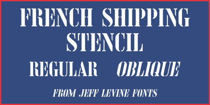
  9. French Shipping Stencil JNL by Jeff Levine, $29.00
    The hand punched lettering of an antique French shipping stencil was the inspiration for French Shipping Stencil JNL; available in both regular and oblique versions.
  10. French Stencil Serif JNL by Jeff Levine, $29.00
    Spotted for sale online, a partial set of antique tin stencils from France had a distinctively handmade look about them. Many of the characters were inconsistently wider than others, some characters were missing and one was damaged. Despite the obvious flaws, the image of these stencils served as the model for a digital font revival once the characters took on a more uniform appearance. French Stencil Serif JNL is available in both regular and oblique versions.
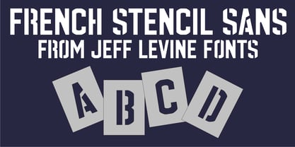
  11. French Stencil Sans JNL by Jeff Levine, $29.00
    French Stencil Sans JNL is another typeface based on vintage French tin/zinc stencils. Slightly rounded corners and a "hand-cut" look add an interesting and charming variation that breaks away from the "standard" design of other metal stencil sets.
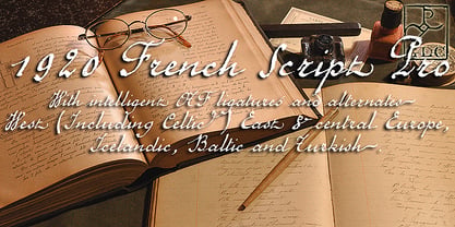
  12. 1920 French Script Pro by GLC, $42.00
    This font was inspired by one of a standard French manual styles in use from the beginning of 1900s to the end of World War II, when people were writing most often with pen holders and metal nibs. This typeface is easily legible as it was used for the lithographic printing of university textbooks. All lower cases from a to z and numerals from 0 to 9 are doubled by a slightly different one to allow a varying manual aspect in texts. We have added a lot of diacritic characters, covering West (including Celtic) and North European, Icelandic, Baltic, Eastern European and Turkish language. A few special glyphs allows to make final loops or underlining.
  13. Pindown X Plain BRK - Unknown license
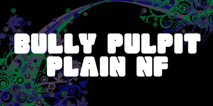
  14. Bully Pulpit Plain NF by Nick's Fonts, $10.00
    This engaging headline face is based on a rather pudgy typeface named “Bullion Shadow”, which was originally released somewhere on the cusp between the hippie and disco eras, and was equally at home in both. Now available in shaded and plain. Both versions of this font support the Latin 1252, Central European 1250, Turkish 1254 and Baltic 1257 codepages.
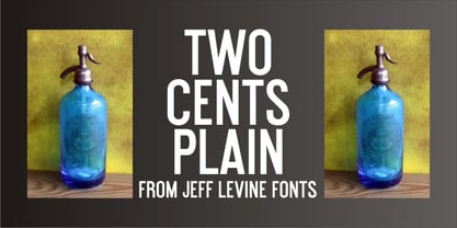
  15. Two Cents Plain JNL by Jeff Levine, $29.00
    Two Cents Plain JNL is a simple sans design for titling, sign work, display ads and so forth. The name is derived from the way folks in the Northeast used to ask for a glass of seltzer water at restaurants and soda fountains decades ago: "Give me a two cents plain." It was always cheaper to order plain seltzer than to have flavored syrup added, and this was especially true in the years during the Great Depression when every penny made a difference.
  16. Ecolier - Unknown license
  17. Georges - Personal use only
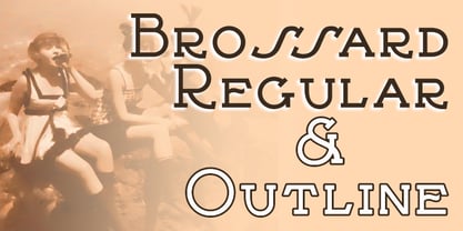
  18. Brossard by Greater Albion Typefounders, $13.95
    Brossard is a slab serif face redolent of French atmosphere and the design ethos of the 1920s. Use it for headines and posters that need that distinctive élan or where a Continental feel is called for. Regular and outline faces are offered.
  19. Bastarda - Unknown license
  20. Courthand - Unknown license
  21. Magdelena - Unknown license
  22. Beanie - Unknown license
  23. Handwriting - Unknown license
  24. TNG Monitors - Unknown license
  25. Metacopy - Unknown license
  26. CHANL - Unknown license
  27. Faces - Unknown license
  28. Crackling - Unknown license
  29. Aquaduct - Personal use only
  30. BLU Esoteric - Unknown license
  31. Atomic - Unknown license
  32. Slumgullion - Unknown license
  33. Big - Unknown license
  34. Flowerchild - Unknown license
  35. Oedipa - Unknown license
  36. ITC Eastwood by ITC, $29.99
    ITC Eastwood is the work of British designer Martin Archer and is named for Clint Eastwood. Archer was looking for a plain oldstyle typeface with open lower case forms and used Stempel Garamond as his starting point, although the result ended up well beyond its origins. In small point sizes the typeface looks interestingly rough while at display sizes it looks like a 16th century French typeface and its unique details come forward.
  37. Snowy - Unknown license
  38. West Side - Unknown license
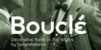
  39. Boucle by TipografiaRamis, $29.00
    Bouclé is a monoline decorative typeface family of three subfamilies—Plain, Round and Loopy. Plain and Round come in two weights—regular and bold. Bouclé Plain, as its name states, has minimal decorative features in comparison with Bouclé Round, and especially Bouclé Loopy. Thus, Bouclé Plain fonts could be better used for display text purposes. Round and Loopy fonts are reserved for highly decorative cases.
Looking for more fonts? Check out our New, Sans, Script, Handwriting fonts or Categories
abstract fontscontact usprivacy policyweb font generator
Processing