6,000 search results
(0.034 seconds)
- Summer Rose by Krafted,
$10.00 Roses are the epitome of beauty, simplicity, and love. Summer provides us with warmth, laughter, and happiness. Combine the two and you get a shimmeringly spectacular combination. Introducing Summer Rose - A Sweet, Casual Handwritten Font. Summer Rose can be used for a variety of different content needs such as headings, logos, business cards, printed quotes, cards, packaging, resumes, and even your website or social media branding. Breathe the sweet-smelling freshness of Summer Rose into your branding and dazzle your guests, audience, or clients. Let the world see your beautiful ideas with this Sweet, Casual Handwritten Font. What you’ll get: Multilingual & Ligature Support Full sets of Punctuation and Numerals Compatible with: Adobe Suite Microsoft Office KeyNote Pages Software Requirements: The fonts that you’ll receive in the pack are widely supported by most software. In order to get the full functionality of the selection of standard ligatures (custom created letters) in the script font, any software that can read OpenType fonts will work. We hope you enjoy this font and that it makes your branding sparkle! Feel free to reach out to us if you’d like more information or if you have any concerns.
 - Headey by Alex Couture,
$15.00 Headey is a clean and lining brush script with a bouncing baseline. Include OpenType alternates and common ligatures. Try the alternates and ligatures to give your designs looks good, fresh, casual, stylish, and modern. That's it! I really hope you enjoy it.
 - Serabut Brush by Siwox Studios,
$11.00 Serabut Brush! A fresh and natural font ready to give your design project looks great. This is very suitable for a beautiful tagline, title, cover book, logo, some of the daily quotes, invitation, poster, and any design project that needs natural touches.
 - Harvest Barn by Konstantine Studio,
$15.00 Harvest Barn, a fresh beautiful rustic farmhouse font. Inspired by the rustic home decor concept and farmhouse feels. It would be a perfect mate for branding, logo, rustic wedding concept, home decor, journal, poster quote, vintage flea market promotion, etc. So versatile, right?
 - Road Trip by Melissa Lapadula,
$19.95This font has wide letterforms and bends which echo the continuous roads traveled on when reaching distant holiday destinations. The typography aims to be clear and legible, as do helpful road signs. This font can function as headings, subheadings and body text. - Plumero Script by Sudtipos,
$39.00 Plumero is the wild, playful side of calligraphy. The disciplined elegance of old lettering is replaced with the fresh, joyful swashes of youth. Attractive and care-free, Plumero catches the eye and leaves its viewer with an indelible impression of its unmistakable signature.
 - Koralle Rounded NF by Nick's Fonts,
$10.00Here's a new, softer take on the classic typeface Koralle, released by Schelter und Geisecke in 1913, and as fresh today as it was then. Both versions of this font support the Latin 1252, Central European 1250, Turkish 1254 and Baltic 1257 codepages. - Staly Home by IbeyDesign,
$17.00 Staly Home Handwritten Script Font is an exquisite handwritten font, masterfully designed to become a true favorite. It maintains its classy calligraphic influences while feeling contemporary and fresh. Fall in love with Stay Home and bring your projects to the highest levels.
 - Clarenwood Stencil JNL by Jeff Levine,
$29.00 It's a wood type! It's a stencil font! It's BOTH! Clarenwood Stencil JNL was originally designed as a solid alphabet (Clarenwood JNL) modeled from vintage wood type. The stencil treatment was applied to add a fresh look to a classic lettering design.
 - Bullseye by Crumphand,
$19.00 Hello, this is the new font "Bullseye" The font has made by Sharpie Marker. Looks bold but still Elegant and Fresh. The font have a good Readability. What's Character Included ? Uppercase Lowercase Numerals Punctuation Multilingual Support Stylistic Set. Standart Ligature Thank you, Regards!
 - Andina by Nissa Nana,
$23.00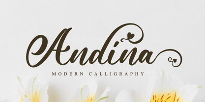 Andina is an exquisite handwritten font, masterfully designed to become a true favorite. It maintains its classy calligraphic influences while feeling contemporary and fresh. This font is PUA encoded which means you can access all of the glyphs and swashes with ease!
 - Andalusia Signature by Letterena Studios,
$9.00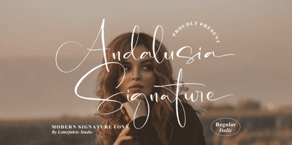 Andalusia Signature is an exquisite handwritten font, masterfully designed to become a true favorite. It maintains its classy calligraphic influences while feeling contemporary and fresh. This font is PUA encoded which means you can access all of the glyphs and swashes with ease!
 - Harder by Doehantz Studio,
$20.00 Fresh and New, Harder. Harder is an elegant script font. Made from vectorized hand strokes so that it will look neat on each side of the character. He has several character alternatives that will offer interesting options for any of your design projects
 - Bruzh by Garisman Studio,
$20.00 BRUZH combines attractive and natural hand-brushed letters with swinging curves and fresh urban edges; delivering a stylish brush which is guaranteed to add an eye-catching appeal to your logo designs, brand imagery, handwritten quotes, product packaging, merchandise & social media posts.
 - Roble by Latinotype,
$26.00 Roble is a Slab Serif Font, from a mix between Andes and Sanchez, following a harmony with both fonts one sans and one serif with a fresh and dynamic result. Roble is a family of 16 display fonts 8 weights plus italics.
 - Carot Sans by Storm Type Foundry,
$39.00 Carot Sans is designed on the basis of three elements - square, circle and triangle. Simple and fresh typeface for visual identities, book covers, magazines and advertisement. The whole Carot system of 64 members offers a modern alternative for all types of design work.
 - Sugar Sand by Ira Natasha,
$10.00 Sugar Sand is a handwritten sans serif font. A new fresh handmade font with rough edges. This font is support multi language. It will be perfect for many different project ex: quotes, logo, blog header, poster, branding, fashion, apparel, letter, invitation, stationery, etc….
 - Mafond by Etewut,
$25.00 Mafond is a fresh slab serif. It supports all european languages. The family is rounded as never before and includes 5 styles. Each of them has alternates for basic latin and a couple of ligatures. In case of success Mafond becomes Yofond.
 - Fontleroy NF Pro by CheapProFonts,
$10.00 I have completely redone the spacing in this font, making the sidebearings more conventional. And after replacing the kerning with fresh pairs working together with the new spacing the font looks like a real gem. I love it! The inline version has a wider spacing after the letters CEK = no connecting words. Otherwise just as lovely and retro! Nick Curtis says: "Here’s a strange hybrid: I took the lower case from the formal script font Stuyvesant, straightened out its rather extreme 22° slant, and combined them with caps from the font Bellevue, again making them upright, and adding an inline effect. The result is a font that flows very nicely, with a nice balance between clean lowercase characters and swashy caps. Thanks to Deb Dunbar for naming this font. Fontleroy Brown is the solid version, produced at the request of the King of Ding, Jeff Levine." ALL fonts from CheapProFonts have very extensive language support: They contain some unusual diacritic letters (some of which are contained in the Latin Extended-B Unicode block) supporting: Cornish, Filipino (Tagalog), Guarani, Luxembourgian, Malagasy, Romanian, Ulithian and Welsh. They also contain all glyphs in the Latin Extended-A Unicode block (which among others cover the Central European and Baltic areas) supporting: Afrikaans, Belarusian (Lacinka), Bosnian, Catalan, Chichewa, Croatian, Czech, Dutch, Esperanto, Greenlandic, Hungarian, Kashubian, Kurdish (Kurmanji), Latvian, Lithuanian, Maltese, Maori, Polish, Saami (Inari), Saami (North), Serbian (latin), Slovak(ian), Slovene, Sorbian (Lower), Sorbian (Upper), Turkish and Turkmen. And they of course contain all the usual “western” glyphs supporting: Albanian, Basque, Breton, Chamorro, Danish, Estonian, Faroese, Finnish, French, Frisian, Galican, German, Icelandic, Indonesian, Irish (Gaelic), Italian, Northern Sotho, Norwegian, Occitan, Portuguese, Rhaeto-Romance, Sami (Lule), Sami (South), Scots (Gaelic), Spanish, Swedish, Tswana, Walloon and Yapese.
 - Bleeker by Typodermic,
$11.95 Are you ready to infuse some laid-back vibes into your design game? Look no further than Bleeker! This hand-lettered typeface is like a breath of fresh air, with casual letterforms and relaxed line-treatment that make your message feel effortlessly conversational. But don’t let the carefree nature of Bleeker fool you—this font is also smart and sophisticated. Thanks to custom letter pairings, it looks totally natural in OpenType-savvy applications. And let’s be honest—who doesn’t want to look natural and effortless while still being totally cool? So if you’re yearning for a typeface that feels like a sunny day and a good conversation rolled into one, give Bleeker a try. It’s the perfect blend of whimsy and sincerity that your designs have been craving. Most Latin-based European writing systems are supported, including the following languages. Afaan Oromo, Afar, Afrikaans, Albanian, Alsatian, Aromanian, Aymara, Bashkir (Latin), Basque, Belarusian (Latin), Bemba, Bikol, Bosnian, Breton, Cape Verdean, Creole, Catalan, Cebuano, Chamorro, Chavacano, Chichewa, Crimean Tatar (Latin), Croatian, Czech, Danish, Dawan, Dholuo, Dutch, English, Estonian, Faroese, Fijian, Filipino, Finnish, French, Frisian, Friulian, Gagauz (Latin), Galician, Ganda, Genoese, German, Greenlandic, Guadeloupean Creole, Haitian Creole, Hawaiian, Hiligaynon, Hungarian, Icelandic, Ilocano, Indonesian, Irish, Italian, Jamaican, Kaqchikel, Karakalpak (Latin), Kashubian, Kikongo, Kinyarwanda, Kirundi, Kurdish (Latin), Latvian, Lithuanian, Lombard, Low Saxon, Luxembourgish, Maasai, Makhuwa, Malay, Maltese, Māori, Moldovan, Montenegrin, Ndebele, Neapolitan, Norwegian, Novial, Occitan, Ossetian (Latin), Papiamento, Piedmontese, Polish, Portuguese, Quechua, Rarotongan, Romanian, Romansh, Sami, Sango, Saramaccan, Sardinian, Scottish Gaelic, Serbian (Latin), Shona, Sicilian, Silesian, Slovak, Slovenian, Somali, Sorbian, Sotho, Spanish, Swahili, Swazi, Swedish, Tagalog, Tahitian, Tetum, Tongan, Tshiluba, Tsonga, Tswana, Tumbuka, Turkish, Turkmen (Latin), Tuvaluan, Uzbek (Latin), Venetian, Vepsian, Võro, Walloon, Waray-Waray, Wayuu, Welsh, Wolof, Xhosa, Yapese, Zapotec Zulu and Zuni.
 - TT Corals by TypeType,
$29.00 TT Corals useful links: Graphic presentation | Customization options TT Corals is a modern humanist sans-serif which has many typical traits of the beginning of the 20th century. For increased functionality, we created 6 styles of various weights: thin, light, regular, bold, extrabold and black. Its distinctive smooth lines and separate elements allow TT Corals to be used for a variety of design applications. It fits classical literature or music perfectly, and is appropriate for any creative or innovative content. TT Corals inspires new ideas for your creativity and art with its freshness and novelty. FOLLOW US: Instagram | Facebook | Website TT Corals language support: Acehnese, Afar, Albanian, Alsatian, Aragonese, Arumanian, Asu, Aymara, Banjar, Basque, Belarusian (cyr), Bemba, Bena, Betawi, Bislama, Boholano, Bosnian (cyr), Bosnian (lat), Breton, Bulgarian (cyr), Cebuano, Chamorro, Chiga, Colognian, Cornish, Corsican, Cree, Croatian, Czech, Danish, Embu, English, Erzya, Estonian, Faroese, Fijian, Filipino, Finnish, French, Friulian, Gaelic, Gagauz (lat), Galician, German, Gusii, Haitian Creole, Hawaiian, Hiri Motu, Hungarian, Icelandic, Ilocano, Indonesian, Innu-aimun, Interlingua, Irish, Italian, Javanese, Judaeo-Spanish, Judaeo-Spanish, Kalenjin, Karachay-Balkar (lat), Karaim (lat), Karakalpak (lat), Kashubian, Khasi, Khvarshi, Kinyarwanda, Kirundi, Kongo, Kumyk, Kurdish (lat), Ladin, Latvian, Laz, Leonese, Lithuanian, Luganda, Luo, Luxembourgish, Luyia, Macedonian, Machame, Makhuwa-Meetto, Makonde, Malay, Manx, Maori, Mauritian Creole, Minangkabau, Moldavian (lat), Montenegrin (lat), Mordvin-moksha, Morisyen, Nahuatl, Nauruan, Ndebele, Nias, Nogai, Norwegian, Nyankole, Occitan, Oromo, Palauan, Polish, Portuguese, Quechua, Rheto-Romance, Rohingya, Romanian, Romansh, Rombo, Rundi, Russian, Rusyn, Rwa, Salar, Samburu, Samoan, Sango, Sangu, Scots, Sena, Serbian (cyr), Serbian (lat), Seychellois Creole, Shambala, Shona, Slovak, Slovenian, Soga, Somali, Sorbian, Sotho, Spanish, Sundanese, Swahili, Swazi, Swedish, Swiss German, Swiss German, Tagalog, Tahitian, Taita, Tatar, Tetum, Tok Pisin, Tongan, Tsonga, Tswana, Turkish, Turkmen (lat), Ukrainian, Uyghur, Vepsian, Volapük, Võro, Vunjo, Xhosa, Zaza, Zulu.
 - Lerku by Typodermic,
$11.95 Looking for a typeface that embodies both grit and grandeur? Look no further than Lerku. This crispy font takes its inspiration from the timeless classic Bold Antique by Morris Fuller Benton, but it adds a grungy edge that’s perfect for today’s contemporary designs. With letter pair ligatures that help break up the monotony of repeating characters, Lerku is perfect for OpenType-savvy applications that demand a bit of variation. Whether you’re designing a website, a logo, or a marketing campaign, Lerku will give your message a bold, authoritative voice that’s sure to make an impact. So if you want to add a touch of vintage charm to your design, while still keeping it fresh and modern, Lerku is the perfect choice. Most Latin-based European writing systems are supported, including the following languages. Afaan Oromo, Afar, Afrikaans, Albanian, Alsatian, Aromanian, Aymara, Bashkir (Latin), Basque, Belarusian (Latin), Bemba, Bikol, Bosnian, Breton, Cape Verdean, Creole, Catalan, Cebuano, Chamorro, Chavacano, Chichewa, Crimean Tatar (Latin), Croatian, Czech, Danish, Dawan, Dholuo, Dutch, English, Estonian, Faroese, Fijian, Filipino, Finnish, French, Frisian, Friulian, Gagauz (Latin), Galician, Ganda, Genoese, German, Greenlandic, Guadeloupean Creole, Haitian Creole, Hawaiian, Hiligaynon, Hungarian, Icelandic, Ilocano, Indonesian, Irish, Italian, Jamaican, Kaqchikel, Karakalpak (Latin), Kashubian, Kikongo, Kinyarwanda, Kirundi, Kurdish (Latin), Latvian, Lithuanian, Lombard, Low Saxon, Luxembourgish, Maasai, Makhuwa, Malay, Maltese, Māori, Moldovan, Montenegrin, Ndebele, Neapolitan, Norwegian, Novial, Occitan, Ossetian (Latin), Papiamento, Piedmontese, Polish, Portuguese, Quechua, Rarotongan, Romanian, Romansh, Sami, Sango, Saramaccan, Sardinian, Scottish Gaelic, Serbian (Latin), Shona, Sicilian, Silesian, Slovak, Slovenian, Somali, Sorbian, Sotho, Spanish, Swahili, Swazi, Swedish, Tagalog, Tahitian, Tetum, Tongan, Tshiluba, Tsonga, Tswana, Tumbuka, Turkish, Turkmen (Latin), Tuvaluan, Uzbek (Latin), Venetian, Vepsian, Võro, Walloon, Waray-Waray, Wayuu, Welsh, Wolof, Xhosa, Yapese, Zapotec Zulu and Zuni.
 - Permanence by Typodermic,
$11.95 Welcome to the world of Permanence, where the past meets the future. Inspired by the iconic cover of Alvin Toffler’s groundbreaking hardcover, “Future Shock” from 1970, Permanence is the perfect typeface to transport you to a world of limitless possibilities. With its bold, clean lines and sleek design, Permanence captures the essence of the retro-futuristic style. Its crisp, angular shapes and unique curves evoke a sense of progress and innovation, harking back to a time when anything was possible. Permanence is more than just a typeface—it’s a vision of a better tomorrow. Its timeless design captures the optimism and hope of a bygone era, while still feeling fresh and modern. Why settle for the ordinary when you can experience the extraordinary with Permanence? Most Latin-based European writing systems are supported, including the following languages. Afaan Oromo, Afar, Afrikaans, Albanian, Alsatian, Aromanian, Aymara, Bashkir (Latin), Basque, Belarusian (Latin), Bemba, Bikol, Bosnian, Breton, Cape Verdean, Creole, Catalan, Cebuano, Chamorro, Chavacano, Chichewa, Crimean Tatar (Latin), Croatian, Czech, Danish, Dawan, Dholuo, Dutch, English, Estonian, Faroese, Fijian, Filipino, Finnish, French, Frisian, Friulian, Gagauz (Latin), Galician, Ganda, Genoese, German, Greenlandic, Guadeloupean Creole, Haitian Creole, Hawaiian, Hiligaynon, Hungarian, Icelandic, Ilocano, Indonesian, Irish, Italian, Jamaican, Kaqchikel, Karakalpak (Latin), Kashubian, Kikongo, Kinyarwanda, Kirundi, Kurdish (Latin), Latvian, Lithuanian, Lombard, Low Saxon, Luxembourgish, Maasai, Makhuwa, Malay, Maltese, Māori, Moldovan, Montenegrin, Ndebele, Neapolitan, Norwegian, Novial, Occitan, Ossetian (Latin), Papiamento, Piedmontese, Polish, Portuguese, Quechua, Rarotongan, Romanian, Romansh, Sami, Sango, Saramaccan, Sardinian, Scottish Gaelic, Serbian (Latin), Shona, Sicilian, Silesian, Slovak, Slovenian, Somali, Sorbian, Sotho, Spanish, Swahili, Swazi, Swedish, Tagalog, Tahitian, Tetum, Tongan, Tshiluba, Tsonga, Tswana, Tumbuka, Turkish, Turkmen (Latin), Tuvaluan, Uzbek (Latin), Venetian, Vepsian, Võro, Walloon, Waray-Waray, Wayuu, Welsh, Wolof, Xhosa, Yapese, Zapotec Zulu and Zuni.
 - Le Havre Titling by insigne,
$24.00 Throughout time, history’s architects have incorporated some of the finest illustrations of type into their great works--cuneiform on Mesopotamian ziggurats; Greek etched into the temples of the gods; inscriptions marking the monuments of mighty Rome. From these Roman inscriptions specifically, we take our capital letters of today; and while we've lost the need for serifs over time, our current characters maintain the classical foundations, even after being distilled to their simplistic forms. Here’s where we have the basis for Le Havre Titling. This updated face is a carefully optimized version of Le Havre that uses purely capital lettering. Originally inspired by the golden period of the passenger ship and the French port that bid a rich bon voyage to so many famed, luxurious ocean liners of the Roaring Twenties and Thirties, the typeface includes an exciting array of ligatures that brings it into the present day and gives designers a tremendous amount of versatility in their work. With its seven weights, Titling looks equally at home on the side of a building as it does in a finely crafted invitation. With over five hundred glyphs, Le Havre Titling offers a multiplicity of options for your projects. Combine ligatures, play around with two sets of art deco forms, use original caps, and more; every one of these is obtainable with the OpenType functionality. The new design also shares five weights with the original Le Havre, allowing you to maximize your potential through its interchangeability. Titling’s Thin weights are delicate but not too fragile, and its geometric forms give each individual composition you create an exquisite and beautiful sense of emotion. Without a doubt, this fresh, fashionable take on the classical forms offers your reader refined, yet unanticipated approach as he or she travels through your text.
 - Martin Luther by Harald Geisler,
$59.00 ❧ Useful links: Luther’s Manuscripts at the UNESCO Memory of the World at Google Arts and Culture Martin Luther font on Kickstarter (with Film about the creation) Each letter of the Martin Luther font is strictly based on original samples found in Martin Luther’s 500 year old handwritten manuscripts. Letters that occur more often for example vowels have two or more different versions stored in the font. (➶ Figure 4) These alternative forms are exchanged automatically by the font as you type, and create a vivid look that comes close to actual handwriting. The font avoids that two identical letters are placed next to each other like, for example the two “o” in the word “look”. ➸ What Historic Sources is the Font based on? Two historic documents were used to base the font on. The notes Luther took before giving his speech in Worms in 1521 and a 6 page letter he wrote immediately after to Emperor Charles V., summarising his speech (➶ Figure 2). Both documents have been added to the UNESCO “Memory of the World” and can be seen at the Google Arts and Culture website. ➸ The Creation of a Handwriting Font The creation of a handwriting font is very different from the creation of a regular font. Harald Geisler has specialised in recreating handwriting in preceding projects with Albert Einstein’s, Sigmund Freud’s and his own handwriting. His experience working with Archives and Museums has gone into this project. First Geisler analyses the movement in the writing to understand how each letter is drawn. This involves partially learning how to write like a person. In this process not the outlines of the sample are reproduced but the original movement path of the handwriting (➶ Figure 3). In a second step width and contrast is added to reproduce Martin Luther’s characteristic impetus and the writing tools used at the time. (Link: Youtube Playlist showcasing the creation of individual letters) How about signs that can’t be found in archives? Some Glyphs can not be found in 500 year old manuscripts, for example the @-sign. Towards the end of the creation one collects a profund amount of details about how a writer moves on paper and addresses certain tasks moving the pen. Keeping this knowledge in mind an improvisation can be based on similar letter forms. For example the @ sign is based on of the movement of a lowercase a and parenthesis. ➸ Features of the Martin Luther font ❶ Extensive Documentation of the creation of the font, including high quality reproduction of the used manuscripts. ❷ Additional texts from Historian Dr. Henning Jürgens and Palaeographer (and Luther handwriting expert) Prof. Ulrich Bubenheimer ❸ Alternating Letters - in handwriting every word looks a bit different. To avoid that two identical letterforms are placed next to each other (for example in the word look) the font actively changes between different versions of letters as you type. ❹ Ligatures - characteristic writing forms when two letters are combined (for example “ct”) (➶ Figure 5) ❺ Terminal Letterforms - renders a special letterform when letter is at the end of a word. (➶ Figure 8) ❻ ‘’’Initial and Medial Letterforms''' - some letterforms are different when placed in the beginning or middle of a word, for example the lowercase s. ❼ Luther Rose - is a seal Luther used to authorise his correspondence. Today it is a widely recognized symbol for Luther. When you enter the numbers of Luthers year of birth and death 14831546 using the Martin Luther PRO font, it will render a stylised version of the Luther Rose. (➶ Figure 7) ❽ Historic letter-forms - letter-forms that are specific to medieval writing around 1500. For example the long-s or h with a loop at the bottom. (➶ Figure 6) ⚑ Multi language support - see the technical information tab for a full list of supported languages. (➶ Figure 11) ➸ The different Styles explained ❋ Martin Luther PRO - this includes all features listed above and is geared towards writing texts that are more readable today. It features alternating letters to create a natural handwriting look as well as two stylistic sets accessible through the OpenType menu. Historic forms are available through the glyph picker. ❋ Martin Luther Historic - this font creates a historically correct reproduction (i.e. with long-s) of Luther’s medieval latin handwriting. It features alternating letters to create a natural handwriting look as well as two stylistic sets accessible through the OpenType menu. ❋ Martin Luther Expert-1 - Dedicated access to the first set of letters only. ❋ Martin Luther Expert-2 - Dedicated access to the second set of letters only. ❈❈❈ Family Pack - recieve all fonts at a discounted price. ❈❈❈ ➸ Kickstarter The creation and development of the Martin Luther font was financed by 500 supporters on ➸Kickstarter.
 - Brassens by Typorium,
$53.00 Le Typorium présente une nouvelle famille de caractères calligraphiques basés sur une écriture étudiée à travers les manuscrits et autographes de Georges Brassens, poète et musicien (1921-1981). Son tracé, rigoureux et appliqué, souvent minutieux, est à l’image d’une œuvre unique et singulière, immédiatement reconnaissable. Le script Brassens offre des fonctionnalités OpenType telles que des caractères alternatifs pour les majuscules et les minuscules afin de renforcer la fluidité d’une écriture manuelle, des chiffres alternatifs, des fractions et un jeu de caractères accentués étendu pour prendre en charge de nombreuses langues étrangères. Trois graisses ont été créées afin d’offrir une large palette de possibilités graphiques. 60 images d’un poète qui a cassé sa pipe à l’âge de 60 ans., classées en trois séries de vignettes (pictogrammes, symboles, portraits), elles illustrent l’univers imagé et la richesse symbolique de la poésie de Georges Brassens où les représentations mythologiques et allégoriques y tiennent une part importante. Georges Brassens est un poète, auteur-compositeur-interprète né à Sète le 22 octobre 1921, mort à Saint-Gély-du-Fesc le 29 octobre 1981 et enterré au cimetière Le Py de Sète. Auteur de plus de deux cents chansons populaires, il met en musique et interprète ses poèmes en s’accompagnant à la guitare. Outre ses propres textes, il met également en musique des poèmes de François Villon, Victor Hugo, Paul Verlaine, Paul Fort, Antoine Pol, ou encore Louis Aragon. Il reçoit le Grand Prix de Poésie de l’Académie Française e 1967. Un grand nombre d’écoles, salles de spectacle, voies, parcs et jardins portent également son nom, dont à Paris le parc Georges-Brassens, tout proche de l’impasse Florimont où il vécut ses premières années parisiennes, de sa maison de la rue Santos-Dumont et du café Les Sportifs Réunis – Chez Walczak – rue Brancion qui lui inspira « Le Bistrot ». À Sète, l’Espace Georges Brassens ainsi que de nombreux festivals et associations redonnent vie au poète et à son œuvre. The Typorium presents a new calligraphic typeface family based on a writing studied through the manuscripts and autographs of Georges Brassens, poet and musician (1921-1981). Its layout, rigorous and applied, often meticulous, is in the image of a unique and singular work, immediately recognizable. Brassens script offers OpenType features such as alternate characters for upper and lower case to enhance the fluency of handwriting, alternate numbers, fractions and an extended accented character set to support many foreign languages. Three weights have been created to offer a wide range of graphic possibilities. 60 images of a poet who broke his pipe (French expression for passing away) at the age of 60, classified into three series of vignettes (pictograms, symbols, portraits), they illustrate the imagery world and the symbolic richness of Georges Brassens poetry where mythological and allegorical representations hold an important part. Georges Brassens is a poet, singer-songwriter born in Sète on October 22, 1921, died in Saint-Gély-du-Fesc on October 29, 1981 and buried in Le Py cemetery of Sète. Author of more than two hundred popular songs, he sets to music and performs his poems, accompanying himself on the guitar. In addition to his own texts, he also sets to music poems by François Villon, Victor Hugo, Paul Verlaine, Paul Fort, Antoine Pol, or Louis Aragon. He received the Grand Prix of Poetry from the Académie Française in 1967. A large number of schools, theaters, streets, parks and gardens also bear his name, including in Paris the Georges-Brassens park, very close to the impasse Florimont where he lived his first years in Paris, his house in the rue Santos-Dumont and the café Les Sportifs Réunis - Chez Walczak - rue Brancion which inspired "Le Bistrot". In Sète, the Espace Georges Brassens as well as numerous festivals and associations bring the poet and his work back to life.
 - Power Grotesk by Power Type,
$15.00 Power Grotesk is a sans serif typeface with details that give typography that has its own characteristics from the thinnest to the thickest that is slightly widened. The goal is to create a typeface with legibility and good contrast between black and white so that it is suitable for different sizes. The typeface has a special feature that aids in reading and reproducing, trapping the right-sized ink for the text to work. The geometric shapes and structures reflect the inspiration and influence of medieval typography. Power Grotesk moves between the vast historical material that makes up modern typography, combining contemporary details with classic styles.
 - Prelo by DSType,
$55.00Prelo was designed to be a neutral, highly readable typeface for identity, editorial and information design. With nine weights and nine true italics from Hairline to Black, Prelo is a workhorse typeface full of OpenType features such as small caps, tabular figures, central European characters and historical figures, among others. Like other DSType fonts, most of the diacritics were designed to fit the gap between the x-height and the caps height, avoiding some common problems with the accented characters. The curves are soft and smooth, providing legibility even in very poor conditions, and the neutrality allows this typeface to be used with any serif companion. - Scala Jewel Pro by Martin Majoor,
$29.00 Scala Jewels is a set of four highly decorative typefaces, based on the bold capitals of Scala. Whereas Crystal and Pearl are modelled on historic examples, Diamond and Saphyr are original designs. Scala Jewels offers the possibility to set decorated borders, designed in the style of each of the four variations. There are corners and different sorts of long and short elements. One of the best ways to use Scala Jewels is as a two- or three-line drop cap at the start of a chapter. The award-winning Scala family (1990-1993) is a worldwide bestseller and has established itself as a ‘classic’ among digital fonts.
 - Rail Line JNL by Jeff Levine,
$29.00 Rail Line JNL is a font for the railroad enthusiast for making their own model train car emblems. The logos contained in this font are or may be the property of the various rail companies, their assigns and/or successors. Outside of non-profit hobby use or for historical/educational purpose under the Fair Use rules, any commercial application of these logos must be obtained by written permission by the respective logo owner or owners. Jeff Levine fonts provided Rail Line JNL strictly as a hobby font. We assume no liability for the use, misuse or misrepresentation of any of the logos contained within the font file.
 - Kolm Keltek by 2D Typo,
$36.00 Kolm Keltek is a collection of ornaments organized into two font files. The ornaments can be divided into two groups: Friezes (borders) and Rapports (patterns). All ornaments belong to the Celtic culture. These ornaments are taken from manuscripts. This makes the font exclusive and unique among other digital collections of ornaments. These patterns perfectly suit to be used in the design of invitations, diplomas, certificates or other printed materials in historical style design. Kolm Keltek - Demo Guide contains basic examples of how to combine the ornaments that significantly facilitates the use of the collection. Kolm Keltek is one of the many high-quality ornamental fonts offed by the 2D Typo foundry.
 - Rosa by Pelavin Fonts,
$25.00 Inspired by Art Deco packaging, Rosa fits comfortably into that classic genre. It’s namesake in the collection of La Sociéte Parisienne de Savons is described thusly: In mythological legend, Chloris, the goddess of Spring flowers transformed the body of a nymph into the first Rose. Aphrodite gave her beauty. Dionysus, the god of wine gave her a sweet fragrance and the Three Graces, charm, joy and radiance. Equally compatible with Machine Age, Streamline, Moderne and even Memphis design motifs, it presents the unique option of serving as both the typographic and decorative components of a design. Use Rosa to evoke a sense of elegance, high style and historical context.
 - Zainer by Proportional Lime,
$9.99 Günther Zainer, (or Zeyner or Zeiner), was the first printer to operate in the city of Augsburg. He was active from 1468 to his death in 1478. In that single decade he was responsible for printing 80 works. Most of these editions were for the clergy but he also printed the first Calendar and large-scale illustrated book intended for the wider public. This font is based on one of his more interesting and peculiar fonts. And it has been enlarged to include over a 1,000 defined glyphs for modern use and also for historical purposes many glyphs recommended by the Medieval Unicode Font Initiative organization have also been included.
 - ALS Zwoelf by Art. Lebedev Studio,
$63.00 The design of Zwoelf stems from a letter created by Oleg Pashchenko for the poetry book called “They Talk.” Modified in several ways, the lettering gained readability and a more neutral look. This typeface combines Modern and Gothic styles, ugliness and beauty, the horrifying and the funny. Typographers may highlight any of this. Zwoelf features elements that can be found in both Roman and Gothic styles, but has no real historical prototype. It creates coarse body copy that feels like blackletters. The type is well-suited for use with rough line graphics. Zwoelf is a good choice for short texts, headings, witchcraft potion recipes, madrigals, spells and treasure map naming.
 - Monocto by Lafonts,
$29.00 Monocto is an upright italic, clearly evidenced by the lowercase letters a, e, f, g, i, k, l, v, w, x, y and several capitals. On one hand, the design is inspired by an historical German running hand written with a pen angle of 45°, and on the other, by rational, utilitarian monospace types, similar to those designed for the mechanical typewriter during the Industrial Revolution. As the writing tool touches the paper, a double-square with broken corners is produced, which then, according to ductus, transforms itself into letter components that are either 90°-verticals or 45°-diagonals. The systematic geometry of Monocto offers unexpected design possibilites.
 - Pyke by The Northern Block,
$39.95 Pyke is a versatile serif typeface inspired by the Didone style of Giambattista Bodoni. After a detailed legibility study, Sofie Beier produced the typeface in three optical sizes; Micro, Text, and Display. The work goes beyond historic revival creating the complexities and subtleties of this classic style fit for users in the modern era. Details include six weights with true italics, specific sizes; Micro for small point sizes of 8 or less, Text for 9–14 points, and Display for larger print sizes, over 530 characters per style with 14 opentype features, and language support for Western, South, and Central Europe. Check out Karlo which is a great pair for Pyke.
 - GLC Ornaments One by GLC,
$20.00 This font is a collection made with the largest part of the ornaments contained in the GLC foundry medieval and renaissance period fonts. It was made for the use of customers who wish to embellish their works without buying our complete catalog! It is used to embellish and animate as variously as web-site titles, posters and fliers design or greeting cards, all various sorts of presentations, menus, certificates, letters. It was specially drawn to accompany our medieval and renaissance fonts, like 1462 Bamberg, 1509 Leyden, 1538 Schwabacher, 1543 Humane Jenson, 1557 Italique, 1589 Humane Bordeaux, 1592 GLC Garamond and others, giving them an historical additional genuine touch...
 - Schwandner Ornaments by Intellecta Design,
$17.50 A highly intrincated set of ornaments inspired from the work of Johann Georg Schwandner (1716-1791). An accurate historical revival and interpretation of Iza W, at Intellecta Design. State-of-art to use in headings, chapter initials from books, magazines and other publications. In Barocque and Renaissance inspired layouts, or modern mixed proposals. If you’re taking a formal approach to your Christmas designs, Schwandner Ornaments from Intellecta Design will provide unparalleled elegance and sophistication. The ornaments and fleurons in this set are intricately drawn, adding a touch of the Victorian era to cards, envelopes, gift tags, and place cards worthy of the grandest holiday feas
 - Cenizas by Sudtipos,
$79.00 Cenizas is another masterpiece of rough-and-tumble script from the prolific Argentine duo of Koziupa and Paul. Although the overall 'wildness' of Cenizas is reminiscent of popular mid-twentieth-century English display scripts, Koziupa's Latin brush humor and ingenuity remain evident in the underlying structure of the design. Casual, care-free and adventurous, Cenizas can be a great choice for design applications relating to active behavior, like outdoor sports and travel. It also is enough of a rough script to be quite useful in a variety of other design contexts, such as the covers of art books or historical novels, museum literature, music sleeves and posters, or even map designs.
 - Shock & Awe by Barnbrook Fonts,
$30.00 Shock and Awe is a family of two display typefaces drawn up from lettering that has been at the centre of major historical events. Enola Gay is based upon nose art from the B-29 Superfortress bomber that dropped the first atomic bomb, on the Japanese city of Hiroshima, in 1945. Tomahawk is based upon the fuselage lettering of the original (then) General Dynamics manufactured Tomahawk cruise missile. Tomahawk missiles were introduced into military service in the 1970s and have been deployed by US and UK 'coalition' forces in a number of conflicts, including both the 1991 Gulf War and the 2003 invasion of Iraq. Aesthetic production by Marcus McCallion.