10,000 search results
(0.055 seconds)
- F2F Lovegrid by Linotype,
$29.99The Techno sound of the 1990s, a personal computer, a font creation software and some inspiration had been the sources to the F2F (Face2Face) font series. Heike Nehl and her friends had the demand to create new unusual faces that should be used in the leading german techno magazine Frontpage"." - Ratatam by alphabeet.at,
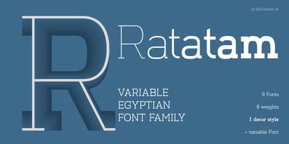
$40.00Ratatam is a variable egyptian font face. There are eight weights from thin to black, but a lot more opportunities with the variable font, and a decor style with inner elements. Useful open type features, which are optional as well as contextual alternates and positions, are defined, all small caps integrated. - Katelyn by Kimmy Design,
$10.00 - Deco by Open Window,
$19.95 - Fulcanelli by Illuminaut Designs,
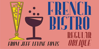
$10.00 - French Bistro JNL by Jeff Levine,
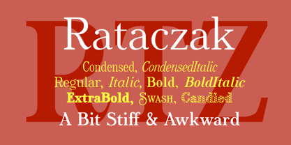
$29.00 - Rataczak by Ingrimayne Type,
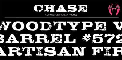
$9.00 - Chase by Device,
$39.00Type that preserves the over- and under-inked textures of true old-fashioned wood faces, now available without ink on your fingers straight from your keyboard. Based on samples taken from early and mid Nineteenth century Clarendons, the font carefully preserves all the battered idiosyncracies of vintage print shop type. - Maple Leaf Rag NF by Nick's Fonts,
$10.00The book Modern Alphabets, published in 1930, called this diamond in the rough from Continental Typefounders Nova Bold. Well, it’s neither new nor modern anymore, but it’s a warm, friendly face that’s sure to please. Both versions of this font contain complete Latin 1252 and Central European 1250 character sets. - Quaint Notions NF by Nick's Fonts,
$10.00This rollicking fun face is based on legendary lettering artist Alf Becker's Super Thick-and-Thin, his twenty-third offering in "Signs of the Times" magazine. The package includes two fonts: a full Adobe Standard character set, and an Alternates version, which features the more extreme elements of Becker's original design. - Vatican by Alan Meeks,
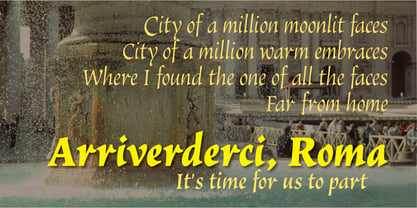
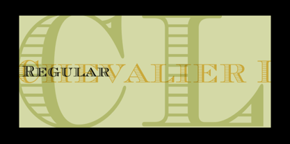
$45.00 - Chevalier LP by LetterPerfect,
$39.00Chevalier LP is a revived decorative face with a European lineage. Its patterned and shaded 'fatface' letterforms exhibit the continent's 19th century fascination with elaborate engraving techniques, often used on currency as a deterrent against counterfeiting. It is not without reason that Chevalier conjures up images of bank notes and finance. - F2F Tyrell Corp by Linotype,
$29.99The Techno sound of the 1990s, a personal computer, a font creation software and some inspiration had been the sources to the F2F (Face2Face) font series. Thomas Nagel and his friends had the demand to create new unusual faces that should be used in the leading german techno magazine Frontpage"." - Smallstep Pro by Evolutionfonts,
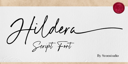
$-Smallstep - One geometric sans serif with a free spirit. If we presume that geometric typefaces play with the idea of what typography would look like in the future when all unnecessary elements would disappear, than most of their designers seem to envision the future in a rather metropolisque kind of way. We love geometric faces, but the cold and heartless feelings that most of them leave is just not our cup of tea. That is why we are happy to bring some optimism in that genre with our new typeface. We called it Smallstep. Smallstep is a typeface that follows the traditions of classic geometric sans serifs like “Futura”, but is at the same time friendly and whimsical. We took the liberty to deviate from the standard sans serif glyphs while drawing some characters (such as ”a” and ”r” ), others (“w” “k”) are completely redesigned. Probably the biggest trademark of this typeface is the way vertical lines in most lower case characters are “cut” so they end in a 60 degree angle. Smallstep is over all a expressive face, which means it brings some emotions to your design and feelings in itself, and should be used accordingly. Other than that, it is suitable for both headline and body text, print and web. So what kind of name is “Smallstep”? We view the type design process as a form of evolution: There can be no typeface that differs drastically from the current standards, since its characters would be unrecognizable and thus unreadable. But at the same time there are hundreds of faces that differ a little, and still manage to make a difference by moving with small steps towards better and more refined looks. Smallstep consist of 4 weights, that cover all the features, that are expected of a modern Opentype face: kerning pairs, ligatures, true italics and alternative characters, plus a set of symbols, that will help you start off your designs more easily. - Hildera by Sronstudio,
$23.00Introducing "Hildera," a script font that beautifully embraces the harmony of elegance and raw texture. This unique typeface effortlessly blends delicate, graceful strokes with a touch of rough authenticity, creating a perfect balance between beauty and character. Ideal for projects that seek a distinctive and handcrafted aesthetic, "Hildera" adds a touch of sophistication with a hint of rugged charm, making it perfect for a wide range of creative endeavors. Features: - Lowercase Swash Alternates - Numeral & Punctuation - PUA Encoded - Multilingual support - Simple Installation - Work both on Mac and Windows Thank you very much :) - Elbflorenz by RMU,
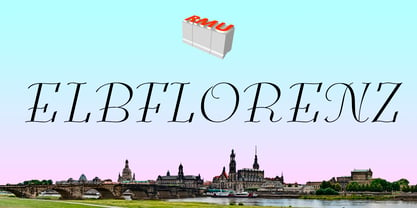
$35.00Another jewel of the vast treasure of historical font designs was digged out and brought to life again. Due to the courtesy of the Quay Brothers, London, who yielded to me an age-old brochure of Albert Auspurg’s ‚Miami‘, released by Schriftguss in 1934, I was able to redesign this elegant font. This font which I called ‚Elbflorenz‘, a cognomen for Dresden, contains West and Central European type faces as well as those for Romanian and Turkish. To get access to the historical number sign please use either the OT feature additional ligatures or ordinals. - Nat Grotesk by ParaType,
$30.00Nat Grotesk family consists of 14 styles including 6 narrow ones. It has a half-closed sans serif design with simple and clear lettershapes. Due to compact proportions the face is very space saving, but nevertheless it is rather legible even in small sizes. The bold weights demonstrate increased contrast. The font is recommended for text and display typography as well as for headlines and advertising. It was designed by Natalia Vasilyeva and released by ParaType in 2007. The upgraded version with extended character set was released in 2009. - Pofukyso by IbraCreative,
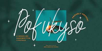
$17.00Pofukyso, a captivating monoline handwritten typeface, seamlessly blends simplicity with a touch of whimsy. Its uniform strokes and consistent line weight create a harmonious and contemporary aesthetic, making it ideal for a range of design applications. Pofukyso’s graceful letterforms evoke a sense of fluidity and friendliness, adding a personal and approachable charm to any project. Whether used in branding, invitations, or editorial design, this monoline typeface effortlessly bridges the gap between casual and refined, offering a versatile and delightful solution for those seeking a handwritten touch with a modern twist. - Finocchio by The Ampersand Forest,
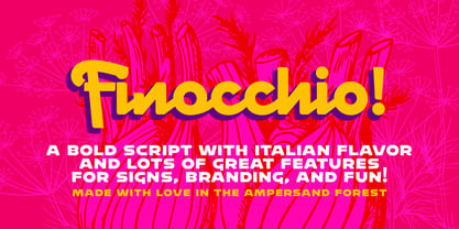
$45.00Finocchio (yes, we know — wink) has the playful, round shapes of a French Ronde with the sharp angles of Italian Futurism. It's a bold, fun, excellent branding face — wherever you need some gusto or brio or forza! Finocchio comes with a large number of ligatures for fluidity. It also comes with a solid, readable set of non-script small caps, so all you need for that sign is one coordinated font! It also comes with loads of fun alternates! Finocchio is made with love in The Ampersand Forest. - Ehrhardt MT by Monotype,
$29.99The Ehrhardt name indicates that this typeface is derived from the roman and italic typefaces of stout Dutch character that the Ehrhardt foundry in Leipzig showed in a late-seventeenth-century specimen book. The designer is unknown, although some historians believe it was the Hungarian Nicholas Kis. Monotype recut the typeface for modern publishers in 1937 to 1938. Ehrhardt has a clean regularity and smooth finish that promote readability, as well as a slight degree of condensation, especially in the italic, that conserves space. Ehrhardt is a fine text face, especially for books. - MVB Peccadillo by MVB,
$39.00MVB Peccadillo is an interpreted revival of a metal typeface popular in the 19th Century, then known as Skeleton Antique. Highly condensed with extra short descenders, the face makes a big impact in a narrow space. Holly Goldsmith worked from letterpress-printed specimens of 96-point, antique metal type, deliberately retaining subtle distortions due to type wear and letterpress impression. Alan Dague-Greene, referring to printed samples of Skeleton Antique, adapted the design to create two additional optical sizes: “Eight” for smaller text and “Twenty-four” for subheads. - ITC Bailey Sans by ITC,
$39.00ITC Bailey Sans is the first typeface family created by Kevin Bailey, a graphic designer in Dallas, Texas. He was once looking for an understated block serif for a design project and could find nothing suitable. Bailey began working on his own serif face but then found that the basics of his new design worked well as a sans serif and continued on that track. ITC Bailey Sans font is available in four weights: book, book italic, bold and bold italic and even has a companion serif display font, ITC Baily Quad Bold. - Deposta by Black Studio,
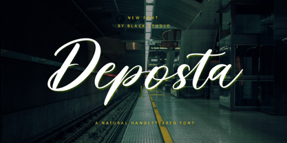
$14.00Deposta handwriting fonts are a charming collection of typefaces that encapsulate the authenticity and organic flow of handwritten script. Each font within the Deposta family is carefully crafted to evoke a sense of elegance, yet maintain a casual and natural appearance. With varying styles and weights, these fonts exhibit fluid strokes, graceful curves, and nuanced detailing, capturing the essence of handwritten text while offering versatility for diverse design projects. Whether used for invitations, branding, or creative endeavors, Deposta handwriting fonts bring a delightful touch of personal expression and sophistication to any typographic composition. - Radiant Extra Condensed CT by CastleType,
$59.00I was commissioned by the Emporium (now Macys) to digitize Radiant Bold Extra Condensed (originally designed by Robert Middleton in 1940) for use in their Sunday supplement to the San Francisco Examiner. For several years, I stubbornly refused to add the lowercase letters to the font, because I thought it looked best just used with caps, but finally relented, added the lowercase letters and at the same time created two more weights as well: Light and Medium. Used very large and carefully, these faces can be quite elegant. - Ye Carbon by Yinon Ezra,
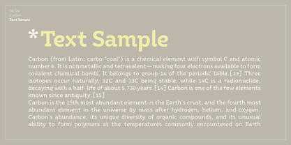
$30.00Slab-serif typeface, with pulsating and flexible forms, which gives the font its humanistic character. Ye Carbon crystallized into its forms in search for graphic language that would represent a sense of matter, of letters written by hand. The delicate finishes at the edges of the letters, and the flexibility of the of shapes, gives a feeling of matter, and bring the font to life. Ye Carbon will be a wonderful tool for variety of uses, thanks to its neat nature, and its forms in motion vibe, a rare and winning combination. - Mag Mixer by ParaType,
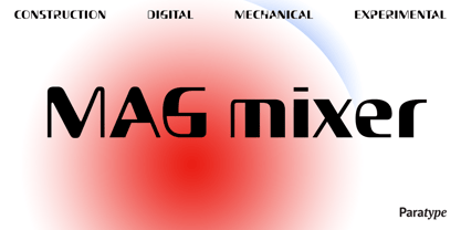
$30.00MagMixer, a display typeface, was designed in 2005 for ParaType by Dmitry Kirsanov. During work on Magistral the designer had an idea of creating a more decorative face based on Magistral shapes but reflecting an industrial and mechanichal approach. Each glyph has maximal contrast between strokes and horizontal shift in shape. The result is some strange and enigmatic but legible letterforms with active inner rhythm. Its letters are reminiscent of building construction, chess board, and many other things that corresponding to author's task. For use in advertising and display typography. - Stand Up JNL by Jeff Levine,
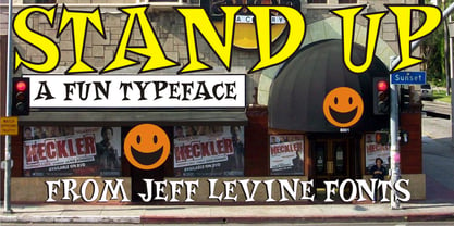
$29.00An online reproduction of a trade ad circa the 1950s for comedian-actor Paul Gilbert featured his name in the hand-drawn lettering that serves as the basis for Stand Up JNL. While the style of the typeface is derivative of the Latin Spur faces used popularly since the 1800s, the playful – almost awkward angles create a casual design that evokes good times. It should be noted that the extremes of such angles might appear ill-spaced unless kerning is turned on within the application where the typeface will be used. - Partenkirchen NF by Nick's Fonts,
$10.00In Lewis F. Day’s 1910 classic, Alphabets Old and New, the author presented the inspiration for this typeface as an example of German monumental lettering, most likely to suggest not that the typeface was really big, but that it had been found on German monuments. Bold yet charming, the face takes its name from a picturesque village in the Bavarian Alps which was the ancestral home of the Gröbl line of Curtii forebears. Both versions of this font include the complete Latin 1252 and CE 1250 character sets, with localization for Romanian and Moldovan. - New Era by Authentic World,
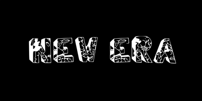
$9.00Decorative, eye-catching and extravagant font. It stands out for the depth of its lines. In addition, it has a three-dimensional effect, it is a typeface that represents the beginning of a new stage, showing the Renaissance change with human figures and parts of the face (eyes, mouths, noses, animal bodies). You can use it for web designs, brands, advertising campaigns, titles, covers, posters, and much more. "New era" is a typeface worked with many details hidden in its design, each character is a new world that tells a story. - Yavome by Arterfak Project,
$26.00Spread your love with Yavome :) Yavome is a quirky Serif font, with modern experimental shapes. Designed with high contrast and artistic curves, it gives a dynamic impression and graceful movement with additional special characters! Yavome is inspired by medieval typography, developed into an elegant and unique form, making it especially suitable for use in display, branding, logos, and quotes. The font can be used on flyers, posters, stories, invitations, t-shirts, stickers, and more. What you will get: Uppercase Lowercase Numbers & punctuation Symbols Stylistic alternates Ligatures (lowercase) Accented characters. Thank you for all your support! - D Hanna Soft by W Type Foundry,
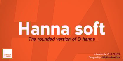
$29.00D Hanna Soft is a sans serif type family of 9 weights plus matching italics. It is inspired by the geometric style sans serif faces with a mix of rounded shapes and a little bit of black in some corners. The medium weights serve very well in body text, while the thinner and bolder styles make an excellent choice for headlines . D Hanna Soft is equipped with a complete set of opentype features including alternative glyphs, fractions, ligatures and many more. It is perfectly suited for highlighting lettering, magazines, web, interaction design, advertising, logotypes, etc. - Architectuur NF by Nick's Fonts,
$10.00Letterpress type, crafted by H. Th. Wijdeveld, founding editor and chief designer of the legendary Dutch art and architecture magazine Wendingen, provided the inspiration for this typeface. The original design graced a 1925 issue examining the work of Frank Lloyd Wright, and Wijdeveld created his typeface by assembling bits of standard brass rules. This version features several of the meanders typical of Wijdeveld’s graphic design in the dagger, double dagger, ASCII tilde and ASCII circumflex positions. Both versions of the font include 1252 Latin, 1250 CE (with localization for Romanian and Moldovan). - Nelson by Laura Worthington,
$25.00Evocative of paint on weathered wood, Nelson’s engraved capital letters are as rustic and confident as the Old West. Combine the engraved face with bold and rough versions to create handsome wordmarks, or use Nelson to captivate customers of food packaging, restaurant menus, and roadside attractions. See what’s included! Engraved • Ornaments • Rugged • Bold *NOTE* Basic versions DO NOT include swashes, alternates or ornaments These fonts have been specially coded for access of all the swashes, alternates and ornaments without the need for professional design software! Info and instructions here: http://lauraworthingtontype.com/faqs/ - Monotype Clearface by Monotype,
$29.99A rather narrow and compact design, Monotype Clearface combines both old style and antique characteristics. The lowercase letters are tall, the ascenders and descenders quite short. The intention was to produce a typeface that was easy to read in small sizes, hence the name. Monotype Clearface Bold was first cut for mechanical composition in 1922, and was based on the Clearface Gothic design created by Morris Fuller Benton for ATF in 1910. Although designed as a text face, Monotype Clearface is now more commonly used in advertising and display work. - Simply Nouveau JNL by Jeff Levine,
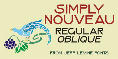
$29.00As Word War I raged on during 1917, a large number of songs were written as morale builders for both the soldiers leaving for overseas service as well as their friends, family and loved ones. One such song, "Send Me Away with A Smile" has its title hand lettered in a simple, yet somewhat stylized sans serif design that was so much a part of the Art Nouveau style of that era. Simply Nouveau JNL captures and preserves that design within a digital typeface; available in both regular and oblique versions. - Ring Neck by Ochakov,
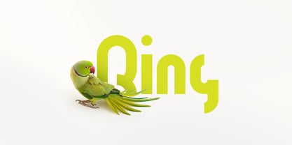
$9.00Ring Neck incredibly elegant and at the same time effortless. Another graceful set of Ring font family! Introducing Ring Neck is a condensed sans serif which has styles from thin to black to make your design more variative and unique. Good for bold branding, titling and headline who has come to be seriously and fun. This typeface can be so serious, fun, and bold it depends on for what purpose. Ring Neck like an other fonts of Ring family is still ready to meet the challenges of everyday life. - Ludwigon by IbraCreative,
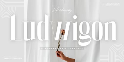
$17.00Ludwigon is a contemporary serif typeface that seamlessly melds timeless elegance with a modern sensibility. With its gracefully elongated serifs and refined letterforms, Ludwigon exudes sophistication and readability, making it a versatile choice for a wide range of applications. Its clean lines and balanced proportions lend an air of classic refinement, while subtle design nuances, such as tapered stroke endings and graceful curves, infuse it with a touch of contemporary flair. Ludwigon strikes a harmonious balance between tradition and innovation, making it a compelling choice for projects seeking a timeless yet fresh typographic aesthetic. - Saphile by Craft Supply Co,
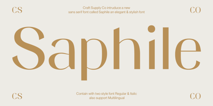
$20.00Saphile – The Epitome of Elegant Sans Serif Elegance in Every Detail Saphile, an elegant sans serif font, stands out with its gracefully angled stem ends and terminals, coupled with high contrast, making it the perfect choice for luxurious designs. A Typeface of Luxury Saphile is more than just a font; it embodies luxury. Its sleek design and high contrast add an opulent touch to any project it graces. Tailored for Luxury Designs Designed with luxury in mind, Saphile elevates the visual appeal of high-end branding, premium packaging, and more. - Simpel by Letterhead Studio-IG,
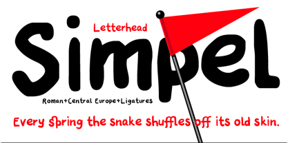
$30.00This font was made during testing of a neat little application, that traced hand-written letters on the fly. That application was later abandoned, and the font, named Simpel for it's obvious casual simplicity, was finished separately. This story goes up to the year 1998, and recently the font was returned from the archives. SImpel was completly remastered and some useful ligatures were added. It is nice, clean and really, quite simple. Which often comes very handy. It will work well in comic books, magazines and party flyers, for instance. - Stenzilla by DarezD,
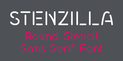
$13.00Stenzilla is a stencil font based on a rounded sans serif, a careful design, with cuts on the same diagonal axis for the curved strokes and elegant slight curves on the oblique strokes. Useful for branding, highlighted paragraphs, signs, headlines, or reading text. The design incorporates characters from the Cyrillic alphabet, special characters, and characters with diacritical marks. It has the versatility of a sans serif that allows it to be used in a wide variety of designs and styles along with the cut-stroke grace of a stencil font.
