10,000 search results
(0.035 seconds)
- Acosta by Zane Studio,
$18.00 Acosta is a serif typeface with high contrast and a refreshing look. From sheer to black with italics, Acosta offers many possibilities for application in many graphic or editorial projects. The lighter weight is suitable for short paragraphs, and the heavier weight is suitable for headlines, perfect for display purposes such as branding, book covers, and web titles. Acosta is also available latin character set which supports latin based languages.
 - WL Lunatrix by Writ Large,
$12.00 Lunatrix is a conceptual type face for futuristic or fantastic treatments. Ideal for suggesting strange new worlds of science-fiction, it can also evoke a land of fantasy or even hint at the occult. In its lighter weights, Lunatrix is well suited for applications such as posters, album covers, video games, and graphic novels, while in its heavier weights, it’s appropriate for titling and more complex type treatments.
 - Joe College NF by Nick's Fonts,
$10.00Go, team, go! Fight, team, fight! Win, team, win! Here’s a family of typefaces based on typical athletic jersey lettering, in sans and serif styles, with inlines and an extrabold Letter Sweater treatment. Both versions of this font include the complete Unicode Latin 1252 and Central European 1250 character sets. - Airo by LetterMaker,
$28.90 Airo is a monospace type family with inverted contrast. The distinct shapes and detailing give Airo a strong typographic voice. The family comes in six carefully selected weights, from Light to Extra Bold, making it a versatile typographic tool. The family works best as a display typeface for creating a strong visual impact, but you can use the lighter weights for medium length text as well.
 - Incognia by Nasir Udin,
$29.00 Incognia is a sharp and high-contrast long-serif type family of 10 fonts inspired by classic roman typography. Ranging from light to bold with matching italics, Incognia offers many possibilities to be applied in many graphic or editorial projects. The lighter weights are suitable for short paragraph, and the heavier weights are perfect for display purpose such as titling or headlines, branding, editorial, book covers, and packaging. Incognia has extended latin character set that supports 200+ latin-based languages.
 - Zuume by Adam Ladd,
$25.00 Zuume is a high-impact, condensed, display font family. Its weight range gives a sharp, technical feel in the lighter weights, while the bolder weights are meant to be tightly spaced and stacked for visual punch. The strong and sturdy design makes it ideal for eye-catching headlines, branding, packaging, sports, logos, and more. The Cut family takes the dynamic nature of this design further by adding sliced out elements to flat, horizontal strokes, giving it more movement, aggression, and speed.
 - Natalia MLG by LGF Fonts,
$15.00 Natalia font, is an original type by Manuel Lage, inspired by the Doric column bases. Its heavy appearance is lightened by the erosion of the serif pieces. It is a typeface with a rigid and compact stroke.
 - Lonely Cowpoke by 10four,
$20.00 Inspired by circus billboards, old west posters and torn paper constructs, "Lonely Cowpoke" is an oddity of bold graphic forms and cheerful curving lines. Revelling in its own quirky nature, this playful font lightens up any mood.
 - Maris by insigne,
$25.00 Maris is a rich, elegant script, subtly characterized by a whimsical handwritten calligraphy. The family is composed of six different weights, each one bolder than the last but all equally as filling. The lighter weights move delicately through each line, showing a gentle strength in their smaller frame. The six weights from these lighter forms to the bold include some textured versions such as jean, wood, print, rough and halftones. The Maris family performs superbly in custom headlines and logotypes. Turn on Swash, Stylistic or Contextual Alternates for even greater emphasis. Opentype lets you "auto-magically" swap out letter sets with alternate versions and creates the visual diversity that gives you the one-of-a-kind look of custom lettering. It also uses OpenType features to assist with letter flow. When you choose to make use of its open-type decorative glyphs, your headlines will dazzle. For the greatest benefit, grab the entire Maris family. Thanks to its variety of styles, Maris makes it easier for you to design. With this large font family, solve your design problem with just one typeface.
 - Rocket Man by Comicraft,
$19.00 Don your Flying Suit and tighten up your Atomic Powered Jet Pack buckle! Pencil in your pencil-thin moustache and stick your head into that Rocketeering Helmet! It's Zero Hour, 9am, 1949! Five Days a Week, you ARE the King of the Rocket Men, ready to Burn out your Fuse on a Timeless Flight into Outer Space Alone! Mission Control has advised our Space Race Typeface that Mars is not the kind of place to raise your kids and, furthermore, it's gonna be a long, long time until touchdown brings you round again to find you're not the man they think you are at home. You are in fact a ROCKET MAN; not a postman or a milkman, you're a modern man, a higher-than-a kite flying masked hero on your first manned flight to Infinity and Beyond!
 - Iowan Old Style by ParaType,
$30.00 Iowan Old Style was designed for Bitstream in 1990 by noted sign painter John Downer. Iowan Old Style is a hardy contemporary text design modeled after earlier revivals of Jenson and Griffo typefaces but with a larger x-height, tighter letterfit, and reproportioned capitals. Cyrillic letters were designed by Natalia Vasilyeva in 2016. Iowan Old Style Cyrillic was released by Paratype in 2017.
 - Skarpa Condensed by Aga Silva,
$23.99 This is condensed and more visually compact version of Skarpa font. All kerning has been thoroughly revised and manually adjusted. The font is based on geometric forms devoid of excessive flourishing. Would suit modern designs either in fashion, technology or laboratory setting. Would look good on door plaques in pharmacy or simple drawer plaques - especially Medium or Bold specimen. Lighter specimens would look good in leaflet & magazine print (see presented posters).
 - Aldus by Linotype,
$29.99 Aldus was designed by Hermann Zapf and appeared with the font foundry D. Stempel AG in Frankfurt am Main in 1954. Zapf named this font after the famous Venetian printer Aldus Manutius, whose work is among the most important of the Renaissance period as well as Zapf’s inspiration for Aldus. Linotype Aldus was introduced by Linotype Library as a text font lighter than Palatino. Zapf’s goal with his Palatino and Aldus was to create a new form of Old Face typeface. This font gives text the feeling of elegance which was typical of the Renaissance.
 - Klassisk by David Engelby Foundry,
$25.00 Klassisk is the Danish name for “classic” [’klasisg]. Taking its inspiration from a wide range of classic serif traditions, Klassisk can be your partner in crime for almost every kind of design job! It has the four classic weights PLUS two lighter display weights for headers and big letter sizes in general. Klassisk also comes with … a large variety in numerals (three styles) swashes and special ligatures a vibrant italic style.
 - Recording Artist JNL by Jeff Levine,
$29.00 When 45 RPM records were the norm for a teenager’s music collection in the 1950s and 1960s, many discs had their labels printed by letterpress. Some record companies utilized a bold, condensed typeface set in all caps for the song’s title and other pertinent information. The digital version of this font is called Recording Artist JNL, and is available in both regular and oblique versions. A companion font loosely based on this type design [but with more original characters and a slightly lighter weight] is Promotional Copy JNL.
 - Bakerie by Adam Ladd,
$25.00 Bakerie is a family of 42 fonts designed to be a hard-working, genuine handmade set of scripts useful in a variety of settings. The lighter weights evoke a signature quality and elegance, while the heavier weights are bolder and more playful. Choose from either a rough edge or smooth edge to fit the need. Multiple stylistic alternates, standard and discretionary ligatures, and swashes allow you to customize your typography for an even more authentic, handwritten look.
 - Costumed Hero JNL by Jeff Levine,
$29.00 Comic books are filled with pages full of the daring adventures of crime fighters with colorful costumes, amazing abilities and wondrous powers. They have enthralled kids of all ages since the 1930s. Costumed Hero JNL emulates both the hand lettered cover titles of those vintage comics as well as the title credits from a 1960s television show based on one of these characters. With its non-conforming letter shapes and varying widths, the lighthearted look of classic comic title art can be yours. The font is available in both regular and oblique versions.
 - Nettle Sans by Duck Soup Design,
$11.00 Influenced by Blackletter type and highway fonts, the Nettle Sans font family sets out to be both a quirky and confident headline font (at the heavier weights), and an easily legible body font for print or screen (at the lighter weights). Careful attention was taken in choosing distinct shapes for each letter to maximise legibility, and to balance a daring experimental form with function. Through its brutal angled cuts out of the ends of tapered links, ink-traps, ascenders and descenders, Nettle Sans' defining motif offers a visual language that communicates speed, efficiency, advancement and the "cutting edge".
 - Pixeloza 02 by Fontsphere,
$12.00 Pixeloza 02 is a pixel-style, grid-based, display typeface. This is another version of Pixeloza type. Compared to Pixeloza 01, it is characterized by a more slender form, the letters are taller and narrower, which makes the font lighter. The font is characterized by its simplicity, attention to detail, and original form. You can use it in a wide variety of projects. It gives many possibilities for creating graphics. Pixeloza 02 is available in two options: Pixeloza 01 Regular and Pizeloza 01 Skewo Regular.
 - Pyramus NF by Nick's Fonts,
$10.00This engaging antique text face is based on Paragon Light, from the 1905 specimen book from Barnhart Brothers & Spindler. Although it is spaced and kerned for text work, it also is suited for headlines if you tighten the tracking. Both versions of this font contain complete Unicode 1252 (Latin) and Unicode 1250 (Central European) character sets, with localization for Romanian and Moldovan. - Aurelac by Harvester Type,
$20.00 Aurelac - is a font that was inspired by the cover of the book "Learn to sew" by authors Egorova R. I. and Monastyrnaya V. P. This is a contrasting font that has unusual serifs and combines elegance and brutalism. Many uppercase letters are bold, while lowercase letters are lighter, which gives a more unusual effect to the text and the beginning of the sentence. It is perfect for headlines, posters, logos, banners, covers and much more. If you find errors in the font, kerning, then a huge request to write to the address: bunineugene@gmail.com
 - Contenu by Hackberry Font Foundry,
$24.95 Because Contenu is designed for text use, it is spaced for body copy in the 9-12 point range. That is far too much spacing for heads, subheads, and the like. So I made the display version of Contenu Book to use for headers. In the process of tightening the spacing at the very large sizes, I also made some minor modifications to the glyph shapes to make this version a little more elegant. Contenu Opentype has two Opentype families for print design. Contenu Book has five fonts: Regular, Italic, Bold, Bold Italic, and Display. Contenu has Medium, Medium Italic, Black, and Black Italic. The name is French for content and this is what the family is designed for: text, body copy, and book layout. If it has a style, it is a modern take on oldstyle serif font using Jenson as a mask. There are no plans for display versions of the bolder weights or the italics. If you want them, use Contenu Medium, Book Bold, Contenu Black, or any of the four italics and tighten the tracking.
 - Contenu Book by Hackberry Font Foundry,
$24.95Because Contenu is designed for text use, it is spaced for body copy in the 9-12 point range. That is far too much spacing for heads, subheads, and the like. So I made the display version of Contenu Book to use for headers. In the process of tightening the spacing at the very large sizes, I also made some minor modifications to the glyph shapes to make this version a little more elegant. Contenu Opentype has two Opentype families for print design. Contenu Book has five fonts: Regular, Italic, Bold, Bold Italic, and Display. Contenu has Medium, Medium Italic, Black, and Black Italic. The name is French for content and this is what the family is designed for: text, body copy, and book layout. If it has a style, it is a modern take on oldstyle serif font using Jenson as a mask. There are no plans for display versions of the bolder weights or the italics. If you want them, use Contenu Medium, Book Bold, Contenu Black, or any of the four italics and tighten the tracking. - Matteo scary by Scratch Design,
$14.00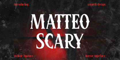 Please Welcome Matteo Scary. Matteo Scary is a horror and creepy font inspired by classic horror movie posters. It gives us the spirit of horror, spooky, frightening and suitable for poster movies, especially Halloween-themed, horror or thriller. This font is perfect also for branding, book cover, magazine header, and others which has horror or spooky vibes. What’s included? Uppercase & lowercase Number & Punctuation Ligatures Multilingual support Enjoy this font!
 - Baskerville Display PT by ParaType,
$30.00 Baskerville Display PT is a type family intended for large and extra large point sizes. It was inspired by the faces of John Baskerville and designed for expressive display typography. Two weights of Baskerville Display with matching italics are much lighter than the existing text versions of Baskerville. Each of them is an ideal partner for ITC New Baskerville. A good addition to the family is Baskerville Poster which will look great in very large sizes. The font was designed by Arina Alaferdova under the supervision of Dmitry Kirsanov and released by ParaType in 2016.
 - Bloktor Mosaik JNL by Jeff Levine,
$29.00Bloktor Mosaik JNL from Jeff Levine was at first a straightforward brick design sent to Typodermic's Ray Larabie for preview. Ray decided to run it through a filter to see what would happen, resulting in a font that emulates the look of cut stone or tile. - ITC Giovanni by ITC,
$29.99ITC Giovanni is the work of the californian type designer Robert Slimbach, whose goal was to create a face of classic old style proportions that was nevertheless thoroughly contemporary. ITC Giovanni was given a modern feel with slightly shortened ascenders and descenders, a slightly larger x-height and optically lighter capitals. - Vatican by Alan Meeks,
$45.00 Vatican is a calligraphic face. The lower case is influenced by the lettering of Arthur Baker but the caps are more formal, the shape of the Cap V reminded me of a Bishops Mitre which led eventually to the name. The lighter weight works particually well in small text pieces
 - West West by Fenotype,
$25.00 West West is a high-contrast condensed display serif. West West has extra large x-height making it suitable for efficient choice for distinguishable display use such as headlines, packaging, magazines, posters and advertising, among any other. In large sizes, you can also try tighter tracking for maximum impact. With certain of Art Nouveau shapes and massive contrast West West is a great choice anywhere you need a stylish and fashionable touch.
 - Rasbern by Nasir Udin,
$29.00 Rasbern is a display serif typeface with high contrast and refreshing looks. Ranging from thin to black with italics, Rasbern offers many possibilities to be applied in many graphic or editorial projects. The lighter weights are suitable for short paragraph, and the heavier weights are perfect for headlines, perfectly suitable for display purpose such as branding, book covers, and web heading. Rasbern has extended latin character set that supports 200+ latin-based languages.
 - Vintage Travel by Fenotype,
$20.00 Inspired and after 20th century’s travel posters, Vintage Travel is a font duo with a monoline Script that has small x-height and a bulky vernacular Sans designed to play together. Script is equipped with several OpenType features such as Swash and Titling alternates as well as Small Caps for small capital letters. Sans comes with Stylistic Alternates that provides you with a selection of lowered accented characters that can be used to create more uniform text blocks and tighter leading.
 - Pen Nib Western JNL by Jeff Levine,
$29.00 Inspired by the hand lettered phrase “the pen is mightier than the sword” in a 1923 promotional blurb for Speedball lettering pens, Pen Nib Western JNL recreates the decorative style of this vintage artistic gem in both regular and oblique versions.
 - STROKIN by AdultHumanMale,
$15.00 STROKIN is an inky, messy, Omnicase display font. It’s part charcoal part paint strokes, reversed in lighter tones it looks like chalk, add a splash a red and it starts to look like blood. It has over 250 glyphs including all those extra pesky foreign features. OpenType coded, It has various letter pairings that interlock automatically to create a more randomized, bespoke feel to your copy. Hope you like it.
 - Scorno by Rosario Nocera,
$22.99 Scorno is a geometric sans serif that offers a high legibility also in the lighter weights. Scorno is ideal for sports and technology. The shape of its letters makes it different from most geometric fonts, making it suitable for branding, magazines, catalogues and much more. Scorno is available in nine weights, from thin to heavy plus matching italics and it comes with open type features like old style and lining figures, ligatures, numerator, denominator, scientific figures, and fractions. What’s more, it also features the bitcoin symbol in the currencies set.
 - Munchkin Land NF by Nick's Fonts,
$10.00This typeface bears a superficial resemblance to Belwe Extrabold, but is based on a work called Thor, issued by Frederic Wesselhoeft Ltd of London in the 1930s. The characters in this font are loosely spaced for use in attention-getting subheads, but you can tighten the tracking to get spectacular headlines, should you wish. Both versions of the font include 1252 Latin, 1250 CE (with localization for Romanian and Moldovan). - Deco Bevel by Open Window,
$- Deco Bevel is a filter font based on Deco, an original Open Window classic. It came about while I was experimenting with light and shadows using 3D rendering software and Photoshop. Its ideal use is as a display font.
 - Zuume Edge by Adam Ladd,
$25.00 Zuume Edge is a condensed, display sans serif ideal for eye-catching headlines, branding, packaging, logos, sports, and entertainment, and anywhere else you need maximum impact. The wide weight range offers versatility — the lighter weights bring a sharp, technical feel while the heavier weights pack a visual punch. The notched and extended ink traps add function and visual interest and the Cut styles have sliced horizontal strokes for more movement, aggression, and speed.
 - Papagayo by Jonahfonts,
$30.00 Papagayo in 6 versions Light & Regular with Italics and Small-Caps. Designed with short ascenders and descenders for tighter line spacing. Effective for short headlines and texts. By invoking the Stylistic Alternates feature to an entire line or paragraph the M W g m w y will result in their respective alternates. You can also invoke each single glyph with the Alternate feature. The Alternates g & y contain a more characteristic letter-form for improving legibility in smaller texts.
 - Arcle by The Northern Block,
$12.80 A modern geometric typeface with precise radius detailing. Each character has it’s own unique subtleties and style variations, with careful adjustment you can create dynamic page layouts. The elegant curves are best demonstrated using the lighter weight at large scale. Details include 5 weights, a complete character set, manually edited kerning and Euro symbol.
 - Springwood by Hanoded,
$12.00 Spring is in the air! At least, where I live. My two pear trees are in bloom, bees are buzzing and everything turns a brighter shade of green. Time for a new and fresh font package with a spring-inspired name! Springwood is a handmade set of fonts, ranging from a fat display font to a messy script font. Use it for your freshest ideas, your coolest designs or just anything that needs a bit of springtime.