10,000 search results
(0.105 seconds)
- Jack Martine Duo by Zamjump,
$17.00 Jack Martine font duo is a textured, hand-drawn slab font in a regular style with upper and lowercase letters and bounching italic script style solid proportions that works great for a variety of display uses. Carefully drawn for quality and legibility, but still rough enough to show handcrafted details. Jack Martine is great for display, branding, packaging, advertising, food, sports, craft, titles and more. Jack Martine Features: Regular and Script Style Different uppercase and lowercase characters Simply switch between upper and lower case for alternatives Hand-drawn details and textures Extensive multilingual character support This font has broad Latin support for Western, Central, and Southeastern Europe. Includes: Uppercase Numbers Punctuation Symbols Multilingual support Begin and ending alternate
 - Maurice Dufrene Initials by Celebrity Fontz,
$24.99Luxurious high-quality ornamental initials superimposed on elaborate Art Deco drawings of plants and flowers, inspired by 18th and 19th Century French designs, with a modern approach. Includes one set of A-Z ornamental initials conveniently assigned to both the upper and lower case alphabet characters. Beautifully ornate and perfect for the beginning of paragraphs in publications and texts conveying the feel of the 1920s and the Art Deco movement, garden-themed texts, or fairy tales. - Art Materials JNL by Jeff Levine,
$29.00 The cover of the 1930s-era “Catalog of Artists’ Materials” from Ernst H. Friedrichs, Inc. (New York) has the words “Artists’ Materials” hand lettered in a stylized Art Deco sans serif type style. This unique design is now the digital font Art Materials JNL, which is available in both regular and oblique versions.
 - K&T Martine by K and T,
$70.00 This is an angular typeface inspired by axonometric construction diagrams (for flat-pack furniture), particularly the way their lines impart a sense of 3-D space. The horizontal, vertical, and diagonal constraints of stroke direction produce interesting results in characters such as the 'R', 'S', and 'V' and contribute the mechanical appearance of this typeface. There is a high degree of repetition amongst different characters (upper and lower case) for instance the ’M’ and ‘W’ are similar and so are the ’m’ and ‘w’.
 - Martin Medium Regular by Wooden Type Fonts,
$15.00 Medium weight, sans serif.
 - Metric Navy PRO by Sea Types,
$19.00 Metric Navy PRO is a lightweight monoline developed for short texts and loose phrases in versions: thin, light, normal, regular, bold and black.
 - Modern Dot Digital-7 - Personal use only

- Small Dot Digital-7 - Personal use only

- Iron Lounge Smart Dot - Unknown license

- Iron Lounge Dots 2 - Unknown license

- Display Dots Two Serif by Gerald Gallo,
$20.00 Display Dots Two Serif is a display font not intended for text use. It, along with its sans counterpart were designed specifically for display, headline, logotype, branding, and similar applications. Display Dots Two Serif has an uppercase alphabet, numbers, and punctuation.
 - Display Dots Three Sans by Gerald Gallo,
$20.00 Display Dots Three Sans and Serif are display fonts not intended for text use. They were designed specifically for display, headline, logotype, branding, and similar applications. Display Dots Three Sans and Serif include an uppercase alphabet, numbers, and punctuation.
 - Display Dots Three Serif by Gerald Gallo,
$20.00 Display Dots Three Sans and Serif are display fonts not intended for text use. They were designed specifically for display, headline, logotype, branding, and similar applications. Display Dots Three Sans and Serif include an uppercase alphabet, numbers, and punctuation.
 - Display Dots Four Sans by Gerald Gallo,
$20.00 Display Dots Four Sans and Serif are display fonts not intended for text use. They were designed specifically for display, headline, logotype, branding, and similar applications. Display Dots Four Sans and Serif include an uppercase alphabet, numbers, and punctuation.
 - Display Dots Four Serif by Gerald Gallo,
$20.00 Display Dots Four Sans and Serif are display fonts not intended for text use. They were designed specifically for display, headline, logotype, branding, and similar applications. Display Dots Four Sans and Serif include an uppercase alphabet, numbers, and punctuation.
 - Display Dots Two Sans by Gerald Gallo,
$20.00 Display Dots Two Sans is a display font not intended for text use. It, along with its serif counterpart were designed specifically for display, headline, logotype, branding, and similar applications. Display Dots Two Sans has an uppercase alphabet, numbers, and punctuation.
 - zerpixl - Personal use only

- Kruti Dev 010 - Unknown license

- A10 STAR Black by Mogtahid,
$90.00 As a former typographer / lino and calligrapher, Abdallah NASRI had recourse to the nature of the idea of an "INTERCHANGEABLE" collection for types who in reality offer a police collar parallel to the complex typeface of the variable. Our fashion is outlined by a simple calculation defined by superimposed geometric circles where we used only its ¼ to fill the need for the angles of each of our letters. Always with the idea of having in the same allocated space, the same letter nested as many times as fat example from Hairline to Ultrabold. It was in this way that I was able to obtain a large number of styles, with a very interesting kerning which prompted me to extend the font to other languages with +1000 characters and +600 glyphs. I have always been treasured by the all in "1". I assure you that I sought to obtain the maximum of Visibility for a use S / Titling TV, WEB Pages and Typography Typo; once the difficult thing was done, I was rewarded by a font that has countless typographic openings for the world of graphics with 10 styles of weights in hand, and again I am happy to have personalized the charm of each letter by new details; I do not regret the time spent on thinking about it so that it is useful and at the same time pleasant as a working tool, finally profitable in all sectors and more multilingual, without forgetting that it is a family of inter change c ' is to say: All the types occupy the same height of the body and it is their fats which differs in the same space width of each of the letters, therefore no interference in spacing. Here, an additional alternative, a participation of a septuagenarian in the service of the love of modern digital typography. • TEST: At 50% screen in a body of 12 pixels, the A10 STAR Alphabet subjected to a test, has a clear Readability / Visibility. • P.S: A10 STAR integrates Diacriticism in all its forms. Texte d'origine : Abdallah NASRI a eu recours en étant ancien typographe/lino et calligraphe à la nature de l'idée d'une collection "INTERCHANGEABLE" pour les types qui en réalité offre un collier de police parallèle à la fonte complexe du variable. Notre mode est esquissé par un calcul simple défini par des ronds géométrique superposés où on a utilisé seulement son ¼ pour garnir le besoin des angles de chacune de nos lettres. Toujours dans l’idée à avoir dans le même espacement alloué, la même lettre imbriquée autant de fois de graisse exemple du Hairline à Ultrabold. C’est de cette manière que j’ai pu obtenir un grand nombre de styles, avec un crénage très intéressant ce qui m’a incité à étendre la police à d’autres langues avec +1000 caractères et +600 glyphes. J’ai toujours été prisé par le tout en « 1 ». Je vous assure que j’ai cherché à obtenir le maximum de Visibilité pour une utilisation S/Titrage TV, Pages WEB et Maquette typo ; une fois le difficile fait, j’ai été récompensé par une police qui possède d’innombrable ouverture typographique pour le monde du Graphisme avec comme atout en main 10 styles de graisses, et encore je suis content pour avoir personnalisé le charme de chaque lettre par des détails nouveaux ; je ne regrette pas le temps passé dessus à réfléchir pour qu’il soit utile et à la fois agréable comme outil de travail, enfin profitable tous secteurs confondus et en plus multilingue, sans oublié que c’est une famille d’inter change c’est-à-dire : Tous les types occupent la même hauteur du corps et c'est leurs graisses qui diffère dans un même espace largeur de chacune des lettres, donc aucune interférence dans l’espacement. Voilà, une alternative supplémentaire, une participation d’un septuagénaire au service de l’amour de la typographie numérique moderne. • TEST : A 50% d'écran dans un corps de 12 pixels, l'Alphabet A10 STAR soumise a un test, présente une nette Lisibilité / Visibilité. • P.S : A10 STAR intégre la Diacritique dans toutes ses formes.
 - MPI No. 510 by mpressInteractive,
$5.00 No. 510 is a friendly, slim gothic face. Strokes have a gentle inward curve at the median with the tops and bottoms of the letters slightly wider and thicker. The design was first introduced by William H. Page & Company around 1887.
 - FM Christmas 3.0 by The Fontmaker,
$20.00 FM Christmas 3.0 consists of 26 hand-lettered Christmas greetings. All the words and phrases are original and handwritten - a high quality calligraphy for your holiday projects. Check our portfolio for the rest of our Christmas collection and more holiday related hand-lettered fonts.
 - American Advertise 010 by Intellecta Design,
$13.90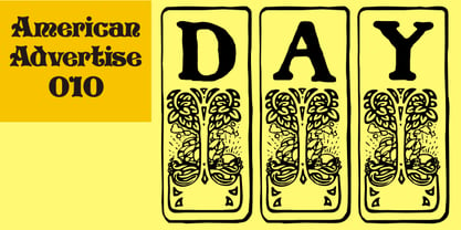
- Don Quixote - Personal use only

- Got heroin? - Personal use only

- Hot Pizza - Unknown license

- Scooby Doo - Personal use only

- Pot roaster - Unknown license

- Don Giovonni - Unknown license

- John Doe - Unknown license

- Got heroin? - Unknown license

- Not Sassure by Australian Type Foundry,
$30.00 Excessive photocopying, with extreme enlargements and reductions to magnify the imperfections, helped to rough the edges and give Not Sassure a non-digital quality.
 - Dom LT by Linotype,
$29.99Dom Casual and Dom Diagonal are a set of informal script typefaces that look like brush writing. They were designed by Peter Dombrezian for American Type Founders in 1952 and were an immediate success. Use these typefaces to create a friendly, informal look in signs, advertising, and invitations. - Hot Coffee by Fonthead Design,
$19.00 - Foundry Dat by The Foundry,
$50.00 Foundry Dat is created with a common horizontal dash grid structure for accurate layering when characters are superimposed. Foundry Dat’s integrated background aligns vertically and horizontally, when set solid, forming a continuous pattern. Foundry Dat’s companion family Foundry Dit functions as a legible correspondence font, with a ‘typewriter’ feel. Each family contains: light, regular, medium and bold weights. Foundry Dat comes with a series of dashes to extend the background grid. Characters can also be offset to make different patterns – in the process becoming images – a graphic language with total integration of form and function.
 - Cute Dog by Yoga Letter,
$15.00 "Cute Dog" is a display font with decorative bones, dog heads, and dog paws. This font is equipped with lowercase, uppercase, numerals, punctuation, and multilingual support. Suitable for posters, business branding, logos, banners, stickers, magazine titles, film titles, and more.
 - Scurvy Dog by Hanoded,
$15.00 Aye, me lovelies, this be Scurvy Dog, a grand font! The letters were etched into a dead man's chest with a blunt rapier, pickled in brine and covered in spew. Ye could be using this crafty penmanship for yer logs or writing yer dear ol' mothers a letter.
 - Dom Casual by URW Type Foundry,
$89.99 Dom Casual is a very condensed script, almost monotone, with irregular vertical strokes ending at different heights, and which suggests a freehand effect. It was designed by Pete Dom in 1951 for American Type Founders. As its name suggests, the Dom Casual font gives the appearance of a quick brush-like lettering and is suitable for setting titles, subheadings and short copy. There is some variations of stress in the rounded letters.
 - DST Helfita by Designsation,
$16.00 This first font was made as an experimental work for us. learn a alot of typeform from other typeface in the past, bring us to this grace position. We learn about Variable font and all the thing to do some improvement in our work. such a nice time to present this new font to the world as the ground breaking of our mission to scale up our skill and to step up into the next vision as a font designer. We create this font with variable and Open Type features. Some instances including, from thin to black. and on the variable font has and oblique style.
 - Heath Notted by YuliusParyadi,
$11.00 Heath Notted is suitable for display like poster, halloween, witch theme. We created it inpired by the night, because some times night is not always just dark, but sometimes it's beautiful. Heath Notted is includes: - full set uppercase and lowercase letter; - numerals; - large number of punctuations; - ligatures, and swash. Please add this font as your favorit, hit like button, or follow me. I'll very happy for that and aprreciated it. Thank you!
 - Jotted Dream by Nathatype,
$29.00 Wanna enhance your branding? Searching for a elegant and stylish font? If you need to create gorgeous logo for your business, work on a poster for an event, or whatever your project may be-then we've got what you want. Jotted Dream - A Brush Display Font Jotted Dream is a display brush that is combined with elegant brush style. Every swash, stroke, and curve was created to entice happiness and elegance. Great choice for your logo, book cover, poster, t-shirt, branding, and advertisement needs. Our font always includes Multilingual Support to make your branding reach a global audience. Features: Ligatures Stylistic Set Swahes PUA Encoded Numerals and Punctuation Thank you for downloading premium fonts from Nathatype


