10,000 search results
(0.07 seconds)
- Harry Potter - Unknown license
- Rambo Killer - Unknown license
- Elastic Wrath - Unknown license
- Mana Mana - Unknown license
- Babe Bamboo - Unknown license
- Bat Ben - Unknown license
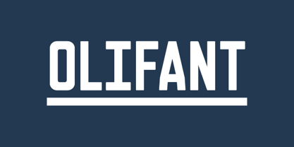
- Olifant by Hipopotam Studio,
$25.00 - Brand New Heavies - Unknown license
- Redd or dedd - Unknown license
- Hunky Chunk by Just My Type,
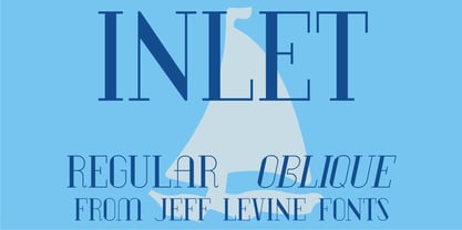
$25.00 - Inlet JNL by Jeff Levine,
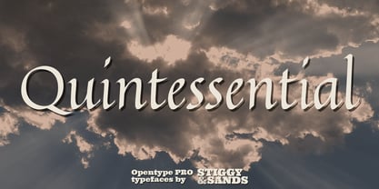
$29.00 - Quintessential Pro by Stiggy & Sands,
$29.00Our Quintessential Pro is based on the calligraphic lettering style known as the Italic Hand. As speed became more essential in writing hands, styles became less formal and more relaxed. Classic, clean, and casual, Quintessential fits a lot of design uses - hence its name. The SmallCaps and extensive figure sets only work to further expand the usefulness of the typeface across a wider breadth of applications. - Day Of The Tentacle - Unknown license
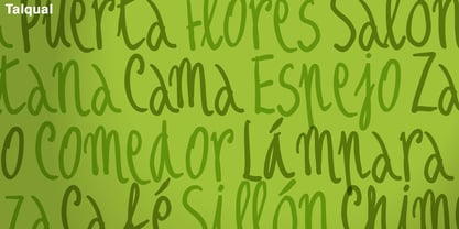
- Talqual by Type-Ø-Tones,
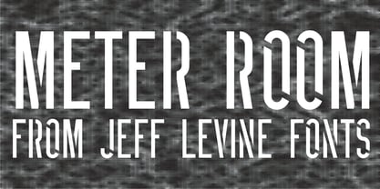
$40.00 - Meter Room JNL by Jeff Levine,
$29.00 - Wordy Diva by Chank,
$99.00Take a gander at this jaunty, journal-inspired handwriting style. Wordy Diva was drawn in 1995 by Lisa Bralts and faxed to Chank Diesel. The fax was converted to font format, and it soon became one of Chank's most popular handwriting fonts. You can download this hurried yet intelligent lady's handwriting font today. - Dremaks by SMZ Design,
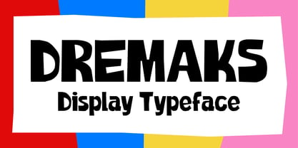
$22.00Dermaks - A modern typeface with unusual shapes. The starting point were intuitively drawn glyphs that gave the impression of being cut in paper. It goes well with colors and black and white. The font is intended to provide a distinctive original form. Intended for slogan designs, headlines, logotypes, clothing designs, posters and all designs with an intriguing style. - VLNL Breakz by VetteLetters,
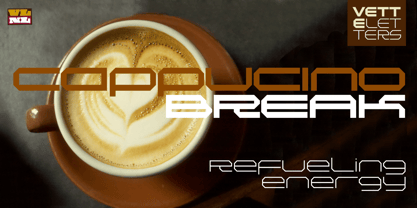
$35.00Donald DBXL Beekman needed a break. And he took it too. While sitting there consuming a sandwich and a half-pint of milk, he took up his ruler and pencil. By the time there was no milk left and only some bread crumbs remained on his plate, VLNL Breakz was finished. That’s DBXL for you. Get your letters during your break. VLNL Breakz was originally designed as the headline and logo font for the breakdance competition Amsterdam Breakz, but turned out to be very versatile. It has 4 variations, Regular and Condensed widths / Bold and Light weights. - CroMagnon by Letters by Wordsworth,
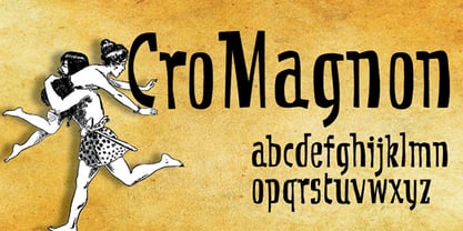
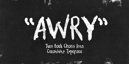
$23.00CroMagnon began as an experiment with breaking the rules - crossbars thick, downstrokes thin - and evolved into a funky, sassy font (a little like the designer). CroMagnon offers a nice mix of edginess with respectability. There are alternates for almost all of the lowercase letters which keep the font fresh and fun. - Awry by Gholib Tammami,
$15.00 - Yorklyn Stencil by House Industries,
$33.00Yorklyn Stencil includes three fonts, each optimized for use at different size ranges. Grande has greater contrast and more delicate breaks designed to be used at larger sizes where finer details are more conspicuous. Medium and Petite are intended for smaller sizes where the breaks and contours must be more resilient. We embedded several OpenType layout features, including traditional fractions and nut fractions. We extensively tested Yorklyn Stencil in what might be the broadest range of media and conditions in the annals of Northwestern Delaware typefounding history. From the ceramic kilns of Heath Ceramics to our studio’s stucco facade, Yorklyn Stencil’s robust curves and deceptively delicate breaks will withstand a wide variety of harsh conditions with unprecedented aplomb. Whether you’re hand cutting a stencil to buzz your bespoke restaurant bar stools or simply looking for a practical yet illustrative display font, Yorklyn Stencil’s elegant efficacy will enhance any creative composition. Like all good subversives, House Industries hides in plain sight while amplifying the look, feel and style of the world’s most interesting brands, products and people. Based in Delaware, visually influencing the world. - Twentieth Century by Monotype,
$29.99Twentieth Century was designed and drawn by Sol Hess in the Lanston Monotype drawing office between 1936 and 1947. The first weights were added to the Monotype typeface library in 1959. Twentieth Century is based on geometric shapes which originated in Germany in the early 1920's and became an integral part of the Bauhaus movement of that time. Form and function became the key words, unnecessary decoration was scorned. This clean cut, sans serif with geometric shapes was most appropriate. The lighter weights of the Twentieth Century font family can be used for text setting; the Twentieth Century bold and condensed fonts are suitable for display in headlines and advertising. Commonly spelled 20th Century. - Junkfool by PizzaDude.dk,
$17.00What happens if you take a bamboo stick and break it into two, then use it with ink on cardboard? Junkfool! - That's what happens! - Madrea by Craft Supply Co,
$20.00Introducing Madrea – Friendly Sans Serif Unconventional Charm Madrea – Friendly Sans Serif is anything but conventional; it introduces a unique and friendly twist to your designs. Irregular Shapes What sets Madrea apart is its irregular shapes, which establish a welcoming and friendly atmosphere. This makes it the perfect choice for designs seeking to break free from formality and monotony. A Breath of Fresh Air In the realm of sans serif fonts, Madrea is indeed a breath of fresh air. Its non-uniformity and organic feel breathe personality and approachability into your projects. Breaking Formality Madrea excels at breaking the chains of formality. It’s an ideal choice for design projects that demand a friendly and informal touch, effortlessly transforming the mundane into something captivating. In Conclusion In summary, Madrea – Friendly Sans Serif is your gateway to a non-uniform, friendly design experience. Its irregular shapes infuse character, warmth, and a refreshing departure from conventional design, ensuring that your creations are brimming with life and far from monotonous. - Mazette by Alfab,
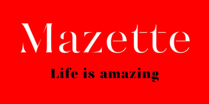
$55.00Mazette is a modern display typeface with a distinctive elegant look. Inspired by the refined forms of a nineteenth century Didot, Mazette offers the freedom to break contours in the manner that a stencil font would. Its sharp construction logic and great readability make it an ideal display font for publishing or branding. - Newsbreak JNL by Jeff Levine,
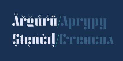
$29.00Breaking news! Hallandale JNL has been italicized and run through a line filter (courtesy of Ray Larabie of Typodermic Fonts)! The result: Newsbreak JNL... a bold, techno-style font with all of the headlines and the first on the scene when the latest news matters... Get the whole story first... with Newsbreak JNL! - KD Arguru Stencil by Kassymkulov Design,
$20.00 - Paper Cube by Pisto Casero,
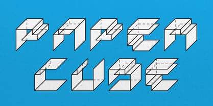
$14.00Paper Cube font family is the first font I've created. I unconciously started to draw letterforms with straight horizontal and vertical lines contained in a square. Soon this experiment became a 3d outlined display family of 3 weights, each one of them gaining depth and articulating into planes. Designed in Cuenca (Spain) in 2011. - BB book A by bb-bureau,
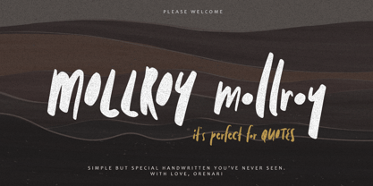
$65.00 - Mollroy by Orenari,
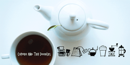
$17.00 - Coffee & Tea Doodles by Outside the Line,
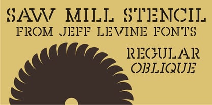
$19.00 - Saw Mill Stencil JNL by Jeff Levine,
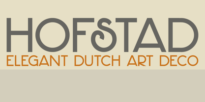
$29.00 - Hofstad by Hanoded,
$15.00Hofstad is a font which was modeled on a poster designed by Dutch graphic artist Jan Lavies (1902 - 2005). Lavies became famous for the posters he designed for the Holland America Line of cruise ships. Hofstad font was named after the theatre group "Vereenigd Rotterdamsch - Hofstad Tooneel" for which Jan Lavies designed a poster. Hofstad comes with all diacritics. - Goodfellow by Solotype,
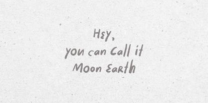
$19.95Our font (circa 1895) of this old wood type was made by Hamilton of Two Rivers, Wisconsin, but we have been told that another identical font was made earlier by W. H. Page, Greeneville, Connecticut. Hamilton became the final home of many of the old wood type patterns as the early companies went out of business. - Moon Earth by Orenari,
$17.00 - Tote Bag JNL by Jeff Levine,
$29.00Totebag JNL continues the stencil font series from Jeff Levine originally inspired by classic lettering stencils of the 1940s and 1950s. This particular design is common amongst "painting stencils", the individual letters used for marking and identification. Some characters are solid shapes while others have the more traditional "breaks" in the letters. - Templit JNL by Jeff Levine,
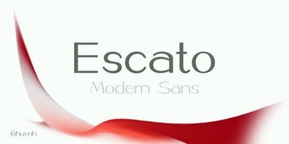
$29.00Templit JNL is one of a number of fonts modeled from actual lettering stencils by Jeff Levine. This one takes its style from a set of individual letters and numbers used for marking and identifying objects. Some of the letters and numbers have solid shapes rather than traditional stencil breaks in the characters. - Escato by Sayurihuynh,
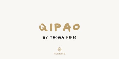
$8.00Escato is a modern sans serif font family with a simple design and a little break-rule, consisting of 5 styles ranging from Regular, Bold, Round, Bold Round, and Outline. Escato is suitable for products with simple but sophisticated and equally creative designs, such as magazine, book look, business card, logo, branding, etc. - Qipao by TEKNIKE,
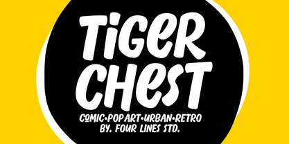
$39.00Qipao is a display monospace handwriting font. The typeface is a distinct hand drawn font using a felt marker. The Qipao name is derived from the traditional Chinese dress that Manchu women wore in China in the 17th century and became known as the qipao (旗袍), meaning “banner gown”. Qipao is great for display work, invitations, writing, architecture, posters, logos and headings. - Tiger Chest by Four Lines Std,
$15.00Introducing "Tiger Chest" - Unleash Your Creativity with Urban Pop Vibes! With Tiger Chest, your creativity knows no bounds. Break free from the mundane and explore the wild side of design. Whether you're crafting social media graphics, YouTube thumbnails, event posters, or comic book covers, this font will give your projects the urban edge they deserve.


