10,000 search results
(0.028 seconds)
- Beagle Sign by Attype Studio,
$14.00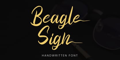 Beagle Sign is a stylish signature font with ending stylistic set that make amazing combination. perfect for any product like branding, invitation, stationery, wedding designs, social media posts, advertisements, product packaging, product designs, label, photography, watermark, special events or anything. Features: - Beagle Sign.otf - Multilingual Support - ligature - Ending stylistic set - Support Opentype features --- Hope you enjoy with our font! Attype Studio
 - VTKS FLOWERS IN OUR SOUL - 100% free

- We Love Nature Summer Flowers by kapitza,
$79.00 We Love Nature Summer Flowers is a picture font inspired by a late summer visit to an organic flower farm in the south of England. The farm specializes in growing local seasonal flowers for lovely bouquets and arrangements. This picture font features 52 hand-drawn illustrations inspired by these flowers. The contemporary flower illustrations can used on their own or in combination with the other illustrations in the We Love Nature font collection to create striking designs.
 - Desirable Brust Texture by Alcode,
$20.00 Desirable Brush Texture is a brush version of desirable solid released in 2019. With a classic style and an elegant touch, inspired by Italian women's handwriting and ancient manuscripts. These two fonts are carefully designed to work together in harmony making them perfect for wedding media, book covers, greeting cards, logos, branding, business cards and certificates, even for any design work that requires classic, formal or extravagant. Try Desirable Brush Texture, enjoy the richness of the features and let her fun and elegant excitement make you happy and enhance your creativity! You can use this font very easily. Multilingual Support And Special Ligatures If you are interested in the solid version, visit the link - https://www.myfonts.com/fonts/alcode/desirable-calligraphy/
 - Lower Metal Shadow by Intellecta Design,
$14.95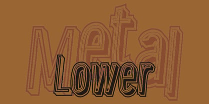
- Dave Gibbons Lower by Comicraft,
$49.00 Other guys may imitate him, but the original is still the greatest! Get in with the In Crowd and check out the font created by Mister Fontastic for Dave Gibbons Original Graphic Novel, The, ah, The Originals. Yes, Dave Gibbons now comes in lower case, it's not just what he does when he gets back from the off license. Be sure and pick up The Originals from Amazon -- now available in paperback, and probably still available as a hard case, much like Dave. After the crack about the case of beer above, I'm guessing you'll find me with a broken spine in the remainder pile. See the family related to Dave Gibbons Lower: Dave Gibbons Journal & Dave Gibbons .
 - Victory Speech Lower by Comicraft,
$49.00 Speak quietly but carry a big stick' as President Theodore Roosevelt once said... so, with so much heated rhetoric in the air this -- let's face it, EVERY -- Election season, we felt that it was important to put together a more dignified and sedate lower case edition of our popular Victory Speech font. Bad Hair and Big Sticks not included. See related font: Victory Speech
 - Resistance Is Lowered by Comicraft,
$19.00 Lower your shields and surrender your ships. You will talk to your central world authority in upper AND lower case, and order global surrender. Your culture will adapt to serve us in sentence case. You will not shout in UPPER CASE as before. You will be upgraded. You will become like us. Upgrading RESISTANCE IS FUTILE to RESISTANCE IS LOWERED is compulsory. There is no escape. Artwork from Monster Truck by Shaky Kane
 - Samaritan Tall Lower by Comicraft,
$49.00 Fifteen hundred years from now, a man will be selected to go back in time to prevent a catastrophic event which turned his world into a dystopia. Sent back in time, he was enveloped in empyrean fire, the strands of energy that make up time itself. Crash-landing near Astro City in late 1985, he learned how to master and channel the empyrean forces that had suffused his body -- finally learning to control his powers in time to prevent the destruction of the Space Shuttle Challenger, the event he had been sent to avert. He described himself to journalists as nothing more than "a Good Samaritan", and has continued to help his fellow man in Astro City ever since. John JG Roshell has also been struggling with the empyrean challenge of fitting all of Kurt Busiek's ASTRO CITY dialogue into balloons with the regular Samaritan font, so he created the Samaritan Tall font to help his fellow comic book letterers! It's kinda the same thing, really.
 - DAMAS PERSONAL USE - Personal use only

- HAWAIIAN DREAMS PERSONAL USE - Personal use only

- J. Scott Campbell Lower by Comicraft,
$39.00 Lower-case lettering is so-called because the characters that we know as lower-case were once kept in the bottom, shallow drawers of a type compositor's typecase. Not a lot of people know that, and we suspect superstar artist and FAIRYTALE FANTASIES Calendar creator, J Scott Campbell doesn't either because even though we looked high and low, in every single one of his drawers, we still could not find a single example of Scott EVER writing in lower case, but we begged him, we pleaded with him and, eventually we HYPNOTIZED him, and here's the font you'll find in J. SCOTT TIME CAPSULE from Image Comics! You're welcome. See the families related to J Scott Campbell Lower: J Scott Campbell & J Scott Campbell Sketchbook.
 - Platinum Sign Over - Personal use only

- dmf studio deins - Unknown license

- Sign Panels JNL by Jeff Levine,
$29.00Alf R. Becker was a noted sign painter, designer and the creator of hundreds of unique alphabets which were published in the trade magazine Signs of the Times during the 1930s through the 1950s. Thanks to Tod Swormstedt of ST Media [and who is also the curator of the American Sign Museum in Cincinnati], Jeff Levine received some reference material on Becker's work. Becker displayed many of his type styles within decorative panels—a popular trend in the days when signs were hand-lettered. Using the reference material as a guide, Jeff has re-drawn twenty-six sign panels for adaptation to digital print work. While the designs in themselves are not thoroughly unique to Alf Becker, he has left behind some tangible examples of how sign painters embellished their lettering work. With the use of complementary colors and tones, these panels—joined with vintage lettering - classically recreate the warm and attractive advertising of years ago. - Sign Sans JNL by Jeff Levine,
$29.00 The original source of design for Sign Sans JNL was an image online of an old New York drinking establishment called the Lenox Lounge. The metal channels encasing the neon had an unusual "feel" to some of the letters. While the original E,G and U of the sign looked "interesting", they didn't quite fit the font's layout. Those letters were scrapped for more traditional versions of them.
 - Night Sign JNL by Jeff Levine,
$29.00 For decades, the soft glow of a neon sign beckoned weary travelers to roadside rest courts, told the hungry individual where to eat; let enthusiastic revelers know where the night life was happening. There is something special about a neon sign, yet changing times, city ordinances and even technology itself is turning this staple of urban life for over a hundred years into a museum piece. Night Sign JNL emulates the craft of hand-formed neon signage and it (along with a few added special effects) can really add some good-old-fashioned pizzazz to a print or web project.
 - Sign Engraver JNL by Jeff Levine,
$29.00 Sign Engraver JNL and Sign Engraver Oblique JNL reproduce the classic rounded letters and numbers engraved into plastic signs, desk nameplates and employee name tags.
 - Fun Signs JNL by Jeff Levine,
$29.00 Fun Signs JNL comprises twenty-six humorous signs from a 1930s-era sales list of products manufactured by the Koehler Sign Company of St. Louis, Missouri. Koehler manufactured a large line of stock cardboard "Blue Signs" (presumably blue backgrounds with white lettering) and alongside the many standard phrases used by various businesses was a list of funny sayings. Such placards were bought by merchants to either evoke interest in their services (such as in a bar or restaurant, or jokingly comment on their business policies (as in credit billing). These novelty signs are a fun addition to a flier, ad, web page or announcement and will leave your readers smiling.
 - Sign Stickers JNL by Jeff Levine,
$29.00 In the early 1960s, the Duro Decal Company of Chicago, Illinois added to its line of water-applied decal lettering a retail sign cabinet of die-cut, pressure sensitive vinyl letters and numbers. Four of the six sizes offered for sale were cut from white plastic with a black outline and a secondary gold inline for a tri-color effect. Sign Stickers JNL emulates as closely as possible the look of these nostalgic pieces, complete with the slight shifts in line weight due to hand-cut silk screens and the printing process. For those of you who prefer to make your own multi-colored letters, a three piece fill font set is available for the low price of a single font purchase. Combine the backfill, midfill and frontfill layers for a truly retro look!
 - Pi Signs+Symbols by Scangraphic Digital Type Collection,
$26.00 PI Signs + Symbols is part of the Scangraphic Collection and designed 1985 by Schriftatelier Scangraphic Dr. Böger GmbH.
 - P22 Koch Signs by P22 Type Foundry,
$24.95This set reproduces over 350 of the signs contained in German typographer Rudolf Koch's "The Book of Signs," the symbols include Astrological, Christian, Medieval and Runic iconography. - American Sign Alphabet by Deniart Systems,
$10.00 This font can be used as a play'n learn tool to teach the meaning of these modern day communication symbols. Each alphabetical character can be printed with or without the corresponding roman symbols. NOTE: comes with an interpretation guide in pdf format.
 - Sign Artist JNL by Jeff Levine,
$29.00Sign Artist JNL is a casual typeface, emulating the hand-lettered look of show card and sign lettering. Created by Jeff Levine from lettering seen on some 1940's packaging, the slightly irregular letter stroke widths and shapes more closely resemble printing made with brush or ink. - Sign Letterer JNL by Jeff Levine,
$29.00Sign Letterer JNL is the serif version of the Art Deco hand-lettering of Sign Painter JNL—and inspired by original pen lettering found on an old decal catalog sheet from the late 1940s to the early 1950s. - Retro Signs JNL by Jeff Levine,
$29.00 Retro Signs JNL collects nearly 50 designs modeled from old water transfer sign decals once manufactured by the Duro Decal Company of Chicago, Illinois and adds in a generous amount of additional phrases newly-drawn in the same hand lettered style. These vintage sign panels are perfect for creating nostalgic signage to fit projects centered around the 1950s and early 1960s.
 - Sign Work JNL by Jeff Levine,
$29.00 The 1951 sheet music of "I Like the Wide Open Spaces" has the cover title set in a casual type design that emulates the "one stroke" or "speed letter" style so popular with sign painters in that decade. Taking the lettering on the sheet music and expanding the character set with a new interpretation, the result is Sign Work JNL which is available in both regular and oblique versions.
 - Privilege Sign JNL by Jeff Levine,
$29.00 The above-the-store signage for many newspaper stands, soda shops, candy stores, luncheonettes and pharmacies of the 1950s and early 1960s were what was referred to as “privilege signs” provided by one of the major cola brands. Consisting of the brand’s emblems on the left and right, the remainder of the sign would carry the desired message of the storekeeper (such as “Candy – Soda – Newspapers”) in prismatic, embossed metal letters. Inspired by these vintage signs, Privilege Sign JNL recreates the condensed sans serif lettering style in both regular and oblique versions. The typefaces are solid black, but adding a selected color and a prismatic effect from your favorite graphics program can reproduce the look and feel of those old businesses.
 - Sign Trade JNL by Jeff Levine,
$29.00Sign Trade JNL is a reworking of Sign Crafter JNL. With a traditional M,N and W replacing the stylized versions of these letters in the previous font, Sign Trade JNL also offers an oblique version. - Sign Letters JNL by Jeff Levine,
$29.00 A few scant examples of some condensed Roman style water-applied decals inspired Sign Letters JNL. The decals were once part of the gold and black "Signmaker" letters and numbers once manufactured by the Duro Decal Company of Chicago and were sold through hardware and variety stores across the country. The condensed letters (which were eight inches in height) did not sell as well as Duro's mainstay sizes of 1/2 inch to 3-1/2 inches and were discontinued long before the rest of the line was supplanted by self-adhesive lettering.
 - Sign Helpers JNL by Jeff Levine,
$29.00Sign Helpers JNL is a collection of silhouette images carefully redrawn from two distinct sources. Prior to their bankruptcy in 1984, the Holes-Webway Company of St. Cloud, MN produced thousands of their "Webway" sign kits that were utilized by merchants, libraries and schools throughout the country. At one point they included in their sales catalog a selection of die-cut images for embellishing sign work. In the late 50s and throughout the 60s, the Joseph Struhl Company (now known as Magic Master Industries) produced cling vinyl sign kits for business, and a home movie titling set for do-it-yourself film makers. This set also featured die-cut embellishments. A generous selection of designs from both kits have been faithfully re-drawn in digital form to pay tribute to two innovative companies. Other fonts based on products from these companies are Sign Kit JNL (Webway® Sign Kit), Cling Vinyl JNL, and Sign Maker JNL (Magic Master® Sign Kits). Trademarked names are used purely for reference purposes. - Signs and Symbols by URW Type Foundry,
$39.99 Signs and Symbols is a collection of general purpose images for a variety of applications like climate and weather, nature, leisure, sports etc. Handy when you need some signs and symbols for your layout. Signs and Symbols was designed for the URW++ FontForum.
 - Signs Of Faith by Fonts of Chaos,
$10.00 Signs of Faith maturity font for artworks. Make cash with it.
 - Sign Vendor JNL by Jeff Levine,
$29.00 Sign Vendor JNL is a simple sans modeled from hand-lettering with a touch of Art Deco influence. The design is from a 1930s poster promoting winter activities in New York State.
 - Sign Project JNL by Jeff Levine,
$29.00 Sign Project JNL is based on vintage water-applied decals once made by the Meyercord Decal Company of Chicago (and later Carol Stream), Illinois. These decals were popular during the 1950s and 1960s for window signage, boat identification, mailbox names and numbers and hundreds of other projects.
 - Wall Sign JNL by Jeff Levine,
$29.00 Wall Sign JNL is a sign painter's chamfered sanserif found in an instructional manual from 1905. A popular lettering style of the day, it features an abridged vertical on the G, a flattened right side on the Q and a truncated horizontal on the 3.
 - Sign Man JNL by Jeff Levine,
$29.00Sign Man JNL is a reworking of Sign Shop JNL, with a lighter font weight and a number of changed characters (including extended horizontal crossbars on the B,E,F,H,K,P and R). - Sign Department JNL by Jeff Levine,
$29.00 For decades - until the advent of affordable computer-generated signage - die-cut display letters were used for many applications. Stores, theaters, schools, charities and religious organizations would have their local sign shop design attractive posters and show cards utilizing these sturdy cardboard letters and numbers, giving a three-dimensional effect to the message. Sign Department JNL recreates one of the many styles of letters available at the time.
 - Ghost Sign JNL by Jeff Levine,
$29.00 Ghost Sign JNL is a spurred serif type design based on the faded lettering of an antique brick wall sign for Homer Hardware [located in Homer, NY] and is available in both regular and oblique versions. From Wikipedia: “A ghost sign is an old hand-painted advertising sign that has been preserved on a building for an extended period of time. The sign may be kept for its nostalgic appeal, or simply indifference by the owner. Ghost signs are found across the world with the United States, the United Kingdom, France and Canada having many surviving examples. Ghost signs are also called fading ads or brickads. In many cases these are advertisements painted on brick that remained over time. Old painted advertisements are occasionally discovered upon demolition of later-built adjoining structures. Throughout rural areas, old barn advertisements continue to promote defunct brands and quaint roadside attractions. Many ghost signs from the 1890s to 1960s are still visible. Such signs were most commonly used in the decades before the Great Depression. Ghost signs were originally painted with oil-based house paints. The paint that has survived the test of time most likely contains lead, which keeps it strongly adhered to the masonry surface. Ghost signs were often preserved through repainting the entire sign since the colors often fade over time. When ownership changed, a new sign would be painted over the old one.”
 - Informational Sign JNL by Jeff Levine,
$29.00 A vintage metal sign saying "No Dogs Allowed" was the model for the ultra-bold Art Deco-influenced lettering comprising Informational Sign JNL.


