10,000 search results
(0.059 seconds)
- Parangon by ParaType,
$25.00 PT Parangon™ was designed in 1986-2002 by Anatoly Kudryavtsev and licensed by ParaType. This type family belonges to Neogrotesque subclass of closed Sans Serif. Letterforms of lower case is based on the tradition of 1710 Civil type and some modern Italic types. The family has a lot of weights and styles including Extra Condensed, Condensed, Regular, Extra Light, Light, Bold, Extra Bold. For advertising and display matter. Also it can be used for texts in advertising magazines.
 - Rookys by Maulana Creative,
$11.00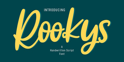 Rookys is a cartoon-is vibes handwritten display font. With bold stroke, slant and Unique Upper and lower characters with bit of ligatures. To give you an extra creative work. Rookys font support multilingual more than 100+ language. This font is good for logo design, Social media, Movie Titles, Books Titles, a short text even a long text letter and good for your secondary text font with sans or serif. Make a stunning work with Rookys font. Cheers, MaulanaCreative
 - Fortyfresh by Maulana Creative,
$11.00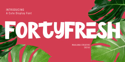 Fortyfresh is a quirky handwritten display font. With bold stroke, upright and fun character with a bit of ligatures and lower alternate. To give you an extra creative work. Fortyfresh font support multilingual more than 100+ language. This font is good for logo design, Social media, Movie Titles, Books Titles, a short text even a long text letter and good for your secondary text font with sans or serif. Make a stunning work with Fortyfresh font. Cheers, MaulanaCreative
 - Triump Rough by Latinotype,
$20.00 The Triump Rough typeface comes with 2 different subfamilies: Blur, a soft, delicate font with a vintage and hipster feel that gives your design a breath of fresh air; and Rock, a strong, hard font in upper and lower case well-suited for high-impact headlines. This version provides a wide variety of OpenType features, such as ligatures, alternates and catchwords as well as a series of ornaments and extras, which help give your artwork a different look!
 - Elodie by Franzi draws,
$12.00 Elodie is an Art Nouveau inspired all caps font with some extra quirky characters. It was hand drawn with a brush pen. Elodie is designed for titles, short quotes, product names etc. Use lower-case letters for regular text, and then add a some special quirks to your writing by using the characters in the upper-case section. Multilingual support is included for Western, Central and Eastern European languages. Please test your characters in the font previewer before purchase.
 - Södermalm by Skybäck Design,
$24.00 Named after and inspired by an area in central Stockholm, this typeface also draws on design characteristics from faces such as Bodoni, Didot, Centennial and Walbaum as well as Mrs Eaves. The currently available Regular version of the typeface includes small caps, default and old style figures, standard ligatures as well as an extensive set of discretionary ligatures. Also included is a set of alternative lower case characters. These styles can be accessed as Opentype Features.
 - Hobo by URW Type Foundry,
$35.99 The Hobo font is a dynamically tapering face in which all strokes are accentuated curves, achieving a superb decorative effect. Hobo almost suggests a freely drawn alphabet with its unusual robust roundness. The Hobo font was designed to be used at large sizes. It has no descenders: the lower case g, p, q and y are incorporated into the x-height. The Hobo font imparts a friendly personality to display work such as invitations, menus, signage and packaging.
 - Buzz by Scholtz Fonts,
$21.00Buzz is a loose and informal grungy font with a modern, electric, zappy quality: The font is particularly useful for the promotion of products aimed at young and trendy consumers. It can be used for the design of: CD and DVD covers; clothing advertising and swing tags; magazines and advertising; and cosmetic packaging. It has been carefully letterspaced and kerned. It contains a full character set: all upper and lower case characters, punctuation, numerals and accented characters are present. - Orbitens by Maulana Creative,
$11.00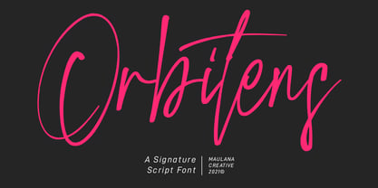 Orbitens is a fancy signature script font. With gel pen stroke, slanted and Unique Upper and lower characters with a bit of ligatures. To give you an extra creative work. Orbitens font support multilingual more than 100+ language. This font is good for logo design, Social media, Movie Titles, Books Titles, a short text even a long text letter and good for your secondary text font with sans or serif. Make a stunning work with Orbitens font. Cheers, MaulanaCreative
 - Zapatos by Maulana Creative,
$11.00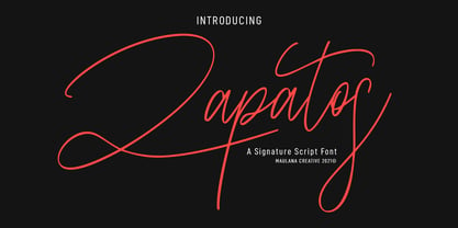 Zapatos is a fancy feminine script font. With thin stroke, super slanted and Unique Upper and lower character with a bit of ligatures. To give you an extra creative work. Zapatos font support multilingual more than 100+ language. This font is good for logo design, Social media, Movie Titles, Books Titles, a short text even a long text letter and good for your secondary text font with sans or serif. Make a stunning work with Zapatos font. Cheers, MaulanaCreative
 - Durer Display by iframe,
$28.00 Durer is a modern font, its soft curves and refined details create a sense of elegance. Inspired by the work of Albrecht Dürer (21 May 1471 – 6 April 1528), who was a German painter, printmaker, and theorist of the German Renaissance. Born in Nuremberg, Dürer established his reputation and influence across Europe in his twenties due to his high-quality woodcut prints. 551 Glyphs Upper / lower case, numbers, punctuation Language support: Latin / Greek Designed by iframe type foundry
 - Apothecary by Pixel Colours,
$26.00 Apothecary is a modern stylish font duo that includes a sweet flowing script font and a typewriter font made from an authentic typewriting. Combine both fonts to create beautiful logos and branding. Design professional apothecary and botanical labels and packaging or make elegant wedding invitations. Includes: Apothecary regular: a script flowy monoline font Apothecary typewriter: an antique typewriter font perfect for small texts, taglines or info Lowercase and uppercase characters Numerals, alternates and ligatures. Language support
 - Amerigo BT by Bitstream,
$29.99 An original Bitstream typeface prepared by Gerard Unger to provide a typeface of tapered stroke that will work well at lower resolutions.
 - Rubens Expanded Regular by Wooden Type Fonts,
$15.00 A sans serif with splayed ends, descenders of the lower case dropping below the baseline, very tall x-height. The expanded version.
 - Stiepa by Dora Typefoundry,
$19.00 Introducing our new collection of fonts Stiepa is designed for fun combining sans and serif so you can combine them to create the perfect typographic design. Stiepa is a classy and bold upper and lower case typeface that looks amazing in both large and small settings. It's perfect for your upcoming projects. Such as luxury logo and branding, classy editorial design, women's magazine, cosmetic brand, fashion promotion, art gallery branding, museum, architectural history, boutique branding, stationery design, blog design, modern advertising design, invitation card, art quote, home decoration , book/cover titles, special events, and more. Here's what's included: Numbers & punctuation Characters with accents Supports Multiple Languages PUA Encoded This type of family has become a work of true love, making it as easy and enjoyable as possible. I really hope you enjoy it! I can't wait to see what you do with Stiepa Display Serif! Feel free to use the #Dora Typefoundry tag and # Stiepa Display Serif font to show what you've done Thank You!
 - ITC Minska by ITC,
$29.99ITC Minska is the work of Carl Crossgrove, who used a combination of upper and lower case shapes together to create new letter forms. Crossgrove created unconventional yet immediately recognizable variations in two different alphabets, which cannot quite be classifed as upper and lower case in themselves. With opulant curves and sharp angles, ITC Minska projects an unorthodox energy which is ideal for unusual effects and display settings. - Seasons Greetings by Ingrimayne Type,
$14.95 Seasons Greetings is intended to bring Christmas cheer. It has a very limited character set, with all the letters being lower-case. One set of letters is white on black Christmas balls, while the other is black on white Christmas balls. The lower-case letters can be layered on top of the upper-case letters to give bi-colored lettering. The letters on the Christmas ornaments are from the typeface Cuthbert.
 - Smiling Lovely by Din Studio,
$25.00 Smiling Lovely is an elegant, classy, modern script font of which prominent character is the combinations of brush style and handwritten curves and shapes. Unlike the other cursive fonts, Smiling Lovely’s letters are not closely interrelated for a legibility reason. This font combines uppercases and lower cases for perfectly interconnected writings. Features: Alternates Ligatures Stylistic Set Swashes Multilingual Supports PUA Encoded Numerals and Punctuation Smiling Lovely fits best for various designs, such as posters, banners, logos, book covers, album covers, headings, printed products, merchandise, clothes designs, quotes, invitations, pamphlets, greeting cards, product packages, social media, and more. Find out more ways to use this font by taking a look at the font preview. Thank you for purchasing our font and happy designing,
 - Axion by Type Innovations,
$39.00 Axion is an original design by Alex Kaczun. It is a display font not intended for text use. It was designed specifically for display headlines, logotype, branding and similar applications. The entire font has an original look which is strong, dynamic, machine generated and can be widely used in publications and advertising. Axion is a futuristic, techno-looking and dynamic typeface with elements of machined-like parts containing sharp and rounded edges. This attractive display comes in roman with lower case and lining figures. The font is also available with true-drawn slant italics. Other design style variations include small capitals with old style figures. The large Pro font character set supports most Central European and many Eastern European languages.
 - Hippie Mojo by Mysterylab,
$18.00 Set the wayback machine for about 1967. Smell the patchouli? Now you can inject just the right dose of swirly-licious mojo into your retro design with this original vintage-styled sixties font. But as with many psychedelic hippie lettering designs, the history reaches back even further; it owes a designer's debt of gratitude to the designs of the Art Nouveau era as well. This is predominantly a uni-case alphabet, but also features a few alternative characters in the lower case – at the full height of the capitals. With an extensive character set and multilingual glyphs, you can use Hippie Mojo to say "Groovy baby" in many languages. Evoke the carefree and tripped-out vibe of the psychedelic era with Hippie Mojo; it's pure retro fun!
 - Argone by Graphite,
$18.00 Argone is a handmade, organic, display family and comes in four weights. It also has a version with lower case letters – Argone LC
 - NeedALilly by Ingrimayne Type,
$14.95 In NeedALilly the characters are composed of threaded needles. It is caps only and the lower-case letters repeat the upper-case glyphs.
 - Malovely Script by FadeLine Studio,
$10.00 Introduce Malovely Font! This is a beautiful script font made with love. This font comes in a bold, upright style. With this style you can create an attractive, cute, sweet and firm design. So that it will make your work even more fun! With a style like this, this font will be suitable in use for logo's, branding projects, homeware designs, product packaging, mugs, quotes, posters, shopping bags, logo's, t-shirts, book covers, name card, invitation cards, greeting cards, and all your other lovely projects. You can use this font for your job very easily. Because there are many features in it. Contains the complete set of lower and uppercase letters, punctuation, numbers, web fonts, and multilingual support. This font also includes several ligatures and alternative style Stylistic Set For those of you who have software that is capable of working OpenType (Corel Draw / Photoshop / Illustrator / InDesign).
 - Mabotim Brush by Creative Lafont,
$10.00 Mabotim Brush Font painted, Fun, modern, multi-purpose and operated bold letters combine letters brushing operates with a natural style. Suitable for review, packaging, titles, posters, t-shirts, logos, quotes, invitation, apparel, wedding, advertising, image overlays, greeting cards and web banners, etc.Get substitute alternate glyphs and characters beginning and end of interest to the composition of your design. Comes with Uppercase and lowercase characters, large set of punctuation glyphs, numerals, supports international languages, stylistic alternates for several key lower case characters And this Font has given PUA unicode (specially coded fonts). Letters replacement can be accessed using a program like Adobe Illustrator and Adobe InDesign OpenType Smart. Adobe Photoshop Corel draw X version, and Microsoft Word. I had a lot of fun designing this font. I hope you have even more fun using it. If you have any questions, please don't hesitate to ask. Thank You for Purchase!
 - Griffith Initials by Celebrity Fontz,
$19.99The Griffith Initials font was inspired by a set of highly stylized capital letters from the remarkable hand of one of Americas foremost penmen, dating back to 1927. They combine a large degree of accuracy, grace, strength, and freedom. This font includes one set of graceful A-Z initials conveniently assigned to both the upper and lower case alphabet characters. - Paralucent by Device,
$39.00 Paralucent is versatile all-purpose modern sans. Available in seven weights, from Thin to Heavy, and in two widths each with corresponding italics, it avoids some of the more eccentric calligraphic quirks of Akzidenz or Helvetica or the cool precision of Univers for an elegant, functional, yet warm design. There are two additions to the core 28-weight family: a three-weight stencil set, and a four weight text family. The text weights have been adjusted for use at small point sizes, and feature more open character shapes, looser inter-letter spacing for improved readability, and lining numerals for use in listings and tables. Several core ideas inform Paralucent’s design. Prime attention has given to the negative space between characters, giving a more even “colour”, especially in text. For example, the J, L and T have shorter arms than comparable sans typefaces, while the M and W are wider. The A has a lower bar, opening up the interior counter. An unusually high lower-case x-height again helps to give a more even colour and improve legibility. Care has been taken to rationalise repeated elements like the tails on lower-case letters, or the Q and the “ear” of the g. Typographic design solutions that are consistent across all these features add more stylistic cohesion. ‘Ink traps’ are exaggerated incisions used to open up a letter's narrower internal angles, which can become clogged with ink, especially in small point sizes. Now largely redundant due to the high quality of modern print, they are still sometimes used as a stylistic quirk or design feature. Now that digital fonts are often reversed or outlined, or enlarged to enormous sizes, these can also lead to unexpected or obtrusive results. Paralucent takes these inevitable digital manipulations into account, and adds optical corrections without resort to ink traps. The family has been picked up by many UK and US publishers, featuring heavily in magazines like Loaded, Heat and TV Quick, as well as high-end coffee-table photography books and gallery websites. A perennial Device bestseller.
 - Rumpled by Ingrimayne Type,
$9.00 TapedUp, Tinkerer, and Rumpled are based on the template I used for several letterbat fonts—fonts made of wrenches and bolts, hammers, or paper clips. TapedUp can be thought of as a font made from masking tape, and Rumpled is the same design but the tape pieces are wavy. Tinkerer is the same design but with elements that resemble what might happen if one constructed letters from Tinker Toys. All are caps only, but some of the shapes on the lower-case keys differ from the corresponding shapes on the upper-case keys. The Rumpled family has four members, the regular, an oblique, a shadowed, and an oblique shadowed.
 - Octopuss by ITC,
$29.99Octopuss is an energetic titling typeface designed in 1970 by Colin Brignall for Letraset dry transfer sheets. Brignall expanded the basic alphabet with an outline variation with a shadow, which makes the typeface look three dimensional, almost like it is floating. Octopuss font displays the unmistakable signs of the typefaces of the 1970s, as do Countdown and Harlow, also designed by Brignall. The circular strokes of the capitals that drop well under the base line are striking and unique. Because of the small white spaces of its lower case letters, the rounded, robust Octopuss is meant exclusively as a headline font and should be set in large point sizes. - Sinah by Linotype,
$29.99Linotype Sinah is part of the Take Type Library, selected from the contestants of Linotype’s International Type Design Contests of 1994 and 1997. Designed by the German artist Peter Huschka, Linotype Sinah is a rounded, ornamental font with many strokes ending in teardrop forms. The letters of this wide-running font do not share a common base line. The capital S and the lower case l both drop under it although neither have descenders. Overall, Linotype Sinah has an almost Asian or Indian feel. The font must be used with generous line spacing and is intended exclusively for headlines or shorter texts in point sizes of 12 or larger. - Linotype Pisa by Linotype,
$29.99Linotype Pisa is part of the Take Type Library, selected from the contestants of Linotype’s International Digital Type Design Contests of 1994 and 1997. It was designed by Swedish artist Lutz Baar and is a modern text font based on the humanistic Old Face style. The dynamic lines and harmonious proportions make Linotype Pisa a pleasant and legible font. Distinguishing characteristics are the elongated cross strokes of the capital A, B, E, F and P and the slanted cross stroke of the lower case e, typical of Venecian Old Face characters of the 15th century. Linotype Pisa is well-suited to longer texts and headlines. - Santa Fe by ITC,
$29.99Santa Fe was created by British designer David Quay in 1983. Distinguishing are its script characters and the lower case e, which has the form of a capital E. The letters of this font emphasize the base line. Rounded corners pair with elegant forms to give Santa Fe a flowing, cheerful look. The figures are reminiscent of American advertisements of the 1960s with their light, carefree images. Like with most script fonts, the letters of Santa Fe should be set close enough together that they touch. An added bonus are the various alternative forms with which Quay provided Santa Fe and the many design possibilities which they offer. - LTC Camelot by Lanston Type Co.,
$24.95 Camelot was the first of over 100 typefaces designed by Frederic Goudy. The upper case characters were drawn in 1896 for the Dickinson Type Foundry. Goudy was so encouraged by his check for $10 (double what he asked for the drawings), that he spent the next 50 years designing type. The lower case was added by the Dickinson foundry. This Lanston digital release includes a Text version based on the smaller point sizes of the metal type and a Display version based on the larger sizes. The two appear different in size but share the exact same line weight when at the same point size.
 - Kinsale Display by Fontdation,
$15.00 Introducing our new font Kinsale Display. A bold and strong looking display font that not only heavily inspired by the vintage/classic letterforms, but also some touch of modern twists and absurdities. Mouse-crafted with high attention to details; clean lines, sharp edges and tempting curves. Its wide and blocky letterforms make Kinsale is a great spacekiller. Suits best for title/headline, logo/logotype, packaging/label designs, etc. Packed with 300+ glyphs, weaponized with standard upper/lower case characters, numerals, punctuations, some multilingual letters, alternate characters, and ligatures. This font is a must have item for your designing arsenal. Get yourself one and start creating something cool! THANKS AND ENJOY!!!
 - Yom Tov by Jonahfonts,
$42.00 YomTov is a whimsical hebrew font. Traditional in design with a free spirit and slightly bounced. Hebrew alphabets contain 22 Hebrew letters along with five final letters which are automatically activated when used in Applications such as Apple Pages® and MicroSoft Word®. The Hebrew Letters do not contain cantillation marks very much used in everyday modern Hebrew. Designed with acomplete latin font that mirror the Hebrew letterforms. Latin lower-case letters have been replaced with smaller caps. You may also be interested in my other Hebrew fonts, NEWMARK Hebrew, HEBRON Hebrew, PAGEANTRY Hebrew and a Hebrew Script font KOMUNIDAD Script. YomTov requires OpenType-aware software.
 - Linotype Finerliner by Linotype,
$29.99Linotype Finerliner is part of the Take Type Library, chosen from the contestants of Linotype’s International Digital Type Design Contest. The American artist Gary Munch, from whom we also have Linotype Ergo and Ergo Sketch, designed Linotype Finerliner as a handwriting font with calligraphic influences. The small, regularly formed lower case letters contrast nicely with the generous, sweeping capitals. The font is available in a light and medium weight and displays no stroke contrast. The lighter weight, micro, is best used for shorter texts in point sizes 18 or larger and the medium weight, macro, is mainly intended for headlines in larger point sizes. - Sinah Sans by Linotype,
$29.99Linotype Sinah is part of the Take Type Library, selected from the contestants of Linotype’s International Type Design Contests of 1994 and 1997. Designed by the German artist Peter Huschka, Linotype Sinah is a rounded, ornamental font with many strokes ending in teardrop forms. The letters of this wide-running font do not share a common base line. The capital S and the lower case l both drop under it although neither have descenders. Overall, Linotype Sinah has an almost Asian or Indian feel. The font must be used with generous line spacing and is intended exclusively for headlines or shorter texts in point sizes of 12 or larger. - Bloemgracht by Hanoded,
$15.00 In the old Amsterdam neighborhood of 'De Jordaan', you will find a canal called Bloemgracht (Flower Canal). For many years, a coffee store called Schildmeijer could be found here. Their paper coffee bags and advertisements sported a hand made font which I have tried to recreate and the result is Bloemgracht typeface. It is an all caps art deco font, quite angular, but very legible and distinct. Bloemgracht comes with extensive language support.
 - Have a Nice Day by Cultivated Mind,
$20.00 Have A Nice Day is a handwritten font created by Cindy Kinash. This font features three font styles (Basic/Tall/Wide) and comes in three weights (Light/Regular/Bold). All three font styles can be used together as one unique and fun font! This font also includes a set of fun hand drawn ornaments like smiley faces, flowers, leaves, insects, frames, captions, desserts, food, clouds, and catchwords that will surely brighten your day! Enjoy!
 - MVB Emmascript by MVB,
$39.00Kanna Aoki drew the letters for MVB Emmascript while on a picnic near the Conservatory of Flowers in San Francisco’s Golden Gate Park. Mark van Bronkhorst adapted the writing as a font that maintains a very natural scrawl. Later a bold weight was added. MVB Emmascript has been used to add a lighthearted, human touch to everything from fiction paperbacks to potato chip packaging. The typeface is named for Aoki's 1968 Volkswagen, Emma. - Ministry by Device,
$39.00 A 14-weight sans family based on the original British ‘M.O.T.’ (Ministry of Transport) alphabet. A capitals-only, single-weight design was drawn up around 1933 for use on Britain’s road network, and remained in use until Jock Kinnear and Margaret Calvert’s ‘Transport Alphabet’ was introduced for Britain's first motorway in 1958. The identity of the original designer is not preserved; however, Antony Froshaug in a 1963 ‘Design’ magazine article mentions Edward Johnston as an advisor. Speculation that it was based on Johnston’s London Transport alphabet is discussed in archived government documents from 1957: “So far as I am aware, the Ministry alphabet was not based on Johnston’s design; indeed, it has been suggested that Gill got his idea from Johnston. Our alphabet was based on advice from Hubert Llewellyn-Smith (then chairman of the British Institute of Industrial Art) and Mr. J. G. West, a senior architect of H. M. Office of Works.” A 1955-57 revision of the alphabet which polished the somewhat mechanical aspects of the original may be the work of stone carver and typographer David Kindersley. For the digitisation, Rian Hughes added an entirely new lower case, italics and a range of weights. The lower case mimics the forms of the capitals wherever possible, taking cues form Gill and Johnston for letters such as the a and g, with single-tier versions in the italic. A uniquely British font that is now available in a versatile family for modern use.