10,000 search results
(0.048 seconds)
- Doll by FaceType,
$30.00 Who needs counters? Although this typeface is bold as hell, it is still absolutely legible. If You are looking for fat curves, this is may be Your choice! There are also extra letters (A, V, v) to let You make better logos and headlines. Please take also a look at Dollbats for suitable Arrows, Symbols and Numbers.
 - La Rose Display by Masa Type,
$15.00 La Rose is Display Sans, designed to look modern & minimal in any setting. Designed for optimal readability, its clean geometric look is perfect for things like fashion, magazine, logo, branding, headers, titles, corporate brochure designs. Typeface also supports Latin-based languages. Other details include 4 font weights, 290 characters, manually edited kerning and an Opentype alternative feature.
 - Abracadabra PW by Patty Whack Fonts,
$29.00This font is made of many unrestrained strokes of the pen and it is perfect for a freestyle look. It would be great to use for projects that you would want to look handwritten, lively and even calligraphic. It's very playful and mysterious. It's so much fun to use and can be used in a variety of ways! - Zolina by Creativemedialab,
$20.00 Unique and fashionable font, the straight lines combined with a slight curve that makes Zolina looks modern and pretty. Try uppercase for clean and elegant look. Zolina is perfect for website header, logo, instagram story, or fashion related branding. This versatile family consists of 9 weights, variable styles as well as multilingual support, numbers, and currency symbols.
 - Flip Spatters by Matthias Luh,
$25.00 Flip Spatters is a very detailed font. It looks like blotches/ink spatters or graffity. It has a lot of characters (~215) and the spatters are different and detailed. But unlike some other 'crazy' fonts, Flip Spatters even looks brilliant using a font size starting from 9pt. So you can use it for text and graphic utilization.
 - Stellina by Jos Gandos,
$15.00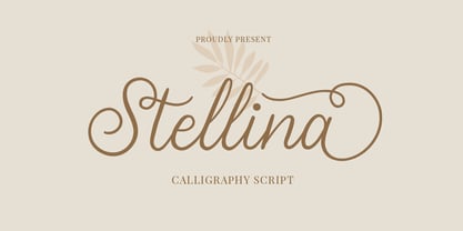 Stellina Calligraphy Script Font with elegant and classy looks. This font will make your design look elegant, natural and stylish. Stellina Font is perfect for any awesome projects such as photography, watermark, quote design, social media posts, advertisements, logos & branding, invitation, product designs, label, stationery, wedding designs, product packaging, special events or any project that need handwriting taste.
 - Logotype Frenzy by Decade Typefoundry,
$40.00 Logotype Frenzy is a display typographer’s guilty pleasure. It’s one of the very few fonts ever made that can take intense abuse and still look natural. It comes with over 1000 characters, including a lot of alternates and extended language support. In OpenType savvy applications, some letter combinations are automatically replaced with ligatures for a more natural look.
 - Brush Writing OC by Okaycat,
$29.95 Brush Writing OC creates a look of lettering written freehand, from the brush of a skilled calligrapher. Funky & cleanly executed. This font is appropriate for many uses. The look is perhaps most well suited to informal poster designs & other casual applications. Brush Writing OC is extended, containing West European diacritics & ligatures, making it also suitable for multilingual environments & publications.
 - Gratia Singer by Burntilldead,
$15.00 Such an honor to introduce our new font family Gratia Singer, a serif font with modern ligature style. Highly recommended font for you who need glamour and stylish looks, perfect choice to make your design projects; logo, branding, invitation, social media ads & website have classy looks, just type and add this font....abra ca da bra! it's magic
 - Daub by Greater Albion Typefounders,
$8.95 Daub captures the look of old-style graffiti—it's graffiti from the days when vandals used a brush and a pot of white paint. Not an airbrush or aerosol in sight. Use Daub to give headings and posters that rough, hand brushed look. Add real grit and vigor to your work, with that old-style urban hard edge.
 - Mixoma by Something and Nothing,
$12.00 Introducing Mixoma, a combination of Serif and Sans strokes gives Mixoma a stylish look. The available stylistic alternates are designed to make your typography look more unique and help bring out your inner Mixologist. Mixoma is available in 9 weights, Thin, Extra Light, Light, Regular, Medium, Semi Bold, Bold, Extra Bold and Black each having an italic version. Enjoy!
 - Fatigue by Typesthetic Studio,
$13.00 Heroic is a bold and playfull handwritten brush font. This font is very unique because sometimes it can look fierce like in modern street art graffiti if with capital letters, but sometimes it can look cute if it is included with the lowercase letters. As a result, this font can matches a wide pool of designs.
 - Nusqie by PizzaDude.dk,
$20.00 Slightly blurred, and handwritten - looks good with massive text. With ligatures for both upper- and lowercase double letters, and alternate letters, also for upper- and lowercase, it makes your text look soooo smooth! Oh, I almost forgot: Nusqie also comes with ligatures for double numbers! You will need to use OpenType supporting applications to use the autoligatures.
 - Night Rumble by Gassstype,
$27.00 Introducing Night Rumble is a Strong Textured Typeface that is written casually and quickly. That is why Night Rumble has charming, authentic and relaxed characteristic more natural look to your text with a more natural look to your text. design more interesting. Night Rumble is perfect for homeware designs,branding projects, Logo design, Quotes product packaging.
 - Lothie by RagamKata,
$14.00 Lothie, a quirky font that will make your design looks outstanding! With Lothie, you can you’re your project even more fun. A playful font with it’s bold and unique shaped font, will make your design catches their eyes. This typeface is a perfect for an invitation, posters, logo, and many more! Get Lothie to make your design looks lit!
 - Blushed by Supfonts,
$17.00 Hello, friends. I keep experimenting with handwritten fonts, shapes and lines. I want the font to set the tone, the atmosphere, and look like an inscription made in a hurry, but it is well read. Blushed combines all these qualities. Simple and clear, looks at ease. It is perfect for signatures or design, where you do not need a strict style. Test it out below to see how it could look for your next project! Includes: Uppercase and lowercase Numbers and punctuation Foreign language support Ligatures Check out my blog: https://www.instagram.com/zloillev pinterest.com/dmitriychirkov7 Enjoy
 - Robusto by Galapagos,
$39.00Thirteen or 14 years ago I admired, out loud, a book I found on a shelf in Matt Carter's office. That Christmas I was pleasantly surprised to find that Matt had found another copy of the book and he gave it to me. The book was about the life of Oswald Cooper and it contained numerous specimens of Cooper's lettering jobs. Among them was an interesting image of 7 letter that spelled out the word 'Robusto'. These letters were used as the model for the font Robusto. All I needed to do was develop 221 other glyphs to finish the font. - Dorris by Creativemedialab,
$20.00 Dorris - Swirly font family Unique, cute and versatile serif family with alternates and ornaments to create a more stunning display. Try capital letters for groovy vintage style look or Capitalize for a happy, cute and beauty. This Family has 9 weights from thin to black with a soft and curly tail that makes this font look funky and fresh. Suitable for use in many design forms, for example, magazines, DIY projects, quotes, ice cream, postcards, logos, vintage look badges, old classic music, the 60s, 70s, 80s era, stickers, label, kids, baby, wedding projects and many more. We recommend using Adobe Programs.
 - Raqilla Kids by Zamjump,
$15.00 Introducing Raqilla Kids - Playful Display Font Raqilla Kids is a display font with a cute character. This is a kids themed font look, inspired by children's writing in general, with a shape that looks irregular but is very distinctive, these characters will add a warm touch to any look. Add this beautiful display font to your every creative idea and see how it makes them stand out! FEATURES - Uppercase - Lowercase - Numbering - Punctuations - Ligature - Alternate - Swash - Multilingual Support - Works on PC or Mac - Simple Installation - Support Adobe Illustrator, Adobe Photoshop, Corel Draw, also works on Microsoft Word Thanks
 - Olike Variable by Typicaltype,
$36.00 Looking for a contemporary and modern grotesque sans serif font? Look no further than Olike! This versatile font comes with 18 styles, so you can create amazing designs that look both modern and stylish. With its sans serif style, Olike is perfect for any type of project or design. You will find your way to use this family certainly. Theatre posters or party flyers, vintage t-shirt or modern web service, movie titles or magazine header and even infographic – Olike will suit you everywhere. You may use the completed styles or may use a Variable Font. To make it as you want to.
 - Olike by Typicaltype,
$20.00 Looking for a contemporary and modern grotesque sans serif font? Look no further than Olike! This versatile font comes with 18 styles, so you can create amazing designs that look both modern and stylish. With its sans serif style, Olike is perfect for any type of project or design. You will find your way to use this family certainly. Theatre posters or party flyers, vintage t-shirt or modern web service, movie titles or magazine header and even infographic – Olike will suit you everywhere. You may use the completed styles or may use a Variable Font. To make it as you want to.
 - The Billates by Letterhend,
$14.00 Looking for a script font with a casual flair? Look no further than Billates! With its natural and free-flowing style, this font exudes a relaxed and informal look that is perfect for capturing a laid-back atmosphere. From handwritten notes to product packaging, Billates brings a touch of casual elegance to your design projects. Features : Uppercase & lowercase Numbers and punctuation Alternates & Ligatures Multilingual PUA encoded We highly recommend using a program that supports OpenType features and Glyphs panels like many of Adobe apps and Corel Draw, so you can see and access all Glyph variations.
 - Laser Vision by Hanoded,
$15.00 I seem to be in my comic book font fase. It's not that I have tons of comics lying around (I actually have none), but when I was a kid, I used to read them all the time. Laser Eyes is a handmade comic book font. It is a little rounded, a little fat and very useful. You don't really have to put it to work in an actual comic book; it will feel at home just about anywhere. Laser Vision comes with two sets of alternate glyphs that cycle as you type, plus extensive language support, including Cyrillic and Vietnamese.
 - The Black Sugare by Arterfak Project,
$23.00 Inspired by minimalism and black letter, introducing "The Black Sugare", the combination of a gothic era and geometric shapes. The more simple black letter display font that is suitable for any style, especially modern style. The flow of the letter shapes gives geometric looks also the stem (and the strokes) and is easy to combine once it writes in 2 lines or more. With fewer spurs The Black Sugare is suitable for classy design, and looks minimalist, elegant, and quietly awesome in your design. This font also good to use in body text. There are OpenType features to give more alternative looks.
 - Qukiha by Twinletter,
$15.00 Looking for the perfect font for your next gothic project? Do not look elsewhere than QUKIHA! A great place to look for fonts for your most recent logo, label, badge, music video, or movie is the QUKIHA Blackletter font. You can select the ideal word for your project by choosing from the beautiful and harmonious shapes available in the QUKIHA font. The capital letters are impressive, and the letters are slick and fashionable. QUKIHA Blackletter is a necessity if you’re designing labels, posters, or other things. They are also of a professional caliber, making them ideal for any design task.
 - Librum by Hackberry Font Foundry,
$24.95 This is the serif text family for the book design group of font families which David designed in the process of writing "Practical Font Design With FontLab 5". The letterspacing is set wide for body copy use. The main purpose is readability and reading comfort. There are several whimsical graphics, plenty of OpenType features: oldstyle figures [tabular and not], small cap figures, lining figures [tabular and not], discretionary ligatures, small caps, and so on. The feature set is limited for the italic and bold versions. It produces an exceptional book. See Librum Book Design Group for a package containing all fifteen fonts,
 - Kinure by Twinletter,
$15.00 Look no further KINURE from Blackletter for the perfect Gothic font! This is a professional-grade font that you should use to design Labels, Retro, Stamps, Badges, Oktoberfest Posters, or anything else. It’s perfect for any kind of project that needs a bit of a gothic touch. Plus, it comes in a variety of beautiful, harmonized shapes so you can use the perfect word for your project. Whether you’re looking for a font for your logo, label, or badge, or you’re looking for a font for your latest music video or movie, KINURE Blackletter is the way to go!
 - TF The Fest by Tyfomono,
$29.00 Take your design game to the next level with a bold, thick and expressive font that truly looks hand painted. The Fest uses authentic looking fonts and is sure to grab the attention of customers and designers alike. We made 2 styles for The Fest, it lets you explore and improve the personality of your design works. This version is also great for blocks of text and small print. Slanted - With a little improvement for the slanted version, The Fest Slanted is fit for the any size. These style is alternative of your choices for the look.
 - Timernis by Aga Silva,
$19.99 Timernis is humanist multilingual contrast sans serif available in eight weights from thin to black. All caps have this super elegant, classic proportions old school look and is based on 1940 stone engraving commemorative plaque. The engraving itself boasted sophisticated clean look and was a joy to look at. All caps: Would suit display usage such as: signage, titles, headers, engravings, high end packaging. Do try putting space between the letters in your selected word for suave and chic feel. Expanded round shapes are prevalent in lowercase, which is legible in small sizes and pleasant to the eye.
 - MN Revolta by Mantra Naga Studio,
$15.00 MN Revolta is an organic hand drawn typeface which has 5 styles, regular, stamp, oblique, oblique stamp and outline. Inspired by the uneven shape of stamp spots, this font is made in a grunge style to make it look more authentic so it looks like it was done manually by hand. There are also extra bonus illustrations to make your design even better. This font is very suitable for people who like vintage aesthetics because it gives a classic, old, vintage feel, and looks like it is handmade. Supporting multilingual as many as 89 languages, this font can be used for all designs.
 - Queen Michelly by Zamjump,
$17.00 Introducing "Queen Michelly" - a Serif font family that's "two-faced" with modern and vintage. If you're using Vintage Retro : Access your OpenType features to access a large selection of alternative fonts and ligatures, pick the font you like from a wide variety of variations to get the vintage look you're looking for. Vary between a light and heavy vintage look based on the number of letters you change. Due to its dual personality, Queen Michelly is a very versatile font, covering a wide variety of projects, from bold magazine images, to wedding invitations, to branding, poster design, and more. Inclouded : - Multilanguage
 - All Ages by KC Fonts,
$19.00 All Ages is a true punk rock font. It has the same look and feel that you see wrapped around a light post telling you where the next show of your favorite band will be. All Ages will work with any of your headline, in your face, stylized design needs and it looks great BIG or small! For a customized look to your works, switch between uppercase and lowercase for a change of grunge to the letters, italics are also available. You can also use All Ages in layers if your background is a little too busy by using All Ages Letters on top of the All Ages Ripped Paper, you can even use All Ages Letters on it’s own for an alternate look. Each font includes a character set large enough to support you international punkers with multilingual characters.
 - Dirty Bubble Gum Grunge by TypoGraphicDesign,
$15.00 The character of the rough, rugged and raw handmade typeface has a very unique sticky atmosphere. Letters lovingly decorated with chewing gum. Warmth, love, handmade. For support of human warmth. CONCEPT/ CHARACTERISTICS Experimental analog handwritten style. Handwritten in ink in a conventional roll-on deodorant. The dirty, grimmy Grunge-Look and the sloppy, rough Handwritten-Look script character, gives the typeface a high recognition value and uniqueness. The motto is handmade, rough & experimental. APPLICATION AREA The rough, ink-like, handwritten look of the handmade font „dirty deo hand ink“ would look good at logos, display size for poster, flyer, comics and graphic novel lettering, headlines in magazines or websites, packaging, music covers or webbanner etc. TECHNICAL SPECIFICATIONS Headline Font | Display Font | Raw Trash Script Font „dirty deo hand ink“ OpenType Font with & 282 glyphs & 1 style (regular). Symbols and ligatures (with accents & €)
 - Quick Or Dead by Vozzy,
$5.00 A vintage look layered label font named "Quick or Dead". This font was inspired by American wild west history. The family includes six styles (including effect styles), for sample look at preview. This font will good viewed on any retro design like poster, t-shirt, label, logo etc. For using effects layers: - Type your text in Regular. - Copy that and paste at the same position. - Change the style to Shadow or Texture. Alternates and catchwords: - Capital letters are different than small (look to the preview). - Several small letters have alternates (look to the preview). - For the catchwords type the word (for sample 'with'), select that and turn on 'Discretionary Ligatures' on the 'OpenType' tab. Or paste it from 'Glyphs' tab in any place on your text. This in Illustrator. In Photoshop 'Discretionary Ligatures' you can find in the menu Type - OpenType.
 - Rotis Semi Sans by Monotype,
$40.99 Rotis¿ is a comprehensive family group with Sans Serif, Semi Sans, Serif, and Semi Serif styles, for a total of 17 weights including italics. The four families have similar weights, heights and proportions; though the Sans is primarily monotone, the Semi Sans has swelling strokes, the Semi Serif has just a few serifs, and the Serif has serifs and strokes with mostly vertical axes. Designed by Otl Aicher for Agfa in 1989, Rotis has become something of a European zeitgeist. This highly rationalized yet intriguing type is seen everywhere, from book text to billboards. The blending of sans with serif was almost revolutionary when Aicher first started working on the idea. Traditionalists felt that discarding serifs from some forms and giving unusual curves and edges to others might be something new, but not something better. But Rotis was based on those principles, and has proven itself not only highly legible, but also remarkably successful on a wide scale. Rotis is easily identifiable in all its styles by the cap C and lowercase c and e: note the hooked tops, serifless bottoms, and underslung body curves. Aicher is a long-time teacher of design and has many years of practical experience as a graphic designer. He named Rotis after the small village in southern German where he lives. Rotis¿ is suitable for just about any use: book text, documentation, business reports, business correspondence, magazines, newspapers, posters, advertisements, multimedia, and corporate design.Today Rotis ia also available with pan european caracter set.
 - Rotis Semi Sans Paneuropean by Monotype,
$92.99Rotis¿ is a comprehensive family group with Sans Serif, Semi Sans, Serif, and Semi Serif styles, for a total of 17 weights including italics. The four families have similar weights, heights and proportions; though the Sans is primarily monotone, the Semi Sans has swelling strokes, the Semi Serif has just a few serifs, and the Serif has serifs and strokes with mostly vertical axes. Designed by Otl Aicher for Agfa in 1989, Rotis has become something of a European zeitgeist. This highly rationalized yet intriguing type is seen everywhere, from book text to billboards. The blending of sans with serif was almost revolutionary when Aicher first started working on the idea. Traditionalists felt that discarding serifs from some forms and giving unusual curves and edges to others might be something new, but not something better. But Rotis was based on those principles, and has proven itself not only highly legible, but also remarkably successful on a wide scale. Rotis is easily identifiable in all its styles by the cap C and lowercase c and e: note the hooked tops, serifless bottoms, and underslung body curves. Aicher is a long-time teacher of design and has many years of practical experience as a graphic designer. He named Rotis after the small village in southern German where he lives. Rotis¿ is suitable for just about any use: book text, documentation, business reports, business correspondence, magazines, newspapers, posters, advertisements, multimedia, and corporate design.Today Rotis ia also available with pan european caracter set. - Rotis Semi Serif Paneuropean by Monotype,
$92.99Rotis¿ is a comprehensive family group with Sans Serif, Semi Sans, Serif, and Semi Serif styles, for a total of 17 weights including italics. The four families have similar weights, heights and proportions; though the Sans is primarily monotone, the Semi Sans has swelling strokes, the Semi Serif has just a few serifs, and the Serif has serifs and strokes with mostly vertical axes. Designed by Otl Aicher for Agfa in 1989, Rotis has become something of a European zeitgeist. This highly rationalized yet intriguing type is seen everywhere, from book text to billboards. The blending of sans with serif was almost revolutionary when Aicher first started working on the idea. Traditionalists felt that discarding serifs from some forms and giving unusual curves and edges to others might be something new, but not something better. But Rotis was based on those principles, and has proven itself not only highly legible, but also remarkably successful on a wide scale. Rotis is easily identifiable in all its styles by the cap C and lowercase c and e: note the hooked tops, serifless bottoms, and underslung body curves. Aicher is a long-time teacher of design and has many years of practical experience as a graphic designer. He named Rotis after the small village in southern German where he lives. Rotis¿ is suitable for just about any use: book text, documentation, business reports, business correspondence, magazines, newspapers, posters, advertisements, multimedia, and corporate design. Today Rotis ia also available with paneuropean caracter set. - Rotis Semi Serif by Monotype,
$40.99 Rotis¿ is a comprehensive family group with Sans Serif, Semi Sans, Serif, and Semi Serif styles, for a total of 17 weights including italics. The four families have similar weights, heights and proportions; though the Sans is primarily monotone, the Semi Sans has swelling strokes, the Semi Serif has just a few serifs, and the Serif has serifs and strokes with mostly vertical axes. Designed by Otl Aicher for Agfa in 1989, Rotis has become something of a European zeitgeist. This highly rationalized yet intriguing type is seen everywhere, from book text to billboards. The blending of sans with serif was almost revolutionary when Aicher first started working on the idea. Traditionalists felt that discarding serifs from some forms and giving unusual curves and edges to others might be something new, but not something better. But Rotis was based on those principles, and has proven itself not only highly legible, but also remarkably successful on a wide scale. Rotis is easily identifiable in all its styles by the cap C and lowercase c and e: note the hooked tops, serifless bottoms, and underslung body curves. Aicher is a long-time teacher of design and has many years of practical experience as a graphic designer. He named Rotis after the small village in southern German where he lives. Rotis¿ is suitable for just about any use: book text, documentation, business reports, business correspondence, magazines, newspapers, posters, advertisements, multimedia, and corporate design. Today Rotis ia also available with paneuropean caracter set.
 - Preta by Lián Types,
$39.00 Preta, portuguese for a very pure kind of black, has its name very related to its concept: I wanted to make the fattest/darkest script ever. People who follow my work may notice its forms are very related to works of my past (1) but this time the challenge was to be very cautious with the white spaces between letters. Not only I followed some rules and ductus of the copperplate style of calligraphy but also I took a lot of inspiration in posters of the early Art Nouveau (specially in Alfred Roller of the Vienna Secession) where letters forms looked like black squares if not looked from a close distance. With Preta, I wanted to achieve that same idea of “darkness” and thanks to the always welcomed question -what if?- the font grew a lot. The result is a very fat font, that looks delicious. Due to possible customer needs, I designed Preta Small, so it can be used in smaller sizes. Preta Ao Sol (which literally means under the sun!) is a style with those lovely tiny details to give the sensation of bright. Preta Ao Sol Solo was made to be used as a layered font with Preta. Finally, Preta Capitals serves as a company for Preta. Hope you enjoy the font as much as I did when designing it: The fact that it’s full of alternates, swashes, ligatures and swirls makes it really pleasurable at the moment of using it. Give it a try and dance with Preta! TIPS For better results, use Preta with the ‘standard ligatures’ feature activated. NOTES (1) Beatle in 2014. Seventies in 2015.
 - Space Armada by Wing's Art Studio,
$10.00 Space Armada - A Science-Fiction Font for Out of this World Designs! Space Armada is inspired by a 1980s interpretation of the future, referencing blockbuster sci-fi action movies of the period, along with the emerging video-game consoles and home computer technologies. It's nine unique fonts are designed to work together in a variety of ways, so you can layer it's different styles on top of each other to retro-futuristic effect!* Here's an example of how it works: Start by placing the Regular font on top of the Bold for a simple base outline. Add contrasting gradients to both fonts for an instant metallic or chrome effect. Take it a step further with one of the readymade Outlines for an embossed look. Overlay the Wireframe font for a glimpse inside the machine! This looks particularly good when you apply a glow effect and reduce it's opacity so the other layers show through. That's just one way to use it. Check out my visuals for more usage ideas! You can also follow my short tutorial! Space Armada is an all-caps font with unique uppercase and lowercase characters, along with a range of alternatives for experimentation with different looks. It also includes punctuation, numerals and language support, plus a selection of underlines and symbols. It's a highly customisable font, perfect for retro designs such as movie titles, posters, games, book covers and more! Every care has been taken to ensure that all fonts align perfectly when layering. Due to the variations in how different software handles text tracking, some minor tweaking may be required for pixel perfect alignment.