10,000 search results
(0.036 seconds)
- Taniya Relly by Stringlabs Creative Studio,
$25.00 Taniya Relly is a magical handwritten font carefully created with a touch of elegance. This is a beautiful combination of timeless elegance and authentic calligraphy. It features an incredibly classic style, while still keeping a friendly feel. This font is the perfect font for making original and outstanding designs.
 - Loco by Juraj Chrastina,
$39.00 Loco is an impacting display typeface playing with simple geometric forms perfect for posters, flyers, magazines and everything that needs to look bold, noticeable and up-to-date. Loco was created to perfectly match Ambassador Plus Sans Light. Their combination offers a flexible tool for your creative designs.
 - Villager by Sign Studio,
$12.00 Villager font created with a simulated ballpoint will give it a natural handwritten shape. It's perfect for a signature, diary, business card, greeting card or printed product with a casual theme. With the discretionary ligature and alternate characters, it will make you a good choice of writing variations.
 - Regular Bien by JASCHA&FRANZ,
$15.00 Regular Bien is a display font that is created out of two shapes - a circle and a line. It has a plain and a mutated face, depending on the usage of lowercase or capital letters. Regular Bien can be used in various fun ways and connections between lines.
 - Hellone Script by Letterhend,
$12.00 Hellone Script is a lovely font duo and comes in two styles: monoline and regular. They are perfect for projects with feminine or girly theme! You can play with the ligatures, stylistic alternate, swash, etc to create your own customized lettering. This font is also support multi-language.
 - LDJ Billy Bob by Illustration Ink,
$3.00Add character to your paper crafts. Download this cool Billy Bob font to create lettering with a scratched, slightly messy look. Design titles, captions, journaling and more for farm or redneck themes, or simply give your publication an off-beat, handwritten appeal. It's more than just chicken scratch! - Akrampus by Mvmet,
$10.00 Akrampus is a scary Christmas display font. You can use it for anything ranging from t-shirts, book designs, and greeting cards to stickers and posters, or anything that needs a casual touch. Fall in love with its incredibly versatile style, and use it to create lovely designs!
 - Liquid Embrace by Hanoded,
$15.00 Liquid Embrace is a rough 'n' ready brush font. It was created using a Chinese calligraphy brush and Royal Blue Ink (I had run out of black...). Liquid Embrace is fat and in your face, making your message stand out all the more. Comes with an ocean of diacritics.
 - Naylans by Aminmario Studio,
$20.00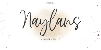 Naylans Font Naylans is a modern script font. Its modern charm makes it appear wonderfully, readable, and, ultimately, incredibly versatile. This font will look outstanding in any context, whether it’s being used on busy backgrounds or as a standalone headline! Thank you for the purchase. Happy creating design :)
 - Jaquizaca by Lamatas un Slazdi,
$19.00 Jaquizaca is hand drawn type to go well with vector illustrations. Jaquizaca was created in 2001 to make inter-titles for a TV-programme. After twelve years it was revised and updated with ligatures, contextual alternates and other OpenType features. It supports all the European languages using Latin alphabet.
 - Pinsher by Abbasy Studio,
$15.00Pinsher, is a font inspired by Signs Painting, This font is based on retro hand-painted paper signs primarily seen in grocery stores from the 1940s through today. With additional shadow font you will be able to create the beautiful combination and bring retro touch to your artworks! - Dorothy Script by Bosstypestudio,
$14.00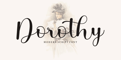 Dorothy Script is a Chic and Lovely Calligraphy font, described by a Love touch with natural handwritten style, perfect for your favorite projects. Fall in love with its incredibly distinct and timeless style and use it to create spectacular designs! What's Include : Multilingual Support Alternatis Ligatures Thank You,
 - Alien Spaceship by Gassstype,
$29.00 introducing : Alien Spaceship Font ,come with powerful themes. We wanted to create the most unique character. It matches applies in some designs such as the gaming logo, logotype, brand, packaging, quotes, cute poster, kids shirt, cover book, birthday invitation and more custom design. Alien Spaceship Font is 3 style.
 - FF Stargate by FontFont,
$41.99 Dutch type designer Donald Beekman created this display FontFont in 1999. The family contains 2 weights: Regular and Italic and is ideally suited for music and nightlife. FF Stargate provides advanced typographical support with features such as ligatures and case-sensitive forms. It comes with proportional lining figures.
 - Disposable by PizzaDude.dk,
$20.00 Disposable is somewhat similar to some letters that are about to disintegrate. The letters are a little worn and give a good impression of something eco or organic. I've created 6 different versions of all the letters, just so your text will look even more organic and handmade!
 - FF Cavolfiore by FontFont,
$41.99 Italian type designer Alessio Leonardi created this display FontFont in 1994. The font is ideally suited for festive occasions, music and nightlife as well as software and gaming. FF Cavolfiore provides advanced typographical support with features such as ligatures and case-sensitive forms. It comes with proportional lining figures.
 - Obsession by Autographis,
$39.50Obsession has taken me completely in its spell. I could go on forever creating new forms for this script. But I have other fonts to do, so this is as far as my obsession goes for the moment. There are six different cuts and all letters can be mixed. - Techno Cowboy by Hipfonts,
$22.00 Introducing Techno Cowboy, a modern techno display font with multilingual support. Techno Cowboy is great for creating eye-catching logos, headlines, ads, posters, web design, print, motion graphics, apparel and much more. If you're looking for a futuristic font that packs a punch, then Techno Cowboy is for you.
 - Kryptic LP by LetterPerfect,
$39.00 Kryptic is based on a design for computer optical character recognition (OCR) from the 1960s developed by Epps & Evans at the National Physical Laboratory. Its pure geometric and elemental shapes create graphic patterns and visual puzzles that only secondarily communicate meaning. Not recommended for extended text, unless intentionally encrypting!
 - Betalina by Letterena Studios,
$9.00 Betalina is a romantic and sweet calligraphy typeface with characters that dance along the baseline. It will add a luxury spark to any design project that you wish to create! This font is PUA encoded which means you can access all of the amazing glyphs and ligatures with ease!
 - NT Gagarin by Novo Typo,
$26.00 Anna Gagarin is the loving matriarch of the Gagarin Family. Her life was full of love and passion. She had several affairs with Futurist and Contstructivist artist in the beginning of the 20th century. She was in love with the Russian poet Vladimir Majakovski (born on July 19th, 1893 and died in Moscow on the April 14th, 1930). She gave birth to his son Boris. She called him 'a cloud with trousers'. After this love story, Anna Gagarin met the designer and artist Gustav Klucis in Italy. His radical and political ideas were much too childish for her. After a period of love and passion Anna gave birth to his son. At that time they were in Italy, which explains his italic forms. After her return to Moscow in the beginning of the 1920's Anna was introduced by Alexander Rodchenko. They were heavenly in love but Ilja Stepanova was very jealous on her husband. Anna once said that 'Alexander fills mine construction with love...' That phrase can be an explanation for the term Constructuvism as an art movement. Alexander was the great love of Anna. She gave birth to their love-baby Dimitri Gagarin. That night Alexander designed his most famous poster. A decade before that Anna told it was 'a time for a change'. In a local bar in Sint Petersburg she met Gregory Rasputin. At that time Rasputin was a well known person and a respected member of the Sint Petersburg upper class.His diabolic character influenced Anna and after several months she gave birth to their son Kurt. He inherited the main characteristics of his father. The Gagarin Family wants to give love and wants be loved...
 - Avenir Next Thai by Linotype,
$79.00 Avenir Next Pro is a new take on a classic face—it’s the result of a project whose goal was to take a beautifully designed sans and update it so that its technical standards surpass the status quo, leaving us with a truly superior sans family. This family is not only an update though; in fact it is the expansion of the original concept that takes the Avenir Next design to the next level. In addition to the standard styles ranging from ultralight to heavy, this 32-font collection offers condensed faces that rival any other sans on the market in on and off—screen readability at any size alongside heavy weights that would make excellent display faces in their own right and have the ability to pair well with so many contemporary serif body types. Overall, the family’s design is clean, straightforward and works brilliantly for blocks of copy and headlines alike. Akira Kobayashi worked alongside Avenir’s esteemed creator Adrian Frutiger to bring Avenir Next Pro to life. It was Akira’s ability to bring his own finesse and ideas for expansion into the project while remaining true to Frutiger’s original intent, that makes this not just a modern typeface, but one ahead of its time. Avenir Next Variables are font files which are featuring two axis, weight and width. They have a preset instance from UltraLight to Heavy and Condensed to Roman width. The preset instances are: Condensed UltraLight, Condensed UltraLight Italic, Condensed Thin, Condensed Thin Italic, Condensed Light, Condensed Light Italic, Condensed, Condensed Italic, Condensed Demi, Condensed Demi Italic, Condensed Medium, Condensed Medium Italic, Condensed Bold, Condensed Bold Italic, Condensed Heavy, Condensed Heavy Italic, UltraLight, UltraLight Italic, Thin, Thin Italic, Light, Light Italic, Regular, Italic, Demi, Demi Italic, Medium, Medium Italic, Bold, Bold Italic, Heavy, Heavy Italic.
 - FabFours by Ingrimayne Type,
$5.00 A tessellation is a pattern in which a shape or tile fits together with copies of itself to fill the plane with no gaps or overlaps. One type of tessellation is formed with sides of center-point rotation, that is, one half of an edge is rotated 180 degrees to form the other half. If a square template is made with sides of identical center-point rotation, there are exactly four shapes that are possible. If these shapes or tiles are fit together not edge to edge but vertex to vertex, the result is a checkerboard-like pattern of tiles and voids. However, the voids have four edges formed by the four possible shapes that the tiles can have, so the voids are limited to the same four shapes that that make up the tiles. The FabFours have 22 tile families that allow a wide variety of fascinating patterns. They form one, two, three, and four tile tessellation. Eleven of the seventeen symmetry groups can be formed with these patterns. In each tile family two of the shapes have two possible orientations, one shape has four possible orientations, and one has eight, for a total of 16 tiles. Each font has two families, one on letters A-P the other on a-p. For some of the families there are also other tiles using the same edge but using triangular and hexagonal templates. To get proper results, the leading must be set equal to the point size of the font. I discovered these fabulous families and their decorative possibilities as I was working on a book about tessellations. I have not been able to find anyone else who has written about these families of four and their decorative possibilities when arranged vertex to vertex.
 - Midnight Diner by Roland Hüse Design,
$30.00 Did your client just say ‘can you make it pop’? Then you already know you got it on lock. Introducing: Midnight Diner! A multi-layered dimensional script font family featuring thin, bold, outline and shadow capabilities, with a left-leaning slant to boot. You can experiment with various layer combinations and colour! How fun is that? Being effortlessly casual, retro and elegant all in one, you can play it up or down to your liking – perfect for display graphics, logos, signages, packaging, lifestyle imagery, invitations and more. It features a diverse range of stylistic alternates, contextual alternates, and standard ligatures, ensuring that you’ve countless options to choose from for your design work. This font family is delicately crafted and well thought out with every little detail in mind, to ensure its ease and versatility when used! Midnight Diner is a collaboration between lettering artist and calligrapher, Leah Chong (www.leahdesign.sg) and typeface designer, Roland Huse (www.rolandhuse.com). Product Content: Midnight Diner Layered Font - Thin (TTF) Midnight Diner Layered Font - Bold (TTF) Midnight Diner Layered Font - Outline (TTF) Midnight Diner Layered Font - Shadow (TTF) Font Guide PDF https://drive.google.com/file/d/1KPSf-gGrhX3wyaImEAmlJICERNbxu2IN/view?usp=sharing Font Guide Youtube Video https://youtu.be/GtZ8E7Y7wnQ 6 Bonus SVGs (TTF): Midnight Diner SVG - Red Yellow Midnight Diner SVG - Black Pink Midnight Diner SVG - Blue Green Midnight Diner SVG - Orange Yellow Midnight Diner SVG - Purple Pink Midnight Diner SVG - Black White Font Features: Latin character set: Uppercase & Lowercase A - Z Stylistic Alternates Contextual Alternates Standard Ligatures Numerals, Currency Symbols & Punctuation Accented Characters To access all features of Midnight Diner such as stylistic alternates etc., it's highly recommended to use professional design software such as Adobe Illustrator, Adobe Photoshop, Adobe InDesign or Procreate (via the ‘add text' feature).
 - FS Jack by Fontsmith,
$80.00 a, g, k and y It was a forensic examination by Jason Smith of his existing designs that laid the groundwork for FS Jack. Jason made a list of unique characteristics that would give the sans serif font its typographic thumbprint, which included an unusually large x-height and slightly off-the-wall letters like the lower-case “a”, “g”, “k” and “y”. “I wanted to make something that was slightly uncomfortable,” says Jason, “and in doing so simplify the quirkiness down to a few letters.” Fernando Mello did “the rest of the cooking”, filling the design out and making the additional weights. Tipos Latinos Upon its release in 2010, FS Jack was submitted by Fernando, who is Brazilian, for the esteemed type design biennial, Tipos Latinos, where it was selected as a winner in the Families category. It went on to be selected for type exhibitions throughout Latin America and around the world. “FS Jack is a workhorse,” says Fernando, “but also very ownable and distinctive, and available in a good range of weights, crafted by Jason and I.” Corporate “FS Jack took a couple of years to get noticed and is still fairly underused,” says Jason, “which is good in a way, for our Brandfont clients that have adopted it.” FS Jack was chosen as the signature font for The Shard in London, from its signage down to business cards. Fontsmith also worked with Lloyds Bank to customise FS Jack into a bespoke font for the bank’s updated brand identity – part of Fontsmith’s Brandfont service, which you can read about here. Fat Jack Included in the FS Jack family – just – is FS Jack Poster, the super-heavy weight of the range. “That was a last minute addition,” says Fernando, “after Jason and I started talking about how much we liked Gill KO, a typeface that is almost comically fat.”
 - Avenir Next Rounded by Linotype,
$42.99Avenir Next Pro is a new take on a classic face—it’s the result of a project whose goal was to take a beautifully designed sans and update it so that its technical standards surpass the status quo, leaving us with a truly superior sans family. This family is not only an update though; in fact it is the expansion of the original concept that takes the Avenir Next design to the next level. In addition to the standard styles ranging from ultralight to heavy, this 32-font collection offers condensed faces that rival any other sans on the market in on and off—screen readability at any size alongside heavy weights that would make excellent display faces in their own right and have the ability to pair well with so many contemporary serif body types. Overall, the family’s design is clean, straightforward and works brilliantly for blocks of copy and headlines alike. Akira Kobayashi worked alongside Avenir’s esteemed creator Adrian Frutiger to bring Avenir Next Pro to life. It was Akira’s ability to bring his own finesse and ideas for expansion into the project while remaining true to Frutiger’s original intent, that makes this not just a modern typeface, but one ahead of its time. Avenir Next Variables are font files which are featuring two axis, weight and width. They have a preset instance from UltraLight to Heavy and Condensed to Roman width. The preset instances are: Condensed UltraLight, Condensed UltraLight Italic, Condensed Thin, Condensed Thin Italic, Condensed Light, Condensed Light Italic, Condensed, Condensed Italic, Condensed Demi, Condensed Demi Italic, Condensed Medium, Condensed Medium Italic, Condensed Bold, Condensed Bold Italic, Condensed Heavy, Condensed Heavy Italic, UltraLight, UltraLight Italic, Thin, Thin Italic, Light, Light Italic, Regular, Italic, Demi, Demi Italic, Medium, Medium Italic, Bold, Bold Italic, Heavy, Heavy Italic. - Univers Next by Linotype,
$53.99 Linotype Univers is a completely reworked version of the original Univers typeface family designed by Adrian Frutiger in 1957. After a long process of painstakingly detailed revision, Frutiger and the design staff at Linotype completed this large joint project in 1997. The result: a brilliant and cohesive font family of 63 weights and styles including the 4 monospaced typewriter weights. All the existing weights were completely redrawn, with careful attention paid to making the proportions more consistent with each other and improving fine details such as curves and thick-to-thin stroke ratios. The family was expanded from 27 to 63 weights, providing a much larger framework to graphic designers for choosing just the right style. The bold and condensed weights were reworked for improved legibility and on-screen application. The stroke weights were revised for consistency within each face as well as in relationship to the other weights. By following Frutiger's original designs, the humanist character of the sans serif Univers now comes through more distinctly. T he systemized numbering system has also been updated. With its sturdy, clean forms Univers can facilitate an expression of cool elegance and rational competence. In fact, the strong familial relationships between all the styles and weights make it a serviceable choice for large graphic design projects that require versatility with consistency. Frutiger was successful in staying true to his initial aims; the new Linotype Univers does indeed work in longer texts as well as for display settings. In 2010 the typeface family was extended and renamed into a more logical naming of "Univers Next" to fit better in the Platinum Collection naming. Univers Next Variable are font files which are featuring two axis and have a preset instance from Light to Heavy and Condensed to Extended. Univers® Next font field guide including best practices, font pairings and alternatives.
 - Sweet Sans by Sweet,
$59.00 The engraver’s sans serif—strikingly similar to drafting alphabets of the early 1900s—has been one of the most widely used stationer’s lettering styles since about 1900. Its open, simple forms offer legibility at very small sizes. While there are digital fonts based on this style (such as Burin Sans™ and Sackers Gothic™, among others), few offer the range of styles and weights possible, with the versatility designers perhaps expect from digital type families. Sweet Sans fills that void. The family is based on antique engraver’s lettering templates called “masterplates.” Professional stationers use a pantograph to manually transfer letters from these masterplates to a piece of copper or steel that is then etched to serve as a plate or die. This demanding technique is rare today given that most engravers now use a photographic process to make plates, where just about any font will do. But the lettering styles engravers popularized during the first half of the twentieth century—especially the engraver’s sans—are still quite familiar and appealing. Referencing various masterplates—which typically offer the alphabet, figures, an ampersand, and little else—Mark van Bronkhorst has drawn a comprehensive toolkit of nine weights, each offering upper- and lowercase forms, small caps, true italics, arbitrary fractions, and various figure sets designed to harmonize with text, small caps, and all-caps. The fonts are available as basic, Standard character sets, and as Pro character sets offering a variety of typographic features and full support for Western and Central European languages. Though rich in history, Sweet Sans is made for contemporary use. It is a handsome and functional tribute to the spirit of unsung craftsmanship. Burin Sans and Sackers Gothic are trademarks of Monotype Imaging.
 - Clear Sans by Positype,
$29.00 Clear Sans™ is a… wait for it… rational geometric sans serif. It is intended to fill a niche… to provide an alternative to the somewhat based-on-vernacular signage, somewhat geometric sans. I hear the word vernacular thrown around too much and too loosely. If a typeface is based in the vernacular, based on hand-painted or hand-crafted signage, then it should be based on the movements of the hand, retain that warmth and not on a pretty geometric model. For me, clean, geometric and precise doesn't have to be cold and expressionless. The original skeleton was hand-painted in 2008 to help determine and inform my decisions going forward. The typeface was completed shortly afterwards at the behest of an old friend for their identity. As usual, I expanded it, but considered retiring it since there were so many things similar out there. Years later, I had a chance to rediscover it and came to the conclusion that it could be improved, expanded in a logical and useful way, and introduced. I would be lying if I didn't admit that the rise of webfonts and embedded type in applications influenced many of the decisions I made about reworking Clear Sans™. Completely new Text and Screen fonts were developed that utitlize larger x-heights, space-saving widths, logical (and simplified) weight offerings… to name a few alterations. Even the pricing of each variant was considered to produce a more reasonable and simple solution for the developer, designer, professional and novice. Clear Sans™ is a departure from my previous sans serifs, but the influences of Aaux Next, Akagi Pro and Halogen are evident. Enjoy a light-hearted mini-site devoted to Clear Sans™
 - Clear Sans Text by Positype,
$25.00 Clear Sans™ is a… wait for it… rational geometric sans serif. It is intended to fill a niche… to provide an alternative to the somewhat based-on-vernacular signage, somewhat geometric sans. I hear the word vernacular thrown around too much and too loosely. If a typeface is based in the vernacular, based on hand-painted or hand-crafted signage, then it should be based on the movements of the hand, retain that warmth and not on a pretty geometric model. For me, clean, geometric and precise doesn't have to be cold and expressionless. The original skeleton was hand-painted in 2008 to help determine and inform my decisions going forward. The typeface was completed shortly afterwards at the behest of an old friend for their identity. As usual, I expanded it, but considered retiring it since there were so many things similar out there. Years later, I had a chance to rediscover it and came to the conclusion that it could be improved, expanded in a logical and useful way, and introduced. I would be lying if I didn't admit that the rise of webfonts and embedded type in applications influenced many of the decisions I made about reworking Clear Sans™. Completely new Text and Screen fonts were developed that utitlize larger x-heights, space-saving widths, logical (and simplified) weight offerings… to name a few alterations. Even the pricing of each variant was considered to produce a more reasonable and simple solution for the developer, designer, professional and novice. Clear Sans™ is a departure from my previous sans serifs, but the influences of Aaux Next, Akagi Pro and Halogen are evident. Enjoy a light-hearted mini-site devoted to Clear Sans™
 - Clear Sans Screen by Positype,
$21.00 Clear Sans™ is a… wait for it… rational geometric sans serif. It is intended to fill a niche… to provide an alternative to the somewhat based-on-vernacular signage, somewhat geometric sans. I hear the word vernacular thrown around too much and too loosely. If a typeface is based in the vernacular, based on hand-painted or hand-crafted signage, then it should be based on the movements of the hand, retain that warmth and not on a pretty geometric model. For me, clean, geometric and precise doesn't have to be cold and expressionless. The original skeleton was hand-painted in 2008 to help determine and inform my decisions going forward. The typeface was completed shortly afterwards at the behest of an old friend for their identity. As usual, I expanded it, but considered retiring it since there were so many things similar out there. Years later, I had a chance to rediscover it and came to the conclusion that it could be improved, expanded in a logical and useful way, and introduced. I would be lying if I didn't admit that the rise of webfonts and embedded type in applications influenced many of the decisions I made about reworking Clear Sans™. Completely new Text and Screen fonts were developed that utitlize larger x-heights, space-saving widths, logical (and simplified) weight offerings… to name a few alterations. Even the pricing of each variant was considered to produce a more reasonable and simple solution for the developer, designer, professional and novice. Clear Sans™ is a departure from my previous sans serifs, but the influences of Aaux Next, Akagi Pro and Halogen are evident. Enjoy a light-hearted mini-site devoted to Clear Sans™
 - PB Capitalis Rustica IVc by Paweł Burgiel,
$32.00 PB Capitalis Rustica IVc is a font face designed for imitate latin writing style found in manuscripts from 1st to 9th century. All characters are handwritten by use ink and reed pen (calamus), scanned, digitized and optimized for best quality without lost its handwritten visual appearance. Character set support codepages: 1250 Central (Eastern) European, 1252 Western (ANSI), 1254 Turkish, 1257 Baltic. Include also additional characters for Cornish, Danish, Dutch and Welsh language, spaces (M/1, M/2, M/3, M/4, M/6, thin, hair, zero width space etc.) and historical characters (overlined Roman numerals, I-longa, historical ligatures for "nomina sacra" and "notae communes"). OpenType TrueType TTF (.ttf) font file include installed OpenType features: Access All Alternates, Localized Forms, Fractions, Ordinals, Superscript, Tabular Figures, Proportional Figures, Stylistic Alternates, Stylistic Set 1, Historical Forms, Historical Ligatures. Include also kerning as single 'kern' table for maximum possible backwards compatibility with older software. Historical ligatures for "nomina sacra" and "notae communes" are mapped to Private Use Area codepoints. Use of OpenType features to get historical characters: ïTo get "I-longa" use Stylistic Alternates for: "I"(U+0049), "i"(U+0069), "dotless i"(U+0131). ïTo get "nomina sacra" use Historical Ligatures and write uppercase letters: DS for: "Deus", DMS or DNS for: "Dominus" EPS for: "Episcopus", IHS for: "Iesus", PBR for: "Presbiter", SCS for: "Sanctus", SPS for: "Spiritus", XPS for: "Christus". ïTo get "notae communes" use Historical Ligatures and write: B(U+0042) + "middle dot"(U+00B7) for: "-BUS", Q(U+0051) + "middle dot"(U+00B7) for: "-QUE". ïTo get "scriptio continua" (writing without words separation) use Historical Forms (regular spaces are replaced by zero width spaces between words). ïTo get "middle dot" for separate words use Stylistic Set 1 (regular spaces are replaced by middle dot between words).
 - Aure Teddy by Aure Font Design,
$23.00 Aure Teddy emanates the trusting tenderness of a favorite teddy bear. The hand-penned look of these forms engages the reader with a subtext of comfort. Teddy is delightfully legible as a text font and works well where a more organic look is wanted. It brings an unassuming charm to text and titles and a welcome empathy to astrological expressions and chartwheels. Its engaging charcter serves well in labeling diagrams and personalizing nametags. Teddy is an original design developed by Aurora Isaac. After more than a decade in development, 2018 marks the first release of the CJ and KB glyphsets in regular, italic, bold, and bold-italic. The CJ glyphset is a full text font supporting a variety of European languages. A matching set of small-caps complements the extended lowercase and uppercase glyphsets. Supporting glyphs include standard ligatures, four variations of the ampersand, and check-mark and happy-face with their companions x-mark and grumpy-face. Numbers are available in lining, oldstyle, and small versions, with numerators and denominators for forming fractions. Companion glyphs include Roman numerals, specialized glyphs for indicating ordinals, and a variety of mathematical symbols and operators. The CJ glyphset also includes an extended set of glyphs for typesetting Western Astrology. These glyphs are also available separately in the KB glyphset: a symbol font re-coded to allow easy keyboard access for the most commonly used glyphs. Aure Teddy fills a unique niche, being a modestly decorative font as well as a competant text font. Like Aure Jane, Aure Teddy serves well paired with the decorative touches of Aure Brash and Aure Sable. Give Aure Teddy a trial run! You may discover a permanent place for this font family in your typographic palette. AureFontDesign.com
 - Kity love by Gilar Studio,
$16.00 kity love is a beautiful and flowing handwritten font with love. It looks beautiful on a variety of designs requiring a personalized style, such as wedding invitations, thank you cards, weddings, greeting cards, logos and so on. This font is PUA encoded which means you can access all of the glyphs and swashes with ease! kity love a new fresh & modern script with a handmade valentines style, decorative characters and a dancing baseline! So beautiful on invitation like greeting cards, branding materials, business cards, quotes, posters, and more!! The alternative characters were divided into several Open Type features such as , Stylistic Sets, Stylistic Alternates. The Open Type features can be accessed by using Open Type savvy programs such as Adobe Illustrator, Adobe InDesign, Adobe Photoshop Corel Draw X version, And Microsoft Word. And this Font has given PUA unicode (specially coded fonts). so that all the alternate characters can easily be accessed in full by a craftsman or designer. You can mix and match with Opentype feature: Ekstras ligature More than 327 of glyphs Alternates Stylistic sets from ss01 to ss05 The ZIP file are include the following : kity love.OTF kity love.TTF kity love.Web Font If you don't have a program that supports OpenType features such as Adobe Illustrator and CorelDraw X Versions, you can access all the alternate glyphs using Font Book (Mac) or Character Map (Windows). To Access Alternate Characters Click The Link Below: Adobe illustrator CS https://www.youtube.com/watch?v=geL0Ye02Ryk Adobe illustrator CC https://www.youtube.com/watch?v=V25yiUh8BcE Ms Word https://www.youtube.com/watch?v=HxkhZiCuwEw Coreldraw X7 https://www.youtube.com/watch?v=UBVsufJjons Adobe Photoshop CC https://www.youtube.com/watch?v=BYKXl58AdNY Indesign CS https://www.youtube.com/watch?v=HgZTCxKG14Q Check my other Font here : https://gilarstudio.com/
 - Ardena Variable by Julien Fincker,
$185.00 About Ardena: Ardena is a modern sans-serif typeface family. While neutral and clear at first glance, it can be characterized as both pleasant and confident due to its open, rounded forms and vertical terminals. It can be used in both a restrained and expressive way. The thinner and thicker weights are particularly suitable for strong headlines, while the middle weights can be used for typographic challenges and body text. Completed with an extensive character collection, it becomes a real workhorse. A versatile allrounder that is up to all challenges – for Corporate Identity, Editorial, Branding, Orientation and Guidance systems and much more. Variable Font The Variable Font contains 2 axes: weight and oblique – all in just one file. Features: With over 1064 characters, it covers over 200 Latin-based languages. It has an extended set of currency symbols and a whole range of Open Type Features. There are alternative characters as stylistic sets, small caps, automatic fractions – just to name a few. Arrows and numbers: In particular, the extensive range of arrows and numbers should be highlighted, which are perfectly suited for use in orientation and guidance systems. Thanks to Open Type Features and an easy system, the various designs of arrows and numbers can also be simply "written" without first having to select them in a glyph palette. The principle is easily explained: If a number is placed in round or square brackets, it will automatically be displayed in an outlined circle or square. If you add a period to the number, it is displayed in a full circle or square. The same principle also applies to the arrows. The arrows themselves are combinations of greater/less symbols with the various slashes or hyphens. Get the static version of the Ardena family here: https://www.myfonts.com/fonts/julien-fincker/ardena/
 - Sweet Sans Pro by Sweet,
$79.00 The engraver’s sans serif—strikingly similar to drafting alphabets of the early 1900s—has been one of the most widely used stationer’s lettering styles since about 1900. Its open, simple forms offer legibility at very small sizes. While there are digital fonts based on this style (such as Burin Sans™ and Sackers Gothic™, among others), few offer the range of styles and weights possible, with the versatility designers perhaps expect from digital type families. Sweet Sans fills that void. The family is based on antique engraver’s lettering templates called “masterplates.” Professional stationers use a pantograph to manually transfer letters from these masterplates to a piece of copper or steel that is then etched to serve as a plate or die. This demanding technique is rare today given that most engravers now use a photographic process to make plates, where just about any font will do. But the lettering styles engravers popularized during the first half of the twentieth century—especially the engraver’s sans—are still quite familiar and appealing. Referencing various masterplates—which typically offer the alphabet, figures, an ampersand, and little else—Mark van Bronkhorst has drawn a comprehensive toolkit of nine weights, each offering upper- and lowercase forms, small caps, true italics, arbitrary fractions, and various figure sets designed to harmonize with text, small caps, and all-caps. The fonts are available as basic, Standard character sets, and as Pro character sets offering a variety of typographic features and full support for Western and Central European languages. Though rich in history, Sweet Sans is made for contemporary use. It is a handsome and functional tribute to the spirit of unsung craftsmanship. Burin Sans and Sackers Gothic are trademarks of Monotype Imaging.
 - Negaroa by Ardyanatypes,
$15.00 Negaroa comes with an aesthetic style, and the serif-type tagline is modern and elegant. This font comes in eight thickness levels, from thin to black to suit your needs. Negaroa is also equipped with the latest professional characteristics that can present an elegant and attractive identity for your company or project for business purposes. It goes well with modern serifs and scripts depicted or stand firm as a title and brand representative for an elegant look. Negaroa also comes with multiple languages, making it easy to use for any country and language use. It also comes with alternative Ligatures and styles to make your designs more attractive. Negaroa is suitable for branding projects and various design purposes such as business cards, name tags, uniforms as a brand enhancement. Advertisements, posters, invitations, branding, logos, magazines, merchandise, presentations, etc. Supports languages: Afrikaans, Albanian, Asturian, Asu, Azerbaijani, Basque, Bemba, Bena, Bosnian, Breton, Catalan, Chiga, Colognian, Cornish, Croatian, Czech, Danish, Dutch, Embu, English, Esperanto, Estonian, Faroese, Filipino, Finnish, French, Friulian, Galician, German, Gusii, Hungarian, Icelandic, Igbo, Indonesian, Irish, Italian, Kabuverdianu, Kalaallisut, Kalenjin, Kamba, Kikuyu, Kinyarwanda, Latvian, Lithuanian, Low German, Lower Sorbian, Luo, Luxembourgish, Luyia, Machame, Makhuwa-Meetto, Makonde, Malagasy, Malay, Maltese, Manx, Meru, Morisyen, North Ndebele, Norwegian Bokmål, Norwegian Nynorsk, Nyankole, Oromo, Polish, Portuguese, Quechua, Romanian, Romansh, Rombo, Rundi, Rwa, Samburu, Sango, Sangu, Scottish Gaelic, Sena, Shambala, Shona, Slovak, Slovenian, Soga, Somali, Spanish, Swahili, Swedish, Swiss German, Taita, Teso, Turkish, Turkmen, Upper Sorbian, Vietnamese, Vunjo, Walser, Welsh, Western Frisian, Yoruba, Zulu A guide to accessing all alternatives can be read at http://adobe.ly/1m1fn4Y Adobe Photoshop go to Window - glyphs Adobe Illustrator go to Type - glyphs Features: A – Z Character Set a – z Characters set Numerals & Punctuations (OpenType Standard) Multilingual Thank you and have a nice day
 - Audens by Artisticandunique,
$20.00 Audens - Sans Serif Font Family - Multilingual supports - 6 Styles Audens is a modern geometric sans serif font. Consisting of 6 styles designed for strong headlines, this font is suitable for use in different areas, from banners and posters, newspapers and magazines, logos and brand identities, to movie and game titles. If you are looking for a modern - geometric sans serif style that can be effective in branding, you can easily use this font. Whit these features, it will be effective in creating alternatives in your projects Ideal for posters, newspaper, movie title and magazines, magazine covers, editorials, headlines, websites, logos, branding, advertising and more. You can create your unique designs with this font. If you have a question, please contact me. Have a good time.
 - Peach Daisy (Duplicate) by Nathatype,
$29.00 Ready to make your branding spark? If you need to create a big, bold logo for your business, work on a poster for an event, or whatever your project may be-then this is the perfect font for you. Peach Daisy-A Sans Serif Font Peach Daisy is a new modern sans serif font. This font was carefully crafted and inspired by luxury fashion in the world. It creates a luxurious, rich, exclusive and elegant look in design. It’s thin brush strokes and imperfect baseline give it a fun and stylish. So beautiful on invitation like greeting cards, branding materials, business cards, quotes, posters, lettering and more. Features: Ligatures Alternates Swashes PUA Encoded Numerals and Punctuation Thank you for downloading premium fonts from Natha Studio
 - Jamel by Sensatype Studio,
$15.00 Jamel is a Modern Luxury Elegant Sans Serif Font with Sharp shape make your design look classy and elegant A new San Serif Font that we created special for Headline, Title and more stand out typography needs, with extra ligature that will add your variations. It's so perfect to add your style and headline overview. And specially for Luxury font, we crafted for unique style and modern feels so enjoy to create any project that will show your main idea out. Jamel Modern Luxury Elegant Sans Serif Font ready with: Any options to get creative variations (combination of Ligature Characters) Preview as a inspirations that you can do with Jamel font Ready with All characters Wish you enjoy our font. :)