6,091 search results
(0.049 seconds)
- Kingston Roman by Letterena Studios,
$17.00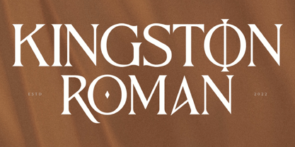 Kingston Roman is a modern and classic serif typeface with a unique style and fancy look. This typeface is perfect for an elegant & luxury logo, book or movie title design, fashion brand, magazine, clothes, lettering, quotes, and so much more. **Uppercase
 - Toma Sunny by Letterena Studios,
$17.00 Toma Sunny is a modern and classic serif font with a unique style and bold look. This typeface is perfect for an elegant & luxury logo, book or movie title design, fashion brand, magazine, clothes, lettering, quotes, and so much more.
 - Bernard Wacker by Letterena Studios,
$10.00 Bernard Wacker is a modern and classic slab serif font with a unique and fancy look. This typeface is perfect for an elegant & luxury logo, book or movie title design, fashion brand, magazine, clothes, lettering, quotes, and so much more.
 - Magisho by Letterena Studios,
$17.00 Magisho is a distinct and classic serif font that has its own unique style & modern look. This typeface is perfect for an elegant & luxury logo, book or movie title design, fashion brand, magazine, clothes, lettering, quotes, and so much more.
 - Heylabs Stroyed by Ronny Studio,
$19.00 Heylabs Stroyed is distinctive handwriting and encapsulates the essence of street style. This typeface is perfect for an poster event, movie title, streetwear stuff, magazine layout, fashion brand, quotes, or simply as a stylish text overlay to any background image.
 - Jagz - Unknown license

- Button by Scholtz Fonts,
$21.00Button is a solid, chunky, font, with a bold symmetry that makes it a must for products aimed at the younger set. Its unusual letter shapes all point to “NEW TREND!” It is the perfect choice for marketing companies targeting: ⁃ web-design and the creation of stylish buttons and menus ⁃ the music scene: CD covers, posters, music videos ⁃ the movie scene: posters, ads, movie titles ⁃ the theatre scene: posters, programs, ads, promotions ⁃ the fashion scene: swingtags, posters, brochures, signage, ads It has been carefully letterspaced and kerned. It contains a full character set: all upper and lower case characters, punctuation, numerals and accented characters are present. - Flexion Pro by Red Rooster Collection,
$60.00 Flexion developed out of design philosophy and ambigramatic artwork of John Langdon. Based on the contents in John’s book Wordplay, author Dan Brown hired John to create ambigrams for his forthcoming novel Angels & Demons. Mr. Brown was so impressed with his work he even named the main character Robert Langdon after John. After the success of Angels & Demons, Dan Brown wrote The Da Vinci Code. When the movie adaptation of that book was in the works, Dan suggested that John create titles for the movie based on ambigrams. John contacted Hal Taylor to create a font based on the lettering treatment to be used for the credits at the end of the movie. Unfortunately, it was decided that the film was running long and the original title concept was scrapped. By this time, Hal was well into developing a full type family, including small caps, alternate characters, lining and ranging figures. John was impressed with the way the design was turning out and decided that it had enough merit to be released as Flexion.
 - Figaro by Monotype,
$29.99Figaro is a very condensed slab serif design of the kind associated with nineteenth century advertising. The Figaro font has considerable weight contrast in the strokes, with a marked weight emphasis on the horizontal elements, including the serifs. Use the Figaro font for display and advertising and for 'Wild West' style posters. - Murisa Rania by Murisa Studio,
$10.00 Murisa Rania is our next very attractive font. Have you ever imagined a font that is formed from brush strokes whose ink is almost dry? That's what this font is made of. Murisa Rania combines elements of art and high technique in its creation to create a unique, attractive and beautiful font.
 - Yahosch by Ingrimayne Type,
$9.00 Yahosch replicates informal hand writing. The typeface is based on egg-shaped circular elements, with the larger part of the oval on the bottom. It comes in three weights, each with an italic style. The regular is very readable even at smaller point sizes where it appears much like neat hand printing.
 - Holokai by Heyfonts,
$18.00 Holokai Typeface is a category of typeface specifically designed for use in larger sizes, typically for headings, titles, logos, and other prominent design elements. Unlike text or body typefaces, which prioritize readability in smaller sizes for extended reading, display typefaces are crafted to make a visual impact and convey a distinct aesthetic
 - Kryptonite by Elemeno,
$10.00Designed to be the ultimate grunge font, Kryptonite and Kryptonite Bizarro are nearly illegible at small sizes, but can't be touched at large sizes. The Kryptonite family has a limited character set and is named for the element capable of killing Superman (with all due respect). Not for the faint of heart. - Fichte Fraktur by RMU,
$25.00 Walter Tiemann’s Fichte-Fraktur, released by Klingspor in 1934, has come to life again. This font contains the traditional long s which can be accessed by either the OT feature historical alternatives or by typing [alt] + b. Two framing elements can be reached by typing [alt] + shift + p and [alt] + p respectively.
 - Balzano by Adobe,
$29.00In 1994, John Benson designed Balzano, Alexa and Caliban, three typefaces with a similar calligraphic character. Balzano differs from the other in its vertical figures, adding a static element to the otherwise lively, flowing components. Balzano is good for short texts and headlines, anywhere in which a personal, elegant look is desired. - Mentor by Ultramarin,
$40.00 Mentor is a font made for professor Bruno K. Wiese 85th birthday. I made it especially for the birthday card I sent him as friendly comment to his always present ideas on clarity, purity, exactness and "less is more". He taught us the importance of carefully managing the spaces between elements in typography.
 - ArTarumianVard by Tarumian,
$40.00 The font reproduces the characteristic detail of some Armenian fonts of the past centuries - the disruption of thin elements. At the same time, the font combines the plasticity of lapidary inscriptions and modern aesthetics. The name Vard (Rose) is highlights an elegance of style. Applicable for headlines, drop caps, advertising compositions, etc.
 - Glimpse by MJType,
$19.00 The Glimpse Font Family, with its reverse contrast approach, provides a fresh take on display fonts. It allows designers to play with visual hierarchy in an innovative way, using the variable weights to enhance different textual elements. Despite their distinctive weights, each font in the family maintains a cohesive look and feel.
 - Americanus by Aerotype,
$29.00 Typical of early 1800s newsprint type, Americanus and Americanus Italics have three historically accurate ornaments and discretionary OpenType features for commonly used ligatures like ct and st. The Americanus Ornaments package contains a wider selection of authentic antique ornaments and border elements and is included as part of the Americanus Family package.
 - RMU Trifels by RMU,
$35.00 RMU Trifels is a revival of Heinrich Wieynck’s great design which was released by Bauer in 1905. This beautiful Art Nouveau font comes with a long s and a historical form of the letter H. Border and adorning elements were added which you can reach by typing [alt] + P and [alt] + p.
 - Madison 01 by Fateh.Lab,
$10.00 Madison 01 is a bold, powerful and sporty font, perfect for sports logos, branding, posters, clothing designs with a bold and confident look. and also suitable for editorial / web titles. by adding some very detailed illustrations, of course this is very helpful to add elements to the design that you will make.
 - SA Tampico by Artcoast,
$9.00 Tampico Typeface is a new font with Rough version, which includes 80+ glyphs and alternative characters. The font looks great on various packages, goods with food. You can also use it to create logos, shortcuts and other design elements. Product Content: SA Tampico Rough SA Tampico Symbols Features: Accents (Multilingual characters) Stylistic Alternates
 - Zira by Artcity,
$10.00 Zira is a playful hand-drawn font family designed by Daniel Bak (Artcity). It is available in three handy weights: regular, bold and screaming. It contains international language accent marks and diacriticals, including Greek and Cyrillic. Zira can be considered as smoothed serif version of Cornelius font. Zira as Cornelius as well is a chimpanzee character in the novel and movie series Planet of the Apes. Dr. Zira is a chimpanzee psychologist and veterinarian, who specializes in the study of humans, in the novel and subsequent movie series Planet of the Apes. Zira was played in the first three Apes movies by actress Kim Hunter. Unique among the Apes characters, Zira has blue eyes. Zira is the fiancée (later wife) of Cornelius, and both are ultimately responsible to the Minister of Science, Dr. Zaius. Zira's character and role are essentially the same in both the novel and the movies, though some story details differ. Her work in each involves both working with humans under laboratory conditions (e.g. learning and behavioural experiments), and working on them physically (lobotomy and other brain surgeries, vivisection, physical endurance and tolerance experiments, and subsequent autopsies). Zira is an outspoken liberal by nature, deploring war and militancy (and despising the gorillas, who seem to make both a way of life), and eager to seek and develop intelligence anywhere it can be found. Zira literally stands for her principles - or refuses to stand, as the case may be.
 - Tomato by Canada Type,
$22.95Tomato is the digitization and quite elaborate expansion of an early 1970s Franklin Photolettering film type called Viola Flare. This typeface is an obvious child of funk, the audio-visual revolution that swept America and put an end to the art nouveau period we now associate with the hippy era. Funk is of course little more than jazz with a chorus and an emphatic beat. Nevertheless, it became the definition of cool in the 1970s, thanks to blaxploitation movies with excellent soundtracks like Shaft and Superfly. Funk began as a commercial audio experience, then later expanded its signature to cover everything, from design to fashion to the later birth of disco, which is really a further simplification of funk. Funk had very strong and unique typographical elements, particularly a kind of titling with an essentially western, wooden core that suddenly changed and flared in unexpected areas until a very individual brand was achieved. Everything that can be tacked on to the alphabet was used towards that individuality. Things like curls, swirls, swashes, ligatures were always plentiful in funk, sometimes giving the titling a specific gender, sometimes bulging, sometimes speeding, sometimes fading in the distance, sometimes doing nothing but crazily aligning with other design elements, but the result was always a fascinating creature that seemed to invariably want to dance and have fun. Tomato was built in exactly that spirit. The original film type certainly had enough swashes and curls to be an unmistakable funk font in itself, but our further expansion of it cements it and makes it the definite font for the genre. With as many as 12 different possibilities for some letters, the designer's choices for a titling set in Tomato are virtually limitless. The Postscript and True Type versions of Tomato come in five fonts, including two fonts for alternates, one font for ligatures, and one font for swashes. These are split into two affordable packages. The entire family package is also available at an even more affordable price, and includes complimentary Cyrillic, Greek, Turkish, and Central European versions of Tomato. A Tomato Pro OpenType version is also available. It is a single font that includes over 650 characters, glued together with extensive programming for convenience of use in OpenType-friendly applications, where you can watch the letters morph and dance as you push the buttons and change the options of your OT palette. Now you know which font will come to mind when someone says the word "funky". - Joyful Turkey by Putracetol,
$16.00 Joyful Turkey - Display Thanksgiving Font is a charming and playful typeface designed to embrace the spirit of Thanksgiving. Its quirky and rounded characters add an element of fun and warmth to your designs, making it the perfect choice for projects that celebrate this special holiday. This font includes seven delightful decorative variations with Thanksgiving-themed elements such as turkey, pumpkin, pie, leaves, and more. Ideal for Thanksgiving-themed designs, including invitation cards, birthday invites with a Thanksgiving theme, party decorations, logos, stickers, clothing, packaging, children's books, magazines, and more, Joyful Turkey brings a delightful and heartwarming touch to your creative projects. With its whimsical and cheerful style, this font captures the essence of gratitude and celebration, making it an ideal choice for designs that reflect the Thanksgiving spirit.
 - Gloriance by Mevstory Studio,
$25.00 Gloriance is a classic serif font adapted from the art deco style, a visual style that emerged in the 1920s and 1930s. This font is characterized by bold geometric shapes, a symmetrical design, and a sense of modernity and glamour. Gloriance is designed to have a distinctive classic impression with the presence of decorative elements such as extended lines, neat and tidy decorative shapes and types. These decorative elements can add a sense of sophistication and luxury to text. With a wide selection of alternates and ligatures, you can create a variety of styles and play with this unique fonts. This typeface is perfect for an elegant logo, jewelry stuff, packaging, magazine design, fashion brand, classic stuff, poster, flyer, wedding invitation, quotes, or simply as a stylish text overlay to any background image.
 - ArchiLogo by Archiness,
$- ArchiLogo is not a regular outline-font. It has a stencil element to it and it’s a kind of indirect, because the font is basically the space between the lines. You have to read between the lines, so to speak. It’s like one of the key elements in architecture: the space between the walls. Here’s where type design meets architecture! The new version, ArchiLogo 3.0, has been improved slightly and 13 glyphs have been added to a total of 85 characters. It is still a free font. Because of the popularity of this font I decided to introduce ArchiLogo Pro. Indeed, the pro version of ArchiLogo. Besides the basic Macintosh Character Set the supported languages are Latin 1, Latin 2: Eastern Europe, Turkish, Windows Baltic. It grew to over 300 glyphs.
 - Verse Sans by Hubert Jocham Type,
$39.00 In 2006 the art director of Emotion, a women’s psychology magazine, asked me to design a copy typeface for them. Before I actually got the job I started to work on a serif. I wanted it to be feminine but still clear and modern. On one hand there are the floral round elements and on the other hand the angular serifs. In the composition I wanted the two extremes to work together. All the other elements had to be harmonized. The proportions needed to match the magazine’s requirements. The ascenders and descenders are short enough to work in narrow columns but long enough to work in small sizes. As you can imagine, the emotion-job never happened. In copy you should not get heavier than Heavy. Extrabold and Ultrabold work best in display.
 - Louisa by Julia Hanft,
$30.00 Louisa is a monospaced font-family designed and optimized specifically for small font sizes. But even as headline font it looks good. It has a very good distinguishability of letter forms and legibility even in longer text paragraphs. The character of Louisa is a combination of strong elements and warm, friendly forms. The font family is not only designed for coding and tabular layout, but can be used in different fields of communication design. Therefore it provides two stylistic sets with different letter forms: one with the look of serious modern typewriter font, the second with more soft letter forms and elements of a real italic. Additionally it consists oldstyle numbers (and of course tabular numbers) and a set arrows. The font is available in four styles: regular, italic, bold and bold italic.
 - Pepi/Rudi by Suitcase Type Foundry,
$39.00 The superfamily Pepi and Rudi is based on playful experimentation with basic geometric shapes - the circle, rectangle and triangle - elements that laid the foundations for typographic Modernism. The Pepi and Rudi introduces a number of current elements into a time-proven concept of primitively constructed typefaces. The typeface's somewhat uniform character width establishes a more regular rhythm; the character set is expanded, and legibility is improved thanks to taller lowercase. A wide range of ten styles, from hairline-thin to extra-thick with adequate Italics allow for universal use across the whole scope of graphic design. Carefully designed diacritics, clear punctuation marks, table number characters, ligatures, arrows or alternative lowercase characters are standard; this is sure to please everyone needing to work effectively with a neutral, geometric headline typeface.
 - Riseria by Alit Design,
$24.00 Introducing "Riseria" – a bold and avant-garde typeface that seamlessly blends the raw power of brutalism metal with the intricate elegance of blackletter, enhanced by haunting thorn decorations. This font is a striking testament to the fusion of divergent design elements, resulting in a visually arresting and unique typographic experience. With 839 meticulously crafted characters, Riseria stands as a versatile typeface that transcends conventional boundaries. Its design exudes an industrial and unapologetically bold aesthetic, drawing inspiration from the robustness of brutalist architecture and the mystique of blackletter scripts. The fusion of these elements creates a harmonious balance between strength and intricacy, making Riseria an ideal choice for projects that demand a powerful and visually captivating presence. The font boasts a comprehensive set of ligatures, allowing characters to seamlessly merge and create a fluid and organic appearance. Alternatives provide additional flexibility, enabling users to experiment with different stylistic variations for a truly customized look. Riseria's multilingual support ensures its adaptability across a wide range of languages, making it a globally accessible and inclusive typographic tool. One of the most distinctive features of Riseria is its spine-chilling thorn decorations. These frightening adornments add an element of darkness and mystique to the font, elevating it beyond mere letters and transforming it into a visceral and evocative design element. The thorns, intricately intertwined with the characters, create an otherworldly aura that is both mesmerizing and unsettling. In essence, Riseria is not just a font – it's an artistic statement that pushes the boundaries of conventional typography. Whether used in branding, album covers, posters, or other design projects, Riseria is sure to leave an indelible mark with its brutalist metal aesthetics, blackletter charm, and spine-tingling thorn decorations.
 - Stocks and Bonds JNL by Jeff Levine,
$29.00 The hand lettered opening title for the 1935 movie “Thanks a Million” is rendered in a condensed, thick and thin Art Deco sans serif design. It is now available as the digital typeface Stocks and Bonds JNL – in both regular and oblique versions.
 - Pandorum by design-tourist,
$29.00 The Pandorum font was especially designed by Alejandro Lecuna and Henning Brehm for film sets in the science fiction movie “Pandorum” starring Ben Foster, Antje Traue and Denis Quaid. It was used for all signage, logos, posters and monitors in the spaceship “Elysium”.
 - Ramelik by Letterena Studios,
$17.00 Proudly present Ramelik, a modern and classy black letter font that has a unique style and modern look. This typeface is perfect for an elegant & luxury logo, book or movie title design, fashion brand, magazine, clothes, lettering, quotes, and so much more. ** Uppercase
 - Odishary by Motokiwo,
$15.00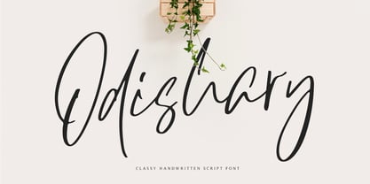 Odishary, classy handwritten font that designed for minimalist design projects. It's perfect for fashion project, logo, branding, quote, posters, movie or cinema. Odishary packed with uppercase, lowercase, numeral & punctuation, accents (Multilingual Support). This font will handle your minimalist design project with simplicity.
 - Ongunkan Atlantis Hollow by Runic World Tamgacı,
$40.00 Atlantis: The Lost Empire is a 2001 I made the alphabet prepared for Atlantis Lost Empire, the first feature-length animated movie of Walt Disney in 2000 years, in 2 versions in accordance with the original. It is suitable for today's use.
 - Summerhaven JNL by Jeff Levine,
$29.00Summerhaven JNL and Summerhaven Italic JNL were partially inspired by sign lettering spotted in an old black and white movie. These fonts are somewhat reminiscent of the Art Deco style, and their casual look can be applied to both formal and informal messages. - Bledso by Olivetype,
$18.00 Bledso is an authentic brush typeface. This all caps font is suitable for posters, magazines, apparels, movie headlines, packaging and more. So what's included : Basic Latin A-Z & a-z Numbers, symbols, and punctuations Ligatures and swashes Accented Characters : ÀÁÂÃÄÅÆÇÈÉÊËÌÍÎÏÑÒÓÔÕÖØŒŠÙÚÛÜŸÝŽàáâãäåæçèéêëìíîïñòóôõöøœšùúûüýÿžß Thank you
 - Caverson by Letterena Studios,
$10.00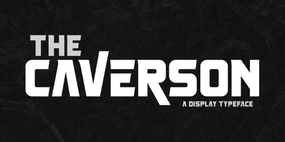 Proudly present Caverson Typeface, a modern and classy slab serif font with a unique style and fancy look. This typeface is perfect for an elegant & luxury logo, book or movie title design, fashion brand, magazine, clothes, lettering, quotes, and so much more. **Uppercase
 - Filmland JNL by Jeff Levine,
$29.00 A hand lettered, dual line sans serif type style was used for the title of “Filmland” – a 1931 movie fan magazine from India. This inspired both the digital typeface’s design and name. Filmland JNL is available in both regular and oblique versions.
