10,000 search results
(0.067 seconds)
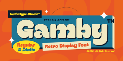
- Gamby by Nathatype,
$29.00Gamby is an attractive, vintage, playful display font for your customers. Its main character is the round, thick letters in thin outlines. Gamby provides two versions, regular and italic to use for bigger-sized texts to be legible. Features: Ligatures Multilingual Supports PUA Encoded Numerals and Punctuations Gamby fits for any design projects, such as posters, logos, book covers, headings, printed products, merchandise, social media, etc. Find out more ways to use this font by taking a look at the font preview. Feel free to contact us for further product information or trouble complaints. Thank you and happy designing. - Radix by TOMO Fonts,
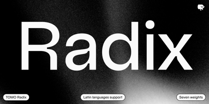
$20.00TOMO Radix gracefully merges the enduring charm of mid-century modernism with the captivating allure of pronounced inktraps. Inspired by the clean lines and geometric aesthetics of the Bauhaus movement, as well as the distinctive lowercase forms of Futura, this typeface embodies a harmonious fusion of classic and contemporary design. Featuring seven (7) weights, Radix showcases an extensive collection of spurless characters that delicately embrace and enhance the inktraps, resulting in a visually captivating and balanced composition. Complementing its versatility, the typeface offers alternate glyphs accessible through opentype stylistic sets, further expanding its expressive potential for any design project. - Brrrrr by Ingrimayne Type,
$14.95Brrrrr is supposed to represent snow-covered letters, though it could also be letters covered with frosting. The lower case letters are identical to the upper-case letters. Buried in the font is another set of letters on Christmas tree ornaments. (They are on unicode characters in the 2400 block, circled digits and letters. See here.) The OpenType Stylistic Sets feature makes accessing these letters easier than using unicode, and another font, InsideLetters-Christmas, develops them further. The Brrrrr-Icing style can be used in a layer over Brrrrr to give the snowcap any color, not just the background color. - Jitter by RagamKata,
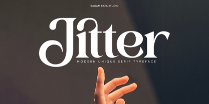
$16.00Jitter is a Beautiful modern serif typeface Unique alternate and ligature, multilingual support . This typeface is perfect for an Display typeface, elegant & luxury logo, Magazine, fashion brand , cosmetic brand, fashion promotion, modern advertising design, invitation card, art quote, home decoration , book/cover titles, special events, and much more. Jitter Features: · Uppercase & Lowercase · Alternates & Ligatures · Numerals & Punctuation · Accented characters · Multilingual Support · Unicode PUA Encoded While using this product, if you encounter any problem or spot something we may have missed, please don't hesitate to drop us a message. We'd love to hear your feedbacks in order to further fine-tune our products. - Praxis by Linotype,
$29.99Praxis™ was designed in 1976 by Gerard Unger for the German technology corporation Dr.-Ing Rudolf Hell. Praxis is the sans serif counterpart to Demos, another early digital type designed by Unger, who is an accomplished Dutch typographer and teacher. Praxis and Demos share important characteristics, such as open counters, a tall x-height, and blunt stroke terminations. Both faces have very little thick/thin variation, which facilitates smooth linear enlargement and reduction. And like Demos, Praxis is a flexible and legible typeface that works well in small point sizes and on low-quality paper (office documents, newsletters, newspapers, etc.). The word "Praxis" comes from Greek, and means "a practical application." In the late 1990s, Demos and Praxis, along with Univers 57, were selected as the official typefaces of the German Government. More info. In 1990, Linotype AG merged with Dr.-Ing Rudolf Hell GmbH, forming the Linotype-Hell AG (today Linotype GmbH). Since then, Linotype has been the official source of all fonts that were originally designed for the Hell Corporation. Linotype has also improved the typefaces using new technologies, including OpenType." - The "Handwriting-draft_free-version" font, designed and distributed by Fonts Cafe, is an artistic interpretation of casual handwriting that exudes a sense of personal touch and familiarity. This font...
- As of my last update in 2023, no official font directly named "Ren & Stimpy" exists as it would pertain specifically to the iconic American animated television series "The Ren & Stimpy Show" which ai...
- Adore by Canada Type,
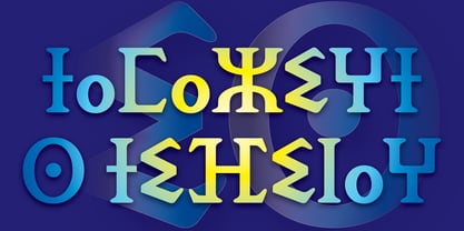
$24.95In 1939 the Stephenson Blake Company bought a very popular script called Undine Ronde and began marketing under the name Amanda Ronde. Although Undine/Amanda was quite popular and can be seen in many advertisements from the 1930s and 1940s, there seems to be no surviving record stating the original foundry or designer. We thought that six and half decades of dust layers over the once-popular typeface were enough, so here and now you have its complete and expanded digital incarnation, Adore. It is quite easy to see why this typeface was popular. A round script with graceful meaty curves is rarely found and can be used in plenty of applications. Wedding paraphernalia, chapter titles, posters, poetry, book covers, religious literature... you name it, Adore can fit it. Aside from its totality being unmatched by currently available designs, Adore also possesses some of the most unique and imaginative letter shapes. The narrow loops on the B, P and R, the minuscule-like Z, the looped b and d, the descending h... all these shapes contribute to a breathtaking and adorable calligraphic work unlike any other. The original design came in a basic alphabet, but we have updated it for current digital technologies, and expanded it to include plenty of alternates and ligatures, as well as some ornaments. The Postscript Type 1 and True Type versions come in two fonts, the second containing the alternates and extras, while the Open Type version is a single font containing all the alternates and extras in conveniently programmed features, easily accessible at the push of a button in OpenType-supporting software. We also encourage you to take a look at Typodermic's Mecheria font, which is further experimentation with the same letter forms, resulting in a quirky, friendly, curly, angular gothic-like creature. - Tifinagh One by GrafikarFonts,
$42.00 - SCR-N by URW Type Foundry,
$39.99SCR fonts are screen optimized (also called 'pixel fonts'). Unlike standard fonts (and like the few well-hinted fonts like Verdana or Arial), they give a crisp look on screen at very small sizes, thus increasing legibility. The perfect applications for those fonts are web pages and software user interfaces (computer, cellular phones, console games and any other system that uses a screen interface). Unlike most pixel fonts, SCR fonts contain kerning information. Kerning is the adjustment of space between certain pairs of characters (like 'AV') to make text look more fluid, thus increasing legibility and appeal. To benefit from this feature, auto-kerning must be activated in the application. In Photoshop, kerning must be set to 'Metrics'. Although SCR fonts are optimized for screen, they can be used for print (in Illustrator or Indesign for example) for a decorative 'computer text' effect. In this case, there is no constraint: they can be used as any other font. For screen use (in Photoshop, Fireworks, Flash... ), they have to keep aligned with the screen pixel grid not to look blurred or distorted. To achieve this, here are the guidelines to follow: RESOLUTION If the application permits it (Photoshop, Fireworks), document resolution must be set to 72 pixels per inch. SIZE The font size must be set to 10 (or multiples of 10) points. POSITIONING & ALIGNMENT The reference points of text fields and text blocks (upper left corner for left aligned text, upper right for right aligned text) must be positioned at integer values of pixels. In Photoshop, text can be precisely moved with [Edit Free Transform]. In Flash, movie clips containing text fields must also be positioned at integer values on the stage. Text must be aligned to the left or right only. Center alignment can be simulated with left alignment by adding spaces at the begin of each line. To dispense with the positioning and alignment constraints, text anti-aliasing can be turned off if the application permits it (Photoshop, Flash MX 2004). OTHER SETTINGS Leading (line spacing), tracking (letter spacing), manual kerning and baseline shift must be set either to integer values of points or to multiples of 100 units (depending on the application). Vertical and horizontal scaling must be set to 100%. Faux bold or Faux italic must not be used. The document must neither be resized on export, nor allow resizing (Flash Movies). - SCR-I by URW Type Foundry,
$39.99SCR fonts are screen optimized (also called 'pixel fonts'). Unlike standard fonts (and like the few well-hinted fonts like Verdana or Arial), they give a crisp look on screen at very small sizes, thus increasing legibility. The perfect applications for those fonts are web pages and software user interfaces (computer, cellular phones, console games and any other system that uses a screen interface). Unlike most pixel fonts, SCR fonts contain kerning information. Kerning is the adjustment of space between certain pairs of characters (like 'AV') to make text look more fluid, thus increasing legibility and appeal. To benefit from this feature, auto-kerning must be activated in the application. In Photoshop, kerning must be set to 'Metrics'. Although SCR fonts are optimized for screen, they can be used for print (in Illustrator or Indesign for example) for a decorative 'computer text' effect. In this case, there is no constraint: they can be used as any other font. For screen use (in Photoshop, Fireworks, Flash... ), they have to keep aligned with the screen pixel grid not to look blurred or distorted. To achieve this, here are the guidelines to follow: RESOLUTION If the application permits it (Photoshop, Fireworks), document resolution must be set to 72 pixels per inch. SIZE The font size must be set to 10 (or multiples of 10) points. POSITIONING & ALIGNMENT The reference points of text fields and text blocks (upper left corner for left aligned text, upper right for right aligned text) must be positioned at integer values of pixels. In Photoshop, text can be precisely moved with [Edit Free Transform]. In Flash, movie clips containing text fields must also be positioned at integer values on the stage. Text must be aligned to the left or right only. Center alignment can be simulated with left alignment by adding spaces at the begin of each line. To dispense with the positioning and alignment constraints, text anti-aliasing can be turned off if the application permits it (Photoshop, Flash MX 2004). OTHER SETTINGS Leading (line spacing), tracking (letter spacing), manual kerning and baseline shift must be set either to integer values of points or to multiples of 100 units (depending on the application). Vertical and horizontal scaling must be set to 100%. Faux bold or Faux italic must not be used. The document must neither be resized on export, nor allow resizing (Flash Movies). - Katarine by Suitcase Type Foundry,
$75.00From today's point of view Katarine has a rather unusual origin. Initially an all-caps display face, what was to become the Medium weight of the family was augmented with a lower case, then the character set was completed by adding all the missing glyphs. The next step was the creation of the Light and the Bold weights with matching Italics. This working method compromised the relationships between the characters across the different weights After some consideration the decision was made to start over and draw the complete family from scratch. This time the "conventional" process was followed — first the Light and Bold weights were designed. Those extremes were used to interpolate the Regular, Medium and Semibold weights. When compared to the original, the glyphs of the new fonts are slightly wider. The construction of the letters is sturdy, with an x-height that varies from the heaviest to the lightest weights. The relationship of the stem weight between the horizontal and vertical strokes is carefully balanced. Characters are open and firm; the italics have room to breathe. The original fonts included two sets of small caps — Small Caps and Petite Caps. However neither set were suited for emphasis, with the Small Caps being too tall and the Petite Caps too short. We decided to replace them both with one set of traditional small caps, slightly taller than the x-height, perfectly suited for emphasis in text usage. The original version of Katarine was partly incorporated into the new OpenType versions. Thus most of the original arrows, frames and boxes can be found in the new Katarine. Each individual weight now contains 830 glyphs, nine sets of numerals, small caps, numerous ligatures and fractions. An additional font named Numbers contains numerals in circles and squares, and is now augmented with accented caps and a number of terminal alternatives, which can easily be accessed through stylistic sets. We also added two extra variants, Experts Regular and Experts Black (in inverted form). Katarine Std preserves the solid construction and excellent legibility of the original family, but has now become a fully featured OpenType typeface. Katarine is suited for a broad range of applications, from simple layouts to intricate corporate systems. It is the typeface of choice where the cold, austere character of modern sans serifs are inappropriate, yet simple shapes and good legibility are required. - Bad Black Cat - Unknown license
- Screwy Melted Wax - Unknown license
- Bitstream Vera Sans is like a welcoming friend in the world of typography, offering a clean, clear, and versatile appearance that feels at home in a multitude of designs. Imagined and created by the ...
- Prognostic - Personal use only
- Wet Pet, designed by the prolific Canadian typographer Ray Larabie, is a whimsical and expressive font that bursts with creative energy. Known for his wide range of typefaces, Larabie has a knack for...
- DT Paper Type by Dragon Tongue Foundry,
$9.00DT PaperType has evolved and morphed over time from quite distant origins. I previously created DT Paperside. It was neither Papyrus nor SSI Countryside, but was inspired in some ways by the Papyrus form, although untextured and smoother, and had the more open dimensions and proportions, similar to that of Countryside SSi, with its larger easily readable lowercase body, and more consistent, shorter stems. DT Paperside had an open scripted feel which was pleasing to the eye and easy to read. DT PaperType has since been crafted from of the original Paperside font. The Organic flow and comfortable form of Paperside has been retained, but it has been shifted very much from the feel of a script font, into a quality, extremely readable, organic and friendly, serif font, retaining its clarity, while adding a great deal of pose and class. This font is primarily suited to body text, and as such is extremely readable. It does however also make an excellent Display font, and comes with a full set of over sized Caps that drop below the line to stand out on a headline when required. Paperside can also automatically enhance the first letter of most sentences, and changes other letters to suit their position within words, and the letters they appear beside. Now comes with an italic that curves and softens various letters. For best results, use this ‘smart font’ with Contextual Ligatures turned on. Mulitiple Stylistic Alternatives are included. Inspiration for this fonts predecessor (Paperside) came from two other fonts. Papyrus: designed by Chris Costello and created in 1982, it is a hand-drawn textured typeface, emulating texts written in biblical times. One of the most used (and misused) fonts of all times. Owned by Letraset, and currently published by the Internation Typeface Corporating (ITC). Countryside SSi: The serif font of an unknown designer, currently licensed by Southern Software Inc. Feel free to preview some other Dragon Tongue fonts that are yet to be released, at https://www.dragon-tongue.com/fonts - The Olivia & Kevin font by Bekeen.co is a captivating and versatile script font that beautifully bridges the gap between classic elegance and contemporary flair. This font is meticulously crafted, em...
- LT Soul - 100% free
- Temporarium - 100% free
- Averia Serif - 100% free
- LT Hoop - 100% free
- Old Standard TT - 100% free
- Pecita - 100% free
- News Cycle - 100% free
- nineveh - 100% free
- Justus - Unknown license
- Averia Sans - Unknown license
- Averia - 100% free
- Aurulent Sans - Unknown license
- Rambat Campotype - Personal use only
- Aurulent Sans Mono - Unknown license
- LT Makeup - 100% free
- LT Beverage - 100% free
- LT Superior - 100% free
- LT Superior Serif - 100% free
- LT Sonoma - 100% free
- LT Stopwatch - 100% free
- LT Wave - 100% free


