10,000 search results
(0.027 seconds)
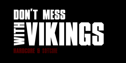
- XXII DONT MESS WITH VIKINGS by Doubletwo Studios,
$- - KG Primary Penmanship 2 - Personal use only
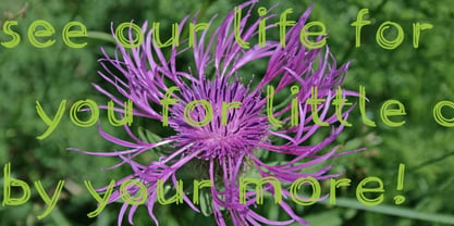
- Four More Years - Unknown license
- LudwigHohlwein - 100% free
- SpideRaY - Personal use only
- Sangkuriang - Unknown license
- Evil Doings by Comicraft,
$19.00In isolated Eastern European states, atop cold castle towers, nefarious nonbelievers are discussing their diabolical devises with their minions, acolytes and sweet little Yorkshire terriers! Evil Doings is a font that gives form to the softly spoken schemes and terrifying tweets of these psychopaths, sociopaths and just plain naughty boys and girls. Will Good Triumph and Defeat the EvilDoings of EvilDoers?! Only if we listen to the cries of the oppressed proletariat and quash the devilish dreams and evil schemes of Fascist Dictators EVERYWHERE! Features: Four fonts (Regular, Italic, Bold & Bold Italic) with upper and lowercase characters. Includes Western European international characters. - ArabDances - Unknown license
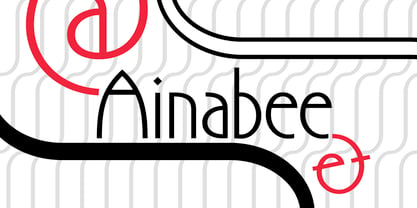
- P22 Ainabee by IHOF,
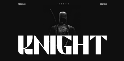
$24.95Ainabee is an Art Deco inspired type design. The designer states: "The Art deco period has always fascinated me. The Architecture, The Furniture, The Car Industry, Letters etc, much of what I associate with 20s and 30s. This design is my answer to this fascination. The name is a tribute to my girlfriend Aina." The design is simple and precise in its form and is intended mainly for decorative use. - Knight by Jafar07,
$10.00 - Sophi Sophi by Daylight Fonts,
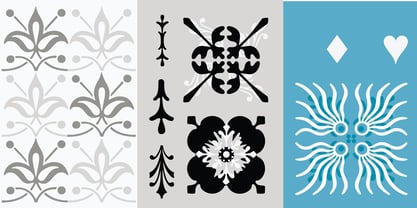
$50.00 - LTC Ornaments Two by Lanston Type Co.,
$29.95 - Johnend by Georg John,
$30.00 - Oh Mabuboo by Aomam,
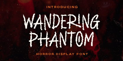
$11.00 - Wandering Phantom by Letterhend,
$15.00Introducing Wandering Phantom, a font that beckons you into terror and fascination collide. Whether you're evoking horror aesthetics or weaving a web of scary sophistication, Nightmare Glyph's versatility knows no bounds. Features : Uppercase & lowercase Numbers and punctuation Alternates/Ligatures Multilingual PUA encoded - After Dark BB by Blambot,
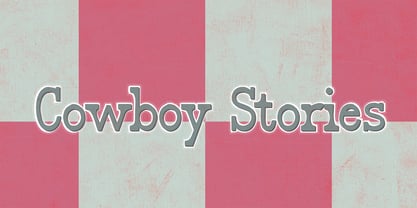
$20.00All good things happen After Dark! This handwritten font has delicate, long lowercase characters and huge, care-free caps. Both dangerous and feminine, perfect for signing your signature, After Dark has a large assortment of European characters to assist in your late-night adventures. - Cowboy Stories by Open Window,
$19.95 - Alnis by Daily Studio,
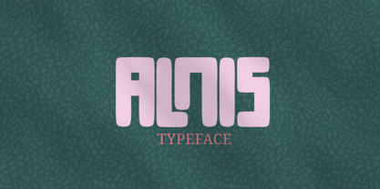
$16.00Alnis is a bold type font with a round but straight shape. This font creates a formal yet relaxed vibe for any of your projects. Best font for designers. Alnis is excellent for logos, posters, cards, ext. Make your project look fascinating by combining it with another font. This font comes up with full uppercase, lowercase, and multilingual letters. - TT Prosto Sans by TypeType,
$29.00Prosto Sans - this font family for any occasion. You can use these fonts almost everywhere. The modern open grotesque forms and classic font family formula: Thin, Light, Regular, Bold, Black and Italics. Prosto Sans is the assistant to work for any projects. Optimized for the websites, mobile applications, and printing materials. We offer you to have a look at this font’s narrow version, which is called TT Prosto Sans Condensed. - Horier Time by Letterhend,
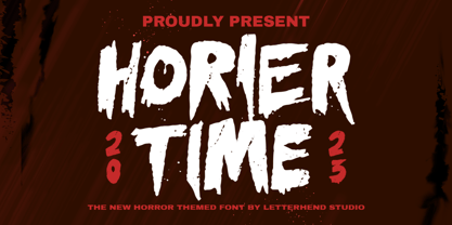
$17.00Unveil the depths of terror and embrace the macabre with our latest font creation,Horier Time - – a bloody mesmerizing horror display font. Prepare to embark on a spine-tingling journey into the darkest realms of design, where fear and fascination intertwine. Features : Uppercase & lowercase Numbers and punctuation Alternates/Ligatures Multilingual PUA encoded - Abecedarian by The Type Fetish,
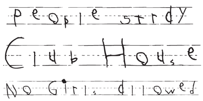
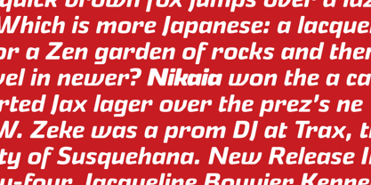
$10.00Chank claims to have the fastest type design, we think we have the youngest. Samuel was merely four years old when he wrote out his first face. We are expecting many more brilliant typefaces from this upcoming designer. Please note that this font has no numbers or punctuation symbols; Samuel just did letters at that time. - Nikaia by Miller Type Foundry,
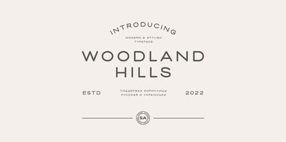
$- - SA Woodland Hills by Artcoast,
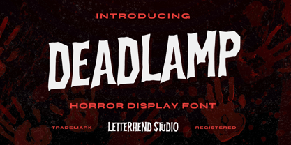
$14.00Introducing SA Woodland Hills - a clean, elegant, modern typeface that you can use in packaging or branding, creating beautiful logos, headlines, quotes and any other printed matter. The font supports Russian and Ukrainian Cyrillic, as well as extended Latin. We hope that the font will become your excellent assistant in the design of products. - Deadlamp by Letterhend,
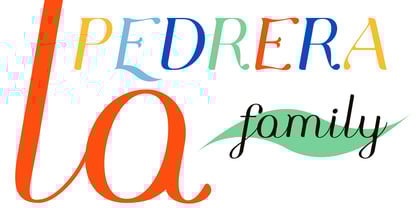
$18.00Unveil the depths of terror and embrace the macabre with our latest font creation, Deadlamp – a hauntingly mesmerizing horror display font that beckons to the shadows. Prepare to embark on a spine-tingling journey into the darkest realms of design, where fear and fascination intertwine. Features : Uppercase & lowercase Numbers and punctuation Alternates & Ligatures Multilingual PUA encoded - Pedrera by Etewut,
$20.00Introducing a vintage typeface Pedrera It is simple pleasure for your eyes. But in the same time, fonts from the family could be used for card signing or product design, they have characters with tiny details that fascinate your attention. Each font is PUA encoded and has foreign symbols. Pedrera family has 6 fonts: - Regular - Bold - Italic - Italic Bold - Script - Script Bold - Giotto Handwriting - Personal use only
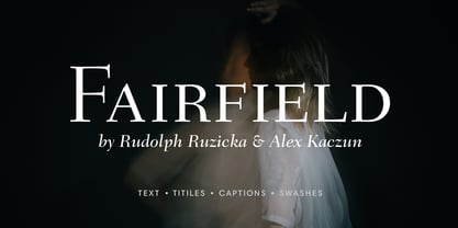
- Fairfield by Linotype,
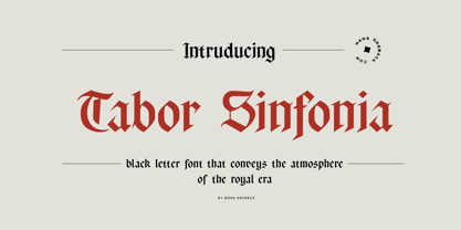
$41.99Rudolph Ruzicka designed his font Fairfield as a legible text font. His philosophy: The reader expects optical assistance with reading. He does not want to be distracted while interpreting and understanding the ideas of a text." Fairfield font is based on the forms of Venecian Old Face fonts as well as on the designs and details of Art Deco, giving the font a distinctive appearance" - Tabor Sinfonia by Mans Greback,
$59.00Tabor Sinfonia is a blackletter typeface that marries the historic beauty of Gothic script with the rhythm and harmony of music. This decorative font is perfect for logotypes, artistic projects, and designs that require a touch of vintage elegance. The inspiration for Tabor Sinfonia came from a fascinating combination of medieval manuscripts and musical compositions. - Enchanter by Cloveron Media,
$49.00Cloveron Media unveils its first serif font that goes beyond the formal nature of typography. It celebrates the artistic expressions of graphic designers within themselves. The Name Mary Anne Remulla is the Master Designer behind the Enchanter Font. She aims to make graphic designers filled with delight and enjoy typography with its extensively artistic alternates and multilingual characters. The Font Style The serif style, known for its formal touch to typographic design, infuses the font with its professionalism as its regular. Using its middle alternate adds a hint of unique touch without losing the serif style's essence. The Enchanter font's start and end alternates are the designer's illustrations of design balance, which elevates its charm and enticing nature that adds to its overall artistic power. "I am fascinated by art and so by design. A font with alternates was my great revelation that I can do typography artistically, enthusiastically, and with freedom. I later found myself fascinated and lost in paper space, which then ended up that I completed my first font creation with extensive alternates for each letter." - Mary Anne Remulla - FranklinGothicHandLight by Wiescher Design,
$39.50FranklinGothicHandLight is part of a series of hand-drawn fonts from way back in time – before computers changed the way we worked. When I was in advertising – before computers – a very time consuming part of my daily work was sketching headlines. I used to be able to sketch headlines in Franklin Gothic, Times, Futura, Helvetica and several scripts. We had a kind of huge inverted camera – which we called Lucy. We projected the alphabet onto a sheet of transparent paper, outlined the letters with a fineliner and then filled them in. It was very tedious work, but the resulting headline had its own charm and we had a permanent race going on who was best and fastest. I won most of the time! They used to call me the fastest "Magic Marker" this side of the Atlantic. Great days, just like today! Your sentimental type designer from the past Gert Wiescher - FranklinGothicHandDemi by Wiescher Design,
$39.50FranklinGothicHandDemi is part of a series of hand-drawn fonts from way back in time – before computers changed the way we worked. When I was in advertising – before computers – a very time consuming part of my daily work was sketching headlines. I used to be able to sketch headlines in Franklin Gothic, Times, Futura, Helvetica and several scripts. We had a kind of huge inverted camera – which we called Lucy. We projected the alphabet onto a sheet of transparent paper, outlined the letters with a fineliner and then filled them in. It was very tedious work, but the resulting headline had its own charm and we had a permanent race going on who was best and fastest. I won most of the time! They used to call me the fastest "Magic Marker" this side of the Atlantic. Great days, just like today! Your sentimental type designer from the past Gert Wiescher - Zhikharev by ParaType,
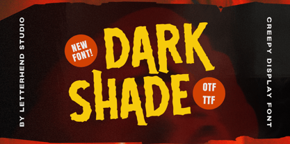
$30.00Designed at Polygraphmash in 1953 by Igor Zhikharev, based on his handwriting. The digital version was developed in 1989 by Gennady Baryshnikov, with the assistance of Vladimir Yefimov. An informal monoline script. For use in both text and display matter. - Dark Shade by Letterhend,
$16.00Meet Dark Shade, the font that dares you to venture into the shadows where creepy and fascination intertwine. This font an aura of spine-tingling dread, perfect for instilling suspense but playful too in your designs. Whether you're channeling classic horror or crafting a display masterpiece, Nights Side versatility is your creative companion. Features : Uppercase & lowercase Numbers and punctuation Alternates & Ligatures Multilingual PUA encoded - Grigory by Hanoded,
$15.00I have always been fascinated by Grigory Rasputin, the rogue ‘monk’ who influenced the Russian Tsar Nicholas and - according to rumours - bedded the Tsarina. Grigory font was handmade with the use of a Chinese marker pen and rough paper. Grigory comes with all the trimmings; some alternate glyphs, a few double letter ligatures, a great amount of diacritics and basic Cyrillic as well. - FranklinGothicHandCond by Wiescher Design,
$39.50FranklinGothicHandCond is another part of a series of hand-drawn fonts from way back in time – before computers changed the way we worked in advertising. When I was in advertising – before computers – a very time consuming part of my daily work was sketching headlines. I used to be able to sketch headlines in Franklin Gothic, Times, Futura, Helvetica and several scripts. We had a kind of huge inverted camera – which we called Lucy. We projected the alphabet onto a sheet of transparent paper, outlined the letters with a fineliner and then filled them in. It was very tedious work, but the resulting headline had its own charm and we had a permanent race going on who was best and fastest. I won most of the time! They used to call me the fastest "Magic Marker" this side of the Atlantic. Great days, just like today! Your sentimental type designer from the past, Gert Wiescher. - FranklinGothicHandBold by Wiescher Design,
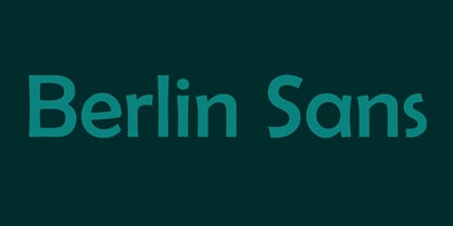
$39.50FranklinGothicHandBold is another part of a series of hand-drawn fonts from way back in time – before computers changed the way we worked in advertising. When I was in advertising – before computers – a very time consuming part of my daily work was sketching headlines. I used to be able to sketch headlines in Franklin Gothic, Times, Futura, Helvetica and several scripts. We had a kind of huge inverted camera – which we called Lucy. We projected the alphabet onto a sheet of transparent paper, outlined the letters with a fineliner and then filled them in. It was very tedious work, but the resulting headline had its own charm and we had a permanent race going on who was best and fastest. I won most of the time! They used to call me the fastest "Magic Marker" this side of the Atlantic. Great days, just like today! Your sentimental type designer from the past Gert Wiescher - Berlin Sans by Font Bureau,
$40.00Berlin Sans is based on a brilliant alphabet from the late ’20s, originally released by Bauer with the name Negro, the very first sans that Lucian Bernhard ever designed. Assisted by Matthew Butterick, David Berlow expanded this single font into a series of four weights, all complete with expert character sets, plus a dingbat font. Imaginative & little-known, it promises enticing opportunities to the adventurous typographer; FB 1994 - Woodrow by Chank,
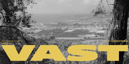
$49.00If Mister Frisky is a bit too kooky for your project, try Woodrow. The big floppy serifs and hand-drawn strokes give this font very "Chanky" characteristics. Woodrow is bold, bouncy, fun and legible like Mister Frisky, but it is also a little more traditional and structured. Chank created Woodrow in 1997. It was named in honor of The Chank Company's first office assistant, Scott "Woodrow" Macdonald. - Vast by ParaType,
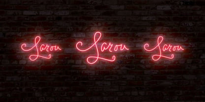
$30.00Vast is a variable sans serif with a range of styles from thin to black and from normal to extra wide. This versatile font family of both of a serious and friendly nature can be used for various purposes, such as text, logos, headings, and branding. Vast was designed by Manvel Shmavonyan with the assistance of Alexander Lubovenko and released by Paratype in 2021. - Larou by Emily Lime,
$29.00
