2,128 search results
(0.011 seconds)
- H74 Dead Empire by Hydro74,
$7.99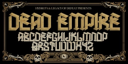
- Ongunkan Byzantine Empires by Runic World Tamgacı,
$100.00 For this Byzantine Empire calligraphy font, I had to work for 2 weeks and 3-4 hours a day and search the internet. It made me very tired, but I finally finished it, and it was good. This font can use both latin keyboard and greek keyboard. I also added Greek unicode characters. I will adapt this font to the latin alphabet, I will make the full character set font, this will take less time. I wish you good work.
 - Empire State Gothic by Comicraft,
$19.00 Empire State Gothic is, from basement to spire, an exultant, soaring skyscraper of a font, distinguished by its high arches, steel-framed construction and the glory and pride of Comicraft's fine woodwork and stonework! You might find it surprising, then, that this tall, lanky font was something of a loner during its teenage years, mingling with others of its kind in the shadowy corners of coffeehouses, nurturing feelings of belittlement while craving attention it may not have rightly deserved.
 - Empire State Deco by Comicraft,
$19.00 Every face tells a story but this font is 77 stories high (1,046 feet with antenna included)! A lofty companion to Empire State Gothic , Empire State Deco is a tall, stately font containing four different styles, sometimes contradictory, united by the desire to be modern. Those familiar with the Exposition Internationale des Arts Décoratifs et Industriels Modernes will notice a post-postmodernism combined with the fine craftsmanship and rich materials for which those awfully nice chaps at Comicraft are known. During its Art Deco heyday, Comicraft represented luxury, glamour, exuberance, and faith in social and technological progress -- this new font recaptures those halcyon days in letter form.
 - I hate Comic Sans - Unknown license

- Late Breaking News JNL by Jeff Levine,
$29.00 Re-drawn from a screen capture of a vintage newspaper front page, Late Breaking News JNL is a traditional sans serif that's perfect for headlines, titling and other forms of announcements.
 - Miss Le Gatees Pro by Sudtipos,
$45.00 The Charles Bluemlein Script Collection is an intriguing reminder of the heady days of hand lettering and calligraphy in the United States. From the early 1930s through World War II, there were about 200 professional hand letterers working in New York City alone. This occupation saw its demise with the advent of photo lettering, and after digital typography, became virtually extinct. The odd way in which the Bluemlein scripts were assembled and created - by collecting different signatures and then building complete alphabets from them - is a fascinating calligraphic adventure. Because the set of constructed designs looked nothing like the original signatures, fictitious names were assigned to the new script typefaces. The typeface styles were then showcased in Higgins Ink catalogs. Alejandro Paul and Sudtipos bring the Bluemlein scripts back to life in a set of expanded digital versions, reflecting the demands of today’s designer. Extreme care has been taken to render the original scripts authentically, keeping the fictitious names originally assigned to them by Bluemlein.
 - Kate Slab Pro Expanded by Monday Type,
$19.00 Kate Slab Pro Expanded is a sophisticated and robust modern Slab Serif Typeface that works in a variety of design scenarios. It is designed to work in big attention grabbing headlines as well as in smaller text and even body text. The recognition value of Kate Slab Pro Expanded is its biggest asset in world of uniformity. Ranging from “100 Thin” all the way to “900 Black” makes Kate Slab Pro Expanded such an amazing and versatile font family that stands out. Kate Slab Pro Expanded doesn’t only work great in lifestyle and fashion related contexts but will also look amazing for restaurants, coffee shops or and other use cases that ask for character and identity. To fill all the gaps of a designer’s needs, Kate Slab Pro Expanded comes with an italic style with every weight. Those italics are equipped with unique and real italic characters and will make you love it. Being a Slab Serif Kate Slab Pro Expanded manages to remind you of a classic Font Family with a modern and timeless approach that will make you happy for decades. Monday Type can’t wait to see the beautiful designs you are going to create with our Kate Slab Pro Expanded.
 - FF Golden Gate Gothic by FontFont,
$41.99 American type designer Jim Parkinson created this display and sans FontFont in 1996. The font is ideally suited for advertising and packaging, festive occasions, film and tv as well as poster and billboards. FF Golden Gate Gothic provides advanced typographical support with features such as ligatures and stylistic alternates. It comes with proportional lining figures.
 - Data Error AOE Pro by Astigmatic,
$24.00 The Data Error AOE Family was one of my earliest typefaces, at a time when I had become obsessed with all forms of "digital/techology" typestyles. It's been awhile since the early 2000's, but I've had a hankering for awhile now to revisit this typeface, giving it a more expansive language character set and fill it out with some Opentype features. Inspired by some old printouts of BASIC programs and an Atari 1050 Disk Drive manual with pin printer examples, comes the familiar yet oddly restricted style with this Data Error family. This family comes complete with Regular and Bold versions with their respective Oblique versions. Odd pin printer restrictions inherent in this typeface are: no characters extend below baseline or above ascender line, (except international accents). A nostalgic typeface for computer programmers everywhere, strong and legible at any size, Data Error is perfect for so many purposes, get it today!
 - BMF Love&Hate Pi by BuyMyFonts,
$25.00BMF Love & Hate Pi is part of the BMF Symbols Collection, a gorgeous, versatile and highly original family of symbols (drawings, icons, pictograms). Love & Hate Pi covers most of the emotions encountered in everyday family and office life. When you buy BMF Love & Hate Pi (which, of course, you’re highly recommended to do today) you will have access to all of these emotions, and the powerful expression thereof, on you very own computer keyboard! - KG Empire of Dirt - Personal use only

- dmf studio klinik expris - Unknown license

- KG Empire Of Dirt by Kimberly Geswein,
$5.00 Neat feminine handwriting drawn with a marker.
 - Kate Slab Pro Ultra Expanded by Monday Type,
$19.00 Kate Slab Pro Ultra Expanded is a sophisticated and robust modern Slab Serif Typeface that works in a variety of design scenarios. It is designed to work in big attention grabbing headlines as well as in smaller text and even body text. The recognition value of Kate Slab Pro Ultra Expanded is its biggest asset in world of uniformity. Ranging from “100 Thin” all the way to “900 Black” makes Kate Slab Pro Ultra Expanded such an amazing and versatile font family that stands out. Kate Slab Pro Ultra Expanded doesn’t only work great in lifestyle and fashion related contexts but will also look amazing for restaurants, coffee shops or and other use cases that ask for character and identity. To fill all the gaps of a designer’s needs, Kate Slab Pro Ultra Expanded comes with an italic style with every weight. Those italics are equipped with unique and real italic characters and will make you love it. Being a Slab Serif Kate Slab Pro Ultra Expanded manages to remind you of a classic Font Family with a modern and timeless approach that will make you happy for decades. Monday Type can’t wait to see the beautiful designs you are going to create with our Kate Slab Pro Ultra Expanded.
 - Data Error Vert AOE Pro by Astigmatic,
$24.00 The Data Error Vert AOE Pro family is another spinoff of my Data Error AOE Pro family. Quite simply, it takes on a slightly different feel than the original pin matrix grid by stroking across all vertical glyph lines. The vertical lines break up the readability somewhat of the original grid and lend a more tech vibe to the family. Check out the range of posters created to see the various Capitals, Lowercase, smallcaps and varying styles that the family has to offer and how it both differs from and compliments the original Data Error AOE Pro family.
 - Data Error Horiz AOE Pro by Astigmatic,
$24.00 The Data Error Horiz AOE Pro family is a spinoff of my Data Error AOE Pro family. Quite simply, it takes on a slightly different feel than the original pin matrix grid by stroking across all horizontal glyph lines. The horizontal lines add more readability to the original grid and lend a more sci-fi vibe to the family. Check out the range of posters created to see the various Capitals, Lowercase, smallcaps and varying styles that the family has to offer and how it both differs from and compliments the original Data Error AOE Pro family. Be sure to note that the "family" price is the same as the "individual" price, so buy the family for the price of a single font!
 - Code 128 - 100% free

- Izhitsa by ParaType,
$25.00 Designed at Polygraphmash Type Design Bureau in 1988 by Svetlana Yermolaeva. Based on Kirillitsa (1982), inspired by typographic poluustav of the Printing Office of the Russian Empire Academy of Science (late 19th century). Shadow style was added by Alexander Tarbeev in 1994. Latin alphabet was added by Oleg Karpinsky in 2009.
 - Ongunkan Proto Canaanite by Runic World Tamgacı,
$75.00 Proto-Sinaitic (also referred to as Proto-Canaanite when found in Canaan, or Early Alphabetic) is found in a small corpus of c. 40 inscriptions and fragments, the vast majority from Serabit el-Khadim in the Sinai Peninsula, dating to the Middle Bronze Age. They are considered the earliest trace of alphabetic writing and the common ancestor of both the Ancient South Arabian script and the Phoenician alphabet, which led to many modern alphabets including the Greek alphabet. According to common theory, Canaanites or Hyksos who spoke a Canaanite language repurposed Egyptian hieroglyphs to construct a different script. The earliest Proto-Sinaitic inscriptions are mostly dated to between the mid-19th (early date) and the mid-16th (late date) century BC.
 - Porn Star Academy - Unknown license

- Ongunkan Khazar Rovas A by Runic World Tamgacı,
$50.00 Khazar, member of a confederation of Turkic-speaking tribes that in the late 6th century CE established a major commercial empire covering the southeastern section of modern European Russia. Although the origin of the term Khazar and the early history of the Khazar people are obscure, it is fairly certain that the Khazars were originally located in the northern Caucasus region and were part of the western Turkic empire (in Turkistan). The Khazars were in contact with the Persians in the mid-6th century CE, and they aided the Byzantine emperor Heraclius (reigned 610–641) in his campaign against the Persians. Although the Khazar Empire had a secular administrative structure, the administrative staff chose the Jewish religion. The Khazars are the only Turkish state that converted to Judaism.
 - Jason Uncial by URW Type Foundry,
$49.99 Jason Uncial, a unicase font, was created by Dutch designer Coen Hofmann. Uncial hand writing began to spread in Europe at the time of the late Roman Empire (200 A.D.). It influenced both the Carolingian Minuscule as well as our present lower case letter forms. Uncial fonts are still very much in use. It is used for headlines, display, titles, certificates, and not surprisingly, very much in Ireland or for anything with a Gaelic/Irish or Celtic touch.
 - Island Time JNL by Jeff Levine,
$29.00 Island Time JNL is based on the hand-lettered title from a piece of 1940s sheet music called "An Island Melody". This Art Deco typeface is perfect for projects where a clean, yet attractive headline font is needed. The font's name is based on the euphamism popular amongst Caribbean Islanders that when someone is excessively late for an appointment, date or event they are running on "island time".
 - ITC Highlander by ITC,
$29.99ITC Highlander font is the work of Dave Farey and loosely based on the handwriting of the late American graphic artist and lettering master Oswald Cooper. ITC Highlander is a unique font family, but not so unusual that it is limited only to display applications. - Ongunkan Atlantis Hollow by Runic World Tamgacı,
$40.00 Atlantis: The Lost Empire is a 2001 I made the alphabet prepared for Atlantis Lost Empire, the first feature-length animated movie of Walt Disney in 2000 years, in 2 versions in accordance with the original. It is suitable for today's use.
 - Ongunkan Lycian by Runic World Tamgacı,
$50.00 Lycia (Lycian: 𐊗𐊕𐊐𐊎𐊆𐊖 Trm̃mis; Greek: Λυκία, Lykia; Turkish: Likya) was a geopolitical region in Anatolia in what are now the provinces of Antalya and Muğla on the southern coast of Turkey, bordering the Mediterranean Sea, and Burdur Province inland. Known to history since the records of ancient Egypt and the Hittite Empire in the Late Bronze Age, it was populated by speakers of the Luwian language group. Written records began to be inscribed in stone in the Lycian language (a later form of Luwian) after Lycia's involuntary incorporation into the Achaemenid Empire in the Iron Age. At that time (546 BC) the Luwian speakers were decimated, and Lycia received an influx of Persian speakers. Ancient sources seem to indicate that an older name of the region was Alope (Ancient Greek: Ἀλόπη, Alópē). Lycia fought for the Persians in the Persian Wars, but on the defeat of the Achaemenid Empire by the Greeks, it became intermittently a free agent. After a brief membership in the Athenian Empire, it seceded and became independent (its treaty with Athens had omitted the usual non-secession clause), was under the Persians again, revolted again, was conquered by Mausolus of Caria, returned to the Persians, and finally fell under Macedonian hegemony upon the defeat of the Persians by Alexander the Great. Due to the influx of Greek speakers and the sparsity of the remaining Lycian speakers, Lycia was rapidly Hellenized under the Macedonians, and the Lycian language disappeared from inscriptions and coinage.
 - Diocletian by Type Fleet,
$12.00 Diocletian fortiter in re, suaviter in modo Diocletian typeface captures the essence and glory of the Diocletian’s palace, one of the most imposing heritages of the late Roman empire. It is designed to bring the confidence and fortune to contemporary communication in a heroic and gentle manner. Diocletian typeface is based on the Uncial script, made up of wide, rounded letters. It is desirable for cafes, restaurants, shops, hotels and apartments. The typeface’s x-height is around 76% of its capitals. The font is enriched with ligatures and special characters.
 - Bloodsuckers - Unknown license

- Ongunkan Phrygian by Runic World Tamgacı,
$50.00 Phrygia is the Greek name of an ancient state in western-central Anatolia (modern Turkey), extending from the Eskişehir area east to (perhaps) Boğazköy and Alishar Hüyük within the Halys River bend. The Assyrians, a powerful state in northern Mesopotamia to the south, called the state Mushki; what its own people called it is unknown. We know from their inscriptions that the Phrygians spoke an Indo-European language. Judging from historical records supported by ceramic evidence, settlers migrating from the Balkans in Europe first settled here a hundred or more years following the destruction of the Hittite empire (ca. 1200 B.C.). Most of what is known about Phrygian archaeology and its language derives from excavations at the capital city Gordion, located about 60 miles southwest of the modern Turkish capital of Ankara (also a Phrygian site). Gustav and Alfred Körte first excavated Gordion in 1900. The excavators did not reach Phrygian levels, but they did reveal burials dated to the late eighth century B.C. with Phrygian ceramic, metal, and wooden artifacts. From 1950 to 1973, Rodney S. Young of the University of Pennsylvania led excavations at Gordion. Archaeological work at the site resumed in 1988 and continues to the present.
 - Fantique Four - Unknown license

- Spawned - Unknown license

- Sauber Script by Typejockeys,
$25.00 After its period of exclusivity expired, the corporate typeface of the Saubermacher recycling company was revised and expanded. Now it is available for everyone! Whether on fresh buttermilk, a Honolulu surfer bar, or a hotel on the Arlberg, this preppy script face is versatile and full of character.
 - IronCladBoltedRaised - Unknown license

- Calendar Blocks JNL by Jeff Levine,
$29.00Calendar Blocks JNL was inspired by old-fashioned wood type used to assemble calendar pages in the days of letterpress printing. The A-Z keystrokes contain the dates 1-26. The lower case a-z keystrokes have the remaining dates 27-31, along with the split dates 23/30 and 24/31 and blank boxes. The days of the week are located on the 1-7 keys. - MeninBlue - Unknown license

- DS Comedy Cyr - Unknown license

- Fleurons of Paris by Outside the Line,
$19.00 The Fleurons of Paris were inspired by an iron gate, an iron railing, a Metro tile, a Metro stop, the Eiffel Tower, Notre Dame, a rainy afternoon, a glass of wine, an outdoor cafe and the list goes on and on. Absorbing all things visual was immensely satisfying second only to coming home and reliving the trip tiny graphic by tiny graphic. Also look at the Ornaments of Paris.
 - 1859 Solferino by GLC,
$38.00 This font is a late 19th Century French script overview inspired by numerous French letters, from around years 1850-1860, during the second French empire, under Napoleon the third. Most of them were written with very tiny characters on light sheets of paper, as postage prices were calculated from the letter's weight. The TTF and OTF versions are enriched with more than 50 ligatures and/or alternate characters. We also offer a choice of two sorts of Capitals. Why "1859 Solferino"? It was the last battle of the Italian independence war, opposing the victorious Franco-Italian army to Austria in June 24, 1859. The Red Cross was inspired directly from the carnage remaining on the battle field.
 - Ganelon by Scriptorium,
$12.00Ganelon is a new, original design by Dave Nalle in the style of the Arts and Crafts movement of the late 1800s. It draws on some of the design characteristics of lettering by artists from English and American branches of the movement, with additional original features. Ganelon Lower Case features the main upper case character set of Ganelon, but instead of small caps it has a full set of lower case letters.


