10,000 search results
(0.058 seconds)
- Flowchart by Muksal Creatives,
$15.00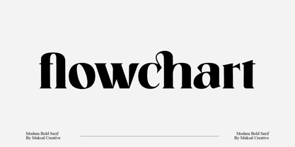 Flowchart Modern Bold serif Font typeface with beautiful Ligature, special glyphs, ornament and multilingual support. It's a very versatile font that works great in large and small sizes. Perfect for editorial projects, Logo design, Clothing Branding, product packaging, magazine headers, or simply as a stylish text overlay to any background image.
 - Minomu by Owl king project,
$37.00 Minomu consists of twenty sans serif font families, With a thicker weight, Minomu can be applied as an attractive and bold appearance for title letters, not only that, but Minomu's family with lowercase letters can also be used in designs with use as body text, to create more detailed descriptions.
 - Retail Shop JNL by Jeff Levine,
$29.00 Vintage New York neon signage alongside the landmark Dubrow's Cafeteria [probably circa the 1940s] of the words "retail shop" inspired the namesake digital type design. Retail Shop JNL is a bold and somewhat eccentric Art Deco font with varying widths and unusual character forms available in both regular and oblique versions.
 - Ransley by Muksal Creatives,
$12.00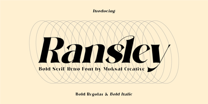 Ransley Modern Bold serif Font typeface with beautiful Ligature, special glyphs, ornament and multilingual support. It's a very versatile font that works great in large and small sizes. Perfect for editorial projects, Logo design, Clothing Branding, product packaging, magazine headers, or simply as a stylish text overlay to any background image.
 - Sugar Crakers by Atom,
$19.00 Sugar Crakers is a bold signature font with pointed corners and supported with over 45 ligatures. Use your imagination to make company logos, product labels, headlines, and other designs that will make your designs come alive and become more selling points. Use Sugar Crackers for the success of your next project.
 - PocketWrench by Deniart Systems,
$20.00 Make a bold statement with this modern, angular design - go wild and use it together with it's partner font, PolkaDot Wrench. This typeface features over 90 extended characters for setting European languages such as Czech, Danish, Dutch, Esperanto, Finnish, French, German, Italian, Hungarian, Polish, Portuguese, Romanian, Spanish, Swedish, Turkish & Welsh.
 - Compton by Greater Albion Typefounders,
$10.00 Compton is a clean modern slab serif face that emphasises simplicity of line and legibility. It's offered in three weights: regular, bold and light. Compton brings the spirit of the 60s and 70s to the present day. It is ideal for clear, simple graphic design that makes an immediate impact.
 - Bitline by Grontype,
$15.00 Bitline is bold swirly font. comes with more alternate style each glyphs and ligature. The font is unique and modern vintage look. This is an adaptable font. Suitable for any project types, from magazine header, wedding invitation, branding design, poster or flyer header design, until logo tagline and so much more.
 - Ayr Thrope by Aiyari,
$25.00 Introducing Thrope the irregular retro display font family heavy influence by motter ombra typeface, geometric basic shape, and 60s to 70s pop culture. Thrope typeface includes 3 font family (regular, bold,& heavy) it comes with stylistic alternates 01-04 & ligatures. Thrope font family best used for logotype, headline, header, signage.
 - Asia by Superfried,
$32.50 Asia by Superfried is an ornate, display typeface inspired by trips throughout the continent. Its distinct, bold style has been designed to evoke the curves and beautiful intricacy of Asian typographic characters and patterns. Asia has been featured on Creative Boom and named font of the day by Creative Bloq.
 - Rataczak by Ingrimayne Type,
$9.00 Rataczak is a stiff, awkward serifed font that was inspired by similar fonts from the 19th century. It is legible as a text font but not graceful. In addition to plain, italic, bold, bolditalic, extrabold, condensed, and condenseditalic styles, there is a striped style and a font of swash capitals.
 - Chinte by FonTastic Designs by Chez,
$10.99 Looking for a fun new font? Look no further I have just what you've been waiting for. This new novelty font that I call Chinte is a bold fullcase font. This font comes with multiple languages and symbols. And had multiple uses: Branding, Logos, and many more of your projects.
 - Storyboard by Atlantic Fonts,
$26.00 Storyboard is expressive, rough, partly connected and full of painterly, brushed energy like the sketches of a storyboard. It's bold and kind of edgy, but can be friendly too. There are tons of ligatures you can turn on or off depending on the look you're after. So what's your story?
 - Fun Play by FunFont,
$17.00 Fun Play is A Fun and Playful display typeface family with 5 wights variant; from Light to Bold. Comes with many features; Multilingual Support, Ligatures, Stylistic Alternate and more. Each character represents a child's joy. ‘Fun Play’ can be used for branding, packaging, headline and all styles of children-related design.
 - Maple Leaf Rag NF by Nick's Fonts,
$10.00The book Modern Alphabets, published in 1930, called this diamond in the rough from Continental Typefounders Nova Bold. Well, it’s neither new nor modern anymore, but it’s a warm, friendly face that’s sure to please. Both versions of this font contain complete Latin 1252 and Central European 1250 character sets. - Take Charge JNL by Jeff Levine,
$29.00 Take Charge JNL is based on the opening title card for the 1936 film "The Charge of the Light Brigade" starring Errol Flynn and Olivia de Havilland, Donald Crisp and David Niven. The typeface is a simple, bold titling font with the slight feel of Art Deco influence in its design.
 - Guildhall by Device,
$39.00 Class, with a punch. It's rare to find fonts that are refined without being too delicate, stylish while still being bold and impactful. Guildhall is a heavy rectangular flared serif in face widths with matching italics. Suitable for film posters, rock concerts and band logos, beer labels, packaging and magazine headlines.
 - Ghiberti LP by LetterPerfect,
$39.00 Ghiberti is a contemporary interpretation of the bold Florentine lettering style used with marble inlaid and bronze cast inscriptions of the fourteenth and fifteenth centuries. The font, consisting of caps and small caps, was designed by Paul Shaw and Garrett Boge in 1997. Ghiberti is part of the LetterPerfect Florentine Set.
 - Blog by BA Graphics,
$45.00Blog has a new distinctive look and comes in four weights light, regular, medium and bold. It can be seen as quite elegant in the light weights while looking masculine in the heavy weight. Its unique look lends to so many different applications. Blog works well for both headline and text. - Lindisfarne Nova BT by Bitstream,
$50.99 Lindisfarne Nova is an uncial-like design based on the script found in the Lindisfarne Gospels. Created by Harry Pears and Margaret Layson, it is available in two weights, regular and bold. Lindisfarne Nova is Harry’s first completed font. There are also two companion styles, Lindisfarne Nova Incised and Lindisfarne Runes.
 - Phantaztik by PintassilgoPrints,
$27.00 Phantaztik is a bold and groovy font packed with stylish interlocks, uncommon alternates, extended language coverage, and clever OpenType programming. Full of cheer and optimism, it's a fantastic option for packaging projects, book covers, game titles, apparel, and many more creative applications. Feel-good designs just got easier, check it out!
 - HT Maison by Dharma Type,
$19.99 HT Mason is bold and hand painting font. This font is retrospective and decent, but it is also funny and cute. Holiday Type Project offers retro hand drawing scripts. Inspired by retro script on shopfront lettering, wall paint advertisements in Italy around 1950s. Check out the script fonts from Holiday Type!
 - Kendrick by Monotype,
$15.99 A heavy-set but lively font, Kendrick’s dense strokes were hand-painted using a thick wet brush. This all-caps set of letters is bold but brushy, textured and expressive; fun but very much meaning business. Kendrick is streetwise and no-nonsense, but with a big cheesy grin to boot.
 - Michaello by Letterara,
$14.00 Michaello is a casual natural handwritten font with an incredibly friendly feel and a stunning brush texture with a bold vibe. It is the perfect font for making original and outstanding designs. This font is PUA encoded which means you can access all of the glyphs and swashes with ease!
 - Nathallia by Portograph Studio,
$20.00 Nathallia is a bold serif while elegance still maintained. It will boost your design stand out! Nathallia is the perfect typeface for any kind of your project, such as advertisements, branding, graphic design, quotes, wedding design, logo for online or offline business, photography, and others. Make your business more elegant beautiful!
 - Pastry Shop JNL by Jeff Levine,
$29.00 In the 1960 edition of Sam Welo’s “Studio Handbook – Letter and Design for Artists and Advertisers” you’ll find a bold, hand lettered Art Deco sans serif typeface designed by Welo with a decidedly 1930s-1940s look. This is now available as Pastry Shop JNL, in both regular and oblique versions.
 - Jingle Binder by Balpirick,
$15.00 Jingle Binder is a Modern Handwritten Bold Font. Jingle Binder is perfect for product packaging, branding project, magazine, social media, wedding, or just used to express words above the background. Jingle Binder also multilingual support. Enjoy the font, feel free to comment or feedback, send me PM or email. Thank you!
 - Uncle Hours by Adante Creative,
$23.00 Introducing by Adante.Creative Proudly Present, Uncle Hours Uncle Hours is A Bold Display Typeface Font Uncle Hours is perfect for product packaging, branding project, megazine, social media, wedding, or just used to express words above the background. Enjoy the font, feel free to comment or feedback, send me PM or email.
 - Rockland by Monotype,
$15.99 This is an original, confident and cheeky little font; characterised by its boldness and dense letterforms, which boast a solid texture and distinctive lack of counters. Drawn with a marker pen, the bounciness of Rockland counteracts its solidity to make for a friendly aesthetic that’s as confident as it is playful.
 - Eye Monsta by Illushvara,
$15.00 Eye Monsta is a bold and fun display font, carefully handcrafted to become a true favorite. Its casual charm makes it appear wonderfully down-to-earth, readable and, ultimately, incredibly versatile. This font will look outstanding in any context, whether it’s being used on busy backgrounds or as a standalone headline!
 - Minimal by Kmaz,
$10.00 Minimal is a distinguished sans serif display family with minimalistic modern edges, designed by Khalid Al-Mazrouei and published by Kmaz. Minimal packs a complete set of uppercase and lowercase letters, numbers and punctuation and comes in 3 weights (Thin, Regular, and Bold). Perfect for headlines, magazines, and much more.
 - Escondido NF by Nick's Fonts,
$10.00This unusual face features letterforms inspired by an Austrian travel poster designed by Johann Süssenbek in the 1930s, and rendered in a bold chiaroscuro manner. In case you're wondering, Escondido is Spanish for hidden. Both versions of the font include 1252 Latin, 1250 CE (with localization for Romanian and Moldovan). - CA Rusty Nail by Cape Arcona Type Foundry,
$19.00 Rusty Nail is a carefully hand-made uppercase only typeface with a full Central European character set which comes in two styles, Regular & Bold. It was created for a liquor company where hand-made letters were part of the corporate design. It’s perfect for labels or lettering with a "used look".
 - Addison by Kimmy Design,
$15.00 Addison is a typeface that brings together modern western styles with a rustic texture. Between Addison West, with thick block serifs, and Circus, a more decorative face, the two would bring an authentic and unique style to any artwork. The bold faces make a stand and standout for any design concept.
 - Kemading by Differentialtype,
$10.00 Kemading is a retro serif font that has a vintage, cute, fun and bold feel. Comes with four styles, regular, italic, outline and outline italic. Kemading's design is unique and energetic, making it perfect for adding a touch of fun nostalgia to logos, crafts, posters, branding, stickers and many other projects.
 - Retail Price JNL by Jeff Levine,
$29.00 Redrawn from lettering found on a British publication circa the 1930s, Retail Price JNL is an extra bold display inline sans that’s great for catchy headlines, price cards, banners or any other attention-getters. Retail Price JNL is offered in regular, oblique, solid and solid oblique versions. Caps only Fonts.
 - Mono Polz by Four Lines Std,
$15.00 "Mono Polz" takes its inspiration from the zany and eccentric world of cartoons. Every letter is an explosion of creativity, with bold lines and playful shapes that'll make your designs pop right off the page. It's the perfect font to add a touch of comic mischief to your projects. - Uppercase
 - Balcon Round by Tour De Force,
$25.00 Balcon is condensed sans family designed to be your first web font choice. Contains 5 weights: Light, Regular, Bold, ExtraBold and Black, it fits perfect into any project, from editorial editions to packages, labels, posters. If you're looking for "sharp" version of this family, feel free to check Balcon sans family.
 - Insigne Display by Gian Studio,
$15.00 Insigne Display A bold, modern and fun display font that lives up to its name. The way you can uniquely combine the different parts of this font makes it a lot of fun to use! Perfect for all purposes. , Suitable for magazine design, logo design, headlines, posters, packaging, cards etc. Enjoy!
 - FS Lucas by Fontsmith,
$80.00 Pure and not-so-simple Maybe it’s the air of purity, openness and transparency that they transmit, but geometric typefaces are more popular than ever among leading brands. Based on near-perfect circles, triangles and squares, geometric letterforms look uncomplicated, even though making them readable is anything but – something the designers of the first wave of geometric fonts discovered nearly a century ago. Many of the world’s most recognisable brands in technology, retail, travel, food, manufacturing and other industries continue to be drawn to the straightforward, honest character that geometric fonts convey. Fontsmith set out in 2015 to develop a typeface in the same tradition, but optimised for the demands of modern brands – online and offline usage, readability and accessibility. And, of course, with the all-important Fontsmith x-factor built in. FS Lucas is the bold and deceptively simple result. Handle with care The letterforms of FS Lucas are round and generous, along the lines of Trajan Column lettering stripped of its serifs. But beware their thorns. Their designer, Stuart de Rozario, who also crafted the award-winning FS Millbank, wanted a contrast between spiky and soft, giving sharp apexes to the more angular letterforms, such as A, M, N, v, w and z. Among his inspirations were the colourful, geometric compositions of Frank Stella, the 1920s art deco poster designs of AM Cassandre, and the triangular cosmic element symbol, which led him to tackle the capital A first, instead of the usual H. The proportions and angles of the triangular form would set the template for many of the other characters. It was this form, and the light-scattering effects of triangular prisms, that lit the path to a name for the typeface: Lucas is derived from lux, the Latin word for light. Recommended reading Early geometric typefaces were accused of putting mathematical integrity before readability. FS Lucas achieves the trick of appearing geometric, while taking the edge off elements that make reading difficult. Perfectly circlular shapes don’t read well. The way around that is to slightly thicken the vertical strokes, and pull out the curves at the corners to compensate; the O and o of FS Lucas are optical illusions. Pointed apexes aren’t as sharp as they look; the flattened tips are an essential design feature. And distinctive details such as the open terminals of the c, e, f, g, j, r and s, and the x-height bar on the i and j, aid legibility, especially on-screen. These and many other features, the product of sketching the letterforms in the first instance by hand rather than mapping them out mechanically by computer, give FS Lucas the built-in humanity and character that make it a better, easier read all-round. Marks of distinction Unlike some of its more buttoned-up geometric bedfellows, FS Lucas can’t contain its natural personality and quirks: the flick of the foot of the l, for example, and the flattish tail on the g and j. The unusual bar on the J improves character recognition, and the G is circular, without a straight stem. There’s a touch of Fontsmith about the t, too, with the curve across the left cross section in the lighter weights, and the ampersand is one of a kind. There’s a lot to like about Lucas. With its 9 weights, perfect proportions and soft but spiky take on the classic geometric font, it’s a typeface that could light up any brand.