10,000 search results
(0.057 seconds)
- PF Scandal Pro by Parachute,
$79.00 “A couple of years ago, when I was designing a package for a marmalade range, I started having a go at creating a typeface that would suit the package I had in mind. The whole process was intensely appealing to me: from merely using typefaces as an intricate part of my work as an art director, I started exploring the function of each and every element that a typeface consists of. The two things on my mind in designing a typeface for a marmalade brand were firstly, that I wanted it to have a hand-written feel, so as to exude that old-fashioned, homemade quality, and secondly, that it ought to have a certain sweetness and gentleness that would match the product. However, PF Scandal managed to outgrow its original inspiration. As I continued working on it, I toned down some of its elements to make it more versatile. And so, PF Scandal evolved into a typeface that has a contemporary, and yet handwritten look, which makes it suitable for a wide range of uses. The ‘Pro’ version comes with the full array of European characters including Latin, Greek and Cyrillic as well as 120 matching pictograms". -A.S.
 - Celestina by Piñata,
$- Celestina is the lively spirit, just like drops of ink on a piece of paper or clouds in the sky. The same spirit is maintained by the rounded letters of the script and by the characters' small whorls. Celestina has come to life as a result of a peculiar game in which I tried to bring together the letters with different tempers with help of calligraphic instruments. I wanted to create a very light and playful font which would look like a quick inscription on a piece of paper, but would also be easy to read in a text array. As I was working on the font, my cat Celestina has been very interested in the brush painting process, and I had no other option but to name the font after her! Celestina works perfect for both Moomins stories and personal blogs, as well as for the design of hand-made things, and even just then when you want to put yourself into a good mood!
 - Marcel Merlina by Pixesia Studio,
$16.00 Introducing Marcel Merlina - A Lovely Chic Script Font Marcel and Marlina is now released as beautiful as romance is. This font-type gives you the vibe of an elegant and the classic-yet-so fresh kind of feeling. The curves and the flexibility of the fonts provide you the warm and familiar sense—as if you are reading letters from your beloved ones. Marcel and Marlina is meant to be endearing—portray the warmth of love. This font is designed to be used in such occasions which require high involvement of delightful emotion. This font would be best to be used in wedding invitations, love letters, and sincere greeting cards for someone so dear to you. FEATURES - Stylistic Alternates - Ligatures - PUA Encoded - Uppercase and Lowercase letters - Numbering and Punctuations - Multilingual Support - Works on PC or Mac - Simple Installation - Support Adobe Illustrator, Adobe Photoshop, Adobe InDesign, also works on Microsoft Word Hope you Like it. Thanks.
 - The Youngest by My Creative Land,
$39.00 The Youngest is a unique modern font family that contains a handwritten signature script and a classic mid-contrast elegant classic serif in two styles - Display and Book. Both serif and handwritten script benefit from stylistic alternates and ligatures that give your creativity a wide variety of design options. The Book serif is optimized to be comfortably read on screen in small sizes. The Youngest Script has more than 600 ligatures (100+ unique basic Latin ligatures, their multilingual variations, and 70+ Cyrillic ligatures) to mimic a realistic handwriting. The serif style has a lot to offer too - more than 300 ligatures including 40+ basic latin ligatures, their multilingual variations and 30+ Cyrillic ones. All three styles support most of the Latin based languages as well as have basic (Russian) Cyrillic support. All three styles, as usually, fully unicode mapped and can be used in the majority of applications available on the market.
 - Dickybird Doodles by Outside the Line,
$19.00 Dickybird Doodles? A dickybird is an ordinary bird, not a raptor or game bird. This illustration font has 32 of them. Birds in a cage, on a wire, in a nest. A flamingo, toucan, sandpiper, cardinal, penguin, heron, chicken & rooster, hummingbird, swan. Some line, some reverse and one with polka dots.
 - Storyboard by Atlantic Fonts,
$26.00 Storyboard is expressive, rough, partly connected and full of painterly, brushed energy like the sketches of a storyboard. It's bold and kind of edgy, but can be friendly too. There are tons of ligatures you can turn on or off depending on the look you're after. So what's your story?
 - BrunstCaps - Unknown license

- Sophia - Unknown license

- Nymph's Handwriting - Personal use only

- Custer by Font Bureau,
$40.00 In 2009, a book from 1897 in the library of the University of Wisconsin caught David Berlow’s attention. It was set in a clear text face—a predecessor of Bookman—cast by the Western Type Foundry who called it Custer. Upon noting how well the typeface worked in sizes of 6 and 7 points, Berlow developed it into a member of the Reading Edge series specifically designed for small text on screen. Custer RE was a broad and approachable typeface drawn large on the body with a tall x-height to maximize its apparent size when set very small. This was the beginning of the newly expanded series; in 2020, Berlow added new optical sizes and weights, growing the original design’s versatility up to headline sizes.
 - Droid Sans by Ascender,
$92.99 Droid Sans Pro Font Family (2 fonts) are a humanist sans serif typeface designed by Steve Matteson, Type Director of Ascender Corp. The Font Family is an approachable, friendly set of typefaces optimized for display on screen. It was designed to provide optimal quality and legibility. It features upright stress, open forms and a neutral appearance. The font was optimized for user interfaces and to be comfortable for reading on a mobile handset in menus, web browser and other screen text. The font family contains Old Style Figures (requires an application that support advanced OpenType typographic features) and extensive character set coverage including Western Europe, Eastern/Central Europe, Baltic, Cyrillic, Greek and Turkish support. Contains: Droid Sans Pro Regular & Droid Sans Pro Bold
 - YR Qaf by Alrefaiy,
$20.00 YR Qaf is a clean, modern, and highly legible font. Featuring clear, easy-to-read letterforms with a focus on legibility. The font is carefully crafted with balanced proportions and an emphasis on vertical lines, resulting in a harmonious and streamlined appearance. YR Qaf offers a sleek and modern aesthetic, with exceptional legibility and versatility. Its clean lines and balanced proportions make it a perfect choice for a variety of design projects where clarity and readability are essential. YR Qaf is ideal for a wide range of applications, including branding, web design, editorial design, and more. With a comprehensive set of glyphs, including both upper and lowercase letters, numerals, and symbols, this font can adapt to diverse design needs with ease.
 - Western Brother by Nathatype,
$29.00 Ready to enhance your branding? Looking for that “something” that’ll make your audience go WOW and clients get on board immediately? We’ve got JUST the thing for you! Western Brother-A Vintage Font Western Brother is a display typeface. Designed primarily as a captivating font with retro style. This font features thick that easy on the eyes and nice to look while it’s also easy to read at captivating headlines, or large branding text, the font oozes that cute aesthetic that just makes you go “aww!” Our font always includes Multilingual Support to make your branding reach a global audience. Features: Alternates Ligatures Stylistic Sets Swashes Bonus Ornament PUA Encoded Numerals and Punctuation Thank you for downloading premium fonts from Nathatype
 - Yotta by Wilton Foundry,
$19.00 Yotta was created for situations where a thin sans with a little extra style is required in branding, advertising promotional projects — it is especially suited for the FASHION retail industry. The extended stroke feature (in u/c B,DP,R and l/c a,b,dg,h,m,npq,u,y) is discreetly applied so it does not dominate. I guess “quasi-serif” might be a way to describe Yotta. “Yotta Thin” and “Yotta Thin Italic” is a friendly Opentype and ready for you to unleash your creativity! btw. Yotta is big, very big: the name comes from YottaByte, as in Megabyte (one million bytes), Gigabyte (one billion (109)Terabyte (one million million (1012), Petabyte (a million gigabytes), Exabyte one quintillion (1018), Zettabyte one sextillion (1021), & Yottabyte (one septillion (1024)
 - Fangs ALot by Ingrimayne Type,
$9.00 FangsALot is a bizarre typeface family that was designed to alternate two character sets. These sets are alternated automatically in applications that support the OpenType feature Contextual Alternatives (calt). The template used to design characters is a distorted triangle that resembles a curved tooth or a fang. This shape can be flipped horizontally, vertically, and both horizontally and vertically to give four orientations. Two of these orientations are used in the regular style and two in what is called the italic style. I thought the fang motif did not come through clearly in the regular and italic styles. Rather the impression they give is more like graffiti lettering. To emphasize the fang motif I added two more members to the family by filling fang outlines with unadorned sans-serif characters. Then to allow more color in lettering, I added two more styles with letters on black. I then had six styles based on triangles skewed left and right. Why not fill the family out with three more styles based on an isosceles triangle? The end result is a family of nine. All members of the family are monospaced and are hard to read. The three graffiti-like styles have some alternative letters that can be accessed with the OpenType feature Stylistic Sets. Also, for each style it is possible to use only one set of characters by adding a space after each letter and then adjusting the character spacing. The graffiti-like styles can be useful in situations where the hard-to-read property is not important but where a menacing and vicious touch is needed, such as topics of sharks, teeth, biting, and vampires.
 - Sinzano by Typodermic,
$11.95 Hey there, cats and kittens. Have you heard the news about the grooviest typeface in town? That’s right, I’m talkin’ about Sinzano—the typeface that’s cool, collected, and interlocking! Now, you might be asking yourself, “What’s so special about Sinzano?” Well, let me tell you, this typeface is a real wild one. It’s got some serious style, with letterforms that interlock like a bunch of jazz cats jammin’ on stage. And don’t even get me started on the ligatures—they’re fascinating, man! Sinzano comes in three different styles, so you can choose the one that’s right for you. Sinzano Regular is a slender, slightly flared headliner, perfect for making a statement. Sinzano Sans is a similar concept, but with straight, flat ends, for a more modern vibe. And if you’re looking for something a little more modest, Sinzano Display is a companion typeface that’s broader and rounder, with just a touch of interlocking. So, if you’re ready to add some serious style to your designs, head on over to Sinzano, baby! This typeface is the real deal, and it’s gonna knock your socks off. Most Latin-based European writing systems are supported, including the following languages. Afaan Oromo, Afar, Afrikaans, Albanian, Alsatian, Aromanian, Aymara, Bashkir (Latin), Basque, Belarusian (Latin), Bemba, Bikol, Bosnian, Breton, Cape Verdean, Creole, Catalan, Cebuano, Chamorro, Chavacano, Chichewa, Crimean Tatar (Latin), Croatian, Czech, Danish, Dawan, Dholuo, Dutch, English, Estonian, Faroese, Fijian, Filipino, Finnish, French, Frisian, Friulian, Gagauz (Latin), Galician, Ganda, Genoese, German, Greenlandic, Guadeloupean Creole, Haitian Creole, Hawaiian, Hiligaynon, Hungarian, Icelandic, Ilocano, Indonesian, Irish, Italian, Jamaican, Kaqchikel, Karakalpak (Latin), Kashubian, Kikongo, Kinyarwanda, Kirundi, Kurdish (Latin), Latvian, Lithuanian, Lombard, Low Saxon, Luxembourgish, Maasai, Makhuwa, Malay, Maltese, Māori, Moldovan, Montenegrin, Ndebele, Neapolitan, Norwegian, Novial, Occitan, Ossetian (Latin), Papiamento, Piedmontese, Polish, Portuguese, Quechua, Rarotongan, Romanian, Romansh, Sami, Sango, Saramaccan, Sardinian, Scottish Gaelic, Serbian (Latin), Shona, Sicilian, Silesian, Slovak, Slovenian, Somali, Sorbian, Sotho, Spanish, Swahili, Swazi, Swedish, Tagalog, Tahitian, Tetum, Tongan, Tshiluba, Tsonga, Tswana, Tumbuka, Turkish, Turkmen (Latin), Tuvaluan, Uzbek (Latin), Venetian, Vepsian, Võro, Walloon, Waray-Waray, Wayuu, Welsh, Wolof, Xhosa, Yapese, Zapotec Zulu and Zuni.
 - LudwigHohlwein - 100% free

- Stickwithu by Redy Studio,
$19.00 the name Stickwithu was inspired by the title song Stickwitu sung by The Pussycat Dolls which was very popular in the early 2000s. Stickwithu has been designed to make any project look like it was handwritten by hand. a simple yet modern handwritten typeface that’s perfect for adding personality to your typographic design. With its intersecting lines and decorative shapes, Stickwithu gives you the perfect look for use in logos, branding, wedding invitations and stationery, social media posts, and even handwritten quotes. That’s what we’ve done with Stickwithu and want to share with you. We hope you find something unique that will add personality and character to your designs. Feel free to give me a message if you have a problem or question. Thank you so much for taking the time to look at one of our products. ~Redy
 - Arkitech - Personal use only

- Arkitech - Personal use only

- Clocks by Pen Culture,
$15.00 Introducing Clocks Typeface Clocks is modern and elegant serif font with lovely ligature. this font has authentic shape which is very suitable for various design projects such as branding, logo, fashion design and many others. What inside and what will you get: Uppercase letter Number and punctuation Lovely ligature PUA Encoded I really hope you enjoy it – please do let me know what you think, comments & likes are always hugely welcomed and appreciated. More importantly, please don’t hesitate to drop me a message if you have any issues or queries. Thank you
 - Rotten by Pen Culture,
$15.00 Rotten is modern and elegant serif font. This font bring modern minimalist and elegant concept, this font will be very suitable for branding needs, logo design, posters and much more. This font is equipped with ligatures and beautiful alternates, you can mix and match them very easily in your projects. I really hope you enjoy it – please do let me know what you think, comments & likes are always hugely welcomed and appreciated. More importantly, please don’t hesitate to drop me a message if you have any issues or queries. Thank you
 - Satnight Script by Picatype,
$17.00 Introducing Satnight, a classy and contemporary modern script font. This versatile script typeface includes many different alternatives for each lowercase letter. It's fun to use because every word can be changed according to your wishes. Satnight offers beautiful typographic harmony for a variety of design projects, including logos & branding, wedding designs, social media posts, advertising & product design. That's it! I hope you enjoy this type!! Let me know what do you think!!! Feel free if you have a question, please contact me : picatypestudio@gmail.com Thank you and keep creative!
 - The Crunch by Pen Culture,
$17.00 Introducing "The Crunch - Elegant Sans Serif Font" The Crunch is a ligature serif font that perfect for any kind design project like branding, logo design, poster, embroidery and much more. This font has elegant ligature and much of alternate, so you can mix and match to create sensational design. I really hope you enjoy it – please do let me know what you think, comments & likes are always hugely welcomed and appreciated. More importantly, please don’t hesitate to drop me a message if you have any issues or queries. Thank you
 - Deluna Signature by Pen Culture,
$15.00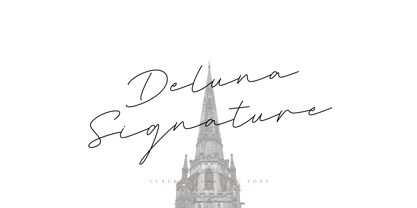 Introducing “Deluna Signature Font” Deluna Signature is modern and luxury signature font. This font comes with a monoline style and with a minimalist concept. This font is suitable for various purposes such as branding, logo design and many more. Feature and what will you get: Uppercase and lowercase Punctuation Multilingual Support PUA encoded font I really hope you enjoy it – please do let me know what you think, comments & likes are always hugely welcomed and appreciated. More importantly, please don’t hesitate to drop me a message if you have any issues or queries. Thank you
 - Andaman by Pen Culture,
$17.00 Andaman is carefully crafted modern calligraphy font, this font comes with ligature and artificial swash which will be very suitable for branding, logos, fashion projects, posters, magazines and many more. What inside and will you get: Fully uppercase and lower case Number and punctuation Ligature Ending Swash PUA Encoded I really hope you enjoy it – please do let me know what you think, comments & likes are always hugely welcomed and appreciated. More importantly, please don’t hesitate to drop me a message if you have any issues or queries. Thank you
 - Kreakers Brush by Mindtype Co.,
$27.00 Kreakers is a hand brushed typeface, with authentic dry brush imperfections, and also provided some ligatures and Swashes. It will be great for Logotypes, Posters, Digital Lettering Arts, Clean Design, Branding Design, Signs, Merchandising and Social Media Posts. Features : Basic Latin A-Z and a-z Numbers Symbols Stylistic Set Ligature PUA Encode Multi-language Support I really hope you enjoy it - please do let me know what you think, comments and likes are always hugely welcomed and appreciated. More importantly, if you have any question, don't hesitate to contact me by email : putrakhan05@gmail.com
 - Semethone by Pen Culture,
$19.00 Semethone is modern calligraphy font with chic style. It's perfect for branding, wedding invitation, card, signature, watermark for photography and many others. Semethone come with beautiful set of hand lettered uppercase and lowercase, punctuation, multilingual language. This font also equipped with beautiful swashes and ligature which will be perfect for your design project. I really hope you enjoy it - please do let me know what you think, comments & likes are always hugely welcomed and appreciated. More importantly, please don't hesitate to drop me a message if you have any issues or queries. Thank you
 - Authentica Bethany by Pen Culture,
$17.00 Introducing "Authentica Bethany Signature Font" This font was born with a sweet touch of hand lettering technique, with a unique and beautiful shape that makes this font very authentic. This font include uppercase and lowercase, number and punctuation, have more than 80 ligature, and beginning and ending swash in lowercase. I really hope you enjoy it – please do let me know what you think, comments & likes are always hugely welcomed and appreciated. More importantly, please don’t hesitate to drop me a message if you have any issues or queries. Thank you
 - Perfect Colony by Pen Culture,
$15.00 Proudly present "Perfect Colony // Bold Serif Font" Perfect colony is bold and classic serif with elegant curves. This font is perfect for branding, logo design, header text, poster and many other. What inside and what will you get: Uppercase and lowercase letter Number and punctuation Multilingual Support PUA Encoded I really hope you enjoy it – please do let me know what you think, comments & likes are always hugely welcomed and appreciated. More importantly, please don’t hesitate to drop me a message if you have any issues or queries. Thank you
 - Aurellio by Pen Culture,
$19.00 Proudly present "Aurellio - Modern Calligraphy Font" A clean and smooth font made by original handwriting. You can apply this font for various needs such as branding, logos, watermarks or signatures. wedding invitations and much more. Aurellio includes fully uppercase and lowercase letters, numbers and punctuation, ligatures and swashes that you can easily access. I really hope you enjoy it – please do let me know what you think, comments & likes are always hugely welcomed and appreciated. More importantly, please don't hesitate to drop me a message if you have any issues or queries. thank you
 - Bethlehem Ephrath by HiH,
$10.00 One menorah that I have long found particularly appealing was named The Tree of Life Menorah, a replica of which I gave as a gift one holiday to a kindly old couple who were neighbors and became friends. It had a simple, organic elegance that I see in the best of Art Nouveau sculpture. To me personally, Judeism is a celebration of life, like the triumph of the flower that blossoms in the crack of the city sidewalk. Just as Hanukkah celebrates the rededication of the temple and the miracle of the oil, it celebrates the victorious quest for freedom of the Hebrew people led by Judah Maccabee. Hanukkah represents determination and courage and faith — and it represents the presence of God in the lives of His people. It is interesting to note that the founding of the Albanian nation in the early twentieth century grew out of the resistance of the Albanian people to the imposition of Greek language and culture in the aftermath of the dissolution of the Ottoman Empire. The typeface, HADASSAH, designed by Henri Friedlander (1904-1996), is my favorite Hebrew typeface. Thirty years in the crafting, I believe it is unsurpassed for its shear beauty, combining a subtle modulation of stroke with a simplicity and clarity of form. No doubt, that is why it has become so popular. For me, the Sîyn/Shîyn characters are especially satisfying. For a Hanukkah message in Hebrew, I would choose HADASSAH LIGHT for a headline and print it as large as I could. If, however, you are looking for a friendly, warm face for a seasonal message in a roman-letter based language, may I suggest BETHLEHEM EPHRATH. It will be as comfortable as a bulky, hand-knit sweater on a frosty afternoon and reflects the solid, encompassing, family orientation of this holiday. It was on the way to Ephrath that Jacob’s beloved wife Rachel gave birth to Benjamin and then died from her labor. It was to Ephrath that Naomi and Ruth returned and in Ephrath that we have the wonderful, heart-warming story of the marriage between Ruth and her Redeemer-Kinsman, Boaz. And it was to Ephrath that prophet, Samuel, went to find a new king and there in Ephrath that the prophet annointed a small shepherd boy named David. The Proverbs tell us to seek wisdom. Never underestimate the impact you have on others. Words of kindness can change people’s lives. The Talmud says that the highest form of wisdom is kindness. Be wise this holiday season. The font BETHLEHEM EPHRATH is based on the typeface Accent with the permission of URW++ of Hamburg, Germany. Like most display fonts, it is most effective at 18 points and larger. Like most script fonts, it is most effective when set with both upper and lower case. Although this font is readable in all caps (many scripts are not), that does not make it a good idea. Do so only with caution.
 - French Bulldog by Sudtipos,
$49.00 Day after day we are running from here to there, living in a society that does not allow us to slow down for a minute. Having so many things on our minds, we often unnecessarily complicate our problems, and our stress is so great that we forget what happiness is. French Bulldog was made to celebrate the unnoticed precious little moments. A hot coffee in the morning, the sea breeze on your face, the sweet smell of a flower, a nap with your dog, a meeting with friends, the tenderness of a maternal caress, traveling, walking, crying, sharing, feeling, being onesself. French Bulldog creates spontaneity from chaos with different shapes working randomly to form finesse or coarseness, just like a casual hand works a brush and tries to follow the rules with unpredictable results. It is versatile and fresh, friendly and relaxed. Flow in the moment.
 - TA Bankslab by Tural Alisoy,
$33.00 The building of the Northern Bank of St. Petersburg's Baku branch was built in 1903-1905. It was the first Art Nouveau-style building in Baku, Azerbaijan. Later the bank was transformed into the Russian-Asian Bank. After the oil boom in Baku in the 19th century, branches of many banks and new banks were opened in the city. The branch of the Northern Bank of St. Petersburg was among the first banks that was opened in Baku. N.Bayev was the architect of the building for the branch of the Northern Bank of St. Petersburg located at Gorchakovskaya 3 in 1903-1905. The building currently houses the Central Branch of the International Bank of Azerbaijan. My purpose in writing this is not to copy and paste the information from Wikipedia. What attracted me to the building was the word "Банкъ" (Bank) written in Cyrillic letters, which was also used in Azerbaijan during the Soviet era. The exact date of the writing is not known. Every time I pass by this building, I always thought of creating a font of this writing someday. I had taken a photo of the building and saved it on my phone. I did a lot of research on the font and asked a lot of people. However, some did not provide information at all and some said they did not have any information. I was interested in the history of this font but I do not know if this font really existed or it was created by the architect out of nowhere. If there was such a history of this font, I wanted to recreate this font and make it available. If not, I had to create it from scratch in the same way, using only existing letters on the building. Finally, I made up my mind and decided to develop the font with all letters I have got. It was difficult to create a font based on the word, Банкъ. Because in the appearance of the letters, the midline of the letters on A, H, K was very distinct, both in the form of inclination and in more precise degrees. The serif part of the letters, the height of the upper and lower sides, differed from each other. I don't know whether it was done this way when the building was constructed or it happened over time. I prepared and kept the initial version of the font. I took a break for a while. I started digging on the story of the font again. Meanwhile, I was researching and got inspired by similar fonts. Unfortunately, my research on the font's history did not yield any results. I decided to continue finishing up the font. After developing the demo, I created the font by keeping certain parts of these differences in the letters. In addition, I had to consider the development of letters in the Cyrillic, as well as the Latin alphabet, over the past period. Thus, I began to look at the appearance of slab-serif or serif fonts of that time. In general, as I gain more experience in developing fonts, I try to focus on the precision of the design for each font. In recent years, I specifically paid attention to this matter. YouTube channel and articles by Alexandra K.'s of ParaType, as well as, information and samples from TypeType and Fontfabric studios on the Cyrillic alphabet were quite useful. I gathered data regarding the Latin alphabet from various credible sources. I do not know if I could accomplish what I aimed at but I know one thing that I could develop the font. Maybe someday I'll have to revise this font. For now, I share it with you. I created the font in 10 styles. 7 weight from Thin to Extra Black, an Outline, Shadow, and Art Nouveau. The Art Nouveau style was inspired by the texture in the background used for the text on the building. The texture I applied to capital letters adds beauty to the font. If you like the font feel free to use it or simply let me know if your current alphabet doesn't support this font.
 - TA Bankslab Art Nouveau by Tural Alisoy,
$40.00 TA Bankslab graphic presentation at Behance The building of the Northern Bank of St. Petersburg's Baku branch was built in 1903-1905. It was the first Art Nouveau-style building in Baku, Azerbaijan. Later the bank was transformed into the Russian-Asian Bank. After the oil boom in Baku in the 19th century, branches of many banks and new banks were opened in the city. The branch of the Northern Bank of St. Petersburg was among the first banks that was opened in Baku. N.Bayev was the architect of the building for the branch of the Northern Bank of St. Petersburg located at Gorchakovskaya 3 in 1903-1905. The building currently houses the Central Branch of the International Bank of Azerbaijan. My purpose in writing this is not to copy and paste the information from Wikipedia. What attracted me to the building was the word "Банкъ" (Bank) written in Cyrillic letters, which was also used in Azerbaijan during the Soviet era. The exact date of the writing is not known. Every time I pass by this building, I always thought of creating a font of this writing someday. I had taken a photo of the building and saved it on my phone. I did a lot of research on the font and asked a lot of people. However, some did not provide information at all and some said they did not have any information. I was interested in the history of this font but I do not know if this font really existed or it was created by the architect out of nowhere. If there was such a history of this font, I wanted to recreate this font and make it available. If not, I had to create it from scratch in the same way, using only existing letters on the building. Finally, I made up my mind and decided to develop the font with all letters I have got. It was difficult to create a font based on the word, Банкъ. Because in the appearance of the letters, the midline of the letters on A, H, K was very distinct, both in the form of inclination and in more precise degrees. The serif part of the letters, the height of the upper and lower sides, differed from each other. I don't know whether it was done this way when the building was constructed or it happened over time. I prepared and kept the initial version of the font. I took a break for a while. I started digging on the story of the font again. Meanwhile, I was researching and got inspired by similar fonts. Unfortunately, my research on the font's history did not yield any results. I decided to continue finishing up the font. After developing the demo, I created the font by keeping certain parts of these differences in the letters. In addition, I had to consider the development of letters in the Cyrillic, as well as the Latin alphabet, over the past period. Thus, I began to look at the appearance of slab-serif or serif fonts of that time. In general, as I gain more experience in developing fonts, I try to focus on the precision of the design for each font. In recent years, I specifically paid attention to this matter. YouTube channel and articles by Alexandra K.'s of ParaType, as well as, information and samples from TypeType and Fontfabric studios on the Cyrillic alphabet were quite useful. I gathered data regarding the Latin alphabet from various credible sources. I do not know if I could accomplish what I aimed at but I know one thing that I could develop the font. Maybe someday I'll have to revise this font. For now, I share it with you. I created the font in 10 styles. 7 weight from Thin to Extra Black, an Outline, Shadow, and Art Nouveau. The Art Nouveau style was inspired by the texture in the background used for the text on the building. The texture I applied to capital letters adds beauty to the font. If you like the font feel free to use it or simply let me know if your current alphabet doesn't support this font.
 - Italiano Fushion New by RM&WD,
$35.00 Italiano Fushion is part of an expanding project on which we have been working for several years and which we are committed to in the future. Like the first two, this one too starts from the study of the great Futurist adventure of the early 1900s by great artists such as DEPERO and MARINETTI, who twisted the world of typography with shapes and colors. Italian Fushion is made up of almost 2,000 glyphs for each weight and in addition to hundreds of alternatives mainly, such as initials and endings of each word but also different alternatives for the letters I, J, Y. Thanks to the characteristics of Open Type, you can change them in automatic many of the alternatives, use it as a simple text font by changing only the I's and J's that have the typical capital dot, and giving the text a more fun breath to the composition. Italiano Fushion is suitable for large texts and to get the most out of it it is compulsory to transform the text into UPPERCASE text using the tabs of graphic applications such as Illustrator, or activate the Alternavive tabs and the various options of SS. Ideal for creating Logos, Head Lines, Web Titles, Posters, Epub Covers, Tatoo Projects, T-Shirts, Drink Labels ... Thanks
 - Lovevelyn two - Personal use only

- Rose Town by Maculinc,
$17.00 Rose Town is a thick typeface with unique angles and is easy to read so that it is comfortable to wear. This font is made with old nuances that are suitable for vintage / retro themed events. You can also use it as logos, badges, badges, packaging, titles, posters, t-shirts / clothing, greeting cards, business cards, and wedding invitations and more. Flowing characters are ideal for making interesting messages to your taste. Mix and match with many alternative characters to fit your project. It would be more interesting if you add Extruded Fonts and alternatives. Alternative characters in this font are divided into several OpenType features such as Stylistic Alternate, Ligature and Ligature Alternate. Mail support: maculinc@gmail.com Thank you! Maculinc
 - Rhino by Canada Type,
$24.95This is Canada Type's second Helmut Matheis revival. Rhino is what Matheis did under the name Mobil for the Ludwig & Mayer foundry in 1960. It's an informal text face with some attractive irregularities relating to the traits of handwriting. The influence of the human hand can be clearly seen in letters like the A, J, Q, R, T and pretty much all of the lowercase. Though obviously inspired by and tooled after the human touch, Rhino's functionality extends to even a page or two of text setting. Aside from its functionality, Rhino gives short paragraphs what the classic immersive-reading fonts are not built for: immediate friendliness and natural humility. A few alternates and ligatures are included within the font. - Faithfull by Black Studio,
$15.00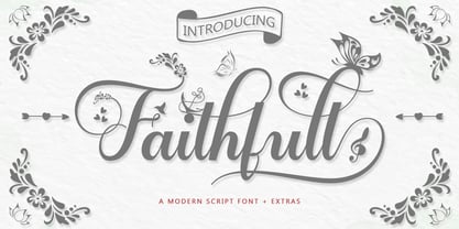 Faithfull is a very easy-to-read Script typeface, getting a touch of bold, classic, and fun Vintage Script fonts, featuring glyphs and opentypes in alternative styles. Can be used for various purposes. such as posters, t-shirts, signboards, logos, news, badges etc. To activate the OpenType Stylistic alternative, you need a program that supports OpenType features such as Adobe Illustrator CS, Adobe Indesign & CorelDraw X6-X7, Microsoft Word 2010 or a later version. Faithfull is coded with PUA Unicode, which allows full access to all additional characters without having any special design software. Mac users can use Font Book, and Windows users can use Character Map to view and copy any additional characters for pasting into your favorite text editor / application.


