10,000 search results (0.055 seconds)
  1. Yoon Gothic 700 by Yoon Design, $400.00
    YD Gothic 700 is a modern sans serif typeface consisting of 9 weights. It supports up to 13 different languages such as English in Latin and other scripts
  2. Yoon Magazine 700 by Yoon Design, $49.00
  3. YD Gothic 700 by Yoon Design, $400.00
  4. Bolded by We Make Font, $16.00
    Bolded is a new complete type family, designed and developed by creative professionals. Contains geometric and rounded features, optimized for both long texts and small screens and texts. The complete family offers seven weights divided between the basic, italic, condensed and condensed italic family. Created in 2022, Bolded has a modern and functional look, designed for the most diverse uses and projects. Bolded is a geometric rounded family that can meet the needs of the most varied professionals looking for a clean and elegant font family with a wide set of Latin characters.
  5. Bolde by Figuree Studio, $18.00
    Bolde is a powerful sans serif font family with modern touches. A balance of hard lines and smooth curves makes them able to stand on their own dynamically Features: five all caps font, Numbers & Punctuation / Extensive Language Support Bolde works great in any branding, logos, magazines, film. The different styles give you the full range to explore a whole host of applications. Thanks for having a peek at Bolde. As always, if you have any questions just send me a message!
  6. My 70s Ding - Unknown license
  7. SF Old Republic SC - Unknown license
  8. SF Old Republic SC - Unknown license
  9. SF Old Republic SC - Unknown license
  10. SF Old Republic SC - Unknown license
  11. Odisean SC - Personal use only
  12. Avondale SC - Unknown license
  13. Covington SC - Unknown license
  14. Covington SC - Unknown license
  15. Covington SC - Unknown license
  16. Covington SC - Unknown license
  17. Avondale SC - Unknown license
  18. Midsole SC by Grype, $16.00
    Geometric/Technical style logotypes have been developed for car chrome labels since the early 1980’s, but automobile companies don't monopolize the style by any means. Shoe companies have a foothold in the geometric sans serif styles as well, and range from straightforward to full of techno styled play. Nonetheless, these logotypes all lack an expansive family which shows off all the logotypes are and what they "could" be and do. And that's where we come in. The Midsole SC Family finds its origin of inspiration in the CONVERSE shoe company logo, or an older version of their logo, and from there we expanded it into a 40 font family of weights, widths, and obliques. Midsole pays homage to the styling of the earlier logotype, including unicase variations to match the original look, while further evolving beyond the brand inspiration to yield a family that pulls on modern and historical styles. It adopts a sturdy yet approachable and recognizable style with its uniform stroke forms and curves, and goes on to include smallcaps, numerals, and a comprehensive range of weights, creating a straightforward, uncompromising collection of typefaces that lend a solid foundation and a broad range of expression for designers. Here’s what’s included with the Midsole SC Family bundle: 489 glyphs per style - including Capitals, SmallCaps, Numerals, Punctuation and an extensive character set that covers multilingual support of latin based languages. (see the 10th graphic for a preview of the characters included) Stylistic Alternates - alternate characters and unicase variants for a less standardized text look. 4 weights in the family: Light, Regular, Medium & Bold. 4 obliques in the family, one for each weight: Light, Regular, Medium & Bold. Here’s why the Midsole SC Family is for you: - You’re in need of stylish sans font family with a range of weights and obliques. - You’re love that older CONVERSE letter styling, and want to design anything within that genre. - You’re looking for an alternative to Eurostile & Handel Gothic. - You’re looking for a clean techno typeface for your rave poster designs. - You just like to collect quality fonts to add to your design arsenal.
  19. GEOspeed SC - Personal use only
  20. Stoutface SC - Personal use only
  21. Geoplace SC - Personal use only
  22. DIN Schablonierschrift - Unknown license
  23. Normalise Din by Mecanorma Collection, $45.00
  24. DIN 1451 by Linotype, $40.99
    DIN stands for Deutsche Industrienorm, German Industrial Standard. In 1936, the German Standard Committee settled upon DIN 1451 as the standard font for the areas of technology, traffic, administration, and business. The committee chose a sans serif font because of its legibility and easy-to-write forms. This font was not seen in advertisements and other artistically oriented uses, and there were disagreements about its aesthetic qualities. Nevertheless, this font was seen everywhere on German towns and traffic signs and hence made its way into advertisements because of its ease of recognition.
  25. FF DIN by FontFont, $104.99
    Dutch type designer Albert-Jan Pool created this sans FontFont between 1995 and 2009. The family has 20 weights, ranging from Light to Black in normal and condensed styles (including italics). It is ideally suited for advertising and packaging, editorial and publishing, logo, branding and creative industries, poster and billboards, small text, wayfinding and signage as well as web and screen design. Looking for the new Thin and Extra Light weights? They are available through fontshop.com, linotype.com and fonts.com. FF DIN provides advanced typographical support with features such as case-sensitive forms, fractions, super- and subscript characters, and stylistic alternates. It comes with a complete range of figure set options – oldstyle and lining figures, each in tabular and proportional widths. As well as Latin-based languages, the typeface family also partly supports the Cyrillic and Greek writing systems. In 2011, FF DIN was added to the MoMA Architecture and Design Collection in New York. This FontFont is a member of the FF DIN super family, which also includes FF DIN Round.
  26. DIN 2014 by ParaType, $47.00
    A contemporary interpretation of the famous DIN typeface. Regular style suits for long texts, while Light and Bold variations work well in large sizes. The typeface includes 24 styles: 6 upright and 6 normal-width italics, as well as 6 Narrow and 6 Condensed styles. The typeface was designed by Vasily Biryukov and released by Paratype in 2015. The set of Condensed styles was added by Alexander Lubovenko and Isabella Chaeva in 2022.
  27. Din Condensed by ParaType, $30.00
    Designed at ParaType (ParaGraph) in 1997 by Tagir Safayev. Based on a condensed style of DIN type family (Linotype Staff designers). That is a group of sans serif faces made to conform to the German Industrial Standard. Based on geometric style, they vary in width but not in weight. Light style was added in 2014 by Manvel Schmavonyan. Demi Bold style was added in 2020 by Isabella Chaeva.
  28. URW DIN by URW Type Foundry, $49.99
    The digital outline fonts, DIN 1451 Fette Engschrift and Fette Mittelschrift were created by URW in 1984 and are the basis for all DIN font families. Both typefaces were designed for the URW SIGNUS system and were mainly used for the production of traffic signs. They have since become so popular in other areas that we have developed a complete DIN font family with 48 styles in OpenType Pro: URW DIN. It is semi-condensed, which is unique among the DIN fonts, so it has a broad spectrum of typographic uses. Its large x-height makes it perfect for use in e-publishing (web, apps, e-Books etc) and its adjusted stroke width between the regular and bold weights enhances its quality and distinguishability in print.
  29. DIN Next by Monotype, $56.99
    DIN has always been the typeface you root for—the one you wanted to use but just couldn’t bring yourself to because it was limited in its range of weights and widths, rendering it less useful than it could be. The century-old design has proven to be timeless, but modern use cases demanded an update, which resulted in DIN Next—a versatile sans serif family that will never go out of style. This classic design turned modern must-have includes seven weights that range from light to black, each of which has a complementary italic and condensed counterpart. The family also included four rounded designs, stretching the original concept’s range and core usability. DIN Next also boasts a suite of small capitals, old style figures, subscript, superscript and several alternate characters. A quintessential 20th-century design, its predecessor DIN was based on geometric shapes and was intended for use on traffic signs and technical documentation. Akira Kobayashi’s update made slight changes to the design, rounding the formerly squared-off corner angles to humanize the family. Rooted in over 100-years of history, it’s safe to say that there will always be a demand for the DIN design, and thanks to DIN Next, now it’s as usable as it is desired. Wondering what will pair with it perfectly? Check out Agmena™, Bembo® Book, Cardamon™, Joanna® Nova, FF Quadraat® and Quitador™. Featured in: Best Fonts for Logos, Best Fonts for Websites, Best Fonts for Tattoos
  30. Museo 300 - 100% free
  31. lelim 200 - Personal use only
  32. lelim 300 - Personal use only
  33. Impossible - 500 - Unknown license
  34. Skylab 600 - Personal use only
  35. Oddessey 7000 - Personal use only
  36. Freeform 710 by Bitstream, $29.99
  37. Zoo 300 by Green Type, $37.00
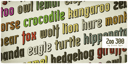
  38. Egyptian 710 by Bitstream, $29.99
  39. Geometric 706 by Bitstream, $29.99
  40. News 705 by Bitstream, $29.99
Looking for more fonts? Check out our New, Sans, Script, Handwriting fonts or Categories
abstract fontscontact usprivacy policyweb font generator
Processing