10,000 search results
(0.083 seconds)
- Alquitran Stencil by RodrigoTypo,
$45.00 Alquitran Stencil is a variant of Alquitran Pro. Alquitran stencil is specially designed for titles, with stencil effect.,Iin addition to Regular and Bold Alquitran Stencil also contains Rough and Rounded with additionally traces Extras (1-2) that are dingbats that support the text to look much more realistic.
 - Alonquin by Studio K,
$45.00 Alonquin is a typographical tribute to Dorothy Parker and the New Yorker crowd who haunted the Alonquin hotel in its 1920s heyday, sharing scintillating one-liners over sparkling cocktails. Deco and decadent, it aims to recapture the spirit of the age (mostly gin from what I can make out!)
 - QuaText by LucasFonts,
$39.00 This special newstext version of TheAntiqua was developed in close collaboration with the Berlin newspaper Die Tageszeitung (taz). Its sturdy forms were optimized for newspaper stock. This font family is currently being reworked and will be further developed with variable weights that can be adjusted to clients’ specifications.
 - RMU Herkules by RMU,
$25.00 At the end of the 19th century, the fin de siècle, both Bauer and Berthold released ‚Herkules‘, a heavy Art Nouveau font for ads and posters. This font was carefully redesigned and makes it a great font in Jugendstil surroundings and a splendid partner of the Carlsbad font family.
 - Starling Bright by Yumna Type,
$16.00 Starling Bright is a elegant handwritten font with a natural and unique design will make your project more beautiful. The font is suitable for your branding project, printing, logos dan wedding. Included: Starling Bright (OTF) Features: Beautiful Ligatures Alternates Multilingual Support PUA encoded Numeral and Punctuation by Yumnatype
 - Chills by Comicraft,
$19.00 Is that the trees rustling, or the hinges on the gate? Pull up your covers as daylight grows dim... there is indeed a chill of fear in your heart and the blood in your veins is turning cold. Try your best not to shiver and shake... The Iceman cometh!
 - Brigade by Alan Meeks,
$45.00 In searching for a Roman to use, I found there were bits of Bembo, Times, Garamond, etc., that I liked and bits that I did not. So I set out to take the best bits of all my favorite Romans and tried to create the ultimate Roman Typeface.
 - Sugar Story by Yumna Type,
$16.00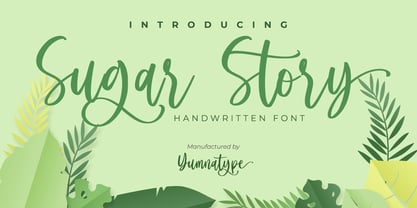 Sugar Story is a sweet handwritten font with a natural and unique design will make your project more beautiful. The font is suitable for your branding project, printing, logos dan wedding. Included: Sugar Story (OTF) Features: Beautiful Ligatures Alternates Multilingual Support PUA encoded Numeral and Punctuation by Yumnatype
 - Stolen Cassette by Gassstype,
$28.00 Stolen Cassette is a Playful Display Font that will make your designs look modern, unique and fun. This is Font Stolen Cassette 2 Style. It’s perfect for labels, quotes, posters, DIY projects, branding, packaging, greeting cards, websites, photos, photography overlays, signs, window art, scrapbooking, tags and so much more!
 - Candymore by Epiclinez,
$18.00 Candymore is a fun and playful handwritten font. Its simple and friendly style is suitable for your DIY or crafting projects. This font has 197 glyphs and its supporting 66 languages, from English to Zulu. Have fun with this super cute font and explore its awesomeness. Thank You!
 - Affiche by RMU,
$35.00 Based on the fin-de-siècle Helios Reklameschrift of the Klinkhardt foundry, Leipzig, Affiche preserves the beautiful art nouveau character of its hot-metal forerunner and was carefully extended to make it multilingual. For more historical authenticity, you can use the long s by typing [alt] and [b].
 - Sweet Mango Italic by Letterafandi Studio,
$18.00 Sweet Mango is a modern sans serif font. This font is perfect for logos, greeting cards, package design, brand identity, craft designs, any DIY projects, book titles, wedding invitations, packaging, and more. Include 4 style font : Sweet Mango Regular Sweet Mango Italic Sweet Mango Bold Sweet Mango Italic Bold
 - Mix Stitch by Mix Fonts,
$13.00 Mix Stitch, is an embroidery lesson disguised as a font, fit for handmade and DIY themed projects. Can be used to emulate embroidery in images, or as a guide to teach kids how to write. So many uses for this fun font, I don't even know where to begin.
 - Whoa Nelly NF by Nick's Fonts,
$10.00In his book of Showcard Alphabets, Dan X. Solo called this one Funhouse, and we couldn't agree more. Wild, wacky and slightly tacky, but suitable for the whole family. The Opentype version of this font supports Unicode 1250 (Central European) languages, as well as Unicode 1252 (Latin) languages. - Deco Moderne JNL by Jeff Levine,
$29.00 The model for Deco Moderne JNL was the hand lettered title on the sheet music cover of "Did You Ever See A Dream Walking" (from the 1933 Paramount musical "Sitting Pretty" starring Jack Oakie, Jack Haley and Ginger Rogers). The typeface is available in both regular and oblique versions.
 - Slim Kim by Wiescher Design,
$39.50 Slim Kim is the sister font of Julienne. It mixes perfectly with Julienn. So whenever you need an especially slim serif font this is it! Slim Kim has very spiky serifs, so I did not want to make an extra-slim version. Enjoy this spiky font, your Gert Wiescher.
 - Saw Mill Stencil JNL by Jeff Levine,
$29.00 A vintage metal stencil from a saw mill with the term "reusable skid" was the model for Saw Mill Stencil JNL. Although the original was what would be termed a semi-stencil (some letters did not have 'breaks' in them), the font was designed with a more traditional look.
 - TagBoyHardcore by PizzaDude.dk,
$15.00TagBoyHardcore is based on my own tagging style when I did graffiti in the mid-eighties. The font is roughly scanned and spaced narrowly in order to keep the original bad boy style. Pump up your text by starting and ending sentences with parentheses, brackets or the curly brackets. - Signboard JNL by Jeff Levine,
$29.00Signboard JNL is based on die-cut cardboard display lettering once made by the Duro Decal Company (now Duro Art Industries) of Chicago, Illinois. Available in various sizes, these letters and numbers could be affixed to a number of different surfaces to make affordable signs, displays and show cards. - Bad Black Cat - Unknown license

- Screwy Melted Wax - Unknown license

- Deng Thick - Unknown license

- Millwright by 10four,
$24.95 Millwright is a display typeface family inspired by spunky DIY attitude and Industrial era hardware… an exercise in rendering glyphs with a rudimentary, hand-cut flavour. The type family’s built in Open Type features allow for easy substitution of glyphs… creating plenty of diversification for letter combinations, and multiple glyph variations. Millwright results in designs that are packed with bold character and Do-it-yourself pizzazz. Millwright’s quirky letterforms lend itself to a multitude of graphic applications; from serious branding applications, to light-hearted packaging, to children’s book publishing, to hand-crafted DIY projects. Millwright comprises a family of 4 styles; the utilitarian “Regular” weight, a brash “Black” weight, to the art-deco inspired "Inline" and the accompanying “Inside” for layering multiple colours.
 - Contype by Wiescher Design,
$39.50 Once I had a young, very eager and interested designer in my employ. We got into talking about where our letterforms come from and the habits in perception we are used to. He did not quite believe me. So I said, let's try to design a typeface where everything is just the opposite of what we are used to. We really had a hard time, our habits crept up on us all the time. But after a couple of weeks we finally finished this typeface and wanted to call it crazytype, but my young apprentice who did most of the manual labor said Contype sounded crazier. So it became Contype and it's really crazy, with a small asian touch to it. Yours very crazy Gert Wiescher
 - Datura - Unknown license

- Cow-Spots - Unknown license

- Bankai Street by Sipanji21,
$14.00 Bankai Street - Realistic Monoline Handwritten Graffiti Font This font designed so that users can use it more easily and make graffiti designs easier. Bankai Street is very suitable for use in various media such as; packaging, logos, labels, posters, shirt designs, bulletins, typography, and many other media, especially with graffiti look.
 - Bombardies by Figuree Studio,
$18.00 Hello, this is Bormbardies modern Graffiti Font! This font was designed so that users can use it more easily and make graffiti designs easier. Bombardies is very suitable for use in various media such as; packaging, logos, labels, posters, shirt designs, bulletins, typography, and many other media, especially with graffiti look.
 - Cloud - Personal use only

- bladeline - 100% free

- Ibiza - 100% free

- Berta_Drug - Unknown license

- Grubby - Unknown license

- Neoro by Lurinzu Studios,
$16.50 Neoro is an Art Deco condensed display typeface with an emphasis on its legibility to work as a “workhorse” typeface. Neoro is developed with the intention to be used in almost all media and sizes. By combining the characteristics of an Art deco type with an emphasis with it’s legibility, this typeface is versatile in almost all medias you can think of! Magazines, body text, captions, headlines, display, albums and almost any media you can think of! *This font includes letters, numbers, multi-language, and all essential marks needed.
 - Ultraworld - Unknown license

- TM Pedestal - Unknown license

- TM Tramway - Unknown license

- Iso - Personal use only

- Cosmic Pattern by Okaycat,
$29.95 Cosmic Pattern is clean, cool & charming. Designed with constellation in mind with bright and dim stars connected together in alphabetical pattern. Cosmic Pattern features extended characters, and contains West European diacritics & ligatures. Highly suitable for international environments & publications. For more universe inspired fonts please check our Star Cursive and Arco Star.
 - Linotype Atlantis by Linotype,
$29.99Lutz Baar was born in Berlin, now living in Gothenburg, Sweden. He is an art director at his own advertising and Web design studio Miraculus. Among his typeface designs you find the award winning Linotype Pisa, the hand tooled looking Linotype Atlantis, and the strictly Linotype Ordinar, designed for Web usage.


