10,000 search results
(0.013 seconds)
- Nobody Home JNL by Jeff Levine,
$29.00 Nobody Home JNL is unusual in nature as it combines two vintage typestyles into one font. Both have been used for home and property identification for decades and still remain popular. Over the years the letters and numbers have been made of cast steel, aluminum, brass and plastic. The alphabet is in a distinctly bold, asymmetrical style, while the numbers almost take on a calligraphic feel. There is just a basic character set - alphabet, numerals and simple punctuation. While the font has been reasonably spaced and kerned, it's best to remember that neither type design was made with digital technology in mind, so it's suggested to adjust your layout manually for optimum results. Nobody Home JNL is best-suited for replicating street addresses, apartment numbers on doors, and homeowner (or apartment house) names on buildings - whether in print design or as plotter-cut vinyl graphics.
 - LED BOARD REVERSED - Unknown license

- Topaz - Unknown license

- Dot.com - Unknown license

- Gamegirl Classic - Unknown license

- Floralissimo by Wiescher Design,
$39.50 Floralissimo are flowery embellishments that I found in several old publishing books dating back over a hundred years. I thought they might be useful for some of you, so I digitized them. Your digitizing typedesigner, Gert Wiescher
 - Verie by Prototype Fonts,
$20.00Inspired by digital displays and mass transit. - Trade Gothic Display by Monotype,
$42.99 It’s a colorful world. Don’t limit yourself to black and white. The Trade Gothic® Display designs take advantage of color to create lively and compelling statements, making the designs ideal for advertising, branding, poster and publication projects. Based on the powerful Trade Gothic Condensed Heavy typeface, Monotype Studio designer Lynne Yun, created the fonts necessary to set both “beveled” and “embossed” characters in any color. Trade Gothic Display 1 (embossed) generates striking highlighted type, while Trade Gothic Display 2 (bevel) produces powerful shadow and outline effects. The designs are natural additions to the Trade Gothic Next family, and stand on their own as formidable display typefaces.
 - Salad by Zetafonts,
$39.00 The island of Fuerteventura is more known for its white sand beaches and windsurf-friendly constant winds than for its typographic marvels. Still, it's on the walls of a ballroom next to its white-sand beaches that Debora Manetti found the hand-painted letterforms that she took as inspiration for her typeface Sala de Fiestas. The resulting font was a condensed sans serif full of curious details and a jumpy latino vibe that many years after still keeps its freshness and vernacular charme. Francesco Canovaro took the original typeface as a starting point for a grand tour into sign-painter aesthetics, developing a reboot of the original into a new type family: Salad. While being faithful to the original proportions and feeling, Salad provides extreme versatility through its five-weights range, its extended charset and its set of Open Type features including stylistic sets, alternates, positional numerals, small capitals and case sensitive forms. While the roman family with its italic counterpart provide a good workhorse tool for informal branding, packaging and editorial projects, the interlocking and the inline weights add additional possibilities for display purposes. This is enriched by the inclusion in the typeface of a set hand-drawn decorative dingbats that further complement the sign painting vibe of the family. All Zetafonts expertise in handmade lettering, typographic design and water sports has been put to test to assure Salad is the best typographical alternative to a a trip to Canary Islands!
 - Chilada by Image Club,
$29.99Chilada is an outrageous display family by designer Patricia Lillie for Image Club. Across four versions, the decorate treatment inside Chilada's letters becomes more intense. Chilada characters exude an energy of their own. Their design could be described as a cross between Bank Gothic and Neuland, with a spoonful of funk mixed in. Big and chunky, Chilada's forms are made up of straight lines only. There are no curved elements. The resulting design is angular and cuts a good figure on the page. Of the Chilada family's four members, the basic font is named Chilada Uno. Uno is Spanish for one!" The forms of Chilada Uno's letter are solid black-or whatever color you choose to set them in! Chilada Dos, Tres, and Quatro each offer their own decorative treatments: Chilada Dos's letters sport a zigzag inline, Chilada Tres is decorated or an ornamented leaving leaves more black from the letters than white, while Chilada Quatro's level of decoration is just crazy. Its letters are made up more more from white space than from black marks. Chilada Quatro is almost an outline font!" - Moneymachine by Mans Greback,
$49.00 Moneymachine is a sans and serif combined display typeface. Inspired by the art of money printing, the typography used for certificate production and classic letterforms, Moneymachine uses a traditional and perfected serif font and blends it together with a modern and clean sans-serif. The result is an original and confident work, which fits perfectly as a logotype or headline in any context that requires that extra touch of coolness. The Moneymachine family consists of six fonts: The Regular that combines sans and serif. Inverted for a white-on-black version. The Serif and Sans for more basic writing. White and Black for a lettering with a banner. The font is built with advanced OpenType functionality and has a guaranteed top-notch quality, containing stylistic and contextual alternates, ligatures and more features; all to give you full control and customizability. It has extensive lingual support, covering all Latin-based languages, from North Europe to South Africa, from America to South-East Asia. It contains all characters and symbols you'll ever need, including all punctuation and numbers.
 - Pentagraph by Intellecta Design,
$28.90 digitization of a classic art nouveau era font
 - Vogus by Intellecta Design,
$25.90a digitization of a classic renaissance fancy font - Gothic by Red Rooster Collection,
$45.00Digitally engineered by Steve Jackaman. Ludlow, circa 1939. - Level Up by Oleg Stepanov,
$16.00 Geometric retro-digital font. Extented latin character set.
 - Breite Italienne by Intellecta Design,
$20.90A digitization revival of a classic woodtype font - Delamotte Large Relief by Intellecta Design,
$9.00digitization of a vintage lettering from Delamotte's book - Fontaniolo by Intellecta Design,
$22.90a digitization from a french vintage classic typeface - American Advertise 015 by Intellecta Design,
$14.95digitization of a classic font from America heritage - Digibeck by Volcano Type,
$19.00 Digibeck represents a new style of digital font.
 - BitchSlap - Unknown license

- Aorta by Gaslight,
$25.00 Aorta was designed for independent subcultural zine. It have stencil in place of lower-case and digit stencil in place of old style digit. Aorta good for headlines, posters, editorial design... Aorta have condensed proportion and good in solid matter.
 - Quendel by URW Type Foundry,
$39.99 Quendel has been expanded to become Quendel Happy Family. Apart from the new Bold weight for easy distinction and emphasis, there are now four other very exciting variants, rendering different writing tools and writing materials. The basic form of Quendel was written with a Japanese bamboo tip and therefore embodies a form letter of natural flow. The new versions show other features that provide the feel of written scripts. While the styles Wood and Crayon include some alternate characters, Q Marking Pen and Q Fingertip, due to their apparently more complex enacted forms, do not need additional alternates without looking stiff or boring. The wood relief of Quendel Wood was created by a freehand wood relief drawn with oiled chalk. Quendel Marking Pen seems to be written with a felt-tip pen soon depleted. At the same time it is also reminiscent of the blooming effect, which we know from photography. The name of Quendel Fingertip suggests what can be seen - someone seems to have written with the finger in a grainy material. One would like to try it himself. The effect of broken lines which can be gained by writing with chalk as reflected in Quendel Crayon. Almost like parched sandy soil, the writing material seems to crumble.
 - Octavian by Monotype,
$29.99Octavian font was designed by Will Carter and David Kindersley for the Monotype Corporation in 1961. Mr. Carter writes: While the ultimate authority is the ancient inscriptional pattern, the physical characteristics of the present rendering are manifest in the economic proportions of the shapes and the modified relations of the strokes. Thus, the letters are narrower than the classical forms and their weight heavier." Octavian is a fine book font and works well for other text settings that are less demanding, such as magazines and brochures." - Tawakkal Sans by Fontdation,
$15.00 New month means new font. Let us introduce our latest (another) sans serif; Tawakkal Sans. This font is a mix of modern and classic style, its cleanliness and irregular shapes represent the future, while its elegant curve mimicking old style typography. Tawakkal Sans is highly versatile, you can use it on many designing fields, ex: headline, editorial, quote-writing, tees/poster design, logo, etc. Packed with lots of glyphs (including OpenType chars), this font is a must have weapon on your designing arsenal. Enjoy!
 - Estung by Twinletter,
$12.00 A beautiful geometric font for writing titles and sentences that are comfortable to see while reading, unique, simple, and elegant, making this font suitable for you to use in various needs of your design projects. flexible in its use, there are 3 options according to your needs This font is very suitable as text with displays for various kinds of branding, advertisements, posters, banners, packaging, news headlines, magazines, websites, logo design, banners, social media design and of course you can use a lot more.
 - Maximo by Red Rooster Collection,
$45.00 Designed by Les Usherwood. Digitally engineered by Steve Jackaman.
 - Waverly by Red Rooster Collection,
$45.00Designed by Les Usherwood. Digitally engineered by Steve Jackaman. - Sycamore by Red Rooster Collection,
$45.00Designed by Les Usherwood. Digitally engineered by Steve Jackaman. - Elias by Typemotion,
$25.00 Elias is a digital version of my own handwriting.
 - Remington Elite Typewriter by Intellecta Design,
$24.90a digitization of Remington Elite model typewriter machine alphabet - Carnivale - Unknown license

- Rostrum by Canada Type,
$24.95The Rostrum fonts are a revival and expansion of a type called Oleander, designed in 1938 by Julius Kirn for the Genzsch & Heyse foundry in Hamburg. Many of the original uppercase letters had some blackletter remnants tacked onto them, so in this digital version they were relegated to the Rostrum Two font, while more contemporary forms were designed for the Rostrum One font. Characters from both fonts are interchangeable via software programs' font menus and glyph palettes in the Postscript and True Type versions, while the OpenType version takes advantage of the Ligatures, Contextual Alternates and Stylistic Alternates features to perform character substitutions. Rostrum finds the middle ground between italic and brush script, which makes it quite usable in all-caps settings. Its majuscules have a very distinct curl that makes the typeface effect-ready and very appealing in packaging design. Plenty of alternates and ligatures are sprinkled throughout the character set. - Beatrix Antiqua by Zetafonts,
$39.00 Beatrix Antiqua is a humanist sans-serif typeface designed by Francesco Canovaro. Beatrix Antiqua is part of the Beatrix Family that takes its inspiration from the classic Roman monumental capital model: its capitals are directly derived from the stone carvings in Florence Santa Croce Cathedral - where the serifs are often removed while keeping the variable width strokes. So, even if it’s basically a sans-serif, Beatrix keeps a subtle swelling at the terminals suggesting a glyphic serif - in the same vein as Herman Zapf classic Optima typeface. In the lowercase design, Beatrix references early humanist typefaces, keeping small calligraphic details (as the prolongation of the e nose) that are especially visible in the italics. While Beatrix Antiqua, the companion typeface to Florentia , slightly exaggerates its antique stylistical features, Florentia tries to mix those influence with a more robust & digital age ready design, featuring bigger X-height and an extended character set that covers over forty languages using the latin alphabet, as well as Greek and Russian Cyrillic.
 - Handsome by Shinntype,
$50.00 Handsome was the first digital typeface to resemble nice, ordinary, fully cursive handwriting. Or neon. In 2005, Handsome Pro was one of the first script typefaces to utilize the OpenType format to simulate the natural quality of writing, by automatically substituting alternate contextual glyphs. The effect follows the conventional “joining rules” of calligraphy, which are a formalization of the way in which letter forms are modified in cursive handwriting for the sake of speed and efficiency—and also perhaps to make life more interesting. For the look of real handwriting, Handsome is most convincing at around 15 pts. At much smaller or larger sizes it works differently. At display size, the feel of the non-nib styles is very slick, more like a speedball Kauffman, owing to the smoothness of the finish. As script fonts go, Handsome has a relatively large x-height, which can be useful if you don't want the “writing” to look too small.
 - Balloon - Unknown license

- Stop - Unknown license

- Marriage - Unknown license

- Svemir by Wirtu,
$120.00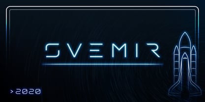 Svemir is display font. Modern, digital, futuristic, clean and simple.
 - American Advertise 008 by Intellecta Design,
$22.90a decorative caps font digitized in the american type heritage


