10,000 search results
(0.017 seconds)
- Milliard by René Bieder,
$39.00 Milliard is a sharp and contemporary family of 22 fonts, taking inspiration from grotesk typefaces developed in the early twentieth century. Its open counters on lowercase "a", "c" or "e" allow for great legibility in small text sizes, supporting an unobtrusive, clear and modern appearance. When set in headlines, Milliard reveals a part humanistic, part geometric voice ranging from elegant and open thin weights to athletic and powerful heavy weights. Milliard comes with many opentype features including stylistic sets, old style numbers, arrows and many more making it a perfect choice for professional type setting in any digital or analog surrounding that requires a clear and modern voice.
 - Arp by W Type Foundry,
$35.00 Arp is a neo-grotesk type system exploring the relations between contrast, functionality, and graphic character in one family. This typography comes in 5 different weights including fine strokes with inverted contrast (20), a sharp sans serif (80), and a high contrast heavyweight (240). Moreover, its design is formed by short ascenders and descenders aiming higher legibility, ink traps for display-functional purposes, and includes a wide range of icons, arrows, and symbols which allow creating consistent compositions in digital and print designs. All styles of 640 characters include a display weight with geometric and glyphic style alternates, which expand the proprieties and versatility of the system.
 - Granesta by Arterfak Project,
$19.00 Introducing Granesta, a freestyle brush font moving with energy. This font was created with digital brush strokes, carefully vectorized to keep the textures. Granesta is a street font that delivers a loud message and strong. This font is an all-capitals font, equipped with stylistic alternates and swashes to gives a more powerful design. Granesta is ideal for logos, merchandise, apparel, banner, quotes, books, social media posts, posters, flyers, stickers, and many more! What you'll get : Granesta TTF & OTF Uppercase Smallcaps Numbers Punctuation Stylistic alternates Swashes (simply type underscore + number. eg. _1, _2, _3, etc) Multilingual support Thank you for watching. Never give up!
 - Mero by Deltatype,
$49.00 Mero inspired by the Roman Capital Proportions which we have seen in Trajan Inscription. With different widths; There are applied each letter to visual proportion. Mero inspired by this measurement method and would like to create the primary typeface in terms of simple form. This sans serif typeface designed to use for any media with a little notice from designer eyes. You won't notice much about style, but something will let you feel extraordinary and trust. Mero has supported over 30 languages and come with nine weights for a complete family. With the standard of CSS font-weight, Mero complete family will map beautifully for your digital layout.
 - Trade Convention JNL by Jeff Levine,
$29.00 An ad for the annual Variety Club Convention appeared in the March 18, 1940 issue of "The Film Daily. The main headline was hand lettered in a classic Art Deco "solid" style of sans serif - ultra bold and with no counters - but had one additional feature: 'engraved' lines to the left of each character. This has now been expanded into the digital typeface Trade Convention JNL, which is available in both regular and oblique versions. Variety Clubs (now know as Variety - The Children's Charity) was founded in Pittsburgh, Pennsylvania in 1928 by entertainers specifically to aid children. Their history can be found at https://variety.org/who-we-are/history
 - Modish by Laura Worthington,
$29.00 Modish is a perfectly balanced synthesis of the casually hand-drawn look and the pixel-perfect slickness of digital design. Inky, but neat, flowing, but controlled, the result is a font that’s ideal for on-trend designs for food, clothing, cosmetics, retail packaging, or menus. Modish features 270 swashes, 78 stylistic alternates that include alternates to create a fully connected OR unconnected look and contextual variants in lowercase letters and 43 Ligatures. See what’s included! http://bit.ly/2bNBcao This font has been specially coded for access of all the swashes, alternates and ornaments without the need for professional design software! Info and instructions here: http://lauraworthingtontype.com/faqs/
 - Linotype Pisa by Linotype,
$29.99Linotype Pisa is part of the Take Type Library, selected from the contestants of Linotype’s International Digital Type Design Contests of 1994 and 1997. It was designed by Swedish artist Lutz Baar and is a modern text font based on the humanistic Old Face style. The dynamic lines and harmonious proportions make Linotype Pisa a pleasant and legible font. Distinguishing characteristics are the elongated cross strokes of the capital A, B, E, F and P and the slanted cross stroke of the lower case e, typical of Venecian Old Face characters of the 15th century. Linotype Pisa is well-suited to longer texts and headlines. - CA Moskow has a plan by Cape Arcona Type Foundry,
$20.00 Inspired by an old Russian book about Moscow’s plan to take over the world, this font was designed to give digital prints the taste of hand lettering. It’s vivid outlines and slight differences in boldness between characters give it an accurate and realistic imperfect letterpress look. It works amazingly well as a text font in small sizes and shows it’s crippled outlines only at larger sizes. »CA Moskow has a plan« has got an extensive character-set including Russian Cyrillic, the Russian Rubel and the Turkish Lira sign. Although it includes kerning, for a full simulation of letterpress print and cold-war feeling we recommend to turn it off.
 - Linotype Go Tekk by Linotype,
$29.00Linotype Go Tekk is a part of the Take Type Library, selected from the contestants of Linotype’s International Digital Type Design Contest. The font was designed by the German artist Critzler and is available in three weights, thin, medium and black. Go Tekk is a cool, constructed with unusual cross strokes, appearing in almost every character at exactly the same height. The capital letters do not end on the baseline, rather drop even farther down than the descenders of the lower case letters, making it necessary to allow for generous line spacing. Linotype Go Tekk is a relatively static font designed exclusively for headlines and displays. - Gimana by Hazztype,
$20.00 Introducing gimana sans serif display font, meticulously designed with deep inktrap details. Crafted for optimal legibility and aesthetic appeal, this font seamlessly blends modernity and tradition. Its generous proportions and balanced letterforms provide exceptional clarity and readability across various digital and print mediums. With its deep inktraps, this font showcases subtle details that enhance its overall visual texture, adding a touch of sophistication to your projects. Its humanist characteristics ensure legibility and readability, making it an ideal choice for a wide range of applications. The deep experimental inktraps add an intriguing element to the font, creating an interplay of light and shadow that captures attention.
 - Bodoni Campanile Pro by Red Rooster Collection,
$60.00 Bodoni Campanile Pro is a font that bridges the gap between a “fat” and a compressed traditional serif typeface. It was originally designed in 1936 by Robert H. Middleton for Ludlow. International TypeFounders exclusively licensed the family from the Ludlow Collection, and Steve Jackaman (ITF) produced a digital version in 1998. Jackaman completely redrew the font for its 2017 release. Bodoni Campanile Pro, much like its transitional status as a font, is successful in both formal and casual roles. The free-flowing aspects of the family, seen especially in the lowercase ‘g’ and the leg of the uppercase ‘R,’ give the family an air of elegance.
 - News Copy JNL by Jeff Levine,
$29.00 Found within the pages of the 1934 edition of the American Type Foundry’s “Book of American Type” is a sans serif design with rounded terminals that emulates a typewriter face. “Jumbo Typewriter” is reminiscent of the type of lettering formerly found on teletype news copy. “Teletype” was a division of Western Electric (part of AT&T), and the machines utilized telephone lines to electronically type and send (as well as receive) messages worldwide. Many folks will remember the sound of teletype machines in the background when radio stations had their news breaks. Now available digitally as News Copy JNL, it is available in both regular and oblique versions.
 - Corporate E by URW Type Foundry,
$179.99 The Corporate ASE typeface trilogy was designed by Prof. Kurt Weidemann, a well-known German designer and typographer, from 1985 until 1990. This superb trilogy consisting of the Corporate Antiqua, Corporte Sans Serif, and Corporate Egyptian is a design program of classical quality, perfectly in tune with each other. Weidemann says: My ASE trilogy, quite like triplets, is in perfect harmony and covers all needs of modern typography! Initially exclusively designed for DaimlerChrysler as a corporate font, the ASE trilogy may be now licensed and used without restriction. URW++ digitized the ASE for DaimlerChrysler and Prof. Weidemann and is the exclusive licencing agent for this outstanding and extremely popular typeface program.
 - Vayu Sans by Gunjan,
$49.00 Vayu(air) Sans is light typeface family. The complete family design comes with 9 weights and 9 matching italics. The fluent functionality of Vayu(air) is created keeping in mind contextual and stylistic alternatives. Which perfectly suits all areas of graphic design such as branding, identity design, especially digital use. It works great for web, corporate as well as editorial design. The standard numerals set encompasses figures and symbols, numerators and denominators, plus fractions. Approach of this typeface is to introduce light weight family. Thin master weight is 5 point size. Designed keeping in mind all kinds of scales and purposes of design aspects.
 - Daily Magnolines by Letterhend,
$14.00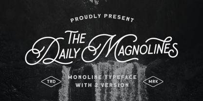 Daily Magnolines is a sophisticated and modern monoline typeface with a charmingly rough version, adding an artistic touch to your designs. This versatile font is designed to capture attention and bring a touch of elegance to any project. Whether used for branding, headlines, invitations, packaging, or social media graphics, this font effortlessly blends classic and contemporary aesthetics, making it a perfect choice for both print and digital projects. Features : Uppercase & lowercase Numbers and punctuation Alternates & Ligatures Multilingual PUA encoded We highly recommend using a program that supports OpenType features and Glyphs panels like many of Adobe apps and Corel Draw, so you can see and access all Glyph variations.
 - Nylon and Draylon by Barnbrook Fonts,
$30.00 Nylon is an interpretation of pre-16th century letterforms, in particular those found in mediaeval portraits at the National Gallery, London. The source material contains many unusual and manic shapes—it appears as if these classical forms have, over time, become perverted, almost demonic. Draylon is the more restrained counterpart to Nylon; it is based on letterforms found on 18th century ceramics—some 200 years after the source material of Nylon. Nylon and Draylon have been designed so that they can be mixed together with ease. Both typefaces have been drawn with a kind of crude digital awkwardness—acknowledging the tool of the present moment, the computer, in the design process.
 - Koruption by Typogama,
$59.00 Koruption is a neo-grotesque typeface family that allows the user to control the amount of distortion in the letters. Thanks to variable axises, this typeface can range from a clean form to a glitched, deformed letter style. To further the effect, these fonts employ further opentype features to alternate the letters, mimicking the real randomness that can arise from distorted letters. With a full character set and some additional symbols and arrows, Koruption aims to be a versatile display solution, for use in headlines or logos, but it’s variable axis can also be employed as a real time animation in videos or digital applications.
 - Zwart by Holland Fonts,
$30.00Originally created with cutting in red litho film, as a headlining typeface for Vinyl music magazine. Its geometric structure was very applicable for early type design experiments on the computer. ...in the early 1980s, he (Max Kisman) became the designer of a small, independent music magazine Vinyl. This Amsterdam-based publication was set up very much as a response to the innovative British magazine, The Face. Responding to Neville Brody's radical designs for that magazine, Kisman began to experiment by creating new headline typefaces for each issue... (Emily King. New Faces: type design in the first decade of device-independent digital typesetting. 1987-1997. - Guess What by Resistenza,
$39.00 Guess What? A new hand-drawn font family has arrived! 5 different sets of letters were sketched using a felt tip marker on paper to get a realistic handmade feeling. The magic comes activating the Opentype features, the letters will randomly combined by an advance code creating a more human feeling. More than 1500 glyphs available to customize your text. Guess what is also a font system, composed by four styles; Regular, Inline, Shadow and Papercut. All styles can be easily overlapped. Works perfectly for many purposes adding a casual natural mood to the text. Try it on a book cover, digital ads, kids stuff, comics, branding, advertising, packaging...
 - Future Bugler Soft by Breauhare,
$35.00 Future Bugler Soft is a soft version of Future Bugler, a font based on the second logo created by Harry Warren in early 1975 for his sixth grade class newsletter, The Broadwater Bugler, at Broadwater Academy in Exmore, Virginia, on Virginia’s Eastern Shore. This font can convey several perspectives or moods. It can suggest a space-age vision of the future, or an art-deco perspective of the future as in the movie “Sky Captain and the World of Tomorrow”. It also communicates the idea of high performance, or extreme sports, without the grunge. Also check out its siblings, the original Future Bugler, and Future Bugler Upright. Digitized by John Bomparte.
 - LTC Camelot by Lanston Type Co.,
$24.95 Camelot was the first of over 100 typefaces designed by Frederic Goudy. The upper case characters were drawn in 1896 for the Dickinson Type Foundry. Goudy was so encouraged by his check for $10 (double what he asked for the drawings), that he spent the next 50 years designing type. The lower case was added by the Dickinson foundry. This Lanston digital release includes a Text version based on the smaller point sizes of the metal type and a Display version based on the larger sizes. The two appear different in size but share the exact same line weight when at the same point size.
 - Okeanos by Nantia.co,
$12.00 Okeanos Handwritten Greek Cyrillic Font is a handwritten display font. 100% handcrafted with a marker, digitized, and turned into a font. Of course, the font supports a full set of Greek characters, Cyrillics, and an extended Latin character set with diacritics. With 10 nautical icons, this typeface can be your next typeface for your graphic design needs. From “hand-written” quotes to product packaging, merchandise, and branding projects, this font is so easy to use that it can cover them all. Also, it can be used on social media content, for branding, poster design, for “hand-written” quotes and any other kind of product packaging.
 - Saussa by Linotype,
$29.99Patricia Pothin-Roesch's Saussa typeface began life as brush-lettered artwork for fruit salad packaging in France. After the key letters had been painted, Patricia Pothin-Roesch switched to digital tools to create the final font. True to its roots, Saussa is a real advertising face, perfect for point-of-purchase displays. Even its name is consistent with its intended area of application: Saussa sounds a lot like the word “sauce.” Saussa is an informal script; its outstrokes function almost like serifs, and the capitals have a lowercase structure. The feelings this typeface conveys are due to the hand of its creator, Patricia Pothin-Roesch, an experienced brush-letterer. - Monod by Resident,
$40.00 Created in 2009 by V.H. Fleisher, Monod is a geometric sans-serif typeface. The font has OpenType features that can be accessed in programs like the Adobe Creative Suite. These features include titling caps which are heavier & more tightly spaced than the regular caps, alternative punctuation marks, and arbitrary nut fractions (for single digit numerators & denominators). By clicking on the "gallery" tab above, you can see an illustration of the OpenType features. The "ff" tab on the "Sample Text" bar below allows you to test the OpenType features with your own text. Supported languages include: Albanian, Czech, Danish, Dutch, English, Faroese, Finnish, French, German, Icelandic, Italian, Norwegian, Portuguese, Spanish & Swedish.
 - Cruller by Wordshape,
$20.00 Cruller is a display typeface that is based on a rare bit of lettering from a 1910 German lettering book. What was the inspiration for designing the font? I found the base lettering years ago in a specimen and scanned it. I've used it perennially for assorted metal bands' logos, and finally decided to digitize it. What are its main characteristics and features? It is a spidery bit of lettering that would work well in Harry Potter movies or on album covers. Usage recommendations: Display type for use in materials that are meant to have a hand-wrought look circa the turn of the century.
 - Superba Pro by Red Rooster Collection,
$60.00 Superba Pro is a condensed Egyptian font family with short ascenders and descenders. The dots on the lowercase ‘i’ and the German umlaut-vowels are square. Haas Type Foundry created the original Superba in 1928-1930. Steve Jackaman (ITF) designed and produced a digital version of the bold weight in 1992. In 2017, Jackaman completely redrew the bold weight, added an accompanying wide weight, and expanded the glyph set to support Central and Eastern European languages. Like other slab serif faces, Superba excels at display sizes and is comfortable at subhead sizes. It is robust, and has “superb” legibility, allowing it to dominate attention in any project it is utilized in.
 - Type Warmers JNL by Jeff Levine,
$29.00 The name Type Warmers JNL traces its lineage to small catalog booklets issued by Indianapolis' Cobb Shinn for his line of letterpress cuts; of which a few can be found included within this typeface. Presumably type could "warm up to" these stock illustrations and work hand-in-hand to deliver the message, hence the "Type Warmers" sobriquet. Originally known for illustrating many attractive and comical postcards of the early 1900s, Shinn moved into the field of purchasing stock art and redistributing them as electrotypes or "cuts", the predecessor to today's digital clip art. A number of the cartoons he sold can be found in the Shinn Kickers JNL font.
 - Blackhole PB by Pink Broccoli,
$14.00 A vintage look to the future of type, this funky typestyle with circular cut outs was stylish for its day, and a true novelty for today. Blackhole PB began as a digitization of a film typeface known as Circue Solid by LetterGraphics. This typestyle has such funkadelic appeal to it that it just makes me smile. Definitely not for broad uses, but full of novel flair. This font is the bees knees for anyone with a circle fetish. They are like hidden mickeys in this typestyle, building up curves and counters all over the place. Take it for a spin and have a flashback to wilder times.
 - Lunatique Rounded by The Flying Type,
$20.00 Lunatique Rounded is the soft version of Lunatique, a highly decorative font, available in three widths, with extended language coverage as well as alternates for some glyphs. And quite a seventies flair, isn't it? This font is inspired by Lucky typeface, designed in 1972 by André Pless for the Mecanorma permanent type contest. The style was later released as Letter-Press transfer sheets. Transfer sheets... Sounds quite nice, definitely. But hey, these digital ones will be waaaaaay smoother to use, you bet. Packaging, posters, books & album covers, applications are endless. Give them a go and make your text shine! [Amazing illustration on the first graphic by our equally amazing neighbor @pedrocorrea84]
 - Reghina by Cititype,
$16.00 Let the ink flows and create your elegant design with Reghina font. This font is PUA encoded. PUA stands for “Private Use Areas”. When a font is PUA encoded it means that you can access all special characters such as Alternates, Swash, stylistic and ligature Playing with alternate glyphs is the same thing by playing combinations according to your taste. Coupled with ligatures to reinforce the natural feel, lowercase swashes at the beginning and ending make your design framed in a flexible flow This font is great for digital signatures, photographic text, website banners and brand logos. Unique and flowing naturally makes this font worth having
 - Kathmandu by Volcano Type,
$19.00Kathmandu, the Nepalese capital in the foothills of the Himalayas, is not like any other city. That's why Kathmandu Bold is not like any other font going by the name of a town, either: This font is not as digital as Chicago but not as solid as Aachen. Kathmandu Bold's capital letters are slightly irregular, giving the font its unique character, which is extended and more black than bold. Everyone who has hitherto regarded "naïve" and "cool" as being an oppositional pair should check out this font by Ingo Juergens. For special needs, such as foreign languages, there is a host of special characters. - Mateo by Linotype,
$29.99 Linotype Mateo is part of the Take Type Library, which features the winners of Linotype’s International Digital Type Design Contest from 1994 to 1997. Jürgen Ellenberger included three styles in his font, roman, bold and outline. The characters of Mateo consist exclusively of lines, giving the font an extremely angular look. However, Mateo retains a certain handwritten style somewhat reminiscent of the graffiti left on wooden grade school desks by previous classes. The bold and outline styles have emphasized stroke contrasts but keep the angular, consciously irregular look. The roman style is best for smaller texts and the bold and outlines styles for headlines.
 - Moveri by Twinletter,
$12.00 Moveri is a lovely sans-serif typeface with powerful curves and a minimalist design. Whatever the theme, this versatile typeface gives a clean and impressive style that’s excellent for branding, digital products, and creative ventures. Moveri fills every room with its beautiful and clean appearance, whether seen up close or from afar. Don’t miss out on this fantastic font — get it right now! of course, your various design projects will be perfect and extraordinary if you use this font because this font is equipped with a font family, both for titles and subtitles and sentence text, start using our fonts for your extraordinary projects.
 - Keyden Drop Caps JNL by Jeff Levine,
$29.00 A set of slab serif framed capitals is displayed in the 1906 edition of the Keystone Type Foundry specimen book as “John Alden Initials”. Digitally redrawn as Keyden Drop Caps JNL, regular and reverse versions are available in one font file. Upper case keys contain the regular version, lower case keys have the reverse version. Blanks frames for each are on the parenthesis keys. The font’s name is a hybrid of both ‘Keystone’ and ‘Alden’. These vintage letters can easily be used as drop caps, monogram initials or for short novelty titles or headlines. Choose from either regular or oblique for your next print project.
 - Hostetler Fette Ultfraktur Ornamental by Intellecta Design,
$18.90 I digitized and revitalize Hostetler Fette Ultfraktur Ornamental from the classical type specimen book from Rudolf Hostetler. He was a Swiss type designer, author of “The Printer’s Terms” designed by Jan Tschichold, of “Technical Terms of the Printing Industry” (5th edition was printed in 1995), and of "Type: eine Auswahl guter Drucktypen; 80 Alphabete klassischer und moderner Schriften" (Teufen, Ausser-Rhoden: Niggli, 1958). He also wrote "Type: A Selection of Types" (1949, fgm books, R. Hostettler, E. Kopley, H. Strehler Publ., St. Gallen and London) in which he highlights type made by European houses such as Haas, Enschedé, Deberny and Nebiolo. Jost Hochuli wrote his biography.
 - Wagner Grotesk by Canada Type,
$49.95 This is the elaborate digital version of Edel Grotesque Bold Condensed (also known as Lessing, Reichgrotesk, and Wotan Bold Condensed) a 1914 typeface by Johannes Wagner, which was later adopted by pretty much every European type foundry, exported into the Americas, and used on war propaganda posters on either side of the Atlantic. Bold, condensed, yet clear and legible, Wagner Grotesk is good for cramming information into tight spaces. Extended language support includes Western, Central and Eastern European character sets, as well as Greek, Cyrillic, Baltic, Esperanto, Maltese, Turkish, and Celtic/Welsh languages. Biform letters and small caps make Wagner Grotesk a most versatile and functional headline face.
 - Rahma by Keristyper Studio,
$14.00 Introducing Rahma, display font in Arabic style. Designed with a digital flat-pen and gothic typography technique which gives the elegant looks of the letters. This font is good for logo design, Social media, Movie Titles, Books Titles, short text even long text letters, and good for your secondary text font with sans or serif. **Featured:** * Standard Uppercase & Lowercase * Numeral & Punctuation * Multilingual : ä ö ü Ä Ö Ü ß ¿ ¡ * Alternate & Ligature * PUA encoded We recommend programs that support the OpenType feature and the Glyphs panel such as Adobe applications or Corel Draw. so you can use all the variations of the glyphs. Hope you enjoy our fonts!
 - Motiva Sans by Plau,
$20.00 Motiva Sans is the chosen typeface for Valve’s Steam OS, a 125.000.000+ users gaming platform. With 7 weights and matching italics (a total of 14 fonts), it comes with essential OpenType features such as small caps, caps to small caps, tabular, lining, oldstyle figures, fractions as well as extended language support and alternate characters in the italic weights. It performs well in printed and digital environments. The italics are more cursive than the average sans serif design and provide very good contrast to the their roman counterparts. Motiva Sans pairs beautifully with our high-contrast didone serif Tenez or with our cute vertically connected script Primot.
 - Maladroit by Comicraft,
$29.00 Okay, we admit it! Comicraft's latest offering -- wrenched heavy-handedly from the pages of CHARLEY LOVES ROBOTS – is definitely a little awkward, maybe even loose-limbed and goofy. Those (usually) awfully nice chaps in the Comicraft studio are perhaps best known for their dexterity, their lightness of touch and nimbleness of finger rather than the kind of bungling, graceless, clumsy work evident in their latest digital alphabet. So, yes, MALADROIT is probably the most inept, cack-handed, undiplomatic addition to our catalogue ever submitted by freewheelin' John Roshell (formerly GAUCHE-ell) but might just possibly be the perfectly wrong font choice for your more bungling, inept, incompetent and hamfisted characters.
 - Alfabet by Borutta Group,
$39.00 Alfabet is the result of over 3 years of work on a typeface inspired by Swiss and German designers & researchers. The main idea was to create a sans-serif with geometric and strong feeling. Whole family will work wherever we want to emphasize modernity and a rational way of visual thinking. Alfabet will be perfect choice for multiscript branding purposes, all styles support Latin (+Vietnamese), Greek and Cyrillic scripts (with Ukrainian,Bulgarian and Serbian forms). The whole family consists of 20 styles – 10 weights and matching italics. In addition to the rich set of characters, Alfabet includes Alternates, Superscript, Subscript, Ligatures, Arrows set and 7 different styles of digits.