2,074 search results
(0.039 seconds)
- DF Stromboli by Dutchfonts,
$- DF-Stromboli doesn’t look like it but in fact it is a script typeface. It was written with a coffee spoon, acting like a broad pen, in the ashes of the Stromboli volcano right on top of a scanner. This typeface evokes orientation and fear, the dichotomy of Stromboli’s personification. A tribute to il faro del mediterraneo: the mediterranean lighthouse.
 - FP Elsinore by Fontpartners,
$29.00 FP Elsinore was custom made for street name signs in the city of Elsinore. The font has a straightforward and very classic expression, that blends harmoniously with the architecture of this old coastal city. The corners are gently rounded, because the font is mainly used in signage.
 - DF Pigtail by Dutchfonts,
$33.00 DF Pigtail is the result of a curious marriage of the 'free'-form of writing with the fixed (mono) space for each character of the typewriter typeface. In the early sixties of the last century, typewriter typography became popular as a Fluxus vocabulary. The Fluxus art movement (in fact a Dada like follow up) which encouraged a do it yourself aesthetic, and valued simplicity over complexity and anti commercialism over the conventional market-driven approach. I was educated in the mid seventies when this form of typography was still very popular and was even applied in corporate design. This particular letter has been used by my teacher Jan Begeer to compose his design assignments. Recently I rediscovered this type and was struck by its pigtail similarity and drew it my way.
 - DF Charlie_go! by Dutchfonts,
$- DF Charlie_go! is designed by Ko Sliggers January 8 and 9 2015 and released by dutchfonts. DF Charlie_go! is a free font. DF Charlie_go! Is a solidarity typeface, dedicated to the free expression and imagination of meaning. Paris 07.01.2015.
 - FP Palina by Fontpartners,
$29.00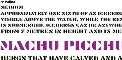 FP Palina is a very simple and geometric, stencil typeface with a strong graphic design.
 - DF Tapa by Dutchfonts,
$39.00 DF Tapa is a typeface based on the vernacular, popular graphics used in Spain. They proudly announce the daily fresh snacks which are homemade and served in every proper bar.
 - DF Ko by Dutchfonts,
$33.00 The Ko family was developed for the text posters at the Holland Festival in 1997, based on the filling of a lettering stencil with different pen thicknesses. Ko Heavy and the Ko KAP were the first weights; the family was completed in 2002 with a Ko Light, a second Ko KAP and two italics.
 - FP Head by Fontpartners,
$29.00 FP Head is a redesign of a corporate typeface for the Danish trade union FOA. Head is a extended display font, with a blurred look and a touch of FF Max: Hard and soft at the same time. Available in two versions.
 - DF Zzzz by Dutchfonts,
$33.00 This typeface, in fact a bitmap font 'avant la lettre' is an interpretation of the Old Face condensed type. It is being used where space is scarce. Its skeleton is projected on the chain structure of a fly screen. Eventually your text lines fill the space as wide as hypothetical doors can be. In small sizes the text appears to be drawn with a pencil.
 - DF Riga by Dutchfonts,
$33.00 DF Riga is a minimal bitmap typeface which works very well in small sizes both on your screen and on paper. But... if you want to express its deep beauty, use it in display sizes and the smell of ink is there. These typefaces (DF-A BIT, DF-Riga and DF-Dudok) owe their existence to the excellent letterpress printing of Hanneke Briër at the Grafisch Centrum Groningen. Beyond ‘the perfect’ there is a lot to get, it is made, you can see that.
 - Por Siempre Gótica - Personal use only

- Top Speed Outline - Unknown license

- Top Speed Heavy - Unknown license

- A Little Pot - Personal use only

- Top Billing JNL by Jeff Levine,
$29.00Sometimes the simplest ideas yield more than one result. The basic “dot matrix” design of aligned circles that was the basis for Transactive JNL also yielded Zera JNL (connected rings) and Pillow Puff JNL (fluffy and cloud-like lettering). One more design was originally cast aside. A separate file is available for filling in the letters with a colored background, however minute adjustments may be needed due to the fact that each drawing or design software program has its own characteristics and quirks. NOTE: DO NOT purchase the fill font as a “stand alone” type face because of the difference in spacing and alignment. For the dot matrix look in your work, please purchase Transactive JNL. - Top Tune JNL by Jeff Levine,
$29.00 The 1955 British edition of the sheet music for Frank Sinatra's hit "I'm Walking Behind You" had its title hand lettered in a sans serif design straight out of the Art Deco era. This bold, condensed type style is now available as Top Tune JNL; in both regular and oblique versions.
 - Just Flower Pots by Outside the Line,
$19.00 Pots of flowers, pots of leaves. 30 topiaries, daffodils, hearts, daisies, lily, a snail, a butterfly, a ladybug, a shovel, a bell jar and watering can too. Just in time for Spring.
 - Top Kick NF by Nick's Fonts,
$10.00Schriftatlas: Alphabete von A bis Z strikes again with this dazzling display of geometry at play, originally named Concentra. Best used at larger sizes for maximum impact. Both versions contain the complete Latin 1252, Central European 1250 and Turkish 1254 character sets. - Boom Pang Pow by TypoGraphicDesign,
$9.00 The typeface Boom Pang Pow is designed from 2020 for the font foundry Typo Graphic Design by Manuel Viergutz. A collection of comic and pop art elements like Speech Bubbles Catch Words, Punctuation Symbols, Boom, Pow, Bang … with various layers for colouring. 1 font-style (Comic) with 248 glyphs (Adobe Latin 1). For use in logos, magazines, posters, advertisement plus as webfont for decorative headlines. The font works best for display size. Have fun with this font & use the DEMO-FONT (with reduced glyph-set) FOR FREE!
 - Hops And Barley by Fenotype,
$25.00 Hops And Barley - a Vintage Font Collection. Hops And Barley includes following: • 6 fonts - a textured and clean version of each • Catchwords, textured and clean version • Ornaments, textured and clean version Hops And Barleys’ core is four font styles. Fonts are designed in the same proportions and they have the same soft edges so that they work great together. Here’s a short introduction to the fonts • Hops And Barley 1 -A Connected Script with Contextual, Swash, Stylistic and Titling Alternates • Hops And Barley 1b -A Bold version of Script • Hops And Barley 2 -A Serif vernacular Swash, Stylistic and Titling Alternates • Hops And Barley 3 -A sturdy Sans Serif with a wide character. • Hops And Barley 3b -A Bold version of Sans Serif • Hops And Barley 4 -A Condensed Sans Serif • Hops And Barley 5 -A set of 61 Catchwords • Hops And Barley 6 -A set of 71 Pictograms Hops and Barley fonts have rugged outline and eroded texture inside the letters. Hops And Barley C stands for Clean - they are an identical set of the styles but they come with straight and clean outlines and softened edges. Hops and Barley fonts work great together or on their own. They’re a fantastic choice for any display use and when paired they can cover the whole display part in any project from website to packaging and from poster to logo.
 - Opz Popz JNL by Jeff Levine,
$29.00 Opz Popz JNL is a collection of fifty-two designs based on geometric designs and pop art (reminiscent of the 1960s). These images are perfect embellishments for retro-themed work projects.
 - Typist Slab Prop by VanderKeur,
$25.00 The Typist SlabSerif is part of a big family, the Typist Family. The family consists of a monospaced, a SlabSerif and a SansSerif version. The idea behind this family originated from the research into the design of typewriter typestyles, which is also the reason why the monospaced version was released first. Since it was decided from the start to make a SlabSerif and a SansSerif version of these monospaced fonts, it was also a logical consequence that the proportional variants also became available in these versions. The monospaced SansSerif fonts have been given the name 'Code' since they are designed to be used while writing code for a software program, for example. The proportional variants with each 6 weights of the Typist Slab Serif and Code (SansSerif) are now available. Although the name may seem a bit strange, it is a logical consequence from the monospaced variant. The SlabSerif variant therefore has Typist Slab Prop, written in full the Typist SlabSerif Proportional. After all, who wants to be bothered with long font names in their font menu. The entire Typist family is designed as a font for use in editorial and publishing publications. A lot of attention has been paid to the spacing and kerning of the fonts. Due to the many variants and weights, this font is versatile. Typist Font Family was designed by Nicolien van der Keur and published by vanderKeur design. Typist Slab Prop and Typist Code Prop contains each 6 styles (Thin, Light, Regular, Medium, SemiBold and Bold, each weight also designed as a true italic) and has family package options. The links to the monospaced version of The Typist are here: https://www.myfonts.com/collections/typist-slab-font-vanderkeur https://www.myfonts.com/collections/typist-code-font-vanderkeur
 - Nanki Poo NF by Nick's Fonts,
$10.00This little gem is based on a typeface discovered in a Boston Type Foundry catalog from the late 1800s, originally called "Mikado". This font gets its name from one of the more memorable characters in Gilbert and Sullivan’s operetta. Both versions of this font include the complete Unicode Latin 1252 and Central European 1250 character sets. - Top Hat JNL by Jeff Levine,
$29.00Top Hat JNL is an new treatment given to Jeff Levine's Art Lover JNL capturing the classic look of Art Deco at its boldest. - Typist Code Prop by VanderKeur,
$25.00 The Typist Code SansSerif is part of a big family, the Typist Family. The family consists of a monospaced, a Slab Serif and a SansSerif version. The idea behind this family originated from the research into the design of typewriter typestyles, which is also the reason why the monospaced version was released first. Since it was decided from the start to make a SlabSerif and a SansSerif version of these monospaced fonts, it was also a logical consequence that the proportional variants also became available in these versions. The monospaced SansSerif fonts have been given the name 'Code' since they are designed to be used while writing code for a software program, for example. The proportional variants with each 6 weights of the Typist Slab Serif and Code (SansSerif) are now available. Although the name may seem a bit strange, it is a logical consequence from the monospaced variant. The SansSerif variant therefore has Typist Code Prop, written in full the Typist Code Proportional. After all, who wants to be bothered with long font names in their font menu. The entire Typist family is designed as a font for use in editorial and publishing publications. A lot of attention has been paid to the spacing and kerning of the fonts. Due to the many variants and weights, this font is versatile. Typist Font Family was designed by Nicolien van der Keur and published by vanderKeur design. Typist Slab Prop and Typist Code Prop contains each 6 styles (Thin, Light, Regular, Medium, Semi-Bold and Bold, each weight also designed as a true italic) and has family package options. The links to the monospaced version of The Typist are here: https://www.myfonts.com/collections/typistslabfont-vanderkeur https://www.myfonts.com/collections/typist-code-font-vanderkeur
 - Sock Hop JNL by Jeff Levine,
$29.00Back in the 1950s and 1960s a popular event was the sock hop - when kids would meet in the school gymnasium, kick off their shoes and dance to the popular records of the day. Sock Hop JNL recalls those simpler times. - I Want My TTR! (Condensed) - Unknown license

- f3 Secuencia round ffp - Personal use only

- f1 Secuencia Quad ffp - Personal use only

- Dip Pen Deco JNL by Jeff Levine,
$29.00 The hand lettered title on the cover of the 1938 sheet music for “If It Rains – Who Cares” featured a condensed Art Deco typeface made with a round nib pen. The square shaped characters with rounded corners were a perfect subject for a digital font revival, and are now available as Dip Pen Deco JNL, in both regular and oblique versions.
 - Doris PP - 100% free

- Po Beef - Unknown license

- PO Box by T-26,
$19.00 - Pip Boy Weapons Dingbats - Unknown license

- Pip Boy Weapons Dingbats - Unknown license

- Pep O Mint Normal - Unknown license

- KR Oh Witchy Poo! - Unknown license

- Peas In A Pod by The Arborie,
$11.00 Peas In A Pod may be a cute font, but this type has a plethora of uses. Its use of thick and thin lines makes it a wonderful display font or an easy-to-read body font.
 - Hop Serif Hand Lettering by Joanne Marie,
$10.00 Here’s another font family for your hand lettering projects. Hop Serif Hand Lettering is a font family consisting of 3 styles: 1.) Hop Serif Hand Lettering Regular 2.) Hop Serif Hand Lettering Lines 3.) Hop Serif Hand Lettering Shadow This font family is all authentically hand drawn from pencil and paper to the digital screen and is perfect to include on designs for apparel such as mugs, t-shirts, bags, notebooks, inspirational quotes for the home and office, and more. Each font is multi-lingual too! I love using this font in my hand lettering designs and I hope you will too!
 - DF Etalage Script by Dutchfonts,
$33.00 Etalage Script was drawn for the first time in the year 2000, based on a early 20th century lettering stencil with what farmer Boelema at Lalleweer stenciled his grainsacks. Eventually the script letter was developed as a typeface with a wink to the ‘lost’ display types for the ‘display window’ of graphic designer Ariënne Boelens, who in exchange made the website www.lalleweer.nl. What originated the Ariënne should be evident now.


