1,963 search results
(0.038 seconds)
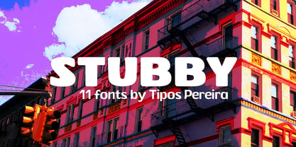
- Stubby by Tipos Pereira,
$12.00Stubby is a display type family with 11 styles, was made for titles, headlines and also packages, posters and everything that provide space for a rude, fat and widish type. You should try Stubby in your text blocks if you're looking for an informal shape with some handwriting taste, there are eleven styles mixing from a narrowed thin to a sloppy ultrabold. Stubby has a tight spacing made to fit in squeeze places, not so elegant or clean but definitely an original choice for your real life project. - Dranskof by PintassilgoPrints,
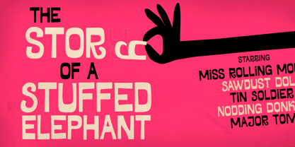
$29.00Dranskof is a light-hearted, cheery font. It is inspired by a page from an extraordinary serbian publication for children by the writer, poet and journalist Duško Radović. Dranskof whimsical letterforms are full of joie de vivre, consisting of different glyphs on upper and lower case slots for added flexibility.The contextual alternates feature will instantly alternate glyphs. To literally add a twist here and there, Dranskof is equipped with a spirited set of stylistic alternates, easily accessible through stylistic alternates feature or by the glyphs palette. This is definitely a 'make feel good' font. Enjoy! - Archwaltz by Creative17studio,
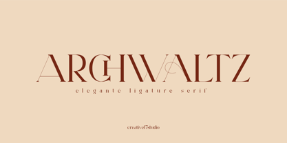
$10.00"Archwaltz" a new elegant ligature serif font. Inspired by the word elegant, Archwaltz is a font that is super unique and has a luxurious also modern impression. With lots of elegant ligatures, you definitely don't want to forget it. Archwaltz is ideal for a wide variety of designs, such as news headlines, letter logos, business cards, poster designs, wedding invitations, and many uses in other design projects. Archwaltz containing many characters and ligatures, numbers, punctuation and European Languages. Archwaltz contains: - Standard Character set - Ligature - Few Alternate - Numeral & Punctuation - Multilingual Support Available Regular & Italic Style - Radiant Days by Prestige Artsy Studio,
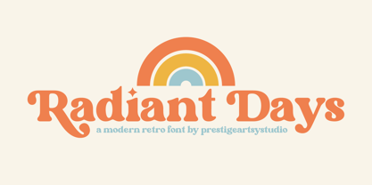
$19.99Spice up your designs with Radiant Days an elegant retro bold serif with its lovely rounded curves that will give a modern retro touch to your designs. Radiant Days with its alternates will provide your project. Whether you are a logo designer, or looking for a great bold header to your designs, retro quotes, Radiant Days will definitely make your work stand-out. To access the ligatures and the stylistic alternates make sure they are ON in the OpenType Feature option. Supported languages: Western European Central European South Eastern European South American Oceanian - Home Education by Hanoded,
$15.00Just before the end of 2020 all schools in Holland closed for the second time, because of an increase in the number of COVID 19 cases. This means that my wife and I have to educate our three kids at home. The kids are great and take their tasks seriously, but it is difficult, as all three of them require different educational levels. I am sure you parents understand. Trying to get some work done is virtually impossible, so my wife and I made a schedule and we live by ‘on duty’ and ‘off duty’ days. I was thinking of this when I created this font (obviously on an ‘off duty’ day). Home Education is a handwritten scribble font. It was made with a Sharpie pen (possibly used by one of my kids, because I noticed tiny ink stains on my wooden dining table…). It comes with all the diacritics you can hope for and lovely double letter ligatures for you to play with. - Silver Streak by Swell Type,
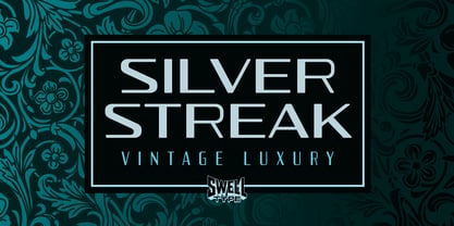
$20.00Inspired by the streamlined lettering of trains, cars and advertisements from the 1930s and 1940s, Silver Streak is a font family that combines Art Deco elegance with refined craftsmanship and modern features. Silver Streak's contrasting strokes and tastefully rounded corners conjure an era of refined, vintage elegance. An extravagant palette of 25 weights — from gracefully tall and thin to commandingly wide and heavy, along with a variable font for unlimited options between — provide unforgettable branding possibilities for luxury items ranging from jewelry, clothing and perfume to the sleek badges of high performance sports cars. Features: Five widths from Compressed to Extended Each with five weights from Light to Heavy Complete family includes a Variable font for precise control of weight and width Support for 223 languages, including Western & Central Europe, Russian Cyrillic, Serbian/Macedonian, Ukranian and Vietnamese Alternate hook-cornered capitals (accessible as Opentype Discretionary Ligatures) Alternate round-topped A in two versions, each with international accents (accessible as Stylistic Alternates) - Interzone by MYSTERIAN,
$9.00This type crept up the sense that it was made in Eastern Europe by poorly trained urbanites from a crippled nation, or that it is the remains of a contemporary gothic (like Eckmann) stencil. The choice of what this type signifies is up to the public. Lately I like the idea of 'putting on' (in McLuhan's sense) a genre of idea that is somewhat different from my tradition's beliefs, and fitting a core category of that toward a teleological/eschatological advantage. Therefore postmodernist/apocalyptic carelessness (which I may 'put on' by using this type) is how I abstain from the cravings of immortality, or more so that wanting it is pointless. It’s stands as memento morí; that I will have to die someday. I have to become less, He must become more. Of course, Interzone may signify a classic Joy Division track from Unknown Pleasures as well as the Cold Warish ongoings of conflicted eastern European life. I considered naming this Lunik 9. - Panamericana by Andinistas,
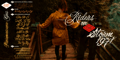
$19.95@andinistas presents an update of Panamericana in 2019, a typographic family worn out and expressive with 10 fonts perfect for short writings with cursive and stained calligraphic look. Panamericana works perfectly in headlines or logos of a film because its different thicknesses of corrosion and textures guarantee striking messages on t-shirts, stickers, skateboards, magazines, printed quotes, packaging, headings and all the designs you can imagine. Panamericana works best by exchanging and mixing letter by letter among its 10 fonts. In this way, you will take advantage of its corrosion levels by mixing the 3 uppercase, lowercase and ideal calipers for the beginning, middle or end of words, phrases or short paragraphs. Each empty and full Panamerican area was designed with care, care and attention and that is why its more than 2000 glyphs were carefully planned in 10 fonts designed for maximum performance in compositions that need scruffy and creative visual properties. - Subway Circle by Hanoded,
$15.00My eldest son Sam always wanted to visit Japan and he has been saving up for a ticket for years now. We should have traveled there this year, but due to the pandemic, that was impossible. We’re now trying to go next year. Sam and I did make some kind of itinerary and I told him how we were going to get around, as I have been to Japan many times. I told him about the Shinkansen trains, the cute Tram in Nagasaki and the immense subway system in Tokyo. One of the lines in Tokyo is the so-called Yamanote Circle Line, which I have used on numerous occasions. A new font name was born and it stuck to this particular font! Subway Circle is a 100% handmade font. It is rounded, slightly slanted and comes with a sunny disposition. I am sure that, when you use it, you will find your 生きがい… ;-) - Hyper Turfu by Bisou,
$10.00Made in La Chaux-de-Fonds (Switzerland), HyperTurfu was born during the shooting of “The Return of Hyperturfu Xpress 2”. A GoPro on a lego electric train, meters and meters of rails, an empty industrial space, loads of puppets, paper, cardboard, pizza boxes, lights, hot glue and a bunch of friends preparing a one shot scene for a month. The title of the movie was made out of lego pieces, painted with golden spray and hanged over the rails. It was the first inspiration for this awsome superbold font. HyperTurfu is thought from ground up to give a strong impact. It’s gothic retro science fiction 80’s style makes it best suitable for metal music albums or posters. As the “Banco” font it works perfectly with short texts for advertisement, bar, cofee shops concert places or even fancy hairdresser. Just hang it over a pet shop and see what cool animals will come in. - Mc Lemore by Galapagos,
$39.00Back when OpenType hadn't yet opened and Apple was developing the Line Layout Manager called GX Typography I created a test font that I name after my stepdaughter, Kristen (now ITC Kristen). Not wanting to offend my wife I started on a font project and gave her name to this new set of glyphs, Roberta. Unfortunately, the name was already in use so I needed to find another name for the fonts. After September 11th I decided that there were people I'd met during my life who were truly cut from the cloth of the hero. Master Sargent McLemore of the 75th Ranger Battalion was one of these people. I met the Sarge when I was in basic training at Fort Gordon. I saw him 2 weeks before he died in 1970. All of the heroes we see on the silver screen pale in comparison to this man. John Wayne and Clint Eastwood both have played the type well, both could have taken lessons from the Sarge. - Senohraby by Spurnej Type Foundry,
$19.00Senohraby is an uppercase display typeface inspired by the old sign at Senohraby train station that is now slowly chipping away. Senohraby is available in three interconnected styles that freely various ages of the sign. “Paint” is a more or less preserved font written with a flat brush and featuring slight scratches and errors. The other styles, “Dirt” and “Trash”, follow up on this style and are increasingly marked by age, damage and erosion... In each style one can use simple alternation with lowercase letters, context-based alternation to eliminate repetition of adjacent characters, and a broad range of language support. As a result, each letter offers six variations that can be combined. These can be used as another alternation within a single word or as different bold weights. As a bonus, a fourth, additional style named “Crap” is freely available and as the name implies, it contains a wide array of various impurities. - Obla by LetterPalette,
$20.00The Obla font family is a modern serif typeface accompanied by appropriate italic in seven weights. Sketches of letters were drawn manually, using thick marker for creating shape and pencil for finishing details. Calligraphic origin of shapes is revealed beneath strained curves drawn on computer. All of the weights were carefully adjusted to each other. Obla is equipped with some basic OpenType features and supports Cyrillic and Latin script. Using Obla in small sizes is very convenient, because of its large x-height, and Obla is a very readable typeface. It seduces the reader with its vivacious character. The typeface is also suitable for usage in large sizes. The best choice for headlines is using the heaviest (Black) and the lightest (Thin) weight. There are two smaller family packages in offer: Obla Basic Set contains Regular, Italic, Bold and Bold Italic, while Obla Light Set contains Light, Light Italic, SemiBold and SemiBold Italic. These two sets are the most appropriate for working with small text. Other weights can be bought separately, or within the whole family. Obla is an awarded typeface. It got Special Mention in Cyrillic Typefaces category in Granshan 2016 competition and it was chosen as a Merit Winner in Print’s Typography and Lettering Awards competition. At that time, before publishing, the typeface was named Petra. - Arlo Sans by S6 Foundry,
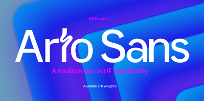
$20.00Arlo is a geometric sans serif typefac containing purposeful subtle design touches, details, and deviations from conformity. The width of the counters and comfortable, breathable apertures means that Arlo Sans has excellent legibility and contrast throughout weights and sizes. Mastered for optimal readability, Arlo Sans is a versatile typefamily, designed with robust, reliable forms; it contains its contemporary personality. The family includes over 20 stylistic glyphic alternatives making it stunningly versatile with its modern details and classic styles. - Imagine, if you will, a font that captures the whimsical essence of a sunny afternoon spent lying in the grass, musing about the mysteries of life with your best friend—a friend who just happens to b...
- Linotype Syntax Lapidar Serif Text by Linotype,
$29.99Modeled on the writings chiseled in stone in the second century B.C., Syntax™ Lapidar is an energetic, spirited typeface designed by Hans Eduard Meier in 2000. Linotype Syntax Lapidar Text and Linotype Syntax Lapidar Serif Text have five weights each, with both cap and lowercase letterforms. Lapidar Display and Lapidar Serif Display also have five weights each, with mostly all cap letterforms and many alternates. It's a terrifically fun and inventive family, and if you look closely, you can see the resemblance to the more modern and restrained Syntax™ relatives. Great for menus, artist books, travelogues, or advertising - and if used very sparingly, it could add just the right element of lapidary significance to corporate documents. - Aquus by phospho,
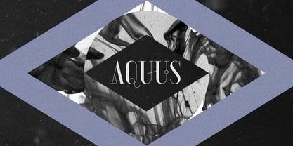
$39.00Aquus is a contemporary all-caps display font that refines the elegance of a classic Didone with experimental interventions. Geometric elements and subtle details are found in its letters, many of which connect to ligatures. Most alternate glyphs can be switched automatically by use of the Stylistic Set function in OpenType-supporting applications, others you can access manually via the glyphs palette. You may try Aquus Linearis as a fashionable outline variant, which reveals its beauty especially when combined with imagery. Use them best for concise strings of characters, such as logotypes, packaging or magazine titles. Aquus Simplex is their sober companion, based on the same letterforms, minus the geometric ornaments and conjunctions. - Linotype Syntax Lapidar Serif Display by Linotype,
$29.99Modeled on the writings chiseled in stone in the second century B.C., Syntax™ Lapidar is an energetic, spirited typeface designed by Hans Eduard Meier in 2000. Linotype Syntax Lapidar Text and Linotype Syntax Lapidar Serif Text have five weights each, with both cap and lowercase letterforms. Lapidar Display and Lapidar Serif Display also have five weights each, with mostly all cap letterforms and many alternates. It's a terrifically fun and inventive family, and if you look closely, you can see the resemblance to the more modern and restrained Syntax™ relatives. Great for menus, artist books, travelogues, or advertising - and if used very sparingly, it could add just the right element of lapidary significance to corporate documents. - Chevin Pro by G-Type,
$72.00Chevin is a contemporary rounded type family in 6 weights which was designed with functionality and legibility in mind. With its open counters and slightly condensed style, Chevin can be used for text and is particularly suited to signage. Erik Spiekermann is a fan, noting that Chevin “is charming without being cute, and very legible even in small sizes because of its restrained shapes and simple construction.” Chevin is named after a hill on the outskirts of Otley in West Yorkshire. Since 2007, the type family has been highly prominent in the UK as Royal Mail’s corporate font and the typeface that adorns every Post Office in the country. The Chevin Pro set includes additional Greek and Cyrillic layouts. - Bosca by Larin Type Co,
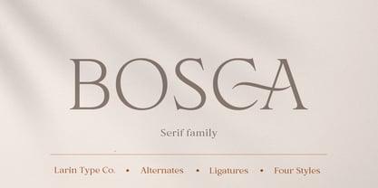
$16.00Bosca this is an elegant serif font family which includes 4 weights. It is multi-purpose and can be used for a variety of tasks. It can look either conservative and restrained or modern and elegant thanks to ligatures and alternative substitutes, they will add variety to your project and make it more attractive and give many options for creating your design. Heavier weights are great for headlines, logos, and other important things. light will look elegant and more discharged. The regular weight is perfect for text tasks, it has a balanced dynamics and is easy to read. This font is easy to use has OpenType features, and all characters in this font have PUA encoding. - Linotype Syntax Lapidar Display by Linotype,
$29.99Modeled on the writings chiseled in stone in the second century B.C., Syntax™ Lapidar is an energetic, spirited typeface designed by Hans Eduard Meier in 2000. Linotype Syntax Lapidar Text and Linotype Syntax Lapidar Serif Text have five weights each, with both cap and lowercase letterforms. Lapidar Display and Lapidar Serif Display also have five weights each, with mostly all cap letterforms and many alternates. It's a terrifically fun and inventive family, and if you look closely, you can see the resemblance to the more modern and restrained Syntax™ relatives. Great for menus, artist books, travelogues, or advertising - and if used very sparingly, it could add just the right element of lapidary significance to corporate documents. - Pascual Ferry by Comicraft,
$39.00The slick and sexy letterforms of Ace ACTION COMICS artist, Pascual Ferry, are the latest to join our MASTERS OF COMIC BOOK ART font line. Pascual's work on the SUPERGIRLS storyline in ACTION made us want to lick each page -- but, y'know, not when anyone was looking... we know they're just comic book characters, they're not REAL and we don't fancy them or anything -- Uhhh... so we were delighted when Pascual invited us to create this stylin' sans souciant family of fonts for him. All we asked for in return was this smokin' alternate cover for the next issue of HIP FLASK... Hey, don't lick your monitor, you might get an electric shock... - Toothpaste Two by Eclectotype,
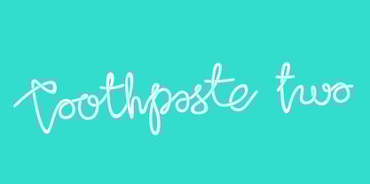
$20.00Toothpaste Two is a reworking of Toothpaste . The new font has all the features of the original Toothpaste, but is now even crazier, with the line twisting and turning over and under itself, making a tangled string of text bordering on the edge of legibility. As in Toothpaste, every letter and number connects and there are numerous contextual alternates and ligatures to keep it all running smoothly. This is a fun, decorative font. It would look good on kids' websites, scrapbooks, party invitations and the like. It works best in brighter colors on darker backgrounds, which give the characters a neon light quality. Also, try it with a stroke for a cool cartoony effect. - Cartes by insigne,
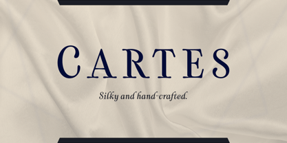
$39.00Cartes has a bit of a strange origin story, as far as fonts go. It’s a combination of ideas from 1920’s advertising and hand-painted letters from the 1500s. The typeface was designed to flow with elegance and speed yet retain a sense of the handmade. The serifs flow with indentations implying movement and terminate with inky globules that lend your copy a sense of gravitas. This typeface can be used for headlines, short texts, posters, logos, headlines, headlines in big sizes or just as easily for ad text. At large sizes, pen strokes can be seen that give the typeface a touch of humanity and vigor. At smaller sizes the type is still unique, but readable. - Chevin Std by G-Type,
$60.00Chevin is a contemporary rounded type family in 6 weights which was designed with functionality and legibility in mind. With its open counters and slightly condensed style Chevin can be used for text and is particularly suited to signage. Erik Spiekermann is a fan, noting that Chevin “is charming without being cute, and very legible even in small sizes because of its restrained shapes and simple construction.” Chevin is named after a hill on the outskirts of Otley in West Yorkshire. Since 2007 the type family has been highly prominent in the UK as Royal Mail’s corporate font and the typeface that adorns every Post Office in the country. The Chevin Pro set includes additional Greek and Cyrillic layouts. - Amhara by Ingo,
$38.00A “latin” alphabet modelled on the ethiopian Ge'ez script - an experiment that works. Amhara was created by transferring the typical forms of the Ethiopian Amharic script to the west European alphabet. Because Amharic is traditionally written with an expanded pen tip, it shows the typical ductus also characteristic of the uncial scripts of late antiquity and the early Middle Ages. So this font »Amhara« has a somewhat sacramental effect. And, although the individual forms look foreign, the overall picture is strangely familiar. The two styles of »Amhara« include a number of ligatures which dispose of many non-attractive letter combinations. Stylistic alternates are available for some letters, too. Read more about this font at ingoFonts... - Linotype Syntax Lapidar Text by Linotype,
$29.99Modeled on the writings chiseled in stone in the second century B.C., Syntax™ Lapidar is an energetic, spirited typeface designed by Hans Eduard Meier in 2000. Linotype Syntax Lapidar Text and Linotype Syntax Lapidar Serif Text have five weights each, with both cap and lowercase letterforms. Lapidar Display and Lapidar Serif Display also have five weights each, with mostly all cap letterforms and many alternates. It's a terrifically fun and inventive family, and if you look closely, you can see the resemblance to the more modern and restrained Syntax™ relatives. Great for menus, artist books, travelogues, or advertising - and if used very sparingly, it could add just the right element of lapidary significance to corporate documents. - Mojacalo AH - Unknown license
- Muraba Arabic by NamelaType,
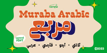
$29.00Muraba Arabic is the sibling font of Muraba, with the addition of Arabic glyphs; Arabic, Persian, Urdu, Kurdish, and Jawi (Pegon). Muraba Arabic font is a one-of-a-kind, bold vintage serif display typeface, defined by its distinctively thick, squared-off serifs that offer decorative flair. This versatile typeface is ideal for various applications, including logos, headers, and display text - Pluton by Proportional Lime,
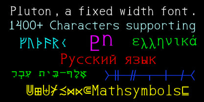
$6.99Pluton, a mono-spaced font, is designed to be versatile and easy on the eyes, with over 1400 defined glyphs. It has wide coverage comprising several different alphabets (Western European, Cyrillic, Hebrew, Runic, Ogham), mathematical, and physical symbols. Pluton Regular has been upgraded to contain over 2600 glyphs. A pluton is a igneous mass of rock formed at considerable depth. - Avayo by Fontop,
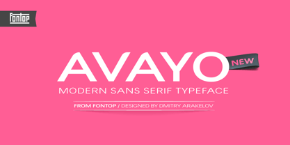
$11.00Avayo is a modern sans serif typeface. It is perfect for creating alphabet logos, branding, titles, headlines, but also looks great when being used casually, in copies and texts. Avayo looks simple but special and distinct and is defined by its round cut design. Avayo font family comes in five weights to help you choose the best option depending on your purpose. - Rudolf by Zuzanna Rogatty,
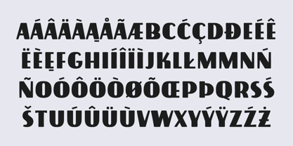
$19.99Rudolf typeface was designed on the basis of medals made by author's grandfather, the sculptor Rudolf Rogatty. He used lettering that was very typical of monuments, medals and commemorative plaques during communist times in Poland, which can still be seen today in any Polish city. These letters are beautiful for their imperfection and they have very strictly defined rules governing their structure. - Brignell Square by IB TYPE Inc.,
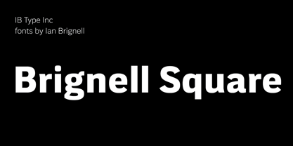
$40.00BRIGNELL SQUARE is a ten font family designed by Ian Brignell. Modern and crisp, this strong-shouldered sans serif offers tonal neutrality. Like Helvetica, Brignell Square is a classic "do anything" font. Spatial balance defines these letter shapes. Creatively, this typeface was born in 1990 out of Ian’s frustration with ubiquitous, barely readable highway signage. Use everywhere. Extended Latin set. - Exotex by ZetDesign,
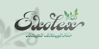
$15.00exotex is a script font created in a bold style at the bottom defined by smooth curves, clean lines, and the finest smooth strokes. Graceful and subtle in its most basic scripted form allows users to elevate their designs to higher levels of aesthetic beauty and elegance. This font is perfect for branding, writing headlines, magazines, and all kinds of your creative work. - Avocado Sans by ArtyType,
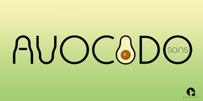
$29.00This ‘pear-shaped’ typeface literally defines its original design inspiration in the first capital letter. The clean-cut lines and uniquely curved letterforms, combined with a thoughtful mix of squared & rounded terminals, all help make Avocado Sans such a stylish and legible font, very easy on the eye. Available in two practical weights, Light & Regular, each offering alternate style options. - Nouvelle Vague by Anatoletype,
$22.00Nouvelle Vague is a display script typeface of a distinguished look defined by a steady rhythm, only broken by its offbeat, dynamic uppercase initials. It's directly inspired by french advertising scripts from the fifties, particularly by Roger Excoffon's Mistral. In order to accentuate this influences and to reproduce their graphic impact, simply structured connections between letters are preferred over OpenType fanciness. - Foundry Journal by The Foundry,
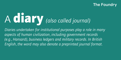
$90.00Foundry Journal is appropriately named for its intended purpose in journals, magazines and publications, where narrow column measures require a more condensed typeface, for the most economic use of page space. Foundry Journal has a characteristic subtle angularity, accentuated by well-defined curve to stem junctions, facilitating legibility and making it an ideal typeface when set at small point sizes. - Ernst by Proportional Lime,
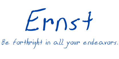
$15.99Ernst is a high powered energetic font designed to provide an interesting and authentic feel to text that needs the handwritten ballpoint pen look without descending into bland letter shapes focused solely on legibility. Ernst has a wide array of glyphs (nearly 1500) defined for many linguistic needs including support for Cyrillic, Runic, Ogham, and various Astronomical and Astrological symbols. - Habana Vieja by Letters&Numbers,
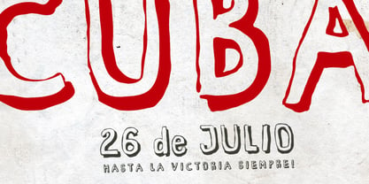
$16.00Habana Vieja is inspired by hand-painted signage in Havana’s old town. Letters are defined by their drop-shadow and worn outlines; suggestive of a sunny environment. This playful sans-serif, bold font, will work well used for headings and short paragraphs especially for posters or signage. Habana Vieja is extended, containing West European diacritics, making it suitable for multilingual environments and publications. - Cascabel by Sudtipos,
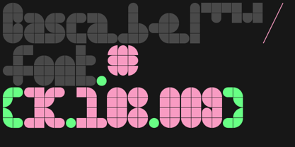
$39.00Cascabel was built on a modular harmony and creates visibly maze-like geometric structures. When typeset in complete words, it conveys an unmistakable architectural approach to a design project. Ideal for magazines, posters or flyers, Cascabel is an alphabet functionally defined by a concept similar to that of building blocks. Designed by Ariel Di Lisio and digitized by Ale Paul.
