10,000 search results
(0.047 seconds)
- Desperation - Unknown license

- Desperate by Typodermic,
$11.95 Are you tired of playing it safe with your typography? Want to stand out from the crowd and make a bold statement? Look no further than Desperate, the punk rock font that will bring a rebellious edge to your designs. With interlocking shapes that give it a new wave feel, Desperate is a font that refuses to play by the rules. And with OpenType technology, it generates wild ligatures for over 200 letter combinations, adding to its unpredictable, untamed vibe. But Desperate isn’t just about making a scene. It delivers your message with an aggressive, hard-hitting style that commands attention. Whether you’re designing a gig poster, album cover, or anything in between, this font will give your work the punk rock attitude it deserves. So why settle for boring fonts when you can embrace your inner rebel with Desperate? It’s time to make your mark and let your designs scream out loud. Most Latin-based European writing systems are supported, including the following languages. Afaan Oromo, Afar, Afrikaans, Albanian, Alsatian, Aromanian, Aymara, Bashkir (Latin), Basque, Belarusian (Latin), Bemba, Bikol, Bosnian, Breton, Cape Verdean, Creole, Catalan, Cebuano, Chamorro, Chavacano, Chichewa, Crimean Tatar (Latin), Croatian, Czech, Danish, Dawan, Dholuo, Dutch, English, Estonian, Faroese, Fijian, Filipino, Finnish, French, Frisian, Friulian, Gagauz (Latin), Galician, Ganda, Genoese, German, Greenlandic, Guadeloupean Creole, Haitian Creole, Hawaiian, Hiligaynon, Hungarian, Icelandic, Ilocano, Indonesian, Irish, Italian, Jamaican, Kaqchikel, Karakalpak (Latin), Kashubian, Kikongo, Kinyarwanda, Kirundi, Kurdish (Latin), Latvian, Lithuanian, Lombard, Low Saxon, Luxembourgish, Maasai, Makhuwa, Malay, Maltese, Māori, Moldovan, Montenegrin, Ndebele, Neapolitan, Norwegian, Novial, Occitan, Ossetian (Latin), Papiamento, Piedmontese, Polish, Portuguese, Quechua, Rarotongan, Romanian, Romansh, Sami, Sango, Saramaccan, Sardinian, Scottish Gaelic, Serbian (Latin), Shona, Sicilian, Silesian, Slovak, Slovenian, Somali, Sorbian, Sotho, Spanish, Swahili, Swazi, Swedish, Tagalog, Tahitian, Tetum, Tongan, Tshiluba, Tsonga, Tswana, Tumbuka, Turkish, Turkmen (Latin), Tuvaluan, Uzbek (Latin), Venetian, Vepsian, Võro, Walloon, Waray-Waray, Wayuu, Welsh, Wolof, Xhosa, Yapese, Zapotec Zulu and Zuni.
 - the DEEPER - Personal use only

- Dezter Black Metal Font by Tebaltipis Studio,
$35.00 Morse Font is a cool alternative for you to easily create a logo for your Underground band or whatever. Using alternate front and ending letters brings the font to life, It comes with a basic character set and a small group of symbols and signs often used in the extreme music sector.
 - Jesper by Linotype,
$29.993 robbers is not a typeface family, only a collective name for three typefaces with the looks of handtexted characters: Kasper, Jesper and Jonatan. There are some common traits between them, but they are three individuals. As the three terrible" robbers in the Swedish writer Lennart Hellsing's Kamomillastad - the ones who borrowed their names to the typefaces - are three individuals. They always appear in the same order: first Kasper, then Jesper and last Jonatan. Swedish children love to sing about them and are not at all scared of them. All three robbers were released in 1995. - Reeler by Mans Greback,
$59.00 Rounded sans-serif with a clean design.
 - Sweeper by Gustav & Brun,
$12.00 Sweeper is a font with several personalities; it’s friendly and scary at the same time, almost like Santa Claus, but nicer. Sweeper has got a handy touch with a lot of different possibilities. You can use it in several occasions. Sweeper is suitable in any environment: the business district in London or the shores of Oxelösund. It’s hella wide and hella fun!
 - DEXTER by Type Innovations,
$39.00 Dexter is an original new typeface creation by Alex Kaczun. It is a warmer, more sophisticated grotesque that is both fun and interesting. Its tight letter spacing and narrow proportions make the typeface particularly well suited for display sizes and headlines. This intriguing sans with distinctive letter shapes is typical for display fonts of the late 19th and early 20th centuries. Dexter is ideal for titles and headlines looking for impact and style. Dexter is also an excellent choice for magazines, books, posters, brochures, flyers, etc. The large Pro font character set, which supports most Central European and many Eastern European languages, also includes a corresponding small caps font along with old style figures.
 - Dumper by LetterStock,
$25.00 Introducing "Dumper" - Your Original Hand-Drawn 60's Retro Bold Font Step into the bold and vibrant world of "Dumper," a font that seamlessly blends original hand-drawn craftsmanship with the iconic style of the 60's retro era. Ideal for posters, headlines, and vintage-themed branding projects, this font exudes a dynamic energy that adds a bold statement to your designs. Key Features: Original Hand-Drawn Craftsmanship: Each character in "Dumper" is crafted by hand, bringing a unique and authentic touch to your creations. 60's Retro Bold Vibes: Immerse your designs in the bold and lively spirit of the 60's, making "Dumper" a perfect choice for projects seeking a retro aesthetic. Why Choose "Dumper": Craft posters and headlines that command attention with bold and dynamic lettering. Design branding materials that transport your audience back to the vibrant 60's era. Establish a brand presence with a font that effortlessly captures the essence of retro boldness. Download "Dumper" Now and Let Your Designs Boldly Embrace the 60's Retro Vibe!
 - Deepdene by URW Type Foundry,
$35.99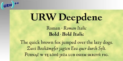
- Deeney by DawnCreative.Id,
$13.00 Deeney is a handwritten style font. The natural form will make your work look more natural, like normal handwriting. This font is perfect for you to use in art, invitation, video, children's books and more.
 - Pepper by Grummedia,
$20.00Pepper was first conceived as an authentic alphabet of runes, but that was far too serious so it ended up as a greater spotted version of Salt. - Dealers by Gumpita Rahayu,
$20.00 Back to the past when the old building and the beauty of a old store decorated by distinctive signage. With a clear feels of authentic historical value and the today's needs must be balanced in order to create the nostalgic feels. Introducing an authentic touch based on old fashioned signage developed into the wood type feels, and it's called Dealers. Dealers is a development of the classic taste wood type to form a solid blocked shapes, modern serifs, and with all caps based characters and slightly condensed. With specific characteristics, dealers font is intended for coffee shops, stores, restaurant menu that you want to create the impression of a classic and harmonious. With the addition of catchwords in the OpenType features, allowing you to be more creative to meet the requirements on the design you create.
 - Semper by Linotype,
$29.99Semper is slightly angular since it is in part based on callygraphic lettering. That is not as evident as in the italic of Jenson Classico. On the contrary, the text looks even and harmonious, which makes the typeface easy to use. The name is Latin meaning always, but you knew that already. Semper was released in 1993. - Keener by Fonthead Design,
$19.00 - Dexterous by Gerald Gallo,
$20.00 Dexterous is my interpretation of an antique typeface. The font includes upper and lowercase alphabets with alternate "E F L M S T" characters and alternate "c e m s" characters, numbers, punctuation, accented characters, symbols, and miscellaneous characters.
 - Baby Jeepers - Unknown license

- Lighthouse Keeper by Asterisk,
$33.00 A fine font for monumental projects. It inspires and perfectly motivates for success and stability. Created from handwritten calligraphy.
 - ITC Jeepers by ITC,
$29.99Designer Nick Curtis found the inspiration for this typeface on a 1920s poster for a German bookseller, by Berlin poster artist Paul Scheurich. ITC Jeepers retains the spontaneity and playfulness of Scheurich's original lettering and adds a few surprises of its own, one being the somewhat exclamatory ear on the lowercase "g". It was, in fact, the excited look of this particular character that gave rise to the font's name. Not to be outdone, the exclamation point takes on an even more startling demeanor. The monoweight, slab serif design has a friendly personality, perfect for headlines and other display uses. - Khan - Unknown license

- Khan - Unknown license

- Khan - Unknown license

- Khan - Unknown license

- Khan - Unknown license

- Khan - Unknown license

- Thang by Fenotype,
$30.00 Aint’ nuthin but the Thang. Thang is a street cred script family with big initial caps and tight flow. Thang is great for flashy headlines or as a logotype. Thang family comes with three weights. Thang Extras is a pack of strokes and dots that can be used to decorate your texts typed with Thang. Thang Extras can also be combined with Thang letters for custom Swash. Thang is packed with several OpenType features: keep on Standard Ligatures and Contextual Alternates for smooth flow. Try Swash, Stylistic or Titling Alternates for alternate characters to create customised lettering works. Check out Glyph Palette for even more alternate characters and go wild the Thang.
 - Thawed by Larin Type Co,
$13.00 Thawed This is a display font of a narrow specialization, its letters seem to have melted and flowed, but at the same time it retains the shape of the letters and is well read. It is perfect for branding, logos, labels, short display inscriptions and advertising materials from flyers to billboards. This font includes drops of style, they make it possible to make the font more voluminous and give detail.
 - Thanks by Monotype,
$15.99 Designed by Romanian lettering artist Andrea Stan, Thanks is a contemporary script packed full of quirky shapes, bouncy baselines and uneven letter heights. This makes Thanks a truly fun and friendly design (Oh and also very polite!). This off-beat font is Bold, monolinear and has a subtle inline twist.
 - Athan by Thinkdust,
$10.00 Athan is an uppercase geometric sans-serif typeface designed by Dani Montesinos in 2009. Inspired by one piece of lettering from the 1970s, Athan offers something a little different in terms of typography. With strong geometric forms, and highly distinctive characters, it's sure to catch your eye.
 - That by Suomi,
$30.00 This is That: a family of four weights with roman and true italics, and also with chiselled medium weight, and Irregular variant for, well, variety.
 - Uthan by Intellecta Design,
$21.90
- Thaun by Scholtz Fonts,
$19.00 I can best describe the Thaun family as a general purpose display family, inspired by Scholtz Fonts' " "Delikat". I wanted to produce a display font that was more robust than Delikat, without losing the delicacy of the original. In order to do this I thinned solid, curved strokes toward the baseline, and let them dwindle to gently rounded points. As a graphic designer I became aware that designs that used a number of styles from the same family seemed to work well. This was easily done using a standard sans serif font such as Arial or Helvetica. However, when a different look is needed, display fonts do not always have a the variety of different styles that are necessary to produce a coherent design. Thus with Thaun, the challenge was to create a coherent family based on a display font. The archetype of this family is Thaun Regular with six different widths forming closely related styles. There are also two variants of the archetype i.e. Thaun Black & Thaun Rough to add variety to the primary style. An additional sub-family, Thaun Accord, appears in two widths. Thaun Jazz is a wide three dimensional variation. Thaun has all the features usually included in a fully professional font. Language support includes all European character sets, Greek symbols and all punctuation. Opentype features include automatic replacement of some characters and discretionary replacement of stylistic alternatives.
 - Font - Unknown license

- Dekers - Personal use only

- Seperated - Unknown license

- Eekers by T-26,
$25.00 - Emperator by Latinotype,
$35.00 Marcelo's new typeface Emperator —based on his knowledge gained from instruction by master calligraphers— provides a fresh perspective on classic typefaces. Emperator comes in 3 variants that make your designs look elegant, legible and expressive. This font is perfectly suitable for a wide range of applications such as titles, wedding invitations, short text, logos, labels, book covers, posters, packaging, etc. Emperator's character set includes small caps (letters, figures and symbols), fractions, stylistic alternates, ligatures, mathematical symbols, etc.— more than 750 glyphs in all, supporting over 200 Latin-based languages.
 - Dever by insigne,
$24.00 Dever’s brute, industrial lines are rounded up in this new typeface from Jeremy Dooley. Dever combines plenty of inspirations. It’s the flair of the Wild West melded with a shout out to the sign painters and package lettering artists of the 1800s. Dever’s big, bold, and handy frame moves through all three of the family’s strapping members. First is the sans. No doubts on what this brother’s like. Dever Sans is as straight-forward as you’ll find in this family with its four separate weights and numerous distressed options. The second of the kin’s a bit of half-breed, you might say. Pointed serifs bring a sharpness to this outfit. Rounding out the family is Dever Wedge, a bit of wild rodeo all its own. This poke’s a quick draw with any of its 107 font, and with it’s auto-replacing alternates, no two repeating characters are alike. You’re guaranteed a great show anytime Dever leaves the chute. The route to Dever was long, with many a switchback. The Wedge variant was designed first, shelved, then developed into Plathorn. But I wanted to return to those brutish forms and decided to round out the family with a sans, serif and plenty of other options. Any of the Dever family have an extended character set including Central and Eastern European languages. The strong faces have specially adapted sub-families, too, so they’re bound and determined to have an outstanding impact at whatever size you use ‘em. It’s a hard ride ahead corralling all those words. Be sure and add these able-bodied boys to your posse today!
 - Rap Script by Graffiti Fonts,
$19.99 - Gate Keeper AOE by Astigmatic,
$19.95 The GateKeeper typeface was inspired by old horror movies, and the various poster typography that went with some of them. A loose and pointy typestyle, GateKeeper embodies the dark side of typography and life, with a creepy and on edge feeling. With large and small capitals, it is easy to exchange cases in events of double characters, which can lend for a very interesting offbeat quality. Usable for any ocassion, but most suitable for dark matter. Learn about the GateKeeper, study his methods, and pass his test. Get the GateKeeper typeface today, and you are on your way!


Page 1 of 250Next page