10,000 search results
(0.076 seconds)
- Carl Beck by Monotype,
$29.99Cartographer Carl Beckman was appalled by the low standard of lettering in Sweden during the 18th century. He published an instruction and pattern book with four different letter forms in Stockholm 1794. The Carl Beck font is based on his Cursiv Skriften no. 1. - Lawson Vintage by Okaycat,
$29.00 Okaycat Font Foundry proudly presents “Lawson Vintage”! A retro classic style font, perhaps futuristic, with vintage textured edges. containing European accents. Beautifully connected cursive with high legibility and style for your design, great for web, print and publication. See original Lawson without texture. Salon
 - Sunny Brush by AEN Creative Studio,
$14.00 Sunny Brush is a cool, cursive and genuine brushed handwritten font. Its natural and unique style makes it incredibly fitting to a large pool of designs. Sunny Brush is PUA encoded which means you can access all of the glyphs and swashes with ease!
 - FS Truman by Fontsmith,
$80.00 Beyond broadcast Like Truman Burbank, the star of The Truman Show, FS Truman was born for TV. You’ll know it from Sky One’s on-screen trails and announcements, but it’s just as at home in other media. Its starting point was the skeleton of a highly legible, space-saving, corporate font with some of FS Dillon’s geometric discipline built in. Its distinctive tone of voice and “ownability” are in its boxy but friendly shapes, and characters with hybrid features. FS Truman’s weights and widths were honed to work at TV screen resolutions. A face for TV it may have been, but this is a font that works on every level, on screen, in print, in headlines, in listings, in longer text, in tight corners and open spaces. The space-saver Compact, condensed but crystal clear, FS Truman comes into its own where a lot needs to be said in not a lot of space. Its letter spacing allows the type room to breathe, even at small sizes, while its fulsome x-height and diminutive descenders pave the way for tighter leading. A natural for headlines and titles over three or four lines. “Hybrid” features With every font, Fontsmith look for crafty new ways to imbue letterforms with a consistent character. The idea with FS Truman was to introduce “hybrid” features. In open letters such as “c” and “s”, for example, the top terminals have straight, vertical cuts while their lower terminals have a more angular, cursive finish. Boxy, spacious forms with unusual curves and angles create not just highly legible and efficient letters but strongly distinctive ones, too.
 - Ongunkan Ogham by Runic World Tamgacı,
$50.00 This font is a latin based version of the ogham alphabet used in the writing of the old irish language. It can be used on Latin keyboards. I will make a unicode font version of this font in the future. Ogham (/ˈɒɡəm/ OG-əm, Modern Irish: [ˈoː(ə)mˠ]; Middle Irish: ogum, ogom, later ogam [ˈɔɣəmˠ] is an Early Medieval alphabet used primarily to write the early Irish language (in the "orthodox" inscriptions, 4th to 6th centuries CE), and later the Old Irish language (scholastic ogham, 6th to 9th centuries). There are roughly 400 surviving orthodox inscriptions on stone monuments throughout Ireland and western Britain, the bulk of which are in southern Munster. The largest number outside Ireland are in Pembrokeshire, Wales. The vast majority of the inscriptions consist of personal names. According to the High Medieval Bríatharogam, the names of various trees can be ascribed to individual letters. For this reason, ogam is sometimes known as the Celtic tree alphabet. The etymology of the word ogam or ogham remains unclear. One possible origin is from the Irish og-úaim 'point-seam', referring to the seam made by the point of a sharp weapon.
 - Automatica BRK - 100% free

- KAPizza - Unknown license

- Nowa by K-Type,
$20.00 A simple, modern sans serif; clean and elegant, just like its inspiration. The name is a play on Futura.
 - Bank Sans EF by Elsner+Flake,
$35.00 With its extended complement, this comprehensive redesign of Bank Gothic by Elsner+Flake offers a wide spectrum for usage. After 80 years, the typeface Bank Gothic, designed by Morris Fuller Benton in 1930, is still as desirable for all areas of graphic design as it has ever been. Its usage spans the design of headlines to exterior design. Game manufacturers adopt this spry typeface, so reminiscent of the Bauhaus and its geometric forms, as often as do architects and web designers. The creative path of the Bank Gothic from hot metal type via phototypesetting to digital variations created by desktop designers has by now taken on great breadth. The number of cuts has increased. The original Roman weight has been augmented by Oblique and Italic variants. The original versions came with just a complement of Small Caps. Now, they are, however, enlarged by often quite individualized lower case letters. In order to do justice to the form changes and in order to differentiate between the various versions, the Bank Gothic, since 2007 a US trademark of the Grosse Pointe Group (Trademark FontHaus, USA), is nowadays available under a variety of different names. Some of these variations remain close to the original concept, others strive for greater individualism in their designs. The typeface family which was cut by the American typefoundry ATF (American Type Founders) in the early 1930’s consisted of a normal and a narrow type family, each one in the weights Light, Medium and Bold. In addition to its basic ornamental structure which has its origin in square or rectangular geometric forms, there is another unique feature of the Bank Gothic: the normally round upper case letters such as B, C, G, O, P, Q, R and U are also rectangular. The one exception is the upper case letter D, which remains round, most likely for legibility reasons (there is the danger of mistaking it for the letter O.) Because of the huge success of this type design, which follows the design principles of the more square and the more contemporary adaption of the already existing Copperplate, it was soon adopted by all of the major type and typesetting manufacturers. Thus, the Bank Gothic appeared at Linotype; as Commerce Gothic it was brought out by Ludlow; and as Deluxe Gothic on Intertype typesetters. Among others, it was also available from Monotype and sold under the name Stationer’s Gothic. In 1936, Linotype introduced 6pt and 12pt weights of the condensed version as Card Gothic. Lateron, Linotype came out with Bank Gothic Medium Condensed in larger sizes and a more narrow set width and named it Poster Gothic. With the advent of photoypesetters and CRT technologies, the Bank Gothic experienced an even wider acceptance. The first digital versions, designed according to present computing technologies, was created by Bitstream whose PostScript fonts in Regular and Medium weights have been available through FontShop since 1991. These were followed by digital redesigns by FontHaus, USA, and, in 1996, by Elsner+Flake who were also the first company to add cursive cuts. In 2009, they extended the family to 16 weights in both Roman and Oblique designs. In addition, they created the long-awaited Cyrillic complement. In 2010, Elsner+Flake completed the set with lowercase letters and small caps. Since its redesign the type family has been available from Elsner+Flake under the name Bank Sans®. The character set of the Bank Sans® Caps and the Bank Sans® covers almost all latin-based languages (Europe Plus) as well as the Cyrillic character set MAC OS Cyrillic and MS Windows 1251. Both families are available in Normal, Condensed and Compressed weights in 4 stroke widths each (Light, Regular, Medium and Bold). The basic stroke widths of the different weights have been kept even which allows the mixing of, for instance, normal upper case letters and the more narrow small caps. This gives the family an even wider and more interactive range of use. There are, furthermore, extensive sets of numerals which can be accessed via OpenType-Features. The Bank Sans® type family, as opposed to the Bank Sans® Caps family, contains, instead of the optically reduced upper case letters, newly designed lower case letters and the matching small caps. Bank Sans® fonts are available in the formats OpenType and TrueType.
 - Bowline Script by Andrew Footit,
$22.00 Bowline Script is a classic monoline cursive script font. This family of 3 fonts has 2 weight options and a Vintage version. Bowline Script is inspired by classic cursive handwriting, the great thing about Bowline Script is its versatile use, it can be used in a retro way or a more modern, clean approach. Anchor script was created with the designer in mind by including some useful stylistic alternates and some swash elements that compliment the font. Use Bowline Script in a range of items like packaging, posters, logotypes, branding, book covers, magazines, wedding stationery and much more. You have the options to keep it clean and modern or take it back to a vintage era.
 - Linka Stencil by Vanarchiv,
$42.00 This font family is display stencil sans-serif with different stylistic layers available as open type font. The main characters are geometric and neutral but when we change the contextual alternates open type feature the letterforms activate the cursive stylish set. The word composition is divided by initial, medial and final forms, available for all uppercase and lowercase, the diacritics for Latin encodings (Western and central Europe and Baltic countries) are available. However the contextual alternate features (cursive mode) can only work on Adobe CS Indesign and Illustrator softwares. This typeface also has uppercase swash and stylish alternates. A large group of discretionary ligatures are also available to improve better legibility and readability on specific characters combinations.
 - ITC Roswell by ITC,
$40.99Roswell was designed by Jim Parkinson, who acknowledges the 'spacey' ancestry of its name. Yes, Roswell, New Mexico. There was a big anniversary of 'the incident' in the news while I was designing in Roswell. "The incident" is of course the alleged UFO crash in Roswell. "I thought the name was acceptable as a serious font name, while, on another level, having a strangely humorous edge," says Parkinson. Roswell looks great in large sizes on a poster or in a magazine layout. It started out as "a variation on American gothic forms like Railroad Gothic", says the designer, but Roswell is an original design with eccentricities of its own." - Makenn01 by giftype,
$20.00 Font Makenn01 is inspired by Asen Petrov’s Perfograma font , based on in the IBM Harvard Mark 1 machines the first electromagnetic computer presented by Howard Aiken this november 84 years ago ,in fact this basic technology received its instructions and data trough punched tapes . It is therefore an interpretation in wich circumferences have been used instead of circles linked with a line , and the name used also refers to Mark 1 calling it Makenn 01 , giving a touch of identity since this name resembles , Carmen my name , the 01, is like a restart of 0 , with the 1 of the Mark 1. It has Greek and Cyrillic characters.
 - P22 Preissig Calligraphic by P22 Type Foundry,
$29.95 P22 Preissig Calligraphic was originally designed by Czech typographer, artist, and designer Vojtěch Preissig (1873–1944). Preissig developed this type design in 1928 and has remained unpublished until recently. One can only speculate why this wonderful design was never produced into a commercially available typeface. His original designs feature an accompanying italic as well as small caps. Preissig had originally named the typeface design after his former employer in New York, Butterick Publishing Co. The ‘Butterick’ typeface retains the angularity of his previous typeface, Preissig Antiqua (AKA P22 Preissig Roman), but displays a more fluid calligraphic influence. P22 Preissig Calligraphic was started shortly after Richard Kegler saw the original drawings in an exhibit in Prague in 2004. A sympathetic security guard allowed a few photographs and the contraband images fueled a development of the typefaces. The design simmered for many years and is now ready to enter the world of contemporary design. P22 Preissig Calligraphic is a 2 font family that contains the originally designed small caps as an OpenType feature, as well as all the necessary diacritical to cover most European languages.
 - Quantico by MADType,
$21.00 Quantico is an angular typeface family that was inspired by old beer packaging and military lettering. It utilizes 30 degree angles and completely straight lines to form unique character shapes. Equally at home in text or display settings, Quantico includes 3 alternate characters as well as several ligatures.
 - Lightnin' by ITC,
$29.99Lightnin' is the work of British designer Alan Meeks. Generous initial capitals complement a more reserved lowercase alphabet, both of which were designed to meet the needs of current fashions in headline typography. Lightnin' will light up all kinds of display work with its robust, angular script style. - India Echo by Vic Fieger,
$6.99India Echo was simply derived from doodling on a whiteboard with a dry erase marker. The aim of the exercise was to create a string of writing that looked foreign enough to be an alien script, angular enough to appear to be futuristic, and familiar enough to be legible. - Prague by ITC,
$29.00Prague was designed by Michael Gills, who was strongly influenced by the work of Czech designer Oldrich Menhart. It is a strong, angular roman typeface with classical overtones. The exciting vibrancy of Prague is suitable for a wide range of advertising work requiring a traditional or classical approach. - SBB Power Grid by Sketchbook B,
$9.00 Powerful and angular. Power Grid comes in four versions: Regular, Stencil, Inline and Rounded. Inspired by 1920s constructivist posters, it's perfect for industrial and bold applications. Power Grid is all caps and includes a handful of alternate glyphs. 8 fonts 4 styles: Regular, Stencil, Inline and Rounded Alternate characters
 - Ongunkan Younger Futhark by Runic World Tamgacı,
$45.00 The Younger Futhark, also called Scandinavian runes, is a runic alphabet and a reduced form of the Elder Futhark, with only 16 characters, in use from about the 9th century, after a "transitional period" during the 7th and 8th centuries. The reduction, somewhat paradoxically, happened at the same time as phonetic changes that led to a greater number of different phonemes in the spoken language, when Proto-Norse evolved into Old Norse. Also, the writing custom avoided carving the same rune consecutively for the same sound, so the spoken distinction between long and short vowels was lost in writing. Thus, the language included distinct sounds and minimal pairs that were written the same. The Younger Futhark is divided into long-branch (Danish) and short-twig (Swedish and Norwegian) runes; in the 10th century, it was further expanded by the "Hälsinge Runes" or staveless runes. The lifetime of the Younger Futhark corresponds roughly to the Viking Age. Their use declined after the Christianization of Scandinavia; most writing in Scandinavia from the 12th century was in the Latin alphabet, but the runic scripts survived in marginal use in the form of the medieval runes (in use ca. 1100–1500) and the Latinised Dalecarlian runes (ca. 1500–1910)
 - Duepuntozero Pro by Zetafonts,
$39.00 Created as a logo typeface in 2004 by Francesco Canovaro, Duepuntozero is one of Zetafonts classic typefaces. A monolinear sans serif typeface with rounded corners and condensed proportions, strictly based on modular geometric design, it was at first designed in five weights to be used as a condensed companion typeface to the rounded display family Arista. In 2019 the family was completely redesigned by the Zetafonts Team, expanding the original character set to include cyrillic and greek glyphs and adding four extra weights and italics to the original weight range. This restored and revamped version, named Duepuntozero Pro, also includes full Open Type features for positional figures, fractions and Small Caps. With his rounded, minimal aesthetic, Duepuntozero embodies the desire for simplicity and playfulness of contemporary mobile applications, making it a perfect choice for gaming and app interface design. Its compact design allow for maximum space saving on mobile screens when used as a text typeface, while the strictly geometric design and the extreme range of weights (including thin and black) make it excel in display, logo and editorial use. A complementary set of free icons in the same range of weights of the font is provided to help designers build consistent branding through pictograms in infographics, interfaces and editorial products.
 - Invocation AOE by Astigmatic,
$19.95 Made from a simple font incantation, the Invocation typeface was born. Inspired by an old Atari game called Necromancer where trees uprooted and came after the wizard, or something like that. The end result, a thematic typeface spawning roots. On darkened night, the moon eclipsed, a cryptic verse does pass my lips, from ancient parchment, edges worn, this Invoctation font is born... Sometimes we need an evil look for our designs, so why not summon this typeface into your hands today!
 - Regular Joe by GroupType,
$21.00 Regular Joe was first delivered to the font world by Ron and Joe. Yes, the same Ron and Joe of the ArtParts fame. A few years of being so regular, Regular Joe became, well, just bored. Regular Joe needed company. He wished for a family. After all, most of his font friends had big families. His wishes were granted by FontHaus. So Skinny and Husky were created to be with Regular and all together, they became Family Joe. All is well.
 - Lost Arcade by Chris Rogers Fonts and Symbols,
$19.00 Are you a game developer, retro enthusiast or lover of pixel art? Ever had trouble tracking down an 8-bit display font that's classy, coherent and truly complete? This type enthusiast and veteran pixel artist once had the same problem, and cut no corners to solve it. Lost Arcade features four styles, a myriad of special characters, broad language support and an accompanying symbol font with 64 pixel art symbols. For the purists out there, each square is proportional to its neighbor.
 - School Type by STARSsoft,
$10.90 The decorative font "SchoolType" came straight from our school notebooks. We painted these letters in our notebooks, but now they can be printed on a computer. All uppercase Latin letters have the same width, which is ideal for designers. As always, we offer you a font with support for many languages. Standard and Latin Extended support such languages - English, Danish, Spanish, German, Norwegian, Polish, Portuguese, French, Swedish. Standard and extended Cyrillic are supported by languages - Russian, Belarusian, Bulgarian, Macedonian, Serbian, Ukrainian, Kazakh, Kyrgyz.
 - Automatica (BRK) - Unknown license

- Piano Solo JNL by Jeff Levine,
$29.00 The hand-lettered name on a couple of 1940s-era piano course books was the basis for Piano Solo JNL.
 - Kexman by Gleb Guralnyk,
$15.00 Hi! Introducing a calligraphic handmade script named "Kexman". It's a one line font with many OpenType features: ligatures, alternates, swashes.
 - Retale by Slide Shoot,
$19.00 Retale Serif is a balanced, smooth, elegant and stylish serif font. He has a beautiful character. It fits perfectly with invitation card designs, company logos, movie titles, movie names, business cards, book titles, brand names and various other designs. Retale Serif is a subtle sans serif font that exudes sophistication and elegance. Its stylish alternations and ligatures make this font the perfect partner for any project.
 - Vloera by Slide Shoot,
$17.00 Vloera Serif is a balanced, smooth, elegant and stylish serif font. He has a beautiful character. It fits perfectly with invitation card designs, company logos, movie titles, movie names, business cards, book titles, brand names and various other designs. Vloera Serif is a subtle serif font that exudes sophistication and elegance. Its stylish alternations and ligatures make this font the perfect partner for any project.
 - Theater Alley JNL by Jeff Levine,
$29.00 Found within the pages of the 1927 edition of the “Welo Studio Handbook - Letter and Design for Artist and Advertisers” is an elegant Art Deco multi-line alphabet. Digitally redrawn as Theater Alley JNL, it is available in both regular and oblique versions. The font takes its name from that of a street in New York, although the street’s name uses the old-fashioned spelling of “theatre”.
 - Smackeroo NF by Nick's Fonts,
$10.00 The model for this monocase typeface was issued in the early 1900s by Barnhart Brothers & Spindler with the rather prosaic name of Steelplate. A hundred years later, it still retains its currency (ouch!), which is how it got its name. Complete Adobe character set except for superior numbers. The Opentype version of this font supports Unicode 1250 (Central European) languages, as well as Unicode 1252 (Latin) languages.
 - Essly by Slide Shoot,
$15.00 Essly Serif is a balanced, smooth, elegant and stylish serif font. He has a beautiful character. It fits perfectly with invitation card designs, company logos, movie titles, movie names, business cards, book titles, brand names and various other designs. Essly Serif is a subtle serif font that exudes sophistication and elegance. Its stylish alternations and ligatures make this font the perfect partner for any project.
 - Hiroka by Slide Shoot,
$12.00 Hiroka Serif is a balanced, smooth, elegant and stylish serif font. He has a beautiful character. It fits perfectly with invitation card designs, company logos, movie titles, movie names, business cards, book titles, brand names and various other designs. Hiroka Serif is a subtle serif font that exudes sophistication and elegance. Its stylish alternations and ligatures make this font the perfect partner for any project.
 - Hazeon by Slide Shoot,
$15.00 Hazeon Serif is a balanced, smooth, elegant and stylish serif font. He has a beautiful character. It fits perfectly with invitation card designs, company logos, movie titles, movie names, business cards, book titles, brand names and various other designs. Hazeon Serif is a subtle serif font that exudes sophistication and elegance. Its stylish alternations and ligatures make this font the perfect partner for any project.
 - Viora by Slide Shoot,
$17.00 Viora Serif is a balanced, smooth, elegant and stylish serif font. He has a beautiful character. It fits perfectly with invitation card designs, company logos, movie titles, movie names, business cards, book titles, brand names and various other designs. Viora Serif is a subtle serif font that exudes sophistication and elegance. Its stylish alternations and ligatures make this font the perfect partner for any project.
 - Novaria by Slide Shoot,
$12.00 Novaria Serif is a balanced, smooth, elegant and stylish serif font. He has a beautiful character. It fits perfectly with invitation card designs, company logos, movie titles, movie names, business cards, book titles, brand names and various other designs. Novaria Serif is a subtle serif font that exudes sophistication and elegance. Its stylish alternations and ligatures make this font the perfect partner for any project.
 - Klepsydra by Hellig,
$12.00 When creating the font, I was inspired by the various names of musical groups and sci-fi movies. I took the hourglass shape as a basis and added various serifs to it, hence the name of my font appeared - Klepsydra, as in the Greek hourglass. This style has an abbreviation - "Z". I will develop this font family and will add new styles, as well as characters.
 - Varesha by Slide Shoot,
$17.00 Varesha Serif is a balanced, smooth, elegant and stylish serif font. He has a beautiful character. It fits perfectly with invitation card designs, company logos, movie titles, movie names, business cards, book titles, brand names and various other designs. Varesha Serif is a subtle serif font that exudes sophistication and elegance. Its stylish alternations and ligatures make this font the perfect partner for any project.
 - Romansa by Slide Shoot,
$12.00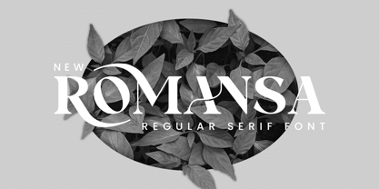 Romansa Serif is a balanced, smooth, elegant and stylish serif font. He has a beautiful character. It fits perfectly with invitation card designs, company logos, movie titles, movie names, business cards, book titles, brand names and various other designs. Romansa Serif is a subtle serif font that exudes sophistication and elegance. Its stylish alternations and ligatures make this font the perfect partner for any project.


