10,000 search results
(0.23 seconds)
- Royal Exquisite by UICreative,
$23.00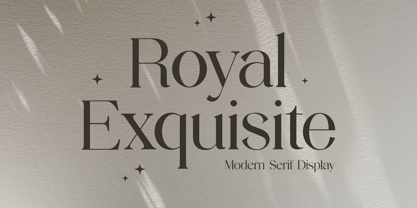 Introducing our new product the name Royal Exquisite Modern Serif Font. Modern Serif font that beautiful classy, elegant, and modern. This font is perfectly suited for a wide variety of projects, such as signature, stationery, logo, wedding, typography quotes, magazine or book covers, website headers, clothing, branding, packaging design, and more. Also for fashion-related branding or editorial design and displays both masculine and feminine qualities.
 - SK Brushwood by Shriftovik,
$10.00 SK Brushwood is an experimental geometric font based on chaotic lines. It is inspired by the Greek stone script, but nevertheless it is modern. The main component of the letter shape is straight and sloping lines ending in straight corners, which makes it look like brushwood. This is why the font gets its name. SK Brushwood is perfect for headlines, posters, print work, and the Internet.
 - People Talk JNL by Jeff Levine,
$29.00 A title card with cast credits for the 1935 movie “The Whole Town’s Talking” (starring Edward G. Robinson and Jean Arthur) formed the basis for People Talk JNL. The hand lettered names were done in a slightly condensed slab serif – mostly rectangular in shape with rounded corners. A few characters take on their own unique appearance. People Talk JNL is available in both regular and oblique versions.
 - Faithfully by UICreative,
$23.00 Introducing our new product the name Faithfully Luxury Serif Font. Modern Serif font that feels beautiful classy, elegant, and modern. This font is perfectly suited for a wide variety of projects, such as signature, stationery, logo, wedding, typography quotes, magazine or book covers, website headers, clothing, branding, packaging design, and more. Also for fashion-related branding or editorial design and displays both masculine and feminine qualities.
 - Presswork JNL by Jeff Levine,
$29.00 Sheet music for the 1939 song “On the Paraña” featured Art Deco hand lettering in a classic “thick and thin” style, with many stylized characters. The publisher of the song was the Theodore Presser Company of Philadelphia, so the name “Presswork” aptly fit this typographic design. Presswork JNL is available in both regular and oblique versions. For trivia buffs, the Paraña is a river in Brazil.
 - Marquisette by UICreative,
$23.00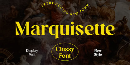 Introducing our new product the name Marquisette Classy Serif Font. Modern Serif font that feels beautiful classy, elegant, and modern. This font is perfectly suited for a wide variety of projects, such as signature, stationery, logo, wedding, typography quotes, magazine or book covers, website headers, clothing, branding, packaging design, and more. Also for fashion-related branding or editorial design and displays both masculine and feminine qualities.
 - Glycerints by UICreative,
$23.00 Introducing our new product the name Glycerints Elegant Serif Font. Modern Serif font that feels beautiful classy, elegant, and modern. This font is perfectly suited for a wide variety of projects, such as signature, stationery, logo, wedding, typography quotes, magazine or book covers, website headers, clothing, branding, packaging design, and more. Also for fashion-related branding or editorial design and displays both masculine and feminine qualities.
 - Wilhelmina by UICreative,
$23.00 Introducing our new product the name Wilhelmina Vintage Serif Font. Modern Serif font that feels beautiful classy, elegant, and modern. This font is perfectly suited for a wide variety of projects, such as signature, stationery, logo, wedding, typography quotes, magazine or book covers, website headers, clothing, branding, packaging design, and more. Also for fashion-related branding or editorial design and displays both masculine and feminine qualities.
 - Glomerolus by UICreative,
$23.00 Introducing our new product the name Glomerolus Modern Classy Serif Font. Modern Serif font that feels beautiful classy, elegant, and modern. This font is perfectly suited for a wide variety of projects, such as signature, stationery, logo, wedding, typography quotes, magazine or book covers, website headers, clothing, branding, packaging design, and more. Also for fashion-related branding or editorial design and displays both masculine and feminine qualities.
 - Kepler by Adobe,
$29.00Named after the German Renaissance astronomer, Kepler is a contemporary type family designed by Robert Slimbach in the tradition of classic modern 18th century typefaces. Modern typefaces are known for their cool intellectual quality, but Slimbach's Kepler multiple master captures the modern style in a humanistic manner. It is elegant and refined with a hint of Oldstyle proportion and calligraphic detailing that lends it warmth and energy. - The Stacy by BlackLotus,
$15.00 The Stacy is a retro script inspired font. This font has a variety of unique alternates and also has 2 styles, namely regular standard and italic. The Stacy is perfect for a wide variety of projects, and can be easily combined with a wide variety of colors. The Stacy has a bold character and soft nuances that will make a striking impression on everyone who sees it.
 - Monumental by UICreative,
$23.00 Introducing our new product the name Monumental Modern Display Serif Font. Modern Serif font that feels beautiful classy, elegant, and modern. This font is perfectly suited for a wide variety of projects, such as signature, stationery, logo, wedding, typography quotes, magazine or book covers, website headers, clothing, branding, packaging design, and more. Also for fashion-related branding or editorial design and displays both masculine and feminine qualities.
 - Breakwater by UICreative,
$23.00 Introducing our new product the name Breakwater Modern Classy Font. Modern Serif font that feels beautiful classy, elegant, and modern. This font is perfectly suited for a wide variety of projects, such as signature, stationery, logo, wedding, typography quotes, magazine or book covers, website headers, clothing, branding, packaging design, and more. Also for fashion-related branding or editorial design and displays both masculine and feminine qualities.
 - Running Hipster by Hanoded,
$15.00 Running Hipster is a tall, thin and all caps font with a funny name. The upper and lower case letters differ and can be mixed. You don’t necessarily have to use it to market your free range sheep woolen jumpers or organic button squash and soy based sour cream soup, feel free to use it for just about anything. Comes with a vintage amount of diacritics.
 - CA Mechano by Cape Arcona Type Foundry,
$19.00 CA Mechano is quite what the name suggests – A mechanical typeface. Pretty straight forward and all-caps as long as you don’t activate the stylistic set "disorder". You will see what happens then: a lot of fun for the typographic eye. A more consumable distraction is offered by the other stylistic set. You will discover peacefully rounded letters in the neighborhood of strictly mechanically constructed glyphs.
 - Brogadier by UICreative,
$23.00 Introducing our new product the name Brogadier Elegant Serif Font. Modern Serif font that feels beautiful classy, elegant, and modern. This font is perfectly suited for a wide variety of projects, such as signature, stationery, logo, wedding, typography quotes, magazine or book covers, website headers, clothing, branding, packaging design, and more. Also for fashion-related branding or editorial design and displays both masculine and feminine qualities.
 - Barata Display by Estudio Arellano Type Foundry,
$25.00 Barata Display is an all caps script family font inspired by the street vendors and informal commerce in Latin countries. A condensed defined and thick stroke evokes the chalk signs that are made in "tianguis", markets, greengrocers, barbecues and flea markets from Los Angeles to Buenos Aires. It is a typeface that "SCREAM" buy me, save money, discounted, almost Free, opportunity!. What distinguishes the New Barata Display from Estudio Arellano Type Foundry is the expressive power of its structure. The Alphabet is built on the geometric principle of free traces from freehand writing. Composed of 236 capital Roman characters, Barata Display includes most common accents and diacritics. Barata Display can be used in any kind of commercial or personal promotion, in graphic design, web, print, animation, etc. Perfect for price labels, tags and other applications such as posters and t-shirts. It is a typeface ideal for headlines and Lettering.
 - Brown Amsonia by Nathatype,
$29.00 Brown Amsonia is a lovely script font of which letters are in handwriting to express unique, personal nuances in your designs. Such a handwriting font is available in high contrasts having noticeable differences between the bright and the dark letter parts to produce clear, firm displays making the designs look professional and modern. Besides, Brown Amsonia can express personal, artistic displays to create more interesting, noticeable designs. The letters are interconnected and their details show sharp, curvy scratches on the edges. Due to the complex font style details, this font is better to apply for big text sizes. In addition, you may enjoy the available features here. Features: Ligatures Stylistic Sets Multilingual Supports PUA Encoded Numerals and Punctuations Brown Amsonia fits best for various design projects, such as brandings, invitations, greeting cards, name cards, quotes, printed products, merchandise, social media, etc. Find out more ways to use this font by taking a look at the font preview. Thanks for purchasing our fonts. Hopefully, you have a great time using our font. Feel free to contact us anytime for further information or when you have trouble with the font. Thanks a lot and happy designing.
 - Hagrid by Zetafonts,
$39.00 Crypto-typography - the passion for unknown, weird and unusual character shapes - is a disease commonly affecting type designers. Cosimo Lorenzo Pancini has celebrated it in this typeface family, aptly named Hagrid after the half-blood giant with a passion for cryptozoology described by R. K. Rowling in her Harry Potter books. Extreme optical corrections, calligraphic counter-spaces, inverted contrast, over-the-top overshoots: all the inventions that abound in vernacular and experimental typography have been lovingly collected in this mongrel sans serif family, carefully balancing quirky solutions and solid grotesque design. Hagrid is a typeface designed for editorial & display use, bringing dynamism to the printed and digital page thanks to its extreme contrast and unique details. It has been developed in a range of six display weights ranging from the monolinear and more traditional thin to the expressive heavy weight. For better readability in small sizes and on the web, a companion text family has been developed, with a slightly different selection of weights, wider metrics, and fine adjustments to keep the dynamic expressivity of the design without sacrificing legibility. This is evident in the design of italics: while the display italics sport a cursive feel with calligraphic terminals to lowercase letters, the text design is more restrained, with a more classical geometric grotesque slanted look. Given the crypto-typographer love for foreign specimens of letters, special care has been put into making Hagrid ready for multilingual projects, giving it an extended character sets covering over two hundred languages that use Latin, Cyrillic and Arabic alphabets and adding a selected range of OpenType features to handle alternate forms and stylistic sets.
 - Charpentier Sans Pro by Ingo,
$41.00 A humanistic sans serif The first version of this font was created in 1994 within the framework of the bid placed by the city of Graz to become the location for the Winter Olympics in 2006. Appropriately, its original name was ”Olympia.“ The font is intended to embody classic ideals as well as to meet modern demands. The proportions of Charpentier Sans are directly derived from Roman capitals and the humanistic book-face. The contrast between strokes and thin strokes is based on medieval uncial script. And thus, a modern serif sans was created emphasizing thick and thin strokes together. Thanks to its traditional form language, Charpentier Sans is very legible, adapts to various forms of content and expresses a kind of calmness and certainty. Details resulting from writing with the quill guarantee that the font doesn’t appear too rough and unemotional. Even the tiny, pointed mini serifs contribute to the unmistakable appearance of the font. They create an exciting contrast to the soft flowing forms of the letters and are, to a great extent, conducive to the legibility. Consequently Charpentier Sans always appears with an extremely sharp and clear outline. Charpentier Sans Italique has an even more distinct ductus derived from writing. Especially the rounded forms from a, e, f, g and y reflect the handwritten humanistic cursive. Charpentier Sans is comprised of many ligatures, including discretional ones, plus proportional medieval and capital figures for the normal type as well as disproportional tabular figures with a consistent width. Above and beyond the ”normal“ Latin typeface system, small caps are available as an especially elegant form of distinction.
 - HelenaDEMOVERSION - Personal use only

- King Arthur - Unknown license

- Record Promotion JNL by Jeff Levine,
$29.00 Record Promotion JNL is based on a stencil version of the same classic font that inspired Album Cover JNL and Record Jacket JNL.
 - Night Hunt by Ronin Design,
$12.00 Night Hunt is a display font, strong and elegant. Night Hunt designed for movie title, poster and cover design, apps and games design
 - BuggyFont by Ingrimayne Type,
$14.95 AntsyPantsy, BuggyFont, and MousyFont are based on the same design; only the building blocks—ants, bugs, and a stylized mouse—have been changed.
 - Xesy by Dharma Type,
$19.99 Odd and funny script for happy, fun time. There are two other fonts designed by in the same concept. -Ekistra -Deluta Black -Xesy
 - Desk Jockey JNL by Jeff Levine,
$29.00Desk Jockey JNL features the same font found in Jeff's Levine's Mailbox Letters JNL (based on self-adhesive lettering), but without the rectangles. - AntsyPantsy by Ingrimayne Type,
$14.95 AntsyPantsy, BuggyFont, and MousyFont are based on the same design; only the building blocks—ants, bugs, and a stylized mouse—have been changed.
 - MousyFont by Ingrimayne Type,
$14.00 AntsyPantsy, BuggyFont, and MousyFont are based on the same design; only the building blocks—ants, bugs, and a stylized mouse—have been changed.
 - Resiliency3 by Alphabet Agency,
$15.00 Resiliency3 font family was designed for use in sports and fitness themes. Gaming is another genres that the font family pairs well with.
 - Robert Moore by Harvester Type,
$15.00 Robert Moore is a font that was specially designed for comics. A lot of work has been done. At first, glyphs were drawn manually using different markers, then they were transferred to the font. The font was tested on real printing and digital comics. The world of fonts for comics is big and I wanted to create even more variability for authors with one family, which is why a variable version was created containing two axes: weight and italics. This gives you more options. A large number of glyphs, multilingualism, ligatures, and a capital give even more scope for work and creativity. The name was created from the names of the authors of the comics Robert Kirkman and Alana Moore, so the Robert Moore font turned out. Although the font was made for comics, it is not limited to them. Posters, logos, covers, text, headings, prints, product design, web, interfaces are not all options for using the font.
 - Kis Classico by Linotype,
$29.99Kis Classico™ is named after the Hungarian monk Miklós Kis who traveled to Amsterdam at the end of the seventeenth century to learn the art of printing. Amsterdam was a center of printing and punchcutting, and Kis cut his own type there in about 1685. For centuries, Kis's type was wrongly attributed to Anton Janson, a Dutch punchcutter who worked in Leipzig in the seventeenth century. Most versions of this type still go by the name Janson. In 1993, the Italian/Swedish type designer Franko Luin completed Kis Classico, his own contemporary interpretation of the Kis types. About the Kis/Janson story, Luin says: If you understand Hungarian I recommend you read the monograph, 'Tótfalusi Kis Miklós' by György Haiman, published in 1972 by Magyar Helikon. It has hundreds of reproductions from his Amsterdam period and from the time when he was an established printer in Kolozsvár (today's Cluj in Romania)." Kis Classico has five weights, and is an admirable version of this classic type. - Koomerang by Type Associates,
$21.95 I arrived this concept as a means to fulfil a need for a simple yet radical semi-sans with rounded terminals. My concept called for a modular approach so a single weight font family resulted, the monoline stroke weights being one-eighth of the cap height and the x-height five-eights, the descent two units. Within these constraints I found it was simple to devise an alphabet which met my need for quirkiness whilst retaining its legibility. As for the outline, shadow and contour variants - well they just seem to work. If you are wondering - and you don't hail from the "Land Downunder" - Canberra is our nation's capital; Bondi - "water breaking over rocks" a beautiful beach in Sydney; Uluru is the name given to the world's largest pebble, (formerly known as Ayers Rock); Kakadu is a national park in the "Top End" and Koomerang means "hill of clouds" - all place names in their respective Australian indigenous languages. Come on down - the natives are friendly.
 - Haakke by Dawnland,
$13.00 Haakke (or Håkke) - a casual, hand drawn (Stabilo OH pen, Fine) font with 4 alternates to all upper and lower case letters (a-z + å ä ö) as well as numbers for a realistic hand written look and feel! “Ligatures” have been created for double letters (TT, tt, ff, ll & LL (open type version of the font and open type compatible layout application required). Of course it holds all(?) the special characters that you will ever need. 451 glyphs... Haakke also includes symbols. Zodiak signs (letter a-l, upper case A-L write the corresponding name of the sign), planet signs (m-z, upper case M-Z write the corresponding name of the planet) triangles, squares and stars (from pentagrams (5 pointed) to Dodecagrams (12 pointed). (Write a 4, or shift-4 ("euro-sign", european keyboard, or "dollar sign", american keyboard) before your star or triangle and you will get a circle around it).
 - Mr De Haviland Pro by Sudtipos,
$45.00 The Charles Bluemlein Script Collection is an intriguing reminder of the heady days of hand lettering and calligraphy in the United States. From the early 1930s through World War II, there were about 200 professional hand letterers working in New York City alone. This occupation saw its demise with the advent of photo lettering, and after digital typography, became virtually extinct. The odd way in which the Bluemlein scripts were assembled and created - by collecting different signatures and then building complete alphabets from them - is a fascinating calligraphic adventure. Because the set of constructed designs looked nothing like the original signatures, fictitious names were assigned to the new script typefaces. The typeface styles were then showcased in Higgins Ink catalogs. Alejandro Paul and Sudtipos bring the Bluemlein scripts back to life in a set of expanded digital versions, reflecting the demands of today’s designer. Extreme care has been taken to render the original scripts authentically, keeping the fictitious names originally assigned to them by Bluemlein.
 - Eloise by Wiescher Design,
$39.50 Ever since I first designed Ellida in 2005, that elaborate script in the tradition of the 18th-century English calligrapher George Bickham and the 19th-century American calligrapher Platt Rogers Spencer, I wanted to add a very high contrast cut to the family. I finally did so. But the result looks so much different to Ellida that I had to give it another name, hence "Eloise". Eloise should actually be written with a 'i' that has double dots, but that would be difficult for international use. Eloise is a beautiful first name not only for French girls. Pronounce: Ay-low-eese. If I would have had a daughter, I would have called her "Eloise" (with double dots!). But instead I have two phantastic sons, so I never got the chance to use it. Actually one of my sons discovered it on his little boys sand shovel, it was called Eloise. Your decorative designer with a heart for sand shovels Gert Wiescher
 - Dudley Castle by Putracetol,
$28.00 Dudley Castle - Hand Written Script Font is a beautifully crafted font with a hand-drawn script style that exudes elegance and luxury. Designed to resemble handwritten text, this font adds a personal touch and a sense of authenticity to your designs. With its abundance of alternative characters and flourishes, Dudley Castle offers versatility and allows for creative exploration. It is a perfect choice for titles, names, branding, headlines, logos, and various other design applications. The hand-written script style of Dudley Castle brings a unique and personalized feel to your projects. It captures the essence of beautiful handwriting, giving your designs a human touch and an intimate connection. The font's elegant and luxurious appearance elevates the visual appeal and adds a touch of sophistication to any text it is applied to. Whether you're creating a title for a magazine, a name for a product, or a logo for a high-end brand, Dudley Castle will help you achieve a refined and stylish look
 - Mr Sandsfort Pro by Sudtipos,
$45.00 The Charles Bluemlein Script Collection is an intriguing reminder of the heady days of hand lettering and calligraphy in the United States. From the early 1930s through World War II, there were about 200 professional hand letterers working in New York City alone. This occupation saw its demise with the advent of photo lettering, and after digital typography, became virtually extinct. The odd way in which the Bluemlein scripts were assembled and created - by collecting different signatures and then building complete alphabets from them - is a fascinating calligraphic adventure. Because the set of constructed designs looked nothing like the original signatures, fictitious names were assigned to the new script typefaces. The typeface styles were then showcased in Higgins Ink catalogs. Alejandro Paul and Sudtipos bring the Bluemlein scripts back to life in a set of expanded digital versions, reflecting the demands of today’s designer. Extreme care has been taken to render the original scripts authentically, keeping the fictitious names originally assigned to them by Bluemlein.
 - Mr Stalwart Pro by Sudtipos,
$45.00 The Charles Bluemlein Script Collection is an intriguing reminder of the heady days of hand lettering and calligraphy in the United States. From the early 1930s through World War II, there were about 200 professional hand letterers working in New York City alone. This occupation saw its demise with the advent of photo lettering, and after digital typography, became virtually extinct. The odd way in which the Bluemlein scripts were assembled and created - by collecting different signatures and then building complete alphabets from them - is a fascinating calligraphic adventure. Because the set of constructed designs looked nothing like the original signatures, fictitious names were assigned to the new script typefaces. The typeface styles were then showcased in Higgins Ink catalogs. Alejandro Paul and Sudtipos bring the Bluemlein scripts back to life in a set of expanded digital versions, reflecting the demands of today’s designer. Extreme care has been taken to render the original scripts authentically, keeping the fictitious names originally assigned to them by Bluemlein.
 - Mrs Von Eckley Pro by Sudtipos,
$45.00 The Charles Bluemlein Script Collection is an intriguing reminder of the heady days of hand lettering and calligraphy in the United States. From the early 1930s through World War II, there were about 200 professional hand letterers working in New York City alone. This occupation saw its demise with the advent of photo lettering, and after digital typography, became virtually extinct. The odd way in which the Bluemlein scripts were assembled and created - by collecting different signatures and then building complete alphabets from them - is a fascinating calligraphic adventure. Because the set of constructed designs looked nothing like the original signatures, fictitious names were assigned to the new script typefaces. The typeface styles were then showcased in Higgins Ink catalogs. Alejandro Paul and Sudtipos bring the Bluemlein scripts back to life in a set of expanded digital versions, reflecting the demands of today’s designer. Extreme care has been taken to render the original scripts authentically, keeping the fictitious names originally assigned to them by Bluemlein.

