10,000 search results
(0.068 seconds)
- Mendulang by DonyaDesign,
$18.00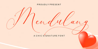 Mendulang Script consisting of a fashionable sophisticated signature-style script with its own unique curves and an elegant inky flow. Mendulang Script is perfect for branding projects, logo, wedding designs, social media posts, advertisements, product packaging, product designs, label, photography, watermark, invitation, stationery and any projects that need handwriting taste. What’s Included : Standard & Multilingual glyphs Ligature PUA Encoded Characters - Fully accessible without additional design software. Fonts include multilingual support
 - Uchrony by deFharo,
$14.00 Uchrony is a condensed proportion slab serif typeface. The font family is made up of 3 styles, Roman, Small Caps & Italics, with 6 weights each. The lowercase letter "o" has guided the basic proportions and curves, in an exercise in minimalist construction, providing morphological coherence and maximum legibility, for this multi-purpose typeface family. The typography includes alternative letters, several sets of numbers, and advanced OpenType features. • View specimen in PDF
 - Bentband by Vishnu Sathyan,
$4.90 Introducing "Bentband" - a unique and playful typeface inspired by the way a pipe bends. This typeface features curved lines, bold and geometric shapes that tries to mimic a pipe. With its distinct style, Bentband is perfect for creating eye-catching headlines and titles that stand out. The font is available in both uppercase and lowercase letters, a range of symbols and numerals. Bentband is available in 66 languages.
 - Layla Layli by Sulthan Studio,
$14.00 Layla Layli - new, fresh, funny, interesting, cute calligraphy fonts with a heart that can be connected and beautiful curves. It is suitable for greeting cards, branding materials, business cards, quotes, posters, and more! Layla Layli - includes many alternative characters. Coded with Unicode PUA, which allows full access to all additional characters without having special design software. Mac users can use Font Book. Windows users can use the Character Map to view and copy one of the additional characters to paste into your favorite text editor. For people who have opentype-capable software: Alternatives can be accessed by turning on the "Alternative Style" and "Ligature" buttons on the Photoshop Character panel, or through any software with the glyph panel, e.g. Adobe Illustrator, Photoshop CC, Inkscape.
 - Carve by Scholtz Fonts,
$19.00 Carve is an African font that was inspired by fonts such as Othello and Neuland designed in the mid-1920s. Rather than attempting to re-create these fonts in a digital form as so many others have done, I have tried to capture the “spirit” of the period and emphasize the “woodcarving” style of the font, while simultaneously giving it a contemporary feel. As a result the characters differ markedly any of the original styles and have much less of an “Art Deco” look to them. To further modernize Carve, I have included all the characters required for a full character set (lower case, as well as all punctuation, numerals, diacritics, special characters etc). The result is a thoroughly modern re-interpretation. The numbers (0 to 9) bear no relation to any originals but, I believe, are fully in keeping with the upper and lower alphabetic characters of my font. Carve comes in two styles: --Regular: contemporary, angular African style --Incised: exaggerating the chunky, hand-carved "woodcut" effect. The "in-line" effect has been hand-crafted to avoid the mechanical effect of computer-generated inline effects.
 - Vianova Serif Pro by Elsner+Flake,
$59.00 The font superfamily Vianova contains each 12 weights of Sans and Slab and 8 weights of the Serif style. The design from Jürgen Adolph dates back into the 1990s, when he studied Communication Design with Werner Schneider as a professor at the Fachhochschule Stuttgart. Adolph started his carrier 1995 at Michael Conrad & Leo Burnett. He was responsible for trade marks as Adidas, BMW, Germanwings and Merz. He has been honored as a member of the Art Directors Club (ADC) with more than 100 awards. On February 26, 2014, Jürgen Adolph wrote the following: “I was already interested in typography, even when I could not yet read. Letterforms, for instance, above storefronts downtown, had an irresistible appeal for me. Therefore, it is probably not a coincidence that, after finishing high school, I began an apprenticeship with a provider of signage and neon-advertising in Saarbrücken, and – in the late 1980s – I placed highest in my field in my state. When I continued my studies in communications design in Wiesbaden, I was introduced to the highest standards in calligraphy and type design. “Typography begins with writing” my revered teacher, Professor Werner Schneider, taught me. Indefatigably, he supported me during the development of my typeface “Vianova” – which began as part of a studies program – and accompanied me on my journey even when its more austere letterforms did not necessarily conform to his own aesthetic ideals. The completely analogue development of the types – designed entirely with ink and opaque white on cardboard – covered several academic semesters. In order to find its appropriate form, writing with a flat nib was used. Once, when I showed some intermediate designs to Günter Gerhard Lange, who occasionally honored our school with a visit, he commented in his own inimitable manner: “Not bad what you are doing there. But if you want to make a living with this, you might as well order your coffin now.” At that time, I was concentrating mainly on the serif version. But things reached a different level of complexity when, during a meeting with Günther Flake which had been arranged by Professor Schneider, he suggested that I enlarge the offering with a sans and slab version of the typeface. So – a few more months went by, but at the same time, Elsner+Flake already began with the digitilization process. In order to avoid the fate predicted by Günter Gerhard Lange, I went into “servitude” in the advertising industry (Michael Conrad & Leo Burnett) and design field (Rempen& Partner, SchömanCorporate, Claus Koch) and worked for several years as the Creative Director at KW43 in Düsseldorf concerned with corporate design development and expansion (among others for A. Lange & Söhne, Deichmann, Germanwings, Langenscheidt, Montblanc.”
 - Vianova Slab Pro by Elsner+Flake,
$59.00 The font superfamily Vianova contains each 12 weights of Sans and Slab and 8 weights of the Serif style. The design from Jürgen Adolph dates back into the 1990s, when he studied Communication Design with Werner Schneider as a professor at the Fachhochschule Stuttgart. Adolph started his carrier 1995 at Michael Conrad & Leo Burnett. He was responsible for trade marks as Adidas, BMW, Germanwings and Merz. He has been honored as a member of the Art Directors Club (ADC) with more than 100 awards. On February 26, 2014, Jürgen Adolph wrote the following: “I was already interested in typography, even when I could not yet read. Letterforms, for instance, above storefronts downtown, had an irresistible appeal for me. Therefore, it is probably not a coincidence that, after finishing high school, I began an apprenticeship with a provider of signage and neon-advertising in Saarbrücken, and – in the late 1980s – I placed highest in my field in my state. When I continued my studies in communications design in Wiesbaden, I was introduced to the highest standards in calligraphy and type design. “Typography begins with writing” my revered teacher, Professor Werner Schneider, taught me. Indefatigably, he supported me during the development of my typeface “Vianova” – which began as part of a studies program – and accompanied me on my journey even when its more austere letterforms did not necessarily conform to his own aesthetic ideals. The completely analogue development of the types – designed entirely with ink and opaque white on cardboard – covered several academic semesters. In order to find its appropriate form, writing with a flat nib was used. Once, when I showed some intermediate designs to Günter Gerhard Lange, who occasionally honored our school with a visit, he commented in his own inimitable manner: “Not bad what you are doing there. But if you want to make a living with this, you might as well order your coffin now.” At that time, I was concentrating mainly on the serif version. But things reached a different level of complexity when, during a meeting with Günther Flake which had been arranged by Professor Schneider, he suggested that I enlarge the offering with a sans and slab version of the typeface. So – a few more months went by, but at the same time, Elsner+Flake already began with the digitilization process. In order to avoid the fate predicted by Günter Gerhard Lange, I went into “servitude” in the advertising industry (Michael Conrad & Leo Burnett) and design field (Rempen& Partner, SchömanCorporate, Claus Koch) and worked for several years as the Creative Director at KW43 in Düsseldorf concerned with corporate design development and expansion (among others for A. Lange & Söhne, Deichmann, Germanwings, Langenscheidt, Montblanc.”
 - Vianova Sans Pro by Elsner+Flake,
$59.00 The font superfamily Vianova contains each 12 weights of Sans and Slab and 8 weights of the Serif style. The design from Jürgen Adolph dates back into the 90th, when he studied Communication Design with Werner Schneider as a professor at the Fachhochschule Stuttgart. Adolph started his carrier 1995 at Michael Conrad & Leo Burnett. He was responsible for trade marks as Adidas, BMW, Germanwings and Merz. He has been honoured as a member of the Art Director Club (ADC) with more than 100 awards. On February 26, 2014, Jürgen Adolph wrote the following: “I was already interested in typography, even when I could not yet read. Letterforms, for instance, above storefronts downtown, had an irresistible appeal for me. Therefore, it is probably not a coincidence that, after finishing high school, I began an apprenticeship with a provider of signage and neon-advertising in Saarbrücken, and – in the late 1980s – I placed highest in my field in my state. When I continued my studies in communications design in Wiesbaden, I was introduced to the highest standards in calligraphy and type design. “Typography begins with writing” my revered teacher, Professor Werner Schneider, taught me. Indefatigably, he supported me during the development of my typeface “Vianova” – which began as part of a studies program – and accompanied me on my journey even when its more austere letterforms did not necessarily conform to his own aesthetic ideals. The completely analogue development of the types – designed entirely with ink and opaque white on cardboard – covered several academic semesters. In order to find its appropriate form, writing with a flat nib was used. Once, when I showed some intermediate designs to Günter Gerhard Lange, who occasionally honored our school with a visit, he commented in his own inimitable manner: “Not bad what you are doing there. But if you want to make a living with this, you might as well order your coffin now.” At that time, I was concentrating mainly on the serif version. But things reached a different level of complexity when, during a meeting with Günther Flake which had been arranged by Professor Schneider, he suggested that I enlarge the offering with a sans and slab version of the typeface. So – a few more months went by, but at the same time, Elsner+Flake already began with the digitilization process. In order to avoid the fate predicted by Günter Gerhard Lange, I went into “servitude” in the advertising industry (Michael Conrad & Leo Burnett) and design field (Rempen& Partner, SchömanCorporate, Claus Koch) and worked for several years as the Creative Director at KW43 in Düsseldorf concerned with corporate design development and expansion (among others for A. Lange & Söhne, Deichmann, Germanwings, Langenscheidt, Montblanc.”
 - Lapoya by Cuchi, qué tipo,
$9.95 “LAPOYA” (meaning in english “the coolest”) is a large slab serif typeface family, with a certain Italian inverted contrast touch. Specially designed for advertising big shows and commerces, Lapoya has 36 variables and four axes, including a text and decorative versions, where the drawing and width of its counterforms vary. It also has icons that remember the old aesthetics of wood types from the early 20th century, and more than 400 characters with a multitude of signs and ligatures, that make Lapoya ideal for up to 89 languages. It is clearly inspired by the large wood types designed for posters, advertisements and newspapers. Since they were introduced in the 19th century, slab serifs have become extremely popular. In fact, serifs are often enlarged, not so much to look like beautiful or balanced letters, but to be more graphic and visual powerful than others. Furthermore, in the case of this typeface, this idea has been applied not only to capital letters, but also to the lowercase, numbers and signs of all kinds. “That’s why this typeface is LAPOYA!” Designed by Carlos Campos in 2023. cuchi@cuchiquetipo.com OPENTYPE FONT 426 GLYPHS 388 CHARACTERS 4 AXES 36 INSTANCES 9 LAYOUT FEATURES 89 LANGUAGES
 - Bebopalula by Studio K,
$45.00 No prizes for guessing this font family was inspired by the 1950s - the sounds (Buddy, Eddie, Elvis), the styles (polka dots, petticoats and Dior's New Look), and the kitsch, from furry dice above the dashboard to plaster ducks over the mantlepiece! A particular point of reference is the furnishings and fabrics of the Fifties (with their distinctive kidney shapes and angular curves) as showcased in the Festival of Britain 1951. See also my other fun fonts Barrowboy, Calypso and Pier Arcade.
 - Ellastia by Aqeela Studio,
$20.00 This modern Ellastia calligraphy script has been written attentively with gentle curves to produce a font that is truly distinctive and original. It contains a complete set of uppercase & lowercase letters, a wide variety of punctuation marks, numbers, and multilingual support. Perfect for adding a unique and elegant touch to your writing and branding projects. Use it to make your ideas more realistic and create spectacular designs! This font is PUA encoded which means you can access all glyphs and swashes with ease!
 - Bolde by Figuree Studio,
$18.00 Bolde is a powerful sans serif font family with modern touches. A balance of hard lines and smooth curves makes them able to stand on their own dynamically Features: five all caps font, Numbers & Punctuation / Extensive Language Support Bolde works great in any branding, logos, magazines, film. The different styles give you the full range to explore a whole host of applications. Thanks for having a peek at Bolde. As always, if you have any questions just send me a message!
 - Decour Soft by Latinotype,
$26.00 Decour Soft is the rounded-edged version of Decour. It is a slab serif humanist low contrast typeface. The overall design also features strong curves, making it a very friendly face. The font retains the original elegant features of Decour—based on Art Deco design—such as high contrast between upper and lower case characters. Decour Soft is a suitable font for logotypes and packaging. Its design also allows it to be used with certain elegance in book titles and magazines subheadings.
 - Holen Vintage by Attract Studio,
$17.00 Holen Vintage is a stylish blend of classic serif fonts with modern serifs with bold curves giving it a traditional groovy vibe, luxury and versatility. Holen Vintage is made with a high level of legibility and is perfect for nostalgic moodboard projects, vintage logos, wedding designs, social media posts, advertisements, product packaging, product designs, labels, photography, watermarks, invitations, stationery and any project. Holen Vintage Features: Multilanguange PUA Encoded OpenType features Stylistic alternates, ligatures Check out Sarlotte which is a great pair for Holen Vintage.
 - Plantago by Schriftlabor,
$29.99 Viktor Solt-Bittner drew logo sketches for an insurance company. Luckily for Schriftlabor, they rejected the design, and he turned the sketches into a font family. Years later, Plantago was expanded, developed and completed by Schriftlabor’s type directors Franziska Hubmann and Lisa Schultz. Plantago shows delicate leaf-like stroke endings and subtle curvings and offers condensed and wide variants. Typeset in 6 weights from Light to Black, 3 widths from Condensed to Extended, both upright and italic, totaling in no less than 36 styles.
 - TT Geekette by TypeTrends,
$27.00 TT Geekette is an experimental variable* serif with friendly and flexible character of shapes. In this project, we wanted to get away from simplifications and dry geometry and to experiment with the smoothness, softness and plasticity of forms. And in order to make the project a little more stylish and serious, we decided to make the font monospaced. When creating TT Geekette, we did not rely on traditional writing techniques or on the influence of pen movement on the font pattern. Despite the fact that judging by certain characters TT Geekette is a serif, the font is specifically “built” and “drawn”. There are several systemic techniques in font design, such as “loops” which set the plastic rhythm for the entire typeface. Variability in TT Geekette is influenced by contrast buildup in the font—moving the slider to adjust the variability axis, you gradually move from a completely non-contrast monolinear serif font to a font with a pronounced reverse contrast. In addition, with the help of the variability slider, you can remove serifs from the monolinear essence of the font. The TT Geekette family consists of 3 styles: the TT Geekette Bones—monolinear font, the TT Geekette Muscles—reverse contrast serif, and the TT Geekette Variable font. Each style contains over 450 glyphs. And yes, technically the typeface can be used in programming, at least you are guaranteed to get your share of bright emotions. *An important clarification regarding variable fonts. At the moment, not all graphic editors, programs and browsers support variable fonts. You can check the status of support for the variability of your software here: v-fonts.com/support/
 - Wood Bonnet Antique No.7 by astype,
$41.00 Wood Bonnet Antique No.7 is based on real vintage wood type blocks from Switzerland. The very distressed letters give a warm analogue vintage charm on printing. These kind of wood type letters were very common and often named by generic names like Roman, French or Antique followed by a catalog number. But these letters have some very quirky details hard to find else were. » pdf specimen « The font offers up to five glyph variations of all the Latin base letters, figures and some additional letters. An OpenType glyph-rotator is programmed to emulate the randomness of old school printing on live typing. All dingbats of the specimen file are included in the font data too.
 - Janky Action by Bogstav,
$15.00 First of all, let me get one thing straight: With Janky Action, I didn’t make any attempt on making a beautiful or good looking font! Janky Action is my humble attempt to recreate a sign I saw at a flea market. The sign was obviously made by someone who didn’t give a darn about the width of strokes, height of letters, and other “rules” when making a sign. I fell in love with the naive approach on how to make a sign. In order to create some randomness, I have added 4 different versions of each lowercase letter. I hope you find this font as enjoyable as I did while making it! :)
 - Plug by Superfried,
$32.50 Plug is an experimental, curvy, display typeface designed by Superfried. As its name suggests, it features ‘plugs’ within all the glyph counters. Plug has a very retro feel and its chunky structure leads to a distinct, high-impact display font. Plug has been featured on the Behance curated typographic gallery TypographyServed.com.
 - 1955 by Alan Smithee Studio,
$9.00 1955 Is a fresh grotesque interpretation. Any detail too historically referenced is replaced by strong geometry and idiosyncratic features. Round dots and punctuation, curved “l” foot, single storey “g” etc. all these details make 1955 a very contemporary typeface (unlike the name suggests!). With a range of weights going from Thin to Black including Italics, OpenType Features, extended character-set, tailored for print and digital, 1955 has everything to become your new go-to typeface for every project!
 - Great Outback by Epiclinez,
$18.00 Great Outback is a display typeface that's bold, fun and playful. It's also clean and versatile, making it a perfect addition to any designer's kit. Packed with personality, this typeface screams out loud. Great Outback is suitable for headlines, packaging, logo etc. Use it to give your design that memorable edge. Out of the ordinary and into the great outdoors! So what’s included : Standard Latin Numbers, symbols, and punctuations Multilingual Support. Accented Characters : ÀÁÂÃÄÅÆÇÈÉÊËÌÍÎÏÑÒÓÔÕÖØŒŠÙÚÛÜŸÝŽàáâãäåæçèéêëìíîïñòóôõöøœšùúûüýÿžß PUA Encoded and fully accessible without additional design software Simple Installations Works on PC & Mac Thank You!
 - Chunk by Fenotype,
$25.00 Inspired by the more than hundred years old classic Cooper Black, Chunk Black features a hefty character with rounded serifs and a soft yet sturdy overall appearance. Chunk Black provides a timeless and friendly feel and it’s very suitable for product and packaging design and any kind of display purposes from music business to restaurant menus and from t-shirts to band logos. Both Chunk Black and Chunk Black Italic are equipped with several OpenType -features and a total number of 87 alternate characters, set in Swash, Stylistic and Titling Alternates and Discretionary Ligatures.
 - Bamberforth by Greater Albion Typefounders,
$12.95 Bamberforth is a new take on the type of lettering that was often seen on Railway timetables, share certificates and anything else that needed a distinctive heading in the mid-19th Century. This sort of thing was used on both sides of the Atlantic and can carry us back to another time. Bamberforth aims to give a modern clarity to a style of lettering that, in all other particulars, harks straight back to Victorian times. Bamberforth is ideal for giving anything a 19th century feel-especially posters, book headings, dust jackets and invitations.
 - Special Edition JNL by Jeff Levine,
$29.00 The Teapot Dome scandal was a 1920s bribery scandal involving Secretary of the Interior Albert Bacon Fall. Fall leased Navy petroleum reserves at Teapot Dome in Wyoming [along with some California reserves] at low rates with no competitive bidding. The San Francisco Examiner for Feb. 20, 1924 ran the two line headline “U.S. Senator Named as Oil Stock Speculator; Whitney to Face Quiz Today on Slush Fund”. The headline was set in a condensed, slightly squared sans serif typeface. This is now available as Special Edition JNL in both regular and oblique versions.
 - Justheros by ZetDesign,
$15.00 Justheros font is a very amazing bold font. This font is created by combining sharp angles and curves to produce a spectacular shape. This font can be used formally and informally, and is equipped with opentype features and international accents to support your best design work. ... thanks ...
 - Parisine Std by Typofonderie,
$59.00 Ultra legible forceful sanserif in 32 fonts Parisine was born as official parisian métro signage typeface. This family of typefaces has become over years one of the symbols of Paris the Johnston for the London Underground or the Helvetica for the New York Subway. The Parisine was created to accompany travelers in their daily use: ultra-readable, friendly, human while the context is a priori hostile. Meanwhile, Parisine is now a workhorse and economical sanserif font family, highly legible, who can be considered as a more human alternative to the industrial-mechanical Din typeface family. More human, but not fancy: No strange “swashy” f, or cursive v, w etc. on the italics, to keep certain expected regularity, important for information design, signages, and any subjects where legibility, sobriety came first. Born as signage typeface family, the various widths and weights permit a wider range of applications. In editorial projects, the Compress version will enhances your headlines, banners, allowing ultra large settings on pages. The Narrow version will be useful as direct compagnon mixed to standard width version when the space is limited. The various Parisine typeface subfamilies Parisine is organised in various widths and subsets, from the original family Parisine, Parisine Gris featuring lighter versions of the usual weights and italics, Parisine Clair featuring extra light styles, to Parisine Sombre with his darker and extremly black weights as we can seen in Frutiger Black or Antique Olive Nord. Many years of adjustments were necessary to refine this complex family. Initially, Parisine was designed by Jean François Porchez in 1996 for Ratp to solely fulfil the unique needs of signage legibility. Parisine remain the official corporate typeface of the public transport in Paris, the worldwide capital for tourism, and now integral part of the French touch. Directly related, Parisine Office was initially created for Ratp’s internal and external communication, Parisine Office is available at Typofonderie too. Not connected with Ratp and public transports, Parisine Plus was created as an informal version of Parisine. Parisine: Introducing narrow and compressed families About Parisine Parisine helps Parisians catch the right bus Observateur du design star of 2007
 - Technical Rounded VP by VP Type,
$24.00 The initial inspiration for the typeface came from examining precisely machined labels on tools of various kinds, from cameras to cars, which need to be perfectly legible at all sizes. Such processes create a distinctly streamlined, clean look that feels both robust and stylish - universal and unique. Technical Rounded VP includes ten diverse styles, offering great versatility. All styles in this family include an extensive Latin character set, the Greek alphabet, multiple sets of numerals, a large set of punctuation marks, and other symbols. With 1120 glyphs in each style, it guarantees full support for all Latin languages. To make the family even more powerful, twenty OpenType features are included, such as multiple vertical positions, diagonal fractional forms, optional slashed zeros, separate old-style and lining figures, small capitals, and contextual alternates. If you are looking for similar typefaces, note that Technical Rounded VP is the soft counterpart of Technical Standard VP. A stenciled version is also available. They can be used either on their own or together seamlessly.
 - MB GEOMETRIXA by Ben Burford Fonts,
$25.00 Inspired from geometric curves and circles, an audacious lower case display face with some alternate characters in Upper and Lower case glyphs. Great for Logos and Logotypes, headlines and larger text. Works well with smaller strap lines as well.
 - Realstin by Ajibatype,
$19.00 Realstin is a luxurious serif with an elegant style. It seduces your eyes with its curves yet still manages to maintain its classy serenity, it’s perfect for branding, logos, invitations, long texts, and many more of your other needs.
 - Aupress by S6 Foundry,
$29.00 Aupress is a contemporary luxurious serif typeface featuring large open counters, curved, round forms, creating a modern & elegant glyph set. The family has been designed to give style and form to every project.
 - Nexa by Fontfabric,
$29.00 Improved kerning of the Updated Version of 2020 - New Features: • Cyrillic language support • Bulgarian Localization • Completely New Nexa Text subfamily • New ExtraLight weight with a corresponding italics • Stylistic Set suitable for Display purposes - ss02 • Tabular Figures Even the most recognizable typefaces of our time, such as Nexa, should be updated sometimes. We proudly present you with the latest upgraded version of the notorious geometric sans serif. The completely refined family design comes with an addition of one more weight—Extra Light—and its matching italic, alongside an entirely new subfamily—Nexa Text, optimized for longer text, and even a futurist stylistic set of Nexa for an alternative display look. The outcome is altogether 9 weights and 36 fonts! The glyph case now covers not only an improved Extended Latin but a new set of Cyrillic with adequate language localization. The fluent functionality of Nexa is achieved with multiple OpenType features, such as case-sensitive forms, contextual and stylistic alternates. The standard numerals set encompasses tabular figures and symbols, superiors and inferiors, numerators and denominators, plus fractions. The unique appearance of Nexa combined with rich variety places it beyond the scope of regular geometric typefaces for all kinds of scales and purposes and designs that speak for themselves.
 - Penmanshift JNL by Jeff Levine,
$29.00Penmanshift JNL by Jeff Levine is actually a semiscript - a vertical text font with the curved lines of a script alphabet, but the look and feel of a poster letter. - Chameleon by Fontforecast,
$30.00 Chameleon consists of 16 fonts based on 3 completely different designs. Different but specially designed to complement each other. Together they form a well-balanced design kit suitable for many different projects, e.g. invites, menus, magazines, brochures, packaging, etc. Chameleon comes in three styles: 2 outline versions and a basic (solid) version. To combine Chameleon with Chameleon Fill, you will need an application that allows you to stack text frames. Once you start layering different fills, like a true chameleon, you can change colors and patterns. Simply place several layers on top of each other, choose from 7 fills to determine your pattern and assign a color to the fill. Always place one of the outline versions of Chameleon on the top layer. Chameleon Pen was added to give you the possibility to spice up your design with a personal touch. It is a charming handwritten font, which was first written out with a dip pen and ink, then scanned in and digitalized. It comes in regular and italic. And then there is Chameleon Sketch for a bit of nonchalance to add to your designs. The Outline, Hatch and Solid version can be used separately, or stacked to create a shadowy or multi-colored effect. On top of that, you'll find 102 glyphs of extra fun to play with in Chameleon Sketch Extra.
 - MVB Greymantle by MVB,
$39.00Kanna Aoki had fairy tales in mind when she designed MVB Greymantle. She drew dots with a felt pen to build up the forms, giving them their particular rough character. The “Extras” font contains a set of whimsical illustrations, including a portrait of Greymantle—her 18-pound cat, a set of curly initial caps, and border parts. MVB Greymantle has been spotted on numerous children's books, in magazines, in salad dressing advertisements, and on food packaging. - Bastia by Jen Wagner Co.,
$17.00 Bastia is a classy, bold upper and lowercase typeface that looks incredible in both large and small settings. Best used as a display for headings and logos, Bastia's clean lines and smooth curves give any project an extra touch of class. See how it looks when used for body text in the 11th sample image above. I also love combining Bastia and clean sans serifs for minimal logos (see the "Lucky Finch" sample logo). This download also includes a special outline version of the serif, so you can layer text or add some flair to your logos and display type. There are also alternates available for "k" and "s" that give each letter some extra curves (available via the special characters panel One thing to note about Bastia is the letter spacing. It was intentionally spaced for clean reading if you wanted to use it for body type, so I recommend setting the spacing a little tighter for display use (around -10 to -20 should do!). Includes: Bastia Bold (uppercase & lowercase) Bastia Bold Outline (uppercase & lowercase) Numbers & punctuation Foreign language support Alternates for "k" and "s" – available via the special characters panel
 - Black Scream by Ditatype,
$29.00 Black Scream is a spine-chilling serif display font designed to send shivers down your spine. Set in uppercase, each letter is meticulously crafted with a haunting ink dripping effect, adding an eerie and nightmarish vibe to your horror-themed designs. The letters of this font exude an unsettling aura, as if they were dipped in darkness and let ink slowly bleed down the page. The ink dripping effect adds a touch of realism and dread to the font, as if it were forged from the depths of a chilling nightmare. On the other side, the serif details of Black Scream add a sense of elegance to the font, contrasting with its nightmarish appearance. The fine lines and precise curves create a mesmerizing yet unsettling effect, making it a unique and captivating choice for horror-themed designs. For the best legibility you can use this font in the bigger text sizes. Enjoy the available features here. Features: Multilingual Supports PUA Encoded Numerals and Punctuations Black Scream fits in headlines, logos, horror movie posters, haunted house flyers, Halloween party invitations, any spine-tingling project, branding materials, print media, editorial layouts, website headers, and many more. Find out more ways to use this font by taking a look at the font preview. Thanks for purchasing our fonts. Hopefully, you have a great time using our font. Feel free to contact us anytime for further information or when you have trouble with the font. Thanks a lot and happy designing.
 - Stern Pro by Canada Type,
$49.95 Originally released in 2008, Stern is the only typeface to be produced and marketed simultaneously in digital and metal. In the twenty-first century, no less. It is also the last typeface Jim Rimmer ever completed. The process he used for its design and manufacture is the stuff of legend, and can be seen in the Richard Kegler documentary, Making Faces: Metal Type in the 21st Century. The design is a delicate upright italic named in memory of Chris Stern, the late artist and printer from Washington State. In 2013, Canada Type remastered and expanded the design's offerings to a glyphset of over 1200 characters, updated programming. Now Stern Pro includes the following features: - Small caps. - Caps-to-small-caps functionality, useful for setting mid-height caps alongside lowercase. - Tall caps. - Historical forms. - A wide variety of alternates for both uppercase and lowercase letters. - Plenty of ligatures. - Seven types of numerals, enclosers, cojoiners and currency symbols. - Automatic fractions. - A complete set of lowercase ordinals, from a to z. - Case-sensitive forms. - Language support for Greek and over 50 Latin languages. 20% of this font's revenues will be donated to the Canada Type Scholarship Fund, supporting higher typography education in Canada.
 - Agmena Paneuropean by Linotype,
$103.99Agmena™ has no historical precursor; it was designed from scratch by Jovica Veljovi? whose aim was to create a new book typeface. Although it generally has certain similarities with the group of Renaissance Antiqua fonts, it is not clearly derived from any of these. Clear and open forms, large counters and a relatively generous x-height ensure that the characters that make up Agmena are readily legible even in small point sizes. The slightly tapering serifs with their curved attachments to letter stems soften the rigidity of the typeface, bringing Agmena to life. This non-formal quality is further enhanced by numerous tiny variations to the letter shapes. For example, there are slight differences to the terminals of the b", the "d" and the "h" and minor dissimilarities in the forms and lengths of serifs of many of the letters. The tittles over the "i" and "j" and those of the German umlauts are almost circular, while the diamond shape that is more characteristic of a calligraphic script is used for the punctuation marks. Although many of these variations are only apparent on closer inspection, they are enough to give Agmena the feeling of a hand-made typeface. It is in the larger point sizes that this feature of Agmena comes particularly into play, and individual characters gain an almost sculptural quality. The italic variants of Agmena are actually real cursives. The narrower and thus markedly dynamically formed lowercase letters have a wider range of contrast in terms of line thickness and have the appearance of having been manually produced with a quill thanks to the variations in their terminals. The lowercase "a" assumes a closed form and the "f" has a descender. The italic capitals, on the other hand, have been consciously conceived to act as a stabilising element, although the way they have been inclined does not produce a simply mechanical effect. This visual convergence with the upright characters actually means that it is possible to use letters from both styles in combination. Agmena is available in four weights: Book, Regular, Semibold and Bold, and each has its matching italic variant. Veljovi? designed Book and Regular not only to provide an optical balance between various point sizes, such as between that used for the text and that used in footnotes, but also to take account of different paper forms: Regular for lined paper and Book for publishing paper. Agmena's range of characters leaves nothing to be desired. All variants include small caps and various numeral sets with oldstyle and lining figures for setting proportional text and table columns. Thanks to its pan-European language support, Agmena can be used to set texts not only in languages that use the Latin alphabet as it also features Cyrillic and Greek characters. The set of standard ligatures has been extended to include special combinations for setting Greek and Serbian. Agmena also has some initial letters, alternative glyphs and ornaments. Agmena is a poetic text font with forms and spacing that have been optimised over years of work to provide a typeface that is ideal for setting books. But its letters also cut a good figure in the larger font sizes thanks to their individual, vibrant and, in some cases, sculptural effects. Its robust forms are not merely suited to a printed environment, but are also at home among the complex conditions on terminal screens. You can thus also use Agmena as a web font when designing your internet page."Agmena has received the Certificate of Excellence in Type Design at the Type Directors Club of New York TDC2 competition in 2013. - Akira by IKIIKOWRK,
$19.00 Introducing Akira - Zenbrush Script, created by ikiiko. Calm brush script type, adapted from Japanese zen culture. Akira typeface uses firm lines with strong curves with lots of alternates & stylistic options to choose. This typeface is perfect for an elegant logo, poster design, beauty product, packaging product, community logo, magazine, quotes, or simply as a stylish text overlay to any background image. What's included? Uppercase & Lowercase Number & Punctuation Alternates & Stylistic Multilingual Support Enjoy our font and if you have any questions, you can contact us by email : ikiikowrk@gmail.com
 - Masio by IbraCreative,
$37.00 Masio is a vibrant and captivating display font that embodies the essence of fun and excitement. Its bold and exaggerated letterforms command attention and make a powerful visual statement. With its playful curves and dynamic angles, Masio injects a sense of energy and liveliness into any design. The exaggerated serifs and unique character shapes add a touch of whimsy and personality, making Masio an ideal choice for headlines, logos, and eye-catching signage. Whether used in print or digital mediums, Masio captivates viewers with its exuberant charm and creates a memorable and enjoyable visual experience.